10,000 search results
(0.018 seconds)
- F2F ZakkGlobe by Linotype,
$29.99The Techno sound of the 1990s, a personal computer, a font creation software and some inspiration had been the sources to the F2F (Face2Face) font series. Thomas Nagel and his friends had the demand to create new unusual faces that should be used in the leading german techno magazine Frontpage". Even typeset in 6 point to nearly unreadability it was a pleasure for the kids to read and decrypt the messages." - Rennie Mackintosh Scotland St by CRMFontCo,
$20.00Derived from the world famous Rennie Mackintosh Font, the Scotland St. version gives an outline form of the genius of Charles Rennie Mackintosh. The "Scotland St." name comes from one of Mackintosh's most famous architectural works - the Scotland St. School in Glasgow, Scotland. This wonderful legacy of Mackintosh's genius can be visited daily FREE OF CHARGE, as it has been classed as a museum by Glasgow City Council. - Dead Mans by Comicraft,
$19.00 Shiver me Timbers and Splice me Mainbrace! There's strange goings on in Smugglers' Cove... A gathering of thieves, brigands, piratefolk and back-stabbing blackguards the likes of which have not been seen since the days of Redbeard! Someone'll be swinging from the yardarm or walking the plank if the map identifying the location of the fonts created for Grim Todd McFarlane's SPAWN: THE DARK AGES doesn't turn up soon!
 - Brollo by Greater Albion Typefounders,
$15.00 Brollo is a chunky display face full of the spirit of the 60s and 70s. Its bold character makes it ideal for poster work, and for anywhere that the point really needs to be driven home. The letter forms have been designed to work well either used conventionally or exclusively in capitals. We recommend use in combination with strong patterns, psychedelic colours and anything else outrageous you can think of.
 - F2F Pixmix by Linotype,
$29.99The Techno sound of the 1990s, a personal computer, a font creation software and some inspiration had been the sources to the F2F (Face2Face) font series. Thomas Nagel and his friends had the demand to create new unusual faces that should be used in the leading german techno magazine Frontpage". Even typeset in 6 point to nearly unreadability it was a pleasure for the kids to read and decrypt the messages." - Taurunum Ferrum by Kostic,
$40.00 Taurunum Ferrum is a version of Taurunum family, made to feel like it’s been cast in iron or cut out of steel plates. It is meant to be used in a bold display setting where raw and strong look is a priority. The Iron style has an medieval (blackletter) flavour, while Steel has more of a contemporary look. Taurunum Ferrum has a character set to support Western and Central European languages.
 - Scamps by Spark Creative,
$39.00 I designed this font because it didn't exist - it’s based on hand rendered type created for black and white line marker scamps used in the advertising industry. I use it that way and it’s saved me a LOT of hand-rendering time over the years. Of course, Scamps works as an informal marker script in its own right too. I’ll be interested to see what you do with it.
 - Bergen Text by Mindburger Studio,
$40.00 Bergen Text is the younger twin and a lifetime companion of Bergen Sans with perfect legibility and adorable personality. It has been carefully crafted to improve readability experience particularly on small text sizes. Bergen Text is a family of of 6 fonts. While being a small font family it has plenty of Open Type features for highly professional use and Extended Latin, Cyrillic (including Bulgarian character set) and Greek language support.
 - Ragerdo by Sealoung,
$20.00 Ragerdo is modern serif font, every single letters have been carefully crafted to make your text looks unique. Trendy, classy & modern style serif font for your fancy projects. Elegant, luxury and classic style on Ragerdo font will be great for any branding project. Lot of ligatures will help you to create unique and original logo design or website header! Enjoy :) Features : Uppercase & Lowercase Numbers and Punctuation Multilingual Ligatures PUA encoded
 - Santanelli by Pisto Casero,
$19.00 Santanelli is a rounded all caps display typeface. It is intended to be used in posters, editorial headlines and logotypes. It comes in three weights: Thin, Medium and Bold. Each letter has been designed with two different styles or flavors: decorative and clean. You can access each of them by typing uppercase and lowercase respectively. These two styles fit perfectly when combined within the same word or message.
 - Honey Valentine by Yoga Letter,
$15.00 "Honey Valentine" is a modern handwritten font. This font can be used for all your work and needs, especially related to Valentine's Day, wedding, winter, photography, engagement, promotions and more. This font is very easy to use because it has been specially designed, and there is also a guide for using letter decorations in the preview. This font comes with swashes, alternatives, basic characters, multilingual support, numbers, and punctuation.
 - Lucky Days by PizzaDude.dk,
$19.00 This is your Lucky Day, and if you are really lucky...it could turn into Lucky Days! :) Just go ahead and type with Lucky Days, it has 6 different versions of each letter...and they are all handmade. The letters are super legible, and can be used for a great variety: posters, postcards, invitations, comics or crafts. I even imagined a label for a beer, using this font!!!
 - Odell by The Organic Type,
$29.99 Odell is a fun, whimsical, yet elegant handwritten font that was created in a light-hearted manner for use in things like menus, invitations, bed and breakfast collateral and whatever else you can dream up. Odell features extra thin letters and it is designed to be creative, a little fancy, and very legible. There are tons of foreign characters to choose from so you can write in other languages as well.
 - Tamword by Prioritype,
$18.00 Introducing a new script font with a bold and clear style. Yes you can use this font in your projects and make it even more classy. It can be applied to logos, video previews, crafts, apparel products, packaging, photographer watermarks, and any of your other awesome projects. for an overview you can see some of the previews above. Features: -Uppercase -Lowercase -Numeral -Punctuation -Multilingual -Alternate -Ligature -Swash Thanks.
 - Augsburger by HiH,
$12.00 The Augsburger Family is a product of the Art Nouveau period in Germany and Austria, reflecting the darker, heavier Jugendstil approach typical of the Secession movement in these two countries. Originally released by H. Berthold AG of Berlin and Bauer & Co. of Stuttgart in 1902, Augsburger has been attributed to the designer Peter Schnorr. This current version represents a year-long revision of the Augsburger Family. All three fonts have been updated to eliminate duel encoding, harmonize metrics, and review all glyphs. In addition, the following features have been included in the individual fonts: Augsburger Schrift: a total of 249 glyphs have been added, for a total of 467 and an increase of 114%. New are Tabular Numbers, Small Caps, a variety of Ligatures and the refinement of all accents. Augsburger Initials: complete redesign of upper case, inclusion of upper case from Schrift instead of lower case, plus inclusion of small caps and a selection of appropriate ligature. Augsburger Ornamente: includes some additional glyphs. Augsburger may be purchased as a complete family or as individual fonts. Each font package includes both TTF and OTF versions to allow you to select what is most useful to you.
 - Gordita by Type Atelier,
$25.00 Gordita is a minimal sans serif typeface with a geometric foundation that has been built upon with modern details that result in an optically balanced, friendly typeface. When designing Gordita referring to features in Futura were influential as were the structural and harmonious strokes of Gotham. Forms have been optically compensated to appear natural and purely geometric. Joints are slightly tapered and ink traps feature in heavier weights with the purpose of achieving maximum legibility. Gordita has been tested in print and on screen in a wide range of point/pixel sizes. The family is equipped with OpenType features including alternate glyphs, fractions, case sensitive forms, small figures, arrows and symbols as well as old style and tabular figures. Now delivered in 7 weights with matching italics that slant at 15°. The italics are slightly lighter and narrower than the upright versions. The horizontal weighting in the italics have been reduced to compensate for the loss of vertical stroke thickness. With support for over two hundred languages with an extended Latin and Cyrillic character set, Gordita is ready to be put to work. Designed by Thomas Gillett, metrics and engineering by iKern (Igino Marini). The family has been recently updated to include two additional weights (Thin & Ultra + their matching italics) as well as slightly opened apertures for better legibility in the heavier weights, new glyphs and more opentype features.
 - Vena Amoris by Delve Fonts,
$49.00 New Orleans, June 25, 1895 My dear Edmond, I found upon my return home to dinner yesterday, your letter informing me of your affection for Annie and asking that we confide her future happiness to your keeping... This excerpt was taken from a letter written by designer Kathryn Podorsky’s great-great-grandfather, Lucien Doize, in response to Edmond’s request to marry his daughter, Annie. The letter was not only beautiful contextually, but exquisitely penned and epitomized the delightful charm of the New Orleans people of the time. Vena Amoris, or “Vein of Love” refers to a phrase coined by Henry Swinburne in his A Treatise of Espousal published in 1686. Vena Amoris also refers to the fourth finger on the left hand which was traditionally believed to contain a vein running directly to the heart, hence “the ring finger.” As a digital font, Vena Amoris boasts an extensive Latin-based character set that supports 51 languages. Also included are stylistic and contextual alternates, ligatures, swash variants, oldstyle figures, and roman numerals and calligraphic words that will undoubtedly bring a dynamic quality to any setting. All of those extras are driven by cleverly applied OpenType features allowing you to add harmony and calligraphic beauty to your layout.
 - Silvestre Weygel by Intellecta Design,
$20.90 A complete figurative alphabet was published by one Peter Flotner (ca. 1485-1546) in 1534. In Flotner’s alphabet, naked or nearly-naked figures are posed singly or disposed in pairs to form the various letters. Unlike de Grassi’s alphabet, we find only human figures here, no other animals. And unlike Tory’s illustrations, these letters seem an end in themselves, rather than the means of demonstrating a design strategy. Flotner’s alphabet was imitated by other engravers. The letters G and N are reproduced from an alphabet published by one Martin Weygel in Bavaria in 1560. Peter Flötner , c.1485-1546, German medalist and artisan, possibly Swiss by birth. He was active in decorative sculpture, wood carving, and other crafts, making medals and plaques and furnishing designs of classical motifs for silversmiths. He was in Nuremberg by 1522 and did most of his work there, although he made two trips to Italy. Flötner is now regarded as a pioneer of the German Renaissance. His Kunstbuch was published in 1549. In the Metropolitan Museum are five of his bronze plaques illustrating biblical episodes. A stylistical tip : Use this caps with SchneiderBuchDeutsch, as shown in the banners above, to create a perfect historiated layout.
 - Wegas by Craft Supply Co,
$20.00 Introduction to Wegas – Bubble Font Wegas – Bubble Font offers a playful and cheerful design, perfect for adding a fun touch to any project. It’s inspired by the lightness of clouds and the joy of bubbles. This font brings a fresh, airy feel to your designs, making them stand out. It’s ideal for creative projects that need a touch of whimsy. Design and Inspiration This font features rounded edges, mimicking the shape of clouds and bubbles. Its design is based on a cheerful and lively aesthetic, perfect for uplifting content. The bubbly appearance gives a sense of joy and playfulness. It’s like capturing the essence of a sunny day in a font. Versatility and Usage Wegas – Bubble Font is incredibly versatile. It works great for children’s books, party invitations, and playful branding. Its readability makes it suitable for both digital and print media. The font is a great choice for anyone looking to inject a sense of fun into their work. Easy to Use and Accessible This font is user-friendly, ensuring accessibility for all skill levels. Its simplicity caters to a wide audience, from professional designers to hobbyists. Downloading and installing Wegas – Bubble Font is straightforward, allowing you to start creating joyful designs immediately.
 - KG Two Is Better Than One by Kimberly Geswein,
$5.00 This font was created in honor of my husband for our 12th wedding anniversary. 14 years ago, I met this tall, skinny guy from Indiana in the lobby of a hotel in Hong Kong. We talked. The next day, we had lunch together. And that night we had dinner together. And the next day. And the next. We met just before my 19th birthday, and on my birthday he took me to the top of Victoria Peak, where we looked out over the city of Hong Kong- such a beautiful place to begin a lifetime of love! We spent 4 months together in Hong Kong, falling in love with each other and with the beautiful city we were privileged to call home for that short time. We married the next year. We've lived in Indiana, Texas, China, Kentucky, and Florida over those 12 years of marriage and have welcomed 2 daughters into our lives. I know beyond a shadow of a doubt that he completes my life in a way I didn't know was possible. And I know that I'm blessed beyond words to have a supportive, wonderful, encouraging husband who is also a loving, involved, caring dad to our daughters. This font is for you, Keith!
 - Lady Edith by MKGD,
$13.00 Lady Edith harkens back to the days of flappers and cocktail parties. The early part of the twentieth century, when Art Deco was at it’s height and high fashion was all the rage. A time of beauty, class and elegance. A minimalistic font with clean lines and just enough flare to make it unique. The perfect font for any occasion that needs a bit of high end magic. There is no lower case for Lady Edith as it is a decorative font. The Upper case version serves both the upper and lower case keys. Lady Edith has a glyph count of 397 and supports the following languages; Supported Languages: Afrikaans, Albanian, Asu, Basque, Bemba, Bena, Bosnian, Catalan, Chiga, Colognian, Cornish, Croatian, Czech, Danish, Embu, English, Esperanto, Estonian, Faroese, Filipino, Finnish, French, Friulian, Galician, German, Gusii, Hungarian, Icelandic, Indonesian, Irish, Italian, Kabuverdianu, Kalaallisut, Kalenjin, Kamba, Kikuyu, Kinyarwanda, Latvian, Lithuanian, Low German, Lower Sorbian, Luo, Luxembourgish, Luyia, Machame, Makhuwa-Meetto, Makonde, Malagasy, Malay, Maltese, Manx, Meru, Morisyen, North Ndebele, Norwegian Bokmål, Norwegian Nynorsk, Nyankole, Oromo, Polish, Portuguese, Romanian, Romansh, Rombo, Rundi, Rwa, Samburu, Sango, Sangu, Scottish Gaelic, Sena, Shambala, Shona, Slovak, Slovenian, Soga, Somali, Spanish, Swahili, Swedish, Swiss German, Taita, Teso, Turkmen, Upper Sorbian, Vunjo, Walser, Zulu
 - Gothikka - Unknown license

- Houndtime - Unknown license

- Scrawny Kids - Unknown license

- PF Kids Pro by Parachute,
$79.00 This is not just a typeface inspired by a kid’s first attempts to write. This is in fact how exactly a kid writes. Alexandros Papalexis was born again kid when he became a father. This series came about while designing his daughter’s birthday invitations. Since its first release, it has been constantly on our most wanted list. You step into a supermarket, a bookstore or a clothing store and you see tens of products using this typeface. Anything from baby products, food, clothing, children’s books and magazines, print and TV campaigns, you name it. But don't just stick to the name. Every single weight serves the right purpose. This is why this typeface has also been used extensively for grown-up market. Recently, it was upgraded to include Latin, Greek and Cyrillic. Furthermore, the accompanied series of pictograms was completed and loaded with 125 western and eastern European pieces.
 - Leaf by Journey's End,
$12.00This "Leaf" font has been swirling in my head for years - I remember my sister and I making letter formations like these when I was young. It was exciting to see the lettering look even better on paper than it did in my mind! "Leaf" surprised me by having two distinct looks: in size 24 or smaller, the look is delicate, because your eye doesn't see any space in the letters. In size 28 or larger, the eye can discern spaces, which gives a different facet to its personality. As much as I like this font when viewed on a monitor screen, it really shines when printed. The "Leaf" font is a perfect blend of quaint hand-written style mixed with crisp letter formations. This font has a very "happy" quality to it. May using it bring a little more happiness to your day! - First Ladies by Celebrity Fontz,
$24.99 First Ladies is a unique collection of signatures of almost all of the First Ladies of the United States plus the First Lady of the Confederacy in a high-quality font. A must-have for autograph collectors, desktop publishers, lovers of history, or anyone who has ever dreamed of sending a letter, card, or e-mail “signed” as if by one of these famous women. This font includes 45 signatures for the following First Ladies: Martha Dandridge Custis Washington, Abigail Smith Adams, Martha Wayles Skelton Jefferson, Dolley Payne Todd Madison, Elizabeth Kortright Monroe, Louisa Catherine Johnson Adams, Rachel Donelson Jackson, Anna Tuthill Symmes Harrison, Julia Gardiner Tyler, Sarah Childress Polk, Margaret Mackall Smith Taylor, Abigail Powers Fillmore, Jane Means Appleton Pierce, Harriet Lane, Mary Todd Lincoln, Eliza McCardle Johnson, Julia Dent Grant, Lucy Ware Webb Hayes, Lucretia Rudolph Garfield, Ellen Lewis Herndon Arthur, Frances Folsom Cleveland, Caroline Lavinia Scott Harrison, Frances Folsom Cleveland, Ida Saxton McKinley, Edith Kermit Cardow Roosevelt, Helen Herron Taft, Ellen Axson Wilson, Edith Bolling Galt Wilson, Florence Kling Harding, Grace Anna Goodhue Coolidge, Lou Henry Hoover, Anna Eleanor Roosevelt, Elizabeth Virginia Wallace Truman, Mamie Geneva Doud Eisenhower, Jacqueline Lee Bouvier Kennedy, Claudia Taylor (Lady Bird) Johnson, Patricia Ryan Nixon, Elizabeth Bloomer Ford, Rosalynn Smith Carter, Nancy Davis Reagan, Barbara Pierce Bush, Hillary Rodham Clinton, Laura Welch Bush, Michelle Obama, and Varina Howell Davis (First Lady of the Confederacy). This font behaves exactly like any other font. Each signature is mapped to a regular character on your keyboard. Open any Windows application, select the installed font, and type a letter, and the signature will appear at that point on the page. Painstaking craftsmanship and an incredible collection of hard-to-find signatures go into this one-of-a-kind font. Comes with a character map.
 - Funyard by Anomali Creative,
$19.99 The idea behind the creation of the Funyärd font is that there is an increasing need for fonts that are simple, funny and can be used in children's learning books, storytelling book, especially for pre-school children, kindergartens or toddlers, who due to this pandemic have not been able to enjoy the atmosphere of school learning, but must still feel a cheerful atmosphere while studying at home. Funyärd can be used as display text or as body text, so that for a story book or textbook for children, this one font family can complete all the typeface needs in it. Funyärd can also be created in typography works, merchandise or any product intended for children. What you will get is Funyärd Regular Funyärd Bold Funyärd Thin Funyärd College Funyärd Shadow
 - Boundar by Huruforia,
$8.00 Boundar is a sans serif font with a Geometric style, this font consists of 6 Weights and 208 Glyph. Boundar is taken from the Indonesian word "Bundar" which means circle because in this font there are so many circle elements in the manufacturing process. And I (Grapya) as the designer in this font hope, Boundar Typeface can be useful for you. If there is an error or anything that is less pleasing, you can contact us via our email, we will be happy to receive a review from you so that my team and I can be better in the future. and please note that every font that we upload in front of your monitor screen must have been tested by the curator of MyFonts. Thank You, Grapya & Suratoria Team
 - Crescent by TrendGFX Design Studios,
$20.00 The most sensational design of the decade is now at large. These high-definition fonts can be used for titles, banners, tattooing, logotypes and many more places. Be it domestic or industrial, formal or informal, it can be used in every field imaginable. It has a sensational, funky style and remarks the current youth's style. Such a font style has never been seen by the world, until today. These designs are 100% original and handmade. I searched a million miles but found this as the most appropriate idea for the world of font types at this time. It's the coolest, funkiest and the best font ever made. It's the era of graffiti and 3D, and we've combined both to give you CRESCENT.. So, use it, love it, buy it!
 - Futura Headline EF Pro by Elsner+Flake,
$103.00 The design of Futura seems to be timeless. This typeface family which had been developed in 1926 by Paul Renner for the Bauer Type Foundry in the style of constructivism and as part of the Bauhaus movement, experienced, however, in the course of the past 90 years, repeated time-appropriate revivals which guaranteed its on-going popularity. The version of the Futura EF Pro contains the original character constructions which Dennis Megaw described as the “first designs of Futura” in 1938 in “20th century sans serif types, Typography no. 7” (See: Dr. Christopher Burke: Paul Renner, Princeton Architectural Press, New York 1998). What makes it exceptional is the extension into three weights: “Text”, “Headline” and “Index” which came about as part of a degree dissertation at the Hochschule für Bildende Künste (HFBK) in Hamburg. In this context, the accompanying documentation “Die Kritik der reinen Futura” (“The Critique of the Pure Futura”) by Katharina Strauer was published by the Materialverlag, Hamburg, in 2003. Some copies are still available at Elsner+Flake.
 - Futura Text EF Pro by Elsner+Flake,
$103.00 The design of Futura seems to be timeless. This typeface family which had been developed in 1926 by Paul Renner for the Bauer Type Foundry in the style of constructivism and as part of the Bauhaus movement, experienced, however, in the course of the past 90 years, repeated time-appropriate revivals which guaranteed its on-going popularity. The version of the Futura EF Pro contains the original character constructions which Dennis Megaw described as the “first designs of Futura” in 1938 in “20th century sans serif types, Typography no. 7” (See: Dr. Christopher Burke: Paul Renner, Princeton Architectural Press, New York 1998). What makes it exceptional is the extension into three weights: “Text”, “Headline” and “Index” which came about as part of a degree dissertation at the Hochschule für Bildende Künste (HFBK) in Hamburg. In this context, the accompanying documentation “Die Kritik der reinen Futura” (“The Critique of the Pure Futura”) by Katharina Strauer was published by the Materialverlag, Hamburg, in 2003. Some copies are still available at Elsner+Flake.
 - Dave Gibbons by Comicraft,
$49.00 How can we possibly call our line of celebrity fonts the MASTERS OF COMIC BOOK ART if it doesn't include a font based on the remarkable work of comic’s renaissance gentleman, artist/writer/colorist/letterer, Dave Gibbons?! Based on Dave’s easy-on-the-eye hand lettering, this is the font Dave himself uses to letter projects such as STAR WARS: VADER'S QUEST, MARTHA WASHINGTON & BATMAN: BLACK & WHITE. Other guys may imitate him, but the original is still the greatest! Get in with the In Crowd and check out the font created by Mister Fontastic for Dave Gibbons Original Graphic Novel, The, ah, The Originals. Yes, Dave Gibbons now comes in lower case, it’s not just what he does when he gets back from the off license. Be sure and pick up The Originals from Amazon -- now available in paperback, and probably still available as a hard case, much like Dave. After the crack about the beer above, I'm guessing you'll find me with a broken spine in the remainder pile. See the family related to Dave Gibbons: Dave Gibbons Journal & Dave Gibbons Lower .
 - Neo Tech by Monotype,
$29.00 Neo Sans began as an intriguing assignment from a branding agency. The agency’s client wanted an “ultra modern” type family that was "futuristic without being gimmicky or ephemeral.” When a bureaucratic decision cancelled the project, Monotype staff designer Sebastian Lester decided to finish the design on his own. “I was left with a sketchbook full of ideas,” he said, “and thought it would be a shame not to see what came of them.” Lester decided that the principal ingredient of an "ultra modern" typeface was simplicity of character structure: a carefully drawn, monoline form, open letter shapes and smooth, strong curves. By further amplifying these qualities, he crossed the line from modern to futuristic. Two highly functional and versatile typefaces emerged. These are Neo Sans and Neo Tech, designs Lester describes as "legible without being neutral, nuanced without being fussy, and expressive without being distracting." Both the Neo Sans and the more minimalist Neo Tech families are available in six weights, ranging from Light to Ultra, with companion italics. Neo Tech offers a suite of alternate characters.
 - DT Partel by Dragon Tongue Foundry,
$9.00 DT Portal: This stylised, partially serifed font, made with a slightly rounded square form, may have been inspired initially by old cathode ray tubes and computer screens. Although not intended to be purely a ‘tech’ font, it can have a strong tech feel to it. More suited to being a headline font than body text. It also appears to have a monospaced look to it, since most letters, (other than letters like ‘i, l and t’), do have the same width. There is some automatic contextual shape adjustment happening in places, to avoid taking up too much space, so contextual ligatures should be turned on. As is the case with most of my fonts, when given the choice, ‘metric’ spacing should be used in preference to ‘optical’. Initially this font was going to be called ‘DT Portal’, because its form was similar to that of a window or doorway. But due to other fonts already having that name, I chose to rename it as ‘DT Partel’, for no reason other than it is only a very small change visually.
 - Marion Bridge by Letterhend,
$16.00 Marion Bridge is a vintage display typeface with the touch of nostalgic feel. The strong and bold looks make this font standout to be used as a title or a logo.This font perfectly made to be applied especially in logo, and the other various formal forms such as invitations, labels, magazines, books, greeting / wedding cards, packaging, fashion, make up, stationery, novels, labels or any type of advertising purpose. Features : Numbers and punctuation multilingual PUA encoded We highly recommend using a program that supports OpenType features and Glyphs panels like many of Adobe apps and Corel Draw, so you can see and access all Glyph variations.
 - Brogue by The Type Fetish,
$29.00 Brogue was designed to be a display typeface, but it can be used for a small body of text. At its core it is an uncial influenced typeface that has been allowed to stray from its roots. Embracing other alphabets, Brogue mixes in some unexpected letterforms that really give it a quirky and unusual look. Because Brogue is unicase it allows the designer to mix and match the roman, italic, upper and lowercase letters together for a truly unique design. Brogue's character set will support the following languages: Azerbaijani (Latin), Belarusian (Latin), Czech, Danish, Dutch, English, Esperanto, Finnish, French, German, Hungarian, Iclandic, Italian, Polish, Portuguese, Romanian, Slovac, Spanish, Swedish, and Turkish
 - Corpesh by Typotheticals,
$4.00 Corpesh was drawn in Adobe Illustrator during the wee hours of the night. It is a single weight set of fonts, no bold version. As is/was much of what I have done over the last year, it was created purely to pass time. As a self taught amateur in this field, I only do this for the enjoyment it brings me. This typeface is being released early, at the same time as 'Brainstroke', for exactly the same reason that typeface is, that being a health crisis. I know this typeface is not complete, with, as mentioned, no bold version, and probably never will have.
 - Rackmon by Letterhend,
$19.00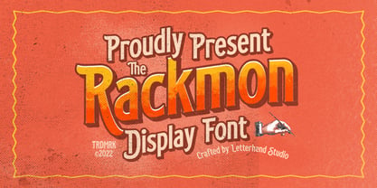 Rackmon is a vintage display typeface with the touch of nostalgic feel. The bold looks make this font standout to be used as a title or a logo. This font perfectly made to be applied especially in logo, and the other various formal forms such as invitations, labels, magazines, books, greeting / wedding cards, packaging, fashion, make up, stationery, novels, labels or any type of advertising purpose. Features : Uppercase and Lowercase Numbers and punctuation Stylistic alternates multilingual PUA encoded We highly recommend using a program that supports OpenType features and Glyphs panels like many of Adobe apps and Corel Draw, so you can see and access all Glyph variations.
 - Slurm by Nikola Klimova,
$15.00 Slurm is a hand-drawn fun font that is ideal for use in headlines, descriptions and logotypes used in product design and similar applications. In longer texts it works well as a complementary font for comics and illustrations. Various sizes and weights for individual characters are derived from the hand-drawn font. Each glyph is an original; no shapes are repeated. Ligatures have been created for double letters and the typeface includes diacritics for languages that use Latin letters. The typeface features two basic styles, Regular and Bold, which can be used separately just as well as combined. Each style also includes pictures that can be used for various occasions.


