10,000 search results
(0.033 seconds)
- Hoolystars by Maulana Creative,
$14.00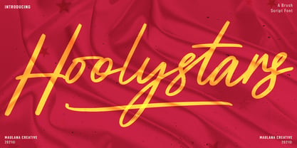 Hoolystars is a Brush casual script font. With slanted regular brush stroke, fun character with a bit of ligatures and swashes. To give you an extra creative work. Hoolystars font support multilingual more than 100+ language. This font is good for logo design, Social media, Movie Titles, Books Titles, a short text even a long text letter and good for your secondary text font with sans or serif. Make a stunning work with Hoolystars font. Cheers, MaulanaCreative
 - Woodline by Jeff Levine,
$29.00 Most folks might picture wood type lettering as the fancy styles of the 1880s which so perfectly evoked images of the Old West. Occasionally there is an exception to that rule, as an online image of some vintage wood letters with an Art Deco influence inspired a revival as a digital type face. Wood Lined JNL features a bold alphabet with an engraved line throughout the characters, and is available in both regular and oblique versions.
 - Solovista by Maulana Creative,
$14.00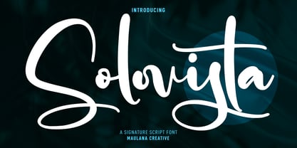 Solovista is an unique modern script font. With regular contrast stroke, fun character with a bit of ligatures and alternates. To give you an extra creative work. Solovista font support multilingual more than 100+ language. This font is good for logo design, Social media, Movie Titles, Books Titles, a short text even a long text letter and good for your secondary text font with sans or serif. Make a stunning work with Solovista font. Cheers, MaulanaCreative
 - Binthrots by Maulana Creative,
$14.00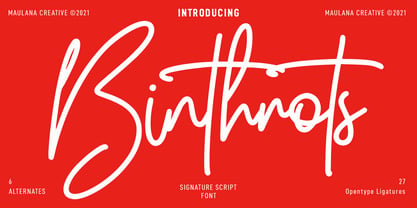 Bintrhots is a Casual Script font. With regular mono-line stroke and fun character with some of natural ligatures and lowercase alternates. To give you an extra creative work. Bintrhots font support multilingual more than 100+ language. This font is good for logo design, Social media, Movie Titles, Books Titles, a short text even a long text letter and good for your secondary text font with sans or serif. Make a stunning work with Bintrhots font. Cheers, MaulanaCreative
 - Screwball Comedy JNL by Jeff Levine,
$29.00 Cary Grant was one of Hollywood’s most versatile actors, playing romantic leads, dramatic parts and showing off his impeccable timing in screwball comedies. A perfect example of this is Frank Capra’s “Arsenic and Old Lace” from 1942. The movie trailer for the film had the title hand lettered in a playful and casual slab serif style, with varying character shapes and weights. This is now available as Screwball Comedy JNL in both regular and oblique versions.
 - Organic Antique by Sarid Ezra,
$19.00 Introducing, Organic Antique, Handmade Blackletter Fonts Organic Antique is blackletter fonts with organic and handmade feels. Containing two styles, regular and true italic, will make your presentations more standout when you use both of the styles. With classic and vintage vibes, you can use this fonts for logotype, quotes, branding, or even movie poster. The hand lettered and rough of this fonts will also make your designs have more stunning and earthy. This fonts also support multi language!
 - MC Alysse by Maulana Creative,
$16.00 Alysse is a tech industrial genre sans display font. With regular condensed stroke, fun character with a bit of ligatures and alternates. To give you an extra creative work. Alysse font support multilingual more than 100+ language. This font is good for logo design, Social media, Movie Titles, Books Titles, a short text even a long text letter and good for your secondary text font with script or serif. Make a stunning work with Alysse font. Cheers, Maulana Creative
 - Mores by Graphicfresh,
$19.00 Mores - Minimal Sans Introducing a minimalist style font. Fonts that are suitable for branding, packaging, logos and others. This font comes in regular and medium formats. Including italics in it. If you like this font, don't forget to collect it and share it with your loved ones. If there are things you want to ask or problems you face with this font. Don't hesitate to ask us. Because we are very happy to help you. Thanks Graphicfresh
 - Location JNL by Jeff Levine,
$29.00 The lettering style of Location JNL is based on sets of "vintage" metal house identification letters and numbers seen for sale online. As these sets are available from overseas sources, it's not clear whether those metal characters are cast from original vintage dies that have been used for years or just designed to look like a vintage style of lettering. Nonetheless, they make for a great digital interpretation and the design is available in both regular and oblique versions.
 - Sanchez Slab by Latinotype,
$- Sánchez, designed by Daniel Hernández, is a serif typeface belonging to the classification slab serif, or Egyptian, that bears a strong resemblance to the iconic Rockwell. Offering contrast and balance to the square structure, Sánchez Slab is a new version, more robust with straight edges, that give greater character and power. Sanchez Slab comprises 12 variants, ranging from extra light to black, each of the same x-height. Regular and Italic variants are available for free.
 - MC Erlota by Maulana Creative,
$14.00 Erlota is a Quirky modern fun sans serif font. With regular consist stroke, fun character with a bit of ligatures and alternates. To give you an extra creative work. Erlota font support multilingual more than 100+ language. This font is good for logo design, Social media, Movie Titles, Books Titles, a short text even a long text letter and good for your secondary text font with script or serif. Make a stunning work with Erlota font. Cheers, Maulana Creative
 - Laftale by Midvel,
$12.00 Fresh script font, Laftale. Laftale help you to make brush font easily. Laftale is casual script typeface with clean characters. This font comes in three style, regular, Italic, and bold. This font is perfect to design especially poster, logo, apparel, book cover, greeting card, birthday card, quotes, advertising poster, and anymore. Explore Opentype features to get unique combination. Feature : · Uppercase · Lowercase · Number · Punctuation · Multilingual (Accented Letters) · Ligature · Swash · Contextual Alternate · Style set (01-03) · PUA Encoded Characters
 - Doubledecker by Hanoded,
$15.00 I love riding English double decker buses! I haven’t been on one lately, but for some reason I had an image of a red double decker bus in my head when I made this font. Doubledecker is a bold, cartoon-like, handmade font. It comes in regular and dots, plus a bonus doodle font called Doubledecker Stuff. Use it for any design that needs a tad of loud, a pinch of unusual and a wee bit of polka.
 - Malinsha by Arterfak Project,
$15.00 Introducing Malinsha, a vintage brush font created from manual hand-lettering. Inspired by retro signage and modern calligraphy, Malinsha has a bold letterform that perfect for displays. Available in Regular and Distressed that you can mix and match to be fit your theme. Malinsha equipped with hundreds of alternates characters that ease you to create an amazing typographic design! Malinsha is perfect for logo, logotype, apparel, merchandise, poster, website, label, signage & storefront, badge, packaging, greeting cards, and much more!
 - Smothy Bubble by HansCo,
$15.00 Smothy Bubble is a cute and fun display font with bubble style. You will get three types of fonts in this pack, Regular, Bubble and Shadow version. Use this display font to add that special bubble touch to any design idea you can think of! Very suitable for logotype, Stickers, Packaging design, Cricut Project, headlines, brand identity, t shirt or apparel industry, posters, magazines, books, YouTube, Instagram, websites, or any of your creative design projects. Enjoy!
 - Nishyad by Maulana Creative,
$14.00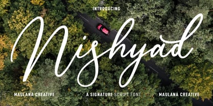 Nisyhad is an unique signature script font. With regular contrast stroke, fun character with a bit of ligatures and alternates. To give you an extra creative work. Nisyhad font support multilingual more than 100+ language. This font is good for logo design, Social media, Movie Titles, Books Titles, a short text even a long text letter and good for your secondary text font with sans or serif. Make a stunning work with Nisyhad font. Cheers, MaulanaCreative
 - Destinys by Maulana Creative,
$14.00 Destinys Script and Sans Font Duo is a modern script and display sans font. With regular marker stroke and bold sans stroke, fun character with some of ligatures. To give you an extra creative work. Destinys Script and Sans font support multilingual more than 100+ language. This font is good for logo design, Social media, Movie Titles, Books Titles, a short text even a long text. Make a stunning work with Destinys Script and Sans font. Cheers, MaulanaCreative
 - Crisp Cracks by Maulana Creative,
$11.00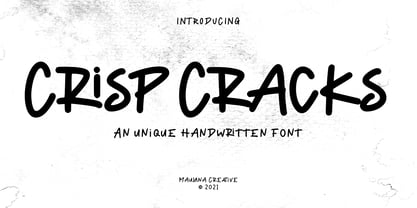 "Crisp Cracks" is a casual Handwritten font. With regular stroke, fun character with a bit of ligatures, lowercase alternates and swashes. To give you an extra creative work. "Crisp Cracks" font support multilingual more than 100+ language. This font is good for logo design, Social media, Movie Titles, Books Titles, a short text even a long text letter and good for your secondary text font with sans or serif. Make a stunning work with "Crisp Cracks" font. Cheers, MaulanaCreative
 - Oblonga by Eurotypo,
$28.00 Oblonga shows thin, elegant lines. The continuity of the trace is only suggested through the curves of the letters, a soft effect of bonding that maintains the identity of each character. Oblonga is an Art-Déco font proposed in a modern key, a revival performed without aggression. More than three hundred glyphs (regular and Italic) that ensure legibility in Central-European and Slavic languages, enriched by some appropriate discretionary ligatures that enhance the charme of a time gone away.
 - Oldion by Locomotype,
$19.00 Oldion is a captivating display font, draws inspiration from the boundless realms of science fiction and modern technology. With its distinctive and futuristic accents adorning each letter, Oldion breathes life and dynamism into your projects. Available in both regular and rounded styles, infuses a touch of innovation and intrigue into your designs. Oldion is your ideal choice for a wide range of creative applications, from commanding movie posters and attention-grabbing headlines to captivating packaging and distinctive logotypes.
 - Argot by K-Type,
$20.00 Argot is inspired by condensed grotesque letterforms and would be a monolinear sans except for an unorthodox disparity between inner and outer shapes. Elegantly curved outlines contrast starkly with austere rectangular counters, suggesting a no-frills functionality, 20th century modernism, or an unsettling discordance. The squared off inner spaces also add clarity and crispness. Argot is available in three widths — Wide, Normal and Narrow. Each width is supplied in three weights — Regular, Bold and Black — with corresponding italics (obliques).
 - Hitshot Signature by Maulana Creative,
$12.00 Hitshot is an expressive signature brush script font. With regular brush stroke, slanted and fun character with some of ligatures and lowercase alternates. To give you an extra creative work. Hitshot font support multilingual more than 100+ language. This font is good for logo design, Social media, Movie Titles, Books Titles, a short text even a long text letter and good for your secondary text font with sans or serif. Make a stunning work with Hitshot font. Cheers, MaulanaCreative
 - MC Rasteira by Maulana Creative,
$16.00 Rasteira is an elegant classical display serif font. Regular contrast stroke, fun character with a bit of ligatures and alternates. To give you an extra creative work. Rasteira font support multilingual more than 100+ language. This font is good for logo design, Social media, Movie Titles, Books Titles, a short text even a long text letter and good for your secondary text font with script or serif. Make a stunning work with Rasteira font. Cheers, Maulana Creative
 - Drawlers by Letterhend,
$14.00 Drawlers is a organic sans with stencil versionthat effortlessly infuses your designs with a touch casual and a dash of classic. Its unique type- maekt it perfect choice for any projects especially in logo, and the other various formal forms such as invitations, labels, logos, magazines, books, greeting / wedding cards, packaging, fashion, make up, stationery, novels, labels or any type of advertising purpose. Features : Regular & Stencil Version Uppercase & lowercase Numbers and punctuation Alternates & Ligatures Multilingual PUA encoded
 - Humanism by Prominent and Affluent,
$30.00 Inspired by the urban typography, which later led to a grotesque style. It can be used for bold editorial statements graphic heavy prints or just as a simple logo. This new type will definitely make your designs stand out and unique. Its robust, strong and contemporary form makes it perfect for any project that needs the extra strength. Humanism is available from A to Z in the regular and italic style, developed in an urban style.
 - Maryam by Outras Fontes,
$24.00 Maryam is an Outras Fontes type family designed by Ricardo Esteves Gomes. With moderate contrast, these fonts have elegant and very legible forms even in small x-height sizes. There are more then 70 ligatures in each font, providing a lot of letterform variations that make this type family looks like a real handwriting on a page. It is currently available in two versions (Regular and Alternate) that you can combine with each other as you wish.
 - Apothecary by Pixel Colours,
$26.00 Apothecary is a modern stylish font duo that includes a sweet flowing script font and a typewriter font made from an authentic typewriting. Combine both fonts to create beautiful logos and branding. Design professional apothecary and botanical labels and packaging or make elegant wedding invitations. Includes: Apothecary regular: a script flowy monoline font Apothecary typewriter: an antique typewriter font perfect for small texts, taglines or info Lowercase and uppercase characters Numerals, alternates and ligatures. Language support
 - Lalalo by Cuda Wianki,
$25.00 Lalalo is a casual, modern sans-serif font family based on hand-lettering. It's oval letter shapes provide soft and friendly appearance. Lalalo font is very legible with a warm touch perfectly suited for children books. Lalalo family consists of 6 weights ( Extra Light, Light, Regular, Semibold, Bold, ExtraBold). You can use it with normal fill or outlined. You can mix various colors and stroke widths to gain interesting results. There is also a set of nice frames available.
 - Caslon #540 by ITC,
$29.00The Englishman William Caslon punchcut many roman, italic, and non-Latin typefaces from 1720 until his death in 1766. At that time most types were being imported to England from Dutch sources, so Caslon was influenced by the characteristics of Dutch types. He did, however, achieve a level of craft that enabled his recognition as the first great English punchcutter. Caslon's roman became so popular that it was known as the script of kings, although on the other side of the political spectrum (and the ocean), the Americans used it for their Declaration of Independence in 1776. The original Caslon specimen sheets and punches have long provided a fertile source for the range of types bearing his name. Identifying characteristics of most Caslons include a cap A with a scooped-out apex; a cap C with two full serifs; and in the italic, a swashed lowercase v and w. Caslon's types have achieved legendary status among printers and typographers, and are considered safe, solid, and dependable. A few of the many interpretations from the early twentieth century were true to the source, as well as strong enough to last into the digital era. These include two from the American Type Founders Company, Caslon 540 and the slightly heavier Caslon #3. Both fonts are relatively wide, and come complete with small caps, Old style Figures, and italics. Caslon Open Face first appeared in 1915 from the Barnhart Bros & Spindler Foundry, and is not anything like the true Caslon types despite the name. It is intended exclusively for titles, headlines and initials, and looks elegant whether used with the more authentic Caslon types or by itself. - Gemma by Homelessfonts,
$49.00 Homelessfonts is an initiative by the Arrels foundation to support, raise awareness and bring some dignity to the life of homeless people in Barcelona Spain. Each of the fonts was carefully digitized from the handwriting of different homeless people who agreed to participate in this initiative. Please Note: these fonts include only the latin alphabet; no accented characters, no numbers or punctuation. MyFonts is pleased to donate all revenue from the sales of Homelessfonts to the Arrels foundation in support of their mission to provide the homeless people in Barcelona with a path to independence with accommodations, food, social and health care. Gemma was born in Madrid 37 years ago. After spending many years in the capital, she decided to start over again and moved to Barcelona. A series of misfortunes and wrong decisions left her on the street. Gemma is a calm, emotional person who likes to take her time to do things and, if there’s one thing the street can offer, it’s time. The street lets you listen carefully, watch without being seen. Being in the street isn’t pleasant at all. Seeing people who’ve just showered go past makes you miss even more things that many take for granted. Breakfast, a clean smell, paying for a metro ticket. Being homeless is much more than having nowhere to sleep. Life in the street is hard, says Gemma, but she also sees the positive side. “It’s the best way to get to know human beings.” She likes to see the street as if it were a school. A school she has been in and out of for too long.
 - Charter BT by Bitstream,
$50.99 Originally released in 1987, Charter incorporates three important features: compact set width to give economical copyfit; generous x-height to give readability at small point sizes; and sturdy open letterforms to give reliable reproduction at both typesetter and laser printer resolutions. The design brings a clarity and freshness to everyday documents, such as newsletters, textbooks, directories and technical manuals, where the reader’s concentration must not be interrupted by unfamiliar letterforms but where typographic dullness can itself impair comprehension. The Italic has cursive letterforms - so is instantly distinguishable, while being readable enough in its own right for continuous text. The Charter BT Pro Pack features 6 fonts: roman, italic, bold, bold italic, black, and black italic. The fonts include characters originally developed for expert sets, such as ligatures, ornaments, old style figures, small caps, and superiors. The Pro Pack fonts support Western, Central European, and Eastern European languages. OpenType fonts are a cross-platform font format. The same OpenType font can be installed on Mac OS X, Windows, Linux, and Unix systems. Mac OS X and Windows 2000, XP, and Vista have built-in support for OpenType. OpenType fonts also work on Linux, Unix, and earlier versions of Windows, where they are recognized as TrueType fonts. OpenType includes many more features than the standard TrueType and PostScript formats, including the ability to install the same font on different platforms, crucial for document portability. OpenType fonts boost productivity because graphic designers and business professionals do not have to wrestle with many different fonts. With OpenType, customers have larger character sets to work with and fewer font files to deal with.
 - Range Serif by Eclectotype,
$36.00 Range Serif is a sharp, contemporary, wedge serif typeface with just a hint of fraktur influence. There are five weights from light to black, each with corresponding italics. This is a typeface designed for demanding typographic work; it’s legible at small sizes, but unique at display sizes. There is an abundance of OpenType features in each font, including: Ligatures - all fonts contain standard f-ligatures. Contextual Alternates - Range Serif has been carefully designed to not ‘need’ ligatures. If you choose to deactivate them, the contextual alternates feature will make sure an alternative f is used before certain letters to avoid clashing. Fractions - When activated, numbers separated by a slash will automagically turn into fractions. Numerals - There are many different figure sets. These are Proportional Lining, Tabular Lining, Proportional Oldstyle, Tabular Oldstyle, Superiors and Scientific Inferiors. A slashed zero feature is also included. Small Caps - All styles include small caps, for both small caps and capitals to small caps functions. Ornaments - For convenience, the arrows are grouped in the ornaments feature. Case Sensitive Forms - There are different punctuation and bracket glyphs for all caps usage. Stylistic Alternates / SS01 - The italic fonts contain alternates for the letters A, K, R, U and X. Range Serif is a versatile and fully-featured typeface, ideal for corporate identities, contemporary art catalogs, even t-shirt slogans. The language coverage is impressive (Latin Extended A is fully covered) so Range Serif should prove a useful text and display workhorse for speakers of many different tongues. The typeface includes an array of currency symbols, including the new symbols for Indian Rupee and Turkish Lira. Also check out the accompanying sans serif version, Range Sans.
 - Ablati by Hackberry Font Foundry,
$24.95 Ablati is the commercial release of the font designed during the production of our new font design book, “Practical Font Design”. It is a new serif font in my continuing objective of designing book fonts that I can really use. In many ways, Ablati is a very different direction for me. Designed to produce gaphics to use in the font design book, I was forced to really reconsider many of my working methods to make them work for outside readership. Like all designers, my internal design processes can get really sloppy. The book helped me clean up my act. Taking my inspiration from one of my favorite fonts of all time {though I've never really been able to use it much}, Romic, by Colin at Letraset, I decided to design a unilateral serif font. In most ways, this is a normal serif for me in that it has caps, lowercase, small caps with the appropriate figures for each case. This font has all the OpenType features in the new set developed for the book. There are several ligatures for your fun and enjoyment: bb gg ff fi fl ffi ffl ffy fj ft tt ty Wh Th and more. Several alternative forms, a dozen ornaments, and more. Like all of my fonts, there are: caps, lowercase, small caps, proportional lining figures, proportional oldstyle figures, & small cap figures, plus numerators, denominators, superiors, inferiors, and a complete set of ordinals 1st through infinity. Enjoy! The Oldstyle and Small Cap fonts are an attempt to have most of the OpenType characters available to people still using Type 1 and TrueType fonts.
 - Baskerville Neo by Storm Type Foundry,
$69.00 One of the most widely used typefaces in the world is actually a legacy of 18th century aesthetics, representing the spirit of late Baroque design, architecture, fashion and society. It has been created and printed for millions of readers around the world for more than two and a half centuries. It influenced many modern typographers. It shaped culture, education, entertainment and science, but also the development of typography itself. As a calligrapher and technical innovator, Baskerville invented new design, papermaking and printing methods, and his typography is very natural and legible to this day. Graphic design today calls for clean and minimalistic solutions, where the use of historical typefaces can achieve a vivid contrast with contemporary elements on the page or screen. Baskerville is undoubtedly the best choice for any kind of publishing house. In keeping with the original inventor’s spirit of excellence, we hereby offer its most advanced digital version. This is not a precise remake of rare Baskerville prints or a restoration of the original punches cut by John Handy, but rather our ideal essence of transitional typography. The old masters were limited by the technology of the time, but today we can dare to have very fine lines, unlimited ligatures, size variations and sophisticated OpenType functions. Drawing, programming, proofing and testing took us many years of development and brought thousands of new letters and dozens of language options. We are convinced that your readers will enjoy this font mainly for reading extensive works, but also for creating corporate identity, orientation systems and cultural posters. Baskerville is perfectly modern in its antiquity, striking in its modesty and timeless in its transiency.
 - The Auratype by Auratype Studio,
$9.00 Hai Folks! The Auratype is retro and classic typeface who inspired by the 60s - 80s designs with more unique explored style like swosh and alternate character. This font made from manual sketch with many many scratch then finished to font. Make your designs project with this font and extras illustration to give more superb. This font also suitable to design like logo, sticker, tees design, banner, poster, sign, display design, packaging and more superb designs! Enyoy with our product and feel free contact us for support! Features : Full set of Upper & Lowercase Character Number & Punctuation Swosh Alternate Extras Illustration Multilingual Language PUA encoded Opentype Features _________ ▼To using the feature OpenType Stylistic alternate (including swosh), you must use program that supports OpenType such as Adobe Illustrator CS, Adobe Indesign, Corel Draw X6-X7 and Microsoft Office 2010 or later versions. Additional way to access alternate/swoshes are using Character Map (Windows), Nexus Font (Windows), Font Book (Mac), or more program which has Pop Character. ▼For more information about accessing alternative, you can see on this link : http://adobe.ly/1m1fn4Y ✌ Get in touch with author https://www.instagram.com/wahyudwi.cc/ https://www.instagram.com/auratype/ https://www.behance.net/fontsfighters ❤ Thank you for purchasing our product and supporting us! We hope this font can be part of your designs project. If you have other queries, questions or issues, just feel free and have fun to contact us directly. We are glad if we can help you more! If you are happy with our product, please put your star into our design reviews, it was so fantastic moment for us. Thanks! :)
 - Poipoi by Dharma Type,
$14.99 Extraordinary impact and visual conspicuousness. Poipoi is a super 3D sans family for posters, logos and all display. The basic idea is not a brand new. The Stacking type system has been used since before wood type age. As you imagined, colored wood type(woodcut), many other engravings and contemporary printer machine print many colors separately with different printing plates for each color. Poipoi uses the same system for 3d effect. Please use Photoshop or Illustrator, or your favorite graphic design apps that can handle layers. Layers are the printing plates of wood type. You should be able to change text color for each layer. Poipoi "Standard" style is the base of this font family. You can add effects by stacking Highlight and shadow layers. Stacked layers in different color make the text in 3D. Instruction 1. Type your text as you like. 2. Set font-name "Poipoi" and font-style "Standard" 3. Set color of "Standard" layer. 4. Duplicate the "Standard" layer twice (One for Highlight, one for Shadow). 4'. The layer order should be Highlight, Standard, and Shadow from top to bottom. 5. Set font-style and color of "Highlight" and "Shadow" layers. 6. Adjust tracking if you need. (Please use same tracking value for all 3 layers.) For further detail, https://www.dropbox.com/s/xymis7dh5hwxn9q/Poipoi.pdf Poipoi Standard, Highlighted, and shadowed style can be used solely. Rounded terminals add soft, cute, and casual impressions to your design. Spec: Over 400 glyphs! Basic Latin ✓ Western Europe ✓ Central Europe ✓ South Eastern Europe ✓ Mac Roman ✓ Windows 1252 ✓ Adobe Latin 1 ✓ Adobe Latin 2 ✓ Adobe Latin 3 ✓ Almost all Latins are covered.
 - ITC Founder's Caslon by ITC,
$40.99The Englishman William Caslon punchcut many roman, italic, and non-Latin typefaces from 1720 until his death in 1766. At that time most types were being imported to England from Dutch sources, so Caslon was influenced by the characteristics of Dutch types. He did, however, achieve a level of craft that enabled his recognition as the first great English punchcutter. Caslon's roman became so popular that it was known as the script of kings, although on the other side of the political spectrum (and the ocean), the Americans used it for their Declaration of Independence in 1776. The original Caslon specimen sheets and punches have long provided a fertile source for the range of types bearing his name. Identifying characteristics of most Caslons include a cap A with a scooped-out apex; a cap C with two full serifs; and in the italic, a swashed lowercase v and w. Caslon's types have achieved legendary status among printers and typographers, and are considered safe, solid, and dependable. ITC Founder's Caslon® was created in 1998 by Justin Howes, an English designer who used the resources of the St. Bride Printing Library in London to thoroughly research William Caslon and his types. As was common in the eighteenth century, Caslon had punchcut several different sizes of his types, and each size had a slightly different design. Howes digitized every size of type that Caslon cast, keeping their peculiarities and irregularities and reproducing them as they appeared on the printed page. This family has the 12 point, 30 point, 42 point, and Poster styles, as well as a full set of bona fide ornaments. In keeping with the original Caslon types, none of the sizes have bold weights, the numerals are all old style figures, and a full set of ligatures (some with quaint forms) are included. ITC Founder's Caslon® is a remarkable revival in the true sense of the word, and works beautifully in graphic designs or texts that require an authentic English or historical flavor. - Archive Garamond by Archive Type,
$59.99Archive Garamond is a typeface roughly based on the designs of Claude Garamond (ca. 1480 – 1561), a French publisher and a leading typeface designer of that period. Garamond’s influence on type design is reflected in many typefaces that are today known under different commercial names. While the majority of contemporary digital interpretations of the “Garamond types” are cleaner and more polished versions of that genre, Archive Garamond tries to keep the rough nature which was typical in the early days of printing. Archive Garamond has a rather unique, distinctive temperament which is even more emphasised with the preserved non-uniformity, such as irregular glyph shapes or a variable baseline. Although Archive Garamond was clearly made to be used for display sizes it works surprisingly well in text. Archive Garamond is availale in three versions, each containing approximately 600 glyphs (in Pro versions). Archive Garamond Pro A Professional version of the typeface contains all glyphs, including the advanced typographic forms, such as different sets of figures, small caps, swashes, historical forms, etc. The font also enables full use of the OpenType features. It fully supports the languages listed in the language list. Archive Garamond Std A Standard version of the typeface is meant to be used for the basic typographic work. It typically contains the most common glyphs. The standard figures are proportional lining. Besides kerning this version does not contain any advanced OpenType features. A Standard file type fully supports the languages listed in the Language list. Archive Garamond Exp An Expert version contains glyphs that are supposed to be used in advanced typographic works. This type of file contains uppercase and small cap glyphs with the proportional oldstyle figures as the default set. Besides kerning this version does not contain any advanced OpenType features (all OTF features have to be replaced manually). An Expert file type fully supports the languages listed in the Language list. - Garamond Premier by Adobe,
$35.00Claude Garamond (ca. 1480-1561) cut types for the Parisian scholar-printer Robert Estienne in the first part of the sixteenth century, basing his romans on the types cut by Francesco Griffo for Venetian printer Aldus Manutius in 1495. Garamond refined his romans in later versions, adding his own concepts as he developed his skills as a punchcutter. After his death in 1561, the Garamond punches made their way to the printing office of Christoph Plantin in Antwerp, where they were used by Plantin for many decades, and still exist in the Plantin-Moretus museum. Other Garamond punches went to the Frankfurt foundry of Egenolff-Berner, who issued a specimen in 1592 that became an important source of information about the Garamond types for later scholars and designers. In 1621, sixty years after Garamond's death, the French printer Jean Jannon (1580-1635) issued a specimen of typefaces that had some characteristics similar to the Garamond designs, though his letters were more asymmetrical and irregular in slope and axis. Jannon's types disappeared from use for about two hundred years, but were re-discovered in the French national printing office in 1825, when they were wrongly attributed to Claude Garamond. Their true origin was not to be revealed until the 1927 research of Beatrice Warde. In the early 1900s, Jannon's types were used to print a history of printing in France, which brought new attention to French typography and the Garamond" types. This sparked the beginning of modern revivals; some based on the mistaken model from Jannon's types, and others on the original Garamond types. Italics for Garamond fonts have sometimes been based on those cut by Robert Granjon (1513-1589), who worked for Plantin and whose types are also on the Egenolff-Berner specimen. Linotype has several versions of the Garamond typefaces. Though they vary in design and model of origin, they are all considered to be distinctive representations of French Renaissance style; easily recognizable by their elegance and readability. Garamond Pemiere Pro was designed by Robert Slimbach, and released in 2005." - Friendly by Positype,
$29.00 Friendly is an homage to Morris Fuller Benton's adorable Announcement typeface. It is not a strict interpretation, digital revival or reverent reproduction of the original letterforms… but I would be remiss and shady to not acknowledge the letterforms that inspired this typeface. If you are looking for a more accurate 'scanned revival' I would recommend searching "Announcement" on MyFonts. As stated earlier, it is an homage to the original letterforms of the typeface but takes a great bit of freedom tightening the construction up in order to loosen up the movement of the variant letterforms to allow a great deal of usable personality. I enjoy stating this dichotomy… "loosen up to tighten up the forms" and vice versa. It seems counterintuitive or silly but by allowing the letterforms to normalize, I felt more comfortable going back and adding rather indulgent personality. Infused with stylistic alternates, swashes, titling, many many contextual alternates, 9 stylistic sets and 2 stylistic sets with wordmarks, the typeface became far more 'friendly' for me… how could it not? With so many loops, swashes and typographic indulgences, it was bound to be fun. The more elaborate and 'overdone' Friendly got, the more I wanted to slant it. Here's where my thinking differs from MFB's original. I like slanted romans… especially ones with long ascenders, but I do not like much of a slant. It has to be the lettering person in me. It's hard for me to do a completely upright serif and not pair it with an angle, but I did not feel Announcement's 'Italic' offered much and the actual slant needed to be far less. If it's not an italic, I prefer the letters to slant with an angle equivalent to the thickness of the vertical stroke. The Slanted version of Friendly is set at 3.6 degrees, is quite subtle, and very fitting for me. You will find that most characters have a contextual, stylistic, swash and titling alternate assigned to them and some have an echoed alternate to the swash and titling options if the stylistic alt has been selected in tandem. Additionally, all of these are accessible in the glyph palette directly from the base glyph typed or through selecting options through the Stylistic Sets 1–9. Stylistic Sets 10 & 11 are a little different. They are actually configured as complex majuscule ligatures… a result of me getting carried away. Other features like a default old style numeral set and coordinating glyphs have been produced along with case support, ordinals, and more have been added to make it more relevant for contemporary use.