10,000 search results
(0.052 seconds)
- Culpepper by Galapagos,
$39.00I've always admired the work of Rudolph Koch. Culpepper is what I think Neuland would have looked like if it had been developed with lowercase, small caps and a range of weights. I started work on this series in the late 80’s and, like so many of my ideas, it was shelved when life drew me in another direction. Culpepper is the name of one of the islands in the Galapagos chain. - TE Focus by Tharwat Emara,
$39.00 This font may be conservative and classic, but also may be more playful and modern. It is good for theater or art posters and for modern music, web-pictures or vinyl covers. Of course it also will be good for coffee shops, cafe's, restaurants, magazine's headers, signs or gift/post cards and weddings. Try to use it in your beauty or travel blogs, you will see how many options you will have with stylish FOCUS
 - Family Queen by Rotterlab Studio,
$15.00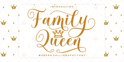 Family Queen is a beautiful script font with many alternative styles, this font looks natural, elegant and perfect for any extraordinary project. Family Queen is suitable for various products such as invitations, product packaging, product design, crafter, labels, photography, watermarks, logos & branding. Everything can be accessed using software that supports Opentype, such as Adobe Indesign, Adobe CS Illustrator, Adobe Photoshop CC, and Corel Draw. Please send a message if you have questions, Thank you :)
 - Lesthone by Nathatype,
$29.00 Lesthone is a display font that seamlessly merges vintage aesthetics with modern elegance. The rounded shapes of Lesthone contribute to its friendly looks. Each letter has its own personality, and this contributes to the font's handcrafted appeal. On the other hand, the most standout characteristic of Lesthone is its slightly rough texture that add a rustic charm. This font includes beautiful ornaments as a bonus. Lesthone fits in headlines, logos, branding materials, and many more.
 - Kanaya by Putracetol,
$14.00 Kanaya is a beautiful modern script font. Kanaya has a very beautiful alternate character, and has modern, elegant and luxurious swashes in each lowercase character. Kanaya is perfect for wedding events, anniversaries, birthday, greeting cards, logotype, branding, wedding invites and cards, elegant logos, posters, packaging, stationery, websites, and many more. Includes OpenType features with a lot of alternates, to help you to make great lettering. This font is also support multi-language.
 - Stickley Decorations by Woodside Graphics,
$19.95Stickley Decorations contains 26 classic images from the pages of "The Craftsman," the foremost journal of the American Arts & Crafts Movement of the early 20th Century. These are graphic elements that can be used in many ways and for all occasions, whether creating a custom greeting card or designing and producing unique personal stationery. They can be used exactly as intended, as "decorations" on a printed page, or they can be combined into unusual borders. - Sunday Girl by Typesthetic Studio,
$13.00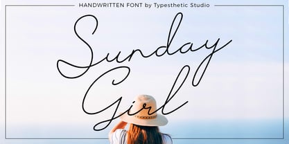 Sunday Girl is clean & fresh script with a stylish handwritten and script style make this font looks natural, classy and perfect for any awesome projects that need handwriting taste. Sunday Girl font is perfect for creating authentic hand-lettered text quickly & easily. This font also perfect for many different project such as logos & branding, invitation, stationery, wedding designs, social media posts, advertisements, product packaging, product designs, label, photography, watermark, special events or anything.
 - Houstoner Script by Martype co,
$19.00 Houstoner Script is a signature script font designed with carefully handcrafted. Also suitable for branding, T-shirt, Wedding Invitation, Classic Design, Logotype, and any project. With two style make you easier to design everything. Comes with many ampersand set to make your design prettier than yesterday, this font also can make you happy when you design something even that you don't like, and of course this font make your design classy, elegant, luxury!
 - Knocky by Jehoo Creative,
$23.00 Knocky is a display typeface that is complete and versatile with a bold round condensed look with unique flexibility. We've added solid alternatives to letters, numbers, and some symbols, plus an outline style that will make the graphic look unique and stand out. With 8 styles and more than 530 glyphs in each. knocky has multi-language support, it will be perfect for many projects from editorial design to branding, advertising, publicity and digital.
 - Asterlight by NREY,
$19.00 Hi, friends! Introducing new typeface - Asterlight. It is a new display font with 2 styles and cool characters. Asterlight has multilingual support includes cyrillic. Many ligatures make your typography most variable. It works well with normal size text and for large displays or short words. You may combine uppercase and smallcase in the text body, as alternates symbols. The Asterlight typeface is suitable for : product packaging, labeling, logo, classic shop, ethnic shop, titles, etc
 - Taguro by Twinletter,
$18.00 Taguro Groovy is a geometric font and the curved lines in each anatomy with high contrast and bold characters make this a powerful font for your projects. This font has an elegant and distinct style that makes it visually different from many other fonts. It makes your design stand out from the rest. This delightful font has precisely defined Curves and the subtle strokes of the typeface make this font very pleasing to the eye.
 - Keltichi by Dima Pole,
$27.00 Keltichi typeface is based on the Book of Kells, the Irish uncial manuscript, the most beautiful European medieval style of writing. Keltichi contains many Opentype features, which make this font absolutely awesome. It looks great, specially titling uppercase sets, simulating the real Book of Kells scripts. Work on this project lasted 1 year, and now, I believe, Keltichi it is the best font simulating the Book of Kells scripts. Glory, glory to the Celts!
 - Floopy Chart by Wacaksara co,
$15.00 Floopy Chart | Font Duo ? is a pair of script and sans font, this font is truly inspired by retro and groove music vibes also from American sport scene like baseball and basketball culture. Floopy Chart comes with uppercase, lowercase, numerals, punctuations and so many variations on each character include OpenType alternates and common ligatures to let you customize your designs. Perfect to use for Logotype, Letterhead, Poster, Apparel Design, Label and etc. Thanks, Wacaksara
 - Extrakt by Hof3,
$25.00 The font EXTRAKT references the grotesque fonts and elementary typography as developed at the Bauhaus (ITC Bauhaus, Futura). Extract originated from a child's game: How many matches are needed to write the word EXTRAKT? (https://hof3.com/arbeitsweise/extrahieren) In the development of the typeface "EXTRAKT", the design principle of reducing the letters to the most necessary strokes was central. In addition to the reference to Bauhaus, EXTRAKT also has a futuristic feel. ("The Expanse")
 - Invertigo by Robert Petrick,
$19.95 Invertigo is an experimental font mainly for designers who love to play with type as you will see in my examples. There are many alternate letters for you to work with, and I will be creating new characters which I will add to Invertigo from time to time. If you purchase Invertigo, you will receive updates at no additional charge. It also makes an interesting looking setting somewhere between contemporary and futuristic.
 - Sigmund PRO by Borutta Group,
$39.00 Sigmund PRO is a visual journey around Poland. The main style is inspired by the Polish road signage typeface – designed by Marek Sigmund. With the increase of weight, Sigmund turns into a geometric display – in the spirit of vernacular typography from the signs of Polish streets. Thanks to this span of styles Sigmund will work both in visual identifications and posters. The family consists of 18 varieties and has many alternative characters.
 - TE Cathrine by Tharwat Emara,
$49.00 This font may be conservative and classic, but also may be more playful and modern. It is good for theater or art posters and for modern music, web-pictures or vinyl covers. Of course it also will be good for coffee shops, cafe's, restaurants, magazine's headers, signs or gift/post cards and weddings. Try to use it in your beauty or travel blogs, you will see how many options you will have with stylish CATHRINE
 - Eckhardt Signwriter JNL by Jeff Levine,
$29.00Eckhardt Signwriter JNL is based on a casual display lettering face popular with many sign painters and show card writers of yesteryear, best suited for large print projects. Jeff Levine has named this font (along with others in a series) after the late Albert Eckhardt, Jr. (1929-2005) who had owned Allied Signs in Miami, Florida from 1959 until his passing. Al was a talented lettering artist and a good friend to Jeff. - Delamoore by Almarkha Type,
$27.00 Introducing our latest display typeface called Delamoore Classic Display Serif with vintage taste can make your logotype become more interesting. Best Vintage font with special Ligatures, and multilingual support. inspired by the decorative arts and architecture movement. Delamoore fonts is perfect for your project and allows you to create designs, headlines, posters, logos, badges, t-shirts and many more that are beautiful. It is also best used for posts, logos, posters, certificates, labels and more.
 - Articulat CF by Connary Fagen,
$25.00 Articulat® CF is a streamlined, updated take on midcentury type design. Strong, sharp, and well-spoken, Articulat was built from scratch to be bold, clean, and clear. Articulat® CF pairs well with itself, as it has many weights to choose from. It also works well with fonts that contrast strongly, such as Wayfinder® CF and Olivette CF. All typefaces from Connary Fagen include free updates, including new features, and free technical support.
 - Good Friend by Senekaligrafika,
$12.00 “Good Friend” has hard strokes and signature style that speak to instant unique sensation. Take your creative projects to the highest level with this font. “Good Friend” will help you to create special and touching typographical design for your projects, for every day or the happiest day in life, greeting card, headings, flyer, product packaging, book cover, printed quotes, logos, and many more. It is really universal and modern font. The owner of endless possibilities!
 - PF DIN Serif by Parachute,
$36.00 DIN Serif: Specimen Manual PDF The DIN Type System: A Comparison Table This is the first ever release of a true serif companion for the popular DIN typeface. DIN Serif originated in a custom project for a watchmaking journal which required a modern serif to work in unison and match the inherent simplicity of DIN. As a result, a solid, confident and well-balanced typeface was developed which is simple and neutral enough when set at small sizes, but sturdy and powerful when set at heavier weights and bigger sizes. It utilizes the skeleton of the original DIN and retains its basic proportions such as x-height, caps height and descenders, whereas ascenders were slightly increased. DIN Serif makes no attempt to impress with ephemeral nifty details on individual letters, but instead it concentrates on a few modern, functional and everlasting novelties which express an overall distinct quality on the page and set it apart from most classic romans. This is a low contrast typeface with vertical axis and squarish form which brings out a balance between simplicity and legibility. Its narrow proportions offer economy of space which is critical for newspaper body text and headlines. At small sizes the text has an even texture, it is comfortable and highly readable. The serifs are narrow at heavy weights and when tight typesetting is applied at large sizes, the heavier weights become ideal for headlines. DIN Serif was inspired by late 19th century Egyptian and earlier transitional roman faces. Bracketed serifs were placed on the upper part of the letterforms (this is where we mostly concentrate our attention when we read) whereas small clean square serifs were placed on and under the baseline to simplify the letterforms. In order to reduce visual tension at the joins and make reading smooth and comfortable, a slight hint of bracketed serif was added at the joins in the form of a subtle angular tapered serif, which softens the harsh angularity. These angular tapered serifs tend to disappear at smaller sizes (or smooth out the joins) but stand out at bigger sizes exuding a strong, modern and energetic personality. What started out as a custom 2 weight family, it has developed into a full scale superfamily with 10 styles from Regular to ExtraBlack along with their italics. Additional features were added such as small caps, alternate letters and numbers as well as numerous symbols for branding, signage and publishing. All weights were meticulously hinted for excellent display performance on the web. Finally, DIN Serif supports more that 100 languages such as those based on the Latin, Greek and Cyrillic alphabet.
 - Scandinavia Brush by Mans Greback,
$69.00 Scandinavia Brush is a wild calligraphy font by Mans Greback, inspired by the untamed beauty of Nordic nature. It captures a rugged essence, with each stroke reflecting the raw energy and grace of natural environments. This brush-painted typeface is perfect for logos, handwritten designs, and tattoo art with its active and streetwise feel. Designed with a professional touch and high-quality craftsmanship, Scandinavia Brush comes in six versatile styles: Regular, Upright, Bold, Italic, and the combinations Bold Italic and Bold Upright. The range of styles allows you to create unique, expressive designs that capture the spirit of adventure, speed, and beauty. Use underscores _ anywhere in a word to make an underline swash. Example: Nord___ic Bru_sh Ideal for designer and art projects, or high-end handcrafted products, Scandinavia Brush brings a bold, authentic, and captivating touch to your creative endeavors. The font is built with advanced OpenType functionality and has a guaranteed top-notch quality, containing stylistic and contextual alternates, ligatures, and more features; all to give you full control and customizability. It has extensive lingual support, covering all Latin-based languages, from Northern Europe to South Africa, from America to South-East Asia. It contains all characters and symbols you'll ever need, including all punctuation and numbers. Mans Greback is a Swedish typeface designer with a passion for creating unique and versatile fonts. With an extensive background in design and typography, Mans has built a reputation for his meticulous attention to detail and prolific craftsmanship. His many fonts are widely used by designers around the world, making his work synonymous with creativity and innovation.
 - Chong Old Style by Monotype,
$29.99In the tradition of Goudy Old Style and Goudy Modern, Chong Wah drew Chong Old Style™ and Chong Modern™ as visually different – but complementary – designs. According to Chong Wah, “The extended family of typefaces started as a concept rather than a preconceived design. The concept is different sans serif type styles with a common underlying structure and a clear lineage to traditional serif designs. While there are similarities between the designs, each typeface was drawn as a separate entity.” Chong Old Style has the flavor of traditional old style designs without slavishly replicating the earlier design traits. It has the heft and color of an old style design but lacks the serifs and inclined stroke axis customarily seen in these typefaces. The result is a versatile suite of typefaces that deliver a straightforward message in large or small sizes. Chong Modern is a sans serif interpretation of the classic modern, or neoclassical, designs of Bodoni and Didot. More than a Bodoni without serifs, Chong Modern also has an elegant, Art Deco demeanor. This is a design that walks the line between traditional and contemporary with grace and aplomb. Chong Wah drew his Old Style and Modern designs in Light, Regular and Bold weights, adding an Extra Bold to the Old Style. All designs benefit from harmonizing italic counterparts. Both branches of the Chong family are also available as OpenType Pro fonts, allowing graphic communicators to take advantage of OpenType’s diverse capabilities. These fonts, in addition to providing for the automatic insertion of old style figures, ligatures and small caps, also offer an extended character set supporting most Central European and many Eastern European languages - Chong Modern by Monotype,
$29.99In the tradition of Goudy Old Style and Goudy Modern, Chong Wah drew Chong Old Style™ and Chong Modern™ as visually different – but complementary – designs. According to Chong Wah, “The extended family of typefaces started as a concept rather than a preconceived design. The concept is different sans serif type styles with a common underlying structure and a clear lineage to traditional serif designs. While there are similarities between the designs, each typeface was drawn as a separate entity.” Chong Old Style has the flavor of traditional old style designs without slavishly replicating the earlier design traits. It has the heft and color of an old style design but lacks the serifs and inclined stroke axis customarily seen in these typefaces. The result is a versatile suite of typefaces that deliver a straightforward message in large or small sizes. Chong Modern is a sans serif interpretation of the classic modern, or neoclassical, designs of Bodoni and Didot. More than a Bodoni without serifs, Chong Modern also has an elegant, Art Deco demeanor. This is a design that walks the line between traditional and contemporary with grace and aplomb. Chong Wah drew his Old Style and Modern designs in Light, Regular and Bold weights, adding an Extra Bold to the Old Style. All designs benefit from harmonizing italic counterparts. Both branches of the Chong family are also available as OpenType Pro fonts, allowing graphic communicators to take advantage of OpenType’s diverse capabilities. These fonts, in addition to providing for the automatic insertion of old style figures, ligatures and small caps, also offer an extended character set supporting most Central European and many Eastern European languages - Jeles by Tour De Force,
$25.00 Inheriting the beauty and style of old type classics from this genre, Jeles is blended with very elegant modern approach featuring soft corners, round slab serifs and tasty ball terminals. Jeles is designed mostly for display use and it is highly recommended to get the whole family if you want to get the best result. It is designed in two styles Condensed and Normal. The Condensed version is developed in two weights each coming with corresponding italics. While the Normal styles are three ranging from Regular, Bold and Black. The total of 7 separate fonts inside the family are quite enough if you look for diversity and flexibility at one place. You could use the uprights for more serious and strong headlines while the Italics work perfectly for more fresh and live subheads. Of course editorial design is only one of the many directions where Jeles family could be used successfully as we all know typefaces with so visible contrast between thin and thick and combined with classic elegance, could be easily used in every design of cosmetic industry, fashion, food, jewelry, etc. Try to design a stylish boutique shop signboard and you will surely discover its beauty and potential. Easy-to-read, it is good for print design, revealing its authentic letterpress-like character as well as perfect for screen use note that the thin strokes and serifs are not that thin to vanish on a low resolution monitor. Professionally designed, they are solid enough yet very elegant and even gentle making Jeles a desired family design of attractive web banners, web sites, apps and e-books.
 - TT Tricks by TypeType,
$35.00 TT Tricks useful links: Specimen | Graphic presentation | Customization options TT Tricks is a modern serif font family whose design refers us to the style of transitional serifs. The distinctive features of TT Tricks are the relatively low contrast of strokes, the slightly squarish shapes of round characters and the emphasized businesslike nature. The original idea of TT Tricks is based on the graduation project of student Sofia Yasenkova, who chose to create a daily planner font as her final project. This led to many stylistic decisions, for example, the large and asymmetrical serifs, low contrast strokes, and the presence of interesting details. In the process of working on TT Tricks, we have significantly revised the initial idea and expanded the areas of possible font application, while maintaining the original spirit of the project. Despite the large number of display details, the typeface looks great in a small point size, and also when it is used in large text arrays. TT Tricks features an original stylistic set which, when turned on, adds features of typical pointed-pen serifs to some of the lowercase characters. In addition, TT Tricks has small capitals for Latin and Cyrillic alphabets, as well as several interesting ligatures. The TT Tricks font family consists of two font subfamilies, these are the main version and the version with the original stencil cutting. Each subfamily consists of 12 fonts: Light, Regular, DemiBold, Bold, ExtraBold, Black + True Italics. Following a good tradition, TT Tricks supports a large number of OpenType features: ordn, case, c2sc, smcp, frac, sinf, sups, numr, dnom, onum, tnum, pnum, dlig, liga, calt, salt (ss01).
 - Natom Pro by Mostardesign,
$25.00 A family of fonts with rhythm. Natom Pro is a modern and geometric font family adapted to the professional requirements of graphic designers, web designers and mobile application developers. Comprised of 19 styles including 8 styles designed especially for the design of headlines, Natom Pro is a very versatile family of fonts that can be used in many projects such as editorial design, branding or corporate identity creation, design of posters or logos, the creation of websites or the development of mobile applications. This font, with a resolutely contemporary aspect, also hides a unique typographic design since it has 2 distinct styles (Title and Roman) which have 2 different typographic rhythms in order to graphically differentiate the appearance of titles, subtitles and long paragraphs. With this design of rhythmically differentiated glyphs according to the styles, the headlines have a very graphic aspect while the long texts have a more classic aspect in order to keep optimal readability in all scenarios. Its architecture is also very modern since it was designed and drawn with particular attention to the geometry of the forms with clear and open endings cut at 90 degrees. The number of styles has also been simplified with the most used thicknesses (Extra Light, Light, Regular, Medium, Bold and Black) in order to speed up your graphic design process. For the more experienced designers, Natom Pro is also available in a variable version. Natom Pro is also equipped with powerful OpenType features like case sensitivity, true small caps, full ligature set, tabular figures for tables, « old styles figures » to elegantly insert figures into your sentences, numbers circled or even alternative characters to satisfy the most demanding professionals.
 - Gimbal Egyptian by AVP,
$19.00 Gimbal Egyptian is a richly-featured font family providing many style options across a broad range of languages. It is twinned with Gimbal Grotesque, a sans-serif family with an identical range of weights and features. Originally conceived as a small webfont family, the letterforms have been revitalised to put a spring in their step and the family has been extended to create a versatile multi-script text face equally at home on the printed page. Carefully crafted at all weights, Gimbal also lends itself to headlines and display applications such as posters, exhibitions and signage while resolving well on-screen for general document creation and web-based applications. The letters are spaced for best readability on-screen and in the usual printed body text ranges but are tolerant of tracking adjustment to suit other uses. The styles are divided by width into four families (Compressed, Condensed, Normal, Extended), each family possessing six weights plus corresponding italics. Within each family, the 'regular' and 'bold' weights are style-linked, and all upright forms have an italic counterpart. The full opentype character set includes latin, greek and cyrillic scripts with appropriate local variants (also as stylistic sets) for Turkish, Polish and Romanian (latin) and Russian, Bulgarian and Serbian (cyrillic). All fonts contain small capitals for all scripts, superscript for latin and commonly used greek together with the usual numeral style, size and positioning options. The default numerals are 'proportional lining'. Other opentype features include case-sensitive marks, fractions, and some discretionary ligatures. A set of circled numerals and circled latin capitals is included, along with an unusual feature that composes 2-character country codes.
 - Istanbul Type by Bülent Yüksel,
$19.00 "Istanbul Type" has a modern streak which is the result of a harmonization of width and height especially in the lowercase letters to support legibility. "Istanbul City" has the modernity of the west and the orientalist texture of the east as the city that unites the Asian and European continents. "Istanbul Type" also includes these features. It is a unique character that reflects the spirit of "Istanbul City". Many letter alternatives prepared with care have been created for all letters. You can make dozens of combinations from a word using these alternative letters. "Istanbul Type" is an effective set for creating identities for branding, posters, book covers, headlines, logotypes, restaurants, menu cards, wedding invitations and so on. "Istanbul Type" provides advanced typographical support for Latin-based languages. An extended character set, supporting Central, Western and Eastern European languages, rounds up the family. The designation “Istanbul Type 500 Regular” forms the central point. The first figure of the number describes the stroke thickness: 100 Thin to 900 Bold. "Istanbul Type" 5 weights and italics total 10 types. The family contains a set of 2.200+ characters. Case-Sensitive Forms, Classes and Features, Fractions, Superior, Inferior, Denominator, Numerator, Old Style Figures just one touch easy In all graphic programs. Attention! "Typography Line" is not suitable for use. When using it for special effects, it may be necessary to "Convert / Create Outlines" it first and then "Pathfinder Unite" it. You might have a crush on this typeface :) Do not hesitate to consult me for information about fonts before, during and after purchasing. You can contact me at "buyuksel@hotmail.com". Enjoy using it.
 - Istanbul Type Variable by Bülent Yüksel,
$69.00 "Istanbul Type Variable" has a modern streak which is the result of a harmonization of width and height especially in the lowercase letters to support legibility. "Istanbul City" has the modernity of the west and the orientalist texture of the east as the city that unites the Asian and European continents. "Istanbul Type Variable" also includes these features. It is a unique character that reflects the spirit of "Istanbul City". Many letter alternatives prepared with care have been created for all letters. You can make dozens of combinations from a word using these alternative letters. "Istanbul Type Variable" is an effective set for creating identities for branding, posters, book covers, headlines, logotypes, restaurants, menu cards, wedding invitations and so on. "Istanbul Type Variable" provides advanced typographical support for Latin-based languages. An extended character set, supporting Central, Western and Eastern European languages, rounds up the family. The designation “Istanbul Type Variable 500 Regular” forms the central point. The first figure of the number describes the stroke thickness: 100 Thin to 900 Bold. "Istanbul Type Variable" 5 weights and italics total 10 types. The family contains a set of 2.200+ characters. Case-Sensitive Forms, Classes and Features, Fractions, Superior, Inferior, Denominator, Numerator, Old Style Figures just one touch easy In all graphic programs. Attention! "Typography Line" is not suitable for use. When using it for special effects, it may be necessary to "Convert / Create Outlines" it first and then "Pathfinder Unite" it. You might have a crush on this typeface :) Do not hesitate to consult me for information about fonts before, during and after purchasing. You can contact me at "buyuksel@hotmail.com". Enjoy using it.
 - Lettro Script by Ferry Ardana Putra,
$15.00 Make your own retro design with Lettro Font! Lettro is an exquisite bold script typeface inspired by the retro design from 70-80-ish. Lettro is created with a ton of stylistic alternates, swashes, and ligatures, and also comes with 5 total Layered fonts: Regular, Extrude, Extrude Outline, Double Extruded, and Double Extruded Outline. Perfect fitted layer to give you more contrast, more bold look of the title. Every glyph for alternates is curated for the best and possible without eliminating the characteristic of these fonts! Combine that many styles and create an awesome retro design! This retro typeface is perfect for logotypes, t-shirts, vintage badges, retro quotes, branding, packaging, posters, signboards, social media needs, etc. ——— Lettro features: A full set of uppercase & lowercase characters Layered Style Numbers & punctuation Multilingual language support PUA Encoded Characters OpenType Features +563 Total Glyphs +212 Stylistic Alternates +49 Ligatures +47 Swashes and more (Shiny and Spray Effect Included!) ——— ⚠️To enable the OpenType Stylistic alternates, you need a program that supports OpenType features such as Adobe Illustrator CS, Adobe InDesign & CorelDraw X6-X7, Microsoft Word 2010, or later versions. There are additional ways to access alternates/swashes, using Character Map (Windows), Nexus Font (Windows), Font Book (Mac), or a software program such as Pop Char (for Windows and Mac). ⚠️For more information about accessing alternative, you can see this link: http://adobe.ly/1m1fn4Y ——— 🔑Important tutorial from the author: Tutorial for Mollusca font trio: https://lnkd.in/d984CQD6 How to use Midway | Retro Script Font on illustrator: https://lnkd.in/eusbZd7s How to use Midway | Retro Script Font on Photoshop: https://lnkd.in/evsYrwgs Happy Designing...😊
 - Griggs by Seniors Studio,
$140.00 Griggs is a variable type family with six-axis. Available as both static and variable font built to maximize versatility. This is a single variable font that can morph between a wide range of stylistic variations with each of its axes: Weight, Serif, Grade, Stylistic Set 1, Stylistic Set 2 and Slant. Also offer a variable subtle grade axis for slight weight adjustments, to user different preferences. For slant axis will automatically apply stylistic set 2 or set custom values on each axes for more options. A multi-purpose sans serif and serif typeface with high contrast, inktraps, sharp form, clean cuts and playful details, to convey the impression of opulence, elegance with a distinctive look. It comes in 3 distinct individual cuts within the Sans, Flare, and Serif subfamilies. Allows for many variations across its subfamilies, weights and styles. Each typeface contains with a warm personality and contemporary look. With different stylistic sets, you can choose the best-desired result for your design. You can change the feel of your design from more delicate, to bold to its sharpest most style. Griggs family with various styles will be an handy tool for a wide variety of designs. Excellent for text large and small. It’s a brilliant choice for branding, identity design, editorial design, logo design, display and packaging design etc. Typeface Features: * 325 Glyphs * 3 Subfamilies: Sans, Flare, Serif ( Each 8 Styles + Slant ) * 6 Weight: Thin, Light, Regular, Semi Bold, Bold, Black * Complete Collection: 144 Styles + Variable Font * Opentype Features: Stylistic Set 1, Stylistic Set 2 * Latin Language support including * Kerning * Autohinted Thank You.
 - Monotalic by Kostic,
$30.00 Monotalic was created as a fun experiment, exploring better solutions for the monospaced type design. Most monospaced (fixed-width) typefaces have the same main design problem regarding the lowercase – filling the empty space around l, f, i, j and r. That usually brings the addition of slab serifs to those narrow characters, causing many monospaced fonts to look and feel alike. Monotalic solves that problem by adopting the handwritten (or cursive) form for those problematic characters, which allows them to be defined in more strokes, thus getting a better distribution of form in that fixed-width space. On the other hand, cursive writing usually lacks the legibility of a Roman (Regular upright) style, so Monotalic was created to be a hybrid, taking the best of both worlds. Monospaced fonts today are mostly used for coding. Modern code editors use colored text in order to differentiate between different kinds of code. So, in that environment there’s actually no need for traditional text styling by adding Italics, Bold or other styles, because the code lines are overstated as it is. That is why Monotalic focuses on one style only, in three widths and four weights. The weights allow users to choose the perfect contrast of text on screen, depending on their monitor resolution and background color in the editor. Movie scripts are almost exclusively set in 12pt Courier. It became the industry standard because when set in the specific “screenplay format" it helps with the breakdown of the schedule and budgeting process of the film production. Although it looks completely different, text set in Monotalic (Normal width) will take the same amount of space as Courier.
 - Gimbal Grotesque by AVP,
$19.00 Gimbal Grotesque is a richly-featured font family providing many style options across a broad range of languages. It is twinned with Gimbal Egyptian, a slab-serif family with an identical range of weights and features. Originally conceived as a small webfont family, the letterforms have been revitalised to put a spring in their step and the family has been extended to create a versatile multi-script text face equally at home on the printed page. Carefully crafted at all weights, Gimbal also lends itself to headlines and display applications such as posters, exhibitions and signage while resolving well on-screen for general document creation and web-based applications. The letters are spaced for best readability on-screen and in the usual printed body text ranges but are tolerant of tracking adjustment to suit other uses. The styles are divided by width into four families (Compressed, Condensed, Normal, Extended), each family possessing six weights plus corresponding italics. Within each family, the 'regular' and 'bold' weights are style-linked, and all upright forms have an italic counterpart. The full opentype character set includes latin, greek and cyrillic scripts with appropriate local variants (also as stylistic sets) for Turkish, Polish and Romanian (latin) and Russian, Bulgarian and Serbian (cyrillic). All fonts contain small capitals for all scripts, superscript for latin and commonly used greek together with the usual numeral style, size and positioning options. The default numerals are 'proportional lining'. Other opentype features include case-sensitive marks, fractions, and some discretionary ligatures. A set of circled numerals and circled latin capitals is included, along with an unusual feature that composes 2-character country codes.
 - Weigela by Colllab Studio,
$15.00 Presenting Weigela! A Beauty Script Font 6 alternates and extra. This font made with the perfect combination of each character. You can combine with Alternates and Extra to get a unique combination. It looks original and can be used for all your project needs. Each glyph has its own uniqueness and when meeting with others will provide dynamic and pleasing proximity. This font can be used at any time and in any project. You can see in the presentation picture above, Weigela looks beautiful and versatile on design projects. So, Weigela Font can't wait to give its touch to all your design projects such as quotes, wedding invitations, wedding theme designs, poster design, personal branding, promotional materials, website, logotype, product packaging, etc. WHAT'S INCLUDED? Weigela Regular • It comes with uppercase, lowercase, ligatures, numeral, punctuation, symbols, Many Ligatures, Alternates, and Standard Latin Multilingual Support (Afrikaans, Albanian, Catalan, Danish, Dutch, English, French, German, Icelandic, Indonesian, Italian, Malay, Norwegian, Portuguese, Spanisch, Swedish, Zulu, and More). Weigela Stylish Alternate • It comes with the lowercase of ending swash. Weigela Alternate One • It comes with the lowercase of beginning swash. Weigela Alternate Two • It comes with the lowercase of ending swash Weigela Alternate Three • It comes with the lowercase of love connecting swash. Weigela Alternate Four • It comes with the lowercase of love connecting swash. Weigela Alternate Five • It comes with the lowercase of love connecting swash. Weigela Alternate Six • It comes with some lowercase; b, d, f, k, and l. Extra Swashes • Included 15 Underline Swashes. You can feature all with typing c_1 until c_15 (Opentype Feature) or using Characters Map Tool. A Million Thanks Colllab Studio
 - Mantika Sans Paneuropean by Linotype,
$67.99With its well-defined characters that are readily legible even in the small font sizes, Mantika Sans by Jürgen Weltin is ideal for typesetting. The elaborately designed and highly individual set of italics enhances the attractiveness of the font.Jürgen Weltin developed the Mantika™ Sans sans serif font using older designs for an serif font as his inspiration. Nothing more than the merest suggestion of the original serifs has survived. Bevelled line endings and the slight variation in thickness of verticals, in particular, provide Mantika Sans with a very dynamic character that evokes manuscript. Short ascenders and descenders give the font a compact appearance that is also underscored by its condensed proportions. Weltin has achieved his aim of producing a typeface with excellent legibility even in small sizes not just by means of the x-height, which is tall in comparison with the capital letters, but also by using clearly defined and well differentiated designs for critical letters, such as i", "I" and "l". Lower case "i", for example, has a serif while the "l" has a curved base.In addition to uppercase numerals, Mantika Sans also has lowercase or old style numerals that have been designed so that they can be used in both tabular and proportional settings. The uppercase numerals are slightly shorter than the uppercase letters, ensuring that the latter can be sympathetically incorporated within continuous text.The Mantika Sans italics are very unusual. They are inclined at only 4.5° (the usual angle for italics is 10 - 12°) and so appear to be almost upright. In addition, they also have quite distinctive forms. The overall effect calls attention to their curvilinear, manuscript character, enhances contrasts and further emphasizes the terminals. Weltin explains: "Within the variety of forms of the italics there are many contrasting terminal elements that create dynamism. The result is a diversity of interaction between the rounded and angular forms". Mantika Sans Italic thus has all the features of a display typeface, but can also be happily used on its own to set longer text passages. Mantika Sans is available in two weights; Regular and Bold, both of which have corresponding italics sets. Mantika Sans has been designed so that the widths of the four related cuts are identical, meaning that a change of font within a single layout will have no effect on justification. In addition, the members of the Mantika Informal font family, designed by Jürgen Weltin in 2010, also have the same thickness. Other font families having weights with equal thickness can be found in the "Linotype Office Alliance series".The Mantika Sans character sets are paneuropean. There are characters for setting texts in Eastern European languages, Greek and Cyrillic. There is also a range of special symbols, including right-angled brackets, subscript and superscript lower case letters, together with numerals, arrows and many different bullet points.As a vibrant and highly legible text font, Mantika Sans has a broad spectrum of potential applications. Its unusual italics are not just perfect for use in display text. The fact that it has only four cuts means that Mantika Sans is particularly suitable for office use or for the setting of business reports. Its excellent legibility even in the small font sizes also makes it ideal as a text for electronic reading devices; this also applies to Mantika Informal.At the 3rd International Eastern Type Design Competition Granshan 2010, Mantika Sans was awarded in the category Greek text typefaces." - Mantika Sans by Linotype,
$50.99 With its well-defined characters that are readily legible even in the small font sizes, Mantika Sans by Jürgen Weltin is ideal for typesetting. The elaborately designed and highly individual set of italics enhances the attractiveness of the font.Jürgen Weltin developed the Mantika™ Sans sans serif font using older designs for an serif font as his inspiration. Nothing more than the merest suggestion of the original serifs has survived. Bevelled line endings and the slight variation in thickness of verticals, in particular, provide Mantika Sans with a very dynamic character that evokes manuscript. Short ascenders and descenders give the font a compact appearance that is also underscored by its condensed proportions. Weltin has achieved his aim of producing a typeface with excellent legibility even in small sizes not just by means of the x-height, which is tall in comparison with the capital letters, but also by using clearly defined and well differentiated designs for critical letters, such as i", "I" and "l". Lower case "i", for example, has a serif while the "l" has a curved base.In addition to uppercase numerals, Mantika Sans also has lowercase or old style numerals that have been designed so that they can be used in both tabular and proportional settings. The uppercase numerals are slightly shorter than the uppercase letters, ensuring that the latter can be sympathetically incorporated within continuous text.The Mantika Sans italics are very unusual. They are inclined at only 4.5° (the usual angle for italics is 10 - 12°) and so appear to be almost upright. In addition, they also have quite distinctive forms. The overall effect calls attention to their curvilinear, manuscript character, enhances contrasts and further emphasizes the terminals. Weltin explains: "Within the variety of forms of the italics there are many contrasting terminal elements that create dynamism. The result is a diversity of interaction between the rounded and angular forms". Mantika Sans Italic thus has all the features of a display typeface, but can also be happily used on its own to set longer text passages. Mantika Sans is available in two weights; Regular and Bold, both of which have corresponding italics sets. Mantika Sans has been designed so that the widths of the four related cuts are identical, meaning that a change of font within a single layout will have no effect on justification. In addition, the members of the Mantika Informal font family, designed by Jürgen Weltin in 2010, also have the same thickness. Other font families having weights with equal thickness can be found in the "Linotype Office Alliance series".The Mantika Sans character sets are paneuropean. There are characters for setting texts in Eastern European languages, Greek and Cyrillic. There is also a range of special symbols, including right-angled brackets, subscript and superscript lower case letters, together with numerals, arrows and many different bullet points.As a vibrant and highly legible text font, Mantika Sans has a broad spectrum of potential applications. Its unusual italics are not just perfect for use in display text. The fact that it has only four cuts means that Mantika Sans is particularly suitable for office use or for the setting of business reports. Its excellent legibility even in the small font sizes also makes it ideal as a text for electronic reading devices; this also applies to Mantika Informal.At the 3rd International Eastern Type Design Competition Granshan 2010, Mantika Sans was awarded in the category Greek text typefaces."
 - The font named "Russian" created by Manfred Klein is a captivating typeface that draws its inspiration from the aesthetic and stylistic elements commonly found in Cyrillic script, which is used acros...
- The Drunken Sailor font, crafted by the prolific Manfred Klein, is a whimsical and playful typeface that embodies the spirit of maritime lore and the rolling waves of the sea. Its letters, with their...