10,000 search results
(0.065 seconds)
- SF Groove Machine Upright - Unknown license

- Robo OS by OS CORP,
$9.00 Robot OS CORP AI Wrote version: 2.0 is the first version, including 340 characters, there are 4 types of handwriting that are: Regular (Regular); Italic (Italic); Bold (Bold); Bold Italic (Bold Italic). The sturdy, strong, robot-like design is the idea to design this typeface
 - Linotype Punkt by Linotype,
$29.99 Linotype Punkt, from US designer Mischa Leiner, is part of the TakeType Library, chosen from the entries of the Linotype-sponsored International Digital Type Design Contest 1999 for inclusion on the TakeType 3 CD. This font, from US designer Mischa Leiner is available in three weights, light, regular and bold. The basic forms are those of a robust sans serif, however the figures are composed of evenly placed dots, hence the name Punkt, the German word for dot. This distinguishing characteristic lets this font look as though it appears on a background of light. One other unique trait of this font is the nature of the three weights. The figures of each weight have exactly the same measurements, the same width, breadth, etc. The only variable measurements are those of the individual dots making up the forms, making the bold weight much darker than the light while retaining the same outer contours. Linotype Punkt should be used in larger point sizes, as when it is too small the dots blur together and rob the font of its 'light'. The font is therefore best for headlines in large and very large point sizes.
 - Bibliophile Script by Sudtipos,
$79.00 A friend once jokingly told me that what I really do is mine extinct arts for parts to use in modern things, like going to the scrapyard to pick up bumpers, quarter-panels and dashboards off of Datsuns and Ponies to build a shiny new Ferrari. I still kind of grin at that, but I certainly do spend a lot of time looking at old things and imagining ways they would work today. This shiny new Ferrari here is called Bibliophile, and it contains scrap heap parts from various pages by Louis Prang, the Prussian-American printer and publisher who inspired my Prangs fonts. This is my second engagement with the late 19th century man, and it’s quite a bit more intricate than just an italic Didone with a connected lowercase. Bibliophile marries Round Hand calligraphy with Italian capitals, two styles not often relayed in the same alphabet, but work together beautifully when combined well. When you combine them well with a few long-practised tricks of the trade, then mix in a few trusted features from my previous work over the years, you get my usual crazy exuberance, like 17 different shapes for the d, 21 different forms for the y, endings, beginnings, swashes, ornaments, and so on. It’s no secret that I can get carried away when I’m so consumed by an idea. — Bibliophile comes in 2 weights, each of them with over 900 glyphs covering all the latin languages. Bibliophile also comes with a bold weight, something I’m always reluctant to do with something as adventurous and complex as the structure of this historical mashup. But I couldn’t chase away the idea of increasing the contrast while maintaining the hairlines in a lowercase this narrow. Part of it was the curiosity about the outcome, and part was the sheer challenge of it. I think it turned out OK. Words set in either weight will show delicateness and elegance, and the more time you spend inside the font and micro-manage the setting, the more ways you will find to magnify either. Bibliophile can be as muted or luxurious as you want it to be. This is the kind of alphabet that fits well in fashion marketing and high-end packaging, from the very subdued to the super-exquisite. Enjoy the gleaming new vehicle made with freshly polished old parts.
 - Megar by Viaction Type.Co,
$20.00 Megar is a display font with a bold retro feel and available in 2 styles, regular & oblique. It is suitable to complement your work with a retro or pop art theme. Megar is sold at affordable prices and you will get lots of bonus background gradient & gradient shapes. Get this font right now! Don't miss this product from us! Also check out our other products. Viaction Type
 - Manor by Jonahfonts,
$35.00 Manor script is designed with an oval brush and a pen, with two alternate [ r's ] completing the connected lowercase handwritten appearance. Suitable for Captions, packaging, cards, posters, ads, book jackets, manuals, and menus, short text and paragraphs.
 - Life Support - 100% free

- LT Asus Print - 100% free

- Vergennes by Scriptorium,
$18.00Vergennes is a decorative script font featuring ornate, calligraphic decorative initials based on 19th century metal type. It has a full character set with lower case and numerals, but the upper case initials are the standout feature - LHF Equinox by Letterhead Fonts,
$39.00 Classic extended style with jumbo decorative caps.
 - Ancestry by Bedoodle,
$12.00Decorative heritage font with family tree design. - Renaisperian by Intellecta Design,
$22.90fancy decorative frame with a script capital - Banderole by Bedoodle,
$11.00Decorative heritage font with family tree design. - Demis by Tour De Force,
$25.00 Supreme decorative typeface, with wedged display serifs.
 - River City Sandwriting by River City,
$24.98 I searched all over the internet looking for a realistic sand writing font and came away empty handed. Undaunted by this, I grabbed my business partner, Mary and trekked down to our local river, the Arkansas (pronounced ar-KAN-sas around here). Using sticks, we scratched out the entire alphabet in the sand, including upper & lowercase, and punctuation marks! I photographed the characters, converted them to line art on my computer and used font creating software to turn it into a true type font! This font was designed for adding dates, places and messages to your beach photos that looked as if you wrote it in the sand before you took the picture! It is a decorative font best used in large, headline sizes. To make it appear more realistic, select a darker color from the sand in the photo to use for the type instead of black!
 - Frant - Unknown license

- SF Slapstick Comic - Unknown license

- SF Minced Meat - Unknown license

- SF Shai Fontai - Unknown license

- SF Intoxicated Blues - Unknown license

- SF Square Root - Unknown license

- SF Proverbial Gothic - Unknown license

- SF Chrome Fenders - Unknown license

- DAMAGEPLAN PERSONAL USE - Unknown license

- Digot 03 by Fontsphere,
$16.00 DIGOT 03 is an innovative two-font family that blends minimalism and geometric precision to create a visually striking and modern design. These fonts are perfect for those seeking a clean and contemporary look for their projects. --- Usage Recommendations DIGOT 03 is a font that thrives in environments where simplicity and clarity are valued. It works exceptionally well in both digital and print formats. Consider using DIGOT 03 in the following situations: Web Design: DIGOT 03 can add a touch of modernity to website designs, providing a clean and contemporary experience for users. Poster Design: Whether creating event posters or advertising material, DIGOT's bold and eye-catching letterforms make it a perfect choice for grabbing attention. Logo Design: This font, despite its very experimental approach, can help establish a strong and memorable brand identity. Its simplicity allows the logo to be easily recognizable and versatile across various marketing channels. Iconography: As DIGOT 03 is built upon geometric principles, it excels in creating visually appealing icons and symbols that follow the same minimalist style. --- DIGOT 03 is the perfect font for designers and creatives who appreciate simplicity and have a keen eye for detail. With its unique minimalist geometric style, DIGOT offers endless possibilities for creating clean and impactful designs.
 - Bodoni Classic Swing by Wiescher Design,
$55.00 Bodoni Classic Swing is another of my decorative additions to Bodoni’s family of typefaces. Bodoni did not design decorative versions. His quest was for purity in book design. He was purely as a printer who had to cut his own fonts because there simply weren't any foundries in those days. I think if Giambattista were alive today he would design many decorative typefaces. Yours molto classico, Gert Wiescher
 - Pravoslavnie by Simeon out West,
$25.00 This is the first of several Eastern fonts I have created and is the prize of the collection. The Pravoslavnie font is highly decorative, with a more complicated letter ‘a’ and a series of flourishes substituting for punctuation. Like its sister font, Pravoslavnie 3 is highly decorative. It differs from the first version of this font, as it has a less decorative ‘a,’ full punctuation marks, and less ornate number forms.
 - Mastodon - Unknown license

- Vild Scapes by Typesketchbook,
$49.00 With the intention to create a family of modern calligraphy, Vild Scapes offers different feels in different effects. The Normal option cuts back the imperfections created from freehand writing, while Inkless keeps those details. There’s also the Rust option, which imitates letterpress printing effects. In addition, the family comes in three designs: Brush (big paint brush style), Script (small paint brush style), and Marker (brush tip maker style), offering you more possibilities for creativity.
 - Maraka by Rosario Nocera,
$12.00 Maraka is a handwritten font family, drawn with a paint marker on rough paper, then scanned and turned into vector format. Maraka has a lot of alternative letters and is available in three versions: “Regular”, characterized by an unique look obtained by drawing the letters on a rough sheet, "Solid" and "Serif". Maraka is ideal for large headers, straplines and typographic compositions, but it still gives a great dynamic effect when writing wordy paragraphs.
 - Channel Surfing JNL by Jeff Levine,
$29.00In 1999, Jeff Levine released a freeware font called "Channel Tuning JL" scanned from drawings made with a felt tip marker and designed as if the letters were breaking up due to poor reception such as on pre-digital TV sets. Over a decade later, Jeff has totally reworked the font—giving it cleaner lines, an extended character set and renaming it Channel Surfing JNL to set it apart from the roughly-drawn original. - Together Whenever by Invasi Studio,
$17.00 The Together Whenever a sweet hand-lettered Font Duo. A casual handwriting marker style all-caps font and a matching Script make up this combo. It can be easily matched to an incredibly wide variety of projects, so try incorporating it into your creative ideas and see how it elevates them! This font is suitable for headlines, flyers, greeting cards, product packaging, book covers, printed quotes, logotype, and album covers, among other applications.
 - Ice Cream Grande by Zeenesia Studio,
$15.00 Ice Cream Grande is Display and colorfull font. It was created with freehand handwriting style using a marker. It look classy and happiness to all your designs. You can use this font for a logo, kids clothing, invitation, poster, friendly design, fun design, book cover, adventure poster, outbound poster, and any cute and funny typeface needs and more. It came with number & punctuation, multilingual support, and PUA encode Hope you like this product.
 - Nafta Brush Font by WildOnes,
$4.95 Nafta Extended Font is the Pro version of the free Nafta Font. It features a huge language support, from all European languages to even Cyrillic and Vietnamese. The Font features handwritten marker shapes with natural edges. Nafta Extended is a brush font which you can use and enjoy again and again, for anything from promotional material and handwritten quotes, to product packaging, merchandise, and branding projects. Made by Krisjanis Mezulis ar Wildones Type Foundry.
 - Gutreks by Maulana Creative,
$15.00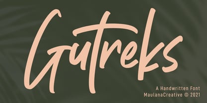 Gutreks is a handwritten feel font. With marker stroke, italic and fun character with a bit of ligatures. To give you an extra creative work. Gutreks font support multilingual more than 100+ language. This font is good for logo design, Social media, Movie Titles, Books Titles, a short text even a long text letter and good for your secondary text font with sans or serif. Make a stunning work with Gutreks font. Cheers, MaulanaCreative
 - Ad Hoc by Linotype,
$29.99Ad Hoc is a fake. My intention was to design a typeface with the looks of the characters drawn on paper with a marker pen. But they are all drawn on a monitor, with no scanner ever involved. That's the reason why they look so regular. Ad Hoc is Latin and stands for, approximately, for this reason". The expression itself is often used for something unplanned, improvised. Ad Hoc was released in 1992. - Lettown Hills by Senzana,
$8.00 Lettown Hills is inspired by urban or freestyle artworks. With casual or marker style and lot of stylistic alternates you can create realistic headers. It’s a font that can be used with vintage, simple and modern styles. Comes also with swashes font. It works beautifully for personal branding, advertising or creative headers. Looks good also with retro style typography or branding. It is very suitable for logos, posters, t shirts and more.
 - Churchward by Wooden Type Fonts,
$15.00 Great ultra bold sans serif font and demi bold wonderful for display.
 - FS Kim by Fontsmith,
$80.00 Unconventional beauty FS Kim is bold and intriguing – exuberant and unmissable, but playing a supporting role when needed. This typeface shines brightest as a display font, and is perfect for applications across fashion, theatre, cultural projects and pretty much any brand that wants to make a statement. While FS Kim is dramatic, it’s incredibly versatile, too, and works to showcase content in a stylish, striking way. This font makes you look, and makes you curious – perfect for brands and publishers that relish unconventional beauty. A playful text version While FS Kim’s text version is more constrained than the display, the strength and playfulness remain. Modifications for the text version include larger x-heights, longer ascenders and descenders, wider proportions and spacing, longer and more defined serifs and a lower contrast. “The overall idea is that it’s not an optical size,” Radoeva explains. Text and display maintain a strong connection that mean they can be used together. A display with a twist The calligraphic starting point helped to create familiar forms, while a contemporary display feel is achieved through short wedge serifs, with bold touches added through the font’s exaggerated forms and details. FS Kim’s narrow proportions, short ascenders and descenders, and tighter spacing make the font suitably compact for display use. The overall aesthetic feels bold and sharp, but closer inspection reveals that all the corners are softened. Decorative inlines In an unusual twist, FS Kim’s display version was first drawn using a broad-nib pen to create familiar forms and elegance while still breaking from serif traditions and making it all about standout character. There are also two additional styles, based on the Regular and Black with inlines – in uppercase, figures and symbols. The inline brings an extra option for an even stronger, more decorative display use.
 - FS Kim Variable by Fontsmith,
$349.99Unconventional beauty FS Kim is bold and intriguing – exuberant and unmissable, but playing a supporting role when needed. This typeface shines brightest as a display font, and is perfect for applications across fashion, theatre, cultural projects and pretty much any brand that wants to make a statement. While FS Kim is dramatic, it’s incredibly versatile, too, and works to showcase content in a stylish, striking way. This font makes you look, and makes you curious – perfect for brands and publishers that relish unconventional beauty. A playful text version While FS Kim’s text version is more constrained than the display, the strength and playfulness remain. Modifications for the text version include larger x-heights, longer ascenders and descenders, wider proportions and spacing, longer and more defined serifs and a lower contrast. “The overall idea is that it’s not an optical size,” Radoeva explains. Text and display maintain a strong connection that mean they can be used together. A display with a twist The calligraphic starting point helped to create familiar forms, while a contemporary display feel is achieved through short wedge serifs, with bold touches added through the font’s exaggerated forms and details. FS Kim’s narrow proportions, short ascenders and descenders, and tighter spacing make the font suitably compact for display use. The overall aesthetic feels bold and sharp, but closer inspection reveals that all the corners are softened. Decorative inlines In an unusual twist, FS Kim’s display version was first drawn using a broad-nib pen to create familiar forms and elegance while still breaking from serif traditions and making it all about standout character. There are also two additional styles, based on the Regular and Black with inlines – in uppercase, figures and symbols. The inline brings an extra option for an even stronger, more decorative display use.


