10,000 search results
(0.04 seconds)
- Haboro Squared by insigne,
$25.00 Haboro Squared is a formidable typeface, created for a variety of uses. Clean and consistent, it evokes the 1950s and 1960s. Haboro Squared conveys accuracy and utility with its clean, consistent strokes. In the 1950s and 1960s, designers and the general public began to reject the austerity of the war years in favor of a new sense of American optimism. This era is reflected in Haboro Squared’s gently rounded letters, playful alternates, and multi-purpose use. Whether you are creating a logo, crafting a website, or designing a magazine article, Haboro balances modernity with a hint of nostalgia. Haboro Squared achieves a balance between fashion and practicality. Even though it has an angular, modern design, it radiates friendliness and warmth. Haboro Squared works well for headings and brief texts. This collection of fonts consists of eight weights, from Thin to Black, each with a corresponding italic. Your design will seem robust and fashionable with so many options. Haboro plenty of alternate glyphs from which you can select an alternative or adjust the appearance of each letter. You’ve found a secret weapon. The Haboro Hyperfamily features a whole array of options, from Haboro Sans, Serif, to Haboro Didone. Take a look at the entire family. Even the most serious texts have a touch of whimsy thanks to the quirky alternate terminals in this multipurpose text face. Impress clients with your next branding package, web site, or magazine spread. Let the nostalgia of America’s post WWII heyday fill you with inspiration! Supercharge your next branding package, web site, or magazine spread with Haboro Squared!
 - Syabil by Eko Bimantara,
$16.00 Syabil is a sans serif font family designed by Eko Bimantara. This font crafted with the intention to present a clean, legible, multipurpose that easy to read wether it on screen or print. Fit for all purposes; Text, display, headline, print, corporate identity, logo, branding, product, infographic, photography and other application and medium. This font consist of 9 weight; Thin, Light, Book, Regular, Medium, SemiBold, Bold, ExtraBold and Heavy with each weight paired by italic. Also including Latin Plus language support with more than 11.700 glyphs in all weight which make this font contain broad language support.
 - Bu Global by Butlerfontforge,
$18.00 While throned before your keys, under your drumming fingers awaits the most astounding standard computer typeface ever devised: BuGlobal. In addition to all the usual alphanumeric characters and symbols, this lone font lets you type more than 400 accented letters appearing in more than 80 English-variant languages worldwide, 70 common math and science symbols, and dozens of other useful characters —more than half a thousand all told— all within the digital parameters of one standard computer typeface, without needing any alternate keyboards or other clumsy digital luggage. Here is a sample: You can add any accent appearing in more than 80 English-variant languages used around the world to any letter appearing in all these languages simply by typing ANY letter then the accent. This includes more than 400 diacritic-laden letters in all —without needing to remember several keystrokes to type any of these letters as a few of them appear in standard computer typefaces. You can type more than 50 math/science symbols that do not appear in standard computer typefaces. These new symbols include several kinds of arrows plus constants, centerlines, dimensions, and graphs and scales that when retyped create continuous scales and graphs. Common symbols such as ballot boxes, rating stars, checkboxes, hearts, fancy fleurons, and similar motifs that do not appear in standard computer typefaces. Dozens of flashy arabesques like ========= [in BuGlobal these equal signs are kerned together so when you type them you create a continuous double line]. In this typeface more than 30 symbols that never appear twice in a row are kerned together so when you continuously type them you create all kinds of flashy arabesques that will make your typing more attractive. No other standard compute typeface allows you to do this. As for Beauty, BuGlobal’s characters are designed according to several axioms of ocular perception until each profile is as iconically simple as Shaker furniture. These axioms make BuGlobal’s letters easier to read compared to other typefaces, and a few of them are: Each letter should look much like the others but for one defining detail. The letters should be as similarly wide as possible. The letters’ midbars should be the same height and thickness. The higher the lowercase letters are compared to capital letters, the more legible and easily readable are their texts. BuGlobal has a typeface user’s guide, titled A Lovely Face, in which a description of each ocular axiom compares BuGlobal with Baskerville, Georgia, Palatino, and other commonly-used standard computer typefaces so you can quickly see why the other typefaces are inferior. You can download a pdf file of this typeface user’s guide, for free, at BuGlobal’s website, butlerfontforge.com, at any time so you can learn all about BuGlobal’s many amazingly new features before possibly buying it. BuGlobal’s plain letters are perfect for texts, its italics are gracefully emphatic, its bolds are ideal for titles and headers, and its arabesques are a fancy way to make your texts look dressy —all of which will add more shimmer to your semantic plumage. One good typeface is more useful than an infinity of poor ones. Robert Bringhurst
 - Power of Dragon by Alit Design,
$21.00 Introducing "Power of Dragon" Typeface - Unleash Your Inner Hero! Unleash the extraordinary with our "Power of Dragon" Typeface, a bold and dynamic serif display font designed for those who aspire to be legendary. Embrace the spirit of a super hero anime with this powerful typeface that combines strength, elegance, and a touch of fantasy. 🐉 Dragons and Wings Illustrations: Feel the might of dragons and soar high with the included intricate illustrations of majestic wings. Each character is crafted to convey the essence of mythical power, bringing an extra layer of magic to your designs. ⚔️ Swords and Pirates: Channel the bravery of a swashbuckling hero with sword illustrations that add a dash of adventure to your projects. The pirate theme brings a sense of daring and excitement, making "Power of Dragon" Typeface perfect for projects that require a touch of maritime courage. 🌟 Super Hero Anime Theme: The "Power of Dragon" Typeface is inspired by the dynamic world of super hero anime, ensuring that your designs exude strength and heroism. Whether you're working on comic books, posters, or branding projects, this typeface brings an electrifying energy to your creations. 🔠 1084 Characters: With a robust set of 1084 characters, "Power of Dragon" Typeface gives you the flexibility to express your creativity without limitations. From uppercase and lowercase letters to numerals and punctuation, every character is meticulously crafted for maximum impact. 🌐 PUA Unicode and Multilingual Support: Seamlessly incorporate "Power of Dragon" into your designs with PUA Unicode support. Additionally, enjoy the versatility of multilingual support, making it easy to communicate your message across various languages and cultures. Let "Power of Dragon" Typeface be your ally in design, helping you create captivating and unforgettable visuals. Elevate your projects to new heights with this font that embodies the spirit of heroic tales and epic adventures. Unleash the power within, and let your creativity take flight!
 - Fleet Street, created by the prolific type designer Ray Larabie, is a font that marries the vibrancy of modern design with the elegance of classic typography, resulting in a typeface that feels both ...
- Verao by insigne,
$24.99 Remember clear summer days as a kid? Remember open fields that you explored? Sun shining? Simple breezes sweeping past your face as you ran far and free? The feeling was uncomplicated and enjoyable. It was natural. That’s Verao, the simple spirit of summer. Alive and vibrant, Verao takes a turn away from the cold structure of today’s rigid creations and embraces the movement back to the value of things handmade. This artisan creation represents the rare, soul-invested fusion of the craftsman’s tools, materials, and hand movements, which shapes the solid--but beautifully defined--parts, pieces that, when put together, breathe a measure of life into everyday paragraphs and other bodies of text. Verao’s hand-written brush script, with its characters’ imperfect elegance and handmade quality, keeps your work looking organic. Write a word in more than a hundred different ways thanks to the large number of extra letters it offers. Two sets of lowercase alternative letters without connectors are included as is a set of swashed endings. Verao contains stylistic substitutions and ligatures, too, that you can combine however you like. Whichever way you design, the elements continue to appear balanced and separate and will undoubtedly add more personality to your design. So stop switching out cogs in your rigid set of fonts. Take time again to play with a natural face that’s both easy and energetic. Verao’s great temperament makes it a joy to design with. Let this spirit of summer take you away from the mundane. There’s a good chance Verao will lead you where you need to go. Production assistance from Lucas Azevedo.
 - Tropical Jungle by Colllab Studio,
$19.00 "Hi there, thank you for passing by. Colllab Studio is here. We crafted best collection of typefaces in a variety of styles to keep you covered for any project that comes your way! Tropical Jungle is a fun wild font, inspired by the wild life of the jungle. Inspired by the tropical rainforests of South America, Africa, and Asia, this font will inspire you to get out there and explore! Tropical Jungle is a bold, quirky typeface that captures the joyous spirit of life on earth or at least, of the parts we’re most familiar with: monkeys swinging through trees, tigers stalking their prey through the jungle, butterflies flitting from flower to flower. You can tell just from looking at it that this is going to be a fun-loving font that will bring a smile to your face and a bounce to your step. With over 500 glyphs, this stack of jungle animals will be a joy to use! We made sure our font was easy to read in any application so you don’t have to worry about your documents cluttering up. We know you can’t wait to get started using it in your next project. So go ahead! Grab Tropical Jungle now! A Million Thanks Colllab Studio www.colllabstudio.com
 - Golden Decades by Dharma Type,
$19.99 Back to the basics. In the last ten years, type design has been confronting chaotic scene. The font market is flooded with a mixture of wheat and chaff and typography becomes increasingly complex. But one golden straight path exists. The path began from the industrial revolution, passing through swiss style, now we walk along the path as a matter of course. It is sans-serif. The decades from the Swiss style, namely "less is more age" to the contemporary basic style "Less, but better age", we call it golden decades. In those decades, type design met modernism. Go back to a theory in the golden decades, we redesigned new geometric, minimal sans-serif. Less is more and better. We added cool and calm spices to the modernism in the golden decades. As a result, letterform has a contemporary, sharp, and neutral atmosphere, and geometric rounded bowls and counters create a nice rhythm. Golden Decades consists of 8 weights and their matching Italics for a wide range of usages. Farther, Golden Decades is supporting international Latin languages and basic Cyrillic languages including Basic Latin, Western Europe, Central and South-Eastern Europe. Also, Golden Decades covers Mac Roman, Windows1252, Adobe1 to 3. This wide range of international characters expands the capability of your works. Lowercase "a" has OpenType stylistic alternate for advanced typography.
 - Gaulois by Canada Type,
$24.95 A couple of years before the second World War, Marcel Jacno, the popular French graphic designer who in the 1930s designed iconic posters for Gaumont and Paramount and famously illustrated the Gaulish helmet that first adorned the Gauloises cigarette packs in 1936, was asked by Deberny & Peignot to design a calligraphic typeface for the advertising market. Jacno's Scribe design, billed by D&P as a "virile ad writing" typeface, was released to some great fanfare in 1937, enjoyed some time of French spotlight, and was ready to make waves in the rest of Europe before the war broke out and snuffed its chances at international recognition. However, samples of it can still be found in some specialty post-war publications as an example of a trend that lasted a couple of decades, when Western European type manufacturers commissioned famous visual artists to design typefaces in order to capitalize on the artists' fame - the trend that brought us standards like Futura and the long list of Lucien Bernhard and Imre Reiner faces. This exclusive digital version of Jacno's design expands on the original concept with a large character set that includes plenty of alternates, a couple of different ways for seamless lowercase connections, three sets of figures, and extended Latin language support, adding up to over 540 characters in a one big, contextually-programmed font.
 - Cutie Sugary by Jafar07,
$14.00 Cutie Sugary is a delightful font that exudes charm and sophistication. With its graceful serifs and refined letterforms, it adds an air of elegance to any design. The carefully crafted swashes on select letters provide a whimsical and playful element, making it perfect for creating eye-catching headlines, invitations, and branding materials. Designed with love and attention to detail, Cutie Sugary captures the essence of timeless beauty. Its classic style, combined with the hand-drawn sketch medium, adds a touch of warmth and authenticity to your projects. Whether you're designing wedding stationery, crafting unique greeting cards, or creating stunning logos, this font will add a delightful and personalized touch. The friendly and simple nature of Cutie Sugary makes it incredibly versatile. It effortlessly blends into a variety of design styles, from modern to vintage, ensuring its adaptability for different projects. Its legibility and balanced letterforms make it equally suitable for both small and large-scale designs, guaranteeing a seamless reading experience for your audience. As you bring your creative ideas to life, Cutie Sugary will be your trusty companion. Its charming aesthetics will help your creations stand out on marketplaces like Etsy, Creative Market, and MyFonts. With Cutie Sugary, you can add a sprinkle of sweetness and elegance to your designs, captivating the hearts of your customers
 - Rare Bird Specimen VI by Rare Bird Font Foundry,
$200.00 Specimen VI is a refined hand by artist Aileen Fretz of Plume Calligraphy: thoroughly modern yet absolutely timeless. We have our sights set on this one becoming an instant classic. OBSERVATIONS Specimen VI takes its inspiration from the old world, while remaining thoroughly contemporary. It is unique while maintaining legibility. DEFINING CHARACTERISTICS At 2,580 characters, we dare say it is one of the most robust script fonts on the market today. The font includes extensive Opentype programming that authentically replicates Aileen’s unique handwriting pattern. As you type, watch the letters automatically adjust between connected and disconnected forms. Specimen VI also features formal titles, prepositions, social media wordart, and web navigation wordart, serif and sans serif Roman numerals, in and out-stroked letterforms at beginning and end of words, multiple alternate lowercase t cross-strokes, realistic double-letter ligatures, seamlessly connecting calligraphic letters, multiple styles of alternate capital letters, including swashes, and basic Latin encoding. Specimen VI is a typesetters’ dream. POTENTIAL SIGHTINGS In the pages of your favorite wedding tome; the signage, robe embroidery, and dinner menus of that coveted boutique hotel on the Italian Riviera, the labels of an artisanal hand-poured candle line, your new favorite Rosé, hand-crafted Belgium chocolate truffles, the indie cosmetic line fit for royalty, in any instance that you may be in need of a refined modern script.
 - Overskrift by PizzaDude.dk,
$17.00 Overskrift is headline in danish. My mind was set on making a font suitable for headlines, and that is exactly what this font is useful for - but, I found it suitable for many other things as well. I was thinking about packaging, posters, postcards and other things that needs a super legible handmade font! I have added 5 different versions of each letter, and they automatically cycle as you type!
 - Herschel by Tried & True Supply Co.,
$30.00 Herschel ventures into the elaborate world of late 19th-century typography to bring its winsome charm and compelling aesthetics into modernity. Staying true to the spirit of its historical era of inspiration, Herschel was designed with extreme attention to detail. Although its aesthetic roots are firmly planted in the treasury of Gilded Age typography, it has been technically constructed to withstand all the rigorous demands that modern technology places on type today. Herschel’s nostalgic, flared, and gently bifurcated serifs shine brightest when employed as display type, but are suited well for any application where inimitable character is needed. Named after designer Brian Brubaker’s maternal grandfather, a retired dairy farmer of more than 60 years, Herschel is available in six delectable weights: Skim, One Percent, Two Percent, Whole, Creamline, and Butter. Features overview: • 800+ glyphs per weight • 120+ stylistic alternates • Upper and lower case • Titling/Drop capitals with multiple and contextual ligatures • Lining, oldstyle, proportional, and tabular figures • Standard and discretionary ligatures • Unique dingbats and special characters • International language support for 200+ latin-based languages, including Vietnamese
 - Kade by Re-Type,
$45.00 Kade is a display/semi display sans family of fonts based on vernacular lettering photographed over the last ten years in and around the harbors of Amsterdam and Rotterdam. Hence the name Kade that translates into English as ‘quay’, also the name of its designer. Kade grew slowly from many different ideas and elements. The letters reflects the industrial method in which they are cut for the side of ships from large steel plates. Frequently subtleties of curves are compromised due to the cutting tools and the fact engineers are in control. Kade’s italics have an experimental character and were produced in an unorthodox manner by rotating 8 degrees, rather than slanting the roman characters, a method sometimes employed in shipyards. Kade constructed character is ideal for contemporary editorial works, architecture magazines, museums communication and posters. The six distinct styles are published in OpenType format, featuring small caps and four sets of numbers (proportional old style, tabular old style, proportional lining and tabular lining), as well as matching currency symbols and a complete set of fractions.
 - Eloquia by Typekiln,
$30.00 Eloquia is a neo-grotesque sans serif type family with geometric roots. Though it's a neutral typeface the unmistakable influence of geometric shapes gives it warmth and a unique flavor. With 34 fonts in total, Eloquia comes in two distinct optical sizes Text and Display. The Display styles are spaced tightly keeping headlines in mind while the Text styles feature a larger x-height and wider apertures with loose spacing making them highly legibility at small sizes. The elegant balance of neutrality and modernism makes Eloquia extremely versatile in its functionality. Whether it's being in the spotlight or in the background blending in, Eloquia can do it all. Eloquia is equipped with powerful OpenType features like Small Caps, Capitals to Small Caps, Stylistic Alternates, Ligatures, Case Sensitive Forms, Superscripts, Subscripts, Numerators, Denominators, Fractions, Ordinals, Proportional Lining, Tabular Lining, Oldstyle Figures, Scientific Inferiors, Localised Forms, Historical Forms, Capital Spacing and more. Eloquia supports more than 88+ languages including all major Latin languages. The Eloquia Display ExtraBold & Eloquia Text ExtraLight are completely free of charge.
 - Husk by Stiggy & Sands,
$24.00 A Flare Serif Family to Rule Them All The Husk Family began as a digitization of a film typeface called Maile by LetterGraphics. From there, it has evolved to a much more robust character set than its original reference. With multiple numerals sets, creative discretionary ligatures, as well as Swash Capitals and a few final forms, this gladiator of the type arena cuts through to let your designs shine. See the 5th graphic for a comprehensive character map preview. The Husk Family is loaded with features to give you plenty of customisation options: - Regular, Chiseled, and Inline styles that can be used alone or chromatically layered - A mix of specialized Capital letterforms for Caps & Lowercase standard - A Swash feature for Swash Capitals as E & R final forms. - Stylistic Alternates feature for Lining Numerals, an alternate & and M. - Discretionary Ligatures for a collection of unique ligature arrangements. - A Full set of Inferiors and Superiors for Limitless Fractions - An Oldstyle (default), Tabular, Proportional, and Lining figure sets Approx. 482 Character Glyph Set per font: The Husk Family comes with a glyphset that includes standard & punctuation, international language support, discretionary ligatures, alternate numeral styles, subscript and superscript.
 - The Wickyfest by Colllab Studio,
$14.00 "Hi there, thank you for passing by. Colllab Studio is here. We crafted best collection of typefaces in a variety of styles to keep you covered for any project that comes your way! You want a playful serif font. Something elegant and charming, but still lighthearted , fun and cheerful with a dash of mischief? Introducing The Wickyfest, a playful serif font with a classic tone. If your next project requires a playful touch, you'll love this collection of special characters and features. The Wickyfest style is incredibly well-crafted, resulting in versatile characters that can present a dashing display for your branding designs and ads. For more extravagant projects, try The Wickyfest for children-related graphics, like book covers, movie titles, or posters. Download The Wickyfest Now and make your designs more memorable. String together words that spell out who you are - not just what you do. Sharpen the image of your company or give your online presence a touch of class and charm. Don’t be afraid to let your clients see there’s more to business than just that bottom line. A Million Thanks www.colllabstudio.com
 - Affair by Sudtipos,
$99.00 Type designers are crazy people. Not crazy in the sense that they think we are Napoleon, but in the sense that the sky can be falling, wars tearing the world apart, disasters splitting the very ground we walk on, plagues circling continents to pick victims randomly, yet we will still perform our ever optimistic task of making some little spot of the world more appealing to the human eye. We ought to be proud of ourselves, I believe. Optimism is hard to come by these days. Regardless of our own personal reasons for doing what we do, the very thing we do is in itself an act of optimism and belief in the inherent beauty that exists within humanity. As recently as ten years ago, I wouldn't have been able to choose the amazing obscure profession I now have, wouldn't have been able to be humbled by the history that falls into my hands and slides in front of my eyes every day, wouldn't have been able to live and work across previously impenetrable cultural lines as I do now, and wouldn't have been able to raise my glass of Malbeck wine to toast every type designer who was before me, is with me, and will be after me. As recently as ten years ago, I wouldn't have been able to mean these words as I wrote them: It’s a small world. Yes, it is a small world, and a wonderfully complex one too. With so much information drowning our senses by the minute, it has become difficult to find clear meaning in almost anything. Something throughout the day is bound to make us feel even smaller in this small world. Most of us find comfort in a routine. Some of us find extended families. But in the end we are all Eleanor Rigbys, lonely on the inside and waiting for a miracle to come. If a miracle can make the world small, another one can perhaps give us meaning. And sometimes a miracle happens for a split second, then gets buried until a crazy type designer finds it. I was on my honeymoon in New York City when I first stumbled upon the letters that eventually started this Affair. A simple, content tourist walking down the streets formerly unknown to me except through pop music and film references. Browsing the shops of the city that made Bob Dylan, Lou Reed, and a thousand other artists. Trying to chase away the tourist mentality, wondering what it would be like to actually live in the city of a billion tiny lights. Tourists don't go to libraries in foreign cities. So I walked into one. Two hours later I wasn't in New York anymore. I wasn't anywhere substantial. I was the crazy type designer at the apex of insanity. La La Land, alphabet heaven, curves and twirls and loops and swashes, ribbons and bows and naked letters. I'm probably not the very first person on this planet to be seduced into starting an Affair while on his honeymoon, but it is something to tease my better half about once in a while. To this day I can't decide if I actually found the worn book, or if the book itself called for me. Its spine was nothing special, sitting on a shelf, tightly flanked by similar spines on either side. Yet it was the only one I picked off that shelf. And I looked at only one page in it before walking to the photocopier and cheating it with an Argentine coin, since I didn't have the American quarter it wanted. That was the beginning. I am now writing this after the Affair is over. And it was an Affair to remember, to pull a phrase. Right now, long after I have drawn and digitized and tested this alphabet, and long after I saw what some of this generation’s type designers saw in it, I have the luxury to speculate on what Affair really is, what made me begin and finish it, what cultural expressions it has, and so on. But in all honesty it wasn't like that. Much like in my Ministry Script experience, I was a driven man, a lover walking the ledge, an infatuated student following the instructions of his teacher while seeing her as a perfect angel. I am not exaggerating when I say that the letters themselves told me how to extend them. I was exploited by an alphabet, and it felt great. Unlike my experience with Ministry Script, where the objective was to push the technology to its limits, this Affair felt like the most natural and casual sequence of processions in the world – my hand following the grid, the grid following what my hand had already done – a circle of creation contained in one square computer cell, then doing it all over again. By contrast, it was the lousiest feeling in the world when I finally reached the conclusion that the Affair was done. What would I do now? Would any commitment I make from now on constitute a betrayal of these past precious months? I'm largely over all that now, of course. I like to think I'm a better man now because of the experience. Affair is an enormous, intricately calligraphic OpenType font based on a 9x9 photocopy of a page from a 1950s lettering book. In any calligraphic font, the global parameters for developing the characters are usually quite volatile and hard to pin down, but in this case it was particularly difficult because the photocopy was too gray and the letters were of different sizes, very intertwined and scan-impossible. So finishing the first few characters in order to establish the global rhythm was quite a long process, after which the work became a unique soothing, numbing routine by which I will always remember this Affair. The result of all the work, at least to the eyes of this crazy designer, is 1950s American lettering with a very Argentine wrapper. My Affair is infused with the spirit of filete, dulce de leche, yerba mate, and Carlos Gardel. Upon finishing the font I was fortunate enough that a few of my colleagues, great type designers and probably much saner than I am, agreed to show me how they envision my Affair in action. The beauty they showed me makes me feel small and yearn for the world to be even smaller now – at least small enough so that my international colleagues and I can meet and exchange stories over a good parrilla. These people, whose kindness is very deserving of my gratitude, and whose beautiful art is very deserving of your appreciation, are in no particular order: Corey Holms, Mariano Lopez Hiriart, Xavier Dupré, Alejandro Ros, Rebecca Alaccari, Laura Meseguer, Neil Summerour, Eduardo Manso, and the Doma group. You can see how they envisioned using Affair in the section of this booklet entitled A Foreign Affair. The rest of this booklet contains all the obligatory technical details that should come with a font this massive. I hope this Affair can bring you as much peace and satisfaction as it brought me, and I hope it can help your imagination soar like mine did when I was doing my duty for beauty.
 - DeDisplay by Ingo,
$24.99 A type designed in a grid, like on display panels Type is not only printed. There were always and still are a number of forms of type versions which function completely differently. Even very early in the history of script there were attempts to combine a few single elements into the diverse forms of individual characters and also efforts to construct the forms of letters within a geometric grid system. The “instructions” of Albrecht Dürer are probably most well-known. But although designers of past centuries assumed the ideal to basically be an artist’s handwritten script, the idea which developed in the course of mechanization was to “build” characters in a building block system only by stringing together one basic element — the so-called grid type was discovered, represented most commonly today by »pixel types.« But even before computers, there were display systems which presented types with the help of a mechanical grid display, like the display panels in public transportation (bus, train) or at airports and train stations. In a streetcar, I met up with a modern variation of this display which reveals the name of each tram stop as it is approached. This system was based on a customary coarse square grid, but the individual squares were also divided again diagonally in four triangles. In this way it is possible to display slants and to simulate round forms more accurately as with only squares. The displayed characters still aren’t comparable to a decent typeface — on the contrary, the lower case letters are surprisingly ugly — but they form a much more legible type than that of ordinary [quadrate] grid types. DeDisplay from ingoFonts is this kind of type, constructed from tiny triangles which are in turn grouped in small squares. The stem widths are formed by two squares; the height of upper case characters is 10, the x-height 7 squares. DeDisplay is available in three versions: DeDisplay 1 is the complex original with spaces between the triangles, DeDisplay 2 forgoes dividing the triangles and thus appears somewhat darker or “bold,” and DeDisplay 3 is to some extent the “black” and doesn’t even include spaces between the individual squares.
 - FF Hertz by FontFont,
$68.99 Low stroke contrast, generous spacing, and fine-grained weights from Light to Extra Bold make FF Hertz a workhorse text typeface which holds up well under today’s widely varying output conditions from print to screen. The quite dark Book style works well on e-ink displays which usually tend to thin out letters, as well as in print when you want to evoke the solid letter image of the hot-metal type era. Two sizes of Small Caps are included: A larger size for abbreviations and acronyms, and a smaller size matching the height of the lowercase letters. FF Hertz is a uniwidth design, that means each letter occupies the same space in all weights. This feature allows the user to switch between weights (but not between Roman and Italic styles) without text reflow. Jens Kutilek began work on FF Hertz in 2012. From a drawing exercise on a low-resolution grid (a technique proposed by Tim Ahrens to avoid fiddling with details too early), it soon evolved into a bigger project combining a multitude of influences which up until that point had only been floating around in his head, including his mother’s 1970s typewriter with its wonderful numbers, Hermann Zapf’s Melior as well as his forgotten Mergenthaler Antiqua (an interpretation of the Modern genre), and old German cartographic lettering styles. Jens likes to imagine FF Hertz used in scientific books or for an edition of Lovecraftian horror stories.
 - Daily Sans by Up Up Creative,
$15.00 Introducing Daily Sans, a complete sans serif font family with 10-weights, plus italics (20-fonts total). Daily Sans was designed to be an everyday-use geometric typeface with excellent legibility and a neutral tone. It's a perfect go-to for branding, web, and print design projects and can stand out on its own or play a supporting role in font pairings. It’s great for body/paragraph type as well as for larger display type. Because the goal was to create a font you can truly use for any project, purpose, or occasion, Daily Sans includes a wide range of weights starting from the very thin Hairline all the way through to the very bold Heavy. This means that you’re always able to find just the right weight for your needs, and it makes creating type hierarchies a breeze. Daily Sans comprises 20 fonts, each with approximately 450 glyphs - including 16 standard and discretionary ligatures, three ampersand variants, a full set of arrows, and more - and supports over 200 languages. The OpenType features can be very easily accessed by using OpenType-savvy programs such as Adobe Illustrator and Adobe InDesign. (To access these awesome features in Microsoft Word, you'll need to get comfortable with the advanced tab of Word's font menu.) PLEASE ENJOY! I can't wait to see what you make with Daily Sans. Feel free to use the #upupcreative and #dailysansfont tags to show me what you've been up to.
 - TT Tunnels by TypeType,
$29.00 TT Tunnels useful links: Specimen | Graphic presentation | Customization options TT Tunnels is a modular font family with narrow proportions and a large number of pronounced visual compensators. In the basic version of the typeface, all glyphs have simple chopped shapes, created according to the usual geometric principles. In the alternative version of TT Tunnels, which becomes available when you turn on OpenType feature stylistic alternates or stylistic set 1, the typeface comes to life and turns into a stylized ductal gothic grotesque, in which the design of glyph forms is created based on the pen movements. Despite the fact that TT Tunnels was created as a display typeface for use in short inscriptions and titles, it works very interestingly in the body text, adding a small touch of archaics. This is especially evident in the Bold and Black faces, when the rhythm and thickness of the strokes create a dense set, covering the paper with a solid, dense pattern. The density and style of such a set conceptually refers us to the old Gothic texture and the Old Slavonic script. In addition to a larger number of alternates for lowercase letters, the typeface features an alternate for number 2, an alternate slashed zero, many ligatures, and other useful OpenType features (ordn, frac, sinf, sups, numr, dnom, case, tnum, onum, pnum, liga, salt, ss01, zero). The TT Tunnels includes five faces: Thin, Light, Regular, Bold, Black.
 - DT Skiart Subtle by Dragon Tongue Foundry,
$9.00 ‘Skiart Serif Subtle’ is now available online. Originally inspired by the san serif font ‘Skia’ by Mathew Carter for Apple. ‘Skiart’ was designed to feel more like a serifed font, but without any serifs. It took a step between sans serif and serif fonts. Next on the path towards a serif font came Skiart Serif Mini, with tiny serifs added. This was a true serif font, all be it on the small side. Skiart Serif Subtle is less of a serif than Skiart Serif Mini, in that it doesn’t have actual 'serifs' as such. It has a subtle flare where a serif might normally be found. It remains fully readable and feels as clean and normal as any of the best body copy serifs, and yet still has the strong solid bones of all the other Skiart font families. If compared to one of the more commonly used serifs like ‘Times New Roman’, the ‘Skiart Serif Subtle’ lowercase is more open with a taller x-height, increasing its readability and friendliness. The serifs are smaller and less distracting. They are not pretending to be ligatures. Where ‘Times’ makes its p q b d forms out of a barely touching oval and stem, the ‘Serif Subtle’ forms are much more firmly attached, appearing clearly as single letters. The standard setting for the a’s and g’s are round single story, feeling warmer and more inviting in the ‘Serif Mini’ font. Much more friendly than the stuffy double-storied versions in fonts such as ‘Times’ etc.
 - Tasman by Re-Type,
$30.00 Originally published by OurType, Dan Milne’s Tasman has found a new home at Retype. Milne first conceived Tasman as a typeface for newspapers. This influenced the proportions and look of the face considerably: the goal was to keep the personality as warm and playful as possible without losing the credible tone required to deliver all kinds of news. A sturdy, warm type family that is neither mechanical nor fragile. It borrows its name from Abel Janszoon Tasman (1603–1659), a Dutch seafarer, explorer, and merchant who mapped parts of Australia in 1642, including Van Diemen’s Land (now known as Tasmania). Tasman’s primary purpose is an unbiased presentation of information; it strives for neutrality over elegance. Its characters are sturdy and unambiguous, sporting strong serifs, punctuation, and diacritics, as well as generously sized small caps and hybrid figures. Rationalized letterforms give the face enough robustness to withstand the stress of screen applications and laser printing. The figures’ three-quarter x-height makes them considerably larger than traditional oldstyle numerals, yet they still integrate with the lowercase much better than lining figures do. Although initially intended for newspapers, Tasman’s somewhat corporate, objective appearance also makes it an excellent candidate for digital and print magazines, websites, annual reports, and corporate identities. Tasman is a suite of feature-rich OpenType fonts fully equipped to tackle complex, professional typography. The character set includes small caps, fractions, case-sensitive forms, bullets, arrows, special quotes, and nine sets of numerals. Besides standard Latin, its extensive character set supports Central European, Baltic, and Turkish languages.
 - Albert Einstein by Harald Geisler,
$29.00 Harald Geisler wants to make you as brilliant as Albert Einstein. Or at least let you write like him. Or at least write in his handwriting. — The Wall Street Journal Imagine you could write like Albert Einstein. The Albert Einstein font enables you to do exactly that. In an joined effort, creators Harald Geisler and Elizabeth Waterhouse, spend over 7 years on finalising the project. It was made possible with the help of the Albert Einstein Archive, the Albert Einstein Estate, and funding by a successful Kickstarter Campaign of 2, 334 backers. The outcome was worth the effort: a font unprecedented in aesthetic technique and a benchmark for handwriting fonts. To create a result that is true to the original, Harald Geisler developed a method to analyse the movement of the famous writer. Letter by letter, every glyph was digitally re-written to create a seamlessly working font. It is the only font that holds 5 variations for each lowercase and uppercase-letter, number, and punctuation sign. Each based on meticulous detail to the original samples of Albert Einstein’s handwriting. The OpenType contextual alternates feature dynamically arranges the letters automatically as you type to ensure that no repeated letter forms are placed next to each other. Stylistic variants can also be accessed through stylistic sets. The font has 10 fine-tuned weights ranging from extra-light to fine and extra bold to heavy. The result is a vivid handwritten text true to the original. A PDF documentation, showing step by step how the font was made and comparing numerous original samples, is included with the font and can be downloaded here. The work has been recognised internationally, by press, Einstein fans, and designers. Some quotes used in images: “The font is beautiful“ — Washington Post “If you could write like Einstein, would it help you to think like Einstein?” — The Times (London) “Finally, if your colleagues aren’t taking you seriously, then perhaps you could start sending e-mails in a new font that mimics the handwriting of Albert Einstein.” — Physics World “Geisler and Waterhouse are really asking deeper questions about the diminishing (or evolving) role of our flawed, variable penmanship as a conduit of thought in today’s pixel-perfect landscape.” — QUARTZ “Your writing will look imaginative — which is exactly what Einstein would've wanted." — Huffington Post Arts & Culture "Forget Myriad Pro, Helvetica or Futura. The only font you’ll ever need" — Gizmodo “Capture a piece of Einstein's genius in your own writing." — Mashable
 - Aillek by Twinletter,
$18.00 Introducing Aillek, a retro-condensed font with multilingual support and a distinctive look that will enhance any project. Aillek lends a touch of retro charm to any design with its lofty letterforms and alternate characters. Your design becomes more dynamic and interesting thanks to its ligatures options. Aillek is ideal for producing vintage flyers, logos in retro style, nostalgic social media graphics, and more. It is perfect for branding initiatives, packaging design, book covers, and more due to its condensed letterforms. It is adaptable for any project that needs to reach a large audience thanks to its multilingual support. Aillek is a must-have for any designer, marketer, or anyone looking to add a dash of nostalgia to their work because of its distinctive design and features. It’s ideal for those who want to add a touch of nostalgia to their designs as well as for those who want to create designs that evoke nostalgia and vintage aesthetics. Make Aillek your go-to font for all your retro-condensed design needs by taking advantage of this opportunity. Don’t wait, get this special font right away, and start making designs that will be remembered. What’s Included : - File font - All glyphs Iso Latin 1 - Alternate, Ligature - Simple installations - We highly recommend using a program that supports OpenType features and Glyphs panels like many Adobe apps and Corel Draw so that you can see and access all Glyph variations. - PUA Encoded Characters – Fully accessible without additional design software. - Fonts include Multilingual support
 - Groundage by Mofr24,
$11.00 Groundage is a Gothic Blackletter font that offers three styles: Outline, Regular, and Shadow. With its bold and clean calligraphic strokes, this typeface boasts a modern-vintage look that exudes elegance and masculinity. Its Y2K-inspired design makes it perfect for stylish posters, marketing materials, logotypes, and headlines. Additionally, it is great for art and craft projects, y2k-streetwear designs, and much more. What sets Groundage apart from other Gothic Blackletter fonts is its unique combination of traditional and modern design elements. Its clean lines and bold strokes give it a contemporary feel while its Blackletter roots pay homage to its historical origins. Groundage also includes both Latin and Cyrillic character sets, making it a versatile option for a range of projects. This font pairs well with other modern-vintage fonts and looks great alongside sans-serif fonts for contrast. Its three styles allow for versatility in design and can be used for a variety of creative projects. Groundage was designed with the intention of creating a stylish, masculine font that could be used in a variety of contexts. Its Y2K-inspired design concept was chosen to evoke nostalgia while still feeling fresh and modern. The combination of traditional Blackletter elements with a contemporary twist creates a unique aesthetic that stands out from other fonts in its category. Groundage is not based on any historical design, but its Blackletter roots pay homage to centuries of typographical tradition. Its modern twist on the classic Gothic style creates a unique and versatile font that can be used in a range of creative projects.
 - Goxac by Twinletter,
$17.00 Introducing Goxac is a boldly shaped font that gives any project a cutting-edge, futuristic feel. Goxac’s slick lines and distinctive letterforms give your text a contemporary appearance, making it ideal for designs with a science fiction or technological theme. Goxac is the perfect tool for designing eye-catching headlines, posters, and social media graphics because of its bold aesthetic and futuristic theme. They are ideal for branding projects, packaging designs, book covers, and more due to their distinctive letter shapes. With a complete set of punctuation and numbers, Goxac is available in both upper- and lowercase letters. This multipurpose font is ideal for designers, marketers, and anyone looking to add a touch of futurism to their work because it has four different variants. With the Goxac font, rest assured that your designs will look unique, stylish, and futuristic. This font is perfect for those who want to stand out in the modern era, and for those who want to give their designs a touch of innovation. Goxac is a must-have for anyone looking to create a plan that really stands out. So don’t wait, make Goxac your font of choice today, and take your design to the next level! What’s Included : - File font - All glyphs Iso Latin 1 - Alternate, Ligature - Simple installations - We highly recommend using a program that supports OpenType features and Glyphs panels like many Adobe apps and Corel Draw so that you can see and access all Glyph variations. - PUA Encoded Characters – Fully accessible without additional design software. - Fonts include Multilingual support
 - Caslon Antique by GroupType,
$19.00 Caslon Antique is a decorative American typeface that was designed in 1894 by Berne Nadall. It was originally called "Fifteenth Century", but was renamed "Caslon Antique" by Nadall's foundry, Barnhart Bros. & Spindler, in the mid-1920s. The design of the typeface is meant to evoke the Colonial era. Early printers would reuse metal type over and over again, and the faces would become chipped and damaged from use. Caslon Antique emulates this look. Despite the name, it is not a member of the Caslon family of typefaces. The renaming is believed to have been a marketing maneuver to boost the popularity of a previously unpopular typeface by associating it with the highly popular Caslon types. Caslon Antique is popular today when a "old-fashioned" or "gothic" look is desired. It is used by the musical group The Sisters of Mercy on their albums, for the logo of the musical Les Misérables, and for the covers of the books in A Series of Unfortunate Events. It is also frequently used on historical displays. It was used for the previous edition of the Warhammer Fantasy Role-Play. Most recently, it has been used on promotional material for the smash musical Monty Python's Spamalot on Broadway, the West End, and its tour of the United States. British 80's band The The also used the font in several of their music videos, usually displaying several lyrics from the song in the opening scenes. It used on the cover of Regina Spektor's album, Begin to Hope. This description was sourced (in part) from Wikipedia, the free encyclopedia.
 - Sada by Arabetics,
$45.00 Sada is a text font designed with hand held devices and ebooks in mind. Glyphs are designed to be larger than usual and very clear with soft visual characteristics and many traditional Arabic calligraphic transitional features incorporated to improve legibility. The word “sada” means “echo” in Arabic. Even though Sada is a cursive style font it offers clearly distinguished and visually unified letter shapes in every position of a word. Sada supports all Arabetic scripts covered by Unicode 6.1, and the latest Arabic Supplement and Extended-A Unicode blocks, including support for Quranic texts. It comes with three weights, regular, bold, and ultra-light. Each weight has normal and left-slanted “italic” styles. The script design of this font family follows the Arabetics Mutamathil Taqlidi style and utilizes varying x-heights. The Mutamathil Taqlidi type style uses one glyph per every basic Arabic Unicode character or letter, as defined by the Unicode Standards, and one additional final form glyph, for each freely-connecting letter in an Arabic text. Sada includes the required Lam-Alif ligatures in addition to all vowel diacritic ligatures. Sada’s soft-vowel diacritic marks (harakat) are only selectively positioned with most of them appearing on similar lower or upper positions to emphasize they are not part of letters. Kashida is zero width glyph.
 - DT Skiart Serif Mini by Dragon Tongue Foundry,
$9.00 ‘Skiart Serif Mini’ is now available online. Originally inspired by the san serif font ‘Skia’ by Mathew Carter for Apple. ‘Skiart’ was designed to feel more like a serifed font, but without any serifs. It took a step between sans serif and serif fonts. Next on the path towards a serif font comes Skiart Serif Mini, with tiny serifs added. This is a true serif font, all be it on the small side. It remains fully readable and feels as clean and normal as any of the best body copy serifs, and yet still has the strong solid bones of all the other Skiart font familys. If compared to one of the more commonly used serifs like ‘Times New Roman’, the ‘Skiart Serif Mini’ lowercase is more open with a taller x-height, increasing its readability and friendliness. The serifs are smaller and less distracting. They are not pretending to be ligatures. Where ‘Times’ makes its p q b d forms out of a barely touching oval and stem, the ‘Serif Mini’ forms are much more firmly attached, appearing clearly as single letters. The standard setting for the g’s are round single storied, (the italic a’s are also), feeling warmer and more inviting in the ‘Serif Mini’ font. Much more friendly than the stuffy double storied versions in fonts such as ‘Times’ etc.
 - Ciseaux Matisse by Harald Geisler,
$65.74 Ciseaux Matisse was inspired by the exhibition Drawing With Scissors, which I visited at the Kunsthalle Schirn in my hometown of Frankfurt am Main in 2003 and the book Jazz published in 1947 by Henri Matisse. Admittedly, before that time I wasn’t a fan of Matisse’s work, neither his late nor the early work. That definitely changed after the exhibition. While his motifs have been overused on postcards and mouspads, in front of the originals you forget those tiny pictures. Some of the works were massive—larger than 24ft. By cutting directly into the color Matisse created shapes with strong dynamics. Years later, in 2007, I used that inspiration to cut an exclusive font for a newspaper that I designed at that time (see Gallery Pictures). Later I developed that font into the four styles featured here. The cut-out style is a paper cutout; boxed is the paper background. Both linear and boxed linear have no curved outlines, so they are more aggressive. As drawing with scissors implies, all characters are cut by hand. With only uppercase letters, this font is designed for editorial use: headlines, slogans in ads, or musical usage in posters and flyers that need the little touch of the jazz scissors. In special cases the lowercase letters contain alternate shapes to the uppercase forms.
 - Rooster Squad by Alexander Sharkov,
$9.00 Let me introduce our new handwritten font - the Rooster Squad! Our dangerous font is designed for completely different missions. Suitable for logo and package design, user interface design, online and print use, comics and more! The font contains letters from a huge number of languages. Contains Latin and Cyrillic alphabets. We also designed various ligatures and alternate letters to add variety to our cool and dangerous typeface. The font will be constantly updated and developed! Don't know what to do with your cool new project? Call the Rooster Squad!
 - Mattcool by Wacaksara co,
$12.00 Introducing Mattcool! A vintage styles monoline font with a natural flow. It's the perfect choice for personal branding projects, handwritten quotes, homeware designs, product packaging or simply as a modern & stylish text overlay to any background image. Mattcool is available in three styles script Regular, Bold, and Rough and two styles on Sans. Mattcool also comes with uppercase, lowercase, numerals, punctuations in script and sans version and so many variations on each characters include opentype alternates, common ligatures and also additional swash to let you customise your designs.
 - Ambrogio by Rotterlab Studio,
$15.00 Ambrogio Script Inspired by Modern Vintage & Retro style and combination with old American traditional style. Ambrogio script that lets you handwrite. Ideal for logos, handwritten quotes, product packaging, headers, posters, merchandise, social media & greeting cards. Multilingual Support To enable the OpenType Stylistic alternative, you need a program that supports OpenType features such as Adobe Illustrator CS, Adobe Indesign & CorelDraw X6-X7. There are additional ways to access alternatives, using the Character Map (Windows), Nexus Font (Windows), Font Book (Mac) or a software program such as PopChar (for Windows and Mac). Thank you !
 - InstaLove Smooth by Nicky Laatz,
$18.00 With smooth curves and a deliciously bold personality, InstaLove Smooth leaves good vibes wherever it goes. The InstaLove Smooth Brush font is loaded with opentype features including character alternates and a large selection of natural looking ligatures. Scroll through the previews to get a good feel for what it can do. Included in the glyphs are 8 super handy swashes , and a few extra doodles, to add some extra punch to your designs. Perfect for making a bold statement, and getting second glances - InstaLove won’t let you down.
 - Bassidle by Josstype,
$24.00 Bassidle Font is a sans serif font family that is simple but strong, defined by sharp edges with a modern touch. It is designed to exude a sense of strength and toughness as well as optimal readability. t’s a perfect choice for branding, magazines, posters, advertising, packaging, headlines, logos, web, print etc. 14 styles: 7 uprights and matching italics. 222 glyphs. Latin based languages. OpenType features, including ligatures. OTF, TTF files. Variable Font Includes. Thank you for your purchase! and please let me know if you have any questions. via email: joelpopon@gmail.com
 - Gadiani by Queenop Studio,
$12.00 Gadiani font is made into a nice and elegant font. Perfect for all your design projects, such as invitation cards, product logos, food brand logos, thank you cards, business card logos and more. Many alternatives will help you create whatever design you need like cute and girly handwritten letters and any other designs that require a beautiful handwritten touch! Enjoy :) Contains full set: -Uppercase -Lowercase -Alternative -Ligatures -Punctuation -Number -Multilingual support. Need help or have questions let me know. I'm happy to help. Thanks & Congratulations on the Design.
 - Arthelo by Lucky Type,
$18.00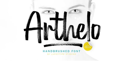 Arthelo is a textured brush font with a bold style and contemporary design approach, naturally handcrafted, perfect for use in title designs such as clothing, invitations, book titles, stationery designs, quotes, branding, logos, greeting cards, t-shirts, packaging designs , posters, and more. Arthelo brush font Complete with uppercase and lowercase letters, and multi-language support, numbers, punctuation, and some perfect ligatures and comes with several lowercase alternatives that will make your designs more interesting. Thank you so much for looking and let me know if you have any questions.
 - Monumental Gothic by Scriptorium,
$18.00For Monumental Gothic, we delved into the archives and found some old rubbings and photos of monumental brasses from British tombs of the 12th and 13th centuries. The sources included famous monuments like the tomb of Richard II and less well known inscriptions with similar style lettering. The rubbings were made by Dave Nalle in the 1970s (when they still let you have access to the the brasses). Monumental Gothic includes some alternate characters, plus upper and lower case characters, numbers and a selection of very interesting decorative emblems to complement the text.