10,000 search results
(0.073 seconds)
- LTC Italian Old Style by Lanston Type Co.,
$39.95LTC Italian Old Style is not to be confused with the English Monotype font also called Italian Old Style, which is an earlier design from 1911 based on William Morris’s Golden Type that is based on Nicholas Jenson’s Roman face. Goudy went back to Jenson’s original Roman and other Renaissance Roman faces for his inspiration and the result is what many consider to be the best Renaissance face adapted for modern use. Bruce Rogers was one of the biggest admirers of Italian Old Style and designed the original specimen book for Italian Old Style in 1924 using his trademark ornament arrangement. These ornaments are now contained in the pro versions of the Roman styles—Regular Pro and Light Pro. With most digitizations of old metal typefaces, one source size is often used as reference (as was Goudy’s method for his own cuttings of his Village foundry types) so that all sizes refer to one set of original artwork. The original hot metal fonts made by Lanston Monotype (from Goudy’s drawings) and other manufacturers used two or three masters for different size ranges to have optimal relative weights—smaller type sizes would need proportionally thicker lines to not appear thin and larger sizes would require thinner lines to not appear to bulky. The variations in size ranges can also be affected by the size of the cutter head in making the master patterns. The light weights of LTC Italian Old Style were digitized from larger display sizes (14, 18, 24, 30, 36 pt) and the regular weights were digitized from smaller composition sizes (8,10,12 pt). The fitting for the regular weights is noticeably looser to allow for better setting at small sizes. Very few font revivals take this approach. Italian Old Style, originally designed by Frederic Goudy in 1924, was digitized by Paul Hunt in 2007. In 2013, it has been updated by James Grieshaber and is now offered as a Pro font. The newly expanded Pro font includes all of the original ligatures, plus small caps and expanded language coverage in all 4 Pro styles. - GretaDS by FontAle,
$9.00 One day, when I was walking with my daughter Greta, I stopped in front of the windowshop of a bookshop, that caught my attention, but Greta was pretty irritated, as always when it comes to books: she is dyslexic. All things written are basically a nightmare for her!So one thing came to my mind: if the great Louis Braille, with visual impairment, invented an instrument that allowed blind people to read, write and play,there had to be a tool that made it easier for dyslexics to do the same things. So, I proposed to Greta to create together a font to help her and other dyslexics. We worked on it, becoming a bit of graphic designers, inventors and guinea pigs at the same time.We brought some initial changes to the mirror letters "pq bd", based on some examples already available on the market, that improved reading times, strenghtening our willing to go ahead. That's how "GretaDS" is born, a completely new font, from the "handwritten" family, which marks a difference on the mirror letters, making them easily recognizable, as well as the lowercase couple rn (RN) which can be confused with the letter "m", not to mention the capital "I" (vowel i) indistinguishable from the lowercase "l" (L)We hope, that other graphic designers will follow its flow, modify and improve the path, and make the most of its energy, to offer dyslexics a tool that make reading as easy as drinking a glass of water.
 - Ratherbe by Zane Studio,
$15.00 Ratherbe is a new modern brush font with an irregular baseline. A contemporary approach to design, natural handmade, suitable for use in designs for clothing, invitations, book titles, stationery designs, quotes, branding, logos, greeting cards, T-shirts, packaging designs, posters, and more. Complete with upper and lower case letters, and multi-language support, numbers, punctuation and several ligature. Thank you very much for searching and letting me know if you have questions.
 - Choowee by Vova Egoshin,
$24.00 Funky decorative display typeface with a curvy eye catching character. Choowee can solve many graphical problems. Features and alternates add personality and let you create unique logos, rad graphic identitys and stunning headlines! Package design for food or any kind of products. Posters or music covers. Prints on sweatshirts or t-shirts. Children’s book-covers or comics. Features: ligatures, alternates, case sensitive punctuation. Support: cyrillic, cyrillic extended, latin, latin extended... 1000+ glyphs! Have fun!
 - Square Line Icons Animals by Howcolour,
$17.00 The square icons focus on maximizing the meaning by minimizing the symbols. Let your viewers understand your data without disorientation. Use a metaphorical icon library, designed for fast, intuitive human recognition. All square icons crafted with precision and eye for quality with 32x32 grid system. The metaphors and the compositions designed with pieces from everyday life and popular culture, thus your viewers will never get lost and enjoy a unique and simplified visual style.
 - Golden Dragon by Hipfonts,
$18.00 Golden Dragon is a hand-drawn serif typeface. The font's vintage look adds a personal/organic touch to your designs. It looks absolutely beautiful paired with textures. You can use it for branding, social media, headlines, Youtube thumbnails, emblems, posters, merchandise, advertising, and much more. Golden Dragon is perfect for creative projects that need a unique Asian look. But don't let that limit your creativity it's also great for pirate themed projects.
 - Boleo by Salsipuedes,
$19.00 Boleo is a typeface designed to work in short texts such as headlines, banners, logos, signs, packaging and posters. It is a display font but has a good legibility thanks to well-proportioned shapes which let it works fine both on paper and screen. Boleo’s shapes remind to ribbons in motion, so that its lines, all curved, can be traced all at once. Boleo displays in three weights: regular, bold and black.
 - WTF Strange Crispy by Wasabib Type Foundry,
$15.00 WTF Strange Crispy - is a playful bounced display font that inspired by retro typeface, I make it with 100% hand drawn to get the artistic look. Perfectly suited for quotes, branding, logos, and social media posts, “WTF Strange Crispy” has a unique touch to every design, ensuring it stands out and makes a lasting impact. Illuminate your content with the enchanting allure of “WTF Strange Crispy” font, and let your creativity shine in every project.
 - Killing Time by PizzaDude.dk,
$15.00 Killing Time can be quite good - if the time killed is being used on something useful ... could be if your are taking your fantasy and imagination for a walk, and let your creativity sprout. Use the soft lines and corners of Killing Time font for your comics, toys, candy, posters, postcards, invitations ... well, the list goes on - but if you need something fresh and comic, and not overdoing it, Killing Time could be your choice!
 - Boomba by 38-lineart,
$17.00 Boomba is an exciting and dynamic font that embodies the essence of creativity and youthful exuberance. With its unique strokes and electrifying presence, it stands out from the crowd, making it perfect for capturing attention and infusing life into any design. Boomba is a fusion of art and typography, offering an exhilarating journey into the world of expressive fonts. Embrace the energy, unleash your imagination, and let Boomba take you on a thrilling typographic adventure.
 - Estylle Madison by Creatype Studio,
$18.00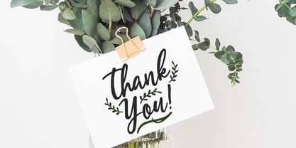 Estylle Madison is classy, elegant and super stylish modern calligraphy with natural handwritten movement. Estylle Madison font is perfect for many different project such as logos & branding, invitations, stationery, wedding designs, social media posts, advertisements, product packaging, product designs, labels, photography, watermarks, special events and more. Estylle Madison comes with uppercase, lowercase, numerals, punctuation and many variations on each character, including OpenType alternates and common ligatures to let you customize your designs.
 - ZenoPotion AOE by Astigmatic,
$19.95ZenoPotion is a geometric styled typeface influenced by alien stories and nostalgia. It carries a techno look with a regular lined top and dipped thick bottom throughout, highly readble, though not best for large bodies of text. Use the alien technology, let ZenoPotion be the type for your designs and stories. From the far reaches of space, another lifeform sent a message, now you can use their typestyle to convey your own! - Oh Icons by Poważne Studio,
$19.00 Oh Icons is a family of 382 icons divided into three thematic sets. Each set contains 52 characters, plus alternate glyphs in Open Type Stylistic sets. Every icon can be used independently, but you can also merge them to design an adult or a baby figure, a nursery room or to dress a dog. Black backgrounds will let you colour your icons. Have fun and stay tuned for the new topics already in the works!
 - Headlines by TypeThis!Studio,
$54.00 Perfect headlines — now and forever! Headlines is designed for clear and straight headlines and also allow longer words and headlines to find the space they need for a well-composed headline. Unicase styles let your headlines shine uniquely in every respect. It contains a number of special ligatures for certain combinations to fill common visual gaps such as tty, rv. Newsletter: www.typethis.studio *Variable fonts work well in software that supports variable font technology.
 - LiebeGerda by LiebeFonts,
$29.00 Go out into the wilderness. Cut down a tree. Stop and smell the roses. And then treat yourself with this unplugged, hand-lettered typeface. LiebeGerda is an effortless-but-refined, spontaneous-but-elegant brush font. She is ready for your next project, and she wants to add that little crafty something that makes the difference. Her natural breath of fresh air lets you escape those same old monotonous script fonts you’ve been using. After our successful first brush font, LiebeDoris, and our first interconnected script, LiebeLotte, we’re combining both genres and taking them to the next level: an interconnected brush script. OpenType magic varies LiebeGerda’s letterforms: Most characters have no less than three different variations that are automatically shuffled and inserted as you type. Plus, the “All-Caps” OpenType feature exchanges uppercase letters with less-swashy variants. Now you know why every one of the four styles contains more than 1,200 characters! Ulrike of LiebeFonts painted LiebeGerda’s four styles individually from scratch and carefully adjusted every detail by hand. Rather than being one typeface with different weights, LiebeGerda is a package of four individual fonts that go together really well. Ulrike’s high level of type-nerdy craftsmanship shows. When you use LiebeGerda, your designs will easily convince your audience that they’re looking at a hand-crafted piece of lettering. Feel free to add a few of the stacked ligatures like “the”, “for”, and “new” to round off the illusion. Last but not least, LiebeGerda has a lot more detail than most other brush fonts. That means there’s no ugly, lazy bézier artifacts in the brush traces. You can print words at billboard size, and people will still believe they smell the paint from your brush!
 - Rekita by Twinletter,
$13.00 Introducing “Rekita Font” – Your Gateway to Playful Typography! Rekita Font is a captivating typeface designed to infuse playfulness and creativity into your projects. With its whimsical and charming characters, this font is your perfect companion for any design that seeks a touch of lightheartedness. Whether you’re crafting children’s books, eye-catching posters, or engaging social media graphics, Rekita Font effortlessly adds a fun and youthful vibe to your work. It’s a versatile choice that breathes life into your designs and sparks joy in your audience. Embrace the lively spirit of Rekita Font and unlock a world of creative possibilities. Elevate your design game, grab attention, and leave a lasting impression with this delightful typeface. Discover the magic of Rekita Font and let your creativity run wild with playful typography today! – PUA Encoded Characters – Fully accessible without additional design software.
 - Lirzec by Twinletter,
$13.00 Introducing “Lirzec Font” – Where Playfulness Meets Creativity! Lirzec Font is your gateway to adding a delightful touch of whimsy to your designs. This playful typeface is designed to infuse your projects with a sense of joy and imagination. With its charming and unique characters, Lirzec Font is perfect for children’s books, eye-catching posters, and distinctive branding that demands attention. Let your creativity run wild as you bring your ideas to life with the playful spirit of this font. Whether you’re crafting invitations that radiate cheerfulness or designing logos that leave a memorable impression, Lirzec Font is the perfect choice to make your projects stand out. Elevate your creative work today with Lirzec Font and embrace the delightful charm it brings to your designs. Grab your audience’s attention and spark their imagination effortlessly! – PUA Encoded Characters – Fully accessible without additional design software.
 - Kuryin by Twinletter,
$13.00 Introducing “Kuryin Font” – Where Playful Typography Meets Creativity! Unleash your design’s full potential with Kuryin Font, a lively and whimsical typeface that adds a touch of playfulness to your projects. Kuryin Font is your go-to choice for designs that need a fun and vibrant personality. Its unique, playful characters are perfect for children’s books, captivating posters, and standout branding that grabs attention. With Kuryin Font, your designs will instantly exude a sense of joy and creativity, drawing your audience in. Whether you’re crafting a cheerful invitation or crafting a memorable logo, this font infuses a playful spirit into your work. Elevate your creative projects and let your imagination run wild with Kuryin Font. Embrace the whimsical charm of this typeface today and watch your designs come to life! – PUA Encoded Characters – Fully accessible without additional design software.
 - Ink Outlaw by Rochart,
$25.00 Ink Outlaw is not just a font; it's a rebellious statement in every stroke. Inspired by the raw energy and urban artistry of graffiti and vandalism, this font unleashes a torrent of creativity onto your canvas. Each letter is a work of defiant art, meticulously designed to capture the edgy spirit of street culture. With Ink Outlaw, your designs will command attention and provoke thought. Its bold and irregular lines, dripping paint effect, and rugged edges give your text a gritty, authentic graffiti feel. Whether you're working on posters, apparel, album covers, or any project that needs an unapologetically bold aesthetic, Ink Outlaw will be your accomplice in making a powerful statement. Embrace the outlaw spirit, break free from conformity, and let Ink Outlaw become the voice of your artistic rebellion. Transform your designs into urban masterpieces with this distinctive and daring font.
 - Rover Pro by Fontforecast,
$24.00 Rover Pro is a hand painted font family that comes in 5 styles: Regular, Bold, Bold Shadow, Bold Rough and Extra. It was designed with retail in mind, but is also perfectly suited for other uses. The flat brush that was used to hand paint all 424 glyphs creates a nonchalant stroke that adds a personal touch and plenty of pizzaz to your design. Combine Rover Pro Bold Shadow with the Bold and Rough styles for more variety and beautiful designs. For extra fun Rover Pro Extra adds another 85 glyphs to play around with. All in all Rover Pro is a smashing painted font family for virtually every project. Rover Pro is PUA encoded. This means that all Rover Pro's characters are fully accessible via Character Map or Font Book (that come with your PC or Mac).
 - Dorset by Positype,
$49.00 Dorset marks Léon Hugues first script typeface and first release with the Positype Flourish label. Built crosscurrent to a strict revival or calligraphic digitization, Dorset’s aim was to understand how a font could interact with various calligraphic influences in a single execution and how that interpretation by Léon would lead to new, exclusive design choices. The design purposely chose to connect various gestures from Spencerian handwriting and copperplate calligraphy and meld that with his initial experiments with fine, flat nibs. The result is wholly unique and useful when clear, open, and legible script typography is desired. OpenType features included in this typeface allow the user to seamlessly move from an italic to connected script, while the various stylistic sets can lead you to variations of texture and rhythm, allowing for a more personal and exact expression.
 - Bayer Sans by Victory Type,
$20.00Bayer Sans, is based on the typography of the Austrian-born artist Herbert Bayer. Bayer worked as a teacher and graphic designer at the Bauhaus, a revolutionary German art school, during the 20's. His specialty was commercial art and he had many "radical" views on typography and its interaction with society. Bayer felt that written language should be merely a graphic version of spoken language. Thus, he advocated a single alphabet without majuscules and miniscules. Bayer's designs are simple, geometric letterforms that lend themselves to lowercase form. This font, based on the typography of Bayer and his students at the Bauhaus Werkstatt (studio), was digitally modeled by Noah Rothschild. Bayer Sans features a complete character set including European characters, alternate letters with adjusted widths and designs and ligatures. Included are the "f" characters and a special linked double-o. - Atlantica by Jonahfonts,
$35.00 My pet peeve for many years has been with the 'rn' in small texts, especially with my smart phone. I felt that perhaps others may have the same peeve. I decided to try and fix that with Atlantica. As you can see in poster No. 4. "With the combination of 'rn' in small text it tends to appear as 'm'. Therefore it may be read as 's t e m' instead of 's t e r n'. Altalntica has an alternate 'rn'. By invoking the < Contextual-Alternate > feature. Atlantica will replace each 'rn' - or you may individually change them if you desire". Also note the deep cuts to help legibility for smaller texts. This combination apparently does not appear in many words, but when it does it can suggest a different word as in; eastern, stern, tarnish, Tornado, Turn and in some names as well.
 - Dear Dolores by Samuelstype,
$24.00 Dear Dolores has had its name from the latin word dolorem, meaning sorrow or grief. When I started working on this display font I found myself trying it out using the latin requiem texts. The capitals somehow sat well with the monumental and solemn words of mourning. The broken hairlines suggested stone cuttings where the fine details had been worn down and obliterated over time and it felt at home in a churchyard or in a monument park. Adding lowercase gave the font a more personal and friendly appearance and opened up new possibilities for use. The name itself is a fictional message to someone long missed or perhaps lost too soon. Dear Dolores comes in a cut and an uncut version where the fine details are left intact. Both are excellent for headlines or memorable quotes.
 - Zapf Essentials by Linotype,
$29.99Linotype Zapf Essentials is the modernized version of Zapf Dingbats and was also designed by Hermann Zapf himself. Over 372 characters and symbols are included within six fonts and make life a little more communicative, a little more informative, and a lot more interesting. The fonts contain symbols for both professional and everyday uses. With their markers, ornaments and arrows they are informative as well as versatile, timeless and lively. An interesting note to the story of Zapf Essentials: in 1977, Hermann Zapf created about 1000 sketches of signs and symbols. ITC chose those which became known around the world as Zapf Dingbats. For a typesetter, dingbats are the characters in the corner of the type box which can be used for just about anything. The last decade has seen the appearance of new symbols for e-mail, fax, mobile phones and other developments. These are now part of Linotype Zapf Essentials, just as they are now a part of everyday life. For a quick overview of the different Linotype Essentials variations, see the keyboard layout PDF in the Gallery section. It shows the keyboard layout of each font. A helpful hint from Hermann Zapf: Linotype Zapf Essentials should be used sparingly so that the characters retain their emphasis. - Goldwyre by Mofr24,
$11.00 Introducing Goldwyre, an extraordinary typeface meticulously crafted to captivate and inspire. With its seamless blend of elements from medieval to modern times, Goldwyre stands out as a truly unique font that embodies the essence of timelessness and elegance. Drawing inspiration from the intricate beauty of Gothic Blackletter and enriched with bold calligraphic strokes, this typeface exudes a mesmerizing charm that effortlessly bridges the gap between the past and the present. What sets Goldwyre apart from other typefaces is its ability to seamlessly combine medieval and modern aesthetics. By skillfully integrating the ornate and elaborate forms of Gothic Blackletter with contemporary design elements, Goldwyre offers a truly captivating typographic experience. This fusion of styles creates a font that is both classic and contemporary, making it an exceptional choice for projects that require a touch of sophistication and versatility. In addition to its captivating design, Goldwyre is available in two weights: regular and bold. The regular weight showcases the delicate intricacies of the typeface, while the bold weight accentuates its bold calligraphic strokes, adding a sense of strength and impact to any design. This versatility allows designers to explore a range of creative possibilities, whether it's designing eye-catching posters, compelling marketing materials, engaging titles, stylish T-shirt designs, or attention-grabbing headlines. Goldwyre is also a highly functional typeface, offering extensive multilingual support to cater to diverse audiences. It features a wide range of characters and diacritical marks, ensuring that it can effectively communicate in various languages and scripts. This broad language coverage expands the possibilities for global projects, making Goldwyre an excellent choice for international brands, publications, and design agencies. When conceptualizing Goldwyre, our design team aimed to create a typeface that harmoniously blends the grandeur of medieval typography with the sleekness of modern design. We wanted to pay homage to the rich history of typography while infusing it with a contemporary twist, resulting in a font that seamlessly integrates into both traditional and modern contexts. The deliberate fusion of styles and the meticulous attention to detail in Goldwyre's creation reflect our passion for typography and our commitment to delivering exceptional design solutions. Goldwyre was born out of a desire to provide designers and creatives with a captivating and stylish typographic solution that effortlessly merges the beauty of the past with the demands of the present. We believe that design is a powerful tool for self-expression, and with Goldwyre, we sought to empower designers to create visually striking and evocative designs that leave a lasting impression. Its timeless appeal and versatile nature make it the perfect choice for those who seek to elevate their projects and make a bold statement. Pairing Goldwyre with related families or other typefaces can further enhance its visual impact. It complements well with minimalist sans-serif fonts, such as Futura or Helvetica, providing a striking contrast between the intricate forms of Goldwyre and the clean lines of the sans-serif typefaces. This combination creates a harmonious balance, allowing designers to play with different aesthetics and create visually dynamic compositions. In conclusion, Goldwyre is more than just a typeface; it's a captivating journey through time. With its seamless blend of medieval and modern elements, extensive multilingual support, and versatile weights, Goldwyre empowers designers to create visually stunning designs across a wide range of applications. Whether you're designing posters, marketing materials, titles, T-shirt designs, or headlines, Goldwyre is the ultimate choice for those seeking to infuse their projects with a touch of timeless elegance and captivating beauty. Experience the magic of Goldwyre and unlock the true potential of your designs.
 - Olivette Sans by VistaType,
$9.00 Introducing Olivette Sans. Olivette is a Clean and elegant typeface, best suitable for display headings, logos, branding, magazines, product packaging and invitations. Olivette is created in 02 styles and 09 weights. It has 18 fonts including true italics. Olivette is perfectly crafted for a wide variety of projects, such as signature, stationery, logo, wedding, typography quotes, magazine or book cover, website header, clothing, branding, packaging design and more. 18 fonts total 2 font styles Upper / lowercase glyphs Multilanguage Support Webfonts included Free updates and feature additions We really hope you enjoy it – please do let us know what you think, comments & likes are always hugely welcomed and appreciated. More importantly, please don’t hesitate to drop me a message if you have any issues or queries.
 - Bungire Retro by Product Type,
$17.00 Introducing Bungire Retro, the ideal answer for your projects with a retro, vintage, or classic modernist theme! Bungire Retro is the perfect font for bringing a sense of nostalgia and charm to your creations because of its distinctive and eye-catching design. With its extensive selection of alternates, Bungire Retro lets you personalize and produce genuinely distinctive typographic designs. When creating logos, posters, invitations, or other creative endeavors, Bungire Retro’s distinct retro vibes will enthrall your audience. Additionally, because of its linguistic support, it may be used for projects everywhere. With Bungire Retro, you can take your ideas to the next level and let your creativity shine. Get Bungire Retro right away to take your audience back to the heyday of classical modernism! What’s Included : - File font - All glyphs Iso Latin 1 - We highly recommend using a program that supports OpenType features and Glyphs panels like many Adobe apps and Corel Draw, so you can see and access all Glyph variations. - PUA Encoded Characters – Fully accessible without additional design software. - Fonts include Multilingual support. Thank you for your purchase!
 - Volta by Linotype,
$29.99Volta is a robust typeface from the 1950s. A revisit to styles that were en vogue at the turn of the century, Bauer type foundry designers Walter Baum and Konrad Bauer designed this type family in1955. The form of Volta's letters are similar to those in New Transitional Serif typefaces, like Cheltenham and Century. Developed after the Didone (i.e., Bodoni) style types, New Transitional Serifs speak more to the zeitgeist of the late 19th Cntury, and were typographic adaptations to it's newer technologies. Already in the period of mass production, typographers and printers at the dawn of the 20th Century had to cope with larger print runs on cheaper materials. The robust letterforms of New Transitional Serifs were designed to compensate for this, but they were also ingenious little inventions in their own right. Form the beginning, the new, peculiar forms of New Transitional Serif letters were adopted for use by advertisers. Their robustness also allowed them to be used in virtually all sizes. Volta was designed especially with advertising display usage in mind. The x-height of Volta's letters is higher than average for serif faces. It is recommended that Volta be used exclusively for shorter tracks of text, above 12 point. Headlines look dashing set in Volta. Four different font styles are available for the Volta typeface: Regular, Medium, Medium Italic, and Bold." - Stamen by Wordshape,
$20.00 Stamen is the answer to a big question: What would happen if one tried to create a typeface that was ‘out of time’? If a type designer was to turn off the internet and put away the type specimens and just try to explore limbic, phantom history, what might that look like? No slavish explorations of the past. No gropings toward the future. No exhaustive core sample of the contemporary. Instead, using what one remembers of history and our collective vision of the future (usually a future imagined from the past) and channeling that into something that is, hopefully, new… The Bentons meet Frutiger for a Manhattan on a space station while Matthew Carter sways to the sweet sounds of the chorale that occasionally played through the halls of Stephenson Blake. This smear of implicit history expressed without explicit reference—this is Stamen: a family of 12 typefaces with a ton of alternate characters. The bold weight was designed for the LP “I Thought the Future Would Be Cooler” ( http://ittfwbc.com/ ) by the band YACHT in response to their request for a typeface that was ‘lost in time’, and refers to neither strict historical models nor purely futuristic forms. I built a small family out from there. It works well in text, but just as well for display setting. I think you’ll enjoy using it.
 - Engria by Eclectotype,
$40.00 Engria is a type family of four weights with corresponding italics that treads the fine line between sans and serif. There are serifs, of a sort, inspired by the brush. Not the marks made by a brush, but the actual splayed shape the bristles make when clamped together. Wedge-like chunks that resemble engraved forms, as the name Engria hints at. But it also has the appearance of a stressed, flared sans. This mixed approach lends a unique voice. Highly legible at text sizes, as indeed it is optimized for, Engria does however shine at display sizes thanks to its characteristic details – flared stems, angular counterforms, rugged ink traps and fluid curves. (I would recommend tracking it a little tighter at larger sizes.) Engria started life way back in 2014, and has been worked and reworked tirelessly to get to this finished product. My intent was to really push the idea of the white shapes being as important, if not more so, than the black. Engria is equipped for typographically demanding applications, boasting as it does an array of OpenType features, including small caps, automatic fractions, stylistic sets, various figure styles, arrows, case sensitive forms and more. It will make a very useful addition to your typographic arsenal, with a flare (ahem) for editorial work, but the individuality for packaging, branding, and logo work.
 - Cadho Toys by Alit Design,
$20.00 Introducing CADHO TOYS, an exciting and playful bubble display font that will add a touch of whimsy to your designs. This font features a unique alternate ligature style that combines bubbles and letters, creating a fun and engaging visual experience. With its lively appearance, CADHO TOYS is perfect for various design projects, especially those aimed at children, toys, games, or anything that requires a cheerful and vibrant aesthetic. This font is carefully crafted with 707 characters, ensuring versatility and multilingual support. Whether you’re designing in English, French, Spanish, German, or any other language, CADHO TOYS has got you covered. The font includes special characters, punctuation marks, numerals, and a wide range of glyphs, allowing you to express your creativity without limitations. One of the standout features of CADHO TOYS is its support for PUA Unicode. This means that you can access the font’s extensive character set through private use area codes, giving you even more freedom to customize and personalize your designs. Let your imagination run wild as you combine different characters and ligatures to create captivating typographic compositions. CADHO TOYS will bring joy and excitement to any project it graces. Whether you’re designing posters, logos, packaging, websites, or any other creative endeavor, this bubble display font is bound to make a lasting impression. Its alternate ligature style adds a touch of uniqueness and flair, setting your designs apart from the crowd. So why wait? Get your hands on CADHO TOYS today and unlock a world of creativity, fun, and boundless possibilities. Let this font take your designs to new heights and bring smiles to the faces of your audience. Language Support : Latin, Basic, Western European, Central European, South European,Vietnamese. In order to use the beautiful swashes, you need a program that supports OpenType features such as Adobe Illustrator CS, Adobe Photoshop CC, Adobe Indesign and Corel Draw. but if your software doesn’t have Glyphs panel, you can install additional swashes font files.
 - Turquoise by Resistenza,
$59.00 Many calligraphers agree that Roman Capitals is one of the most beautiful yet difficult hands to master. Its beauty lies in its simplicity of form and structure, yet understanding and applying these skillfully can take years of mindful practice. My goal was to design Roman Capitals that were smoothly designed with a brush, not carved. The main concept was based on the fundamental strokes that are commonly studied when you practice Roman letters. That’s why many Serifs have these unfinished terminal serifs. I created the Turquoise typeface based on my Capitalis Romana practice with a flexible broad edged brush and gouache. During the lowercase process I was still following Foundational calligraphy with a flat brush. My Turquoise Capitals were then adjusted and redesigned at the Tipobrda calligraphy workshop in Slovenia. Turquoise contains small caps, many discretionary ligatures, ornaments, swashes as well as several brushy nature-inspired ornaments, accessible via OpenType. Ideally suited for headlines or body text in advertising, packaging and visual identities, its delicate shapes, curves and endings give projects a harmonious elegance and stylistic feel in unique Turquoise style. My inspiration for this font showcase is one of the richest islands in the Mediterranean, the place where my parents are from, Sicily. This southern Italian region has so many unique spots: Stromboli, part of the Aeolian Islands, and the Pelagie Islands is one of my favorite places in Sicily. The pictures I used were taken there this year. So enjoy the sun, the serifs, the water and its Turquoise colors. The brush is mightier than the sword. Opentype Features: https://www.rsztype.com/article/how-to-use-opentype-features-adobe-microsoft-pages Turquoise works very well with Nautica Check also Turquoise Inline
 - deccodisco - Personal use only

- Adamantium by Comicraft,
$39.00Looking for sharp-looking characters in ferocious action? Then look no further than this font, originally designed by Senior Comicraftsman John Roshell for GHOST RIDER 2099. Adamantium has also been featured in WOLVERINE and THE UNCANNY X-MEN. - Auberge Script by Sudtipos,
$79.00 It took me a long time, but I think I now understand why people of my generation and older feel the need to frame current events in an historical context or precedents, while most of the young couldn't care less about what happened ten years ago, let alone centuries back. After living for a few decades, you get to a point when time seems to be moving quite fast, and it’s humbling to see that your entire existence so far can be summed up in a paragraph or two which may or may not be useful to whoever ends up reading the stuff anyhow. I suppose one way to cope with the serenity of aging is trying to convince yourself that your life and work are really an extension of millenia of a species striving to accept, adapt to, and improve the human condition through advancing the many facets of civilization -- basically making things more understandable and comfortable for ourselves and each other while we go about doing whatever it is we are trying to do. And when you do finally convince yourself of that, history becomes a source of much solace and even a little premonition, so you end up spending more time there. Going far back into the history of what I do, one can easily see that for the most part it was ruled by the quill. Western civilization’s writing was done with quill pens for more than thirteen centuries and with newer instruments for about two. By the mid-18th century, the height of the quill experience, various calligraphy techniques could be discerned and writing styles were arranged in distinct categories. There are many old books that showcase the history of it all. I recommend looking at some whenever the urge comes calling and you have to get away from backlit worlds. Multiple sources usually help me get a better perspective on the range of a specific script genre, so many books served as reference to this quill font of mine. Late 17th century French and Spanish professional calligraphy guides were great aides in understanding the ornamental scope of what the scribes were doing back then. The French books, with their showings of the Ronde, Bâtarde and Coulée alphabets, were the ones I referenced the most. So I decided to name the font Auberge, a French word for hotel or inn, because I really felt like a guest in different French locales (and times) when I going through all that stuff. Because it is multi-sourced, Auberge does not strictly fit in a distinct quill pen category. Instead, it shows strong hints of both Bâtarde and Coulée alphabets. And like most of my fonts, it is an exercise in going overboard with alternates, swashes, and ornamental devices. Having worked with it for a while, I find it most suitable for display calligraphic setting in general, but it works especially well for things like wine labels and event invitations. It also shines in the original quill pen application purpose, which of course was stationery. Also, as it just occurred to me, if you find yourself in a situation where you have to describe your entire life in 50 words or less, you may as well make it look good and swashy, so Auberge would probably be a good fit there as well. This is one quill script that no large bird had to die for. A few technical notes The Auberge Script Pro version includes 1800 glyphs, everything is included there. Also latin language support. We recommend you to use the latest design application to have full access to alternates, swashes, small caps, ornaments, etc. The images from the gallery uses this version. For better results use the fonts with “liga” feature on. Awards During 2014 the early develop of Auberge Script was chosen to be part of Tipos Latinos, the most important type exhibition in South America.
 - Malven by Craft Supply Co,
$15.00 Malven is a modern serif features thin stroke, low-contrast modulation, with small serif that make it elegant and classy. It can be used to create almost all types of design projects like print materials. Just use your imagination and your project will become more alive and look great than ever with this typeface.
 - Excalibur SCF by Scholtz Fonts,
$21.00 Let it be known that this font is named for Excalibur, King Arthur's Magic Sword. The font is derived from a note that Arthur hastily penned to his Queen, Guinevere, during a lull in one of his many battles against the Saxons. Arthur's armour was so hefty that he could not easily seat himself, and so to pen his letter to Guinevere he plunged his legendary sword Excalibur into the marshy soil on which he had been fighting and thereby steadied his writing hand with the hasp of his magical sword. This ancient and battle-weary font is based on the writing from a fragment of that original document. It has been heralded by modern scholars as "grunge" writing of great antiquity. The font Excalibur SCF contains a full character set and it is professionally letterspaced and kerned. Use this font to create a feeling of haste, of authentic ancient history, of magical times, of chivalry, of dragons and of brave battles fought.
 - Ruttar Signature by Malindo Creative,
$10.00 Ruttar Signature, is a signature script with natural flow & style. This font has a natural looking ligature for the OpenType feature, making the font appear as close as possible to natural handwriting,Ruttar Signature is perfect for all projects such as, logos & branding, invitations, stationery, wedding designs, social media posts, advertisements, product packaging, product designs, labels, photography, special events or whatever. Ruttar Signature Comes With 679 Glyphs and OpenType Features are also added to this font. Ruttar Signature has given PUA encoded (fonts with special code). This font comes with language support: €Š‹ŚŤŽŹ‘’“”–—™›śťžźˇ˘¦§¨©Ş«ÍÎĎĐŃŇÓÔŐÖŘŮ ÚŰÜÝ®Ż±˛´·¸Ľ˝ľżŔÁÂĂÄĹĆÇČÉĘËĚĀ ŕáâăäĺćçčéęëěíîďđńňóôőö÷řůúűüý˙¢àèêùˆ˚ąş»š The Features includes: Stylistic Alternates, Swashes, Ligatures, Stylistic Set. You can pick the alternate for all style. If There Any questions, Please Let Me Know, Your support and suggestion is needed, And I am Happy To Help You. Thanks For Looking,Hopefully Useful,And Good Luck For You.
 - Best Deals by Malindo Creative,
$8.00 Best Deals | Signature Typeface, is a signature script with natural flow & style. This font has a natural looking ligature for the OpenType feature, making the font appear as close as possible to natural handwriting,Best Deals | Signature Typeface is perfect for all projects such as, logos & branding, invitations, stationery, wedding designs, social media posts, advertisements, product packaging, product designs, labels, photography, watermarks, special events or whatever. Best Deals | Signature Typeface Comes With 353 Glyphs and OpenType Features are also added to this font. Best Deals | Signature Typeface has given PUA encoded (fonts with special code). This font comes with language support: €Š‹ŚŤŽŹ‘’“”–—™›śťžźˇ˘¦§¨©Ş«ÍÎĎĐŃŇÓÔŐÖŘŮ ÚŰÜÝ®Ż±˛´·¸Ľ˝ľżŔÁÂĂÄĹĆÇČÉĘËĚĀ ŕáâăäĺćçčéęëěíîďđńňóôőö÷řůúűüý˙¢àèêùˆ˚ąş»š The Features includes: Stylistic Alternates, Swashes, Ligatures, Stylistic Set. You can pick the alternate for all style. If you want other files that are not here, please let me know at malindocreative@gmail.com. I will be happy to help. Thanks For Support, Hopefully Useful.
