10,000 search results
(0.028 seconds)
- Pastiche Brush by Eclectotype,
$40.00 This handmade looking brush font is inspired by the titles of the 1959 movie, Imitation of Life, by prolific film titles artist, Wayne Fitzgerald. The 'pastiche' of the font's name derives from the 'imitation' of the film's title, and from the imitation of the brush. OpenType enabled software can make Pastiche Brush feel even more handmade. There are alternates for every letter and number, and most punctation marks and symbols. Every letter has at least one alternate glyph, and more commonly used (in English at least) letters have up to three, so when contextual alternates are enabled, the font automatically cycles through glyphs in a pseudo-random manner. This means no double letter combination will ever contain two identical glyphs. Not only this, but it's highly likely the same word will look different elsewhere in the sentence. The contextual alternates feature also takes care of start and end forms of letters, for an even more handmade feel. This is a great font for headlines in fashion glossies, food packaging where an organic look is desirable, posters, perfume bottles, wine bottles... the list goes on. And with extensive language support, it's going to be a very usable addition to your display font repertoire.
 - Georgia Pro by Microsoft,
$40.00Georgia was originally designed in 1996 by Matthew Carter and hand-tuned for the screen by Tom Rickner. The Georgia family received a major update in 2011 by Monotype Imaging, The Font Bureau and Matthew Carter. Georgia is the serif companion to the sans serif screen font, Verdana. It was designed specifically to address the challenges of on-screen display with elegant yet sturdy and open forms. If you must have one serif face for reading on a computer, then you've found the best one right here. The original Georgia family included four fonts: regular, italic, bold and bold italic. The new and expanded Georgia Pro family contains 20 fonts in total. The Georgia Pro and Georgia Pro Condensed families each contain 10 fonts: Light, Regular, Semibold, Bold and Black (each with matching italic styles). Georgia Pro includes a variety of advanced typographic features including true small capitals, ligatures, fractions, old style figures, lining tabular figures and lining proportional figures. An OpenType-savvy application is required to access these typographic features. - Ocean Beach by LLW Studio,
$22.00 Ocean Beach is a fun, retro, all-caps Nautical Art Deco headline font. It sports geometric letterforms, perfect circles and highly stylized crossbars with waves on several letters—think the beach, flags rippling in the breeze and Fred and Ginger tap-dancing merrily on the deck of a ship! The inspiration for this font are the many whimsical nautical-themed buildings still to be found dotting the landscapes of America, from South Beach in Miami to hidden gems tucked away in industrial areas of southern California. I was fascinated by some of them when I was growing up, and in doing research on Art Deco styles I found many images of these wonderful buildings sporting portholes, streamlined moderne details and even faux rivets. Ocean Beach is created with a 3-stroke detail, and the complexity of the design will be appreciated better in larger sizes of type (36 pts or larger). Use this font for any application that needs a bold, decorative or Art Deco look; great for signage, magazine layout, illustration, posters and packaging.
 - Largo EF by Elsner+Flake,
$35.00The typefaces Largo Mager (Light) and Largo Halbfett (Medium) were cast for the first time in 1937 by Ludwig & Mayer based on the designs by Hans Wagner. One weight Largo Licht (Outline) was added in 1956. All fonts were only configured with capitals. The digital version of Largo has pointed serifs and not the slightly rounded ones seen in the hot metal versions which gives the typeface a more elegant note. Largo is often used for fine printing jobs as business cards or formal invitations, or in the fashion and cosmetics fields. Hans Wagner was born in Munich in 1894 and died in 1977 in Altenburg where he had worked as a painter, graphic designer and book designer. In addition to the Largo typeface, he developed, among others, the Altenburger Gotisch (1928), the Welt-Antiqua (1931-1934) and the Wolfram (1930). - Livory by HVD Fonts,
$50.00 Livory is a serif type family of four fonts including small caps, 25 ornaments & 50 ligatures in each style. It was designed by Hannes von Döhren & Livius F. Dietzel between 2005 and 2010. Livory is influenced by the French Renaissance Antiquas from the 16th century. It has an organic look with a warm touch and was especially developed for long texts. With its melted corners and individual serifs, Livory has also a smooth and handcrafted appearance in display sizes. With almost 780 glyphs in each font, Livory is equipped for complex, professional typographic work. The OpenType fonts have an extended character set to support Central and Eastern European as well as Western European languages. Each font includes small caps, fractions, old style-, lining-, tabular numbers, scientific superior/inferior figures, ligatures, ornaments and a set of arrows.
 - F6 Grand Prix by Ortho,
$19.99 It's here! Designed with the future in mind, while paying tribute to a rose-tinted past we all deeply cherish. As usual for Ortho's fonts, F6 Grand Prix is a display type meant to engender a feeling of freedom and potential in any designer's hands. Although it comes ready for any occasion, it's also incredibly malleable and quickly-transformed for even the most specific projects. Inspired by the classic Y2K styles seen in series such as Wipeout and SSX, nothing will quench the need for speed quite like F6 Grand Prix! This stylish font sports a comprehensive Western Latin glyph set of 192 glyphs (per typeface!) as well as meticulously-tuned kerning pairs. Whether it be for titles, body copy, or logotype design, F6 Grand Prix is sure to be a powerful tool in any modern-day designer's belt!
 - Surfoid by astroluxtype,
$20.00 Surfoid is a bold, soft, hazy, lazy and sleepy font-dude that is most happy under an umbrella at the beach holding a drink with an umbrella in the glass. It’s fun, fun, fun until daddy takes the T-Bird away because of the problems that too much fun creates. It’s a rounded off, a little blurry on the lazy edges and would never want to be a serif font. Serif is not the style of Surfoid. Dressed up and sophisticated, this font never wants to be in a suit and tie. Happy is to be in tie dye t-shirt…with its feet dug deep into the cool sand. This is a display headline font best seen at sizes greater than 36 points. It is a full glyph set with upper and lowercase forms. Very Stoked.
 - Holiday And Party Words by Outside the Line,
$19.00 Handwritten or printed holiday and party words for all your flyers and party invitations. Font includes Happy Birthday, Merry Christmas, Happy Holiday, New Year, Holidaze, Joy, Greetings, Ho, Ho, Ho, Fa, La, La, Glad Tidings, Jingle, Yule tide, Happy Kwanzaa, Happy Hanukkah, Easter, Valentine’s Day, 4th of July, Labor Day, Engagement, Wedding, Baby, Open House, Party, Shower and Event. Just add an icon from Party Doodles or Holiday Doodles or Holiday Doodles Too and you have a years worth of flyers!
 - Catskin by Hanoded,
$15.00 Catskin is a fairytale by The Brothers Grimm. The story is about a king who has a beautiful wife and daughter - you know, the basic fairytale stuff. Long story short: they all live happily ever after (except for the wife, who dies…). Catskin is also a nice, handmade font. I like making fairytale fonts, especially since I have three kids, who love books. And when I see one of my fonts on the cover, I can tell them: ‘daddy made this’. #prouddaddy ;-)
 - FS Siena by Fontsmith,
$80.00 Eclectic FS Siena is a typeface with history, and not just in the sense of having its origins in classical Roman lettering. Fontsmith founder Jason Smith first committed it to tracing paper while still at college, instinctively redrawing letterforms based on Hermann Zapf’s Optima according to ‘what felt right’. When Krista Radoeva took up the challenge to edit and extend the typeface, she and Jason were determined to preserve its subtly nonconformist and eclectic spirit. Like a great dish, there are individual components throughout the character set that all add flavour, and need to be balanced in order to work together. The smooth connection of the ‘h’ ‘m’ ‘n’ and ‘r’ contrasts with the corners of the ‘b’ and ‘p’. The instantly recognisable double-storey ‘a’ – the starting point of the design – contrasts with the single-storey ‘g’ and the more cursive ‘y’. And only certain characters – ‘k’, ‘w’, ‘v’ and ‘x’ in the lowercase and ‘K’, ‘V’, ‘W’, ‘X’ and ‘Y’ in the caps – have curved strokes. Transitional FS Siena is a contrasted sans-serif typeface, blending classical elegance and modern simplicity. Its construction and proportions are descended from classical broad-nib calligraphy and humanist typefaces, with a high contrast between the thick and thin strokes. The angle of the contrast, though, is vertical, more in the character of pointed-nib calligraphy and modernist typefaces. This vertical stress helps to give FS Siena a strong, cultured presence on the page. Idiosyncratic italics The italics for FS Siena were developed by Krista to complement the roman upper and lower-case alphabets first drawn by Jason. Many of the letterforms are built differently to their roman counterparts: there’s a single-tier ‘a’, a looped ‘k’ and connections more towards the middle of stems, such as in the ‘m’, ‘n’ and ‘u’. These distinctions, along with generally much narrower forms than the roman, give the italics extra emphasis within body copy, where the two are side-by-side. In editorial, especially, the combination can be powerful. To cap it all… In his original draft of the typeface, Jason found inspiration in Roman square capitals of the kind most famously found on Trajan’s Column in Rome. In keeping with those ancient inscriptions, he intended the capitals of FS Siena to also work in all-upper-case text, in logotypes for luxury consumer brands and property developments, for example. A little added space between the upper-case letters lets the capitals maintain their poise in a caps-only setting, while still allowing them to work alongside the lower-case letterforms. The caps-only setting also triggers a feature called case punctuation, which adapts hyphens, brackets and other punctuation to complement the all-caps text.
 - Abril Titling by TypeTogether,
$35.00 Abril is an extension of the Abril typographic system that was engineered as a response to a very specific requirement from the editorial design community: a low contrast typeface for head- lines. Given its broad range of styles though, Abril deserves to be considered a separate font family on its own. Based on the original text styles of Abril, the letter shapes are sturdy, very legible, and deliver a newsy and trustworthy feel. The accented editorial style of the Scotch Roman finds continuity in this new type family, but some of the details have been ironed out for improved performance in headline, both in print and on screen. The family is conceived as four series of different widths, with four weights in each series plus matching italics, a total of 32 fonts. This wide range of styles allows for setting titles at almost any size. The wider series are aimed for smaller point sizes while the con- densed weights can deliver a striking and cohesive appearance as front cover headlines. Abril was designed as a versatile tool for those graphic and web designers looking for a workhorse with high impact. It is also an excellent companion for the rest of the Abril type family: Abril Titling and Abril Narrow.
 - Hiragino Sans Rounded by SCREEN Graphic Solutions,
$210.00 Hiragino Sans Rounded (Maru Gothic) is derived from the basic design of the Hiragino Sans (Kaku Gothic) with its wide counters and comfortable appearance. It features gentle typeface that provides graceful roundedness to the tips of all the strokes of a character. On the flip side of this gentle impression is the fact that every single element in the Hiragino Sans upon which this typeface is based has been carefully polished down in every respect in pursuit of an elegant roundness that makes it possible to handle carefully executed typesetting. That approach is clearly different from the general rounded typeface that makes full use of the body, and makes it possible to respond the requirement of professional typesetting. It is never-uninteresting design whose letterform is rooted in the traditions of traditional printing type. It is a font that of course can be used on its own and easily formatted just like Hiragino Sans while adding splendid coloring to the page. Furthermore, when used with other Hiragino fonts such as Hiragino Sans or Hiragino Serif (Mincho), the fact that all their designs are oriented on the same vector creates a multiplier effect. The user may be surprised at the sense of unity that cannot be experienced when combining it with other typefaces.
 - Paradise Point by Swell Type,
$20.00 Surf's up! Take an unforgettable adventure to the sparkling shores of Paradise Point. Ride our 25 majestic weights, from tranquil tall & thin to thunderous wide & heavy. Expand your horizons with the versatile Variable font to select any spot between. One-of-a-kind activities: Drop in a thrilling Inline weight for stylistic flair. Overlay with the matching Heavy for striking color effects. Discover hidden wonders! Stylistic Alternates will take you to the scenic heights of uppercase in a friendly lowercase style. Or immerse your text in interlocking Discretionary Ligatures for an authentic Tiki Type island experience. Enchanting views: Two versions of each letter and number automatically rotate for a natural, hand-drawn appearance. The Light weights have round ends to simulate a single pen stroke, which matches the center of the Inline weights for a perfect pairing. Explore! If you venture into unknown territory, each weight of Paradise Point contains 775 glyphs for stress-free support of over 200 languages. An all-inclusive getaway: Each weight of Paradise Point includes the features above, and can set readable body text as well as create striking logos and headlines. Use it for restaurant menus, surf and skate brands, or any design project where you want to convey lively, friendly, stress-free fun.
 - Bridone by Tipo Pèpel,
$22.00 Introducing the innovative and original Josep Patau’s new recipe, salsa and wild-type master. 1. In a font, combine a bit of slightly outdated British slab types from the late Victorian period. If you find Vincent Figgins’s variety, do not discard. You'll find plenty to choose from in his specimens, some of then with unexpected vitality an enviably condition, despite it’s age. As aging wine, they had improve their quality with time. Cut Didones into thin slices and add. 2. In a blender, whisk the strength of these Slab serif with highly contrasted strokes from Bodoni or Didot’s neoclassical types. Adjust the mix to get a sweeter or spicier taste, but do not forget to emphasize the contrast to avoid the dressing off. 3. On the page, set the wide variety of weights as your menu demands. If you want to feed fill the stomach of the hungriest holders, use Bridone Titling as main course. If you are serving a traditional menu, starter, main and dessert, then simmer a combination of weights and sizes according to your space. It will not disappoint, much less your guests . 4. Spread thoroughly the page, serve and enjoy . If you like natural, switch to Bridona, your pages will thank you.
 - Zhang QA - Unknown license

- Agatized Formal by ULGA Type,
$25.00 Agatized Formal is a chunky stencil typeface with slightly condensed letterforms and tight spacing. Designed primarily for display use, it’s ideal for posters, logos, advertising, book cover designs or small chunks of text such as pull-out quotes. It exudes authority without taking itself seriously, like a plump jolly uncle in charge of a brass band. Agatized Formal is a big, bold typeface with a charismatic presence that commands attention – in a friendly way, of course. But what really makes this typeface come alive is its arsenal of alternative characters and ligatures. There is a saying: Use sparingly. Whoa! Not here, no, no, no. Make your Glyphs palette earn its money. Flex your OpenType muscles: get stylized, contextualized, indulge in some ligaddiction. This typeface is a peacock that likes to put on a show, spread its plumage and strut around in all its blazing glory. Agatized, according to Wiktionary, means: A living thing converted into the form of agate; fossilized. I felt the name suited the solid, almost rock-like letterforms, but most of all I just wanted a typeface name that began with the letter A. Although Agatized Formal is a single-weight typeface it has a sibling, Agatized Informal, an older, more casual brother, rougher round the edges with craggy good looks and an altogether more jaunty style.
 - Marchioness by MKGD,
$13.00 Marchioness is a typeface that was built on the same basic structure as Lady Edith. I considered making it a subset of Lady Edith but felt that its overall appearance projected a uniqueness that allowed it to stand on its own. Although still maintaining a definite Art Deco form, it differentiates itself from its parent font by possessing a more opulent, if not regal, construction. The bones may be that of Lady Edith, but the typeface itself is most certainly Marchioness. There is no lower case for Marchioness as it is a decorative font. The Upper case version serves both the upper and lower case keys. Marchioness has a glyph count of 389 and supports the following languages; Supported Languages: Afrikaans, Albanian, Asu, Basque, Bemba, Bena, Bosnian, Catalan, Chiga, Colognian, Cornish, Croatian, Czech, Danish, Embu, English, Esperanto, Estonian, Faroese, Filipino, Finnish, French, Friulian, Galician, German, Gusii, Hungarian, Icelandic, Indonesian, Irish, Italian, Kabuverdianu, Kalaallisut, Kalenjin, Kamba, Kikuyu, Kinyarwanda, Latvian, Lithuanian, Low German, Lower Sorbian, Luo, Luxembourgish, Luyia, Machame, Makhuwa-Meetto, Makonde, Malagasy, Malay, Maltese, Manx, Meru, Morisyen, North Ndebele, Norwegian Bokmål, Norwegian Nynorsk, Nyankole, Oromo, Polish, Portuguese, Romanian, Romansh, Rombo, Rundi, Rwa, Samburu, Sango, Sangu, Scottish Gaelic, Sena, Shambala, Shona, Slovak, Slovenian, Soga, Somali, Spanish, Swahili, Swedish, Swiss German, Taita, Teso, Turkmen, Upper Sorbian, Vunjo, Walser, Zulu
 - ALS SyysScript by Art. Lebedev Studio,
$63.00 Handwriting of a strong Carelian personality revived: It’s autumn time once again, harvesting season, mushroom & berry time – the favourite season of my Karelian aunt Katri. A postcard she sent me more than twenty years ago had inspired me to SyysScript, “Script of Autumn” in Finnish. Katri had a very kind but also energetic personality, and I always thought her handwriting was a mirror of it. By making SyysScript I felt I could revive some of her unforgettable character. My Finnish autumn font has by now become a favourite for many and is branding fine food in both the Eastern and the Western hemisphere – even far beyond the arctic circle. “SyysScript“ is actually a growing family. For enhanced functionality in small sizes I added “SyysScript Eco” a year ago, a style with shortened extensions and simplified letterforms especially suited for packaging. And this autumn, a special one for Finland which is celebrating its 99th birthday, SyysScript grew again: Two long awaited newcomers, “SyysScript FeltTip” and “SyysScript FeltTip Eco” joined the family. They are bolder and softer than the previous styles but keep their positive, lighthearted feel. Use them to make a powerful individual mark on any background. – They are equally well suited for paper, packaging, a screen or even a concrete wall! Language support: Western and Central European, Extended Cyrillic.
 - Gelato Luxe by Eclectotype,
$60.00 Back in 2011, Gelato Script was the best-selling brush script font on MyFonts, and has remained popular, appearing on everything from designer handbags to primetime TV shows; from food blogs to wedding invitations; from glossy magazines to (not so imaginatively!) ice cream shops. All these years on, and it struck me that there is much that could be improved on; there are certain glyphs that never quite felt right. So I decided to update Gelato Script, and this is the result, Gelato Luxe. What started as a simple update quickly spiralled into a total overhaul. There is not a single glyph in the new version that’s the same. The entire font has been tweaked and tinkered with and redrawn and respaced and rekerned to get it to this point. While I wanted to maintain the feel of Gelato Script, Gelato Luxe represents a massive leap in sophistication, with new alternates for smoother connections, and a totally new OpenType engine, with no fewer than seventeen stylistic sets. Gelato Luxe is a truly versatile script font. You can effortlessly change the feel by playing with the many OpenType features. Make sure contextual alternates and standard ligatures are switched on, and it will work like a charm right out of the box. See also Gelato Fresco for a further updated version, this time with extra weights!
 - Pacioli by MADType,
$29.00 This font is based on an alphabet published by Luca Pacioli in his 1509 mathematical treatise De divina proportione. In this book, Pacioli describes how to build the Roman alphabet geometrically using lines, squares and circles. Pacioli was not the first or the last man in his era to describe the building of letters mathematically. Felice Feliciano did this before Pacioli, and Albrecht Dürer further developed these forms years after. According to Pacioli, the thick strokes should be 1/9th of the height, and the thin strokes should have 1/2 the weight of the thick strokes. I felt that this beautiful alphabet needed to be restored to its full geometric glory and set out to construct an accurate replica using Pacioli's instructions. Included in the font you'll find the letters that have the grid overlay and also the letters without the grid. The letters J, W, U, and Z were not included in the book, so I have created my own versions of these characters that fit into Pacioli's grid. Pacioli shows two different Os in the book, so I have included the second O as well as a second J, Q, and Z as OpenType stylistic alternates. Also included in the font are border patterns and a fleuron taken from the cover of the book.
 - Sabron by Fontron,
$35.00Sabron Light is a very round font with the thickness at the corners rather than the side as in most typefaces. Serifs are swollen ends coming to a point. - TT Ricordi Greto by TypeType,
$29.00TT Ricordi Greto useful links: Specimen | Graphic presentation | Customization options TT Ricordi Greto is the 5th project from the TT Ricordi collection of fonts, the main task of which is to find gems in old tablets and on stones and bring these inscriptions back to life in the form of contemporary fonts under the general name TT Ricordi. TT Ricordi Greto is Kseniya Karataeva’s original experimental project, inspired by a floor plaque dating from 1423 found in the Basilica di Santa Croce, Florence. When working on the typeface, we wanted to do something new and modern, but at the same time find details or artifacts in the source that could be exaggerated to the maximum. TT Ricordi Greto is a non-contrasting Florentine sans-serif with dynamic proportions and a hint on what would be serifs. The main features of the typeface are the closed aperture, dynamic proportions, and the combination of historical forms with modern visual solutions, flowing terminals with curling dash ends and flared ends, and subtle serifs that hint at the historical material. Another feature of the typeface is a large set of graphic icons (characters and objects), margin markers (flowers, stars and drops) and thirteen catchwords. All icons and spacing have been carefully selected and rendered in order to best match the visual plasticity of the font and interact well with it. The TT Ricordi Greto font family consists of 4 styles: Regular, Medium, Demibold + the Variable font. Each style includes 678 glyphs and 14 OpenType features. In addition to wide language support (extended Latin and basic Cyrillic), each style has two sets of figures and currencies (proportional and tabular), a set of arrows alternative versions of the letter M (flared and straight versions) and the letter Ф (round and oval) and the same a set of icons, margin markers and catchwords. TT Ricordi Greto OpenType features list: aalt, ccmp, locl, numr, ordn, tnum, pnum, case, ss01, ss02, ss03, ss04, ss05, calt. TT Ricordi Greto language support: Acehnese, Afar, Albanian+, Aleut (lat), Alsatian, Aragonese, Arumanian+, Asu, Aymara, Azerbaijani +, Banjar, Basque +, Belarusian (lat), Bemba, Bena, Betawi, Bislama+, Boholano+, Bosnian (lat), Breton +, Catalan+, Cebuano+, Chamorro+, Chichewa, Chiga, Colognian+, Cornish, Corsican +, Cree, Croatian, Czech+, Danish, Dutch+, Embu, English+, Esperanto, Estonian+, Faroese+, Fijian, Filipino+, Finnish, French, Frisian, Friulian+, Gaelic, Gagauz (lat), Galician+, Ganda, German+, Gikuyu, Guarani, Gusii, Haitian Creole, Hawaiian, Hiri Motu, Hungarian+, Icelandic+, Ilocano, Indonesian+, Innu-aimun, Interlingua, Irish, Italian+, Javanese, Jola-Fonyi, Judaeo-Spanish, Kabuverdianu, Kalenjin, Kamba, Karachay-Balkar (lat), Karaim (lat), Karakalpak (lat), Karelian, Kashubian, Kazakh (lat), Khasi, Kikuyu, Kinyarwanda, Kirundi, Kongo, Kurdish (lat), Ladin, Latvian, Leonese, Lithuanian+, Livvi-Karelian, Luba-Kasai, Ludic, Luganda+, Luo, Luxembourgish+, Luyia, Machame, Makhuwa-Meetto, Makonde, Malagasy, Malay+, Maltese, Manx, Maori, Marshallese, Mauritian Creole, Meru, Minangkabau+, Moldavian (lat), Montenegrin (lat), Morisyen, Nahuatl, Nauruan, Ndebele, Nias, Norwegian, Nyankole, Occitan, Oromo, Palauan, Polish+, Portuguese+, Quechua+, Rheto-Romance, Rohingya, Romanian +, Romansh+, Rombo, Rundi, Rwa, Salar, Samburu, Samoan, Sango, Sangu, Sasak, Scots, Sena, Serbian (lat)+, Seychellois Creole, Shambala, Shona, Silesian, Slovak+, Slovenian+, Soga, Somali, Sorbian, Sotho+, Spanish+, Sundanese, Swahili, Swazi, Swedish+, Swiss, German +, Tagalog+, Tahitian, Taita, Talysh (lat), Tatar+, Teso, Tetum, Tok Pisin, Tongan+, Tsakhur (Azerbaijan), Tsonga, Tswana +, Turkish+, Turkmen (lat), Uyghur, Valencian+, Vastese, Vepsian, Volapük, Võro, Vunjo, Walloon, Walser+, Welsh+, Wolof, Xhosa, Zaza, Zulu+, Belarusian (cyr), Bosnian (cyr), Bulgarian (cyr), Erzya, Karachay-Balkar (cyr), Khvarshi, Kumyk, Macedonian+, Montenegrin (cyr), Mordvin-moksha, Nogai, Russian+, Rusyn, Serbian (cyr)+, Ukrainian. - NEON LED Light - Personal use only

- Luxca by Shakira Studio,
$17.00 Introducing Luxca, a font that epitomizes modern luxury within the serif category. This typeface seamlessly blends contemporary sophistication with timeless elegance, making it the perfect choice for designers seeking to infuse their projects with an air of opulence and refinement. With Luxca as your font of choice, you have at your fingertips a versatile tool that can elevate a wide range of design applications. Whether it's high-end branding, editorial layouts, invitations, or packaging.
 - Fat Pleasure by JAF 34,
$9.90 Fat Pleasure is extremely wide serif typeface inspired by the modern consume society and is suitable for posters, magazines, massive headlines (also for a web presentation) and so on. For dynamic of ultra hairy and massive fat strokes is not suitable for comprehensive text. Fat Pleasure is also inspired and constructed in the sense of modern type design. Even though Fat Pleasure is pure and clean serif font is very catchy a fresh.
 - Paula Natalie by Grezline Studio,
$17.00 Paula Natalie is a cute and playful script font. This font was created to give your headlines and logotype projects a cheerful touch. Paula Natalie font is also usable in a wide range of works such as logos, covers, posters, quotes, product packaging, merchandise, social media and much more! Feature : - PUA Encoded - Multilingual Language - Works on PC & Mac - Simple installations - Accessible in the Adobe Illustrator, Adobe Photoshop, Adobe InDesign, even works on Microsoft Word.
 - Fredy Youth by Mightyfire,
$14.00 Introducing Fredy Youth - Multilingual Handwritten Font. The characters of this handwritten font exude a subtle charm, maintaining a delicate balance between sophistication and simplicity. Each letter is carefully crafted with a light touch, capturing the essence of handwritten notes while maintaining a modern and refined aesthetic. The absence of unnecessary embellishments allows the font to convey a sense of clarity and purity, making it a versatile choice for a wide range of design projects.
 - Primavera Sans by UICreative,
$23.00 Introducing our new product the name Primavera Sans Serif Font Family comes with 9 different weights. Modern Sans Serif font that feels beautiful classy, elegant, and modern. This font is perfectly suited for a wide variety of projects, such as signature, stationery, logo, wedding, typography quotes, magazine or book covers, website headers, clothing, branding, packaging design, and more. Also for fashion-related branding or editorial design and displays both masculine and feminine qualities.
 - Adeston by Sealoung,
$25.00 Adeston is a modern multilingual serif enhanced by ligatures & alternates. Adeston is a very versatile font - with it's classic forms and modern features it will cover a wide range of design projects starting from greeting cards to magazines, wedding invitations, websites etc. The amount of alternates is tremendous, from simple stylistic alternates to ligatures and their alternates. Languages supported: English, German, French, Italian, Spanish, Swedish, Portuguese, Irish, Norwegian, Luxembourgish, Basque, Breton, Corsican, Faroese, Galician, Icelandic.
 - Geskal by Maulana Creative,
$11.00 Geskal is a wide strong sans display font. With bold stroke, fun character with a bit of ligatures. To give you an extra creative work. Geskal font support multilingual more than 100+ language. This font is good for logo design, Social media, Movie Titles, Books Titles, a short text even a long text letter and good for your secondary text font with script. Make a stunning work with Geskal font. Cheers, Maulana Creative
 - Ostent by Stuart Hazley,
$10.00 Ostent is a font family which is inspired by the early Din-Type fonts. In particular, Din 1451. This is reflected in Ostents simple and uncomplicated design, which results in creating a good sense of legibility. Each of the three weights have been carefully designed to work in conjunction with one another, or individually, complimenting other typefaces. Ostent can be used across a wide range of design mediums (both print and screen).
 - Gonero by Artisan Studio,
$12.00 Gonero is a sans font belonging to 81 font families, created in a very bold style. Gonero is a type font, comes in 81 upright weights. Gonero works well in all brands, logos, magazines, movies. The different weights give you a wide host of applications, while the outlined fonts give a real modern feel to any project. Multilingual support for multiple languages including: French, German, Spanish, Portuguese, Italian, Dutch, Finnish, Swedish and many more.
 - Punkto by Ahmet Altun,
$19.00 The Punkto font family comes in nine weights of Normal and Italic. With the Punkto font family, you can create beautiful works for the web, including logos, banners, body copy, and presentations. Punkto typeface also works nicely in print formats such as posters, T-shirts, magazines, and affiches. Because of its eye-pleasing style, this font is both effective and versatile. It supports a wide range of languages, including Extended Latin and Cyrillic.
 - Rimogles by UICreative,
$23.00 Introducing our new product the name is Rimogles Modern Serif Font Family comes with 9 different weights. Modern Serif font that feels beautiful classy, elegant, and modern. This font is perfectly suited for a wide variety of projects, such as signature, stationery, logo, wedding, typography quotes, magazine or book covers, website headers, clothing, branding, packaging design, and more. Also for fashion-related branding or editorial design and displays both masculine and feminine qualities.
 - Every by TypeThis!Studio,
$54.00 EVERY is designed to be the most valuable typography equipment in your repertoire! Rich in visions, a wide range of features have been created to master all your typographic challenges par excellence: Italics, small caps, old-style figures, ligatures & arrows are just some of the many possibilities that EVERY offers. 28 Styles in three optical sizes gives you the opportunity to create fascinating design with the scent of iconic elegance. Be exceptional – EVERY day. www.typethis.studio
 - Geli by Volcano Type,
$46.00 It’s a mixture of digital exactness and analog freedom. With over 130 Opentype features, the font can change its look from strict to charming twirly. GELI offers many different ways to highlight words, which gives the font a personal character. It is a powerfull corporate font with a wide range to play with. Tobias Gutmann designed the Font in 2009/10 in the Typoclub which is part of the Hochschule der Künste Bern.
 - Bobar by Valentino Vergan,
$14.00 Bobar is a retro inspired variable font. Bobar is very eye catching, its groovy design and bold chunky shape makes it great for retro projects. Bobar comes with standalone fonts and a variable version, the variable version allows you to manually adjust the slant. Bobar is designed with creative alternate and engraved characters, this makes it perfect for a wide range of project such as: branding, magazines, logos, product packaging, advertisements and much more.
 - Espect Retro by Mans Greback,
$59.00 Espect Retro beckons to the discerning eye with its harmonious blend of the modern and the classic. Its wide, yet hairline-thin structure gracefully extends into elongated serifs, giving it a poised and elegant stance. The extended x-height isn't just noticeable; it's a celebration of design that evokes charm and cuteness in every curve and counter. Espect Retro's lightness radiates a fashion-style sophistication, making it a go-to for classy projects.
 - Newsweekly by UICreative,
$23.00 Introducing our new product the name Newsweekly Editorial Serif Display Font comes with 2 different weights. Modern Sans Serif font that beautiful classy, elegant, and modern. This font is perfectly suited for a wide variety of projects, such as signature, stationery, logo, wedding, typography quotes, magazine or book covers, website headers, clothing, branding, packaging design, and more. Also for fashion-related branding or editorial design and displays both masculine and feminine qualities.
 - Gymphow by UICreative,
$23.00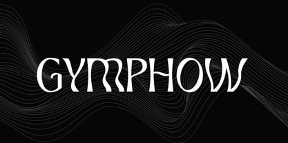 Introducing our new product the name is Gymphow Modern Serif Font Family comes with 9 different weights. Modern Sans Serif font that feels beautiful classy, elegant, and modern. This font is perfectly suited for a wide variety of projects, such as signature, stationery, logo, wedding, typography quotes, magazine or book covers, website headers, clothing, branding, packaging design, and more. Also for fashion-related branding or editorial design and displays both masculine and feminine qualities.

