10,000 search results
(0.031 seconds)
- Liebfraumilch by Yanone,
$25.00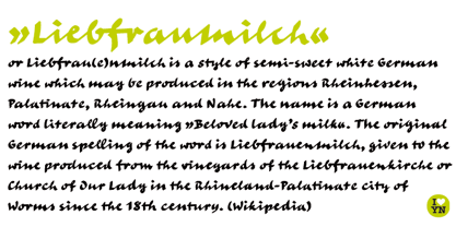 Liebfraumilch is a vivid handwriting script that relies on the OpenType features Contextual Alternates, Discretionary Ligatures and Stylistic Alternates, which are available only in OpenType-aware applications such as the Adobe Creative Suite or Quark Xpress. Liebfraumilch or Liebfrau(en)milch is a style of semi-sweet white German wine which may be produced in the regions Rheinhessen, Palatinate, Rheingau and Nahe. The name is a German word literally meaning "Beloved lady's milk". The original German spelling of the word is Liebfrauenmilch, given to the wine produced from the vineyards of the Liebfrauenkirche or Church of Our Lady in the Rhineland-Palatinate city of Worms since the 18th century. The spelling Liebfraumilch is more common on labels of exported wine. (Wikipedia)
 - DF Etalage Script by Dutchfonts,
$33.00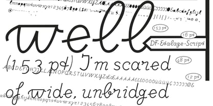 Etalage Script was drawn for the first time in the year 2000, based on a early 20th century lettering stencil with what farmer Boelema at Lalleweer stenciled his grainsacks. Eventually the script letter was developed as a typeface with a wink to the ‘lost’ display types for the ‘display window’ of graphic designer Ariënne Boelens, who in exchange made the website www.lalleweer.nl. What originated the Ariënne should be evident now.
 - Envelope by HyperCGI,
$59.00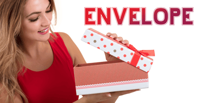 Whether or not you still use snail mail, there's something about folding a piece of card or paper and putting it inside a pristine white envelope. A sense of nostalgia or the tactile pleasure of mailing a card to someone you care for. The Font "Envelope" reminds us of the often overlooked innocent and fine wrapping. Envelope is an excellent display uppercase-only font for use on larger font display purposes.
 - Magnetica by Galaxa,
$10.00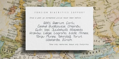 Magnetica font family combines design simplicity of modern sans serifs with a futuristic feel based on semi-rounded concept. Its fluent lines can bring unusual spark to logo designs, headlines, magazine designs, quotes, documentaries, advertisements or similar projects. This font, especially its Italic variation, will find its use also in larger text blocks where simplicity, clean lines and well applied kerning is a must. Create something spectacular with Magnetica.
 - Hancock Pro by Red Rooster Collection,
$60.00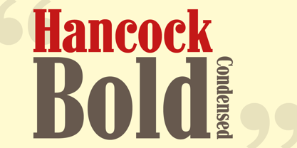 Hancock Bold Condensed is slab serif typeface. The original Hancock design was produced by the Keystone Type Foundry, circa 1903; a condensed version was added circa 1917 by Lanston Monotype. Steve Jackaman (ITF) designed and produced a digital version of Hancock in 1994, and completely redrew the typeface for its 2017 release. The new version has a 40% larger glyph set, and supports Latin 1 plus Central/Eastern European languages.
 - Mr Porter by Pelavin Fonts,
$20.00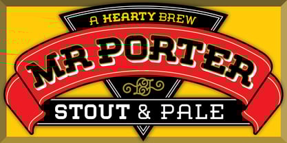 A robust, mono-weight typeface with gently rounded slab serifs, Mr. Porter harkens back to celebrated roots in late 17th Century England. Not for the meek or faint-of-heart, it lends a nutty, chocolaty, toffee flavor to both a stout and pale variety, with lots of malty goodness. Rich and full-flavored with notes of coffee, licorice and molasses, it promises delightful pairings for an infinite variety of typographic solutions.
 - Messner by Juraj Chrastina,
$29.00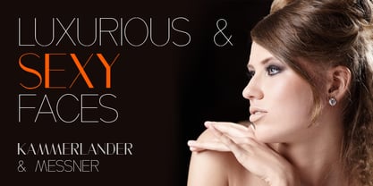 Hairline fonts are very clean, shining, elegant and even luxurious. They look great in fashion magazines, in the expansive world of beauty and glory. Messner is an extra-light all-caps face, especially suitable for larger sizes. Simplicity, purity and readability of its classic forms were on the first place in the creation process. Messner was a resource for designing the Kammerlander family and their combination looks very natural.
 - ITC Regallia by ITC,
$29.99The calligraphic ITC Regallia is, like ITC Samual, a work of Phill Grimshaw. Generous capitals contrast beautifully with reserved lower case letters whose flowing ascenders and descenders create the flow which characterizes this font. ITC Regallia is graceful and almost poetic, its capitals also suited for use as initials. ITC Regallia includes several ligatures and is best used for short and middle length texts in point sizes of 12 and larger. - Phantasm by Partnrz,
$15.00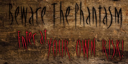 Beware of the Phantasm! Just in time for Halloween, Phantasm is perfect for your creepiest projects. It has great legibility and boasts a much larger character set than most display fonts. It can look wispy and vaporous, or you can make it look like it has been scratched into a surface by hand. All letterforms use a minimum of strokes and the gentle curves reinforce the hand-etched look.
 - Scruff by ITC,
$29.99Scruff was designed by Timothy Donaldson in 1995. This cheerful, laid-back font is made out of a variety of different fragments - stripes, dots, zigzags and more, giving each character its own identity. When brought together into words and sentences, the figures create a playful chaos like that of a patchwork quilt. To bring out its individual details, Scruff is best used in headlines in larger point sizes or as initials. - MFC Westport Monogram by Monogram Fonts Co.,
$19.95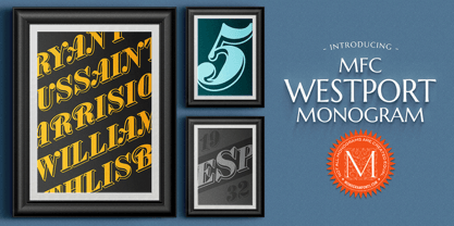 The inspiration for MFC Westport Monogram was a heavily soiled vintage lettering & penmanship book which only listed this alphabet specimen as "Banker Tilted". The look and feel of this typestyle is reminiscent of old checks and cartography lettering styles, lending itself a wonderful sense of antiquity for any monogram or headline typeset with it. Download and view the MFC Westport Monogram Guidebook if you would like to learn a little more.
 - Zera JNL by Jeff Levine,
$29.00Zera JNL is one of those fonts that defy any simple description. While trying out effects on Transactive JNL, Jeff Levine came up with a set of letters comprised of intersecting rings that could illustrate chain, cellular structure, bubbles or probably anything your imagination can come up with to adapt the font to a particular project. Please keep in mind this design works best in larger point sizes. - DF Ariënne by Dutchfonts,
$33.00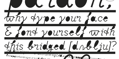 The Etalage-script has been drawn for the first time in the year 2000, based on a early 20th century lettering stencil with what farmer Boelema at Lalleweer stenciled his grainsacks. Eventually the script letter was developed as a typeface with a wink to the ‘lost’ displaytypes for the ‘display window’ of graphic designer Ariënne Boelens, who in exchange made the website www.lalleweer.nl. What originated the Ariënne should be evident now.
 - Blippo by Linotype,
$40.99Blippo Black with its constructed style is a typical headline typeface. Its robust figures with their even strokes were composed using the basic forms of the circle and rectangle. Its curves are often not completely closed. The figures of Blippo Black form dark, heavy lines, making the typeface suitable only in middle and larger point sizes. Blippo Black will make an impression when used for flyers and correspondence. - Linotype Rory by Linotype,
$29.99Linotype Rory oblique is part of the Take Type Library, selected from contestants of Linotype’s International Digital Type Design Contests of 1994 and 1997. The font was designed by Canadian Tad Biernot with strictly constructed forms. The similarly formed figures seem mechanically created and their light slant gives the impression of strenght and dynamism. Linotype Rory oblique should only be used in the shorter texts of headlines in larger point sizes. - Agave by Jonahfonts,
$35.00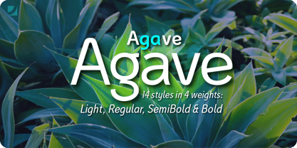 Agave a sans-serif family with 14 styles and 4 weights. The Light, Regular & Semibold contain Italics and Condensed styles, the Bold comes only in its' upright and Italic styles. A text family designed to easily be read in lower point sizes as well as larger display sizes. Providing a legible print, web or e-book family suitable for reading and not calling attention to its' letter-graphics.
 - Kazootie by Chank,
$99.00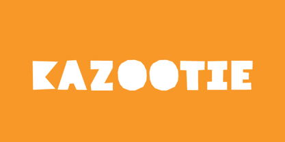 Kazootie was inspired by cut-paper shapes and named after the hand puppet character Rootie Kazootie in a 1950s children's television show. Kazootie is a light-hearted and fun display font with a big, strong voice and crisp confident stride. Best for headlines and larger text in picture books, Kazootie is all caps, but you can type your letters in uppercase or lowercase to access two different variants of the style.
 - Christon Hunington by HansCo,
$15.00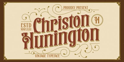 Christon Hunington is a Vintage typeface font, it will add an old-time charm to any design project. It was made with the intention of being used for product Logo like a Pomade, Coffee, Barber shop or packaging label. It’s great also for Branding, Logo designs, Lettering, Logotype, Craft, Posters and much more. Features : Uppercase & Lowercase Numbers & Punctuation Multilingual Alternate character & ornament How to access alternate / ornament ? : https://hanscostudio.com/tutorial/ Enjoy!
 - Renos Rough by Graphite,
$18.00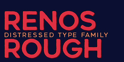 Reno Rough is a distressed display typeface family with an eroded rustic look, yet a distinct geometric spirit. It is an all caps font family with variations in the roughness in upper and corresponding lower case glyphs to eliminate identical distress pattern in repeated adjacent letters. Reno Rough works well for smaller as well as larger point sizes, but is especially suited for headlines, titles, headers, posters, packaging and branding.
 - Aysiano by Bean & Morris,
$42.00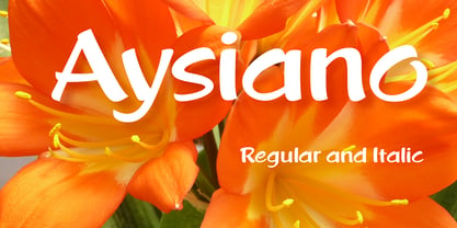 Aysiano Regular and Italic is a casual sans serif typeface with its influence originating from Eastern broad brush style calligraphy. It includes selected swash caps to vary the settings where required. With a slick, fresh feel, capturing the spontaneity of brushed hand lettering, it will be suited to many applications especially as a display font although it can also be used in larger text sizes with great legibility.
 - Dalcora by Linotype,
$29.99Dalcora was designed by Erwin Koch in 1989 in a single weight. The most distinguishing characteristic of this font is its unusual proportions. Text fonts are usually designed with more delicate horizontal strokes as the verticals, but Dalcora is exactly the opposite. Its slight slant to the right and the round forms of the letters make the font dynamic and cheerful. Dalcora is intended exclusively for headlines in larger point sizes. - Bodyhand by Bodyhand,
$10.00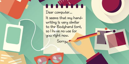 The main problem with handwritten fonts is the limited use in body text. Bodyhand is specifically designed to remedy this, for example when designing children's books with a larger amount of text or in similar contexts. Bodyhand is especially adapted to read comfortably even when used in small font size and requires approximately the same space as the fonts we usually use in body text, such as Times or Helvetica.
 - Modet by Plau,
$30.00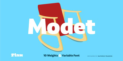 Modet is a versatile and friendly humanist sans-serif prepared for all typographic tasks. It is quite readable in smaller sizes and shows its character in larger sizes. You can change the face of Modet through its many alternate characters and OpenType features. This versatility makes it a great performer in editorial and branding projects. Modet comes in 10 roman styles, from thin to 'ultra black' and speaks 289 languages.
 - Diskus by Linotype,
$29.99Fonts based on handwritten forms enjoyed a revival in popularity in the 1930s. Diskus was designed by Martin Wilke in 1938 and exhibits many traits of modern script and brush typefaces. The informal and energetic Diskus is a script and brush font for daily use and the capitals can be used as initials mixed with other fonts. Diskus is particularly good for titles or texts in middle to larger point sizes. - Rosengarten by Typogama,
$19.00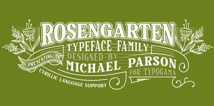 Rosengarten is a condensed, bold typeface inspired by the work of Lucien Bernhard and the Plakatstil mouvement. With bold, rounded serifs, this typeface was created for use in headlines and larger point sizes. A complimentary sans serif style was integrated as a secondary weight with accompanying italics to allow a combination of styles to be set in layouts. This typeface includes an extended Latin and Cyrillic language support.
 - Gatlinburg Gossamer NF by Nick's Fonts,
$10.00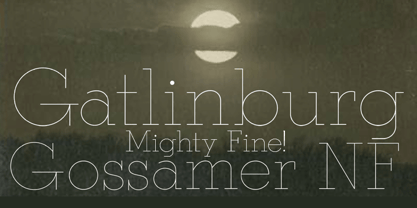 The original characters, and now-rarely-seen alternate characters, for Memphis, designed by Emil Rudolf Weiss for American Type Founders in 1930, provided the pattern for this wispy, ultralight typeface. Although intended primarily for headlines, this typeface can also be used for brief blocks of text, if set 18 pt. or larger. Both versions of the font include 1252 Latin, 1250 CE (with localization for Romanian and Moldovan).
 - Bertie by ITC,
$29.99Bertie was designed by Alan Meeks in 1986, an ornamented typeface with a light and elegant look. Such typefaces were at their peak in the middle of the 19th century, when they were created for the advertisements of booming industries. The sophisticated Bertie is based on forms of the transitional period and is best used in headlines with point sizes of 18 or larger to highlight its unique details. - Wilhelm Klingspor Gotisch by Linotype,
$40.99Wilhelm Klingspor Gotisch appeared in 1925 with the Klingspor font foundry in Offenbach, Germany. Designer Rudolf Koch based his work on the Gothic forms of the 14th century and his broken letter font is often seen in advertisements. However, the ornamental letters do not match today’s legibility standards and Wilhelm Klingspor Gotisch is therefore recommended for use in headlines and short texts with a point size of 12 or larger. - Neue Northwest by Kaligra.co,
$19.00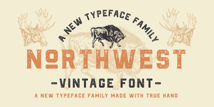 Neue Northwest is a vintage sans serif family, Inspired by Vintage Wild west culture and combining with modern vintage touch. An All-Caps Sans Serif pairing with a Clean, Rounded & textured version of each. Choose between varying texture strength for your desired effect. This font is great for logo print, Restaurant Menus & Signage, Pubs, Bars, Tattoo Shops, Barber Shops, Butcher Shops, Handmade Brands, BBQ, Anything vintage styles related, etc
 - Odell by The Organic Type,
$29.99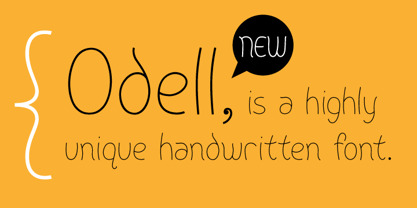 Odell is a fun, whimsical, yet elegant handwritten font that was created in a light-hearted manner for use in things like menus, invitations, bed and breakfast collateral and whatever else you can dream up. Odell features extra thin letters and it is designed to be creative, a little fancy, and very legible. There are tons of foreign characters to choose from so you can write in other languages as well.
 - Robert Moore by Harvester Type,
$15.00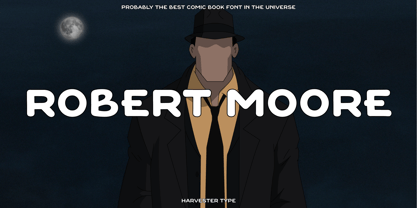 Robert Moore is a font that was specially designed for comics. A lot of work has been done. At first, glyphs were drawn manually using different markers, then they were transferred to the font. The font was tested on real printing and digital comics. The world of fonts for comics is big and I wanted to create even more variability for authors with one family, which is why a variable version was created containing two axes: weight and italics. This gives you more options. A large number of glyphs, multilingualism, ligatures, and a capital give even more scope for work and creativity. The name was created from the names of the authors of the comics Robert Kirkman and Alana Moore, so the Robert Moore font turned out. Although the font was made for comics, it is not limited to them. Posters, logos, covers, text, headings, prints, product design, web, interfaces are not all options for using the font.
 - Garlic Salt by Adam Ladd,
$19.00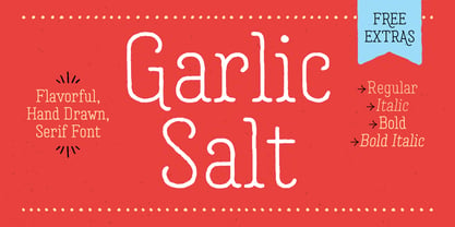 Garlic Salt is a flavorful, hand drawn, serif font family. Drawn with a single marker pen, it has a monoline appearance giving it a distinct mix of whimsical and modern qualities. The semi-condensed propositions are sturdy and space-saving for your layouts. Choose from either the regular weight or a slightly thicker line in the bold weight to suit your needs. It works great set large as a display font to show off the hand drawn texture, but it also is pleasantly readable set in smaller point sizes because of the carefully drawn letterforms. BONUS: Garlic Salt also comes with a free Extras font of matching ornaments and dingbats to complement your designs! Special features include stylistic alternates and swashes to enhance the type to your liking. Those glyphs are also PUA-encoded to make them accessible in software that is not OpenType-savvy. This font has extensive Latin language support.
 - Wasted Youth by Wing's Art Studio,
$12.00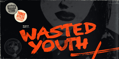 Wasted Youth: A 90s Grunge Inspired Brush Font by Wingsart Studio Wasted Youth is a versatile brush font with shades of grunge, punk and horror. The font comes in three styles including a clean-edged original, plus two additional versions drawn with inky brush and marker pen. It takes inspiration from 90s grunge bands, with a hand-made punk aesthetic that’s equally at home in music videos, album covers, horror movies and skate culture. It aims to combine the best of these popular looks into one versatile font. Along with its unique uppercase and lowercase characters, Wasted Youth also comes with a host of custom ligatures, underlines and alternatives, along with numerals, punctuation and language support. It’s a truly flexible font that can be shaped into titles and headlines that look authentically hand-made. Try it on t-shirts, posters, stickers, movie titles, YouTube videos and more! Check out my visuals to see it in action.
 - Wonky by Ana's Fonts,
$16.00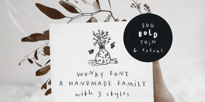 The Wonky Font family is a set of 3 handmade fonts, made using three different materials: a pencil, a thin fineliner and a bold marker. Each font includes 3 variations for each letter and number, accessible through contextual alternates, for extra realism and fun. The pencil font is a SVG font, which allows for the texture of the pencil to be captured in a more authentic way, and is complemented with an extra doodles font. Wonky Font looks good at small sizes and will also look great in all caps texts. Use Wonky Font in designs such as postcards and notes, posters, logotypes, social media posts, branding and packaging. This font includes: a Wonky Pencil SVG font, with a vector alternative that preserves the texture a Wonky Thin font a Wonky Bold font a Wonky SVG Extras font, with 26 pencil doodles Software requirements for the SVG font: Photoshop CC2017+ // Illustrator CC2018+
 - CarlMarx by Adobe,
$29.00This typeface is based on lettering by Carl Marx (1911?1991), designed during his first semester at the Bauhaus in Joost Schmidt?s class, in 1932. Although the letter proportions are based on Schmidt?s teachings, the forms are not constructed from compass and ruler, but drawn with brush and marker, lending the words a warm and lively touch. Hidetaka Yamasaki redrew the letters from scratch and added all missing characters for today?s needs. A set of hanging figures, alternates for some critical letterforms (such as f, r, and t) as well as several ligatures make CarlMarx especially suitable for use in body text. As suggested by Marx, Yamasaki captured two weights from the original drawing and perfectly adjusted light and bold to highlight words and create hierarchy in headlines ? without losing or adding space. True to the original, Yamasaki captured the wobbly contour in CarlMarx, preserving warmth in the condensed geometric style of the early 1930s. - Rafisqi by Suamzu Art,
$13.00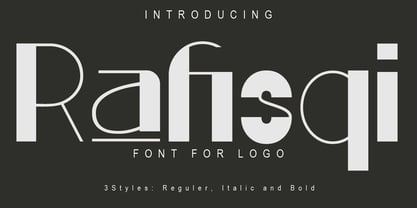 Rafisqi is a new font for a minimalist logo design. This font is suitable for creating word markers, titles, taglines. Use alternatives to set separate fonts in your text, unite thick and thin lines with your design techniques, so as to produce a very unique shape. Rafisqi font is perfect for designing company logos, online game logo, magazine covers, biographical book covers, business cards and all your design work, of course. to be more attractive in appearance, it helps you combine the Rafisqi font with other fonts so that your design looks more attractive Rafisqi is the display font, so it can not be the best choice for continuous text. Font contains: 3 letter styles 3 choices of basic replacement letters 3 number choices Ligature punctuation All character options are included in one font. You can use ligature in most major image editors, just look for the glyhps menu there. For example, in Adobe Illustrator you must select the Window Type glyhps menu item.
 - Carnival by House Industries,
$33.00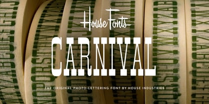 Unlike the modest fonts in your menu content with discreetly imparting information, Carnival is conspicuous by design. Deliberately engineered to attract eyeballs, the typeface’s unmistakable silhouette produces a dramatic visual texture that stands out in print, on screen, or in any environment where your message demands to be noticed. The steady yet vibrant rhythm created by its letterforms also makes Carnival ideal for fashioning alphabet patterns and graphic devices. Flaunting a lean slender body anchored by stout stroke endings, Carnival turns conventional typographic thinking on its head by inverting the relative thickness of its stems and serifs. This reverse-contrast approach stretches all the way back to the roots of modern advertising, when similar types became the favorite for posters, packaging, and loads of consumer products during the 1800s. The striking style prevailed well into the next century, as Harold Horman, co-founder of New York City-based Photo-Lettering. Inc., modernized a version for the company’s popular film-typesetting service in the early 1940s. Digitized and expanded by Dan Reynolds in 2013, Carnival had previously been used exclusively for House Industries projects. Now you can get in on the action, and use this stunning slice of type history anytime you want your work to turn heads. SUGGESTED USES Carnival’s unique character commands attention, making it the perfect voice for promotional pieces, editorial design, labels, packaging, posters, and any other application that needs to strike the right tone. Like all good subversives, House Industries hides in plain sight while amplifying the look, feel and style of the world’s most interesting brands, products and people. Based in Delaware, visually influencing the world.
 - Resist Sans by Groteskly Yours,
$25.00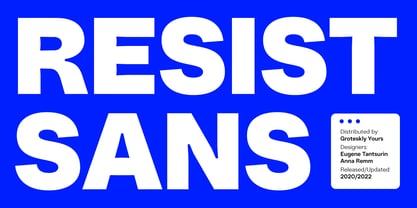 Resist Sans is a free-spirited neo-grotesque that embodies both the innate desire for revolt and a tendency towards uniformity. While Resist Sans preserves the neat, minimalist look which is associated with neo-grotesques, it also accentuates the tentativeness of each letter form. The name, too, hints at the rebellious character of the typeface. Resist Sans comes in 28 styles (14 uprights and matching obliques). Text vs Display Resist Sans comes in two versions: Display and Text, which serve different purposes but remain interchangeable and even complementary in some cases. Resist Text is equipped with deep ink traps and optical compensators, which really come into play at smaller sizes. The Display version is smoother and more consistent, so better for use in larger sizes and headlines. Styles/Weights Each of the two versions of Resist Sans comes in 7 weights (Thin to Black) and is equipped with matching Obliques, which brings the total number of styles to 28. Two trial styles (Text Light and Display Medium Oblique) can be downloaded free of charge. Each style contains 900+ glyphs, awesome OpenType features, and around 1500 kerning pairs. Language Support Resist Sans is truly multilingual. It supports most European and Latin-languages and features Extended Cyrillic, which gives access to such languages as Ukrainian, Bulgarian, Serbian, Russian, Macedonian and many more. Free Styles Two styles of Resist Sans can be downloaded for free on MyFonts. Type Specimen Resist Sans PDF Type Specimen can be downloaded here: Resist Sans PDF Type Specimen
 - Linotype BlackWhite by Linotype,
$29.99BlackWhite is a titling typeface created by Ferdinay Duman in 1989 styled after the designs of the late 1980s. Like the name says, the figures emphasizes the play between dark and light. To this end, most inner spaces have been deleted. The constructed outlines of the robust figures draw the attention. In some weights, Duman split the figures horizontally, giving them a unique look. The technical and mechanical BlackWhite is perfect for generous headlines on fliers or in trendy magazines. - Pina Colada by Larin Type Co,
$12.00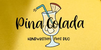 Pina Colada this beautiful handwritten font duo is a smooth script and playing sans, they perfectly combine and complement each other, they will bring their unique style to any design project and make it unique. It is as sweet as Pina Colada, fall in Love with its incredibly versatile and simple style and use it to create gorgeous wedding invitations, beautiful stationery, greeting cards, attractive social media messages and more! This font is easy to use, has OpenType features, and supports PUA encoding.