10,000 search results
(0.043 seconds)
- S Water Jump by Supfonts,
$10.00 Water Jump will be perfect for wedding lettering, beautiful frame for your home, book covers, greeting cards, logos, marketing, magazines or anything that requires cute handwritten lettering :) What's inside: Multilingual support Cricut support If you have any questions, please contact me directly or in instagram @superdizigner
 - El Masterico by OKSHUtypeCO,
$14.00 El Maestro - a new fresh unique font. Very suitable for greeting cards, branding materials, business cards, quotes, posters, and more!This font are perfect for wedding postcard. Or you can create perfect and unique design of your logo, blog, stationery, marketing, magazines and more :) Multilingual OK!!!
 - Ricardo Montero by Supfonts,
$12.00 Ricardo Montero will be perfect for wedding lettering, beautiful frame for your home, book covers, greeting cards, logos, marketing, magazines or anything that requires cute handwritten lettering :) What's inside: Multilingual support Cricut support If you have any questions, please contact me directly or in instagram @superdizigner
 - Banuchi by OKSHUtypeCO,
$12.00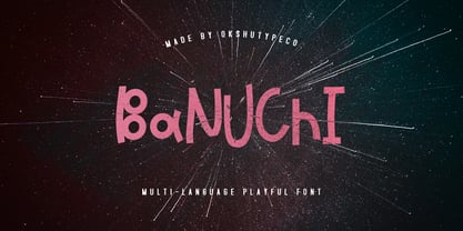 Banuchi - a new fresh handmade playful font. Very suitable for greeting cards, branding materials, business cards, quotes, posters, and more!This font are perfect for wedding postcard. Or you can create perfect and unique design of your logo, blog, stationery, marketing, magazines and more :) Multilingual OK
 - Woodpecker by profonts,
$41.99 Woodpecker is a self-confident, sturdy caps-only sans serif design imitating grained wood created and digitized by German type designer Ralph M. Unger for the profonts library. Woodpecker is perfectly suited for any graphic work around timber, lumber, prperty markets, carpenter, furniture and so on.
 - Pretty Letters by Supfonts,
$14.00 Pretty Letters will be perfect for wedding lettering, beautiful frame for your home, book covers, greeting cards, logos, marketing, magazines or anything that requires cute handwritten lettering :) What's inside: Multilingual support Cricut support If you have any questions, please contact me directly or in instagram @superdizigner
 - Alaska by Solotype,
$19.95This interesting type was introduced by the Chicago firm of Marder, Luse & Company in 1890, about the time designers were beginning to lose some of the excessive ruffles and flourishes that characterized the Victorian age. Originally a caps-only font, we have added a lowercase to match. - Panoramic by Supfonts,
$9.00 Panoramic will be perfect for wedding lettering, beautiful frame for your home, book covers, greeting cards, logos, marketing, magazines or anything that requires cute handwritten lettering :) What's inside: Panoramic Script Multilingual support Cricut support If you have any questions, please contact me directly or in instagram @superdizigner
 - Shabon Dama by Abdulrhman Saeed,
$19.99 Shabon Dama is a cheerful fun Arabic typeface, it bridges the gap between formal and fun, thus keeping it readable. It fits well with video games rated for everyone, kids comics and books, and cheerful marketing. Featuring three weights: Light, Regular, and Bold. ARABIC CHARACTERS ONLY.
 - Bubble Dubble family by OKSHUtypeCO,
$9.00 Bubble Dubble- a new fresh handmade playful font. Very suitable for greeting cards, branding materials, business cards, quotes, posters, and more!This font are perfect for wedding postcard. Or you can create perfect and unique design of your logo, blog, stationery, marketing, magazines and more :) Multilingual OK
 - Colore by FSdesign-Salmina,
$39.00 Colore. Colourful and Modular. A happy and colourful New Year from the FSdesign team. In order not to lose the joy of playing, we provide the "Colore" font family: a modular font kit, that encourages to play. By superimposing the different font styles you can create a colourful typographical staging. This New Year's card was realized with the help of "Colore". Too wild? auto-referential? Try Colore and form your own opinion.
 - ThomasSchrift by URW Type Foundry,
$39.99 Since better (larger) text samples were available for Thomas Versalien, this font is closer to it's original.
 - Malutzki Initials by Spirit & Bones,
$15.00 In 1980, Peter Malutzki, Heidi Hübner-Prochotta and Manfred Prochotta founded the FlugBlatt-Presse and began producing broadsheets, which they called FlugBlätter and which also gave their press its name. They were mostly woodcuts or linocuts, combined with hand-set typography. When they finished the series in 1984 there were 67 FlugBlätter. During a Frankfurt Book Fair in the 1980s the collector Rob Saunders acquired FlugBlatt No. 37 along with other prints. Later they became part Letterform Archive, a non-profit museum and special collection library in San Francisco, which Rob Saunders founded in 2014. In 2021, Letterform Archive posted the FlugBlatt No. 37 on social media, where type designer Lena Schmidt saw it, immediately fell in love with it, and developed the plan to bring it into the digital world. After contacting Peter Malutzki – who is still working as a book artist today – and in close consultation with him, Schmidt translated the letterforms into a font series, Malutzki Initials. The three fonts can be used for black (single-color) text using the Regular style, or for multicolor text by applying different colors to the Letter Layer and Figure Layer styles.
 - Plantin Infant by Monotype,
$29.99Plantin is a family of text typefaces created by Monotype in 1913. Their namesake, Christophe Plantin (Christoffel Plantijn in Dutch), was born in France during the year 1520. In 1549, he moved to Antwerp, located in present-day Belgium. There he began printing in 1555. For a brief time, he also worked at the University of Leiden, in the Netherlands. Typefaces used in Christophe Plantin's books inspired future typographic developments. In 1913, the English Monotype Corporation's manager Frank Hinman Pierpont directed the Plantin revival. Based on 16th century specimens from the Plantin-Moretus Museum in Antwerp, specifically a type cut by Robert Granjon and a separate cursive Italic, the Plantin" typeface was conceived. Plantin was drawn for use in mechanical typesetting on the international publishing markets. Plantin, and the historical models that inspired it, are old-style typefaces in the French manner, but with x-height that are larger than those found in Claude Garamond's work. Plantin would go on to influence another Monotype design, Times New Roman. Stanley Morison and Victor Larent used Plantin as a reference during that typeface's cutting. Like Garamond, Plantin is exceptionally legible and makes a classic, elegant impression. Plantin is indeed a remarkably accommodating type face. The firm modelling of the strokes and the serifs in the letters make the mass appearance stronger than usual; the absence of thin elements ensures a good result on coated papers; and the compact structure of the letters, without loss of size makes Plantin one of the economical faces in use. In short, it is essentially an all-purpose face, excellent for periodical or jobbing work, and very effective in many sorts of book and magazine publishing. Plantin's Bold weight was especially optimized to provide ample contrast: bulkiness was avoided by introducing a slight sharpening to the serifs' forms." - Plantin Headline by Monotype,
$29.00Plantin is a family of text typefaces created by Monotype in 1913. Their namesake, Christophe Plantin (Christoffel Plantijn in Dutch), was born in France during the year 1520. In 1549, he moved to Antwerp, located in present-day Belgium. There he began printing in 1555. For a brief time, he also worked at the University of Leiden, in the Netherlands. Typefaces used in Christophe Plantin's books inspired future typographic developments. In 1913, the English Monotype Corporation's manager Frank Hinman Pierpont directed the Plantin revival. Based on 16th century specimens from the Plantin-Moretus Museum in Antwerp, specifically a type cut by Robert Granjon and a separate cursive Italic, the Plantin" typeface was conceived. Plantin was drawn for use in mechanical typesetting on the international publishing markets. Plantin, and the historical models that inspired it, are old-style typefaces in the French manner, but with x-height that are larger than those found in Claude Garamond's work. Plantin would go on to influence another Monotype design, Times New Roman. Stanley Morison and Victor Larent used Plantin as a reference during that typeface's cutting. Like Garamond, Plantin is exceptionally legible and makes a classic, elegant impression. Plantin is indeed a remarkably accommodating type face. The firm modelling of the strokes and the serifs in the letters make the mass appearance stronger than usual; the absence of thin elements ensures a good result on coated papers; and the compact structure of the letters, without loss of size makes Plantin one of the economical faces in use. In short, it is essentially an all-purpose face, excellent for periodical or jobbing work, and very effective in many sorts of book and magazine publishing. Plantin's Bold weight was especially optimized to provide ample contrast: bulkiness was avoided by introducing a slight sharpening to the serifs' forms." - Milford by SparkyType,
$19.00Milford is a font with its feet planted in several styles of design. It has aspects of Art Deco shapes and proportions, but has modern additions and tweaks that make it a handsome substitute for your tired heading fonts. Because of its tight spacing and filled, super-black forms, it responds nicely to treatments such as negative letter spacing and outlining. - Kempoka by Hanoded,
$15.00 Kempoka is a Japanese word describing someone who practices Kempo. Kempo, or Chuan Fa in Chinese, is a martial art with roots in China and Japan. I thought of this brush font just before my weekly kempo-training and I figured the name suited the font style. Kempoka comes with alternates and ligatures, and has a black belt in diacritics!
 - Srostky by Nikita Kanarev,
$25.00 The Srostky font is willful and stubborn. It is rude, but it is as natural as a country boy. The characters of this font were inspired by an image of the Russian countryside. The letters look as if they were felled with an ax. It is named after the village in Altai region. This font is suitable for short sayings and titles.
 - Farquharson by Quadrat,
$25.00Farquharson is an all-caps display face, adapted from an early American woodtype, and designed especially for use in the book Charlie Farquharson’s Unyverse. The complete family consists of two fonts: a regular version and a stencil version. Alternate versions with slightly elongated feet are provided for A, H, K, M, N and R. Very eccentric, it is best used in small doses. - Small Talk - Unknown license

- Ergonomix - Unknown license

- Ergonome - Unknown license

- Beneta by Linotype,
$29.99Karlgeorg Hoefer designed Beneta in 1991, inspired by the Littera beneventana, the script of the Benedictine scribes from the 10th to the 12th century. During this time, scribes began to use wider pens and set them at a 45 degree angle to the paper, which caused their scripts to have radical stroke contrasts. This script was mainly used for books and certificates but disappeared by the end of the 13th century. Beneta revives the characteristics of this historic script, changing a line of text into an almost ornamental space. Beneta should be used in middle to larger point sizes for shorter texts and headlines. - IronGlass DropCaps - Unknown license

- Vintage Hands by Intellecta Design,
$24.90 Vintage Hands is a collection of pointing hand illustrations, suitable for modern designs. The hands has pointing, counting, signaling, demonstrating, writing, playing and other positions.
 - How To Consume Oxygen by Vic Fieger,
$8.99How To Consume Oxygen was created with the plan of emulating words written on a fluted-steel 'warehouse'-type door in advanced state of rusting. - Reina Neue by Lián Types,
$29.00 Hey! See Reina Neue in action here! INTRODUCTION When I designed the first Reina¹ circa 2010, I was at the dawn of my career as a type designer. The S{o}TA, short for the Society of Typographic Aficionados, described it as complex display typeface incorporating hairline flourishes to a nicely heavy romantic letterform². And it was like that; that’s what I was pursuing at that time since I was very passionate about ornaments and accolades of Calligraphy. Why? I felt that Typography, in general, needed more of them. These subtle flourishes could breathe life into letters. Maybe, I thought it was the only way I could propose something new into the field of type. However, after some years, I came across a very interesting quote: –Beautiful things don’t ask for attention– Wow! What did this mean? How could something be attractive if it’s not actually showing it. Could this be applied to my work? Sure. I think every type-designer goes through this process (aka crisis) regarding his or her career. At the beginning we love everything. We are kind of blind, we only see the big picture of a project. And that’s not because we are lazy. We actually can’t see the small mistakes nor the subtleties that make something simpler beautiful. We are not able. But, the small subtleties… They are actually everything: With experience, one puts more attention into the details and learns that every single decision in type has to be first meticulously planned. Here I am now, introducing a new Reina, because I felt there was a lot of it that could be improved, also the novelty of Variable Fonts caught my attention and I had to take that to my type library. THE FONT A thing of beauty is a joy forever Now, a decade later, I’m presenting Reina Neue. This font is not just an update of its predecessor: –A thing of beauty is a joy forever– is the first line of the poem ‘Endymion’ by John Keats, and despite the meaning of “beauty” may vary from person to person, and even from time to time (as read in the last paragraph), with Reina I always wanted to bring joy to the eye. In 2010, and now, in 2020. I believe the font is today much better in every aspect. It was entirely re-designed: Its shapes and morphology in general are much more clean and pure. The range of uses for it is now wider: While the old Reina consisted in just one weight, Reina Neue was converted into a big family of many weights, even with italics, smallcaps and layered styles. The idea behind the font, this kind of enveloping atmosphere made out of flourishes, is still here in the new Reina. This time easier to get amazing results due to the big amount of available alternates per glyph and also more loyal from a systemic point of view. However, and as read in the introduction -Beautiful things don’t ask for attention-, if none of the flourishes are activated the font will look very attractive anyway. Reina Neue is ready to be used in book covers, magazines, wedding cards, dazzling posters, storefronts, clothing, perfumes, wine labels and logos of all kind. Like it happened with the previous Reina, I hope this new font satisfies every design project around the world if used, and can be a joy forever. SOME INSTRUCTIONS Before choosing the right style for your project, hear my advice: -Reina Neue Display was meant to be used at big sizes. If you plan to print the font smaller than 72pt, I suggest using Reina Neue, not Display. Otherwise, if the font will be BIG or used on a digital platform, Reina Neue Display should be your choice. For even smaller sizes, use Reina Neue Small. This style was tested and printed in 12pt with nice results. (Note for variable fonts: Print them in outlines) -Reina Italic is not a slanted version of the roman, and this means some flourishes are different between each other. The Italic version has other kind of swirls. More conservative, in general. -All the styles of Reina Capitals have Small Capitals inside. -Reina Capitals Shine should be used/paired ONLY with Reina Capitals Black. The engraved feeling can be achieved if Reina Capitals Black and Reina Capitals Shine are used as layers, with the same word. Variable fonts instructions: -For more playful versions, choose Reina Neue VF, Reina Neue Italic VF or Reina Neue Capitals VF: With them you can adjust between 3 axes: Weight (will change the weight of the font) – Optic Size (will thicken/lighten the thin strokes and open/close the tracking) – Accolades (will modify the weight of the active flourishes). SOME VIDEOS OF REINA NEUE VF https://youtu.be/8cImmT5bpQM https://youtu.be/1icWfPmKAkg https://youtu.be/YC9GkJDL1a8 NOTES 1. The original Reina, from a decade ago: https://www.myfonts.com/fonts/argentina-lian-types/reina/ 2. In 2011, Reina received an honourable mention by S{o}TA. “Great skill is shown in the detailing, and an excellent feel for the correct flow of curves and displacement of stroke weight.” https://www.typesociety.org/catalyst/2011/ Reina was featured in the “Most Popular Fonts of the year” in MyFonts in 2011 https://www.myfonts.com/newsletters/sp/201201.html In 2012, the font was also selected in Tipos Latinos, the most prestigious competition of type in Latinoamerica. https://www.tiposlatinos.com/bienales/quinta-bienal-tl2012/resultados Also, chose as a “Favorite font of the year” in Typographica. https://typographica.org/typeface-reviews/reina/
 - Hedgehock by Dirtyline Studio,
$19.00 Hedgehock Script Inspired by Sign painting style and combination with Hand Lettering style. I'm made with personality touch every single curve. I hope this can make inspire you from your work. and a very bouncy baseline It has a perfectly paired complimentary marker font , and a super handy set of bonus Swash. Ideal for logos, handwritten quotes, product packaging, header, poster, merchandise, social media & greeting cards. Opentype Feature Stylistic Alternate Alternative Character Ligature Swash Extended Latin Pro
 - Appetizer by Cititype,
$14.00 'Appetizer' is a casual marker font, this font is suitable for a variety of purposes, it is great for logos, craft, prints, text headers, web banners, writing quotes as well as for video editing, animation and other visual presentations. This font is equipped with ligatures and is supported by multi languages, making it worthy of your bringing to any part of the world. Fall in love with its incredibly versatile style and use it to create spectacular designs!
 - Hai California by Colllab Studio,
$15.00 Meet Hai California, a handwritten font with a fancy script and a small-caps companion, this passionate pair of hand-drawn marker fonts is for logos + branding ,website design + website accents - think travel blogs, fashion blogs, & more, Clean print design, like magazines + flyers, header elements that need handwritten touch, quote graphics for social media. Hai California comes with stylistic alternate, ligatures, swashes, and multilingual support. Follow us for more great fonts. A Million Thanks Colllab Studio
 - Kumo Sans by EchadType,
$10.00 Kumo Sans is a clear and comprehensible font stylized to mimic marker pen handwriting. The idea was to interpret swift and negligent hand movement in a distinct and easy to read familiar glyph silhouette. Family comes in three weights and italic slant option. Shadow version with outline and shadow effect is perfect for short catchy phrases, brand names and headlines use. Font contains Latin diacritics, Hebrew cursive writing, Bitcoin, Indian Rupee, New Israeli Shekel symbols, fractions etc.
 - Salmonillo by Maulana Creative,
$10.00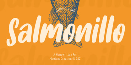 Salmonillo is a Cartoon-is natural handwritten feel font. With marker stroke, slanted and fun character with a bit of ligatures. To give you an extra creative work. Salmonillo font support multilingual more than 100+ language. This font is good for logo design, Social media, Movie Titles, Books Titles, a short text even a long text letter and good for your secondary text font with sans or serif. Make a stunning work with Salmonillo font. Cheers, MaulanaCreative
 - Bumbees by Maulana Creative,
$11.00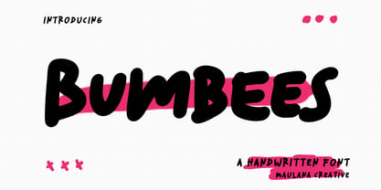 Bumbees is a casual marker handwritten font. With medium stroke, fun character with a bit of ligatures and alternates. To give you an extra creative work. Bumbees font support multilingual more than 100+ language. This font is good for logo design, Social media, Movie Titles, Books Titles, a short text even a long text letter and good for your secondary text font with sans or serif. Make a stunning work with Bumbees font. Cheers, Maulana Creative
 - Destinys by Maulana Creative,
$14.00 Destinys Script and Sans Font Duo is a modern script and display sans font. With regular marker stroke and bold sans stroke, fun character with some of ligatures. To give you an extra creative work. Destinys Script and Sans font support multilingual more than 100+ language. This font is good for logo design, Social media, Movie Titles, Books Titles, a short text even a long text. Make a stunning work with Destinys Script and Sans font. Cheers, MaulanaCreative
 - Belle Helene by Studio Indigo,
$17.00 Belle Helene is a script and symbols font based on handwritten brush letters. The name is inspired by the famous french dessert with the same name (wine cooked pears with vanilla ice cream and chocolate syrup). This soft and smooth shaped font is suitable for restaurants, cafes, shops, bakeries, menus, wedding stationary or wherever a warm and informal feeling is required. It comes with open type features such as standard ligatures and alternate end/initial letters. The symbols font has 62 cute symbols to play around with to spice up your designs. Multilingual support is included for almost all European languages (Diacriticals). Please Note! Test the font in the Font Preview before purchase.
 - ArTarumianKhachatur by Tarumian,
$40.00 This is a font imitating the stage of outline construction of letters using drawing tools - compass and ruler. It is very geometric (with auxiliary lines, axes, centers of circles, tangents, and conjugation of circles), although the circles are somewhat compressed from four sides. The second style, which plays the role of Bold style, is a hatched version of the Regular style. The font has very small elements that appear in a sufficiently large size, so it is better to use it for large compositions, in particular, advertisements, posters, large headings, etc. The family is named "Khachatur" after the name of the father of designer Ruben Tarumian — architect Khachatur Hakobyan, his first master.
 - Hot Rush by Set Sail Studios,
$16.00 Prepare yourself for a wild retro ride with Hot Rush – 80s nostalgia is about hit you harder than a DeLorean at 88 miles per hour. This Sans & Script font duo were simply meant to be together; the unmistakeable clean & condensed sans is complimented perfectly by the long, fast, textured strokes of the script. It’s the ideal font pairing for retro-inspired high impact display text, merchandise design, logos, packaging & more. The Hot Rush font family consists of; Hot Rush Script • A fast, textured script font hand-made with a marker pen. Hot Rush Script contains uppercase-only characters, however a full alternate set of uppercase letters is available when you switch to lowercase. Supports a full set of numerals & punctuation. Hot Rush Sans • A condensed sans-serif font with a big impact, containing uppercase-only characters. Supports a full set of numerals & punctuation. Hot Rush Sans Striped • A second version of Hot Rush Sans, with vertical stripes running through each letter for added retro style. Italic Versions • For Hot Rush Sans & Hot Rush Sans Striped are also included as separate fonts. Extra Stuff; End Forms For Hot Rush Script are available for the letters A, C, E, F, G, H, K, L, R & T. These have elongated horizontal strokes and look great as the last letter of a word. Simply turn on ‘Stylistic Alternates’ with any Opentype capable software to access these characters. 4 Swashes For Hot Rush Script are available, these are great for underlining your text for extra style. Simply type any of the square brackets [ ] { } in the Hot Rush Script font to access the swashes. Language Support; All fonts support English, French, Italian, Spanish, Portuguese, German, Swedish, Norwegian, Danish, Dutch, Finnish, Indonesian, Malay, Hungarian, Polish, Turkish, Slovenian
 - MVB Diazo by MVB,
$59.00 Mundane information—the sort you might ignore—often appears in the form of very simple, utilitarian lettering, devoid of personality, the sort of industrial lettering you find on old blueprints, park restrooms, and electrical boxes. MVB Diazo is such a thing. It looks like lettering done earnestly with a plastic template. The monoline caps—constructed from straight lines and simple curves—have rounded details as if rendered by a blunt pen on a topographical survey or by a router on a rustic campground sign. The MVB Diazo fonts are compact, available in two widths: Condensed and Extra Condensed. Each width offers four weights from Light to Black. The fonts are perfect for wherever plain and boring letterforms are required. All widths and weights are also available in two distressed textures (#1 and #2) that accentuate the industrial character of the design. Rough #1 is gritty, with finer texture for use at larger sizes. Rough #2 exhibits more damage, the roughness apparent when used at smaller sizes. The Rough fonts include alternates of a number of glyphs so that variation of texture is possible when letters repeat in a word.
 - Slug by FaceType,
$18.00 Slug is a clean, geometric font, like those that were widely used in the 1970s. To give the user a wide range of possibilities, we made not only a half, a single and a double version, but also provided a bicolor solution: by combining Bicolor A and B you will create astounding multicolored pieces of typography.
 - Dudek PRO by Hotniedog Studio,
$22.00 Dudek is a highly functional font family. Styles from thin to black with italics for each one, allows to create wide and consistent design systems. I wanted Dudek to be soft and simple. Not too much geometrical, but also not calligraphic in detail. Dudek can help in every day jobs and wide multilingual support leaves no one behind.


