10,000 search results
(0.03 seconds)
- Kessel 205 by Talbot Type,
$19.50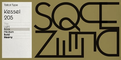 Kessel 205 is inspired by the classic, geometric sans-serifs such as Futura, but has shallower ascenders and descenders for a more compact look, and features an art deco influence with sharp points at the apex of many characters, lowered crossbars and an oblique crossbar on the lower case e. It's a versatile, modern sans, highly legible as a text font and with a distinctive, elegant look as a display font at larger sizes. It includes old style non-aligning (lower case) numbers, both proportional and tabular as well as accented characters for Central European languages. The Kessel 205 family comprises of six weights and is closely related to Kessel 105.
 - Binner Poster by Monotype,
$29.99Binner was designed by John F. Cumming in 1898 and is an alphabet with a strongly historic character. It takes the reader back to the early part of the 20th century, when typefaces of this kind could be found in advertisements on houses and posters. The robust figures display a marked stroke contrast. Particularly striking are the high middle strokes of the E and F as well as the wavy connecting stroke of the H. The curves of the R and P extend well into the lower third of the characters. With its robust figures, Binner is best used for headlines in middle and larger point sizes. - Linotype Minos by Linotype,
$29.99Linotype Minos is part of the Take Type Library, chosen from contestants of Linotype’s International Digital Type Design Contests of 1994 and 1997. This fun font was designed by Swiss artist Christian Goetz, who named it after King Minos of Crete of the Bronze Age. Typical of scripts of this time were the ornamental borders around the characters, found on palaces of Knossos, Phaistos and Mallia. These borders surround every character of Linotype Minos, making it exclusively for headlines in larger point sizes. Single characters can also be used as initials mixed with other alphabets, especially with constructed sans serif and modern serif fonts. - Xcetera by Typogama,
$19.00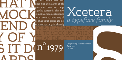 Work for the Xcetera typeface started with the desire to create a classical serif design but using the less contrasted stroke thickness found in a host of sans serif designs. My aim was to retain some of the clarity found in modern strokes yet use the serifs to aid in letter recognition and legibility. The result is a form of hybrid design that is surprising clear in small point sizes yet offer a lot of personality in larger formats. Suited for both display and text settings, Xcetera aims to be both functional and fun while looking to explore new possibilities for the classical typeface style.
 - Gerdika by Mantype Studio,
$22.00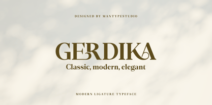 Gerdika is a typeface conceived by Sulai Man specifically for intensive editorial use, mainly in newspapers, magazines, and online, its personality and flexibility make it a true multipurpose typeface. The intermediate weights deliver a neutral look when used in text sizes, providing the usual robustness expected in a newspaper font. The unobtrusive appearance, excellent texture, and slightly colour allow it to behave flawlessly in continuous text, even in the most unforgiving editorial applications. As it becomes larger in print,Gerdika shows its personality through a series of measured particularities which make it easy to remember and identify. Its energetic character, becomes evident when used for subheadings and headlines.
 - Linotype Schachtelhalm by Linotype,
$29.99Linotype Schachtelhalm is part of the Take Type Library, chosen from the entries of the Linotype-sponsored International Digital Type Design Contests of 1994 and 1997. The inspiration of German designer Ilka Kwiatkowski is not hard to figure out and the font carries the German name of the plant which was its model. The alphabet consists exclusively of capital letters with clear geometric basic forms. The font is meant for headlines in point sizes of 18 and larger. The details which make Linotype Schachtelhalm unique and true to its inspiration are however best seen in large point sizes, such as on posters, and Schachtelhalm is best combined with neutral fonts. - Meltow by Typesketchbook,
$39.00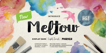 In the age where stationery is replaced by typing devices, Meltow brings back memories with the design created from the actual writing tools and then developed into a convenient-to-use set of font. It features Brush (written with larger painting brush), Script (smaller painting brush), and Hand (watercolour texture). It also comes with a Sans Serif design to befit a caption, a body and a headline. With the Rust option for a retro appeal and an all-round usage, a mix of Meltow and other types can bring you something new. Offering 25 letters in 4 options, Meltow is most desirable for your creative projects.
 - Auriol by Linotype,
$29.99Auriol and Auriol Flowers were designed by Georges Auriol, born Jean Georges Huyot, in the early 20th century. Auriol was a French graphic artist whose work exemplified the art nouveau style of Paris in the late 19th and early 20th centuries. In 1900, Georges Peignot asked Auriol to design fonts for Peignot & Sons. The resulting Auriol font was the basis for the lettering used by Hector Guimard for the entrance signs to the Paris Metro. It was re-released by Deberny & Peignot in 1979 with a new bold face, designed by Matthew Carter. These decorative fonts with a brush stroke look are well-suited to display settings. - Android by Type Innovations,
$39.00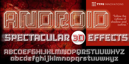 Android is an experimental 3D shadow outline font developed by the American type designer Alex Kaczun. The unique lighting created by the beveled edge in combination with an outline font was particularly difficult to create. But the result was worth the effort. Android makes for a powerful headline display that virtually pops off the page. There is a true three dimensional quality to this innovative new typeface. Use the regular Android when setting tight leading for smaller point sizes, and use Android Tall which has taller capitals for larger headlines. By experimenting with Type Effects in Illustrator or PhotoShop you can achieve some spectacular additional 3D effects.
 - Orto by LetterPalette,
$20.00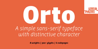 Orto is a type family of sans serif fonts in eight weights. It's a humanist typeface with real cursive, containing both Roman and Italic styles. The letters are designed to look good on screen, they have a bit narrower proportions and simple shapes. Their structure is based on flat horizontal and vertical strokes, which are emphasized wherever possible. That’s where the name comes from: Orto is an abbreviation of the word orthogonal. Thanks to its narrow width, the typeface is less space-consuming and adapts well to the screens of smaller devices. It is legible in small sizes, thanks to the larger x-height. The characteristic details, like bent ends of diagonal strokes, stand out when used in larger sizes. Orto can be used equally good in print and its overall neutral look fits different contexts. However, its character is pretty recognizable. Orto contains Latin and Cyrillic script and covers six codepages: Latin 1, Latin 2, Cyrillic, Turkish, Windows Baltic and MacOS Roman. It has basic OpenType features like ligatures, oldstyle numerals, proportional and tabular lining figures, fractions, superiors, etc. Capital German sharp S shows up when the lowercase is typed between two uppercase letters, and the Contextual Alternates feature is turned on. The Stylistic Set 01 changes the shape of the Cyrillic b. The Stylistic Set 02 is a shortcut for using Serban Cyrillic alternatives that differ from Russian in cursive.
 - Totemic by Canada Type,
$29.95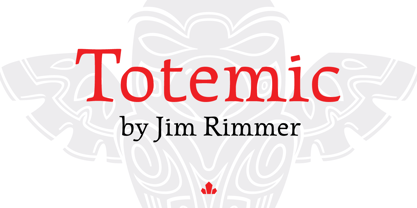 Jim Rimmer’s first typeface was originally published in 1970 as a basic film type alphabet through a small, independent type house in central California. Its sources of influence (now calligraphic type standards by Dair, Goudy and Zapf) are ones that remained with Jim for the rest of his career. If you squint at Totemic in just the right way, you can see some recognizable themes Jim would later flesh out and make his own in later works throughout his career as a type designer and printer. Totemic is now available for the first time as a digital font, of the refined and expanded kind now expected from Canada Type. It comes with quite a few standard advanced typography features: Small caps, caps-to-small-caps, automatic fractions and standard ligatures, stylistic alternate sets, six kinds of figures, case-sensitive forms, and extended Latin language support. It also comes with a very unique and unprecedented feature: Variably stackable totem poles. Simply enable the discretionary ligatures feature, type any unique three-digit combination using numbers between 1 and 4, and watch the magic happens. With a name like Totemic, we just couldn't help ourselves. Many thanks to Andrew Steeves of Gaspereau Press for finding Jim’s lost gem in a most unexpected place, and for helping us bring it back to life 45 years after its analog birth. 20% of Totemic’s revenues will be donated to the Canada Type Scholarship Fund, supporting higher typography education in Canada.
 - Figgins Tuscan by HiH,
$12.00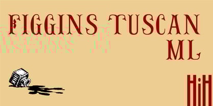 Early in the 19th century, foundries began releasing a variety of decorated ornamental letters based on the Tuscan letterform. Fancy Tuscan letters quickly became so popular, they eventually came to represent the cluttered extremes of Victorian design. Foundries competed with each other to produce most extravagantly decorated letterforms. As often happens, success turned to excess. What is often overlooked is the long history of the Tuscan style. Early examples have been traced back to ancient Rome. Indeed, the characteristic bifurcation may have represented a fishtail to the early Christians, thus sharing in the roll of symbolic identification played by the simple drawing of a fish as a whole. Later. trifurcation was developed as an alternate termination, followed by loops, full fishtails, curls, hooks and other fancy variations. Nicolete Gray provides an extensive history in her Appendix One of NINETEENTH CENTURY ORNAMENTED TYPEFACES. According to Gray, the first metal typeface based on the Tuscan form was the Ornamented of 1817 by Vincent Figgins of London. Thorowgood followed suit in 1821, Fry in 1824 and Caslon in 1830. Each was to re-visit the form many times during the Victorian era. Here we present our interpretation of what Figgins might have produced in a basic, plain Tuscan form - free of the decorative additions. We are pretty safe here because Figgins was very creative. He explored many of the terminal variations listed above and combined them with different decorative devices to produce a constant stream of new faces to meet the demands of the marketplace. Figgins Tuscan ML represents a major extension of the original release, with the following changes: 1. Added glyphs for the 1250 Central Europe, the 1252 Turkish and the 1257 Baltic Code Pages. There are also a few glyphs for Anglo-Saxon, Gaelic and Old Gaelic. Total of 355 glyphs. 2. Added OpenType GSUB layout features: aalt, ornm and liga ˜ with total 34 lookups. 3. Added 351 kerning pairs. 4. Redesigned several glyphs: the comma, quotes, brackets, braces, acute accent, and grave accent. 5. Revised vertical metrics for improved cross-platform line spacing. Please note that some older applications may only be able to access the Western Europe character set (approximately 221 glyphs). The zip package includes two versions of the font at no extra charge. There is an OTF version which is in Open PS (Post Script Type 1) format and a TTF version which is in Open TT (True Type)format. Use whichever works best for your applications.
 - Augenblick by Etewut,
$20.00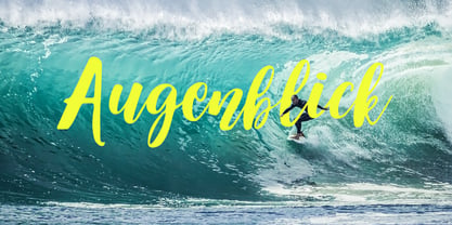 I'm glad to introduce Augenblick! My new font fits to your design be it wedding invitation, corporative Identity or bottle of wine. Send flowers to your lover with a card signed with Augenblick, and see what happens! It has multi language support, so, please use your mother tongue. Good luck & be happy!
 - Screenplay JNL by Jeff Levine,
$29.00Screenplay JNL was modeled from the signage seen in an old photo of the RKO movie studios building circa the 1930s. This multi-line lettering is so classic of the Art Deco period. For best effect and readability, use wider spacing between letters. For single words or initials, regular spacing should do fine. - Rough Tongue by Comicraft,
$19.00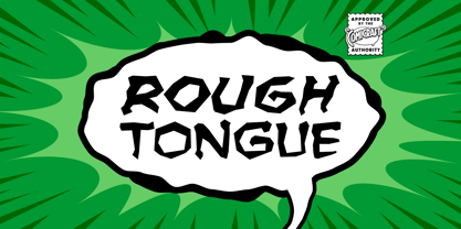 Here's The Thing -- it can be loosened, twisted, tied, tripped over, wagged, bitten, forked, stuck out or kept in your cheek. You need your tongue to talk, taste, chew, swallow and sing. You can keep a civil tongue in your head or you can give someone the rough side of your tongue...
 - Jungle Man by PleasureFonts,
$14.00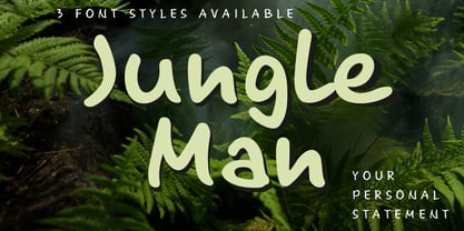 Looking for a typeface with a unique appearance? Jungle Man is the right choice for advertising, graphic design and webdesign to make a personal statement. And when it comes to readability, you are on a safe side by using Jungle Man. There are numerous occasions where a handwritten font makes a great impression.
 - Kirha by Twinletter,
$15.00 Introducing our newest gothic font called Kirha blackletter font, presenting a vintage and elegant style. With a classic typeface, this font evokes confident elegance with striking details on each side of the lettering. Use this font to enhance visual projects that require a bold classic look that exudes style, elegance, and strong personality.
 - Ornaments of Paris by Outside the Line,
$19.00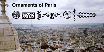 The Ornaments of Paris were inspired by a recent trip to Paris. Each tiny Paris icon is distilled from a church, a fence, a doorway, a railing, the Louvre, graphics in a store window, a feeling, a rainy day, a glass of wine... For more of the similar see Fleurons of Paris.
 - Hybi10 Metal by Hybi-Types,
$12.50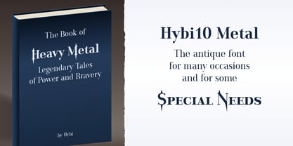 With its straight and clean face Hybi10 Metal can be a quite normal antique font family. But the alternates with different versions of spikes at the uppercase letters gives it an additional use. Decide for your own, how to use it. The styles with real capitals widens the range of use too.
 - Knight by Jafar07,
$10.00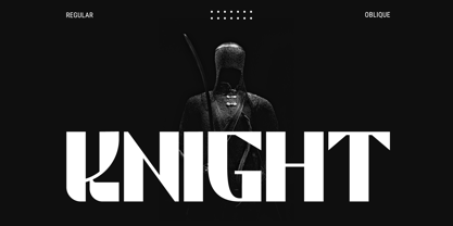 Knight Display was designed to be inspired by the knight himself, who was a strong, wise, and the fastest horseman, that's why this font is made in two versions Regular and Oblique, and also has several alternative characters and ligatures for those of you who want a unique touch of these fonts.
 - Americanus by Aerotype,
$29.00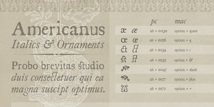 Typical of early 1800s newsprint type, Americanus and Americanus Italics have three historically accurate ornaments and discretionary OpenType features for commonly used ligatures like ct and st. The Americanus Ornaments package contains a wider selection of authentic antique ornaments and border elements and is included as part of the Americanus Family package.
 - Amovand by Zealab Fonts Division,
$10.00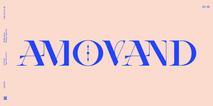 Amovand is a versatile and unique half-side serif font, Amovand has a unique style with stylistic, alternates, ligatures and supports multilingual languages. Create unique & beautiful logotype, use it as an elegant solution for your next magazine layout, or choose Amovand for any graphics that require a sleek look with a elegant flair.
 - Roseblue by Sign Studio,
$15.00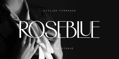 Roseblue is a font that was built in a modern style. Has a smooth appearance on each side. The opentype feature is very helpful in the design process. Equipped with adequate alternative characters and ligatures will provide choices for designers. It is suitable for product branding, logotype, quote, and various other printed products.
 - Summer Fling by Comicraft,
$19.00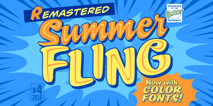 Summer Fling is a breezy brush script lettering font in the style of classic sign painting, complete with custom letter pairs and word ends to create authentic hand-painted feel. Consider this the perfect headline font for the Summer Blockbuster Romance you’re sure to pen in the warm, wine-soaked evenings ahead.
 - MGN Humble by Morgana Studio,
$17.50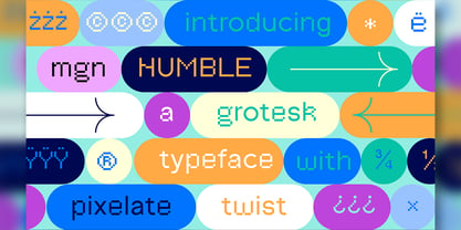 MGN Humble is a sans-serif type that provides room for users to express their experimental and playful side. The pixelated strokes engage venturously with the need to communicate excitement; a perfect set for clothing, gaming, technology, and experimental poster use. Currently available in a beta version and to be developed further.
 - Les Palmiers by Sarid Ezra,
$19.00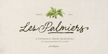 Introducing, Les Palmiers, an old handwritten script! Les Palmiers is a vintage and rough handwritten script. This font include alternates and swash that will make your project more attractive. With rough and imperfect side, this font will also make your design looks more vintage and old. Les Palmiers also support multi language!
 - Breughel by Linotype,
$29.99Adrian Frutiger came up with this unusually purposeful and strong design in 1981 for Linotype. Early humanistic typefaces of the sixteenth century, especially Jenson, served as models for Breughel. The right sides of the stems are vertical and at right angles to the baseline while the left sides of the stem curve into the serifs, making the typeface look as though it slants to the right, and giving it a sense of movement and liveliness. The ductus of the broad-edged pen is reflected in the flow, rhythm, and texture of text set in Breughel, but at the same time this design has a regularity of form that is typographically solid. Breughel is an ideal typeface for the designer with skill and vision. Use it to create innovative publications, posters, and advertisements. - Brannboll Fet, a creation of the talented Swedish typeface designer Måns Grebäck, is a striking font that seamlessly bridges the gap between vintage charm and contemporary flair. Known for his master...
- Cnabel by Agnieszka Ewa Olszewska,
$20.00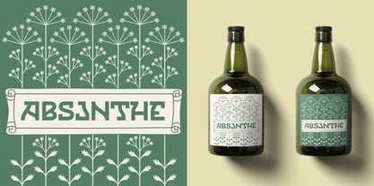 Cnabel, is a display font inspired by the Art Nouveau movement, particularly by Slovenian book illustration from the period. It�s a modern interpretation that took some characteristic features. It has no contrast, large x-height, and rather wide proportions. The typeface feels constructed and futuristic, but at the same time, it has sinuous round lines that provide an organic feel. Its unconventional shapes guarantee a unique design experience. Good for posters, branding, headlines, logotypes, covers. Easy to use, fits nicely to different materials, attracts attention. It supports European languages, has alternates characters, OpenType features, and ligatures. It�s in 3 weights: thin, regular, and bold. It� contains 357 glyphs.
 - KT Nirma by Kotivoro Lab,
$14.00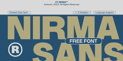 KT Nirma Sans Nirma is a typeface with 9 Weight Sans Serif from thin to Black, inspired by Founders Grotesk, This project start from April 2022 and start from the stretch until shaped the solid character to represent the Dynamic Sans Serif. Nirma has total 462 glyph and 218 Support language. Nirma support Latin Basic, Latin-1 Supplement, Latin Extended A-B, Spacing Modifier Letters, and Combining Diacritical Marks. The Solid Character has multi function Display Sans & Body text based on Display Grotesk. Especially in te Thin to Regular is more legible for body text and the black one good for Display Sans, with dinamyc shape and more wide.
 - Naston by Sopheynoft,
$49.00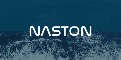 Naston Regular is the font of choice for those who seek an elegant and versatile typeface. With its timeless design, Naston Regular adds sophistication to a wide array of applications, be it formal invitations, business presentations, or creative projects. Its meticulously crafted letterforms prioritize readability while maintaining a unique and distinctive style, leaving a lasting impression on your audience. This font's broad language support and impeccable craftsmanship ensure a seamless reading experience, making it an excellent choice for anyone who values professionalism and aesthetics in their design projects. Choose Naston Regular to elevate your content and effectively convey your message with clarity and elegance.
 - Dash Wisher by PizzaDude.dk,
$15.00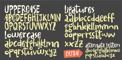 The name Dash Wisher is a wordplay. The letters of the font are also quite playful - you never know what comes next, when typing. There is no exact x-heigh, the baseline is jumpy, the descender and ascender are messed up...there are no real rules for Dash Wisher! But with all that in mind, it comes out surprisingly legible, which means it does have a wide range of use. Let your fantasy and imagination break the boundaries and Dash Wisher do the rest - or maybe the other way around! :) I've added both ligatures to substitute double letters and a set of alternate letters as well.
 - Mucho Sans by Fontforecast,
$17.00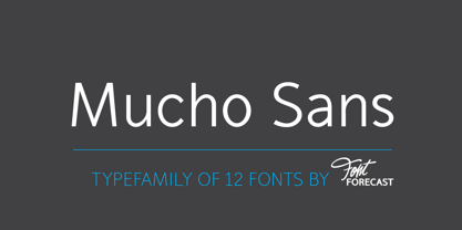 Mucho Sans is a geometric sans serif type family that comes in six weights with matching Italics. The design is very clean, yet friendly and modern. Some of its characteristics are the generous x-height, the Ascender-height that matches the Cap-height, the friendly looking real italics and the low contrast. The result is a contemporary versatile type family that is excellently suited for both display and text uses and that supports a wide range of languages. Mucho Sans is equipped with many Opentype features such as five numeral styles, numerators, denominators, superiors, inferiors, automatic fractions, alternative a and g, case sensitive forms and ordinals.
 - Kesora Faux by Twinletter,
$15.00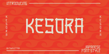 KESORA is a Japanese-style font that we carefully crafted to give your composition the proper look. This font is really versatile, so you may use it for a wide range of projects. Your project will always appear special to your audience if it has the proper composition, beautiful appearance, and unique shape. Logotypes, food banners, branding, brochure, posters, movie titles, book titles, quotes, and more may all benefit from this font. Of course, using this font in your various design projects will make them excellent and outstanding; many viewers are drawn to the striking and unusual graphic display. Start utilizing this typeface in your projects to make them stand out.
 - Hypebuzz by IKIIKOWRK,
$19.00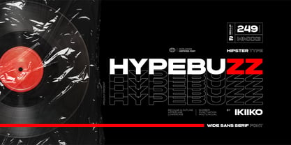 Proudly present Hypebuzz - Hipster Type, created by ikiiko. Hypebuzz is an urban sans serif font with a distinctive wide shape. This type has a character of streetwear vibes, hip-hop, youth, urban culture, etc. Hypebuzz had a 2 types of letters allows us to explore the text with creativity. This type is very suitable for making a poster, magazine layout, brand logo, sleeve cover, party flyer, quotes, or simply as a stylish text overlay to any background image. What's Included? 2 Weights : Regular & Outline Uppercase & Lowercase Numbers & Punctuation Multilingual Support Works on PC & Mac Enjoy our font and if you have any questions, you can contact us by email : ikiikowrk@gmail.com
 - Hando by Eko Bimantara,
$24.00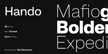 Being one of the most popular font style; Neo Grotesk, Hando offers a wide range of usage possibilities. It's low x-height and variety of light size options make it a good choice for reading, it's tenuous white spaces in the counter letterforms make it legible enough to be recognized remotely. It's curve tensions on the circular letterforms gave a futuristic impression. It's sleek and simple strokes make it perfect for a broad range design purposes. Hando consist of 10 syles from Hairline to Black with each matching oblique. Contain more than 440 glyphs that support a broad latin languages. Also some Opentype features e.g. stylistic alternates, variation of figures, e.t.c
 - Columbia Titling by Typetanic Fonts,
$24.00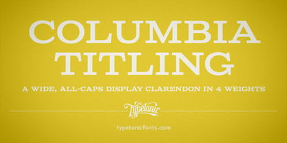 Columbia Titling is a titling-caps display family based on wide Clarendon-style wood type and industrial signage design from the late-19th and early-20th Century. Columbia Titling includes a small set of OpenType features, including both tabular and proportional figures, special superscript ordinal suffixes, underlined superscript alternate letters, and OpenType fractions. Columbia Titling can have a ‘period feel’ depending on its use, but is fresh enough to use in contemporary designs, like magazine headlines, invitations, or stationery. The typeface — released in four weights — takes its name from the historic S.S. Columbia, a steamboat launched in 1903. Lettering found on the ship’s wheelhouse provided initial inspiration for Columbia Titling.
 - Orbi Sans by ParaType,
$30.00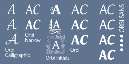 Orbi Sans was designed as an extension of the font system Orbi released on the end of 2010. It’s a low contrast humanist sans serif of open design with the elements of dynamic nature that inherited from Orbi its elegance and clearness. The faces were coordinated with Orbi on metrics, proportions, weights, and design features. Orbi Sans consists of 4 roman weights with corresponding true italics. It can be used together with Orbi and separately. Due to wide variety of styles the family is very good for books, periodicals, and business papers. The fonts were designed by Natalia Vasilyeva. Released by ParaType in 2011.
 - Black Pink Summer by Letterara,
$13.00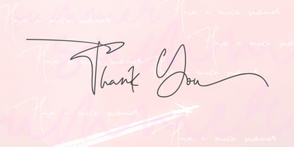 Introducing a new beautiful calligraphy font, Black Pink Summer, the monoline version of Black Pink Signature, created for summer. Black Pink Summer is perfect for beautiful and elegant logos, upscale packaging, wedding stationery, websites, and any other projects requiring a handwritten and luxurious touch. A wide range of swashes (a-z) and alternates (A-Z) are included so that you can give your logo or name a custom, hand-calligraphic look. Moreover, Black Pink Summer was created to look as close to a natural handwritten script as possible by including 109 ligatures. With built in Opentype features, this script comes to life as if you are writing it yourself.
 - Mosquich by FallenGraphic,
$15.00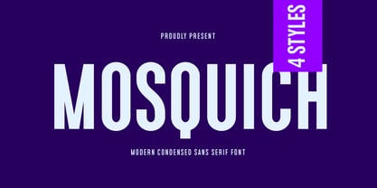 Mosquich is a modern and minimalistic sans serif condensed font. It has a bold and strong character, making it suitable for use in title text, logos, posters, flyers, and social media. Mosquich has wide and thick strokes, which give a strong and bold impression. It also has a compact and dense character, making it suitable for use in limited space. Mosquich is available in various sizes, from standard to custom sizes. It is also available in various styles, including Reguler, Bold, and italic. Mosquich is a versatile font that can be used for a variety of purposes. It is suitable for designers looking for a modern, minimalistic, and strong font.