10,000 search results
(0.042 seconds)
- Benefits by Mchcrafter,
$18.00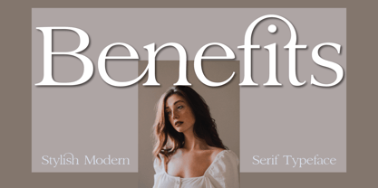 Benefits font – a stylish OpenType rich serif with letters that seem to dance and twist harmoniously together – to form unique & elegant typography designs. A large selection of interwoven Opentype ligatures and alternates, means ample selection and variety in your finished look. To access these OpenType features, you will need Opentype capable software such as : Word, Textedit, Photoshop, Sketch, Pages, Keynote, Numbers, iBooks Author, QuarkXPress, Indesign and Illustrator. A wide range of useful glyphs are included – see preview image of all glyphs. Benefits includes: All uppercase & lowercase letters All numbers 0-9 & Punctuation Ligatures & Alternates Symbols Multiligual Letters
 - Different by Haksen,
$12.00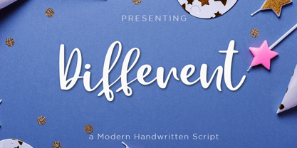 Different is a Bold beauty handwritten script style with upper and lowercase feel nice balanced. Its wide range of uppercase and lowercase alternates allow versatile design options and works perfectly for headlines, logos, posters, packaging, T-shirts, postcards and much more. Ligatures feature is default setting in Adobe Illustrator or Adobe Photoshop in Uppercase character. So when you want not to use the ligatures. Open glyphs panel : In Adobe Photoshop choose tool Window Character and then please klick fi symbol In Adobe Illustrator choose tool Window Type Open Type and then please klick fi symbol Have a great day, Haksen
 - Evey by Nantia.co,
$8.50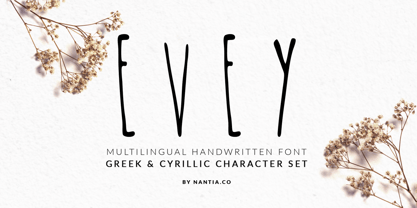 I’m very glad to introduce Evey Handcrafted Multilingual Font | Latin / Greek / Cyrillic, a high-quality, multilingual, handwritten font. The wide range of multilingual support of the font makes it ideal for international food packaging. Because of the unique style of the typeface, is the perfect design tool for natural organic product packaging and branding, as one can describe it as a logo font. In addition the crafty, yet elegant style of EVEY Font can make it a cute alternative wedding font. Furthermore, you can pair this wedding typography with handcrafted / kraft / recycled papers for an amazing wedding invitation!
 - Nouveau Calendar JNL by Jeff Levine,
$29.00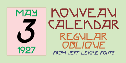 Inspired by the lettering on Koloman Moser’s poster design for Fromme’s Calendar (circa 1912), Nouveau Calendar JNL is available in both regular and oblique versions. According to Wikipedia: “Koloman Moser (30 March 1868 – 18 October 1918) was an Austrian artist who exerted considerable influence on twentieth-century graphic art and one of the foremost artists of the Vienna Secession movement and a co-founder of Wiener Werkstätte. Moser designed a wide array of art works, including books and graphic works from postage stamps to magazine vignettes; fashion; stained glass windows, porcelains and ceramics, blown glass, tableware, silver, jewelry, and furniture.”
 - Malmo Sans Pro by Martin Lexelius Core,
$33.00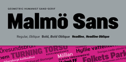 Malmö Sans was born from the preconception that geometry is neutral, and neutral fonts have a wide application window. No ornaments, no quirks – just clean. Design process: establishing the main proportions, grids and library of geometric shapes. However, people are not math, people are not built from grids. We are irregular, not always logical, and, foremost, we are human. So: humanisation – define parts and areas, and make the needed adjustments to shapes and forms, although being mathematically correct. Basically, changing it into something that pleases the eye. Much effort has been made to achieve equal parts minimalism, aesthetics and legibility.
 - Aringgo by Letterara,
$15.00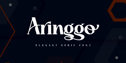 Aringgo is a stylish and elegant serif font. It is suitable for a wide variety of designs due to its neat and clean style. Incredibly versatile, this font fits a vast pool of designs, elevating them to the highest levels. Comes with some alternates and ligatures, so you can combine them to make a perfect typography design. It is ideal for your upcoming projects. Such as luxury logo and branding, classy editorial design, magazines, Packaging, poster, movie, cosmetic brand, fashion promotions, art gallery branding, and more. This font is PUA encoded which means you can access all of the glyphs.
 - Ranille by Arterfak Project,
$26.00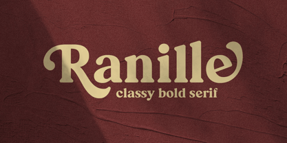 Ranille is a modern, classy, bold serif and display font. It includes a great number of of alternates and ligatures. Ranille is inspired by retro curves style from the 50-60s era and brings it into modern design with bold weight. Ranille comes with over 200+ alternative characters (PUA Encoded) that give you a wide range of typographic design results. Ranille is a versatile font that ready to make your designs more stand out such as posters, magazines, branding, logos, label, merchandise, presentation, advertising, cards, quotes and so much more! Check out Novante which is a great pair for Ranille.
 - Dog Eared by Andy Babb,
$19.20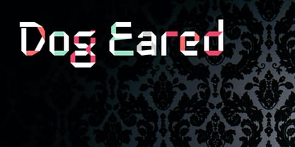 Each character of Dog Eared began its life as a half-inch wide strip of paper, folded and Scotch-taped into formation, and then scanned and recreated digitally. Dog Eared is distinguished from other folded paper style typefaces by its robustness and versatility: each numeral and upper- and lowercase letter has a stylistic alternate. Dog Eared Striped is a traditional single color font, while Dog Eared Solid is a chromatic variant that can be used for a two-toned effect. Layer and multiply Dog Eared Striped and Dog Eared Solid together to achieve even more color variety.
 - Tioga by Monotype,
$29.99Tioga is a highly legible typeface designed specifically to display clearly on low-resolution displays. With superior readability even at small sizes, Tioga is an ideal typeface for developers of set-top boxes and digital televisions. Tioga is metrically compatible with Tiresias, a widely-used typeface designed for digital TV applications and adopted by the DVB and MHP standards. Tioga was fine-tuned to be more readable and aesthetically pleasing. Individual characters were adjusted for improved legibility and the letter spacing was revised to improve appearance and readability. Tioga bold was created to make the design more versatile. - Coltinly Script by Gian Studio,
$16.00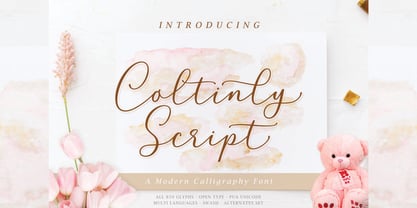 Coltinly is a script typeface with beautiful calligraphy and is modern with an irregular baseline. This font is suitable for a wide range of products for each project, such as wedding invitations, greeting cards, correspondence, and various other purposes and many more. This language support some international fonts, you can get unique ligatures, and font, there are 859 glyphs, so many options that you can use for your projects, Features : Initial Alternates Contextual Alternates - Standard ligatures - Unique ligatures - Stylistic Alternates - Stylistic sets Basic Latin A-Z and a-z - Numbers - International Symbols include Thank You for your purchase!
 - Bocfer by Brenners Template,
$19.00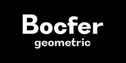 Designed by Ryul Davidson, this typeface is a special style for designers who prefer a sense of space and differentiation in the layout system. It applies a design concept that continues the modern and contemporary grotesque lineage. And, It adopts a somewhat low x-height system and has a classic and sophisticated balance. As the height of lowercase letters is lowered, more differentiated and rhythmic typography can be realized, and it showcases a wide range of coverage from offline publishing to display areas. The elaborately optimized kerning system is a good choice for designers who prefer more professional logos and editorial designs.
 - Good Timing by Typodermic,
$11.95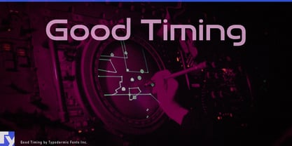 The perfect typeface for the modern age has arrived. Good Timing is the ultimate fusion of style and substance, taking the best of the classic Good Times typeface and elevating it to a new level of cool. The wide, capsule-shaped design of Good Timing makes it stand out from the crowd, giving your text an edgy, high-tech vibe. And with its seven weights, including italics, you’ll have all the flexibility you need to create eye-catching designs that are sure to grab attention. But that’s not all—Good Timing also comes packed with all the symbols and characters you need for any project. Mathematical symbols, fractions, numeric ordinals, and monetary symbols are all in good supply, so you’ll never be left searching for the right character. So whether you’re designing a cutting-edge website, a sleek marketing campaign, or a futuristic logo, Good Timing is the typeface for you. Download it today and take your design game to the next level! Most Latin-based European, Vietnamese, Greek, and most Cyrillic-based writing systems are supported, including the following languages. Afaan Oromo, Afar, Afrikaans, Albanian, Alsatian, Aromanian, Aymara, Azerbaijani, Bashkir, Bashkir (Latin), Basque, Belarusian, Belarusian (Latin), Bemba, Bikol, Bosnian, Breton, Bulgarian, Buryat, Cape Verdean, Creole, Catalan, Cebuano, Chamorro, Chavacano, Chichewa, Crimean Tatar (Latin), Croatian, Czech, Danish, Dawan, Dholuo, Dungan, Dutch, English, Estonian, Faroese, Fijian, Filipino, Finnish, French, Frisian, Friulian, Gagauz (Latin), Galician, Ganda, Genoese, German, Gikuyu, Greenlandic, Guadeloupean Creole, Haitian Creole, Hawaiian, Hiligaynon, Hungarian, Icelandic, Igbo, Ilocano, Indonesian, Irish, Italian, Jamaican, Kaingang, Khalkha, Kalmyk, Kanuri, Kaqchikel, Karakalpak (Latin), Kashubian, Kazakh, Kikongo, Kinyarwanda, Kirundi, Komi-Permyak, Kurdish, Kurdish (Latin), Kyrgyz, Latvian, Lithuanian, Lombard, Low Saxon, Luxembourgish, Maasai, Macedonian, Makhuwa, Malay, Maltese, Māori, Moldovan, Montenegrin, Nahuatl, Ndebele, Neapolitan, Norwegian, Novial, Occitan, Ossetian, Ossetian (Latin), Papiamento, Piedmontese, Polish, Portuguese, Quechua, Rarotongan, Romanian, Romansh, Russian, Rusyn, Sami, Sango, Saramaccan, Sardinian, Scottish Gaelic, Serbian, Serbian (Latin), Shona, Sicilian, Silesian, Slovak, Slovenian, Somali, Sorbian, Sotho, Spanish, Swahili, Swazi, Swedish, Tagalog, Tahitian, Tajik, Tatar, Tetum, Tongan, Tshiluba, Tsonga, Tswana, Tumbuka, Turkish, Turkmen (Latin), Tuvaluan, Ukrainian, Uzbek, Uzbek (Latin), Venda, Venetian, Vepsian, Vietnamese, Võro, Walloon, Waray-Waray, Wayuu, Welsh, Wolof, Xavante, Xhosa, Yapese, Zapotec, Zarma, Zazaki, Zulu and Zuni.
 - Merside by Putracetol,
$28.00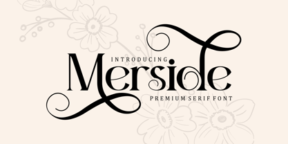 Merside - Premium Serif Font Merside - Premium Serif Font is a stunning typeface that exudes sophistication and elegance. The font's clean and crisp lines make it a versatile choice for various design projects, from high-end branding to classic book covers and posters. The font was crafted with the utmost care and attention to detail, resulting in a timeless typeface that will elevate any design. Merside - Premium Serif Font is the perfect choice for designers who want to convey a sense of luxury and exclusivity in their work. The font's classic serif style adds a touch of refinement, while the clean lines give it a modern twist. Whether you are designing a logo for a luxury brand, creating marketing materials for a high-end fashion label, or designing a product packaging, Merside will add a touch of elegance and sophistication to your project. One of the standout features of Merside - Premium Serif Font is its OpenType features, which include alternates and ligatures. These features give designers more creative freedom, allowing them to customize the font and create unique and eye-catching designs. The font also includes uppercase and lowercase letters, as well as number, punctuation, and symbol glyphs. Additionally, Merside supports multiple languages, making it an excellent choice for global brands. The font is compatible with a wide range of design software and platforms. You can easily install and use Merside - Premium Serif Font on your computer or device, making it a convenient and accessible choice for designers. If you are looking for a premium serif font that will make your design stand out, Merside - Premium Serif Font is an excellent choice. With its elegant and refined style, it is perfect for creating luxury branding, elegant design, and high-end fashion. This font will give your project a timeless and classic look that will never go out of style. In summary, Merside - Premium Serif Font is a stunning and versatile font that is perfect for designers who want to create high-end and sophisticated designs. With its classic serif style, OpenType features, and multilanguage support, it is a font that will elevate any design project.
 - FF Infra by FontFont,
$50.99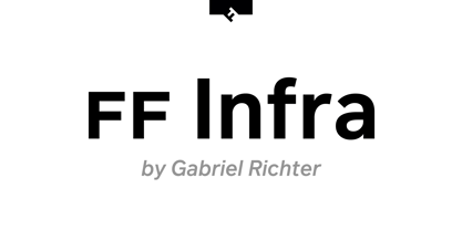 FF Infra™ is a fresh take on the robust sans serif typefaces of the early 20th century. Drawn by Gabriel Richter, it’s a friendly, inviting – and multi-talented family. Whether long blocks of editorial text, or snackable copy in web pages and blog posts, FF Infra’s 20 typefaces are easy on the eyes in both print and digital environments. The design also performs as well at petite sizes, as it does at supersized display settings. Pair FF Infra with an old style or Didone serif design and you’ll have powerful and distinctive typographic pages! FF Infra is available in 10 weights, ranging from a delicate light to a commanding black, each with an italic companion. OpenType® Pro fonts of FF infra have an extended character set supporting most Central European and many Eastern European languages, in addition to providing for the automatic insertion of ligatures and fractions. Each font also contains four sets of figures and a bevy of arrows that are ideal for wayfinding and similar info-graphic projects. A generous lowercase x-height, open counters and subtle graduations between family weights, make for a family that is at home in a wide range of sizes, and comfortable in everything from large signage, content for mobile apps, product manuals and full-scale branding projects. In addition, to provide design diversity, Richter drew alternate designs for the a, G and ß. Richter first became interested in fonts and the art of creating typefaces while studying communication design at Düsseldorf University of Applied Sciences. His first designs were experimental, but these lead a position at FontShop International in 2013, where he developed his typeface design skills. A strong background in font production, hinting and font marketing were also part of his FontShop experience. Richter worked as freelance graphic and type designer until he founded übertype in 2017. He also invests back into the type community through the type design courses he teaches at his alma mater. FF Infra is Richter’s first commercial design for Monotype. We’re sure that you’ll find it as versatile and powerful as we do.
 - Anselm Sans by Storm Type Foundry,
$63.00One of the good practices of today’s type foundries is that they release their type families as systems including both serif and sans serif type. Usually, the sources of inspiration need to be well tried with time and practice, since production of a type family is such a laborious and complex process. From the beginning, it needs to be clear that the result will be suited for universal use. Such systems, complete with the broad, multi-lingual variations permitted by the OpenType format, have become the elementary, default instrument of visual communication. Non-Latin scripts are useful for a wide scope of academic publications, for packaging and corporate systems alike. And what about outdoor advertisement designated for markets in developing countries? Cyrillics and Greek have become an integral part of our OpenType font systems. Maybe you noticed that the sans serif cuts have richer variety of the light – black scale. This is due to the fact that sans serif families tend to be less susceptible to deformities in form, and thus they are able to retain their original character throughout the full range of weights. On the other hand, the nature of serifed, contrasted cuts does not permit such extremes without sacrificing their characteristic features. Both weights were drawn by hand, only the Medium cut has been interpolated. Anselm Ten is a unique family of four cuts, slightly strengthened and adjusted for the setting in sizes around 10 pt and smaller, as its name indicates. The ancestry of Anselm goes back to Jannon, a slightly modified Old Style Roman. I drew Serapion back in 1997, so its spirit is youthful, a bit frisky, and it is charmed by romantic, playful details. Anselm succeeds it after ten years of evolution, it is a sober, reliable laborer, immune to all eccentricities. The most significant difference between Sebastian/Serapion and Anselm is the raised x-height of lowercase, which makes it ideal for applications in extensive texts. Our goal was to create an all-round type family, equally suitable for poetry, magazines, books, posters, and information systems. - Anselm Serif by Storm Type Foundry,
$63.00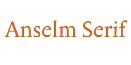 One of the good practices of today’s type foundries is that they release their type families as systems including both serif and sans serif type. Usually, the sources of inspiration need to be well tried with time and practice, since production of a type family is such a laborious and complex process. From the beginning, it needs to be clear that the result will be suited for universal use. Such systems, complete with the broad, multi-lingual variations permitted by the OpenType format, have become the elementary, default instrument of visual communication. Non-Latin scripts are useful for a wide scope of academic publications, for packaging and corporate systems alike. And what about outdoor advertisement designated for markets in developing countries? Cyrillics and Greek have become an integral part of our OpenType font systems. Maybe you noticed that the sans serif cuts have richer variety of the light – black scale. This is due to the fact that sans serif families tend to be less susceptible to deformities in form, and thus they are able to retain their original character throughout the full range of weights. On the other hand, the nature of serifed, contrasted cuts does not permit such extremes without sacrificing their characteristic features. Both weights were drawn by hand, only the Medium cut has been interpolated. Anselm Ten is a unique family of four cuts, slightly strengthened and adjusted for the setting in sizes around 10 pt and smaller, as its name indicates. The ancestry of Anselm goes back to Jannon , a slightly modified Old Style Roman. I drew Serapion back in 1997, so its spirit is youthful, a bit frisky, and it is charmed by romantic, playful details. Anselm succeeds it after ten years of evolution, it is a sober, reliable laborer, immune to all eccentricities. The most significant difference between Sebastian/Serapion and Anselm is the raised x-height of lowercase, which makes it ideal for applications in extensive texts. Our goal was to create an all-round type family, equally suitable for poetry, magazines, books, posters, and information systems.
 - Satimah by Attype Studio,
$13.00 Satimah is a stunning Arabic style typeface that brings an elegant and professional look to any design. With its simple yet refined design, this font is perfect for a wide range of projects, from branding to editorial and beyond. The font also comes with stylistic set 1 and 2, as well as stylistic alternates for some characters, giving you even more creative options. Satimah is particularly well-suited for Islamic design and Islamic theme events, thanks to its beautiful calligraphic flourishes and timeless elegance. With both regular and italic versions, this font is versatile enough to be used in a wide range of design applications. And with multilingual support, you can be sure that your message will be communicated clearly and effectively no matter where your audience is located. Features : - Satimah Family Font - Stylistic Alternates - Stylistic Set - Multilingual, US Roman, Latin 1 Support --- This Font Support Language: Afrikaans, Albanian,Asu, Basque, Bemba, Bena, Breton, Catalan, Chiga, Cornish, Danish, Dutch, English, Estonian, Faroese, Filipino, Finnish, French, Friulian, Galician, German, Gusii, Indonesian, Irish, Italian, Kabuverdianu, Kalenjin, Kinyarwanda, Luo, Luxembourgish, Luyia, Machame, Makhuwa-Meetto, Makonde, Malagasy, ManxMorisyen, North Ndebele, Norwegian Bokmål, Norwegian Nynorsk, Nyankole, Oromo, Portuguese, Quechua, Romansh, Rombo, Rundi, Rwa, Samburu, Sango, Sangu, Scottish Gaelic, Sena, Shambala, Shona, Soga, Somali, Spanish, Swahili, Swedish, Swiss German, Taita, Teso, Uzbek (Latin), Volapük, Vunjo, Zulu, Hope you enjoy with our font! Attype Studio
 - Pulse JP Arabic by jpFonts,
$29.95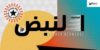 النبض - the Pulse Pulse JP ME is a constructivist text and display font that differs from comparable fonts due to its special sharpness and harmonious balance. Its technical and constructed form creates a somewhat artificial impression of particular appeal. It is ideal for display on the screen and can be used in many projects. Pulse JP ME is a super family consisting of 48 fonts from compressed to expanded in six weights each. This opens up a wide designspace with the possibility of combining typefaces of the same character in a wide variety of variants and being able to adapt them to very different conditions. The details of the individual fonts are coordinated with each other with great precision and perfectly implemented in terms of craftsmanship. In all variants, this leads to a very balanced design with particular sharpness. The very extensive character set supports 120 Latin + 7 Arabic languages + Hebrew. The Arabic characters were designed in close collaboration with the Iranian designer Prof. Raafat Negarandeh. Here the constructivist approach is repeated within Arabic proportions. This leads to a very reduced and clear design with high legibility. Additional typographical adjustments can be made in the variable font, which is also available. There all variants are stored in a single font and can be continuously fine-tuned between them.
 - Brinca by In-House International,
$7.50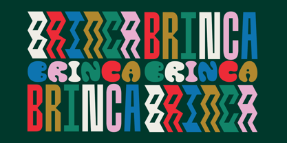 Brinca is an intrepid ‘full spectrum’ typeface with emotional range and a dynamic heart. Morphing sharp tight pleats that relax into office ready neutral sans, then plump into joyful bouncy letters with mesmerizing fluency, Brinca is ready to adapt to a wide variety of expressive needs. Named after its jumping extremes of the type’s styles; from coiled spring to stuffed and bouncy, Brinca is also a leap into new possibilities for display type design. Because of its chameleon-like range of styles, Brinca is a versatile workhorse. It’s a great choice for brand identities ready to embrace expressive range, and it’s perfect for fine-tuned packaging, events promotions, merch, product lines, and much more. WIth its very wide spectrum of options, It’s a single typeface that can be used to design a library’s worth of book covers. (We put it to the test!) About Brinca was designed by Alexander Wright and Rodrigo Fuenzalida with Michu Benaim Steiner for In-House Int’l foundry, the type foundry of brand consultancy In-House International. It was developed by Rodrigo Fuenzalida at FragType, and available through YouWorkForThem. In-House foundry offers bold, fearless, and expressive, display typefaces that tell a story. Its previous releases have been featured on Design Milk, DesignBoom, Slanted, PAGE. They’ve also been used to create standout work by designers around the world, and even won some awards.
 - Pagnol by Typorium,
$15.00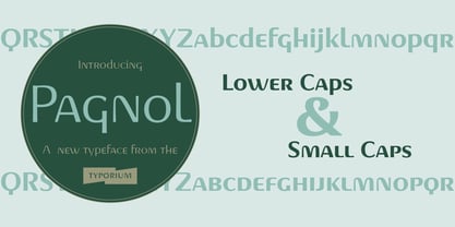 The Pagnol typeface has been designed with a principle developed by A. M. Cassandre in 1937, when the great French designer created the Peignot typeface following paleographic studies on the evolution of letterforms. Researches in the history of writing have proved that the lowercase "a" is at its origin nothing but the "A" shape transformed through centuries by scribes until the invention of printing. A large number of lowercases meanwhile kept their original shapes. If the scribes’ hand didn’t find the necessity to simplify them, it is only because these letters could be easily written. Integrating the classical shapes of capitals to the lowercases has already been used, keeping the lowercases which are only a deformation of capitals. Nevertheless, the respect of readability imposes to keep ascendants and descendants from traditional lowercases which serve as optical focus points in a text and make reading easier. The particularity of Pagnol is to use rounded shapes on top and bottom of pointed capital letters to make them fit with corresponding lowercases (Aa, Mm, Nn, Vv, Ww, Zz). Lowercases proportions are wide, to be in tune with classic lowercase shapes in order to optimize readability. Five weights in roman and italic have been designed to offer a wide palette of typographic possibilities in all sizes and all paper and screen supports.
 - Atyp by Suitcase Type Foundry,
$80.99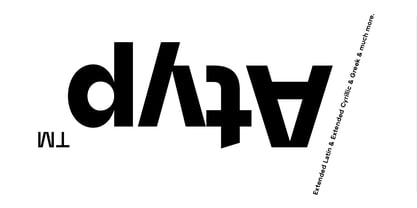 The sources of inspiration for the Atyp typeface are spread out widely both stylistically and chronologically. The basic proportions of the uppercase refer to the elementary geometric constructions of the Bauhaus. The subtle details in the drawing of the characters and the microscopic adjustments, which evoke the illusion of uniformity and mechanical purity, pay homage to the rationalism of the typefaces popular in the International Style. The increased contrast of the joints of the bowls and shoulders in the Display weight, which in certain diagonal curves transition into almost deconstructive permutations. For a change these take delight in doing things on purpose, teasing readability and breaking the rules of the new millennium's typography. Atyp was created by adapting a typeface originally made for a commercial television station. The potential of the neutral grotesque, proven by its excellent readability on screens, gave the impetus for its preparation into an extremely wide character set with full support for three language scripts. Coherence across all eight key masters lays the groundwork ideally for using the variable font format. The key benefits of this technology are a significant reduction in data consumption in the case of web fonts, as well as an unlimited access to the full range of styles, which in turn is a significant benefit in the area of responsive design.
 - Double Porter by Fenotype,
$30.00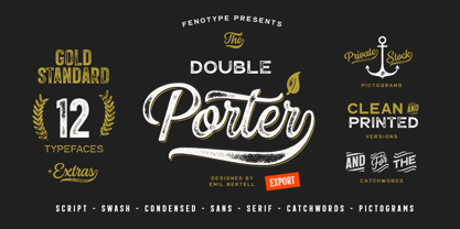 Double Porter - an elegant font collection. Double Porter includes following: • 6 fonts - a clean and textured version of each. • Ornaments • Catchwords • Ending swash ornaments for the script Double Porter is a clean cut script font with five strong sans fonts. All the fonts are designed to work nice together. Here’s a short introduction to the fonts: • Double Porter 1 -Clean connected script with Swash Alternates for caps and lowercase letters with ascender or descender. The Script also has Contextual Alternates that add variation & make the flow smooth. Contextual Alternates are automatically on. • Double Porter 2 -Wide Sans Serif font. • Double Porter 3 -Bold version of Double Porter 2 • Double Porter 4 -Semi condensed Sans Serif • Double Porter 5 -Condensed Bold Sans Serif • Double Porter 6 -Serif version of Double Porter 5 • Double Porter 7 -Set of 60 icons and ornaments • Double Porter 8 -Set of 68 Catchwords • Double Porter 9 -Set of 62 Ending Swashes and Strokes designed to go with Double Porter 1 - the script. In addition there is a “Printed” version of every Double Porter font. Printed versions are named Double Porter P x. Printed versions are exactly the same but the shapes have rugged outlines and a worn-out texture. Double Porter has wide language support including West European, Central European, Baltic, Turkish and Romanian character sets.
 - Hipweee by Storictype,
$9.00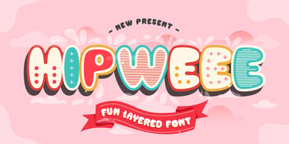 Introducing Hipweee Layered Font Hipweee, A new carefully crafted layered rounded Typeface. The Ideas of this fonts are from wide range of reference, baby, kids, school, cafe, food desert & beverages are our main focus for this fonts. So the looks of this fonts must be in the wide range of the reference above. It’s Versatile, Fun, Cute and Beauty feel that you get in Hipweee Typeface Hipweee Created with 7 Layer : Base, Extrude, Shadow, Dot, Flower, Hatch & Inline. Perfect fitted layer to give you a more contrast, more bold look of the title. Our creation on the display to give you a reference what it looks like on your project. such as Branding, Header, Logotype, Poster, and etc. It shows that Gemoy clearly can accommodate various design style. Language Support : Afrikaans, Albanian, AsuBasque, Bemba, Bena, Breton, Catalan, Chiga, Colognian, Cornish, Croatian, Czech, Danish, Dutch, English, Estonian, Faroese, Filipino, Finnish, French, Friulian, Galician, German, Gusii, Hungarian, Indonesian, IrishItalian, Kabuverdianu, Kalenjin, Kinyarwanda, Latvian, Lithuanian, Lower Sorbian, Luo, Luxembourgish, Luyia, Machame, Makhuwa, Meetto, Makonde, Malagasy, Maltese, Manx, Morisyen, North Ndebele, Norwegian , Bokmål, Norwegian Nynorsk, Nyankole, Oromo, Polish, Portuguese, Quechua, Romanian, Romansh, Rombo, Rundi, Rwa, Samburu, Sango, Sangu, Scottish Gaelic, Sena, Serbian, Shambala, Shona, Slovak, Soga, Somali, Spanish, Swahili, Swedish, Swiss, German, Taita, Teso, Turkish, Upper Sorbian, Uzbek (Latin), Volapük, Vunjo, Western, Frisian, Zulu
 - Restrict by Twinletter,
$12.00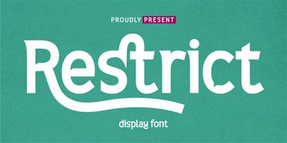 Restrict is a san serif font that we design with a wide selection of beautiful characters and strong characteristics. Having a distinctive shape that is attractive to the eye and easy to read when you make it as a sentence is our main goal in designing this font. Not limited to that, the bold calligraphy font is designed to keep paying attention to the beauty of each letter, there are alternate options for the letters which are certainly easy for you to access, so you can automatically customize the letters you want to enhance the visual appearance of your design project. This charming font also offers the beauty of abstract typography harmony for a wide variety of design projects, including digital natural handwriting for designs, quote designs, for social media business designs, advertisements, trademarks, food and beverage promotion banners, text, posters, a signature, and all designs require handwriting or whatever design you want. What’s Included : File font Web Fonts Standard glyphs Ligature Works on PC & Mac Simple installations Accessible in Adobe Illustrator, Adobe Photoshop, Adobe InDesign, even work on Microsoft Word. PUA Encoded Characters – Fully accessible without additional design software. Fonts include multilingual support for; Afrikaans, Albanian, Croatian, Czech, Danish, Dutch, English, Estonian, Finnish, French, German, Hungarian, Italian, Norwegian, Polish, Portuguese, Slovak, Slovenian, Spanish, Swedish Thank you for your purchase! Hope you enjoy our font!
 - Palatino Arabic by Linotype,
$187.99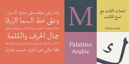 Palatino Arabic is a collaboration between Lebanese designer Nadine Chahine and Prof. Hermann Zapf. The design is based on the Al-Ahram typeface designed by Zapf in 1956 but reworked and modified to fit the Palatino nova family. The design is Naskh in style but with a strong influence of the Thuluth style as well. This is evident in the swash-like finials and the wide proportions of the letterforms. It is designed for use in print in both large and small sizes. The counters are wide open to allow for better readability in small sizes as well as to maintain an open and friendly appearance. The font has 1091 glyphs and includes a large number of extra ligatures and stylistic alternates as well as the basic Latin part of Palatino nova and support for Arabic, Persian, and Urdu. It also includes proportional and tabular numerals for the supported languages. Palatino Arabic wins Type Directors Club award. Each year, the New York-based Type Directors Club judges typeface designs from all over the world in their TDC2 contest. Linotype is pleased to announce that a very new typeface of its own is among 2008’s winners: Palatino Arabic. A collaboration between Nadine Chahine and Prof. Hermann Zapf, this face is an extension of Zapf’s Al-Ahram Arabic type from 1956 recreated to join the Palatino nova family.
 - Village Green JNL by Jeff Levine,
$29.00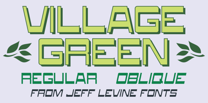 Village Green JNL is based upon a font called “Giraffe Extended” from the 1892 edition of the MacKellar, Smiths & Jordan type specimen book, and is available in both regular and oblique versions. Its Art Nouveau styling can also fit well with 1960s counter-culture revival projects. According to Wikipedia “A village green is a common open area within a village or other settlement. Historically, a village green was common grassland with a pond for watering cattle and other stock, often at the edge of a rural settlement, used for gathering cattle to bring them later on to a common land for grazing. Later, planned greens were built into the centres of villages.”
 - Praysire by Letterhend,
$19.00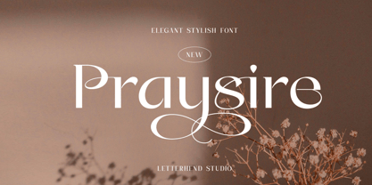 Praysire is a sophisticated sans serif with beautiful swashes. It has many alternates which you can play around to match your project, whether for a standout headline, or for a tagline, you name it. The unique letterform makes this font one of a kind! Perfectly to be applied to the other various formal forms such as invitations, labels, logos, magazines, books, greeting / wedding cards, packaging, fashion, make up, stationery, novels, labels or any type of advertising purpose. Features : uppercase & lowercase numbers and punctuation multilingual alternates & ligatures PUA encoded We highly recommend using a program that supports OpenType features and Glyphs panels like many of Adobe apps and Corel Draw, so you can see and access all Glyph variations.
 - Buyan by Yu Type,
$12.00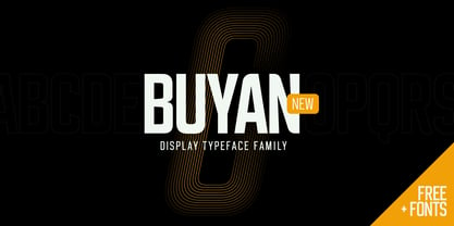 Meet Buyan, a unique typeface family that draws inspiration from the iconic Mongolian film title "Nugel Buyan" 1963. Buyan is your go-to All Caps and Sans-Serif typeface, crafted with a sleek Condensed design that effortlessly blends style with readability. Elevate your projects with this versatile display font, adding a cool and contemporary touch to your text. This font family boasts a comprehensive range with 6 distinct weight styles and italics, allowing you to play with contrast and customize your text to suit your creative vision. Whether you're working on branding, headlines, or any display application, Buyan is the perfect choice to bring a modern and impactful aesthetic to your work. Elevate your design game with Buyan!
 - Cooper Goodtime by Breauhare,
$35.00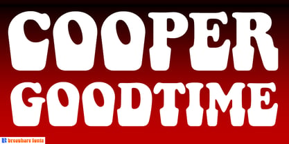 Cooper Goodtime is a font based on the lettering used on the CBS-TV variety series The Glen Campbell Goodtime Hour (1969-1972). The name pays tribute to its two origins, the other being Cooper Black. It was never an actual complete font set on the TV show, only a limited number of handmade letters, all upper case. It has lain dormant since the show went off the air in 1972. With this incarnation, a set of lower case letters has been created to complement the upper case letters. These lower case letters never existed before now. Cooper Goodtime is a funky, nostalgic, cool way to create a display, and it works surprisingly well in text sizes, too.
 - Nutcase by ArtyType,
$29.00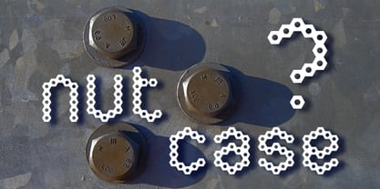 Nutcase is a perfect example of a font that principally designed itself. I created a hexagonal template (the most economical form in nature by the way) and took out the center to increase the decorative element. I played around with it, creating some pleasing characters at first but it soon became clear it would translate into a complete alphabet, so I set to work applying the idea to both upper and lower cases. It wasn't all straight forward though, avoiding awkward characters and retaining legibility took a little perseverance but it eventually paid off. I thought of this primarily as a decorative display face but having tested it out, found it reads surprisingly well as body copy too.
 - Brolly Fight by Rachel White Art,
$16.00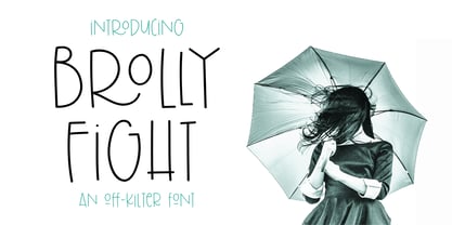 Brolly Fight is a fun, slim line font with off-kilter lines. I had so much fun creating this one! It has a stick figure art deco feel. It's fun and playful, with lots of ligatures and alternates to play with. Mix and match lowercase and uppercase letters for a unique look. There are four alternate ampersands, and fun double letter ligatures, as well as playful ligatures for r, k + a, e, o, u combinations. That high lowercase o with an underscore has a twin lowercase a alternate you can access too! Mix and match capitals and lowercase (plus the ligatures & alternates) to create unique text designs. Now with a bold version!
 - Milanesa Serif by Sudtipos,
$39.00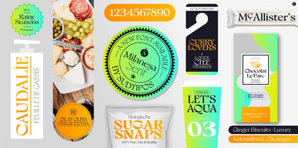 Serif typefaces have undergone a constant change over time; this has allowed the emergence of modern shapes that bring expressiveness to each letter, making them fun to use and design. Milanesa Serif is a typeface family with seven weights that changes the contrast angle in its black version, achieving a particular transition in the different interpolations. Beyond maintaining the traditional canon in a serif, Milanesa plays with a modern concept to impose its versatility in different graphic applications. Milanesa Serif undergoes a metamorphosis in its weights, intensifying its shapes and varying its counterforms without losing the sense of the typeface family, perfect for versatile uses such as web design, editorial or packaging, among many others.
 - Allotropic by The Flying Type,
$24.00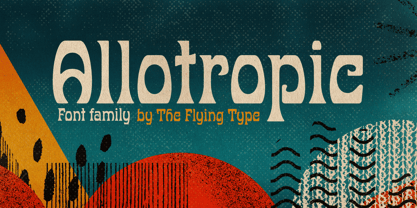 Allotropic is a pretty decorative face with a remarkable art nouveau flair. It loosely draws inspiration from a 1914 untitled alphabet by J.M. Bergling, a then "Modern Alphabet", and from its interpretation by Photo-Lettering, from the sixties. Allotropic comes in two styles, regular and bold, both with extended language coverage, as well as stylistic alternates and a couple of ornaments. It's decidedly a fab choice not only for vintage and retro designs (ça va sans dire!), but also for creative contemporary uses in print and on screen. Play it on book covers, packaging, branding, editorial, web, advertising, apparel, uses are endless. Just give Allotropic a go, let the inspiration flow, and keep on creating!
 - DECRYPT 01 by Type Innovations,
$39.00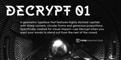 Say hello to Decrypt—a geometric typeface that features highly stylized capitals with sharp corners, circular forms and generous proportions. Specifically created for visual impact—use Decrypt when you want your words to stand out from the rest of the crowd. The concept is modern, futuristic and non-traditional. Perfect for display text, logos and headings. The development of Decrypt started in 1997, inspired by Alex Kaczun’s best selling grotesque font family called Contax Pro. Decrypt is specifically introduced here as a bold weight, but Alex plans to expand the design to include many weights, styles and alternative design treatments. Stay tuned! If you like Decrypt—check out all of Type Innovations fonts here.
 - Apnea by The Type Fetish,
$25.00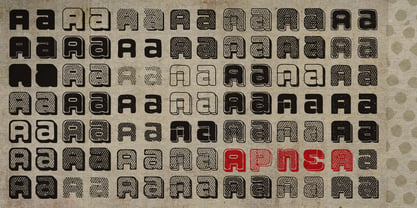 Apnea is a layerable type family consisting of fifty weights. It is an all caps font with a few lowercase alternatives (a, e, i, m, n, t, w, and y) thrown in for a more casual feel. The base letterforms are inspired by a painted sign I found in the garage of an old house I moved into years ago. All the hand-drawn elements were done directly in FontLab to keep them loose and playful without getting distorted or grungy. At its core Apnea consists of eight base weights (Base, Drop Shadow, Halftone, Inline Fill, Outline, Outline 3D, Shading and Shadow) that when combined, can make up the rest of the family. Have fun, experiment and play!
 - Republica Banana by Hanoded,
$15.00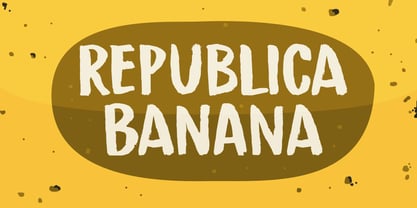 At home we love bananas: the kids take them to school for ‘snack time’, they’re healthy and they look pretty as well! Republica Banana is a pun on the term Banana Republic, which was coined by American author O. Henry in 1901. In economics, a Banana Republic is a country that is run as a private commercial enterprise for the exclusive profit of the ruling class. Of course I can point out a few countries that fit this description, but let’s not get into that. Republica Banana is a very nice, hand painted brush font. It comes with double letter ligatures for the lower case and a lot of diacritics for you to play with.
 - Bigday by Scoothtype,
$9.00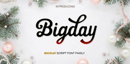 Bigday is a bold modern script with a bright atmosphere. It's inspired by suburban bars, winter and the city, chilly afternoons with a cocktail in your hand and the sound of crashing snow. Bigday comes with Contextual Alternatives that add variety to the text and help maintain a smooth flow. Contextual Alternative activates automatically. For extra flair, try Alternates or Swash danTails from the glyph palette. Bigday is PUA coded so you can access its alternatives in any graphic design software. This font is versatile and useful for web and print media; think websites, posters, menus, logos, cards, signs, packaging and more. Bigday is friendly, sturdy, and stands out, but most importantly, it's fun to play.
 - Hendrix by Scriptorium,
$18.00I had a chat recently with a customer who is a big fan of lettering from the psychedelic poster era. The discussion got me thinking about poster lettering we hadn't yet made into fonts, and a particular sample from a Jimi Hendrix poster I had played around with but never finished making into a font. So I went back to the drawing board and the result is the new Hendrix font. Unlike many of our other Psychedelic fonts which are stripped down to their basic character forms, this font includes the outlines characteristic of a lot of poster lettering from that period. It also includes variant versions of a number of the characters - Neumatic Compressed by Arkitype,
$12.00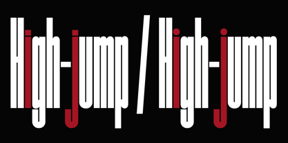 Neumatic compressed has a super compressed character set, increased cap height and tight kerning that combine to give you the ability to create large, beautiful and effective headlines and copy for your artwork. Neumatic Compressed packs punch when it comes to large copy lines and is perfect for posters, display copy, headlines in printed materials like magazines and books . The family comes in 8 weights from extra light to Black so it's versatile. Its extra light weight can give you some great height due to how narrow it is. Play around with the opentype Superscript with an underline or the Opentype stylistic sets which turns the default squared dots on i's, j's and punctuation to round dots.
 - California Quotes by Letterhend,
$19.00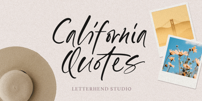 California Quotes is a casual typeface based on natural hand writing. This font has many stylistic alternates, ligatures, swashes so you can play around with them using opentype features and creates lettering with natural touch. This type of font perfectly made to be applied especially in logo, and the other various formal forms such as invitations, labels, logos, magazines, books, greeting / wedding cards, packaging, fashion, make up, stationery, novels, labels or any type of advertising purpose. Features : uppercase & lowercase numbers and punctuation multilingual alternates and ligatures PUA encoded We highly recommend using a program that supports OpenType features and Glyphs panels like many of Adobe apps and Corel Draw, so you can see and access all Glyph variations.