6,812 search results
(0.026 seconds)
- Reveler JNL by Jeff Levine,
$29.00 The sheet music for "Good Night Angel" from the 1937 motion picture "Radio City Revels", had the movie's title hand lettered in a free form Art Deco sans serif design. This has been recreated digitally as Reveler JNL, which is available in both regular and oblique versions.
 - Bill of Fare JNL by Jeff Levine,
$29.00 A 1942 menu cover for the restaurant at the Biltmore Hotel in Los Angeles features its name in a stylized Art Deco serif design. This is has been turned into the digital typeface Bill of Fare JNL, and is available in both regular and oblique versions.
 - Persia BT by Bitstream,
$50.99Masoud Nejabati has drawn upon his capable calligraphic skills to create this typeface. Persia represents his first latin-based design. This gentle and finely rendered script reveals Nejabati's extensive background in Islamic calligraphic art. The slight back slant further enhances the appearance of hand-scribed pen calligraphy. - Moulin Rouge by Solotype,
$19.95This came from a shop near Munich, Germany, and was a very poor proof with no font name on it. Never did identify it. When we cleaned it up, we liked it pretty well. We think it is typical of some early twentieth century art nouveau fonts. - Ornella by URW Type Foundry,
$39.99 Ornella is a very typical art nouveau typeface that perfectly fits into the series of URW++ Jugendstil fonts released in the last couple of years. Ornella was reworked, redesigned, completed and digitally remastered by Ralph M. Unger for URW++, based on specimen taken from old font catalogues.
 - Prebuga Signature by Balevgraph Studio,
$12.00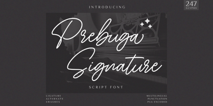 Prebuga Signature is a fragile, elegant and versatile script font. Fall for its ravishing style and use it to create gorgeous wedding invitations, beautiful stationary art, eye-catching social media posts, and much more! What's Included? Uppercase & Lowercase Numbers & Punctuation Alternate & Ligature Multilingual Support PUA Encoded
 - Musical Prelude JNL by Jeff Levine,
$29.00 Musical Prelude JNL is a thin Art Deco typeface with some interesting character shapes, and was inspired by the hand lettering on the cover of the 1933 sheet music for "Blue Prelude" by Gordon Jenkins and Joe Bishop. It is available in both regular and oblique versions.
 - AZ Tiki by Artist of Design,
$20.00 AZ Tiki font was inspired from Polynesian pop art Ephemera of the 1950's. This font utilizes an "old look" to the line work which is designed to have a "worn feel" to it. Ideal for use as headline or sub-head text in you design.
 - Moon Rays by Epiclinez,
$18.00 Moon Rays is a bold and playful display font, suitable for all children's designs, product packaging, stationary art, apparel designs, and more fun and creative ideas! So what's included: Basic Latin A-Z & a-z. Numbers, symbols, and punctuations Multilingual Support. Accented Characters : ÀÁÂÃÄÅÆÇÈÉÊËÌÍÎÏÑÒÓÔÕÖØŒŠÙÚÛÜŸÝŽàáâãäåæçèéêëìíîïñòóôõöøœšùúûüýÿžß Thank You.
 - Basic Nouveau JNL by Jeff Levine,
$29.00 The 1913 sheet music for "You’ll Be Welcome When You Get Back Home" had its title hand lettered in a simple, yet attractive Art Nouveau sans serif design which has been preserved as digital type. Basic Nouveau JNL is available in both regular and oblique versions.
 - P22 BlancoNeg by IHOF,
$24.95 BlancoNeg was inspired by the lettering of Saul Bass with some thoughts of Op-Art. Each character relies on the positive and negative spaces of its neighboring letters to help define its own shape. This font is casual with the look of cut out paper forms.
 - Qoxiem by Almarkha Type,
$29.00 Introducing our latest Modern Slab called Qoxiem can make your logotype become more interesting. inspired by the decorative arts and architecture movement Qoxiem fonts is perfect for your project and allows you to create designs, headlines, posters, logos, badges, t-shirts and many more that are beautiful.
 - Solid Deco JNL by Jeff Levine,
$29.00 Solid Deco JNL was modeled after a small sign with the word "restaurant" in an unusual Art Deco solid lettering style. It was spotted within the same image of the Lenox Lounge in New York which gave forth the neon letters that became Sign Sans JNL.
 - Streamlined Stencil JNL by Jeff Levine,
$29.00 Streamlined Stencil JNL is based on a photo of an Art Deco era shipping stencil saying "With Care" which was heavily influenced by the Futura Black style of lettering. The image was seen in the Steven Heller-Louise Fili book "Stencil Type" (published by Thames and Hudson).
 - Walahard by JprintStudio,
$10.00 Introducing Walahard, Walahard is a sweet, soft handwritten font. Get inspired by its authentic feel and use it to create gorgeous wedding invitations, beautiful stationary art, eye-catching social media posts, and cute greeting cards. Ready to use for projects, texts, letters, or whatever you want!
 - Sleuth JNL by Jeff Levine,
$29.00 The movie trailer for the1936 film "After the Thin Man" is filled with text lettered in this classic Art Deco condensed typeface. Sleuth JNL seems the appropriate name for this digital revival, as the romantic comedy centers around detective Nick Charles' and his wife Nora's adventures.
 - Movie Production JNL by Jeff Levine,
$29.00 Inside the pages of the August, 1930 issue of “The New Movie Magazine” is an ad for Warner Brothers-First National Pictures – hand lettered in a bold Art Deco sans. This was the basis for Movie Production JNL, which is available in both regular and oblique versions.
 - Show Card Elite JNL by Jeff Levine,
$29.00 One example in the 1919 instructional book “One Hundred Alphabets for the Show Card Writer” was for an elegant sans serif with a subtle Art Nouveau style to the letter forms. This is now available digitally as Show Card Elite JNL in both regular and oblique versions.
 - Street Power by Arendxstudio,
$17.00 Street Power is a free style font that has the characteristics of street art that shows freedom. It is filled with unique characters. Features : • Character Set A-Z • Numerals & Punctuations (OpenType Standard) • Accents (Multilingual characters) • Ligatures • Alternates There it is! I really hope you enjoy it.
 - Belgravia by Scriptorium,
$24.00Belgravia is an Art Nouveau period design based on hand lettering from the 1890s. Like our popular Pantagruel font it has a lot of the elements which would influence later Psychedelic poster lettering in the 1960s. Very nice looking with a good weight for title designs. - Discotheque JNL by Jeff Levine,
$29.00 A 1930s casual Art Deco type style with as much influence in 1970s graphic design as in its day was found within the pages of the 1930s French publication L'Art du Tracé Rationnel de la Lettre. Discotheque JNL is available in both regular and oblique versions.
 - Brand X JNL by Jeff Levine,
$29.00 Brand X JNL is a retro-inspired Art Deco typeface with its name being derived from the generic label given to competitor's brands. Whenever a product wishes to extol its virtues without directly naming its competitors and thereby giving reverse publicity to them, "Brand X" is mentioned.
 - The Overcook by Arendxstudio,
$22.00 The Overcook is a free style font that has the characteristics of street art that shows freedom and is filled with unique characters Features : • Character Set A-Z • Numerals & Punctuations (OpenType Standard) • Accents (Multilingual characters) • Ligature • Alternate There it is! I really hope you enjoy it
 - FranklinGothicHandCond by Wiescher Design,
$39.50 FranklinGothicHandCond is another part of a series of hand-drawn fonts from way back in time – before computers changed the way we worked in advertising. When I was in advertising – before computers – a very time consuming part of my daily work was sketching headlines. I used to be able to sketch headlines in Franklin Gothic, Times, Futura, Helvetica and several scripts. We had a kind of huge inverted camera – which we called Lucy. We projected the alphabet onto a sheet of transparent paper, outlined the letters with a fineliner and then filled them in. It was very tedious work, but the resulting headline had its own charm and we had a permanent race going on who was best and fastest. I won most of the time! They used to call me the fastest "Magic Marker" this side of the Atlantic. Great days, just like today! Your sentimental type designer from the past, Gert Wiescher.
 - Scala Pro by Martin Majoor,
$49.00 The award-winning Scala family (1990-1993) is a worldwide bestseller and has established itself as a ‘classic’ among digital fonts. It was one of the first serious digital text fonts to support small caps, ligatures and different set of numbers. In fact Scala and Scala Sans (1990-1993) are two different typefaces sharing a common form principle: the skeletons of both Scala and Scala Sans are identical. Scala’s dark colour and low contrast works to prevent the thin parts from breaking up. The generous length of Scala italic’s serifs gives it a strong rhythm. The bold weight has the same character widths as the normal weight, so changing a text from normal into bold does not affect the set width. Another part of Scala is very popular among its users: Scala Hands, containing more than one hundred decorative hands and pointers, is a free bonus. Scala Jewels is a set of four highly decorative typefaces, based on the bold capitals of Scala.
 - FranklinGothicHandBold by Wiescher Design,
$39.50 FranklinGothicHandBold is another part of a series of hand-drawn fonts from way back in time – before computers changed the way we worked in advertising. When I was in advertising – before computers – a very time consuming part of my daily work was sketching headlines. I used to be able to sketch headlines in Franklin Gothic, Times, Futura, Helvetica and several scripts. We had a kind of huge inverted camera – which we called Lucy. We projected the alphabet onto a sheet of transparent paper, outlined the letters with a fineliner and then filled them in. It was very tedious work, but the resulting headline had its own charm and we had a permanent race going on who was best and fastest. I won most of the time! They used to call me the fastest "Magic Marker" this side of the Atlantic. Great days, just like today! Your sentimental type designer from the past Gert Wiescher
 - Linotype Projekt by Linotype,
$29.99Linotype Projekt was created by German type designer Andreas Koch with both a well-defined inspiration and goal. It occurred to me that typefaces like Helvetica and Univers seemed to have a higher quality in hot-metal composition as with modern digital typesetting. They are stronger and livelier. This is in part due to the printing process, which presses the characters onto paper, and in part to the forms of the letters, which differ from the PostScript version of the same typeface. An important aspect of printing is the slight increase in character width resulting from the pressure which also serves as an optical correction to the forms. (True exact squares appear slightly barrel-formed to the eye.) I wanted to revive this peculiarity, not because of a nostalgic feeling, rather just because it is more attractive." The result is Linotype Projekt, a text font which is harmonious, clear and extremely legible. Koch lives in Bielefeld, Germany, and is a freelance book and type designer." - Brecksville by OzType.,
$15.00 Brecksville is a condensed grotesk typeface that takes inspiration from early German designs of the mid-19th century. It was designed as part of my current research into grotesk typefaces and different letterforms, as part of my dissertation research, “Perfected Letters: German Grotesk in the Nineteenth Century”, which focuses on the role of German design in typography. The Brecksville font family provides a wide range of weights, ranging from light to bold for both its rounded display style and more rugged sharp style. Both its styles feature the same horizontal proportions and metrics so they can freely be combined with no spacing issues. Brecksville's visually punchy condensed style and sharp edges, allows it to stand out on the screen – at almost any size. Its black composition also brings out the details needed in magazine and tabloid headlines, while maintaining readability throughout. The rounded display version is ideal for posters and other uses where you want something eye catching but not too hard on the eyes.
 - Theater Nouveau JNL by Jeff Levine,
$29.00 Sheet music from the 1911 stage production of the comic opera “The Enchantress” featured the hand lettered names of both the star and composer in a monoline Art Nouveau style. This sans serif type design is now available as Theater Nouveau JNL in both regular and oblique versions.
 - Roman Nouveau JNL by Jeff Levine,
$29.00 In the 1904 book “Letters & Lettering” by Frank C. Brown is a page of Roman style upper case letters entitled “Modern American Capitals – after Will Brady”. The slab serif, Art-Nouveau-influenced alphabet inspired a digital version. Roman Nouveau JNL, is available in both regular and oblique versions.
 - Celtic Spiral by Kaer,
$19.00 Hi! This is a new classic Celtic font. With spirals, knots and animals’ faces. СelticSpiral font is perfect for printing of graphic arts, posters, packaging and t-shirts. The font is presented in usual and color versions. Only uppercase letters from A to Z and numbers set (36 characters)
 - Weekend Plans JNL by Jeff Levine,
$29.00 A piece of vintage British sheet music from 1941 entitled “That Lovely Week-End” featured the song’s name in a bold Art Deco sans serif with rounded edges. This lettering design is now the digital type face Weekend Plans JNL, which is available in both regular and oblique versions.
 - Outdoor Cafe JNL by Jeff Levine,
$29.00 The movie poster for the 1937 film “Cafe Metropole” served as the basis for Outdoor Cafe JNL, which is available in both regular and oblique versions. The extra bold, stylized letter forms with their rounded corners typify the wide variety of typographic styles the Art Deco period offered.
 - Foreign Tourist JNL by Jeff Levine,
$29.00 A 1929 German travel poster had the caption “Wer schlafwagen reist spart zdeit und geld” (“Whoever travels in a sleeping car saves time and money”) hand lettered in an Art Deco sans serif style. This is now available as Foreign Tourist JNL, in both regular and oblique versions.
 - RMU Herkules by RMU,
$25.00 At the end of the 19th century, the fin de siècle, both Bauer and Berthold released ‚Herkules‘, a heavy Art Nouveau font for ads and posters. This font was carefully redesigned and makes it a great font in Jugendstil surroundings and a splendid partner of the Carlsbad font family.
 - Bumper by HVD Fonts,
$19.00 Bumper is the ideal ultra-black Sans Serif if you wanna make noise. The three widths could even be mixed in one single word, which creates a hand-made, edgy look. Bumper falls between glossy mags and poster art, and has a great effect when used for flyers.
 - Kallisty by Creaditive Design,
$12.00 Kallisty is a thin lettered and graceful script font. Fall for its ravishing style and use it to create gorgeous wedding invitations, beautiful stationary art, eye-catching social media posts, and your branding project! Kallisty is PUA encoded which means you can access all glyphs and swashes with ease!
 - Nouveau Stencil JNL by Jeff Levine,
$29.00 The sheet music for the 1917 song "Wake Up Virginia (and Prepare for Your Wedding Day)" features a hand lettered title in a sans serif Art Nouveau design with stencil influences. This was the inspiration for Nouveau Stencil JNL, which is available in both regular and oblique versions.
 - Cutout by Adobe,
$29.00Matisse's paper cutouts inspired Gail Blumberg, Adobe art director, to create a typeface of figures. Her biggest challenge: keeping each Cutout design in scale. It's not easy to make a standing figure, like 'Y,' to be the same size as a curled up figure, like 'G,'" Gail says." - Nadsat by Typogama,
$19.00 Nadsat is a unicase display typefaces with a condensed, art deco styling. Best suited for short texts or display settings, the lowercase and capital letters can be combined to offer more layout possibilities. The typeface also includes a series of ligatures and alternate characters for even more layout options.