10,000 search results
(0.021 seconds)
- Reverse Gothic JNL by Jeff Levine,
$29.00 Reverse Gothic JNL is a design based on vintage reverse letterpress type for creating interesting headlines with white-on-black text.
 - Dandygal by PizzaDude.dk,
$20.00Dandygal is wild and unpredictable, but she still does the works with rich text or just headlines - without overdoing the sillyness! - Times Gothic by Wooden Type Fonts,
$15.00 Based on a revival of one of the popular wooden type fonts of the 19th century, suitable for display, or text.
 - Filature by JBFoundry,
$16.00 Filature is a fully connected typeface with open type features. Use Filature any time you want fancy, legible, and original text.
 - Sturdie by Gerald Gallo,
$20.00 Sturdie is an all caps condensed sans serif font. It is ideal for headlines, titles, branding, and small blocks of text.
 - Mia Mano by Kate Brankin,
$32.00 Based on designer's own handwriting, Mia Mano is a decorative display typeface ideal for headlines, logos, magazines, posters and short text.
 - Clinch by Gerald Gallo,
$20.00 Clinch is a clean, contemporary, condensed sans serif font. It is ideal for headlines, titles, branding, and small blocks of text.
 - Grotesque by Wooden Type Fonts,
$15.00 Based on a revival of one of the popular type fonts of the 19th century, suitable for display, or text, bold.
 - Pudgie by Gerald Gallo,
$20.00 Pudgie is an all caps, bold, sans serif font. It is ideal for headlines, titles, branding, and small blocks of text.
 - Mrs Eaves XL Serif by Emigre,
$59.00 Originally designed in 1996, Mrs Eaves was Zuzana Licko’s first attempt at the design of a traditional typeface. It was styled after Baskerville, the famous transitional serif typeface designed in 1757 by John Baskerville in Birmingham, England. Mrs Eaves was named after Baskerville’s live in housekeeper, Sarah Eaves, whom he later married. One of Baskerville’s intents was to develop typefaces that pushed the contrast between thick and thin strokes, partially to show off the new printing and paper making techniques of his time. As a result his types were often criticized for being too perfect, stark, and difficult to read. Licko noticed that subsequent interpretations and revivals of Baskerville had continued along the same path of perfection, using as a model the qualities of the lead type itself, not the printed specimens. Upon studying books printed by Baskerville at the Bancroft Library in Berkeley, Licko decided to base her design on the printed samples which were heavier and had more character due to the imprint of lead type into paper and the resulting ink spread. She reduced the contrast while retaining the overall openness and lightness of Baskerville by giving the lower case characters a wider proportion. She then reduced the x-height relative to the cap height to avoid increasing the set width. There is something unique about Mrs Eaves and it’s difficult to define. Its individual characters are at times awkward looking—the W being narrow, the L uncommonly wide, the flare of the strokes leading into the serifs unusually pronounced. Taken individually, at first sight some of the characters don’t seem to fit together. The spacing is generally too loose for large bodies of text, it sort of rambles along. Yet when used in the right circumstance it imparts a very particular feel that sets it clearly apart from many likeminded types. It has an undefined quality that resonates with people. This paradox (imperfect yet pleasing) is perhaps best illustrated by design critic and historian Robin Kinross who has pointed out the limitation of the “loose” spacing that Licko employed, among other things, yet simultaneously designated the Mrs Eaves type specimen with an honorable mention in the 1999 American Center for Design competition. Proof, perhaps, that type is best judged in the context of its usage. Even with all its shortcomings, Mrs Eaves has outsold all Emigre fonts by twofold. On MyFonts, one of the largest on-line type sellers, Mrs Eaves has been among the 20 best selling types for years, listed among such classics as Helvetica, Univers, Bodoni and Franklin Gothic. Due to its commercial and popular success it has come to define the Emigre type foundry. While Licko initially set out to design a traditional text face, we never specified how Mrs Eaves could be best used. Typefaces will find their own way. But if there’s one particular common usage that stands out, it must be literary—Mrs Eaves loves to adorn book covers and relishes short blurbs on the flaps and backs of dust covers. Trips to bookstores are always a treat for us as we find our Mrs Eaves staring out at us from dozens of book covers in the most elegant compositions, each time surprising us with her many talents. And Mrs Eaves feels just as comfortable in a wide variety of other locales such as CD covers (Radiohead’s Hail to the Thief being our favorite), restaurant menus, logos, and poetry books, where it gives elegant presence to short texts. One area where Mrs Eaves seems less comfortable is in the setting of long texts, particularly in environments such as the interiors of books, magazines, and newspapers. It seems to handle long texts well only if there is ample space. A good example is the book /CD/DVD release The Band: A Musical History published by Capitol Records. Here, Mrs Eaves was given appropriate set width and generous line spacing. In such cases its wide proportions provide a luxurious feel which invites reading. Economy of space was not one of the goals behind the original Mrs Eaves design. With the introduction of Mrs Eaves XL, Licko addresses this issue. Since Mrs Eaves is one of our most popular typefaces, it’s not surprising that over the years we've received many suggestions for additions to the family. The predominant top three wishes are: greater space economy; the addition of a bold italic style; and the desire to pair it with a sans design. The XL series answers these requests with a comprehensive set of new fonts including a narrow, and a companion series of Mrs Eaves Sans styles to be released soon. The main distinguishing features of Mrs Eaves XL are its larger x-height with shorter ascenders and descenders and overall tighter spacing. These additional fonts expand the Mrs Eaves family for a larger variety of uses, specifically those requiring space economy. The larger x-height also allows a smaller point size to be used while maintaining readability. Mrs Eaves XL also has a narrow counterpart to the regular, with a set width of about 92 percent which fulfills even more compact uses. At first, this may not seem particularly narrow, but the goal was to provide an alternative to the regular that would work well as a compact text face while maintaining the full characteristics of the regular, rather than an extreme narrow which would be more suitable for headline use. Four years in the making, we're excited to finally let Mrs Eaves XL find its way into the world and see where and how it will pop up next.
 - Castelan Hispane by Ixipcalli,
$35.00 La tipografía Castelan Hispane es una tipografía inspirada en documentos y textos antiguos históricos españoles del siglo XVI. Los trazos semi-medievales - cursivos, le dan una apariencia antigua pero también moderna para los proyectos en los que se desee utilizar la tipografía. Cuenta con seis estilos y tres pesos, ligera, regular y negrita. Cada peso contiene también su forma “itálica”. The Castelan Hispane typeface is a typeface inspired by ancient Spanish historical documents and texts from the 16th century. The semi-medieval - cursive strokes give it an ancient but also modern appearance for projects in which you want to use typography. It has six styles and three weights, light, regular and bold. Each weight also contains its “italic” form.
 - Mistaken by Gassstype,
$23.00 Hello Everyone, introduce our new product font Mistaken is a Bad Brush Font.This is a Textured Natural Style and classy style with a clear style and dramatic movement. This font Mistaken is great for your next creative project such as logos, printed quotes, invitations, cards, product packaging, headers, Logotype, Letterhead, Poster, Design this font is great for your creative projects such as watermark on photography, and perfect for logos & branding, invitation,advertisements,product designs, stationery, wedding designs,label ,product packaging, special events or anything that need handwritting taste. That is has charming, authentic and relaxed characteristic more natural look to your text This font is PUA encoded which means you can access all of Alternate glyphs.
 - Anago by Positype,
$16.00 Anago shares the same DNA as its sibling Macha, but is a completely different species than the former or any of my other sans serifs (Aaux Next, Air, Akagi Pro or Wasabi). Soft, ample letterforms are casually constructed and the end result produces a typeface that changes color as it varies in size — allowing the type family to work well in both text and display settings as long as attention is given to size. Anago takes a little but gives a lot. The 10-style typeface features a fully-loaded character set that includes: Small Caps, Proportional Lining and Oldstyle Numerals, Tabular Lining and Oldstyle Numerals, Fractions, Ordinals, Inferiors, Superiors, Stylistic Alternates, Ligatures, Case-sensitive, and more.
 - Outline 99 by Alphabet Agency,
$15.00 The font family offer various combinations that work together to can be used to create interesting varieties of color and texture. Whether you are looking to achieve a traditional, vintage, worn, or modern look or a cool mix - all can be achieved with this font family. Outline 99 Font family contains 8 fonts: Outline 99 Outline 99 Italic Outline 99 Inner Outline 99 Inner Italic Outline 99 Blockprint Outline 99 Blockprint Italic Outline 99 Inner Blockprint Outline 99 Inner Blockprint Italic The fonts are ideal for sports themed designs. They can be used to take a design to the next level and add a bit more sophistication and complexity to make your text really stand out from the crowd.
 - Piercing by Linotype,
$29.99Piercing is part of a series of typographic experiments from the young Swiss designer Michael Parson. In the Piercing family, which contains three separate weights, Parson has successfully transformed the movements of points and lines into a fabulous display of alphabets. But you can use Piercing as your key to the techno scene: these letters, made up of fine lines terminated by dots, virtually groove with the beat as you set them in text. Like a musical score, they provide a fantastic look just right for your next flyer. Piercing is one of ten experiments in constructed letter design that Parson has included in the Take Type 5 collection from Linotype GmbH." - Mango Juice by Gassstype,
$23.00 Hello Everyone, introduce our new product Font Mango Juice is a Rough Brush Font.This is a Textured Natural Style and Authentic Brush style with a clear style and dramatic movement. This font Mango Juice is great for your next creative project such as logos, printed quotes, invitations, cards, product packaging, headers, Logotype, Letterhead, Poster, Design this font is great for your creative projects such as watermark on photography, and perfect for logos & branding, invitation,advertisements,product designs, stationery, wedding designs,label ,product packaging, special events or anything that need handwritting taste. That is has charming, authentic and relaxed characteristic more natural look to your text You can activate Alternates glyphs OpenType panel.
 - Written By Himself by Gassstype,
$25.00 Hello Everyone, introduce our new product font Written by Himself is a Brush Display Font. This is a Textured Natural Style and classy style with a clear style and dramatic movement. This font Written by Himself is great for your next creative project such as logos, printed quotes, invitations, cards, product packaging, headers, Logotype, Letterhead, Poster, Design this font is great for your creative projects such as watermark on photography, and perfect for logos & branding, invitation,advertisements,product designs, stationery, wedding designs,label ,product packaging, special events or anything taste. That is has charming, authentic and relaxed characteristic more natural look to your text It also features a wealth of special features including Ligatures glyphs.
 - Eisley by Rocket Type,
$20.00 Eisley started as an experiment with creating brushes in illustrator. I began by drawing each letter and tweaking until each one balanced next to one another. I painted over 50 paint brush strokes to give a variety of different looks to the final characters. Strategically crafted to look as real and as spontaneous as a sign painter might paint up (although possibly running a bit dry on paint giving the end result a vintage and grungy effect). Eisley is perfect for use in any design branding that requires vintage or distressed display lettering. Eisley is perfect for use in any design branding that requires vintage or distressed display text. Great fun to use AND personalize with your own flair.
 - Chalga VPoutline by VP Creative Shop,
$20.00 Introducing Chalga Serif Typeface - 3 weighs - Latin and Cyrillic support Chalga is elegant, vintage typeface that contains 3 weights to enchant your next project. They have basic latin, advanced latin, basic Cyrillic and advanced Cyrillic character sets. Very versatile fonts that works great in large and small sizes. Chalga is perfect for branding projects, home-ware designs, product packaging, magazine headers - or simply as a stylish text overlay to any background image. Uppercase, numeral, punctuation & Symbol Light Regular Bold Basic and advanced latin character sets Basic and advanced Cyrillic character sets Alternate Glyphs Ligature Glyphs Feel free to contact me if you have any questions! Mock ups and backgrounds used are not included. Thank you! Enjoy!
 - Funk Fact by Gassstype,
$23.00 Hello Everyone, introduce our new product Font Funk Fact is a Simple Graffiti Tag Typeface.This is a Textured Natural Style and classy style with a clear style and dramatic movement. This font Funk Fact is great for your next creative project such as logos, printed quotes, invitations, cards, product packaging, headers, Logotype, Letterhead, Poster, Design this font is great for your creative projects such as watermark on photography, and perfect for logos & branding, invitation,advertisements,product designs, stationery, wedding designs,label ,product packaging, special events or anything that need handwritting taste. That is has charming, authentic and relaxed characteristic more natural look to your text. You can activate Ligatures glyphs and Alternates glyphs OpenType panel.
 - Ablation by VP Creative Shop,
$20.00 Introducing Ablation Sans Serif Typeface - 6 weighs Ablation is casual, clean typeface that contains 6 weights to enchant your next project. They have basic latin, advanced latin, basic Cyrillic and advanced Cyrillic character sets. Very versatile fonts that works great in large and small sizes. Ablation is perfect for branding projects, home-ware designs, product packaging, magazine headers - or simply as a stylish text overlay to any background image. Uppercase, numeral, punctuation & Symbol Hairline Light Regular Bold Extra Bold Black Basic and advanced latin character sets Basic and advanced Cyrillic character sets Feel free to contact me if you have any questions! Mock ups and backgrounds used are not included. Thank you! Enjoy!
 - Fast Messages by Gassstype,
$23.00 Hello Everyone, introduce our new product Font Fast Messages is a Fun Display Typeface .This is a Textured Natural Style and classy style with a clear style and dramatic movement. This font Fast Messages is great for your next creative project such as logos, printed quotes, invitations, cards, product packaging, headers, Logotype, Letterhead, Poster, Design this font is great for your creative projects such as watermark on photography, and perfect for logos & branding, invitation,advertisements,product designs, stationery, wedding designs,label ,product packaging, special events or anything that need handwritting taste. That is has charming, authentic and relaxed characteristic more natural look to your text You can activate 14 Alternate and 15 Ligatures OpenType panel.
 - Coco Sharp by Zetafonts,
$39.00 Coco Sharp is the newest evolution of the Coco typographic project, developed since 2013 by Cosimo Lorenzo Pancini for the foundry Zetafonts, with the help of Francesco Canovaro and Andrea Tartarelli. Influenced by vernacular grotesques sign-painting and modernist ideals, and inspired by the classy aesthetic of fashion icon Coco Chanel, Coco is drawn on a classic geometric sans skeleton but applies humanist proportions and visual corrections to key letters with the aim to create a warmer, subtly vintage texture on the page and on the screen. Coco Sharp drops the rounded corners of previous incarnations (Coco Gothic and Cocogoose) to pair the typeface display and logo capability with a sharper definition for text use. As in the other Coco families, a wide range of alternate letterforms allows to express different historical moods, including elegant, quirky and unexpected designs able to transform a simple word in a memorable wordmark. The other peculiarity of Coco Sharp lies in the wide choice of x-heights given to the user, both by providing a variable version and five graded sub-families, that allows designers to fine-control text readability and space usage. Large and XLarge versions provide big and easily readable lowercase letters, perfect for small point size typesetting or bold copywriting; Small and XSmall provide smaller lowercase letters with the elegant proportions of Futura and its modernist eponyms, optimized for display use or for adding a classy flare to body text; the Regular x-height offers a "one size fits all" solution that works both for texts and for display use. Alle the 60 weights of Coco Sharp come with a full set of open type features allowing faultless typesetting thanks to small capitals, positional numbers & case sensitive forms. Use Coco Sharp out of the box as a solid workhorse family or enjoy discovering the limitless possibilities of its 2000+ latin, cyrillic and greek glyphs covering over 200 languages worldwide. • Suggested uses: perfect for modern branding and logo design, editorial design, web design, packaging and countless other projects; • 62 styles: 6 weights + 6 italics x 5 different x-heights + 2 variable fonts; • 2011 glyphs in each weight; • Useful OpenType features: Access All Alternates, Small Capitals From Capitals, Case-Sensitive Forms, Glyph Composition / Decomposition, Denominators, Fractions, Kerning, Lining Figures, Localized Forms, Mark Positioning, Mark to Mark Positioning, Alternate Annotation Forms, Numerators, Oldstyle Figures, Ordinals, Proportional Figures, Stylistic Alternates, Scientific Inferiors, Small Capitals, Stylistic Set 1, Stylistic Set 2, Stylistic Set 3, Stylistic Set 4, Stylistic Set 5, Stylistic Set 6, Stylistic Set 7, Stylistic Set 8, Stylistic Set 9, Subscript, Superscript, Tabular Figures, Slashed Zero • 220 languages supported (extended Latin, Cyrillic, Greek alphabets): English, Spanish, Portuguese, French, Russian, German, Javanese (Latin), Vietnamese, Turkish, Italian, Polish, Afaan Oromo, Azeri, Tagalog, Sundanese (Latin), Filipino, Moldovan, Romanian, Indonesian, Dutch, Cebuano, Igbo, Malay, Uzbek (Latin), Kurdish (Latin), Swahili, Greek, Hungarian, Czech, Haitian Creole, Hiligaynon, Afrikaans, Somali, Zulu, Serbian, Swedish, Bulgarian, Shona, Quechua, Albanian, Catalan, Chichewa, Ilocano, Kikongo, Kinyarwanda, Neapolitan, Xhosa, Tshiluba, Slovak, Danish, Gikuyu, Finnish, Norwegian, Sicilian, Sotho (Southern), Kirundi, Tswana, Sotho (Northern), Belarusian (Latin), Turkmen (Latin), Bemba, Lombard, Lithuanian, Tsonga, Wolof, Jamaican, Dholuo, Galician, Ganda, Low Saxon, Waray-Waray, Makhuwa, Bikol, Kapampangan (Latin), Aymara, Zarma, Ndebele, Slovenian, Tumbuka, Venetian, Genoese, Piedmontese, Swazi, Zazaki, Latvian, Nahuatl, Silesian, Bashkir (Latin), Sardinian, Estonian, Afar, Cape Verdean Creole, Maasai, Occitan, Tetum, Oshiwambo, Basque, Welsh, Chavacano, Dawan, Montenegrin, Walloon, Asturian, Kaqchikel, Ossetian (Latin), Zapotec, Frisian, Guadeloupean Creole, Q’eqchi’, Karakalpak (Latin), Crimean Tatar (Latin), Sango, Luxembourgish, Samoan, Irish, Maltese, Tzotzil, Fijian, Friulian, Icelandic, Sranan, Wayuu, Papiamento, Aromanian, Corsican, Breton, Amis, Gagauz (Latin), Māori, Tok Pisin, Tongan, Alsatian, Atayal, Kiribati, Seychellois Creole, Võro, Tahitian, Scottish Gaelic, Chamorro, Greenlandic (Kalaallisut), Kashubian, Faroese, Rarotongan, Sorbian (Upper Sorbian), Karelian (Latin), Romansh, Chickasaw, Arvanitic (Latin), Nagamese Creole, Saramaccan, Ladin, Kaingang, Palauan, Sami (Northern Sami), Sorbian (Lower Sorbian), Drehu, Wallisian, Aragonese, Mirandese, Tuvaluan, Xavante, Zuni, Montagnais, Hawaiian, Marquesan, Niuean, Yapese, Vepsian, Bislama, Hopi, Megleno-Romanian, Creek, Aranese, Rotokas, Tokelauan, Mohawk, Onĕipŏt, Warlpiri, Cimbrian, Sami (Lule Sami), Jèrriais, Arrernte, Murrinh-Patha, Kala Lagaw Ya, Cofán, Gwich’in, Seri, Sami (Southern Sami), Istro-Romanian, Wik-Mungkan, Anuta, Cornish, Sami (Inari Sami), Yindjibarndi, Noongar, Hotcąk (Latin), Meriam Mir, Manx, Shawnee, Gooniyandi, Ido, Wiradjuri, Hän, Ngiyambaa, Delaware, Potawatomi, Abenaki, Esperanto, Folkspraak, Interglossa, Interlingua, Latin, Latino sine Flexione, Lojban, Novial, Occidental, Old Icelandic, Old Norse, Slovio (Latin), Volapük;
 - Just Calling by Din Studio,
$29.00 Say hello to Just Calling , designed with modern style. It will make your design more beautiful. It's suitable for branding, web design, personal signature (logo) and many other modern designs. It has support for multiple languages and many ligatures. Thanks for visiting and purchasing my font! Best regards Donis
 - Beloved Sandra by Lunas Type,
$19.00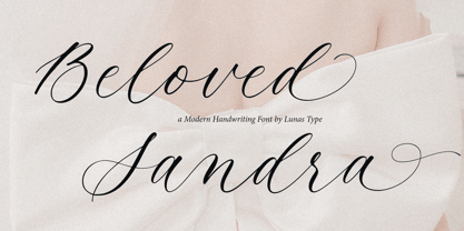 Introducing, Beloved Sandra! Beloved Sandra is a modern and luxury calligraphy font. Beloved Sandra will add charm and impression for your design. Beloved Sandra is perfect for many design needs such as merch, T-shirts, signature logo, wedding, book covers, social media posts, websites, events, and many more.
 - Auditory Perception by Ali Hamidi,
$12.00 Auditory Perception is a monoline and handwritten font. Auditory Perception have a fashion and simple curves to add charm impression for your design. This font is perfect for many design needs such as merch, T-shirts, signature logo, wedding, book covers, social media posts, websites, events, and many more.
 - Chinthya by Namara Creative Studio,
$12.00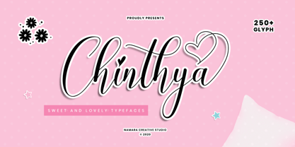 Chinthya is sweet and lovely calligraphy fonts in cute and beautiful elegant styles. decorative characters and handlettering effect make this font looks so naturally. Included OpenType features : alternates, ligatures and multilingual support. perfect for many designs, from wedding invation, greeting card, social media quotes, branding, logo, and many more.
 - Harpo by Elemeno,
$25.00Harpo is a naturally condensed font, better at large sizes. Harpo Wide is a more versatile version of the same font. Part of The Algonquin Collection, Harpo was named for occasional Round Table member, Harpo Marx. Light, narrow and discreet this font brought to mind the silent Marx brother. - Mough by Krntype Studio,
$16.00 a bold marker display font. Font with round and fat style. Mough imitate round marker pen in a clean way, this font fits perfectly into any background. Mough is perfect for many design such as merch, T-shirts, titles, book covers, social media posts, websites, events, and many more
 - Sparrowhawk Script by Max.co Studio,
$14.00 Sparrowhawk Script is retro signage font, bold and clean. There are so many variations on each character. Include Opentype stylistic alternates. You are able to create so many different typographical layouts easily and quickly. Make sure you use OpenType savvy program and simply open Glyph Palette to access all of the glyphs. This font is suitable for t-shirts, signage, logos, headlines, branding, packaging, etc. Sparrowhawk Script features 460+ glyphs and alternate characters. including initial and terminal letters, alternates, ornament, swash, ligatures and multiple language support. To enable the OpenType Stylistic alternates, you need a program that supports OpenType features such as Adobe Illustrator CS, Adobe Indesign & CorelDraw X6-X7, Microsoft Word 2010 or later versions. How to access all alternative characters using Adobe Illustrator: http://youtu.be/iptSFA7feQ0 Sparrowhawk Script is coded with PUA Unicode, which allows full access to all the extra characters without having special designing software. Mac users can use Font Book , and Windows users can use Character Map to view and copy any of the extra characters to paste into your favourite text editor/app. How to access all alternative characters, using Windows Character Map with Photoshop: https://www.youtube.com/watch?v=Go9vacoYmBw If you need help or advice, please contact me by e-mail "maximal.fonts@gmail.com"
 - Silken by Scholtz Fonts,
$19.92 Silken is a stylish and contemporary handwriting font that combines the elegance of fonts such as Zapfino with the immediacy of handwriting fonts such as Affable. There are many handwriting fonts out there, but many of them border on being grungy and irregular. This font combines beauty with individuality and spontaneity. Silken comes in a number of styles, the primary style of which is Silken Scarf. This style has a strength and sophistication that is particularly appropriate for headlines and short passages of text (such as invitations, certificates, greeting cards etc.) Silken Thread is a variant of the font family that is even more delicate and polished than Silken Scarf. The third style, Silken Book, with a greater x-height and less dramatic capitals, is more readable and less extreme than the other two styles. It should be used for longer passages or where readability is of primary importance. Suggestions for use: - wedding stationery - greeting cards - valentines day mediaa - beauty product media - lingerie tags - women's magazine pages - classical music media - award certificates The font is fully professional: carefully letterspaced and kerned. It contains over 235 characters - (upper and lower case characters, punctuation, numerals, symbols and accented characters are present). It includes all the accented characters used in the major European languages.
 - Ongunkan Cypriot Linear C Sylla by Runic World Tamgacı,
$100.00 This font is an adaptation of the cyprus syllabic script to a Latin-based font. I tried to assign as many correct letters as possible, but there were too many characters so I had to fit them. Please review the alphabet table of Cypriot syllabic to use the Font. To see all the characters, you can see all the characters and add them to the text by selecting this font from the add character section on the word page. Cypriot syllabary The Cypriot syllabary was used in Cyprus from about 1500 and 300 BC and is thought to have developed from the Linear A. The earliest known inscriptions from between 1500 and 1200 BC are in an unknown language called 'Eteo-Cypriot', or 'True Cypriot', and the script in which they are written is called Cypro-Minoan. From around 1200 BC Cyprus began to be colonised by Mycenaean, Minoan and possibly Cretan Greek settlers, and they probably adapted the existing script to write their own language - the oldest known inscription in Greek dates from the 11th century BC. Cypriot Greek had much in common with Greek dialects of Arcadia and Pamphylia, which corresponds to the province of Antalya in Turkey.
 - Handasi by Arabetics,
$39.00 The Handasi type family follows the guidelines of the Mutamathil Taqlidi type style. It has one glyph for every basic Arabic Unicode character or letter and one additional, final-position, glyph for each Arabic letter that is normally connected with other letters from both sides in traditional cursive Arabic strings. Handasi employs variable x-height values. Its design uses straight lines only but with variable distributed weight. Handasi fonts include all required Lam-Alif ligatures and use ligature substitutions and selected marks positioning but they do not use any other glyph substitutions or forming. Text strings composed using types of this family are non-cursive with stand-alone isolated glyphs. It employs our "natural Arabic input" method where first glyph is displayed in its non-isolated form. Tatweel (or Kashida) glyph is a zero width space. Keying it before any glyph will display that glyph isolated form. Keying it before Alif Lam Lam Ha will display the Allah ligature. Handasi family includes both Arabic and Arabic-Indic numerals, all required diacritic marks, Allah ligature, in addition to all standard English keyboard punctuations and major currency symbols. The fonts in this family support the following scripts: Arabic, Persian, Urdu, Pashtu, Kurdish, Baluchi, Kashmiri, Kazakh, Sindhi, Uyghur, Turkic, and all extended Arabic scripts.
 - Mehdi by Arabetics,
$39.00 The Mehdi type family follows the guidelines of the Mutamathil Taqlidi type style. It has one glyph for every basic Arabic Unicode character or letter and one additional, final-position, glyph for each Arabic letter that is normally connected with other letters from both sides in traditional cursive Arabic strings. Mehdi employs variable x-height values. Its design uses full curves with variable distributed weights. Mehdi family includes all required Lam-Alif ligatures and uses ligature substitutions and selected marks positioning but it does not use any other glyph substitutions or forming. Text strings composed using types of this family are non-cursive with stand-alone isolated glyphs. The family employs our "natural Arabic input" method where first glyph is displayed in its non-isolated form. Tatweel (or Kashida) glyph is a zero width space. Keying it before any glyph will display that glyph isolated form. Keying it before Alif Lam Lam Ha will display the Allah ligature. Mehdi family includes both Arabic and Arabic-Indic numerals, all required diacritic marks, Allah ligature, in addition to all standard English keyboard punctuations and major currency symbols. The fonts in this family support the following scripts: Arabic, Persian, Urdu, Pashtu, Kurdish, Baluchi, Kashmiri, Kazakh, Sindhi, Uyghur, Turkic, and all extended Arabic scripts.
 - Bird Script by Lián Types,
$24.95 Characterized by quickness, lightness, and ease of movement, Bird Script is a font which challenges many aspects of type-design: every single stroke, comes directly from the author’s hand and tries to reflect not only the tool used, but also his feelings at the moment of writing. Bird Script is a font filled up with the energic gestures of what it’s called gestural calligraphy, a not very explored field in typography, where hardly ever a letter comes the same way two times: When manipulating the pen, the letterer seeks for the beauty of the differences and the grace of a confident execution. Originally done with a flat speedball pen nib nº5 and retouched with pencil for the bolder elements, it turned into a very pleasant to the eyes font which dances between the formal rules of typography and the artistic look of calligraphy. Bird Script Pro and Bird Script Light Pro come with many ligatures, alternates and ornaments. Into the standard ligatures we find lots of pairs of two and three ligated letters so when they are activated the font seems alive. However if none of them are activated, the font gives a really particular text pattern, specially in smaller sizes. Get Bird Script, add rhythm to your work.
 - Big Vesta by Linotype,
$29.99Vesta™ was originally designed as an orientation and information system for the city of Rome, the birthplace of the roman alphabet. The forms are inspired by letterforms found on a frieze in the Vesta temple in Tivoli. Vesta has more contrast than the average sans serif but, like many of other designs of Gerard Unger, let in a lot of light - the letterforms are open, the counters generous. Relatively narrow and hence economical - without feeling too compressed - Vesta is an ideal solution for newspapers and magazines, and numerous other applications, including corporate identity and more. Big Vesta was intended as Vesta's display partner. However, it also performs very well at small sizes - its large x-height and short ascenders and descenders make it particularly economical, making it ideal when space is limited; for example on a mobile display. Vesta and Big Vesta are now available in seven weights - from Light to Black - and include everything necessary for setting extended texts well: italics, small caps, and a range of figures, including old style, lining, and tabular figures. All in addition, Vesta is available as a family of OpenType fonts with a very large Pro character set and supports most Central European and many Eastern European languages. - Melinda Script by Gatype,
$12.00 The Melinda is a smooth, elegant and flowing handwritten font. It has a beautifully balanced character, it fits into many designs. Melinda features a varied baseline, smooth lines, gorgeous glyphs, and stunning alternatives. Hand-drawn design elements allow you to create many beautiful typographic designs in an instant like branding, web design and editorial, prints, crafts, quotes, It's great for logotypes, wedding invitations, romantic cards, labels, packaging, spelling of names and others. Add to your most creative ideas and watch how they bring them to life! Melinda includes OpenType stylistic alternates, ligatures and International support for most Western Languages.To enable the OpenType Stylistic alternates, you need a program that supports as Adobe Illustrator CS, Adobe Indesign & CorelDraw X6-X7, Microsoft Word 2010 or later versions. How to access all alternative characters using Adobe Illustrator: https://www.youtube.com/watch?v=XzwjMkbB-wQ Melinda is coded with PUA Unicode, which allows full access to all the extra characters without having special designing software. Mac users can use Font Book , and Windows users can use Character Map to view and copy any of the extra characters to paste into your favorite text editor/app. How to access all alternative characters, using Windows Character Map with Photoshop: https://www.youtube.com/watch?v=Go9vacoYmBw
 - Akceler by Adtypo,
$45.00 Many sport publications missed typefaces designed especially for sport communication conditions. We usually see only mechanically slanted or other synthetically destroyed standard typefaces. I want to fill in this space and create a system of fonts, that will be used primarily in sport. It is usable for many prints - logotypes, magazines, catalogues, posters etc. Elasticity of glyphs reflected an adrenalinous shapes of latest bikeframes, skies or sportcars. Maximum open arches guaranteed good readability in very small sizes and prevented interchanges of glyphs „o, c, e“ per poor reading conditions. Softness of lowercase is at uppercase balanced in bottom arches, that are subtly kicked-up. Numerals are an important component of sport communication, so this font offers expressive design, different from numerals of book typefaces. Every font has 9 kinds of numerals. Character case contains over 1000 glyphs, sport icons and othes signs creating the sport feeling. The font name, Akceler, represents acceleration, which is characteristic attribute of this typeface. It’s suitable for display and text usage, too. To see more please visit the PDF specimen. ■24 styles (2 alternatives, 3 grades of dynamics, 4 weights) ■over 1 000 glyphs per font ■9 kinds of numerals ■icons of sport equipment ■8 stylistic sets ■8 kinds of arrows ■23 OT features ■support of latin languages
 - Smashed Display by Raquel Fernandes,
$17.49 Smashed Typeface is a reversed-contrast, slab serif, display font. Was inspired by the old west days that we can often see in printing, circus posters and wanted notices in western movies, even tho the style was really used in many parts of the world during that period. This style is sometimes called as "circus letter" too. Was designed to have a modern look, using straighter lines and an extended style, can be used on various situations like posters, logos for restaurants, alternative business like an old washing station (as you can see on the next images), music bands etc. I believe that is a promising typography that can be used by various designers in a lot of diverse project. It counts with 226 multi language characters, one weight on version 1.0, on a next version I hope to take this project to another level, creating a variable typeface from condensed to really extended weights. It would complete this typography and eliminate the limits of use.
 - Skema Pro by Mint Type,
$40.00 Skema Pro is a versatile system of 6 serif typefaces - each bearing a distinct character and purpose. Together they form a huge superfamily of 84 fonts to fit any imaginable task. Skema Pro Livro is a low contrast, low x-height typeface with inclined axis. It is designed to work in books, where long ascenders and descenders along with increased line-spacing aid comfortable reading. Skema Pro Text has low contrast, medium x-height, and slightly tilted axis. Its neutrality along with modern feel makes it default choice for long texts of any nature. Skema Pro Omni features medium contrast, medium x-height, and slightly inclined axis. Being a more contrasted version of Skema Pro Text, it shares its intent of usage, however, creates a different texture with more formal look. Skema Pro News is a low contrast, large x-height typeface with vertical axis. Works best in newspapers and in screen applications. Skema Pro Title has medium contrast, large x-height, and vertical axis. Designed to work in larger text sizes, it offers contemporary detailing for pull-quotes and subheadings. Skema Pro Display is a typeface with high contrast, large x-height, and vertical axis. It shows its features in large text sizes, such as editorial headings.