10,000 search results
(0.261 seconds)
- Niquitta Mirzani by Arterfak Project,
$17.00 introducing Niquitta Mirzani, a brand new font combination Script and Sans. The script means signature because the letterform created with quick handwriting, wide, signature-like. The sans serif designed with condensed shapes, semi-bold that gives a large space to be combined with the script one. You can mix and match this font with any layout possibilities. top-bottom, left-right, headline-tagline, or side by side. Niquitta Mirzani script carefully crafted with additional alternates and ligatures that allow you to create a natural typographic design. This font duo is perfect for display such as apparel, name cards, headline, logo, packaging, labels, signage, quote, and many more! The versatile design for many themes such as romantic, professional, formal, or playful! Fonts featured : Uppercase Lowercase Smallcaps Numbers & punctuation Multilingual PUA encoded Swashes Stylistic set 01-03 Ligatures.
 - Fontena by Gilar Studio,
$16.00 Introducing Fontena - A Font Family ! The Fontena - A Font Family will work perfectly for fashion, e-commerce brands, trend blogs, wedding boutiques or any business that wants to appear upscale and chic. The Fontena - A Font Family also Suitable for Logo, greeting cards, quotes, posters, branding, name card, stationary, design title, blog header, art quote, typography, art, modern envelope lettering or book design, happening style like handdrawn design or watercolor design theme, craft design, any DIY project, book title, or any purpose to make your art/design project look pretty and trendy. Features : Numerals & Punctuations (OpenType Standard) Accents/Multilingual characters (AÀÁÂÃÄÅCÇDÐEÈÉÊËIÌÍÎÏNÑOØÒÓÔÕÖUÙÜÚÛWYÝŸỲŸÆŒßÞ) PUA Encoded No special software is required to use The Fontena - A Font Family Check my other Font here : https://gilarstudio.com/ Give it a try! You will surely love it! Thanks and have a wonderful day, Gilar :)
 - California Street by Letterara,
$14.00 California Street is the perfect handwritten font: Sweet, innocent, light and charming, this one-of-a-kind typeface will add a unique charm to any design project! California Street font was created to look as close to a natural handwritten script as possible by including 64 ligatures. With built in Opentype features, this script comes to life as if you are writing it yourself. You can see it in the picture shown. A wide range of swashes (a-z) and alternates (A-Z, a-z) are included so that you can give your logo or name a custom, hand-calligraphy look. This font is available in 10 fonts in 1 typefaces : Thin, Light, Regular, Semi Bold, Bold, Thin Italic, Light Italic, Italic, Semi Bold Italic, Bold Italic and most importantly, California Street is perfect for you.
 - Shandy BF by Bomparte's Fonts,
$40.00 Shandy is a cheerful, free-spirited font that dances jauntily along an undulating baseline. Like Gene Kelly merrily cavorting through that rain-soaked street, in the famous dance scene from Singin’ in the Rain. Curiously, it’s got the liveliness of a bouncy brush script, with some elements of a robust Copperplate-style script, that appear to have been defined by a funhouse carnival mirror. In order to promote variety, no two letters are identical within most occurrences of typical lowercase double-letter pairings (bb, dd, ee, ll, nn, oo, tt, etc.) To enhance your typography, Shandy features many automatic OpenType ligatures, beginning and terminal lowercase forms and Stylistic Alternates for letters E, M and N which are accessible in OpenType-capable applications. Suitable for Branding, Logos, Product Packaging, T-shirts, Magazine headlines, Fashion Glossies, and Food Advertising to name a few arenas.
 - Consta by Identitype Co,
$29.00 Consta Serif is a seven-weight typeface that wishes to express a tribute to the gracious and delicate forms of the human body. Consta is a standout display font that is a mode to Contrast Serif typography in the present day. Its elaborate curves and unique shapes make it perfect for headings, logos & wedding invitations. Consta is all class so if you want a stylish font that is guaranteed to draw the eye, then this is it! All seven weights (Extralight, Light, Regular, Medium, Semibold, Bold, Extra Bold) contain character sets that include uppercase, lowercase, numerals, diacritics, punctuation, ligatures, alternates, and symbols. Furthermore, this Human Grade Type supports more than 89 languages derived from Latin, namely Western, Central, and South-Eastern European languages, making it a perfect fit to be used either in titles or other typographic compositions.
 - VLNL Mais by VetteLetters,
$30.00 The design of VLNL Mais started out as a thought experiment – "How would it look if you dressed up FuturaBlack in LatinWide serifs?” DBXL drew up the first sketches on graph paper in 2014. Although the concept looked promising enough, it ended up dormant in a desktop folder. To be resurfaced recently when covid-19 started spreading and we were asked to all stay home. The final design ended up with a distinct latino flavour due to the long spikey serifs. They look like tortilla chips. And as maize is the main ingredient in many South-American and specifically Mexican dishes – tortillas, burritos, nachos, tamales, tacos – a name was quickly found. VLNL Mais was designed by DBXL, and can be used for logos, headlines, flyers or posters (and not just for Mexican restaurants). It can be found in the VetteLetters vegetable section.
 - Marioline Barnard by Asd Studio,
$14.00 Introducing my Marioline Barnard Script, a passionatly crafted fancy script. Marioline Barnard script fully meets my expectations for a script that gives you luxurious vibes as much as casual vibes, elegant but simple, strong but light vibes. Marioline Barnard comes with beautiful uppercase and lowercase alternates (up to 11 level alternates, ligatures include), and swashes. Marioline Barnard has Multilingual support (Western European characters) and works with following languages: English, French, Italian, Portuguese, German, Swedish, Norweigan, Danish, Dutch, Finnish, Indonesian, Filipino, and Malay. Marioline Barnard is modern script font, every single letters has been carefully crafted to make your text looks beautiful. With modern script style this font will perfect for many different project, example: invitations, greeting cards, posters, name card, quotes, blog header, branding, logo, book cover, fashion, apparel, letter, logotypes, wedding invitations, product labels, and clothing product, stationery and more. Thank you.
 - Marathon, crafted by the prolific font foundry Iconian Fonts, is a distinctive typeface that exudes both modernity and versatility. Iconian Fonts, known for its broad spectrum of font styles, adds Ma...
- Aquawax Pro by Zetafonts,
$39.00 Aquawax Pro PDF Specimen Aquawax Graphic Project on Behance Created as a custom brand typeface in 2008 by Francesco Canovaro, Aquawax is one of Zetafonts most successful typefaces - having been chosen, among the others, by Warner Bros for the design of the logo for the Aquaman movie. Its logo design roots are obvious in the design details, from the blade-like tail of the Q and the fin-like right leg of the K to the intentionally reversed uppercase W, as well as the rounded edges softening the stark modernist lettershapes. While this details make the typeface extremely suitable for logo and display design, especially in the bolder weights, the open, geometric forms of the letters and a generous x-height make it extremely readable at small sizes, making it perfect for body text and webfont use. In 2019 the family was completely redesigned by the Zetafonts team, expanding the original glyph set to include Cyrillic and Greek and adding three extra weights and italics to the original six weights, for a total of 27 weights (including 9 pictograms). The restored and revamped version, named Aquawax Pro, also includes full Open Type features for Positional Figures, Stylistic Alternates, Discretionary Ligatures and Small Caps, and adds to the typeface new alternate glyph shapes, accessible as Stylistic Alternates. Optimized for maximum screen readability, it covers over 200 languages that use the Latin, Cyrillic and Greek alphabet, with full range of accents and diacritics.
 - Bank Sans EF by Elsner+Flake,
$35.00 With its extended complement, this comprehensive redesign of Bank Gothic by Elsner+Flake offers a wide spectrum for usage. After 80 years, the typeface Bank Gothic, designed by Morris Fuller Benton in 1930, is still as desirable for all areas of graphic design as it has ever been. Its usage spans the design of headlines to exterior design. Game manufacturers adopt this spry typeface, so reminiscent of the Bauhaus and its geometric forms, as often as do architects and web designers. The creative path of the Bank Gothic from hot metal type via phototypesetting to digital variations created by desktop designers has by now taken on great breadth. The number of cuts has increased. The original Roman weight has been augmented by Oblique and Italic variants. The original versions came with just a complement of Small Caps. Now, they are, however, enlarged by often quite individualized lower case letters. In order to do justice to the form changes and in order to differentiate between the various versions, the Bank Gothic, since 2007 a US trademark of the Grosse Pointe Group (Trademark FontHaus, USA), is nowadays available under a variety of different names. Some of these variations remain close to the original concept, others strive for greater individualism in their designs. The typeface family which was cut by the American typefoundry ATF (American Type Founders) in the early 1930’s consisted of a normal and a narrow type family, each one in the weights Light, Medium and Bold. In addition to its basic ornamental structure which has its origin in square or rectangular geometric forms, there is another unique feature of the Bank Gothic: the normally round upper case letters such as B, C, G, O, P, Q, R and U are also rectangular. The one exception is the upper case letter D, which remains round, most likely for legibility reasons (there is the danger of mistaking it for the letter O.) Because of the huge success of this type design, which follows the design principles of the more square and the more contemporary adaption of the already existing Copperplate, it was soon adopted by all of the major type and typesetting manufacturers. Thus, the Bank Gothic appeared at Linotype; as Commerce Gothic it was brought out by Ludlow; and as Deluxe Gothic on Intertype typesetters. Among others, it was also available from Monotype and sold under the name Stationer’s Gothic. In 1936, Linotype introduced 6pt and 12pt weights of the condensed version as Card Gothic. Lateron, Linotype came out with Bank Gothic Medium Condensed in larger sizes and a more narrow set width and named it Poster Gothic. With the advent of photoypesetters and CRT technologies, the Bank Gothic experienced an even wider acceptance. The first digital versions, designed according to present computing technologies, was created by Bitstream whose PostScript fonts in Regular and Medium weights have been available through FontShop since 1991. These were followed by digital redesigns by FontHaus, USA, and, in 1996, by Elsner+Flake who were also the first company to add cursive cuts. In 2009, they extended the family to 16 weights in both Roman and Oblique designs. In addition, they created the long-awaited Cyrillic complement. In 2010, Elsner+Flake completed the set with lowercase letters and small caps. Since its redesign the type family has been available from Elsner+Flake under the name Bank Sans®. The character set of the Bank Sans® Caps and the Bank Sans® covers almost all latin-based languages (Europe Plus) as well as the Cyrillic character set MAC OS Cyrillic and MS Windows 1251. Both families are available in Normal, Condensed and Compressed weights in 4 stroke widths each (Light, Regular, Medium and Bold). The basic stroke widths of the different weights have been kept even which allows the mixing of, for instance, normal upper case letters and the more narrow small caps. This gives the family an even wider and more interactive range of use. There are, furthermore, extensive sets of numerals which can be accessed via OpenType-Features. The Bank Sans® type family, as opposed to the Bank Sans® Caps family, contains, instead of the optically reduced upper case letters, newly designed lower case letters and the matching small caps. Bank Sans® fonts are available in the formats OpenType and TrueType.
 - CA Capoli by Cape Arcona Type Foundry,
$29.00 CA Capoli is a fine script typeface with a vintage touch. Perfect for illustrative titles or logotypes. It comes in two styles, Regular and Stroke. The inspiration came during our trip to Italy, where we took a short rest in a bar during a hot day. We discovered a simple ceramic ashtray on the table. The word “Nido” was inscribed in a typeface that looked like it dated back to the 1950s. We made some investigations about the word, its meaning and origin but it still remains a big mystery. Was it the name of a hotel or a restaurant or some vintage Italian cigarettes? We don’t know. We were so amazed about the design of the logo that we decided to create a typeface out of it. A sophisticated endeavor because we just had four letters. How could the rest of the letters – if it ever existed – have looked like? Our hypothesis is CA Capoli. A typeface with a full Central European character set and some nice alternative letters to chose from. When we thought about “Nido” and its possible derivation of hotel business, we felt like creating a small side project for this typeface, a brand for a fictional hotel called Hotel Capoli with business cards, letterheads, a reception book, key fobs and embroidered patches for the service dress of the hotel service stuff. The Hotel Capoli is located at the wonderful beach of Cape Arcona on the fictional country of Arcona Islands where our type foundry is located.
 - Glogalex by ZultypeFonter,
$21.00 We designed this Glogalex font inspired by today's rapid digital technology, where the art of typography is very much needed to support various digital needs, both for software and for other print media needs. Glogalex is a display font designed with the main focus aimed at the needs of various brands of digital products or other technology products, but not limited to the use of various kinds of printing, both mass media or for the needs of various titles of books, magazines, newspapers, and various other kinds of tabloids, the wealth of Glyph Alternate and Ligature can add to the creation of typography art, you can be creative in using various letters that we have designed by combining ordinary letters with alternative letters and also ligatures, we have combined several ligatures to make it easier for you to use, but if If you have difficulty using Alternate letters and ligatures, we recommend you to manually combine each Alternate and ligature you want to use. We highly recommend the use of this Glogalex font for the needs of displaying company brands, trademarks, logo designs, use in digital media, such as movie titles, online game names, and for various vehicle brands, if you can maximize its use it will be very interesting. for each display that has been designed, pleasing to the eye and easy to read. we are very happy if you are satisfied in using our products, and if there are problems in using our products you can tell us via email zulfikarzul80@yahoo.co.id, we will respond as soon as possible, thank you.
 - FS Pele by Fontsmith,
$50.00 Iconic Conjuring memories of chunky typefaces from the late-60s and early-70s, and named after the world’s greatest footballer of that and probably any other era, FS Pele is one of a set of Fontsmith fonts designed specifically for headlines and other prominent applications. “We wanted to create fonts that could be integral to the design of posters, album covers and magazines,” says Jason Smith. Welcome to FS Pele, iconic, like its namesake (though, perhaps, a little less nimble). Big Pele, little Pele There was only one Pele. But there are two sizes of FS Pele. FS Pele One, with the finer counters and details, adds considerable weight and style at large sizes, especially in big block headlines on posters. FS Pele Two’s thicker “slots” make it a better choice for smaller-sized text. A load of blocks FS Pele began as an exercise by Phil Garnham in turning squares into legible letters, via the least means necessary. The idea extended his ideas about logo-making, and the search for a stamp-like brand mark that lends authority, stability and instant identification. “The thought that the type was a 2D/3D jigsaw of slotted, architectural pieces was almost an after-thought. I wanted to create a strong, stacking, block aesthetic for the most contemporary poster design. “At the time there were a lot of designers creating their own versions of the same thing but I wanted to take the blocker forms to the next step, and infer a more legible text without sacrificing the idea.”
 - FS Pele Variable by Fontsmith,
$199.99Iconic Conjuring memories of chunky typefaces from the late-60s and early-70s, and named after the world’s greatest footballer of that and probably any other era, FS Pele is one of a set of Fontsmith fonts designed specifically for headlines and other prominent applications. “We wanted to create fonts that could be integral to the design of posters, album covers and magazines,” says Jason Smith. Welcome to FS Pele, iconic, like its namesake (though, perhaps, a little less nimble). Big Pele, little Pele There was only one Pele. But there are two sizes of FS Pele. FS Pele One, with the finer counters and details, adds considerable weight and style at large sizes, especially in big block headlines on posters. FS Pele Two’s thicker “slots” make it a better choice for smaller-sized text. A load of blocks FS Pele began as an exercise by Phil Garnham in turning squares into legible letters, via the least means necessary. The idea extended his ideas about logo-making, and the search for a stamp-like brand mark that lends authority, stability and instant identification. “The thought that the type was a 2D/3D jigsaw of slotted, architectural pieces was almost an after-thought. I wanted to create a strong, stacking, block aesthetic for the most contemporary poster design. “At the time there were a lot of designers creating their own versions of the same thing but I wanted to take the blocker forms to the next step, and infer a more legible text without sacrificing the idea.” - Deco Blocks - Unknown license

- Arcadia by Kraken,
$15.00A typeface inspired by the old computer games of the 1980s. - SF Buttacup - Unknown license

- Theater Nouveau JNL by Jeff Levine,
$29.00 Sheet music from the 1911 stage production of the comic opera “The Enchantress” featured the hand lettered names of both the star and composer in a monoline Art Nouveau style. This sans serif type design is now available as Theater Nouveau JNL in both regular and oblique versions.
 - Screenwriter JNL by Jeff Levine,
$29.00 The hand lettered credits from the 1950 Humphrey Bogart film “In a Lonely Place” inspired the digital version called Screenwriter JNL, which is available in both regular and oblique versions. The font was named after the profession of the main character (Dixon Steele) who was a Hollywood screenwriter.
 - Burt by Renegade Fonts,
$35.00 Burt is extended grotesk with condensed uppercase. Its combines modern bauhaus features with old grotesk details. And the X, what a banger! Well it actually is. That what gave the font name - buřt = sausage. Full Latin extended A support, many features, stylistic sets and alternates. All together 9 styles.
 - Weekend Plans JNL by Jeff Levine,
$29.00 A piece of vintage British sheet music from 1941 entitled “That Lovely Week-End” featured the song’s name in a bold Art Deco sans serif with rounded edges. This lettering design is now the digital type face Weekend Plans JNL, which is available in both regular and oblique versions.
 - Lil Milton AEF by Altered Ego,
$45.00Lil Milton is full of energy and excitement, like the blues legend that inspired its name. Irregular counters (and irregular outlines!) creates a dissonant harmony of form and function. Stretch it, but don't condense it for a righteous look. Lil Milton is the perfect companion to Adobe Myriad Tilt. - Velouté by Wilton Foundry,
$29.00 Velouté is named after one of the original French Mother Sauces, it is a surprisingly bold and velvety script with delicate flourishes that demand your attention. Velouté's unique mix of classic, contemporary, bold and delicate detail is ideally suited for Special Invitations, Coffee shops, Restaurants, Boutiques and Menus.
 - Banana Moonpie by Letterhanna Studio,
$19.00 "Banana Moonpie" is a fresh and whimsical addition to the world of fonts. This unique sans serif handwritten font combines the casual charm of handwritten script with the clarity of a sans serif typeface, resulting in a delightful and versatile font that's as fun as its name suggests.
 - Churchward Legible by BluHead Studio,
$25.00 Churchward Legible is an extensive typeface family designed by New Zealand type designer Joseph Churchward. A geometric sans serif, it is, as its name boasts, highly legible and readable on screen as well as in print. The family includes five weights from Light to Extra Bold, with companion italics.
 - Marshrut by Gaslight,
$20.00 Another stencil font? Oh, yes. Circular trip time of bus number 17 is so long and designer has one relaxation: look over the letters in the bus. So many tables with bus stop names in it! And now you can write it yourself - enjoy new Marshrut Stencil typeface.
 - Nuuk by Hanoded,
$15.00 Nuuk is the capital of Greenland. It is the Kalaallisut word for "cape". I really like the sound of it, so I just had to name this font Nuuk. Nuuk is a whimsical, handmade serif font. It comes in four weights, each weight with its own Italic style.
 - Morningside Heights JNL by Jeff Levine,
$29.00 Named for a Manhattan neighborhood, Morningside Heights JNL is based on lettering found on a 1920s-era piece of sheet music. Part of the charm of hand lettering from the Art Nouveau era is found in the non-standard line thicknesses, experimental character shapes and varying character widths.
 - Hugedelia by Invasi Studio,
$19.00 This modern handwritten brush script is stylish and fresh. Featuring a touch of class and a fabulous brush style. It has a huge and sophisticated look, so we named it Hugedelia. The font offers tons of ligatures and multi-language support, which adds more naturalness to the application.
 - RoyHand RP by BluHead Studio,
$25.00RoyHand RP is a new OpenType font family release by BluHead Studio, LLC from the wonderfully talented English designer and illustrator Roy Preston. RoyHand, as the name would suggest, is based upon the handwriting of Roy himself. The family has three weights and is suitable for many everyday uses. - Matamoros NF by Nick's Fonts,
$10.00Another tip of the hat to the halcyon days of woodtype, this cap-small cap typeface takes its name from the bustling Mexican metropolis just across the Rio Grande from Brownsville, Texas. Both versions of the font include 1252 Latin, 1250 CE (with localization for Romanian and Moldovan). - Golden Beach JNL by Jeff Levine,
$29.00 Art Deco monogram initials on a vintage business card from the Miami area inspired Golden Beach JNL. The font was named for a small upscale South Florida residential community located between Sunny Isles Beach in the Northern part of Miami-Dade County and Hallandale Beach in Southernmost Broward County.
 - Reepy by The Design Speak,
$100.00 Reepy is a font designed with horror in mind and works for all your scary needs. The design concept was designed with Tim Burton and Jordan Peele's "Us". It is ideal to be used in communicating something a creepy or frightening and this is where the name comes from.
 - Hubbard by Scriptorium,
$12.00Hubbard is based on hand lettering from the Roycroft Arts and Crafts movement of turn-of-the-century New York. The Roycrofters were heavily influenced by the design concepts of William Morris and Charles Rennie MacKintosh. The font takes its name from Elbert Hubbard, leader of the Roycroft movement. - Olde Nouveau JNL by Jeff Levine,
$29.00 Olde Nouveau JNL is an interesting Art Nouveau typeface based on lettering found on some vintage sheet music. It's name is a contradictory pun, since "Nouveau" means new in French, and Olde (spelled in the archaic form) is the total opposite of what the Art Nouveau movement embodied.
 - Linndale Square NF by Nick's Fonts,
$10.00A typeface named, simply, Geometric, from the 1885 Cleveland Type Foundry specimen book, has been beefed up a bit and softened with round serifs to create this everything-old-is-new-again gem. Both versions of this font include the complete Latin 1252 and Central European 1250 character sets. - P22 Allyson by IHOF,
$39.95 P22 Allyson is based on an old metal font by Barnhart Bros. & Spindler named Hazel Script. This font is perfect for elegant invitations and certificates and has been expanded to meet the needs of today's computer user to include a full character set. Allyson Pro contains OpenType features.
 - Monstora by Blankids,
$18.00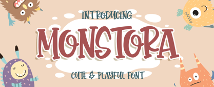 Introducing of our new product the name is Monstora Cute & Playful Font. Monstoray inspired by bouncy quirky this font is a fun theme very good for, book cover, poster, t-shirt, quote, logotype, craft and etc. MULTILINGUAL ACCENT : ØÆøæ¢ÐŒœÁĂÂÀÄĄÅÃǼĆČÇĈĊĎÉĔĚÊËĖÈĘĞĜĢĠĤÍĬÎÏİÌĮĨĴĶĹĽĻĿŃŇŅÑÓŎÔÖÒŐǾÕŔŘŖŚŠŞŜȘŤŢÚŬÛÜÙŰŲŮŨẂŴẄẀÝŶŸỲŹŽŻáăâäàąåãǽćčçĉċďéĕěêëėèęğĝģġĥíîïìįĩĵķĺľļŀńʼnňņñóŏôöòőǿõŕřŗśšşŝșťţŭûüűùųůũẃŵẅẁýŷÿỳźžż FEATURES : Uppercase Lowercase Number Punctuation Multilingual PUA Encode Opentype
 - P22 Mai Pro by IHOF,
$39.95 Mai Pro is a new transitional antiqua that features ligatures, smallcaps and full Central European support. Mai's classic design is understated enough to be used for long running text applications yet includes unique characters suitable for design purposes. It is the Norwegian name for the month of May.
 - British Vehicle JNL by Jeff Levine,
$29.00 Auto license plates in the United Kingdom are made with a typeface originally designed by (and named for) Charles Wright and must meet strict criteria as to type height, weight and spacing. A bold sans serif design; British Vehicle JNL is available in both regular and oblique versions.

