10,000 search results
(0.034 seconds)
- Ehrhardt MT by Monotype,
$29.99 The Ehrhardt name indicates that this typeface is derived from the roman and italic typefaces of stout Dutch character that the Ehrhardt foundry in Leipzig showed in a late-seventeenth-century specimen book. The designer is unknown, although some historians believe it was the Hungarian Nicholas Kis. Monotype recut the typeface for modern publishers in 1937 to 1938. Ehrhardt has a clean regularity and smooth finish that promote readability, as well as a slight degree of condensation, especially in the italic, that conserves space. Ehrhardt is a fine text face, especially for books.
 - Aldus by Linotype,
$29.99 Aldus was designed by Hermann Zapf and appeared with the font foundry D. Stempel AG in Frankfurt am Main in 1954. Zapf named this font after the famous Venetian printer Aldus Manutius, whose work is among the most important of the Renaissance period as well as Zapf’s inspiration for Aldus. Linotype Aldus was introduced by Linotype Library as a text font lighter than Palatino. Zapf’s goal with his Palatino and Aldus was to create a new form of Old Face typeface. This font gives text the feeling of elegance which was typical of the Renaissance.
 - Kapsalon by Hanoded,
$12.00 It could be you’ve never heard of Kapsalon and I will forgive you for that. Kapsalon is a Dutch word, meaning ‘hairdresser’s’. Since 2003 it is also a very popular snack food, which consists of french fries, döner kebab, lettuce, sambal, garlic sauce and melted Gouda cheese, served in an aluminium tray. I have to admit that I have never eaten a Kapsalon myself, as I am not too fond of fast food. I named this font package Kapsalon, because, like its namesake, it consists of several unrelated elements that work really well when combined.
 - Deca Sans by ParaType,
$30.00 Super family Deca consists of ten fonts. Six sans serif styles form the Deca Sans family and four styles of serif family named Deca Serif . These are low contrast fonts of pure design with ovals bent to rectangular shapes. They are nicely readable in small sizes and can be recommended for scientific, legal, official and business documents. Serif and sans serif fonts were designed in comparable proportions, they are balanced by color and have similar details in basic shapes. These features provide high compatibility and assume collective usage of the fonts in documents.
 - Romford Stencil by Paula Minelgaite,
$30.79 Romford Stencil is a Brexit inspired typeface. It’s letterforms represent the idea of a union splitting apart and the stylistic differences between the upper and lower case symbolise the notion of being different from one another. Research for this typeface started off in Romford which is an area where the majority of UK voters wanted to leave the European Union, hence the name. Romford Stencil is designed to be readable for body copy and look impressive when used as a display typeface. However, the bigger it's size the better it looks, especially in all capitals.
 - Mamontov by omtype,
$49.00 Originally Mamontov has been inspired by poster (usually wooden) types of the end of 19th—the beginning of 20th centuries. The type family was named after Savva Ivanovich Mamontov (1841-1918), Russian industrialist and patron of the arts. Massive asymmetric serifs, stocky proportions, type weight... are traces of harsh imperial reality. And soft forms of ovals, exaggerated compensators, humanistic curves of serifs and horizontal strokes betray the sensitivity and artistry of Savva Ivanovich. Mamontov has 25 styles, ranging from Light to Black and from Condensed to Wide, with more than 1000 characters per font.
 - Force Of Habit by Kitchen Table Type Foundry,
$15.00 I am not really a creature of habit, but when I start working on a new font, I make myself a cup of coffee first. I guess you can call that a habit, so I decided to name this font Force Of Habit. Force Of Habit is a nice brush font - made with a cheap pencil that I borrowed from the kids’ colouring box and my trusted (and seemingly ever flowing) Chinese ink. Force Of Habit comes with extensive language support, some alternates and - quite possibly - a faint smell of freshly roasted coffee..
 - Hyggemand by Hanoded,
$16.00 Hyggemand is not a real word: it is a combination of Hygge (meaning ‘fun’ or ‘coziness’ in Danish) and Mand (which means man in Danish). Combined it means something like ‘Nice Man’. I just like the sound and look of this name, so if I offend Danish languages purists, then I apologise for this monstrosity! ;-) Hyggemand is a happy kids font that comes with extensive language support and a set of alternates for the lower case glyphs. If you want the cute Huggeman face, you will find it as a stylistic alternate for the asterisk.
 - Tangential Rounded by ArtyType,
$29.00 This variation of Tangential (see also the Standard & Semi Serif variants) continues with the angles that give the typeface its name; however, the square terminals are half-rounded to create a softer and slightly more fluid styling. The Tangential style I envisaged for the family is complemented by the prominent use of negative space throughout, most apparent on the drop-shaped ‘o,’ which is a key feature of the typeface and a letterform I'm particularly pleased with. Available in 2 weights, Regular & Bold, in both OpenType OTF & TrueType TTF formats.
 - Murisa Barbara by Murisa Studio,
$10.00 This time we present to you our newest font. Barbara is one of our proud fonts. Barbara is designed with the inspiration of a woman's beauty. Barbara was born with stunning elegance. You can use this font for your daily needs, such as writing a message, quote words, or the name of the recipient of your invitation. You can of course also use this font in your products. Barbara will perfect your product. Elegance, cheerfulness, beauty will be the main attraction for your product. Get it right now.
 - Lemony Crumpet by Kitchen Table Type Foundry,
$10.00 A crumpet is a small griddle bread, mostly enjoyed in the UK, North America, Australia and New Zealand. I have never had one, but I have heard of them and I like the name - which is probably Welsh in origin. Lemony Crumpet is a whimsical, handmade font. It is tall & thin, shaky and jumpy and I wouldn’t use it as a poster font because of its delicate properties, but it would look fantastic on book covers, product packaging and websites. Comes with extensive language support and a set of alternates for the lower case letters.
 - Boostnia by Twinletter,
$14.00 Introducing our newest font called Boostnia, a bold signature font written with abstract curves but still looking modern and elegant, This font in addition to having a charming and unique shape is also equipped with various options that support good results when you use it in your project. This font is perfect for business cards, photography studios, autographs, interior designs, model names, coffee late, travel, weddings, cosmetics, jewelry, social media posts, product packaging, watermarks, special events, or anything else. Start using this font to add an authentic and heartfelt vibe to any design project.
 - CG Gothic by Monotype,
$29.99This is a family of "Gothic" types from the Monotype Design Studio. The faces named "Gothic No. 1 through 4" were produced by Compugraphic. Gothic No. 1 is a condensed, late 19th century American-style sans serif typeface. Gothic No. 2 and Gothic No. 3 are based on the Metro #2 series, designed by W.A. Dwiggins for Mergenthaler Linotype during the 1920s and 30s. Gothic No. 4 looks vaguely like Gothic number one, but is heavier and smaller on the body. Gothic Extra Light Extended is a very light and wide design. - Mafuta by Scholtz Fonts,
$19.00Mafuta is a round, happy font, named for the Zulu word for "fat". In tribal societies in Africa, where food was often scarce and almost never easily come by, it was considered desirable to appear "well fed". Roundness was a symbol of high status in the tribe, and a sign of wealth. The up-beat, bold outline of the font celebrates the confidence of people who feel comfortable being who they are. The font manages to be both contemporary and African. It is best used for posters and for headings. - Morningstar JNL by Jeff Levine,
$29.00 Her father named her Estella Dawn, or morning star. She truly shines bright, for as the owner of Stella Roberts Fonts, she has dedicated part of her net profits to helping her siblings pay for their medication; they both suffer from Cystic Fibrosis and diabetes. Calm in spirit, loyal to friends and family, nurturing and caring-- Stella has been a friend of Jeff Levine's for years. His Estella JNL font was dedicated to her, as is this other namesake font, Morningstar JNL. The design is a cross between retro-techno and a slight calligraphic touch.
 - Sanitation JNL by Jeff Levine,
$29.00 Sanitation JNL is a bold Art Deco sans design inspired by some stylized hand lettering on a 1930s-era WPA (Works Progress Administration) poster and is available in both regular and oblique versions. The topic of the poster was "Your home is not complete without a sanitary unit" and that was recommended by the State Department of Public Health. A "sanitary unit" is the formal name for what rural folks called an "outhouse", and it's presumed the target group were homeowners not hooked up to major sewer lines such as in those rural areas.
 - Molly Louie by Pelavin Fonts,
$18.00 Conceived on a cold evening to the hot Jazz of the Eri Yamamoto Trio at Arthur’s Tavern in the Village, font Molly Louie is best described by the person for whom it was named. “Very intricate, like a whole little world in each of them” and “The solid is nice too, like little cut up sandwiches.” The detailed and solid versions facilitate a variety of two-color applications. You might not use this decorative display font at smaller sizes, but you are encouraged to let your imagination guide you.
 - Burdigala Semi Serif by Asgeir Pedersen,
$19.99Burdigala is a clean-cut, modern yet classic typeface inspired by Didones and Aicher’s Rotis family. The Semi Serif is ideal for larger amounts of (printed) texts in brochures, magazines and books. It is slighty narrow in order to conserve space, but spacious enough to faciliate reading and overall clarity. The expanded versions of the semi serif, being wider and more open, works equally well in media intended both for print and on-screen reading, e.g. in Pdf-documents etc. Burdigala is the ancient Roman name of the city of Bordeaux France. - Roseta Display by Gatype,
$14.00 Roseta Display is an elegant script with a creative mood and perfect form, inspired by today's beautiful serif Display. thick, balanced and varied, born for luxury and beauty. In my example I show how this can be used. It's great for logotypes, branding, wedding invitations, romantic cards, alcohol labels, packaging, name spelling and more. Roseta Display with beautiful uppercase and lowercase letters, numbers, and punctuation. In addition to the main character set, there are many alternative characters, early and late sweeps. If you have any questions don't hesitate to contact me! Thank you,
 - Barataria by Scriptorium,
$24.00When designing a font, I often imagine how I think it should be used or where I'd be likely to see it out in the real world. With Barataria I envisioned it on decorative, antique-looking signs hanging outside shops in the French Quarter of New Orleans - hence the name. Barataria is based on samples of 1920s period poster lettering. It's a bold, heavy roman font with strong, rounded character forms. Barataria also has some unique alternative character forms, like the super-looped 'g' shown in the sample. - Reaper BT by Bitstream,
$50.99Thomas Oldfield’s typeface, Reaper, is reminiscent of inscribed Greek letterforms but he claims that its origin is much simpler than that. “I recall”, Tom says, “that I just began the design by making the uppercase ‘I’ and continued using it to make up the other characters.” The cap only typeface has alternate cap forms in the lowercase positions, including a vastly scaled downed O and Q that make for some unusual text settings. Contrary to what the name might have you believe, there’s a lot of life in this quirky typeface. - Sloop Script Pro by Lipton Letter Design,
$29.00 Richard Lipton originally released Sloop Script in 1994 through Font Bureau. Sloop Script Pro is the new, improved, rethought version, offering expanded language support and smart OpenType features. All of the new enhancements can be activated via human-readable stylistic sets whose names precisely describe what they do: “Entry Swashes,” “Exit Swashes,” “Smaller Caps,” and so on. Every weight of Sloop Script includes the available styles. Applying these features is straightforward and, thanks to automatic ligatures and contextual alternates, Sloop Script sets beautifully right out of the box.
 - Xanthine by Hanoded,
$15.00 Xanthine… is a purine base found in most human body tissues. Yes, you can forget that. I don’t even know what it means, but I suddenly realised that I was running low on fonts with an ‘x’ in the name. Xanthine font is a messy brush: it is all caps, but upper and lower case mingle freely. It comes with a whole bunch of diacritics and some interesting ligatures as well. I have included a very handy shapez pack and a truckload of arrows - anything to make you happy…
 - On The Town JNL by Jeff Levine,
$29.00 On the Town JNL is a reworking of Parks Department JNL, giving it a classic "solid black Art Deco treatment". The wide monoline font of the original design was inspired by hand lettering on a WPA (Works Progress Administration) poster. Art Deco typography and the streamlined style it embraced often conjures up images of New York City in the 1930s and 1940s, thus On the Town JNL is named for the classic MGM musical starry Gene Kelly, Frank Sinatra and Jules Munchen that was filmed on location in "the city that never sleeps".
 - Stand Up JNL by Jeff Levine,
$29.00 An online reproduction of a trade ad circa the 1950s for comedian-actor Paul Gilbert featured his name in the hand-drawn lettering that serves as the basis for Stand Up JNL. While the style of the typeface is derivative of the Latin Spur faces used popularly since the 1800s, the playful – almost awkward angles create a casual design that evokes good times. It should be noted that the extremes of such angles might appear ill-spaced unless kerning is turned on within the application where the typeface will be used.
 - Ongunkan Armanen Runes by Runic World Tamgacı,
$50.00 The Armanen runes (or Armanen Futharkh) are a series of 18 runes, closely based on the historical Younger Futhark, introduced by Austrian mysticist and Germanic revivalist Guido von List in his Das Geheimnis der Runen (English: "The Secret of the Runes"), published as a periodical article in 1906, and as a standalone publication in 1908. The name Armanen runes associates the runes with the postulated Armanen, whom von List saw as ancient Aryan priest-kings. The Armanen runes continue in use today in esotericism and in currents of Germanic neopaganism.
 - Languedoc by Hanoded,
$15.00 Languedoc is a former province of France. Most of its territory lies in what is now the Occitanie region. My family and I love camping there and I figured I’d name a font after it! Languedoc is a beautiful and useful typeface: it is a handmade serif that is a bit rough around the edges, but very legible and fun to use. Because of its legibility, you could use it for texts, product packaging, cook books and whatever else you fancy. Comes with a royal amount of diacritics.
 - Bertram by ITC,
$29.00Bertram Plain is the perfect font for setting titles in comic strips and similar designs. UK designer Martin Wait created this font 1991, after he was inspired by the casual style of circus graphics. In fact, this jolly and lighthearted font was even named after one circus in particular: the Bertram Mills Circus. Bertram Plain is an all-caps font, with capital letters placed on both the upper and lowercase keyboard strokes. Additionally, Bertram Plain letters sport a 3D-like drop shadow, a distinctive feature when comparing this to many other display fonts. - Orenji by Hanoded,
$15.00 Orenji is the Japanese word for Orange: it is a phonetic translation of the English word. I was actually looking for a certain shade of orange (the color), when I stumbled upon this fun word. I already toyed with the idea of creating a font loosely based on my son Sam's handwriting and I figured Orenji would be a good name for it. Orenji is a fun, cute and extravagant font. It has some uniquely shaped glyphs, comes with a giggle and a hug and more diacritics than you can throw a banana at.
 - Saturknight by Echopraxium,
$13.50 Saturnight Regular is a proportional and kerned typeface. The name is a variation of Saturnight, which is itself the anagram of Unstraight. This is because vertical lines are Unstraight sticks. It's a consequence of the Design rule * Glyphs are built from segments on a triangular tessellation (cf. poster 1) Note 1: Unstraight lines depend from the chosen tesselation orientation (here the tesselation has horizontal lines and thus Unstraight verticals). Note 2: The encoding is Windows Latin 'ANSI', which includes Icelandic characters (as illustrated by poster 3).
 - Partenkirchen NF by Nick's Fonts,
$10.00In Lewis F. Day’s 1910 classic, Alphabets Old and New, the author presented the inspiration for this typeface as an example of German monumental lettering, most likely to suggest not that the typeface was really big, but that it had been found on German monuments. Bold yet charming, the face takes its name from a picturesque village in the Bavarian Alps which was the ancestral home of the Gröbl line of Curtii forebears. Both versions of this font include the complete Latin 1252 and CE 1250 character sets, with localization for Romanian and Moldovan. - Skippy is Canon by Edd's Aurebesh Fontworks,
$5.00 Working on a Star Wars project? This font is in the main Star Wars written language of Aurebesh, and contains all the additional letters found in the language as glyphs. Designed to be a blocky workmanlike font that has the roughness commonly found in Star Wars related visuals. All numbers are also included as well as central punctuation symbols. The name is a very obscure reference to the old Star Wars expanded universe, when a force-sensitive droid self destructed in order for Uncle Owen to purchase R2-D2.
 - Laca Text by Nova Type Foundry,
$21.99 Laca Text is a sans-serif version of Laca. It was designed starting from the shapes of Laca. It is a cleaner version of Laca. Laca Text has characteristics like a bigger x-height, open counters, and smaller ascenders. It works better in smaller text than Laca because it keeps the structure without the stylistic features of Laca. Laca Text has more straight lines and follows the round shapes of Laca. Laca Text, as the name says, is more proper for long text but also for identity and branding.
 - Contributor by Arendxstudio,
$18.00 Contributor Luxury Calligraphy - that is luxurious in a casual and distinctive style - is perfect for your branding designs and will also be very beautiful in wedding invitations, business cards and especially in your brand name logotype. Contributor Luxury Calligraphy has beautiful Uppercase and Lowercase, figures and ligature, and much more. There it is! I really hope you enjoy it. Comments & likes are always welcome and accepted. Don’t hesitate to send a message if you have a problem or question. Now just read this, go there and make it happen.
 - Hyggelig by Hanoded,
$15.00 After watching a bunch of Danish series like Dicte, Bron and The Killing, I figured it would be nice to give my newest font a Danish name. It became Hyggelig. Hyggelig, like the Dutch word 'Gezellig', cannot be translated into English, but it means something like 'cosy'. And a 'cosy' font it is. Hyggelig is a very cute, very threedee-ish typeface. It works great in poster ads and as a display font. It comes with upper and lower case letters and a whole bunch of diacritics. Enjoy!
 - Bryzhi by Gleb Guralnyk,
$15.00 Hello! Presenting an originally designed, decorative font, named Bryzhi. The main goal of this font is a flowing liquid reflection of characters. Most of the letters have five variations that switch automatically to create a seamless effect. Check out that the "Context Alternates" OpenType feature is activated to achieve the necessery result. Also simple letters without reflection effect are available using the "Stylistic Alternates" feature. Bryzhi font supports most of the European languages, please check out all the available characters on the screenshots. Thank you and wish you a peaceful sky!
 - Tangential SemiSerif by ArtyType,
$29.00 This variation in the Tangential series (see also the Standard & Rounded families) continues with the angles that give the typeface its name, however a semi-serif is applied wherever appropriate to create a more open, softer variant. The Tangential style I envisaged for the family is complemented by the prominent use of negative space throughout, most apparent on the drop shaped ‘o’ which is a key feature of the typeface and a letterform I'm particularly pleased with. Available in 2 weights, Regular & Bold, in both OpenType OTF & TrueType TTF formats.
 - Romantica Signature by Scratch Design,
$12.00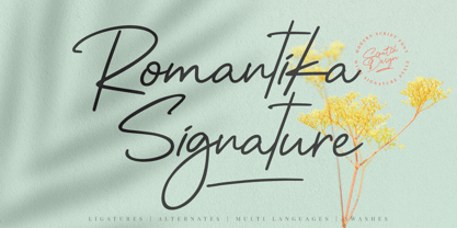 Introducing RomantiKa Signature! It's a modern script font with a signature style look. It's very recommended for you who want to make some designs with natural handwriting with signature style. Romantika will work for name card design, invitation design, wedding design, poster, packaging, book cover title, quote, social media post, etc. Just open your Opentype features ( Minimum Compatible with Adobe Photoshop CS 6 and Adobe Illustrator CS 6 ) while using the script font to use the ligatures, stylistic alternates, and swashes. As you type, your text will look like a natural signature or handwriting.
 - Sava by Adobe,
$35.00Sava is a calligraphic capitals and small capitals design by Jovica Veljović. Available in six weights--light, regular, medium, semibold, bold and black--it includes support for most western and central European languages, as well as for Greek and many Cyrillic languages. Typographic features include a series of non-standard ligatures and a large collection of specialized Byzantine ornaments. Influenced by the forms of medieval calligraphy, Sava is named after St. Sava, the first Archbishop of Serbia, who was famous as a peacemaker, and for his educational and charitable works. - Linotype Charon by Linotype,
$29.99Linotype Charon is the work of Renate Weise. Linotype Charon is a typeface with two sides to it: both objective and classic, it is neither neutral, nor an everyday typeface. Charon is modern and animated; its curving letters seek to touch the reader. Linotype Charon is named after the ferryman of Greek mythology who brought the souls of the dead across the River Acheron into the Underworld, connecting living and the dead. Linotype Charon, with its light swing and script character, can be used for either short texts or headlines.