10,000 search results
(0.033 seconds)
- Plate Gothic by Monotype,
$29.00Around the turn of the twentieth-century, Steel and copper plate engraving was the most sophisticated and expensive method for producing business cards, stationery, and formal announcements. In engraved printing, the image is incised, or engraved into a hard, flat plate. Ink is applied to the plate, and then wiped off; leaving only the ink that is trapped below the surface in the incised areas. When the paper is pressed against the flat plate, the ink is drawn out of these areas and transferred to the paper. The results are twofold: printing which sits above the surface of the paper, and the reproduction very delicate lines and shapes. For business and formal printing, engraved printing was, and is, considered the best. The problem is that not everybody can afford the best. Type foundries, in the early 1900s, figured that if they could produce a typeface for traditional printing, which had appearance of engraving, they would be able to satisfy the needs of those forced to live with modest printing budgets. Engravers faces were born. Fredric Goudy’s Copperplate Gothic was one of the most popular. Plate Gothic is a version of this style updated for digital technology. It has all the charm and charisma as the metal type and yet is perfect for today's needs. - Knock Type by sugargliderz,
$20.00 KnockType is based on the concept of braille notation in Japanese. It does not support braille notation in other languages. KnockType is not necessarily aimed at facilitating “braille transcription”. It is designed so that someone who understands the grammar of “braille transcription” can instantly transliterate into braille text that was previously transcribed to kana characters, etc. In addition, it allows ink characters to be converted to braille using OpenType features. It is recommended for use in applications that are compatible with OpenType features. If they are not compatible, KnockType is “simply a kana font”. To be a little more specific, it is assumed that KnockType will be used in Adobe’s InDesign and Illustrator applications. If you don't have them, you will not get satisfactory results. Four types of font are available. There are “hasBox&Line”, “hasnotBox&Line”, and the reversed font of each. When displayed on a convex surface, the assumption is that they will be used mainly for printing applications. When displayed on a concave surface, the assumption is that they will be used mainly for writing on braille boards, etc. By printing, you can get a rough idea of the dot positions. It is more effective to match them to the grid size of the braille board.
 - Nasser by Eyad Al-Samman,
$3.00 “Nasser” is a Kufic modern Arabic typeface. It is suitable for books' covers, advertisement light boards, and titles in magazines and newspapers. It is very distinctive when used in black and white printout. It decorates colored pages and makes artworks more attractive. This font comes in three different weights. My father’s name is “Nasser”. Consequently, “Nasser” Typeface was designed for eternizing the memory of my late father. He was the person who taught me how to like arts, literature, and languages. Besides, my first cute child is named also “Nasser.” The main characteristic of “Nasser” Typeface is in its modern non-descender style for some of its Arabic characters such as “Sad”, “Seen”, “Sheen”, “Qaf” and others. The shape of the characters' “dot”, “dots”, and “point” is innovative; a triangle with a semi-circle shape. “Nasser” Typeface is suitable for books' covers, advertisement light boards, and titles in magazines and newspapers. Its characters' modern Kufic styles give the typeface more distinction when it is used also in posters, greeting cards, covers, exhibitions' signboards and external or internal walls of malls or metro’s exits and entrances. It can also be used in titles for Arabic news and advertisements appeared in different Arabic and foreign satellite channels.
 - Carbona by Plau,
$30.00 Carbona is our attempt to imagine the future through typography. The perspective of the future is, perhaps, the greatest force of action humans have. Knowing that there will be a tomorrow is the stimulus we depend on to decide how we are going to act today. This idea is also one of the best fuels for creativity. That's why we thought of Carbona as a typeface in sync with everything that appears on our technological future. From the countless births of new digital currencies to the sending of ultra complex algorithms at 5G speed, the future of any habit, choice or task that we will perform will transit through some super computer located somewhere very far away – who knows even on another planet. The family is designed to deal with the situations of the digital world, today and what is yet to come. It is optimized for programming, contains cryptocurrency symbols, advanced features for use in interfaces, and much more.
 - Pelegotic by T4 Foundry,
$21.00Pelegotic makes you think of Scandinavian pioneer design, with its functional letterforms and architectural look. It is also a very versatile typeface, and fits easily as headline type for a magazine, or as part of a graphic profile for a company. It looks simple, but that impression is deceptive; the letters are drawn with a flair and individuality that shows the hand of a master typographer. Pelegotic Regular is rather thin, and is useful for big type like signs. Veteran designer Bo Berndal has created Pelegotic: "Pelegotic is a sansserif inspired by the Art Deco of the 20's and the Swedish functional style of the 30's. The slightly condensed design is an attempt to find a somewhat more elegant lettershape than the usually rather technical expression of monoline typefaces", says Bo Berndal. Pelegotic comes in three weights, with roman and italic in each weight. It is an OpenType creation, for both PC and Mac. - IL Palamede by Notope,
$25.00 IL Palamede is a typeface with just one style, referring by its name to the French chess magazine Le Palamède. Connects with chess here not only the name. Each symbol is built on a 5x5 grid with 3x3 priority. At the same time, the logic here is higher than optical compensation, so you can observe here quite dense, for example "b". Thanks to this solution, the typed text is balanced in width, and it also creates the feeling of a chess cell, where black and white cells alternate. Connects with chess here not only the name. Each symbol is built on a 5x5 grid with 3x3 priority. At the same time, the logic here is higher than optical compensation, so you can observe here quite dense, for example, "s". Thanks to this solution, the typed text is balanced in width, and it also creates the feeling of a chess cell, where black and white cells alternate. Use this font for any purpose that includes winning or enjoying.
 - ZT Vollun by Khaiuns,
$29.00 ZT Vollun is a work of awakening from my valley of boredom in making fonts, it is not only a transformation of thickness, but also in terms of theme, aura, shape and beauty. Maybe this is a superstition of adulthood and also as we get older, our taste in cigarettes can change too. And the taste of the coffee is also getting bitter, in fact there is no sugar anymore, but the enjoyment is increasing. ZT Vollun consists of seven weights, starting from the thin one with curves combined with thin strokes, offering a playful aura, to the thickest one with a firm design that will present a thick modern atmosphere. Whether you're working on a branding project, an editorial project, or any other graphic project, ZT Vollun is the perfect choice for a modern, elegant look or any design vibe you can get your hands on. I hope you have fun using ZT Vollun. Thanks for using this font
 - Hela by Renegade Fonts,
$12.00 Hela is a high contrast rounded font with interpolation twist. I have a personal saying that fits this font: So long you drive around nice lettering, until you digitize it. Hela comes from lettering of an old Czech textile company called Helana, which does not exist anymore, but the signage is still on the building. The weird thing on this font is that it does not add weight on every stem from Light to Black as usual, but rather adds more and more black stems to the light skeleton. Another nice thing about this font is that it does not include unnecessary glyphs. So there are just 10 figures - you don't have to think which one is the correct figure kind for you. There is just one kind. No alternates, no italics, no opentype features - even no lowercase. Well, who would use it anyway, it is a display font! Try it yourself with Basic character set for free.
 - Dolly Pro by Underware,
$50.00 Dolly Pro is a book typeface with a flourishing flavour. She’s suitable for classical book type setting as well as for more contemporary magazine designs. The family consists of four fonts: Dolly Regular is neutral and useful for long texts. Dolly Italic is narrower and lighter in colour than the Regular, and so it can be used to emphasize words within Regular text. Dolly Bold is also useful in emphasizing words within Regular text. It also works well as a display type. Dolly Small Caps is intended for setting whole words or strings of characters. With its relatively low contrast, Dolly is perfectly legible in really small sizes. When Dolly is applied in bigger sizes, such as book covers, more crispy details will show up. These four fonts provide a good basis for most of the problems of book typography. Dolly Pro fonts have Underware’s Latin Plus character set, supporting a total of 219 languages.
 - Utroligt by Hanoded,
$15.00 I am (trying to) learn Danish using an app on my phone. The grammar and vocabulary are not that difficult, as the Danish language is very close to the Dutch language. The pronunciation, however, is quite tricky. Words look simple when written down, but when pronounced, they sound very different. Take ‘pige’ (‘girl’) - it reads ‘pee-guh’, right? Well, it is pronounced ‘pee-uh’. Or how about ‘brød’ (meaning bread)? If you keep in mind that the o-slash is pronounced as the ‘i’ in bird - almost like ‘uh’, it should be br-uh-d, right? Wrong again. It is pronounced br-uh-l. Aaargghh! I will succeed, hopefully! Utroligt is a Danish word meaning ‘incredible’. It is a nice, uncomplicated all caps font. I made it with a cheap rollerball pen and some nice French paper. Comes with double letter ligatures and all the diacritics you’d like - including the danish ones.
 - Tepuy by John Moore Type Foundry,
$20.00 Tepuy is the name given to the ancient plateau-shaped mountains that abound in the Venezuelan Amazon. Tepuy is a display typeface inspired by the symbolic forms of the Venezuelan ethnic roots. It is constructed based on a very precise geometry of open forms that produce a double letter in form and counterform. Tepuy originates as an evolution curve of my Font Makiritare rectilinearly. Was devised for a book of photographs of the ancient mountains of the Venezuelan Amazon, its form and Makiritare are morphologically inspired crafts in the ethnic groups of the region. Tepuy is held in a very precise geometric construction based on rounded forms, each letter is a form envelope enclosing another in counterform, is a letter to display. Tepuy comes in four versions Regular, Light and thin, and there is a double line version enclosed. Tepuy recommended for creative headlines for the label and packaging design aimed at all ages.
 - Bikini Season by Los Andes,
$37.00 Summer has come! Boho girl is going on her beach vacation. Relaxed, spontaneous, feminine, irreverent, though. Like a girl with a Gipsy soul, she just grabs her Bikini and turns away! This is the new font duo by the couple Coto and Luciano. Bikini includes a sans version, based on the proportion and structure of Roman capitals, but with a contemporary flavor and a clean style that give the typeface a chic touch. The other version of this font duo is a modern calligraphy script of handmade style. The mix is just perfect: opposites attract creating a very interesting counterpoint. Can you guess who is the designer behind each style? This font duo is intended to be used for posters, labelling or branding. The sans and script styles add visual hierarchy when composing text. Feel the fresh free spirit of its OpenType features and ornaments! Please see User Guide Every season is Bikini season!
 - Alfons by Fenotype,
$35.00 Alfons is a handy collection of 38 display fonts with a pack of Ornaments and Extras on top of that. Alfons is great for any kind of display use from online to packaging to posters or identities. Alfons is divided into eight subfamilies that play great together. Alfons’ core family is a monoline script that has eight weights from extra thin to black and on top of that two printed versions that have softer, a bit blurred features. Alfons Script is equipped with Standard Ligatures which makes the flow more natural. For more swirling swashes and bouncy flow try Swash, Stylistic or Titling Alternates in any OpenType savvy program or manually select from even more alternate characters from Glyph Palette. Alfons Display, Sans, Condensed, Serif and Slab are equipped with Swash alternates and Alfons Tiki has interlocking ligatures feature that you can access from Discretionary Ligatures. Alfons Extras is a pack of pictograms and icons and some catchwords. Alfons Ornaments is designed to work with Script.
 - HS Albadr by Hiba Studio,
$59.00 HS Albadr is an Arabic display typeface. It is useful for book titles and graphic projects where a contemporary, geometrical and streamlined look is desired. The font is based on the simple lines of modern and simplified Kufi calligraphy that support Arabic, Persian and Urdu. It has one weight only which is similar to the bold weight. This typeface is created for being used in technical and engineering companies under strict geometric conditions . The company desires to follow the geometrical shape with uniform and equal dimensions in both vertical and horizontal storks; where some parts of the letters are to be cut at a slanting angle of 45 degree to give the impression of a coherent geometrical nature for this font. The typeface HS Albadr is considered as a chain of geometric fonts series designed for engineering companies. After HS Almohandis and HS Alhandasi were designed we are looking forward to giving some additions to the geometric typefaces field.
 - M Banquet P PRC by Monotype HK,
$523.99 M Banquet is a humanistic script written by a Chinese restaurant owner, which the name ‘Banquet’ comes from. It is a calligraphic style that always being seen in traditional Chinese banquet menu. Incorporated a feeling of masculinity, fill with strength and energy and attracts eyeballs of customers. It was written with a thin ball pen in a unique, personal and expressive writing style, such that it is realistic, natural and masculine. Contrast of strokes is low and the text is visible and eye-catching. Its light to medium stems (豎) make it suitable for small text to subheading with little conglutination. All strokes are irregular, inconsistent, irregularly oriented and tightly coupled. Spatial distribution, positioning, size and relative proportion of radicals fully reflect a natural and personal style. It is one of the few proportional-width font in a full scale. It is best suited for casual lively atmosphere, illustrations, set upright (non-slanted), non-condensed.
 - M Banquet P HK by Monotype HK,
$523.99 M Banquet is a humanistic script written by a Chinese restaurant owner, which the name ‘Banquet’ comes from. It is a calligraphic style that always being seen in traditional Chinese banquet menu. Incorporated a feeling of masculinity, fill with strength and energy and attracts eyeballs of customers. It was written with a thin ball pen in a unique, personal and expressive writing style, such that it is realistic, natural and masculine. Contrast of strokes is low and the text is visible and eye-catching. Its light to medium stems (豎) make it suitable for small text to subheading with little conglutination. All strokes are irregular, inconsistent, irregularly oriented and tightly coupled. Spatial distribution, positioning, size and relative proportion of radicals fully reflect a natural and personal style. It is one of the few proportional-width font in a full scale. It is best suited for casual lively atmosphere, illustrations, set upright (non-slanted), non-condensed.
 - YR Basma by Alrefaiy,
$20.00 YR Basma is a slab serif font that is renowned for its bold and distinctive appearance, which is designed to create a powerful impact. It is characterized by its strong and striking letterforms, with bold and thick strokes that give it an intense and impactful look. The font is also highly legible, with a focus on clear and easy-to-read letterforms that are meticulously crafted to balance visual weight and vertical alignment. YR Basma is ideal for a broad range of design projects that require a robust and striking visual presence, such as headlines, posters, packaging, and branding. It boasts a comprehensive set of glyphs, including both upper and lowercase letters, numerals, and symbols, making it highly versatile and adaptable to diverse design needs. YR Basma font offers a bold and commanding aesthetic, while maintaining excellent legibility and clarity of letterforms. Its powerful design makes it an excellent choice for various design projects where a strong and dominant visual presence is desired.
 - Tempest-narrow - Unknown license

- Claudia Betta by Matra Creative,
$14.00 Claudia Betta Font is a formal script font with multilingual support. It is ideal for wedding invitations, magazines, social media, restaurant menus, greeting cards, birthday invitations, headers and more. This font is equipped with a complete set of lowercase and uppercase characters, various kinds of punctuation ligatures, numbers and and multilingual support.
 - Woodmark JNL by Jeff Levine,
$29.00 Woodmark JNL is a rough and somewhat irregular in letter form wood type based on some examples of William H. Page's "New Process No. 507". The eccentricity of the letters is reminiscent of many of the 1800's wood type designs, and is perfect for a rustic look within any retro project.
 - Angela Love Script by Fargun Studio,
$14.00 Introducing Angela Love Script Angela Love Script is modern script that is perfect for photography, branding, signature. It is beautiful and classy for all your projects. This font has given PUA code (specially coded fonts) so that all the alternate characters can easily be accessed in full by a craftsman or designer.
 - The Devils Poetry by Michael W. Moss,
$10.00 The Devil's Poetry is a new blackletter typeface from Michael W. Moss. The lowercase letters feature a pleasing hexagonal visual cadence while the capital letters stand tall and modestly ornate. The Devil's Poetry is available in three styles and features a Unicode Latin Extended-A character set. "Sarcasm is The Devil's Poetry."
 - Show Poster JNL by Jeff Levine,
$29.00 In the 1960 edition of Samuel Welo’s “Studio Handbook for Artists and Advertisers” is an example of poster lettering with the accompanying blurb “call this Chrysler”. This casual brushstroke design was slightly modified and then reworked into what is now Show Poster JNL and is now available in both regular and oblique versions.
 - Grasstrack by Gassstype,
$33.00 Hello Everyone, introduce our new product Font Grasstrack This Is Rough Brush Font.This is a Textured Natural Style and classy style with a clear style and dramatic movement. That is has charming, authentic and relaxed characteristic more natural look to your text. You can activate 29 Ligatures and 5 Alternate glyphs OpenType panel.
 - Reinkey by Sign Studio,
$15.00 Reinkey is a neat and clean brushed display font. It has alternate characters, which will give you convenience when choosing a character for each design project. It is suitable for logotypes, banners, brochures, branding and more. It is PUA encoding which means you can access all of the glyphs and swashes with ease.
 - Qairen by Letterena Studios,
$10.00 Qairen is a classic typeface with a unique style and modern look. It is perfect for elegant and luxury logos, book or movie title design, fashion brands, magazines, clothes, lettering, quotes, and so much more. This font is PUA encoded, which means you can access all of the glyphs and swashes with ease!
 - Salsa Billa by Sulthan Studio,
$12.00 Salsa Billa is new, fresh, funny, interesting, cute calligraphy font. It includes hearts and cute cords as alternatives. It is suitable for greeting cards, branding materials, business cards, quotes, posters, and more! Salsa Billa is coded with Unicode PUA, which provides full access to all additional characters without having special design software.
 - Alvardo by Tigade Std,
$15.00 Alvardo is a retro and vintage bold script font. This font is PUA encoded which means you can access all of the glyphs and stylistic alternates with ease! It is looking great on product, headlines, magazines, logos, poster, branding and many more!. Use this font to bring your design back to the oldies!
 - Homeplate Rough by Alphabet Agency,
$14.00 Homeplate Rough is a classic serif display font. The font is designed for use in vintage themes and works particularly well in bar, steakhouse, rodeo and country music themes. The font was originally developed for use in branding in baseball teams. The font is an all capitals font and includes 128 characters.
 - Bolyvina by Almarkha Type,
$33.00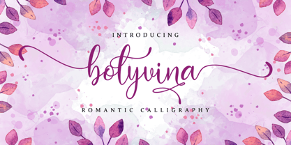 Bolyvina is a beautiful script that feels classy, elegant, and modern. It is perfectly suited for a wide variety of projects! This font is PUA encoded which means you can access all of the magical glyphs and swashes with ease! It also features a wealth of special features including alternate glyphs and ligatures.
 - Rochalle by Liartgraphic,
$20.00 Meet our newest product, this product we call Rochalle font. Rochalle font is a cute typeface font A little unique and firm touch. The Rochalle font is great to use on: fashion magazines, logos, and photography, landing pages, flyers, What is included? -multilingual support - alternative - . fastener Thank you, greetings Ali Sifak Muftar
 - LeBeau by Ascender,
$29.99 LeBeau is a new display typeface designed by Steve Matteson. LeBeau is an all capital letters font, and is based on brush-lettering from the turn of the 20th Century. The Lebeau font has an amusing, art nouveau attitude and can be used for festive posters and fliers, greeting cards or invitations.
 - Linotype Spacera by Linotype,
$29.99Louis L. Lemoine created the font Linotype Spacera in 2002. Linotype Spacera is a fun font from the new TakeType No 4 which contains 182 fresh, new, experimental, freaky and above all contemporary fonts. This is a contemporary typeface that could be a good choice when a modern futuristic look is desired. - Rayna by melifonts,
$5.00 Rayna is a simply beautiful handwritten font that is suitable for scrapbooking, notes to friends, and stylish logos. It is both elegant and versatile, including both Latin and Cyrillic alphabets with support for most European languages. This delicate typeface's swooping curls and sweet lines are the perfect addition to your handwritten font collection!
 - Green Nature by ZetDesign,
$10.00 We're introducing our new product that we named Green Nature..... this font is inspired by leaves, so it gives a beautiful and natural impression. This font is very suitable for clothing, logos, magazines, banners, etc. With natural touch, this font is the best choice for your natural business. Files included: green nature.otf
 - Glandian by TM Type,
$12.00 Glandian is a romantic and sweet calligraphy typeface with characters that dance along the baseline. It has casual yet elegant features. It is perfect for wedding invitations, logo designs, social media, wedding greetings, etc. This font is PUA encoded, which means you can access all of the glyphs and swashes with ease.
 - Wickedelic by Oui Studio,
$17.00 Hello, friend! 'Wickedelic' font is coming; a playful modern psychedelic font with stylistic and ligatures. Wickedelic font is highly inspired by the 60s era and psychedelic vibes. Wickedelic is perfect for display, title, logo, branding, music event, t-shirt design, merchandise, and perfect for anything that wants to show a psychedelic theme.
 - Witch Pumpkin by Yoga Letter,
$15.00 "Witch Pumpkin" is a special display font with a unique shape. This font is very easy to use for all your work needs because it has been specially designed. This font is perfect for Halloween, movie titles, horror, comics and more. "Witch Pumpkin" comes with ligatures, numerals and punctuations, and multilingual support.
 - Gurgle Jock by Bogstav,
$14.00 urgle Jock is actually two fonts in one: The Regular version is a classic handmade sans and the Outline version is…well, an outlined version of the Regular - however, I made it a bit off-grid and hasty scribbled looking. The two versions works well as they are and even greater together!
 - Cutting Corners by Just My Type,
$20.00 Cutting Corners is all about letters made of squares that also suggest circles. That’s it. This is one of several fonts I’ve created based upon a strictly geometric form; in this case, a round-cornered square. The width is equal to height (except for i, I and most punctuation). Usage recommendations: logos, samplers.
