10,000 search results
(0.045 seconds)
- Christmas Lights by Letterara,
$12.00 Christmas lights is a modern handwritten font with an incredibly friendly feel. It features gorgeous swashes and ligatures that make this script incredibly versatile. Whether you’re looking for fonts for Instagram or calligraphy scripts for DIY projects, Christmas lights will turn any creative idea into a true piece of art! This font is PUA encoded which means you can access all of the amazing glyphs and swashes with ease! It also features a wealth of special features including alternate glyphs and ligatures.
 - Straits Light by AdultHumanMale,
$12.00 Straits is an oddball fun ALL-CAPS font, a modern take / re-imagining of some old Art Deco signage and a sister to my other font Penang. The font is available in 2 weights for now, a light and a medium. In general I think ALL-CAPS steal 26 characters from you, so each letter in each case is a little different, however subtly. This being an ALL-CAPS font I imagine it will work best in Headlines and other bold statements, but buy it and find out. The font is loaded with plenty of extras and glyphs. This was designed to be fun, so I hope you can have some with it.
 - Demons Light by Yoga Letter,
$13.00 "Demons Light" is a halloween themed font that will add horror and excitement to your Halloween party. This font is very easy to use because it has been specially designed. "Demons Light" is also equipped with multilingual support, numeral and punctuations, ligatures, uppersace, and lowercase. So that this font is very complete and is expected to be able to help your work or Halloween moment.
 - Aurora Lights by Lazy Holiday Studio,
$15.00 Aurora Lights was designed by Moon Young. Aurora Lights was inspired by album [ AURORA - URC ]. Included: -Uppercase and Lowercase -Number and Punctuation It expresses the fluid shape of the aurora. Recomended to use it on album covers and posters.
 - Love Light by TypeSETit,
$24.95 Love Light was the first commercial font released to the public by Rob Leuschke. As a result of many requests to make this piece of hand lettering into a font, Love Light introduced the world to the TypeSETit foundry. A playful calligraphic style, Love Light is great for scrapbooking, cards, invitations and other fun things.
 - Antique Light by Wooden Type Fonts,
$15.00 One of the classic display types of the 19th century, a slab font, suitable for text and display.
 - Inked Lights by PizzaDude.dk,
$20.00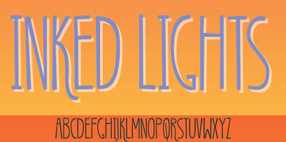
- Might Makes Right Pro BB by Blambot,
$9.00 Might Makes Right Pro BB is an all-purpose comic book dialogue font inspired by Bronze Age comics. It’s designed to compliment a wide variety of art styles. The opentype version has autoligatures to swap out adjacent, identical letter pairs for a more organic look, and a wide variety of European characters are included. This Blambot classic comic book dialogue family has been updated with even more European characters, improved spacing and kerning, contextual alternate correction of errant serif-I, and a fourth weight, plain Bold.
 - Mantika Sans Paneuropean by Linotype,
$67.99With its well-defined characters that are readily legible even in the small font sizes, Mantika Sans by Jürgen Weltin is ideal for typesetting. The elaborately designed and highly individual set of italics enhances the attractiveness of the font.Jürgen Weltin developed the Mantika™ Sans sans serif font using older designs for an serif font as his inspiration. Nothing more than the merest suggestion of the original serifs has survived. Bevelled line endings and the slight variation in thickness of verticals, in particular, provide Mantika Sans with a very dynamic character that evokes manuscript. Short ascenders and descenders give the font a compact appearance that is also underscored by its condensed proportions. Weltin has achieved his aim of producing a typeface with excellent legibility even in small sizes not just by means of the x-height, which is tall in comparison with the capital letters, but also by using clearly defined and well differentiated designs for critical letters, such as i", "I" and "l". Lower case "i", for example, has a serif while the "l" has a curved base.In addition to uppercase numerals, Mantika Sans also has lowercase or old style numerals that have been designed so that they can be used in both tabular and proportional settings. The uppercase numerals are slightly shorter than the uppercase letters, ensuring that the latter can be sympathetically incorporated within continuous text.The Mantika Sans italics are very unusual. They are inclined at only 4.5° (the usual angle for italics is 10 - 12°) and so appear to be almost upright. In addition, they also have quite distinctive forms. The overall effect calls attention to their curvilinear, manuscript character, enhances contrasts and further emphasizes the terminals. Weltin explains: "Within the variety of forms of the italics there are many contrasting terminal elements that create dynamism. The result is a diversity of interaction between the rounded and angular forms". Mantika Sans Italic thus has all the features of a display typeface, but can also be happily used on its own to set longer text passages. Mantika Sans is available in two weights; Regular and Bold, both of which have corresponding italics sets. Mantika Sans has been designed so that the widths of the four related cuts are identical, meaning that a change of font within a single layout will have no effect on justification. In addition, the members of the Mantika Informal font family, designed by Jürgen Weltin in 2010, also have the same thickness. Other font families having weights with equal thickness can be found in the "Linotype Office Alliance series".The Mantika Sans character sets are paneuropean. There are characters for setting texts in Eastern European languages, Greek and Cyrillic. There is also a range of special symbols, including right-angled brackets, subscript and superscript lower case letters, together with numerals, arrows and many different bullet points.As a vibrant and highly legible text font, Mantika Sans has a broad spectrum of potential applications. Its unusual italics are not just perfect for use in display text. The fact that it has only four cuts means that Mantika Sans is particularly suitable for office use or for the setting of business reports. Its excellent legibility even in the small font sizes also makes it ideal as a text for electronic reading devices; this also applies to Mantika Informal.At the 3rd International Eastern Type Design Competition Granshan 2010, Mantika Sans was awarded in the category Greek text typefaces." - Mantika Informal Paneuropean by Linotype,
$67.99Jürgen Weltin's Mantika Informal is pretty difficult to categorize, but very easy to like. This particularly reader-friendly typeface in regular and bold weights, brings to the table the informal fluidity of a script, the consistency of an inclined italic, and the open and airy forms and contrast of a humanist sans. The result is a warm, approachable, and very legible typeface that is never static and staid, but rather invites an attentive, reading eye. The original idea behind Mantika Informal lay in the challenge to create a typeface for setting children's books. German designer Jürgen Weltin aimed to create a reading typeface for those just starting to learn how to read. On the one hand, it should help create clear word-images; on the other, its letterforms should remain uncomplicated but resist mechanical and industrial sterility. Mantika?s subtle cursive lines stress the printed word's connection with handwriting, in addition to making the transition from school writing exercises to printed texts seamless and effortless. The resulting slightly organic and cursive forms that developed during the design process are so captivating that Mantika Informal may be used for a multitude of unintended applications - anywhere a friendly and informal yet sophisticated character could lend a helping hand, Mantika is there, giving a fresh accent to anything from packaging design to food products. With a broad character set encompassing support for Cyrillic and Green, Mantika Informal's two fonts make for a versatile and dynamic typeface that surely will find its place in a broad range of applications. - Menina Graciosa Ornaments by Intellecta Design,
$17.90 Meninas are the new comprehensive collection of innovative craft alphabets and ornaments researched in rare cross-stitch booklets from 1850 to 1930. This alphabet and ornaments series was entirely designed by hand, without use of auto-tracing, by Iza W, from Intellecta Design. Keep your eyes wide-open, because we will launch more amazing alphabets in this collection. “Menina” means “Girl” in Portuguese. Menina Graciosa is a Graceful Girl. See too her sister fonts: Menina Formosa , Menina Carinhosa , Menina Poderosa Ornaments , Menina Espinhosa .
 - Mantika Book Paneuropean by Linotype,
$67.99Mantika Book expands the Mantika super family: a contemporary serif font with a soft, yet robust character and a classic lookMantika Book, an Antiqua, is the third member of the Mantika super family, which consists of the Mantika Sans and Mantika Informal. Designer Jürgen Weltin has gone back to the roots of his font, which he had originally derived from a Renaissance Antiqua. These origins are recognizable in the first member of the Mantika family, Mantika Sans, in the form of carefully suggested line use and a contrast in the weights that recalls the Antiqua. This solid sans serif, optimized for use in text, also has a particularly energetic and dynamically designed italic. Mantika Informal also brings to mind a cursive font at first glance; ultimately, however, it is not easily categorized. Its light, organic shapes combine the informally flowing style of cursive handwriting with the open and airy form and contrast of a humanist sans serif. The shapes in the serif Mantika Book are also based on the Renaissance Antiqua, just like the other members of the Mantika super family. However, the contrast in the weights is somewhat stronger than is conventional for this genre, and the serifs are characteristically asymmetrical, with slanted ends. Lightly grooved stems with an implied curvature in the lower-case letters as well as dots whose shape flirts with a fountain pen lend the Mantika Book a dynamic and particularly friendly character. Details like the open "g" or the contoured foot of the "k" emphasize this dynamism. The letters of Mantika Book have the same large x-height as the other members of the super family, but are equipped with somewhat longer ascenders and descenders. - Menina Poderosa Ornaments by Intellecta Design,
$27.00 Meninas are the new comprehensive collection of innovative craft alphabets and ornaments researched in rare cross-stitch booklets from 1850 to 1930. This alphabet and ornaments series was entirely designed by hand, without use of auto-tracing, by Iza W, from Intellecta Design. Keep your eyes wide-open, because we will launch more amazing alphabets in this collection. “Menina” means “Girl” in Portuguese. Menina Poderosa is a Powerful Girl. See too her sister fonts: Menina Formosa , Menina Carinhosa , Menina Espinhosa , Menina Graciosa Ornaments .
 - Maxima Now Pro by Elsner+Flake,
$59.00 The sans serif linear antiqua Maxima which was created in the beginning of the sixties by Prof. Gert Wunderlich for Typoart Dresden, was newly actualized in 2007 after more than 45 years. Many hands and heads were involved in the successful re-design of Maxima Now over a period of two years to assist the designers of the Elsner+Flake Design Studios in Hamburg, and the typeface family is now available. The re-design happened in close cooperation with Wunderlich who has given support to numerous projects in Elsner+Flake’s studio in Hamburg. A great deal of care was given to the necessary preliminary tasks such as the viewing of the original designs and print tests, the analysis of the digital Typoart data which had been in the possession of Elsner+Flake since 1985 and 1989, and a design conceptualization based on detail correlations, as well as the extension of the character complement. It had been Elsner+Flake’s goal to include as many of the existing Maxima cuts into the re-design program as possible. The result is an extended font family with 25 weights in EuropaPlus layout.
 - NEON LED Light - Personal use only

- Ronduit Capitals Light - Personal use only

- ENYO Serif Light - Personal use only

- Kingthings Petrock Light - Unknown license

- LIGHT EMITTING DIODES - Personal use only

- id-Kaze2OT-Light - Personal use only

- Kingthings Serifique Light - 100% free

- Ignite the Light - Personal use only

- Upper Lane Light - Unknown license

- Am Sans light - Unknown license

- Lady Ice - Light - Unknown license

- Shadows Into Light - Personal use only

- SF Espionage Light - Unknown license

- id-kairyu1OT-Light - Personal use only

- Lady Ice - Light - Unknown license

- First Order Light - Unknown license

- SF Espionage Light - Unknown license

- Bionic Type Light - Unknown license

- Pandemonious Puffery Light - Unknown license

- Frigate Katakana - Light - Unknown license

- SF Arborcrest Light - Unknown license

- Xmas Lights BRK - Unknown license

- SF Arborcrest Light - Unknown license

- Lane Posh Light - Unknown license

- Flying Leatherneck Light - Unknown license

- TM Tail Lights - Unknown license


