10,000 search results
(0.069 seconds)
- LB Priester 1906 by Jonahfonts,
$30.00 There are many fonts inspired by Lucian Bernhard. I have always admired his 1906 award-winning poster: ‘Priester’— believed to be the birth of the ‘Sachplakat’ (or Object Poster). I have interpreted the hand lettered “Priester” logo into a formal typeface and only hope I have done it justice. Usage recommendations: Captions, fliers, packaging, cards, posters, ads, book jackets, manuals, bulletins, magazines, greetings, announcements.
 - Sigwald by Good Java Studio,
$20.00 Sigwald is born from bold and fun style fonts. That's available on other file from letter A-Z and a-z. Versatile for design poster, logo, branding, label, quote, headline profil, banner, t-shirt design, packaging, magazine, brochure, and many more your amazing work with this fonts. Features: - Included file: Sigwald Regular (OTF) - Simple installation - Support for MAC and PC - PUA encoded - Stylistic Alternates
 - Presswork JNL by Jeff Levine,
$29.00 Sheet music for the 1939 song “On the Paraña” featured Art Deco hand lettering in a classic “thick and thin” style, with many stylized characters. The publisher of the song was the Theodore Presser Company of Philadelphia, so the name “Presswork” aptly fit this typographic design. Presswork JNL is available in both regular and oblique versions. For trivia buffs, the Paraña is a river in Brazil.
 - Pochoir by Yanone,
$50.00Pochoir is a sweet stencil antiqua typeface with round and thick serifs. Once, on a university trip to Paris, Yanone saw some spray-stencil street art. This inspired him to redraw Underware’s Dolly (with permission) in a spray-stencil style, making many adjustments to weight and character shapes to bring about Pochoir. The art form of stencils have first appeared in Paris in the 1980s. - Catchfire by Alan Smithee Studio,
$10.00 Warm and human, yet reliable and precise. Catchfire blends humanist proportions and geometric features. The result is a sans serif typeface with strong personality traits, but that can fulfil everyday needs. It is very legible due to its open counters. It boasts a large character-set, OpenType features, circled numbers, wide range of weights, cursive italics : everything needed to become your new companion for years to come!
 - Bridgest by Attract Studio,
$20.00 Bridgest is an old and modern style serif created with a desire for quality fonts. The number of alternatives is enormous, from simple styling alternatives to swashes, fasteners and substitutes. Bridgest being a very versatile font with its classic shape and modern features, this font will be ideal for a variety of design projects from blog graphics, stylish quotes, wedding stationery, art prints and many others.
 - Mint Dayz by Four Lines Std,
$15.00 Unleash a wave of nostalgia with Mint Dayz, the font that seamlessly blends retro charm with modern legibility. This font captures the essence of yesteryears, infusing a sense of vintage elegance into your designs. Also Mint Dayz places a premium on readability and legibility. Each character is carefully crafted to ensure your message is crystal clear, making it suitable for a wide range of design projects.
 - Hacky Sack NF by Nick's Fonts,
$10.00Ross George in his numerous Speedball chapbooks called the pattern for this typeface Stunt Roman. A studious observer may discern that many of the wackier letterforms were tamed to produce the popular font University Roman; however, this version remains unapoligetically true to the original. All versions of this font include the Unicode 1250 Central European character set in addition to the standard Unicode 1252 Latin set. - Praha Deco by Deniart Systems,
$20.00 Praha Deco was inspired by the Prague art deco movement at the turn of the 20th century. Spiced with our own creative blend, this is our tribute to that wonderful era in architecture. The Praha Deco typeface contains a large assortment of extended characters to support many of Europe's languages, including Czech, Danish, Dutch, Esperanto, Finnish, French, German, Italian, Hungarian, Polish, Portuguese, Romanian, Spanish, Swedish, Turkish & Welsh.
 - Velveteen Round NF by Nick's Fonts,
$10.00This fresh face takes a number of design cues from Tomás Vellvé Mengual's eponymous design for Barcelona's Neufville Type Foundry in 1971. This version softens many of the lines of the original, and warms the design up overall with rounded terminals. Available in three weights, this font contains the complete Latin language character set (Unicode 1252) plus support for Central European (Unicode 1250) languages as well. - Kiwiberri by Melonaqua,
$10.00 Introducing Kiwiberri, a fun and playful handwritten font that you can use for your home or work projects. You can put it on shirt designs, mug designs, printable chalkboards, printable planners, websites, note-taking apps, wall art, greeting cards, and many more. The sky is the limit. This is multilingual so it is compatible with other languages. Kiwiberri is created to showcase handwritten fonts using brushes.
 - Juke Joint JNL by Jeff Levine,
$29.00 Although many pieces of sheet music used standardized backgrounds and metal type for their titles and information, there are hundreds of songs with innovative illustrations and clever typography beckoning potential buyers with their cover art. Whether the era was Post-Victorian, Art Nouveau or Art Deco, the sheer variety of eye-catching images offered visual enticement to the potential customer whilst browsing the local music shop.
 - Jolly Jester by Deniart Systems,
$20.00 Jolly Jester is an irregular and whimsical typeface inspired by old type playing card jokers. Great for any humorous occasion, whether you're designing headlines, greetings, fairy tales or any number of other projects. Jolly Jester includes a large assortment of extended characters to support many of Europe's languages, including Czech, Danish, Dutch, Esperanto, Finnish, French, German, Italian, Hungarian, Polish, Portuguese, Romanian, Spanish, Swedish, Turkish & Welsh.
 - Vast by ParaType,
$30.00 Vast is a variable sans serif with a range of styles from thin to black and from normal to extra wide. This versatile font family of both of a serious and friendly nature can be used for various purposes, such as text, logos, headings, and branding. Vast was designed by Manvel Shmavonyan with the assistance of Alexander Lubovenko and released by Paratype in 2021.
 - Algoria by Sealoung,
$15.00 Algoria is a functional sans serif that includes open character openings, a uniform distribution of white and black, and excellent readability. The general neutrality of the font patterns is not without elegance, and all the details of the typeface are crafted with mathematical precision and love. Typographic designs are developed for the widest possible range of tasks that any quality corporate font must accomplish.
 - Sefilya Script by Almeera Studio,
$15.00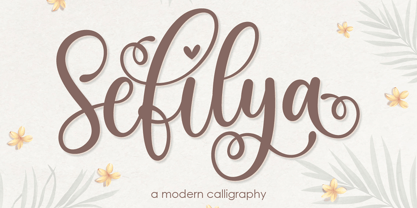 Sefilya Script is a beautiful script font with many alternative styles, this font looks natural, elegant and perfect for any extraordinary project.Sefilya Script is suitable for various products such as invitations, product packaging, quotes, product design, crafting, labels, photography, watermarks, logos & branding.Everything can be accessed using software that supports Opentype, such as Adobe Indesign, Adobe CS Illustrator, Adobe Photoshop CC, and Corel Draw.etc. Thank you :)
 - Avenia by Supfonts,
$15.00 Avenia it is a modern calligraphic font with exquisite accents. It is perfect for branding, wedding invitations and invitation cards and many more Font includes a full set of gorgeous uppercase and lowercase letters, numbers, a large selection of punctuation marks and ligatures. Includes: Regular Script Latin languages support Uppercase and lowercase Numbers and punctuation Ligatures Swashes Check out my blog: https://www.instagram.com/di.zigner pinterest.com/dmitriychirkov7 Enjoy
 - Matita Geometric by Trine Rask,
$30.00 Matita Geometric is part of a larger type family developed from 2005-2019 with handwriting and teaching in mind. A humanistic geometric sans serif in five weights containing mathematical symbols, roman numerals, fractions, superior-& inferior numerals, tabular & proportional figures. The family share proportions and weights to ensure all fonts (family members) work together well. Matita Geometric is also a very basic typeface suitable for many purposes.
 - Toddler Toys by NJ Studio,
$19.00 Hi...Thank for your visit :) Toddler a handmade fonts are font designs that are made for various vector designs, printing such as digital wedding invitations, blogs, online shops, social media, while printing can be used in the field of product clothing, accessories, bags, pins, logos, business cards, watermarks and many others ... so it can make your product look elegant and attractive, and also Multilingual support!!! Happy design ...
 - Candy Coloured Clown by Jeremy Woods,
$15.00 Candy coloured clown is a unique and quirky display font created to invoke feelings of fun and carelessness that one might experience while visiting a carnival or circus. The font has a comic strip or cartoon aesthetic with it's thick outline and bubbly appearance. Candy Coloured Clown features a broad range of highly legible characters in both uppercase and lowercase, making it a guaranteed eye catcher.
 - Octangle by RagamKata,
$14.00 Octangle, a well-shaped font that gives a retro power as a display typeface. It’s quirkiness makes it looks funky to enhance your design. The groovy touch to the Octangle font, makes it a fun typeface to explore with! Octangle is very suitable for a variety design, such as posters, Invitations, greeting cards, logo, and many more. Embrace your design with Octangle to make your work pinnacle!
 - Etelka Slab by Storm Type Foundry,
$39.00 Etelka Slab is a slab-serif variation of Stormtype's Etelka. In the process of adding serifs are applied some arched elements to emphasize its unique character. The usual range of OpenType functions is present as well as multi-lingual capability. You can use Etelka Slab wherever you intended to put Etelka, but with even sharper, louder expression. It shines in corporate identity and branding.
 - Running Hipster by Hanoded,
$15.00 Running Hipster is a tall, thin and all caps font with a funny name. The upper and lower case letters differ and can be mixed. You don’t necessarily have to use it to market your free range sheep woolen jumpers or organic button squash and soy based sour cream soup, feel free to use it for just about anything. Comes with a vintage amount of diacritics.
 - Beagley by Seniors Studio,
$35.00 Beagley Display is a contemporary serif typeface, special designed for printing and advertising. With deliberately tight kerning. Beagley provides a warm and friendly atmosphere. Suitable for logotypes, brands, magazines and editorial. The font contains 6 styles from condensed, normal and expanded, plus matching italics. 250 glyphs include ligatures, discretionary ligatures and a wide range of flexibility for Latin language support for every typographical needs.
 - Quartell Round by NREY,
$19.00 Hello! Introducing Quartell - modern display typeface family. Font looks amazing as alone words and as full text blocks. Also it good for bright captions and unforgettable logos It have supporting for many languages as: Czech, Danish and Norwegian, Deutsch, English, Espanol, French, Italiano, Magyar, Nederlands, Polish, Portuguese, Finnish, Swedish, Turkish, Russian and other based on extended latin. Thank you for purchasing and happy designing :)
 - Wahoobomex by Alit Design,
$22.00 Introducing the Wahoobomex Dynamic Blackletter Font - A Modern and Strong Typeface with 785 Characters, Ligatures, and Alternates! Are you looking for a font that combines the timeless charm of blackletter typefaces with a modern twist? Look no further than the Wahoobomex Dynamic Blackletter Font. This remarkable typeface strikes the perfect balance between tradition and contemporary design, making it ideal for a wide range of creative projects.
 - PR Swirlies 01 Frames by PR Fonts,
$10.15 This font is a collection of simple calligraphic ornaments suitable for invitations, gift tags, and anything that can benifit from a "spoonful of sugar" visually. The frames font uses the same calligraphic elements as PR-Swirlies-01, but has them combines in ways which form an elliptical cartouche. Many of the elements can be used in a modular way to create frames of varying length.
 - Raspberry Script by Mans Greback,
$59.00 Raspberry Script is a tall and characteristic script typeface. It supports hundred of Latin languages, and has several ligatures to maximize the letters' flow. The font is designed and created by Noah Kinard and Måns Grebäck. Also check out its sister fonts: Blueberry Script and Strawberry Script.
 - Flighter by Mans Greback,
$59.00 Flighter is a bold sans-serif typeface, in a somewhat geometric and balanced style. It has speed and stability and should bring the thoughts to a mid 20th century traveler. Created by Måns Grebäck in 2017-2018, this high-quality font has support for hundreds of languages.
 - Blueberry Script by Mans Greback,
$59.00 Blueberry Script is a bold and characteristic script typeface. It supports hundred of Latin languages, and has several ligatures to maximize the letters' flow. The font is designed and created by Noah Kinard and Måns Grebäck. Also check out its sister fonts: Raspberry Script and Strawberry Script.
 - Strawberry Script by Mans Greback,
$59.00 Strawberry Script is a stylish and characteristic script typeface. It supports hundred of Latin languages, and has several ligatures to maximize the letters' flow. The font is designed and created by Noah Kinard and Måns Grebäck. Also check out its sister fonts: Raspberry Script and Blueberry Script.
 - Cykelsmed by Hanoded,
$15.00 A cykelsmed in Danish is a bicycle repair man. This quirky font was more or less based on an older font of mine called Pinkus. It is a jumpy, happy book cover font and comes with a bunch of ligatures and all the diacritics you’ll probably need.
 - Sleuth JNL by Jeff Levine,
$29.00 The movie trailer for the1936 film "After the Thin Man" is filled with text lettered in this classic Art Deco condensed typeface. Sleuth JNL seems the appropriate name for this digital revival, as the romantic comedy centers around detective Nick Charles' and his wife Nora's adventures.
 - FF Infra by FontFont,
$50.99 FF Infra™ is a fresh take on the robust sans serif typefaces of the early 20th century. Drawn by Gabriel Richter, it’s a friendly, inviting – and multi-talented family. Whether long blocks of editorial text, or snackable copy in web pages and blog posts, FF Infra’s 20 typefaces are easy on the eyes in both print and digital environments. The design also performs as well at petite sizes, as it does at supersized display settings. Pair FF Infra with an old style or Didone serif design and you’ll have powerful and distinctive typographic pages! FF Infra is available in 10 weights, ranging from a delicate light to a commanding black, each with an italic companion. OpenType® Pro fonts of FF infra have an extended character set supporting most Central European and many Eastern European languages, in addition to providing for the automatic insertion of ligatures and fractions. Each font also contains four sets of figures and a bevy of arrows that are ideal for wayfinding and similar info-graphic projects. A generous lowercase x-height, open counters and subtle graduations between family weights, make for a family that is at home in a wide range of sizes, and comfortable in everything from large signage, content for mobile apps, product manuals and full-scale branding projects. In addition, to provide design diversity, Richter drew alternate designs for the a, G and ß. Richter first became interested in fonts and the art of creating typefaces while studying communication design at Düsseldorf University of Applied Sciences. His first designs were experimental, but these lead a position at FontShop International in 2013, where he developed his typeface design skills. A strong background in font production, hinting and font marketing were also part of his FontShop experience. Richter worked as freelance graphic and type designer until he founded übertype in 2017. He also invests back into the type community through the type design courses he teaches at his alma mater. FF Infra is Richter’s first commercial design for Monotype. We’re sure that you’ll find it as versatile and powerful as we do.
 - Rabenau by Linotype,
$29.99 Rabenau (formerly Lucinde), the distinctly warm and legible type family For 30 years the graphic designer Axel Bertram worked at creating his typefaces: He developed complete new alphabets for magazines and typewriters as well as for the constant demand for typefaces for use by commercial artists. He has developed wall charts the size of advertising posters as teaching aids for training commercial and graphic artists to write in a clean, classic cursive script. In the eighties he used the American Chyron computer to design a screen font for television. In the mid-nineties he discovered for himself the fabulous possibilities offered by the Fontographer font software program and explored them playfully. From the results of these experiments, Axel Bertram selected a design for further development. From 2003 onwards the calligrapher and type designer Andreas Frohloff collaborated with him on the further development and production of the 16 fonts of the Rabenau™ typeface family.The Rabenau font was inspired by many factors: From the fonts used as book covers to typewriter fonts and even printed material from England dating from the beginning of the nineteenth century (e.g. those used by the skilled printer William Bulmer), Rabenau's relatively high contrast is offset by some organic tapers, subtley rounded bracketed serifs, and a fairly generous x-height. This makes for a typeface that looks especially good in print. Its broad repertoire of weights and styles - Condensed, Poster, and Shadow - give it added versatility, and make it ideal for setting both display and text in the same typeface. Throughout the heavier weights, the contrast is maintained. The Poster Italic sparkles, and will make a fine display type for dynamic headlines, or logotypes. This family of sixteen fonts works beautifully together. All Rabenau font styles have a large set of ligatures and thus cover typical letter combinations in many European languages. Besides the standard ligatures for ff, fi and fl, letter connections are also available for tt, th and fj or ffi, ffl and ffk. The range is completed with lovely arched transitions for the characters st, ck or ct. The latter gives the font that certain something, both in continuous text and above all in headlines.
 - LTC Italian Old Style by Lanston Type Co.,
$39.95LTC Italian Old Style is not to be confused with the English Monotype font also called Italian Old Style, which is an earlier design from 1911 based on William Morris’s Golden Type that is based on Nicholas Jenson’s Roman face. Goudy went back to Jenson’s original Roman and other Renaissance Roman faces for his inspiration and the result is what many consider to be the best Renaissance face adapted for modern use. Bruce Rogers was one of the biggest admirers of Italian Old Style and designed the original specimen book for Italian Old Style in 1924 using his trademark ornament arrangement. These ornaments are now contained in the pro versions of the Roman styles—Regular Pro and Light Pro. With most digitizations of old metal typefaces, one source size is often used as reference (as was Goudy’s method for his own cuttings of his Village foundry types) so that all sizes refer to one set of original artwork. The original hot metal fonts made by Lanston Monotype (from Goudy’s drawings) and other manufacturers used two or three masters for different size ranges to have optimal relative weights—smaller type sizes would need proportionally thicker lines to not appear thin and larger sizes would require thinner lines to not appear to bulky. The variations in size ranges can also be affected by the size of the cutter head in making the master patterns. The light weights of LTC Italian Old Style were digitized from larger display sizes (14, 18, 24, 30, 36 pt) and the regular weights were digitized from smaller composition sizes (8,10,12 pt). The fitting for the regular weights is noticeably looser to allow for better setting at small sizes. Very few font revivals take this approach. Italian Old Style, originally designed by Frederic Goudy in 1924, was digitized by Paul Hunt in 2007. In 2013, it has been updated by James Grieshaber and is now offered as a Pro font. The newly expanded Pro font includes all of the original ligatures, plus small caps and expanded language coverage in all 4 Pro styles. - Sugar Pie by Sudtipos,
$79.00 When Candy Script was officially released and in the hands of a few designers, I was in the middle of a three-week trip in North America. After returning to Buenos Aires, I found a few reactions to the font in my inbox. Alongside the congratulatory notes, flattering samples of the face in use, and the inevitable three or four “How do I use it?” emails, one interesting note asked me to consider an italic counterpart. I had experimented with a few different angles during the initial brainstorming of the concept but never really thought of Candy Script as an upright italic character set. A few trials confirmed to me that an italic Candy Script would be a bad idea. However, some of these trials showed conceptual promise of their own, so I decided to pursue them and see where they would go. Initially, it seemed a few changes to the Candy Script forms would work well at angles ranging from 18 to 24 degrees, but as the typeface evolved, I realized all the forms had to be modified considerably for a typeface of this style to work as both a digital font and a true emulation of real hand-lettering. Those were the pre-birth contractions of the idea for this font. I called it Sugar Pie because it has a sweet taste similar to Candy Script, mostly due to its round-to-sharp terminal concept. This in turn echoes the concept of the clean brush scripts found in the different film type processes of late 1960s and early 1970s. While Candy Script’s main visual appeal counts on the loops, swashes, and stroke extensions working within a concept of casual form variation, Sugar Pie is artistically a straightforward packaging typeface. Its many ligatures and alternates are just as visually effective as Candy Script’s but in a subtler and less pronounced fashion. The alternates and ligatures in Sugar Pie offer many nice variations on the main character set. Use them to achieve the right degree of softness you desire for your design. Take a look of the How to use PDF file in our gallery section for inspiration.
 - Carnero Variable by Monotype,
$209.99Carnero™ is a feisty hybrid of precise geometry and calligraphic flair; a design that walks that fine line between being sensible and a standout. In an increasingly monotone typographic landscape – Carnero has a unique pulse that moves the reader along with a new energy. Carnero gives life to simple utility with kinetic letter shapes, open apertures, and generous counters Drawn by Steve Matteson for the Monotype Studio, Carnero’s versatility is its strength. From digital ads and applications to packaging and branding, Carnero is comfortable and contemporary. The lightest and boldest weights create inviting headlines, while the middle weights read well for body copy. Used together, they build a lively brand and a clear hierarchy. Matteson infused Carnero with a modernist exterior resting on a 10th century calligraphic foundation. Delightful flourishes on the capital R and K, and lowercase a, k and l, give the design a distinctive demeanor; while the alternate italic swash caps are a saucy nod to the scribes. The result is a design that is warm, approachable – and a bit lighthearted. Matteson describes Carnero as, “transcending the static posture of the geometric sans genre.” The Carnero family is a compact collection of six distinct weights, ranging from an engaging light to an authoritative black, each with an italic counterpart. Its extended Latin character set ensures worry-free localization for eastern/western European languages. This is a design that will prove its value many times over. Matteson has drawn over 80 distinctive typeface families for major corporations, branding firms and retail sales. His passions for the outdoors and performing music balances an intense focus on work – and subtly finds its way into typefaces like Carnero. Matteson has designed custom fonts for three generations of the Microsoft Xbox® game console, the original core fonts for the Android® mobile-phone platform, in addition to branding typefaces for Toyota®, Rocket Mortgage®, and Google®. He also drew the Kootenay™ family, Monotype’s proprietary branding typeface. Matteson’s retail designs range from the elegant and utilitarian Open Serif™ (a companion to Google’s Open Sans), to a growing series of Frederic Goudy revivals. Carnero Variables are font files which are featuring one axis and have a preset instance from Light to Black. - Carnero by Monotype,
$50.99 Carnero™ is a feisty hybrid of precise geometry and calligraphic flair; a design that walks that fine line between being sensible and a standout. In an increasingly monotone typographic landscape – Carnero has a unique pulse that moves the reader along with a new energy. Carnero gives life to simple utility with kinetic letter shapes, open apertures, and generous counters. Drawn by Steve Matteson for the Monotype Studio, Carnero’s versatility is its strength. From digital ads and applications to packaging and branding, Carnero is comfortable and contemporary. The lightest and boldest weights create inviting headlines, while the middle weights read well for body copy. Used together, they build a lively brand and a clear hierarchy. Matteson infused Carnero with a modernist exterior resting on a 10th century calligraphic foundation. Delightful flourishes on the capital R and K, and lowercase a, k and l, give the design a distinctive demeanor; while the alternate italic swash caps are a saucy nod to the scribes. The result is a design that is warm, approachable – and a bit lighthearted. Matteson describes Carnero as, “transcending the static posture of the geometric sans genre.” The Carnero family is a compact collection of six distinct weights, ranging from an engaging light to an authoritative black, each with an italic counterpart. Its extended Latin character set ensures worry-free localization for eastern/western European languages. This is a design that will prove its value many times over. Matteson has drawn over 80 distinctive typeface families for major corporations, branding firms and retail sales. His passions for the outdoors and performing music balances an intense focus on work – and subtly finds its way into typefaces like Carnero. Matteson has designed custom fonts for three generations of the Microsoft Xbox® game console, the original core fonts for the Android® mobile-phone platform, in addition to branding typefaces for Toyota®, Rocket Mortgage®, and Google®. He also drew the Kootenay™ family, Monotype’s proprietary branding typeface. Matteson’s retail designs range from the elegant and utilitarian Open Serif™ (a companion to Google’s Open Sans), to a growing series of Frederic Goudy revivals. Carnero Variables are font files which are featuring one axis and have a preset instance from Light to Black.
 - Madurai Slab by insigne,
$24.00 Chennai’s market-tested type styles have taken new form once again. The geometric forms of Chennai and its derivant Madurai, both successful in web-based applications and logotypes, have now been adapted for the superfamily Madurai Slab, a potent, square slab serif ideal for headlines and posters. Under the surface of Madurai Slab’s straightforward geometric structure, the font’s exaggerated vertical serifs provide the face with an extra chunk that commands the reader’s attention and gives the font more impact in its heavier styles. The extra-fortified forms are anything but monotonous, though. The bolder structure of the slab is instead rational, diligently thought-out, with minimally contrasting strokes, making the sturdier look particularly legible in shorter textual content blocks. This child of Madurai contains a comprehensive range of nine weights--slender to black--and features condensed and extender selections for a complete set of fifty-four fonts. All users of the Madurai Slab collection can access numerous OpenType alternates. Madurai Slab is furnished for experienced typographers, together with alternates, compact caps and many alts like “normalized” capitals and lowercase letters that come with stems. The typeface also contains a range of numeral sets, together with fractions, old-style and lining figures with superiors and inferiors. OpenType-capable programs including Quark or the Adobe suite allow quick changes to ligatures and alternates. Previews of these options can be found in the .pdf brochure. Madurai Slab also features the glyphs to enable all Central, Eastern and Western European languages. In all, Madurai Slab supports around forty languages that utilize the prolonged Latin script, making it an excellent option for multi-lingual publications and packaging. This richness of options makes this the best slab serif family for websites as well as for print, motion graphics, logos, t-shirts and the like. Madurai Slab is a great choice when looking for a Neo-Grotesque slab serif font. In the hands of a learned designer, this new slab offers the potential for beautiful and well-blended layouts. With its widths adjusting to compact and extended content blocks, this typeface is perfect for the headings, captions and other brief, immediate messages that you need to drive your message home.