10,000 search results
(0.043 seconds)
- Mirandolina by ParaType,
$25.00 A freestyle serif typeface, some details of its letterforms are modelled after flat-nib pen calligraphy (serifs with slanting ends, cutting terminals). Three decorative calligraphic versions with swashes and connecting elements are incuded. For text and display typography. The face designed by Natalya Vasilyeva and licensed by ParaType in 2007.
 - Engram Pro by Borutta Group,
$35.00 Engram (2015-2020) designed by Mateusz Machalski is a classical sans geometric family. This typeface is characterised by a lot of details, which gives it a friendly character. Scalable x height, rounded corners makes Engram good choice for many purposes. All family consist 22 styles with italics from Hairline to Black.
 - Institut by Brownfox,
$18.99 Institut is an industrial-strength display face, with a no-nonsense feel of a research lab and audacity of a space mission control. Based on assertive geometric forms, it is suitable for a variety of on-screen and print uses. Designed by Vyacheslav Kirilenko with participation of Gayaneh Bagdasaryan in 2013.
 - Tall & Lean - Personal use only

- Clio by LeType,
$75.00 Clio, Clio XS and Clio Condensed —each available separately— is a big family of 72 fonts. They were designed by Gabriel de Souza in 2012. They are simple and stylish and they have the ideal appearance to your work. Furthermore, features such as italics, obliques, great language support and flexibility. They can be applied in many different forms but their primary use is indicated to display use and luxurious trade mark creation and also available for Clio Icons.
 - Benton Sans Std by Font Bureau,
$40.00 In 1903, faced with the welter of sanserif typefaces offered by ATF, Morris Fuller Benton designed News Gothic, which became a 20th-century standard. In 1995 Tobias Frere-Jones studied drawings in the Smithsonian and started a redesign. Cyrus Highsmith reviewed News Gothic, and with the Font Bureau studio expanded it into Benton Sans, a far-reaching new series, with matched weights and widths, offering performance well beyond the limits of the original; FB 1995-2012
 - Rum Soft Serif by Trine Rask,
$30.00 Rum Soft Serif is a soft version of Rum Serif with softly rounded outer corners. Rum Soft Serif is a text & display family suitable for any purpose, any media, any size. A humanistic modular Serif in five weights containing small caps, italic, swashes, alternative characters, old style, lining, tabular & proportional figures. Design date: 2011-2023 The complete family consists of Sans Serif & Serif in both sharp and soft version + the display fonts Rum Plakat & Rum Silhouette.
 - Amealnia by Josstype,
$12.00 Amealnia Script is a new modern script font with an irregular baseline. Amealnia looks lovely on wedding invitations, thank you cards, quotes, greeting cards, logos, business cards and more. Perfect for using in ink or watercolor. Including initial and terminal letters, alternates, ligatures and multiple language support. To enable the OpenType Stylistic alternates, you need a program that supports OpenType features such as Adobe Illustrator CS, Adobe In design & CorelDraw X6-X7, Microsoft Word 2010 or later versions.
 - Textbook New by ParaType,
$30.00 Designed for ParaType in 2007 by Isabella Chaeva. The type is based on Bukvarnaya (TextBook) photocomposing version designed in 1987 by Emma Zakharova. The initial Bukvarnaya for metal composition was created at Polygraphmash in 1958 by Elena Tsaregorodtseva. It was developed for primers and the first level school textbooks. An early sans serif ('Grotesque') with half-closed static letterforms. For use in book and magazine typography, advertising and headlines. Also may be useful as screen font.
 - SF Mabsut by Sultan Fonts,
$19.99 Sultan-Mabsut, designed by Sultan Maqtari in 2018, is an Arabic typeface in the style of Maghribi (Moroccan Mabsut). This style, which originated in western North Africa, is characterized by a strong baseline and long, fluid, and curvaceous curves. It can be used in headlines or in text and gives a very fresh and calligraphic look. The font combines two methods of writing at one time (writing oriental and writing Moroccan). It also includes lots of Stylistic Alternates.
 - Remah Pro by Rosario Nocera,
$12.00 Originally created in 2014 but redesigned and improved in 2020, Remah Pro is an eclectic and versatile sans serif font family consisting of 5 weights, from extra light to extra bold with its respective condensed. When looking for something different, Remah Pro is certainly the best choice: the wavy shapes that defines it are intertwined with clean cuts and sharp edges, making it suitable for typographic experimentation and ideal for display work, logo design, posters and billboards.
 - Cruz Quaste by Mans Greback,
$59.00 Cruz Quaste is a calligraphic medieval type, drawn by Måns Grebäck between 2018-2020. While traditional in character it is yet original, and could be described as a reinvented Gothic style. Its blackletter style it works great in historical contexts, or to give projects a tough feeling. Cruz Quaste contains OpenType features such as alternates and ligatures. The font is multilingual and supports all Latin-based European languages. It contains numbers, punctuation and all symbols you'll ever need.
 - Humus by AndrijType,
$25.00 Ukrainian humanistic sans of universal purpose. Thanks to humanistic proportions and somewhat calligraphic sharpness, the typeface unobtrusively disturbs the eye, while remaining at the same time a “strong” modern grotesque. Asymmetric motive, distinctive letters and alternative glyphs give the font a Ukrainian flavor. The character set includes Slavic Cyrillic, European Latin and Monotonic Greek. Humus contains traditional and original ligatures, numeral variants, fractions, stylistic and historical alternatives in Cyrillic. The typeface was designed by Andrij Shevchenko in 2007-2022
 - Festion Script by Gatype,
$12.00 Festion Script is a beautiful script font It can be used for many purposes. such as logos, product packaging, wedding invitations, branding, headlines, signage, labels, signatures, book covers, posters, quotes and others. Blessing Script featuring OpenType style alternatives, International binders and support for most Western Languages is included. To enable the OpenType Stylistic alternative, you need a program that supports OpenType features such as Adobe Illustrator CS, Adobe Indesign & CorelDraw X6-X7, Microsoft Word 2010 or a later version.
 - Mellnik by ParaType,
$25.00Mellnik is a sans serif of humanist style (in a way) that was developed by Oleg Karpinsky for ParaType in 2006. The type family contains nine styles with a number of alternate characters in each ones. For use as a text font in long text passages of advertising booklets, catalogues or magazines, as well as for accident setting. Mellnik may be also applied as a corporate typeface. Five condensed styles were added in 2007 by the same designer. - Centima Pro by TipografiaRamis,
$39.00 Centima Pro is an enhance development of Centima – a geometric Sans Serif typeface, released back in 2011. Centima Pro family consists of two sub-families Sans and Serif fonts. Centima Sans – an upgraded version of Centima, with careful refinements to glyph shapes and extension of glyph amounts, which enabled support of Cyrillic languages. A new extended sub-family Centima Serif have been added to the Centima Pro family. This typeface is released in OpenType format with some OpenType features.
 - Fundstueck by Ingo,
$12.00 Inspired by a find a coarse but decorative font was created. "Fundstueck" ist the German term for it. Fonts can be so simple. That is what I was thinking as my attention was turned to this rusty piece of metal. Only a few centimeters in size, I couldn’t imagine which purpose it might truly serve. But my eyes also saw an E, even a well-proportioned E: a width to height ratio of approximately 2/3, black and fine strokes with a 1/2 proportion — could I create more characters on this basis? Thought it, did it. The form is based on a 5mm unit. The strikingly thick middle stroke of E suggests that the emphasis is not necessarily placed on the typical stroke, and likewise with the other characters. But if the font is going to be somewhat legible, then you cannot leave out slanted strokes completely. Eventually I found enough varying solutions for all letters of the alphabet and figures. A font designed in this way doesn’t really have to be extremely legible, which is why I forwent creating lower case letters. Nevertheless, Fundstueck still contains some diverse forms in the layout of upper and lower case letters. Thus, the typeface is a bit richer in variety. By the way — the “lower” letters with accents and umlauts stay between the baseline and cap height. And with that, you get wonderful ribbon-type lines.
 - Czykago Rough by TypoGraphicDesign,
$19.00 From 2019 back to the 90s … The typeface “Czykago Rough” by Alexander Branczyk and Manuel Viergutz is a re-issue of the font “Czykago” published in 1995 by the font label “Face2Face”. Designed as a re-release for the Font Foundry “Typo Graphic Design” in 2019. The rough sans serif display font is inspired by the 80s and 90s. Glyhph-Set: Latin Extended (Adobe Latin 3). 907 glyphs with 3× A–Z & a–z and 350+ decorative extras like icons, arrows, dingbats, emojis, symbols, sign of the zodiac, geometric shapes, catchwords, decorative ligatures (type the word #LOVE for ❤ or #SMILE for ☺ as OpenType-Feature dlig) and stylistic alternates (4× stylistic sets). For use in logos, magazines, posters, advertisement plus as webfont for decorative headlines. The font works best for display size. Have fun with this font & use the DEMO-FONT (with reduced glyph-set) FOR FREE! ■ Font Name: Czykago Rough ■ Font Weights: Cond + Stretch + Mix + CondBG + Icons + DEMO (with reduced glyph-set) ■ Font Category: Display for headline size ■ Font Format: .otf (OpenType Font for Mac + Win) + .ttf (TrueType Font) ■ Glyph Set: 907 glyphs with 350+ decorative extras like icons ■ Language Support: 80+ for Latin Extended (Adobe Latin 3). Afrikaans, Albanisch, Baskisch, Bemba, Bena, Bosnisch, Dänisch, Deutsch, Englisch, Estnisch, Färöisch, Filipino, Finnisch, Französisch, Friulisch, Galizisch, Gusii, Indonesisch, Irisch, Isländisch, Italienisch, Kabuverdianu, Kalenjin, Katalanisch, Kinyarwanda, Kölsch, Kornisch, Kroatisch, Lettisch, Litauisch, Luhya, Luo-Sprache, Luxemburgisch, Machame, Madagassisch, Makhuwa-Meetto, Makonde, Malaiisch, Manx, Morisyen, Niederländisch, Niedersorbisch, Nord-Ndebele, Norwegisch Bokmål, Norwegisch Nynorsk, Nyankole, Obersorbisch, Oromo, Pare, Polnisch, Portugiesisch, Rätoromanisch, Rombo, Rukiga, Rumänisch, Rundi, Rwa, Samburu, Sango, Sangu, Schottisches Gälisch, Schwedisch, Schweizerdeutsch, Sena, Shambala, Shona, Slowakisch, Slowenisch, Soga, Somali, Spanisch, Suaheli, Taita, Teso, Tschechisch, Türkisch, Turkmenisch, Ungarisch, Vunjo, Zulu ■ Specials: Alternative letters, stylistic sets, automatic contextual alternates via OpenType Feature (3× different versions of A–Z & 0–9 + a–z), Euro, kerning pairs, standard & decorative ligatures, Versal Eszett (German Capital Sharp S), 350+ extras like Dingbats & Symbols, arrows, hearts, emojis/smileys, stars, further numbers, lines & geometric shapes ■ Design Date: 1995–2019 ■ Type Designer: Alexander Branczyk and Manuel Viergutz
 - Abelina by Sudtipos,
$69.00 «Abelina» is a typeface that can be used in display sizes for titles where part of the central premise is to emulate certain features of gestural handwriting. Concepts like spontaneity, speed and fluidity, associated with the use of certain calligraphic tools – in this case the pointed brush – led to a typographic result based on the pattern-like structure coming from the chancery and italic calligraphic models. «Abelina» - initially designed by Yanina Arabena (Calligrapher, Graphic Designer and Typographer) - is reborn to make way for “Abelina Pro” through the solid work of Guillermo Vizzari working together with Ale Paul from Sudtipos. Throughout its use, “Abelina Pro” maintains the structure of a firm style, integrating a dynamic rhythm in the composition of short texts and offering personality to each of the words it builds. It has over a thousand glyphs, including several alternates, ligatures combination, initials and miscellaneous to reinforce the idea of the author of merging a calligraphic project in the typographic world; allowing new ways to capture this great universe of italic faces. «Abelina» project was initially born as a typographic project developed by Yanina Arabena – tutored by Ale Paul and Ana Sanfelippo – under completion of the Specialization in Typography Design at University of Buenos Aires, Argentina, during the years 2011 and 2012.
 - Imagine if fonts could dance. Well, if any font were to throw on a pair of dancing shoes and hit the dance floor, Unity Dances by S. John Ross would be busting moves that would make even the most res...
- Preta by Lián Types,
$39.00 Preta, portuguese for a very pure kind of black, has its name very related to its concept: I wanted to make the fattest/darkest script ever. People who follow my work may notice its forms are very related to works of my past (1) but this time the challenge was to be very cautious with the white spaces between letters. Not only I followed some rules and ductus of the copperplate style of calligraphy but also I took a lot of inspiration in posters of the early Art Nouveau (specially in Alfred Roller of the Vienna Secession) where letters forms looked like black squares if not looked from a close distance. With Preta, I wanted to achieve that same idea of “darkness” and thanks to the always welcomed question -what if?- the font grew a lot. The result is a very fat font, that looks delicious. Due to possible customer needs, I designed Preta Small, so it can be used in smaller sizes. Preta Ao Sol (which literally means under the sun!) is a style with those lovely tiny details to give the sensation of bright. Preta Ao Sol Solo was made to be used as a layered font with Preta. Finally, Preta Capitals serves as a company for Preta. Hope you enjoy the font as much as I did when designing it: The fact that it’s full of alternates, swashes, ligatures and swirls makes it really pleasurable at the moment of using it. Give it a try and dance with Preta! TIPS For better results, use Preta with the ‘standard ligatures’ feature activated. NOTES (1) Beatle in 2014. Seventies in 2015.
 - Best Choice by Dharma Type,
$9.99 Best Choice is a family of next-generation monospaced fonts for developing, programming, coding, and table layout. Some desirable features in monospaced fonts are listed below. 1.Easy to distinguish 2.Easy to identify 3.Easy to read Best Choice has very distinguishing letterforms for confusable letters such as Zero&Oh, One&I, and Two&Z. A lot of ingenuity makes this family very distinguishable. Italics have a very large inclination angle to be distinguished from their Roman. For the same reason, Italics are slightly lighter than Romans. Italic is not cursive Italic. It is near the slanted Roman. This is an intentional design to identify Italic letters. Cursive is not suitable for programming font. Very clean and natural letterform is good for reading. Common curvature for tails and hooks makes harmony and a sense of unity. Best Choice supports almost all Latin including Vietnamese and Cyrillic. Try this all-new experiment.
 - Scala Sans Pro by Martin Majoor,
$49.00 The award-winning Scala family (1990-1993) is a worldwide bestseller and has established itself as a ‘classic’ among digital fonts. It was one of the first serious digital text fonts to support small caps, ligatures and different set of numbers. In fact Scala and Scala Sans (1990-1993) are two workhorse-like typefaces sharing a common form principle: the skeletons of both Scala and Scala Sans are identical, therefore they can be combined perfectly. Where many of the modern sans serifs (like Helvetica and Univers) have rather ‘closed’ letter shapes, the same elements in Scala Sans are much more ‘open’. This greatly improves legibility, especially in the smaller point sizes. The italic of Scala Sans is not a slanted version of the roman, but rather a ‘real’ italic. Another part of Scala is very popular among its users: Scala Hands, containing more than one hundred decorative hands and pointers, is included in the Scala fonts and is a free bonus.
 - VTCTattooScriptTwo - Personal use only

- Moshi Moshi by Unio Creative Solutions,
$10.00 Introducing “Moshi Moshi” – Inspired by Japanese street posters, this all-caps block typeface delivers modernness with some brushy imperfections. Taking inspiration from Japanese hand-painted street art, "Moshi Moshi" has rough letterforms, but at the same time communicates a modern and minimalistic style. "Moshi Moshi" includes full multilingual capabilities and a coverage of several languages based on the Latin alphabet. Ideal to add an eye-catching appeal to your logo designs, branding, quotes, product packaging, merchandise and social media posts. Specifications: - Files included: Moshi Moshi - Formats: .otf - Multi-language support (Central, Eastern, Western European languages) - OpenType features (Small-Caps, Alternate & Ligature) Thanks for viewing/downloading, Unio.
 - ITC Einhorn by ITC,
$29.99Einhorn is a peculiar typeface. Difficult to classify, this upright, bold, script-like semi serif typeface was designed in 1980 by Alan Meeks. Meeks was inspired by the art nouveau period, and may have been trying to liven up the design scene. In 1980, typefaces like Helvetica and Univers were ubiquitous, and the digital revolution was still years away. Experimental faces like Einhorn helped fill the gap for creative designers looking for untraditional choices in which to set headlines and advertising work. The merit of pioneer display faces like Einhorn have never lessened; Einhorn still sets a mean display text, and works great in logos and other corporate ID solutions. - Reina Neue by Lián Types,
$29.00 Hey! See Reina Neue in action here! INTRODUCTION When I designed the first Reina¹ circa 2010, I was at the dawn of my career as a type designer. The S{o}TA, short for the Society of Typographic Aficionados, described it as complex display typeface incorporating hairline flourishes to a nicely heavy romantic letterform². And it was like that; that’s what I was pursuing at that time since I was very passionate about ornaments and accolades of Calligraphy. Why? I felt that Typography, in general, needed more of them. These subtle flourishes could breathe life into letters. Maybe, I thought it was the only way I could propose something new into the field of type. However, after some years, I came across a very interesting quote: –Beautiful things don’t ask for attention– Wow! What did this mean? How could something be attractive if it’s not actually showing it. Could this be applied to my work? Sure. I think every type-designer goes through this process (aka crisis) regarding his or her career. At the beginning we love everything. We are kind of blind, we only see the big picture of a project. And that’s not because we are lazy. We actually can’t see the small mistakes nor the subtleties that make something simpler beautiful. We are not able. But, the small subtleties… They are actually everything: With experience, one puts more attention into the details and learns that every single decision in type has to be first meticulously planned. Here I am now, introducing a new Reina, because I felt there was a lot of it that could be improved, also the novelty of Variable Fonts caught my attention and I had to take that to my type library. THE FONT A thing of beauty is a joy forever Now, a decade later, I’m presenting Reina Neue. This font is not just an update of its predecessor: –A thing of beauty is a joy forever– is the first line of the poem ‘Endymion’ by John Keats, and despite the meaning of “beauty” may vary from person to person, and even from time to time (as read in the last paragraph), with Reina I always wanted to bring joy to the eye. In 2010, and now, in 2020. I believe the font is today much better in every aspect. It was entirely re-designed: Its shapes and morphology in general are much more clean and pure. The range of uses for it is now wider: While the old Reina consisted in just one weight, Reina Neue was converted into a big family of many weights, even with italics, smallcaps and layered styles. The idea behind the font, this kind of enveloping atmosphere made out of flourishes, is still here in the new Reina. This time easier to get amazing results due to the big amount of available alternates per glyph and also more loyal from a systemic point of view. However, and as read in the introduction -Beautiful things don’t ask for attention-, if none of the flourishes are activated the font will look very attractive anyway. Reina Neue is ready to be used in book covers, magazines, wedding cards, dazzling posters, storefronts, clothing, perfumes, wine labels and logos of all kind. Like it happened with the previous Reina, I hope this new font satisfies every design project around the world if used, and can be a joy forever. SOME INSTRUCTIONS Before choosing the right style for your project, hear my advice: -Reina Neue Display was meant to be used at big sizes. If you plan to print the font smaller than 72pt, I suggest using Reina Neue, not Display. Otherwise, if the font will be BIG or used on a digital platform, Reina Neue Display should be your choice. For even smaller sizes, use Reina Neue Small. This style was tested and printed in 12pt with nice results. (Note for variable fonts: Print them in outlines) -Reina Italic is not a slanted version of the roman, and this means some flourishes are different between each other. The Italic version has other kind of swirls. More conservative, in general. -All the styles of Reina Capitals have Small Capitals inside. -Reina Capitals Shine should be used/paired ONLY with Reina Capitals Black. The engraved feeling can be achieved if Reina Capitals Black and Reina Capitals Shine are used as layers, with the same word. Variable fonts instructions: -For more playful versions, choose Reina Neue VF, Reina Neue Italic VF or Reina Neue Capitals VF: With them you can adjust between 3 axes: Weight (will change the weight of the font) – Optic Size (will thicken/lighten the thin strokes and open/close the tracking) – Accolades (will modify the weight of the active flourishes). SOME VIDEOS OF REINA NEUE VF https://youtu.be/8cImmT5bpQM https://youtu.be/1icWfPmKAkg https://youtu.be/YC9GkJDL1a8 NOTES 1. The original Reina, from a decade ago: https://www.myfonts.com/fonts/argentina-lian-types/reina/ 2. In 2011, Reina received an honourable mention by S{o}TA. “Great skill is shown in the detailing, and an excellent feel for the correct flow of curves and displacement of stroke weight.” https://www.typesociety.org/catalyst/2011/ Reina was featured in the “Most Popular Fonts of the year” in MyFonts in 2011 https://www.myfonts.com/newsletters/sp/201201.html In 2012, the font was also selected in Tipos Latinos, the most prestigious competition of type in Latinoamerica. https://www.tiposlatinos.com/bienales/quinta-bienal-tl2012/resultados Also, chose as a “Favorite font of the year” in Typographica. https://typographica.org/typeface-reviews/reina/
 - Mak by Tkachenko design,
$21.00 Mak is a display font with a Ukrainian feeling inspired by Ukrainian music. This is a big update of the first free two styles of Mak (SemiBold High & Black High) that were created in 2019 and become widespread among free display fonts. The big update wasn't been only adding more weights and contrasts but also changing a lot of glyphs and adding new ones. Now Mak supports all Latin-based languages and European Cyrillic. Experiments with historical forms, contrasts, and daring shapes to create a new image of Ukrainian Cyrillic and Latin based on it.
 - Kotadaila by Gatype,
$17.00 Kotadaila is a script font that includes a complete set of uppercase and lowercase letters, multilingual symbols, numbers, punctuation, alternatives and ligatures. This font has a Modern Elegant Style, perfect for branding, logos, invitations, masterheads and more. Kotadaila features OpenType style alternatives, International binders and support for most Western Languages included. To enable the OpenType Stylistic alternative, you need a program that supports OpenType features such as Adobe Illustrator CS, Adobe Indesign & CorelDraw X6-X7, Microsoft Word 2010 or later. Thank you very much for viewing and Enjoying it.
 - Reklame Script by HVD Fonts,
$30.00 Reklame Script is a brush typefamily consisting of four weights. It was designed by Hannes von Döhren in 2010. This family is influenced by the handlettering of printed advertisements of the 1940s and 1950s. You can combine the four weights to gain a better emphasis – perfect for headlines, posters, and other display uses. Reklame Script is equipped for professional typography. The OpenType fonts have an extended character set to support Central and Eastern European as well as Western European languages. The fonts also contain double-letter ligatures to prevent repetition.
 - Hello Sunshine by Romie Creative,
$13.00 Hello Sunshine - elegant Calligraphy font is a romantic and sweet calligraphy typeface with characters that dance along the baseline. It has a casual and yet elegant touch. It can be used for various purposes such as logos, wedding invitations, headings, t-shirts, letterhead, signage, lables, news, posters, badges etc. The fonts include OpenType features with stylistic alternates, ligatures and multiple language support. To enable the OpenType Stylistic alternates, you need a program that supports OpenType features such as Adobe Illustrator CS, Adobe Indesign & CorelDraw X6-X7, Microsoft Word 2010 or later versions
 - PGF Strange by PeGGO Fonts,
$36.00 Multilayer Roman font with 8 levels, inspired on ’70-80s, it wears sharp edges and compact proportions, with a way fresh contemporary retro volumetric style, ideal for branding & packaging, logotype, headlines, covers, sign letters, label, ticket design, and even 3D lettering. It contains a variety of design resources like stylistic alternates, sensitive case adaptations, old-style numbers, fractions, ordinals, ligatures, localized forms, all of them are accessible via character set panel. Design period: 2019 & 2021. Release: 2021 Graphic interpretation: Pedro González Concept: Bruno Jara Development: Peggo Fonts Foundry.
 - Wak by ParaType,
$30.00 Wak is a lively calligraphy-based sans serif. The simplicity and smoothness of its forms is combined with the sharpness and suddenness of the details. There are six weights from light to extra bold, with a variety of alternative signs, additional ligatures and initial and final forms with swashes. Lowercase letters repeat the uppercase pattern. The font is intended for short inscriptions and texts and is adapted for use on the screen. Wak was designed by Viktor Fitzner, character set expanded by Alexander Lubovenko. The font was released by ParaType in 2018.
 - Verlyana by Gatype,
$12.00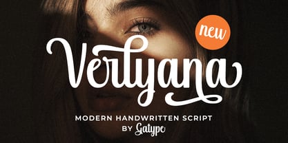 Verlyana is an organic, handwritten font suitable for branding, signatures, wedding invitations, promotions, product packaging, and other needs. This font is modern, simple, but still authentic. You'll get a full set of lowercase and uppercase letters, numbers and punctuation, multilingual symbols, initial and final lowercase swashes, binders, and extra swashes. Verlyana features OpenType style alternatives, International binders and support for most Western Languages included. To enable the OpenType Stylistic alternative, you need a program that supports OpenType features such as Adobe Illustrator CS, Adobe Indesign & CorelDraw X6-X7, Microsoft Word 2010 or a later version.
 - Motley Crew by Hanoded,
$20.00 Motley Crew is my last font for 2016. It is quite a lively, quirky and a little bit scary typeface, which will give your designs a little more ‘joie de vivre’. It was made with a soft brush and Chinese ink. The splatter was added after I had painted the glyphs. I forgot to put away my laptop, which now looks like this font… Motley Crew wishes you all the best for the coming year - in a lot of languages, as it comes with a generous splatter of diacritics.
 - Rondell by Scrowleyfonts,
$12.00 Rondell was originally designed in 2011 as a reasonably priced variable width and weight font. There were a couple of things about it that I didn't like and so I withdrew it from sale. Since then I have found myself using it for many different projects and have realised how useful and versatile it is. Therefore I have fixed the things I didn't like about it and it is now available again. Rondell is a simple, smart, sans serif font. Rounded corners make it slightly informal and friendly.
 - Abigan by IM Studio,
$18.00 Abigan is an elegant new serif font that will add a touch of luxury and sharp diamond points add a slick yet legible Persian style. This versatile font is Perfect for editorial projects, magazine headers, Logo designs, Apparel Branding, product packaging, and displays both masculine and feminine qualities. Abigan comes with full uppercase, lowercase, numbers and punctuation marks + Multi-language support and PUA encoding. To enable the OpenType Stylistic alternative, you need a program that supports OpenType features such as Adobe Illustrator CS, Adobe Indesign & CorelDraw X6-X7, Microsoft Word 2010 or later.
 - Santis by Latinotype,
$45.00 Santis is a multiface type, special for logos, brands, magazines and editorial world. Especially for setting trends in fashion and design. The particularity of this font is that you can easily read it, even when applying swash type letters. It is a Didot based font. Santis versatility can harmoniously display a word or phrase. Santis has 1017 glyphs with alternate characters, numbers and ligatures ornaments specially created for a better design. For best results use with Open Type. Designed by Enrique Hernandez with technical support of Daniel Hernández.
 - Filson Pro by Mostardesign,
$26.00 Designed by Olivier Gourvat in 2014, Filson Pro is a new geometric sans serif family with versatility in mind. With its 575 glyphs and its round aspect, this typeface covers all kind of graphic and web design projects. This font family contains 16 fonts from Thin to Black with a professional range of Opentype functions such as pro kerning,lining and oldstyle figures, stylistic alternates, case sensitive forms, localized forms and f-ligatures. For better typographic control, Filson Pro also includes Opentype class kerning with thousands of kerning pairs.
 - Times Eighteen by Linotype,
$29.00In 1931, The Times of London commissioned a new text type design from Stanley Morison and the Monotype Corporation, after Morison had written an article criticizing The Times for being badly printed and typographically behind the times. The new design was supervised by Stanley Morison and drawn by Victor Lardent, an artist from the advertising department of The Times. Morison used an older typeface, Plantin, as the basis for his design, but made revisions for legibility and economy of space (always important concerns for newspapers). As the old type used by the newspaper had been called Times Old Roman," Morison's revision became "Times New Roman." The Times of London debuted the new typeface in October 1932, and after one year the design was released for commercial sale. The Linotype version, called simply "Times," was optimized for line-casting technology, though the differences in the basic design are subtle. The typeface was very successful for the Times of London, which used a higher grade of newsprint than most newspapers. The better, whiter paper enhanced the new typeface's high degree of contrast and sharp serifs, and created a sparkling, modern look. In 1972, Walter Tracy designed Times Europa for The Times of London. This was a sturdier version, and it was needed to hold up to the newest demands of newspaper printing: faster presses and cheaper paper. In the United States, the Times font family has enjoyed popularity as a magazine and book type since the 1940s. Times continues to be very popular around the world because of its versatility and readability. And because it is a standard font on most computers and digital printers, it has become universally familiar as the office workhorse. Times™, Times™ Europa, and Times New Roman™ are sure bets for proposals, annual reports, office correspondence, magazines, and newspapers. Linotype offers many versions of this font: Times™ is the universal version of Times, used formerly as the matrices for the Linotype hot metal line-casting machines. The basic four weights of roman, italic, bold and bold italic are standard fonts on most printers. There are also small caps, Old style Figures, phonetic characters, and Central European characters. Times™ Ten is the version specially designed for smaller text (12 point and below); its characters are wider and the hairlines are a little stronger. Times Ten has many weights for Latin typography, as well as several weights for Central European, Cyrillic, and Greek typesetting. Times™ Eighteen is the headline version, ideal for point sizes of 18 and larger. The characters are subtly condensed and the hairlines are finer. Times™ Europa is the Walter Tracy re-design of 1972, its sturdier characters and open counterspaces maintain readability in rougher printing conditions. Times New Roman™ is the historic font version first drawn by Victor Lardent and Stanley Morison for the Monotype hot metal caster."

