10,000 search results
(0.147 seconds)
- Gola Chanis by Runsell Type,
$16.00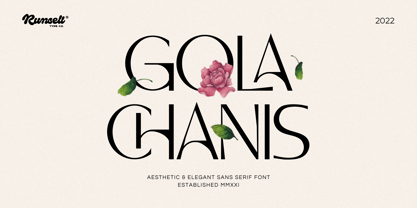 Gola Chanis font is perfect for many of your projects like logos & branding, photography, invitations, watermarks, advertisements, product designs, stationery, wedding designs, labels, product packaging, special events and much more.
 - The England by Runsell Type,
$16.00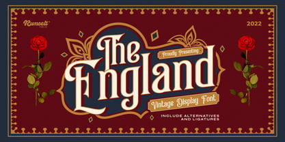 The England font is perfect for many of your projects like logos & branding, photography, invitations, watermarks, advertisements, product designs, stationery, wedding designs, labels, product packaging, special events and much more.
 - TE Start2 by Tharwat Emara,
$30.00 Start 2 is a mixture of modern style with traditional functionality. It is flexible and has many beautiful and wonderful features. This font will work for modern and important designs.
 - The Amboy by Runsell Type,
$16.00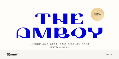 The Amboy font is perfect for many of your projects like logos & branding, photography, invitations, watermarks, advertisements, product designs, stationery, wedding designs, labels, product packaging, special events and much more.
 - Geometric Patterns JNL by Jeff Levine,
$29.00 Geometric Patterns JNL offers a large and varied assortment of interesting design variations in a 'tiled' (square) format that can be adapted to spot embellishments, running borders or repetitive patterns.
 - The Entik by Runsell Type,
$16.00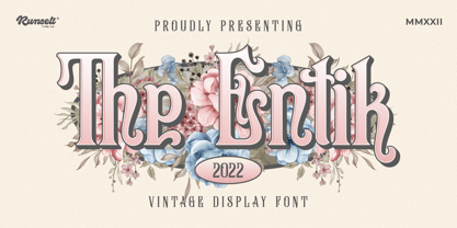 The Entik font is perfect for many of your projects like logos & branding, photography, invitations, watermarks, advertisements, product designs, stationery, wedding designs, labels, product packaging, special events and much more.
 - Morales Bonaven by Runsell Type,
$16.00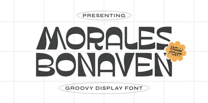 Morales Bonaven font is perfect for many of your projects like logos & branding, photography, invitations, watermarks, advertisements, product designs, stationery, wedding designs, labels, product packaging, special events and much more.
 - Latino Elongated by ITC,
$29.00Latino is the work of British designer David Quay, an unusual, condensed, wedge-serif roman typeface. The characters can be set normally or widely spaced. Latino exudes grace and elegance. - Rome Dianok by Runsell Type,
$16.00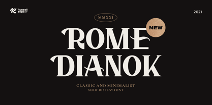 Rome Dianok font is perfect for many of your projects like logos & branding, photography, invitations, watermarks, advertisements, product designs, stationery, wedding designs, labels, product packaging, special events and much more.
 - The Vegals by Runsell Type,
$16.00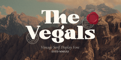 The Vegals font is perfect for many of your projects like logos & branding, photography, invitations, watermarks, advertisements, product designs, stationery, wedding designs, labels, product packaging, special events and much more.
 - Bilibin by Scriptorium,
$12.00Ivan Bilibin was one of the best artists and designers of the Russian folk art movement of the early 1900s. His posters and his illustrative work are exceptional, and like many of the artists of the period he did a lot of hand lettering in various old-fashioned and modernistic interpretations of traditional Russian folk calligraphy. Our first Bilibin font is based on his lettering from an illustrated folk story by Alexander Pushkin. - DJHappeeFont - Personal use only

- oakland hills 1991 - Personal use only

- Grymmoire - Unknown license

- Downtown Elegance - Personal use only

- MythBusters - Personal use only

- A bite - Personal use only

- 1 - Personal use only

- Flying Peace PERSONAL USE - Personal use only

- CREATOR PERSONAL USE - Personal use only

- DAMAS PERSONAL USE - Personal use only

- BEEF 3 PERSONAL USE - Personal use only

- DAMAGEPLAN PERSONAL USE - Unknown license

- Beat Fool by PizzaDude.dk,
$15.00 Beat Fool is my latest layered font. I love making layered fonts, because the possibilities are almost endless! Play around with transparency and your favourite colorschemes and patterns to create awesome effects! Beat Fool comes in two layers that plays well together. One layer is solid and can be used for shadow, fill, texture or other creative parts of your design. The second layer is the "Regular" one - the outline that made the basis for the font. I wanted the handmade and handwritten brushstrokes visible, to keep the flaws which makes the look more authentic. Every letter has 4 different versions, again to make things more natural and kind of random! Both layers can be used alone or as described, together - and since it has multilingual support, you can be creative in all kinds of languages! :)
 - Rainmaker Script by Fenotype,
$35.00 I started Rainmaker Script by hand sketching a huge amount of letters to find the right tone. After having enough I picked the characters that I liked and begun composing a font out of them. With this method I ended up with the Rainmaker Script - an elegant signature style connected script with natural variation in the rhythm. Rainmaker Script is great for branding, headlines and packaging. It’s equipped with (automatic) Contextual Alternates that keep the flow natural and variable. There’s also Swash, Stylistic and Titling Alternates, and even more alternates can be found for some characters from the Glyph Palette. From the Glyph Palette you’ll also find a handful of ending swooshes and ornamental strokes that can be combined with the font. All the extras in Rainmaker Script are PUA encoded so you can access them in most graphic design software.
 - Bjorn by Monotype,
$50.99 Meet Bjorn. A super usable, digital-device ready type design, refreshingly unburdened by today’s pre-conceived notions of ‘digital neutrality’. This is a typeface driven by the notion that today’s ‘digital’ shouldn’t automatically mean the devolution of typographic personality, Bjorn brings a softer-side to the idea of pixel perfect brand comms. Solid digital typography can also convey a warm tone of voice, radiate a softness, a human emotive charm whilst still maintaining all of the functional on-screen requirements of crisp easy reading fonts across viewports. Bjorn is a distinctive type design that combines a unique blend of flattened round stems (to take the edge-off), levelled inner terminals (pixel friendly) and pointed ears and feet (creating an distinct rhythm and dynamic with bowled letters). Bjorn is not a typeface following a tried and tested pattern, it’s a typeface designed to make digital brands feel special, enabling speech in a voice that brings viewers closer to their words. Bjorn is warm, yet clinical, flat and curved, elliptical and pointy. The font’s strong sense of ‘straightness’, the letter proportions and features build up its versatility across digital environments, not too wide, not too narrow, not too pointy, not too round — just right. Bjorn is available in 4 Roman styles — Light, Regular, Medium and Bold.
 - Nurnberg Schwabacher by Intellecta Design,
$29.95"I digitized and to revitalize NurnbergSchwabacher by the extinct Haas'sche Schriftgiesserei, a German/Swiss foundry established in 1790 and based in Basel/Münchenstein. Many of its shares were acquired by D. Stempel in 1927. On the Luc Devroye site this foundry is listed on the Extinct Foundries of the 18th century page. This design is very similar to another Intellecta best seller: Hostetler Fette Ultfraktur Ornamental, both drawn from the classical type specimen book from Hostetler. The ornamental frame that completes the font is a fantastic baroque ornament that I found in another old book, unfortunately lost now. Luc Devroye, whose book is the source for all of my fonts, writes this about Rudolf Hostettler: He was a Swiss type designer, author of “The Printer’s Terms” designed by Jan Tschichold, of "Technical Terms of the Printing Industry" (5th edition was printed in 1995), and of "Type: eine Auswahl guter Drucktypen; 80 Alphabete klassischer und moderner Schriften" (Teufen, Ausser-Rhoden: Niggli, 1958). He also wrote "Type: A Selection of Types" (1949, fgm books, R. Hostettler, E. Kopley, H. Strehler Publ., St. Gallen and London) in which he highlights type made by European houses such as Haas, Enschedé, Deberny and Nebiolo. Jost Hochuli wrote his biography. - Tessie Some More by Ingrimayne Type,
$12.00 A tessellation is a shape that can be used to completely fill the plane without gaps or overlaps—simple examples are isosceles triangles, squares, and hexagons. Tessellation patterns are eye-catching and visually appealing, which is the reason that they have long been popular in a variety of decorative situations. TessieSomeMore has two family members, a solid style that must have different colors to be useful and an outline style. They can be used separately or they can be used in layers with the outline style on top of the solid style. For rows to align properly, leading must be the same as point size. To see how patterns can be constructed, see the “Samples” file here. Shapes that tessellate and also resemble real-world objects are often called Escher-like tessellations. Most of the shapes in TessieSomeMore are Escher-like. Over half are either bug-like and bird-like shapes. There are also a few animal and other object shapes as well as some geometric or abstract shapes that have visual appeal.
 - TessieBugs by Ingrimayne Type,
$23.95 A tessellation is a shape that can be used to completely fill the plane—simple examples are isosceles triangles, squares, and hexagons. Tessellation patterns are eye-catching and visually appealing, which is the reason that they have long been popular in a variety of decorative situations. These Tessie fonts have two family members, a solid style that must have different colors when used and an outline style. They can be used separately or they can be used in layers with the outline style on top of the solid style. For rows to align properly, leading must be the same as point size. To see how patterns can be constructed, see the “Samples” file here. TessieBugs contains shapes that resemble insects such as moths, ants, butterflies, and weevils. (Earlier tessellation fonts from IngrimayneType, the TessieDingies fonts, lack a black or filled version so cannot do colored patterns. The addition of a solid style that must be colored makes these new fonts a bit more difficult to use but offers far greater possibilities in getting visually interesting results.)
 - Barberry by FontaZY,
$35.00 Barberry is a hand-made brush script typeface equipped with some decorative OTF features, made by Zakhar Yaschin (FontaZY). Barberry font contains stylistic alternates, initial and final alternates (which is duplicated by contextual alternates in the case when ini & fina are not supported), ligatures, titling alternates, small caps and large collection of swashes (additional variants - in Stylistic Set). The Barberry font is essential for hand-made lettering and design. The Barberry family also includes Barberry Vigniette font with over 200 icons and vigniettes in it. Barberry Letters supports most of Western languages (including Central Europian, Baltic and Eastern European languages) and also Cyrillic. Each lowercase letter has three positional versions of the design – basic (if the letter is in the middle of a word), initial (if the word starts with it) and the final (in the end of the word) that makes the set look more alive and expressive. Working with Barberry Letters you can enable and disable if needed such typographic tools as swashes, ligatures, small caps, titling alternates, stylistic alternates, additional swashes and the already mentioned initial and final alternates. If your design software does not support the use of the initial and final alternatives, they can be duplicated by contextual substitutions. There are more than 20 Latin and Cyrillic ligatures in the Barberry Letters. It works by default as the standard ligatures, but you can switch it off for design reasons or to select the more appropriate typographic solution in any particular case. Ornamental font Barberry Vigniette has more than 200 pictograms and vignettes that can decorate your typographic layout. All icons are drawn with a brush in the same style as the Barberry Letters. You can use them inside the text lines, or make the ornamental decoration for text, or use separately, without any letters. OpenType extensions of the Barberry Letters significantly expand the choice of typographical tools to design a better, more expressive layout. Choosing the optimal variant of certain letters in each case, you can receive a unique composition. Whether it is lettering for packaging or magazine headline, logotype or the name in the invitation – just one Barberry font-family gives you the very wide typographic possibilities.
 - Sindelar by Willerstorfer,
$95.00 Please note: Sindelar webfonts are exclusively available at willerstorfer.com Sindelar is a capable, contemporary text face addressing today’s news design requirements. Its large x-height, low contrast and robust serifs grant a high legibility in small sizes. The balanced, well chosen proportions make the typeface economic (i.e. space saving) without giving it a too narrow appearance. These characteristics make it the ideal choice for extensive text setting in newspapers and magazines – on paper and on screen. Named after famous Austrian football (soccer) player Matthias Sindelar (1903–1939), one of the best players of his time, the typeface shares two major qualities with its namesake: their technical brilliance and their way of performing aesthetically to the last detail. The football player’s nickname »Der Papierene« (the Paper-man) elegantly refers to the media too. Although optimised for small sizes, Sindelar’s low contrast and robust serifs give the typeface a strong impact and an unmistakable personality in larger sizes. Sindelar’s calligraphic influences can be noticed in the Italics best. The italic letters are inclined by slightly different angles, respecting the letters’ shapes and proportions and resulting in a balanced, yet vivid appearance. Sindelar comes in 18 styles – nine weights in Roman and Italic each. Each font is equipped with a huge character set of about 980 glyphs and various OpenType features.
 - Perron by Fontforecast,
$39.00 Meet the successor of our bestselling design kit 'Chameleon': Perron. The concept of designing multiple contrasting designs under the same name was first introduced by Fontforecast in TyfoonSans and TyfoonScript. Two font families that were designed to complement each other. And that's exactly what this new release does. With the three designs in Perron, which means 'platform' in dutch, you will be able to take your design projects where ever you want them to go. This flexible kit consists of 7 fonts in three basic designs, and when combined Perron No1, No2 and No3 reïnforce each others charm. This offers great potential for creating lively layouts for many different projects, e.g. invites, menu's, magazines, brochures, packaging, greeting cards, T-shirts, etc. Perron No1 is a serif display font with large and small Caps. This font requires an Opentype savvy application to reach its full potential. Turn on contextual alternates and beginning and ending characters are replaced by their alternative versions, as you type. Stylistic sets and swashes offer even more variations. Perron No1 comes in two versions: No1 and No1 Shade. They can be used separate or layered for a colorful or shaded effect (if your application allows you to stack text frames). Perron No2 is a charming handwritten font, with slightly rough contours, that was added for an extra personal touch. It comes in regular and Italic. Perron No3 is a clean, tall and very skinny font family. It has large and small Caps and comes in three weights: Light, Regular and Bold. Because of its clean appearance No3 adds a modern touch to the design kit.
 - Used Cars JNL by Jeff Levine,
$29.00Used Cars JNL is based on one of the many unique alphabets created by the late Alf R. Becker for Signs of the Times magazine from the 1930s through the 1950s. Special thanks to Tod Swormstedt of ST Media (who is also the curator of the American Sign Museum in Cincinnati, Ohio) for providing the reference material for this design - Dem Bones by Greater Albion Typefounders,
$3.50 Dem Bones is a bit of fun-display alphabet (capitals), numbers and punctuation assembled out of the sort of knobbly ended bones that dogs used to gnaw on in all the best childrens cartoons and comics. Thing Gnasher and Gnipper or Spike and Tyke. Dem Bones is particularly apt at Halloween, but can introduce some un at any time of the year...
 - Chaos1996 by Dawnland,
$9.00 Graphite/4b pen illustrations from the past resurrected as vector/tattoo-art! The detailed illustrations can be displayed at large sizes/full magazine layout page down to thumbnail size! a-l: The full Zodiac of Chaos m-u: Parts from the Tarot of Chaos v-z: Faces of Chaos A total of 26 unique illustrations. Upper case A-Z hold mirrored versions. Enjoy!
 - Awkward Gothic JNL by Jeff Levine,
$29.00Awkward Gothic JNL gets its name from the fact that it's a non-conformist alphabet - as if rendered by hand by a school child or an amateur lettering artist. Although there is a relative symmetry to most of the letter forms, some unconventional widths and the shape of many of its characters adds to the hand-made look of this alphabet. - RM Hunky by Ray Meadows,
$19.00 This distinctive chunky design has a wide range of possibilities as a display face. With a nod towards Deco this strong, bold and well balanced font has a wide range of uses. Due to the nature of this design there may be a very slight lack of smoothness to the curves at extremely large point sizes (around 200 pt and above).
 - RM Celtic by Ray Meadows,
$19.00 RM Celtic is derived from a mix of Uncial, Carolingian, Insular and Half-Uncial characters that, together, provide a legible and useable font with a touch of that old Celtic magic. Due to the modular nature of this design there may be a slight lack of smoothness to the curves at very large point sizes (around 100 pt and above).
 - Staple Remover JNL by Jeff Levine,
$29.00 Hand lettering on the packaging for an Arrow "Commander" Staple Remover seen in an online auction is the inspiration for the unusual and angular typeface comprising Staple Remover JNL. The Art Deco era of the 1930s and 1940s offers many wonderful examples of stylized and experimental lettering, and this, by far is one of the more eclectic styles of the time.
 - Ballard Avenue by Turtle Arts,
$20.00Ballard Ave is inspired by old vintage signage found in Ballard, Washington, an old neighborhood of Seattle. Ballard Avenue is a protected historical district filled with turn of the century brick buildings that have been converted into quaint shops and independent businesses. This alphabet is based on the antique signage that still exists on the sides of many of these buildings.


