10,000 search results
(0.042 seconds)
- Thiny Cupid by Sipanji21,
$15.00 Thiny Cupid is a lovely display font that radiates charm. It features gorgeous hearts in each letter which give it an incredibly romantic feel. this font suitable for valentine day poster, logo, t shirt, event banner and etc. you can use this font for any design, apparel, kids logo, logo type, with many swash for make your design awesome.
 - Klorofeel by Invasi Studio,
$19.00 Featuring a classy elegant handwritten display typeface, Klorofeel font is inspired by Plants and Poems. This font was created to help you tell your story. This font comes with so many ligatures, that you can use that for more fun on your projects. Klorofeel font is perfect for quotes, headlines, branding projects, or any project requiring an elegant feel.
 - Millano Script by MJB Letters,
$17.00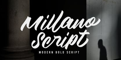 Millano Script is a bold script font, with a strong and masculine style that is equipped with some unique ligatures and alternates so that it can provide an interesting look Works on PC & Mac Simple installations Accessible in the Adobe Illustrator, Adobe Photoshop, Adobe InDesign, even work on Microsoft Word. PUA Encoded Characters – Fully accessible without additional design software
 - IngrianaCasual by Ingrimayne Type,
$9.95 IngrianaCasual features a hand-drawn sans-serif family with an italics that has semi-script lower-case letters. The five upright weights are relaxed and informal and the five italics styles are decorative and elegant. The family is very legible and can be be used for many purposes including brochures and advertising, though probably not for book text.
 - Bologna Script by Hrz Studio,
$16.00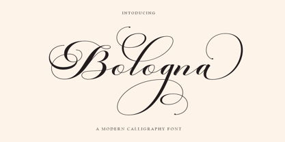 Welcome to the Bologna Script font is a modern, casual, and beautiful calligraphic typeface with a swash. It can be used for many purposes. such as titles, signatures, logos, wedding invitations, letterheads, nameplates, labels, newsletters, posters, badges, etc. Bologna Script Features Open type, including initial and terminal letters, alternatives, binders, and International support for most Western languages included.
 - Minebold by ahweproject,
$9.00 Minebold is a retro bold handwritten font that will bring you back to the 70s. Fall in love with its unique character and use it to create gorgeous wedding invitations, beautiful stationery art, eye-catching social media posts, and much more! Minebold is PUA encoded, which means you can access all glyphs and swashes with ease!
 - Hydrolic by Sensatype Studio,
$15.00 Carbon is a Modern Sport Sans Serif font that special created for Sport and Technology design needs with Modern style. Carbon Modern Sport Sans Serif font ready with: Uppercase and Lowercase characters Numbers and Punctuations Preview as a inspirations that you can do with Carbon font Available for PC and Mac Wish you enjoy our font. :)
 - Kage Retro by Sakti Avellin,
$15.00 Kage Retro is a fun and retro font, it's perfect for designs that need a playful, cheery accent. Kage Retro is suitable for book covers, posters, packaging, merchandise, logotypes, and many more! -standard glyph -Works on PC & Mac -Accessible in Adobe Illustrator, Adobe InDesign, it even works in Microsoft Word. PUA Encoded Characters – Fully accessible with no add-ons.
 - Lothie by RagamKata,
$14.00 Lothie, a quirky font that will make your design looks outstanding! With Lothie, you can you’re your project even more fun. A playful font with it’s bold and unique shaped font, will make your design catches their eyes. This typeface is a perfect for an invitation, posters, logo, and many more! Get Lothie to make your design looks lit!
 - Melodi by Diego Berakha,
$20.00 Melodi is the result of years of working with hand made types on my designs. Every time I draw the letters and words that I need for every design piece. One day I decided to go serious and make a real type of it and “Melodi” is the result of this work. It’s a calligraphic font, built using a regular stroke, and carefully crafted to have nice joins between all the letters. It has some playful but stylish capitals that brings lot of personality to the font. It work super nice either in lowercase writing as in all-caps texts. It looks specially good on lists of words or small sentences. Melodi is a playful but very versatile font, it can be used in lots of different scenarios. From creating a logo, writing the tittles of a catalogue or use it in a poster combined with other types (it work really well as counter point of more classical types) to motion graphics animations or advertising work. It can be cute but it also can do hard work!
 - Scriptina Pro by CheapProFonts,
$- This is the 100th font released by CheapProFonts, and I wanted to make something special - so I have chosen to upgrade one of the most popular free fonts ever: the one and only Scriptina by the infamous Fredrick “Apostrophe” Nader! After first cleaning up the outlines, spacing and kerning, Scriptina Pro has been expanded with a set of alternate letters without the loops and swashes, using the OpenType contextual alternates feature to switch them around automatically to avoid too many overlapping and repeating elements. You can also manually turn off the loops and swashes with the OpenType titling and swash features respectively. The originals alternate letters have been incorporated as stylistic alternates (and stylistic set 02) and the ligatures as discretionary ligatures if you should want them. The alternate non-script lowercase z is programmed as stylistic set 01. In addition Scriptina Pro has been given the usual CheapProFonts large multilingual character set, of course. I hope many will enjoy the improvements and additional language support. And, naturally: it is still free! ALL fonts from CheapProFonts have very extensive language support: They contain some unusual diacritic letters (some of which are contained in the Latin Extended-B Unicode block) supporting: Cornish, Filipino (Tagalog), Guarani, Luxembourgian, Malagasy, Romanian, Ulithian and Welsh. They also contain all glyphs in the Latin Extended-A Unicode block (which among others cover the Central European and Baltic areas) supporting: Afrikaans, Belarusian (Lacinka), Bosnian, Catalan, Chichewa, Croatian, Czech, Dutch, Esperanto, Greenlandic, Hungarian, Kashubian, Kurdish (Kurmanji), Latvian, Lithuanian, Maltese, Maori, Polish, Saami (Inari), Saami (North), Serbian (latin), Slovak(ian), Slovene, Sorbian (Lower), Sorbian (Upper), Turkish and Turkmen. And they of course contain all the usual “western” glyphs supporting: Albanian, Basque, Breton, Chamorro, Danish, Estonian, Faroese, Finnish, French, Frisian, Galican, German, Icelandic, Indonesian, Irish (Gaelic), Italian, Northern Sotho, Norwegian, Occitan, Portuguese, Rhaeto-Romance, Sami (Lule), Sami (South), Scots (Gaelic), Spanish, Swedish, Tswana, Walloon and Yapese.
 - High Castle by Par Défaut,
$40.00 High Castle is a serif family fonts with baroque aspects. Composed of more than 500 glyphs, inculing many Latin accents for as many languages. With also 9 OpenType Features (Fractions, Numerator, Denominator, OldStyle Figure, Ordinal, Case Sensitive, Contextual Alternate, Liguature, All Access Alternate) and arrows support.
 - Ocean by Arodora Type,
$10.00 Ocean font offers you unique experiences for your designs. It reflects the essence of your designs thanks to its distinctive writing lines and original style. You can use Ocean font character in every field, and you can use it in magazine and catalog cover designs, poster designs.
 - Pills by UNDT,
$45.00PILLS is a modular font based on overlayed circular and square forms, the characters have been spaced mathematically. 'PILLS' can have interesting side effects, when the leading is set very close. Feelings of anxiety, loneliness and depression can be avoided by 'PILLS'. Do not exceed daily dose. - Brown Hunter Vic by Alit Design,
$15.00 Brown Hunter Inspired by the design style of the 1830s, the elegant Victorian style design is full of charming sharp curves. Designs with a classic Victorian style from the cruel era, people always use it for redesigning needs or creating new designs. The Brown Hunter typeface is designed in an elegant Victorian style which contains many font characters which when combined will make an attractive design and of course very cool. Included in the download package are: Brown Hunter Vic, which is a classic Victorian serif style and contains swash and alternatives, there are two types of Brown Hunter Vic, the standard one and the hold one, which contains ornaments on the inside of the body. Brown Hunter Script is an elegant street writing style made with spontaneous and sharp brush strokes giving a bold impression. Brown Hunter Dis is a Serif display style font that is intended for subtitles in designs, besides this font has 13 families from thin to heavy. Brown Hunter Black is a font with a charming black letter style and is still comfortable to read when used for body text in a classic Victorian style. This font also has 13 families from thin to heavy so it can be used for headers or body text. Brown Hunter Ornament is a font made with a unique orament shape in the classic Victorian style, besides that there are also border frames, animal vectors, silhouette logos, flowers and many more. With 4 styles and 30 different fonts, the Brown Hunter typeface when combined will create a cool design and a Victorian concept. By collecting Brown Hunter Typeface you can easily create classic, Victorian and elegant themed designs. Brown Hunter is perfect for designing vodka labels, beer, pomade, logo tattoos, book covers, t-shirts and so on.
 - Josef K Patterns by Juliasys,
$9.60 Franz Kafka’s manuscripts have always been a source of inspiration for designer Julia Sysmäläinen. At first she was just interested in literary aspects but later she noticed that content and visual form can not be separated in the work of this ingenious writer. Analyzing Kafka’s handwriting at the Berlin National Library, Julia was inspired to design the typeface FF Mister – by now a well known classic. Over the years, FF Mister K became a handsome typeface family and even produced offspring: the Josef K Patterns. Some of Kafka’s most expressive letterforms were the starting point for these decorative ornaments. How do the Patterns work? Outlines and fillings correspond to the uppercase and the lowercase letters on your keyboard. You can use them separately or layer them on top of each other. If you write a line of “pattern-text” in lowercase and repeat it underneath in uppercase you get a row of fillings followed by a row of outlines. Now you can color them and then set line space = 0 to get a single line of layered colored ornaments. Alternatively, activating OpenType / stylistic set / stylistic alternates will also unite the two lines to a single layered line. Further magic can be done with OpenType / contextual alternates turned on. On the gallery page of this font family is a downloadable Josef K Patterns.pdf with an alphabetical overview of forms. Hundreds of patterns are possible … we’d love to see some of yours and present them here on the website!
 - CartoGothic Std - 100% free

- Bergamo Std - 100% free

- Niceto by MaGo Fonts,
$5.00 by MaGo in Fonts Display Niceto Typeface is a sans serif display font family designed for logotype design. Using its different variations (included in 4 fonts) you may archieve unique headlines and phrases to emphasise your brand. It's cool and clean yet warm, and it may communicate many personalities, according to its different uses. This font family includes: Niceto Regular (286 glyphs) Niceto Smallcaps (381 glyphs, including alternates!) Niceto Shadow (286 glyphs) Niceto Shadowline (286 glyphs) This font is PUA encoded, so you may access ALL characters included, to be used on your design software. Please search for "PUA encoded fonts" if you are not sure how to access them! Under Type1 encoding, supports 64 languages. With all its possibilities, Niceto may be as flexible as your needs require, giving you all the freedom to design!
 - Coranto 2 by TypeTogether,
$49.00 Now available as Opentype font with extended character set, Coranto 2. It is originally based on Unger’s typeface Paradox, and arose from a desire to transfer the elegance and refinement of that type to newsprint. Coranto 2 has a larger x-height and in many places has been made more robust. Over the past 25 years newspaper production has seen spectacular improvements in paper and print quality, the introduction of colour printing, and vastly better register. Newspaper production still demands a lot of letter forms, but advanced printing brings out details better and makes typography more appealing to readers. For text type the newspaper is no longer an environment in which survival is the chief assignment. Today, newspapers are not merely a matter of cheap grey paper, thin ink and super-fast rotary printing, and type design no longer has to focus on surviving the mechanical technology and providing elementary legibility. Now there is also room to create an ambience, to give a paper a clearer identity of its own; there is scope for precision and refinement. One consequence of this is that newspaper designers can now look beyond the traditional group of newsfaces. Conversely, a newsface can be used outside the newspaper — not an uncommon occurrence. The update to this beautiful font family, Coranto 2, includes the addition of over 250 glyphs featuring full Latin A language support, new ligatures, 4 sets of numerals, arbitrary fractions and superiors/inferiors. Furthermore, kerning was added and fine tuned for better performance.
 - OK Corral by FontMesa,
$20.00 OK Corral is a revival of a very old Italian font that you may have seen in the past under the original name of Italian Print. The Lined version of this font has never been known to have a lower case set of letters until now.
 - Chromium One by ITC,
$29.99Chromium One is the work of British designer David Harris. With their rounded edges and shiny appearance, the characters seem to be made of smooth pieces of chrome joined seamlessly together. The unusual and distinctive Chromium One can be used for a variety of display applications. - Melusine by Scriptorium,
$18.00Melusine is based on an ornate style of gothic calligraphy used primarily in decorative signs and advertising in Germany around the turn of the century. It has many of the characteristics of a true medieval gothic hand, but is a more elaborate, extreme variaton on the style. - PR Scrolls 05 by PR Fonts,
$10.05 Inspired by food labels, signs and coats of arms, PR Scrolls is a collection of images which can be used for framing text in contexts where antiquity, craftsmanship, or traditional quality are conveyed. Most of the glyphs are presented in a range of four or more widths.
 - PackardClipperNF - 100% free

- IndochineNF - 100% free

- PonsonbyNF - 100% free

- DrumagStudioNF - 100% free

- PointsWest - 100% free

- KG Flavor And Frames Five by Kimberly Geswein,
$5.00 Fun frames and borders in a variety of styles. The binder tabs can be printed, folded, and adhered to binder page dividers.
 - Veronese by Red Rooster Collection,
$45.00Based on the early original Monotype design, you can definitely see the influence of Italian Old Style, Jenson and Morris’ Golden Type. - Soft Fleurons by Intellecta Design,
$21.95 Soft Fleurons is a dingbats/decorative display font featuring many different styles of flourishes and ornaments. Great for a vintage antique feel.
 - Printers Leftovers JNL by Jeff Levine,
$29.00 Printers Leftovers JNL has an assortment of cartoons, embellishments, ornaments and decorations that span many eras and cover numerous tastes and styles.
 - MidnightKernboy - Unknown license

- Love Duets by Ingrimayne Type,
$9.00 LoveDuets is a family of two novelty fonts that have letters on hearts. There are at least five other font families on myfonts that have have letters on hearts but LoveDuets differs from them because it uses the OpenType feature of Contextual Alternatives (calt) to put two letters on each heart, one on the left side and a second on the right side. The two styles in the family can be used in layers to increase color possibilities. The brace characters have empty half hearts that can be used to replace spaces or to complete hearts at ends of lines. LoveDuets can be used when hearts are appropriate such as for Valentines Day, anniversaries, and weddings.
 - Bristol by GroupType,
$19.00 Bristol and Bristol Adornado (also known as Greco) was first released by Fundición Richard Gans of Madrid, Spain, in 1925. The Richard Gans Foundry is a defunct Spanish foundry which existed from 1888-1975. Throughout its existence, types were designed by a number of people including José Ausejo Matute (d. 1998), Antonio Bilbao (who created Escorial in 1960), the son Ricardo Gans, and Carl Winkow. GroupType's versions of this font pair have been with FontHaus since the mid 1990s. Bristol is a charming and strong period design. Its structure is masculine and vertical. A great poster font and the Adornado style is an excellent choice for an eye-catching large drop cap.
 - Arnetalia by Artisan Studio,
$16.00 Arnetalia is Modern Calligraphy. This font was designed by handwriting, and it has a modern and unique forms of calligraphy, the writing style is very natural. Can be used for various purposes.such as headings, logos, wedding invitation, t-shirt, letterhead, signage, lable, news, posters, badges etc. To enable the OpenType Stylistic alternates The Features of this fonts is; Standart ligatures Stylistic Alternates Contextual Alternates Stylistic sets File font Arnetalia Include ; Arnetalia PUA Unicode (Private Use Areas) The OpenType features can be very easily accessed by using OpenType-savvy programs such as Adobe Photo Shop, Adobe Illustrator, Adobe InDesign and CorelDraw X6-X7, You can also access most most of these awesome features in Microsoft Word and other similar programs
 - Monserga FFP - Personal use only

- A10 STAR Black by Mogtahid,
$90.00 As a former typographer / lino and calligrapher, Abdallah NASRI had recourse to the nature of the idea of an "INTERCHANGEABLE" collection for types who in reality offer a police collar parallel to the complex typeface of the variable. Our fashion is outlined by a simple calculation defined by superimposed geometric circles where we used only its ¼ to fill the need for the angles of each of our letters. Always with the idea of having in the same allocated space, the same letter nested as many times as fat example from Hairline to Ultrabold. It was in this way that I was able to obtain a large number of styles, with a very interesting kerning which prompted me to extend the font to other languages with +1000 characters and +600 glyphs. I have always been treasured by the all in "1". I assure you that I sought to obtain the maximum of Visibility for a use S / Titling TV, WEB Pages and Typography Typo; once the difficult thing was done, I was rewarded by a font that has countless typographic openings for the world of graphics with 10 styles of weights in hand, and again I am happy to have personalized the charm of each letter by new details; I do not regret the time spent on thinking about it so that it is useful and at the same time pleasant as a working tool, finally profitable in all sectors and more multilingual, without forgetting that it is a family of inter change c ' is to say: All the types occupy the same height of the body and it is their fats which differs in the same space width of each of the letters, therefore no interference in spacing. Here, an additional alternative, a participation of a septuagenarian in the service of the love of modern digital typography. • TEST: At 50% screen in a body of 12 pixels, the A10 STAR Alphabet subjected to a test, has a clear Readability / Visibility. • P.S: A10 STAR integrates Diacriticism in all its forms. Texte d'origine : Abdallah NASRI a eu recours en étant ancien typographe/lino et calligraphe à la nature de l'idée d'une collection "INTERCHANGEABLE" pour les types qui en réalité offre un collier de police parallèle à la fonte complexe du variable. Notre mode est esquissé par un calcul simple défini par des ronds géométrique superposés où on a utilisé seulement son ¼ pour garnir le besoin des angles de chacune de nos lettres. Toujours dans l’idée à avoir dans le même espacement alloué, la même lettre imbriquée autant de fois de graisse exemple du Hairline à Ultrabold. C’est de cette manière que j’ai pu obtenir un grand nombre de styles, avec un crénage très intéressant ce qui m’a incité à étendre la police à d’autres langues avec +1000 caractères et +600 glyphes. J’ai toujours été prisé par le tout en « 1 ». Je vous assure que j’ai cherché à obtenir le maximum de Visibilité pour une utilisation S/Titrage TV, Pages WEB et Maquette typo ; une fois le difficile fait, j’ai été récompensé par une police qui possède d’innombrable ouverture typographique pour le monde du Graphisme avec comme atout en main 10 styles de graisses, et encore je suis content pour avoir personnalisé le charme de chaque lettre par des détails nouveaux ; je ne regrette pas le temps passé dessus à réfléchir pour qu’il soit utile et à la fois agréable comme outil de travail, enfin profitable tous secteurs confondus et en plus multilingue, sans oublié que c’est une famille d’inter change c’est-à-dire : Tous les types occupent la même hauteur du corps et c'est leurs graisses qui diffère dans un même espace largeur de chacune des lettres, donc aucune interférence dans l’espacement. Voilà, une alternative supplémentaire, une participation d’un septuagénaire au service de l’amour de la typographie numérique moderne. • TEST : A 50% d'écran dans un corps de 12 pixels, l'Alphabet A10 STAR soumise a un test, présente une nette Lisibilité / Visibilité. • P.S : A10 STAR intégre la Diacritique dans toutes ses formes.
 - Mess Hall JNL by Jeff Levine,
$29.00Modeled from a set of individual painting stencils, Mess Hall JNL is named for the armed services cafeteria where thousands of enlisted men endured bland, boring meals day in and day out for years.


