10,000 search results
(0.042 seconds)
- Side A by bb-bureau,
$60.00 Side A – Bauhaus-inspired Experimental and spiky type in 3 sizes (1 - 1/2 - 1/3), designed by Benoît Bodhuin (An ideal use could be: Side A unit in 48 pt, half in 24 pt and A third in 16 pt, then bars would have the same width and spaces between the forms would be equal, but it’s just an ideal use)
 - Squaripeg by Andy Peat,
$9.00 About this font family Squaripeg is a funky square typeface with geometric shapes to create impactful headlines and web banners. This typeface was designed so that it takes up less horizontal space but still has a lot of prominence on the page. Some letters have been combined into one unit to save further space. Features 8 weights (from thin to black) Multi language Ligatures To be able to access alternative fonts, make sure the software you use can support opentype features such as Microsoft Word, Paint, Adobe, Corel draw, Cricut and other applications. Designed and published by Andy Peat. Released April 2022
 - Print Shop Parts JNL by Jeff Levine,
$29.00 Print Shop Parts JNL has a nostalgic assortment of blank sign panels, a pointing hand, decorative embellishments and even an assortment of "Made in U.S.A.", "Made in America" and "Made in United States" emblems located on the 1-9 keys. All are from vintage type catalogs and sign painting instruction books from the early 1900s. When scaled up, the blank sign panels can be used for small signs or price tags as originally made in years past. During the early part of the 20th Century, it was common to create show cards in attention-getting shapes matched with beautiful hand lettering.
 - Manufacturer JNL by Jeff Levine,
$29.00 Manufacturer JNL is a reinterpretation of the classic type face Venus Extra Bold Extended, and is available in both regular and oblique versions. According to Wikipedia: “Venus or Venus-Grotesk is a sans-serif typeface family released by the Bauer Type Foundry of Frankfurt am Main, Germany from1907 onwards. Released in a large range of styles, including condensed and extended weights, it was very popular in the early-to-mid twentieth century. It was exported to other countries, notably the United States, where it was distributed by Bauer Alphabets Inc, the U.S. branch of the firm.”
 - Oxford Street by K-Type,
$20.00 Oxford Street is a signage font that began as a redrawing of the capital letters used for street nameplates in the borough of Westminster in Central London. The nameplates were designed in 1967 by the Design Research Unit using custom lettering based on Adrian Frutiger’s Univers typeface, a curious combination of Univers 69 Bold Ultra Condensed, a weight that doesn’t seem to exist but which would flatten the long curves of glyphs such as O, C and D, and Universe 67 Bold Condensed with its more rounded lobes on glyphs like B, P and R. Letters were then remodelled to improve their use on street signs. Thin strokes like the inner diagonals of M and N were thickened to create a more monolinear alphabet; the high interior apexes were lowered and the wide joins thinned. The crossbar of the A was lowered, the K was made double junction, and the tail of the Q was given a baseline curve. K-Type Oxford Street continues the process of impertinent improvement and includes myriad minor adjustments and several more conspicuous amendments. The stroke junctions of M and N are further narrowed and their interior apexes modified. The middle apex of the W is narrowed and the glyph is a little more condensed. The C and S are drawn more open, terminals slightly shortened. The K-Type font adds a new lowercase which is also made more monolinear so better suited to signage, loosely based on Univers but also taking inspiration from the Transport typeface both in a taller x-height and character formation. The lowercase L has a curled foot, the k is double junctioned to match the uppercase, and terminals of a, c, e, g and s are drawn shorter for openness and clarity. A full repertoire of Latin Extended-A characters features low-rise diacritics that keep congestion to a minimum in multiple lines of text. The font tips the hat to signage history by including stylistic alternates for M, W and w that have the pointed middles of the earlier MOT street sign typeface. Incidentally, Alistair Hall (‘London Street Signs’, Batsford, 2020) notes that when the manufacturer of signs was changed in 2007, Helvetica Bold Condensed was substituted in place of the custom design, “an unfortunate case of an off-the-peg suit replacing a tailored one” and a blunder that has happily since been rectified, though offending nameplates can still be spotted by discerning font fans.
 - Jenifer Malvia by Asd Studio,
$15.00 Jenifer Malvia is a script font created with love, sincerity, and patience. can be used to make invitation writing, lettering, and all graphic design needs. This font is equipped with 7 stylistic sets that will make your design look more attractive and beautiful. Thank you if you are interested in purchase and using this font.
 - Baveuse - Unknown license

- Shutterbug JNL by Jeff Levine,
$29.00 On April 20, 1950, film comedian Jerry Lewis indulged his love of cameras by opening up Jerry Lewis’ Camera Exchange on Vine Street in Hollywood. It closed in 1951. Thanks to an image preserved within newsreel footage of the shop’s grand opening night, a glimpse of the post-Art Deco signage with its unusual, block style lettering inspired a digital version. Highly unusual and best for novelty projects, Shutterbug JNL is available in both regular and oblique versions.
 - Alter Headletter by Alter Littera,
$25.00 This is Alter Littera’s second original design. It started as an attempt at translating into roman forms the lowercase metrics of classic blackletters, in particular those of The Oldtype “Alter Gotisch” Font. Eventually, the design process led naturally to an innovative and modern re-creation of the overall forms and style of classic bold condensed letters from the early twentieth century, especially those of the “Century Bold Condensed” type from American Type Founders (ATF) Company’s American Specimen Book of Type Styles, Jersey City, 1912 (pp. 274-7) [also seen in McGrew, M. (1993), American Metal Typefaces of the Twentieth Century, New Castle: Oak Knoll Books (pp. 76-7)]. In addition to the usual standard characters for typesetting in modern Western languages, the font includes a comprehensive set of special characters, alternates, ligatures and ornaments, plus Opentype features, that can be used for creating distinctive and attractive texts with virtually unlimited variations. The glyphs are clean, smooth and definitely readable, so the font will be suitable not only for large titles and headings, but also for full text pages. Specimen, detailed character map, OpenType features, and font samples available at Alter Littera’s The Oldtype “Alter Headletter” Font Page.
 - Lilith - Unknown license

- Laurels Qeylla by Asd Studio,
$15.00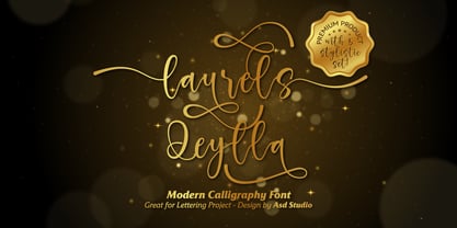 Laurels Qeylla is a script font created with love, sincerity, and patience. can be used to make invitation writing, lettering, and all graphic design needs. This font is equipped with 5 stylistic sets and several alternative letters that will make your design look more attractive and beautiful. Thank you if you are interested in purchase and using my font.
 - Next Stop by Kenneth Woodruff,
$15.00Every possible character in the standard encoding set has been designed, using a block system which is based on varying shapes, rather than the more common grid or dot-based signage systems. Each font contains 188 glyphs. Next Stop was designed for contiguous flow, and can be made pseudo-monospaced by using spacers in the fi and fl ligatures. - Cloister Initials by GroupType,
$29.00 Cloister Initials™ have become FontHaus's most popular decorative initials font since we began selling it in 1993. First released in 1919 for ATF, Goudy's "Cloister Initials", sometimes called Goudy Initials is recognized as "one of the most beautifully designed set of initials ever made". We agree. Our digital revival is historically accurate because it was referenced from the actual ATF 144-point brass matrices acquired at the now legendary and final ATF auction in Elizabeth, New Jersey in 1993. The exquisite design of each character inspire it's use. Perfect for holiday invitations, elegant note pads, as drop caps or in period design. We've even sold these initials for use as company logos.
 - Nouveau Poster JNL by Jeff Levine,
$29.00 When master letterer Hugh Gordon and his student, Ross F. George developed a set of lettering pens between June 16, 1913 and Sept. 1, 1914, they had no idea that their invention (which they named Speed-Ball®) would still be in use nearly a hundred years later. The C. Howard Hunt pen company [originally of Camden, New Jersey] became the original (and sole) distributor of these pens. By 1915 an instructional booklet entitled "Modern Pen Lettering" was produced, and it was copiously illustrated with examples of layouts, lettering techniques and an assortment of alphabets for the user to learn. Nouveau Poster JNL is Jeff Levine's interpretation of a sanserif design found within the pages of this vintage publication.
 - FP København by Fontpartners,
$35.00 Copenhagen has been in need of a typeface that unites the city’s many visual expressions. The three designers Morten Rostgaard Olsen, Henrik Birkvig and Ole Søndergaard have designed and developed the typeface FP København. Now available from MyFonts in 20 styles: Uprights & Italics, small caps, pictos-characters, stencils, sprayed style, OT-features, ligatures, contextual alternates etc. The shapes of the letters are inspired by the city’s culture and the visual environment and design in Denmark in the 20th century. It is relatively low and wide as the city itself and with rounded corners that give it a warm visual mood. “You can find examples of the use of a typeface with the same purpose in other parts of the world, for example, to identify local areas or urban tourism materials. FP København is our take on that kind of typeface” the designers add.
 - Lockdown Christmas by Kaer,
$19.00 Are you ready for Christmas and New Year 2022? Have you prepared gifts for your loved ones and colleagues? Are all the cards, T-shirts, and souvenirs printed? Lockdown Christmas is a knitted fonts family in regular and icons styles. All letters are inspired by sweater designs made of bold round knits. Just take a try! Please feel free to request to add characters you need: kaer.pro@gmail.com *Best wishes, Roman!*
 - Felabra by Keristyper Studio,
$14.00 Felabra adalah font kontemporer dengan kurva terhubung yang menyenangkan, memberikan nuansa unik tetapi juga bisa modern dan memukau. This font is good for logo design, Social media, Movie Titles, Books Titles, short text even long text letters, and good for your secondary text font with sans or serif. Featured: Standard Uppercase & Lowercase Numeral & Punctuation Multilingual : ä ö ü Ä Ö Ü ß ¿ ¡ Alternate & Ligature PUA encoded We recommend programs that support the OpenType feature and the Glyphs panel such as Adobe applications or Corel Draw. so you can use all the variations of the glyphs. Hope you enjoy our fonts!
 - Arts And Crafts-GS by Bannigan Artworks,
$19.95The Arts And Crafts-GS font is loosely inspired by the lettering of Charles Rennie Mackintosh (1868 - 1928) of the Glasgow School, from which Jessie receive her training. - Hornsea FC by Studio Fat Cat,
$18.00 Hornsea FC is a super condensed font family that designed for display purposes. 14 styles of Hornsea FC font will let you to explore more your creativity. Related keywords: modern font, branding font, logo font, magazine font, display font, packaging font, logotype font, contemporary font, elegant font, poster font, headline font, geomatric font, corporate font, serif font, sans serif font, classic font, advertising font, fashion font, editorial font, design font, vintage font, identity font, book font, text font, legible font, grotesk font, grotesque font, technical font, clean font, swiss font, webfont, web font, wordmark font, serif font, retro font luxury font, unique font, typography font, title font, playful font, signage font, german font, workhorse font, versatile font, neutral font, condensed font, expanded font, slab serif font, college font, sports font, sport font, slab font, football font, baseball font, athletic font, varsity font, soccer font, soccer font, basketball font, american font, ligatures font, wedding font, feminine font, classy font, chic font, script font, opentype font, contemporary font, oriq font, handwriting font, handwritten font, urban font, stylish font, fashion font, bold font, handmade font, casual font, trendy font, signature font, marker font, street font, font family,
 - Kwun Tong JNL by Jeff Levine,
$29.00 Loosely based on a hand lettered title found on vintage sheet music for the song "Hong Kong", the design for Kwun Tong JNL emulates the letters and numbers formed from pieces of bamboo stalk. Kwun Tong JNL is named for a locality in Hong Kong although (according to Wikipedia) "the Hong Kong Government is unitary and does not define cities and towns as subsidiary administrative units."
 - Furius by Typogama,
$29.00 Furius is a display typeface inspired by the split serif style of woodcut or chiseled letters found in roman inscriptions and later popularized by the western genre in the United States. Created as a display typeface, Furius combines a host of Opentype features and equally incoporates a full extended latin and cyrillic character set to provide a versatile and complete design solution for titles or display settings.
 - Birthy by ZetDesign,
$20.00 Birthy is a serif font that comes with an alternate style for each letter unit, this allows you to choose the shape you want. This font is made to be used in every situation, both formal and informal and is available in 2 regular and italic styles with over 300 glyphs in each style. Make your creations more awesome with BIRTHY font ... have fun creating ...
 - Macaw by Unio Creative Solutions,
$4.00 “Macaw” is a welcome addition to our library, a modern serif typeface with roots in classical typography. Its forms are sober and delicate in its lightest weights and as the width increases to the boldest, it unleashes a powerful and distinctive emphasis on your project. Developed in a range of four weights with a matching set of true italics, the design of Macaw takes its inspiration from the Italian newspaper market at the beginning of last the century, a time where roman typography was predominant. In fact, the main purpose of this typeface is to preserve versatility and legibility, to prescind from any text size. A multilanguage serif family with a unique fluidity to modern and classic projects. Particularly useful for any editorial need and seamlessly adaptable to any destination of use such as corporate identity, web design, and social feeds. Specifications: - Files included: Macaw Light, Macaw Regular, Macaw Medium, Macaw Bold with corresponding italics - Formats:.otf - Multi-language support (Central, Eastern, Western European languages) Thanks for viewing, Unio.
 - Markera - Personal use only

- Hippie Mojo by Mysterylab,
$18.00 Set the wayback machine for about 1967. Smell the patchouli? Now you can inject just the right dose of swirly-licious mojo into your retro design with this original vintage-styled sixties font. But as with many psychedelic hippie lettering designs, the history reaches back even further; it owes a designer's debt of gratitude to the designs of the Art Nouveau era as well. This is predominantly a uni-case alphabet, but also features a few alternative characters in the lower case – at the full height of the capitals. With an extensive character set and multilingual glyphs, you can use Hippie Mojo to say "Groovy baby" in many languages. Evoke the carefree and tripped-out vibe of the psychedelic era with Hippie Mojo; it's pure retro fun!
 - #NAME? by OtherwhereCollective,
$29.00 -OC Format Sans is the third incarnation of this geometric grotesk sans serif which fuses the style of Futura with the rhythm and proportions of Akzidenz. It comes in two styles, standard and a new Print family where crisp sharp edges have been made blunt in reference to the ink spread that occurs when printing on uncoated paper stock. It can give digital media a softer more approachable analog aesthetic. Typical of both grotesk and geometric styles the design has an even weight with minimal stroke contrast and the slanted form is an oblique rather than a true italic. The default double-story �a� and �g� give an academic touch, the single story versions of Set 1 are more friendly and approachable while Set 2 changes the look into something more scientific. Made with tireless attention to detail and kerning it's perfect for logotypes and extensive text, supports multiple languages and comes with a plethora of OpenType features including standard and discretionary ligatures, social icons, symbols, and multiple figure styles including roman numerals.
 - Arial Windows compatible by Monotype,A contemporary sans serif design, Arial contains more humanist characteristics than many of its predecessors and as such is more in tune with the mood of the last decades of the twentieth century. The overall treatment of curves is softer and fuller than in most industrial-style sans serif faces. Terminal strokes are cut on the diagonal which helps to give the face a less mechanical appearance. Arial is an extremely versatile family of typefaces which can be used with equal success for text setting in reports, presentations, magazines etc, and for display use in newspapers, advertising and promotions.
- P22 Constructivist by P22 Type Foundry,
$24.95 Font mavens of the world unite! Constructivist recreates the bold graphic design of early Soviet Era Russian Artists such as Rodchenko and Popova. The Constructivist family contains 5 fonts plus a set of decorative extras. Constructivist Pro is an Opentype adaptation of the P22 Constructivist Set font system which combines the 5 font styles and adds Opentype features such as alternate Latin and Cyrillic letterforms, full Central European Language support and changes in line spacing and optical sizing of some characters for improved harmony. In all over 1200 Glyphs for maximum flexibility and design choices. Seize control of the means of desktop production with this revolutionary font collective!
 - DBXLNightfever by VetteLetters,
$- DBXL Nightfever was originally designed by Donald Beekman in 2001 for the disco-techno-house record label of the same name, an imprint of United Recordings. Geometric and gridded, with a solid sci-fi techno feel, Nightfever still contains a lot of soul. Three additional wider weights were added for more design flexibility, as well as italics for all widths. After the record label was terminated the Nightfever fonts were used for many other DBXL design projects. It was put online for free download first in 2008, this year (2019) the design got more refined with additional accurate kerning and spacing. All fresh and new, ready for a new space age!
 - Beckasin - Personal use only

- Berlinette NB by No Bodoni,
$39.00 These four typefaces, Berlinette NB, Lyonette NB, Marseillette NB and Parisette NB, were designed from the same basic shape, a fanciful geometric form that avoids strict horizontals and uses more offbeat triangular shapes. Berlinette is the medieval Gutenbergian version of the four. It’s like a weird black letter font from the 1930s. It would work well advertising an obscure brand of German beer on the side of a Zeppelin as it circles the soccer stadium during the last match. In a William Burroughs novel.
 - The SPORT RELIEF font, crafted by the talented SpideRaY, is a distinctive typeface that undoubtedly brings a zest of energy and dynamism to any project it graces. This font is not just a collection o...
- Arachnids - Personal use only

- Village Hall JNL by Jeff Levine,
$29.00 A 1918 poster issued during World War I from the YWCA encouraged women to pitch in to the war effort by joining the “United War Work Campaign”. The Art Nouveau hand lettering of that poster was a slight throwback to the “Western” or “Victorian” style of typography because of the characters having split serifs. This is now available as Village Hall JNL, in both regular and oblique versions
 - Dance Number JNL by Jeff Levine,
$29.00 Vintage sheet music for the song "Just Once for All Time" (from the United Artists release "Congress Dances") provided the bold sans that served as the model for Dance Number JNL. This 1932 film was the English language version of the German comedy "Der Kongrefl tanzt" The movie's plot is based around the Congress of Vienna. There, an Austrian commoner is mistakenly thought to be the Tsar of Russia.
 - Helena Handbasket NF by Nick's Fonts,
$10.00The 1888 edtion of James Conner's Sons United States Type Foundry specimen book listed this little gem simply as "Antique Light". Its original, rather anemic outlines have been beefed up and its serifs have been rounded, with the result that this face will get noticed wherever it goes. Both versions of this font include the complete Latin 1252 and CE 1250 character sets, with localization for Romanian and Moldovan. - Seductive Height by Wildan Type,
$15.00 Seductive Height has been realised Seductive Height is sans serif font. It is unic font. all Character have hight stem. That make this font look simple but elegant. Seductive Family has 10 font style with different wieght. you also will get lowercase, uppercase, number, function, multilingual, and some alternate. Suitable for many project (formal or informal). Features Lowercase/Uppercase/ Numbers & Punctuation / Extensive Language Support/Alternate
 - Print Enhancers JNL by Jeff Levine,
$29.00 Decorative border, spacer and ornamental elements comprise the bulk of Print Enhancers JNL, with a few extra goodies included to round out the collection.
 - Gridiron Glory by Hipfonts,
$17.00 Gridiron Glory is a modern and elegant font that stands tall as a tribute to the world of sports. This dynamic display typeface captures the power and energy of athletic competition with its strong, bold letterforms and sharp angles. Inspired by the lines and precision of a football field, Gridiron Glory exudes a sense of strength and determination. Its clean and structured design, reminiscent of a gridiron play, brings a sense of order and professionalism to sports-related designs. Whether used for team logos, jerseys, or sports event promotions, Gridiron Glory makes a bold statement and evokes a sense of excitement and anticipation. Embrace the spirit of the game with this font that embodies the glory and fierce competition found on the field.
 - Ticketbook by Suomi,
$20.00 Univers and Helvetica Compressed are most often used for movie posters, but they lack variants. Therefore I made a compressed family with seven weights for more versatility.


