10,000 search results
(0.051 seconds)
- Roklin by Sign Studio,
$20.00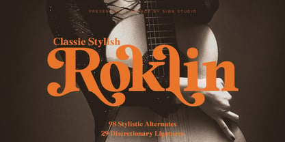 Roklin is an elegant serif family for use as both formal text and headers. Has quite a lot of character alternatives and also enhanced ligatures. It's perfect for casual typography as well as official documents, really. All characters are PUA Encoded, you can use this font easily in many common editor software easily.
 - Floreste by Krakenbox Studio,
$9.00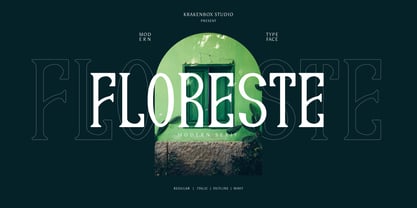 Floreste is a modern display font. Its elegant, classy, and modern look makes it a fantastic choice for fashion, apparel projects, signature, album covers logos, branding, magazines, social media posts, advertisement, and many more. Use this display font to add that special cool touch to any design idea you can think of!
 - Waradala by Differentialtype,
$10.00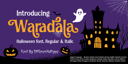 Waradala is a Halloween display font. Perfect for any of your October craft ideas. Which will make your design look mysterious, horror and spooky. Add it to your font library, and it will enhance your creativity! This font is PUA coded, which means you can access all the glyphs and swashes easily!
 - Lazy Monday by Stringlabs Creative Studio,
$29.00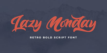 Lazy Monday is a flowing and beautiful handwritten font. It is PUA encoded which means you can access all of the glyphs and swashes with ease! It features a varying baseline, smooth lines, gorgeous glyphs and stunning alternates. Fall in love with its incredibly versatile style and use it to create spectacular designs!
 - Adellia Heart by Rotterlab Studio,
$15.00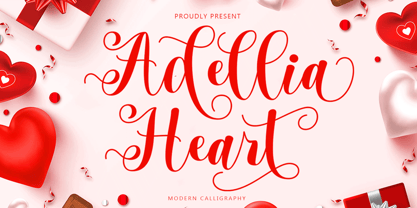 Adellia Heart is a modern calligraphy font created especially for Spring. Adellia Heart is great for unique branding, photo overlays, watermarks, greeting cards, posters, business cards, invitations, weddings, photography, fashion, clothing, letters, stationery, etc. This font is PUA encoded which means you can access all the glyphs and sweeps easily! Thank You
 - Cleanliness Power by Letterara,
$12.00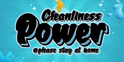 Cleanliness Power is bold script script that looks elegant and classy. It will add a charming touch to anything project This font is PUA encoded which means you can access all of the cute glyphs and swashes with ease! It also features a wealth of special features including alternate glyphs and ligatures.
 - Virathers Shine by Ably Creative,
$12.00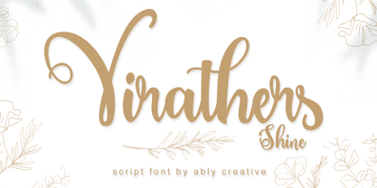 Virathes shine font feels equally charming and elegant and romantic script font that features flowing characters. It looks stunning on wedding invitations, thank you cards, quotes, greeting cards, logos, business cards and every other design which needs a handwritten touch. This font is encoded which means you can access all and with ease!
 - Christmas Surprise by AEN Creative Studio,
$16.00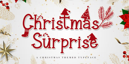 Christmas Surprise is a joyful and festive display font. It is ideal for holiday-themed greeting cards and for any crafting project so add this font to your designs and make them come alive! This font is PUA encoded which means you can access all of the glyphs and swashes with ease!
 - Gatheraz by Rvandtype,
$9.00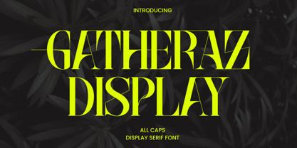 Gatheraz Stylish Display font. Its elegant and cool look makes it the perfect choice for logos, branding, invitations, stationery, wedding designs, social media posts, and so much more. Gatheraz font is PUA encoded which means you can access all of the glyphs. Features : All Caps numbers and punctuation multilingual Alternate Characters PUA encoded
 - Summer Letter by AEN Creative Studio,
$15.00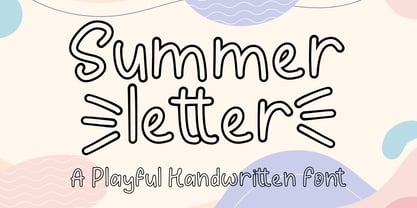 Summer Letter is a fun, quirky, and sweet outline display font. No matter the topic, this font will be an incredible asset to your fonts’ library, as it has the potential to elevate any creation. This font is PUA encoded, which means you can access all of the glyphs and swashes with ease!
 - Just Simple by Stefani Letter,
$14.00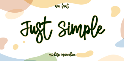 Just Simple is a playful monoline handwritten. It was inspired by a marker pen, and is perfect for logos, t-shirts, branding, prints, and much more! This font is PUA encoded which means you can access all of the cute glyphs with ease! It also features a wealth of special features including ligatures.
 - Story of Christmas by Amarlettering,
$15.00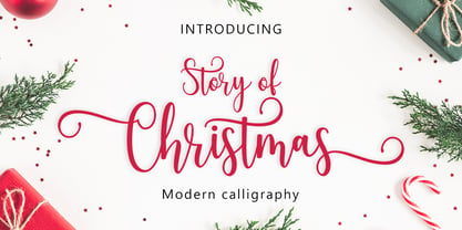 Story of Christmas is a sweet handwritten font. It will add a unique and romantic touch to your Christmas projects! This font is PUA encoded which means you can access all of the cute glyphs and swashes with ease! It also features a wealth of special features including alternate glyphs and ligatures.
 - Christmas Script by Letterara,
$16.00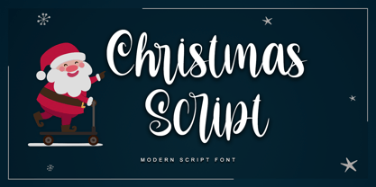 Christmas script font that is simple and unique looking. Its beautiful charm makes it appear wonderfully down-to-earth, readable, and, ultimately, incredibly versatile. This will add a fun and friendly touch to any of your projects! This font is PUA encoded which means you can access all glyphs and sweeps easily.
 - Dopetta by Creaditive Design,
$12.00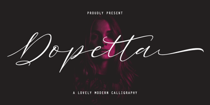 Dopetta is a beautiful light handwritten font with a unique feel and a stunning impact. It will add a luxury spark to web design, invitaition, quotes and branding project that you wish to create! This font is PUA encoded which means you can access all of the amazing glyphs and ligatures with ease!
 - Sunnyletter by Juncreative,
$24.00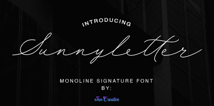 Sunnyletter is a elegant script font. This font is neatly crafted and highly detailed. Whatever the topic, this font will be a wonderful asset to your font library, as it has the potential to enhance any creation. This font is PUA encoded which means you can access all glyphs and swashes with ease!
 - Candywrap by Outerend,
$10.00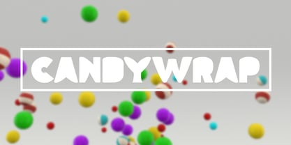 The design of the font, "Candywrap," was inspired by the various shapes of candies It gives soft and gentle, but optimistic and fun feel to your design. It offers round-shaped glyphs which can be uniquely used for your shop signs, logos, posters, menus, billboards, and many others! It's a caps only font.
 - Butterline by Nissa Nana,
$26.00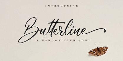 Butterline is a beautiful and elegant script font. Its modern and classy look makes it the perfect font for creating outstanding DIY projects! This font is PUA encoded which means you can access all of the glyphs and swashes with ease! It features a varying baseline, smooth lines, gorgeous glyphs and stunning alternates.
 - Studio Five by Lafonts,
$29.00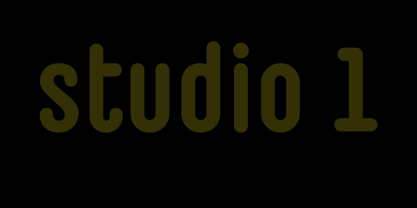 Designed after the sixties neon sign of an arthouse cinema in downtown Zurich, Studio 5 is now a typeface for many applications. The three different styles include old style numbers and alternate characters for titling. All styles have the same metrics. Bold and open styles can be layered for neon sign effects.
 - Spooky Christmas by Stefani Letter,
$12.00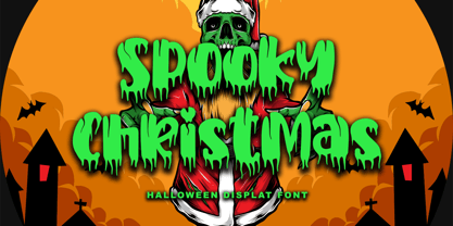 Spooky Christmas is an incredibly unique and spooky display font. Add this font to your favorite Halloween-themed ideas: invitations, banner, logo, app game scary or horror, and notice how it makes them come alive! Spooky Christmas is PUA encoded which means you can access all of the glyphs and swashes with ease!
 - Smack Game by Beary,
$15.00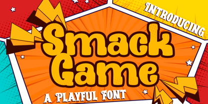 Smack game is a fun font with a cute decorative theme. Masterfully designed to become a true favorite, this font has the potential to bring each of your creative ideas to the highest level!. This font is PUA encoded, which means you can access all of the glyphs and swashes with ease!
 - Springbee by Letterafandi Studio,
$10.00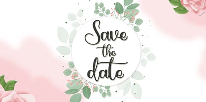 Springbee is a dazzling script font. This font is neatly crafted and highly detailed. Whatever the topic, this font will be a wonderful asset to your font library, as it has the potential to enhance any creation. This font is PUA encoded which means you can access all glyphs and swashes with ease!
 - Tiny Love by Andrey Font Design,
$9.00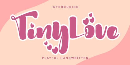 Tiny Love is a chic, playful and fun display font. It will look gorgeous on a variety of design ideas. It will add a joyful and romantic touch to each of your projects! This romantic font is PUA encoded which means you can access all of the glyphs and swashes with ease!
 - Thalita by Slex Studio,
$12.00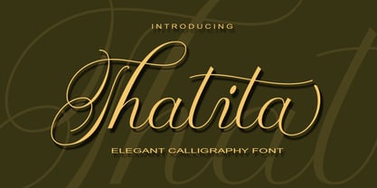 Thalita is an elegant and luxurious calligraphy font. It looks beautiful on a variety of designs requiring a personalized style, such as wedding invitations, thank you cards, weddings, greeting cards, logos and so on. This font is PUA encoded which means you can access all of the glyphs and swashes with ease!
 - Bought Something by Aldedesign,
$25.00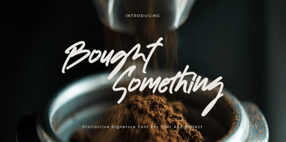 Bought Something is a simple, quirky and adaptable handwritten font. Its informal style and casual vibe will make this font a go-to choice for each of the creations that require a relaxed touch. Bought Something is PUA encoded which means you can access all of the glyphs and swashes with ease!
 - Barjiah by Letterena Studios,
$9.00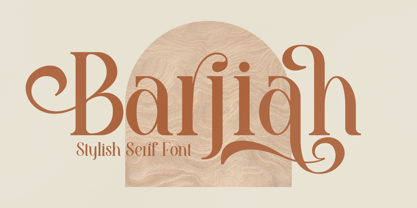 Barjiah is a stylish serif font that has modern and unique elements. It is perfect for creating luxurious logos, book or movie title designs, fashion brands, magazine covers, clothes, lettering, quotes, and so much more. This font is PUA encoded which means you can access all of the glyphs and swashes with ease!
 - Sothardjo by Isolatype,
$15.00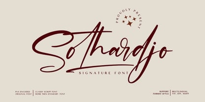 Introducing! new typeface by wildan type and Isolatype Sothardjo is a delicate, elegant and flowing handwritten font. It has beautiful and well balanced characters and as a result, it matches a wide pool of designs. Sothardjo is PUA encoded which means you can access all of the glyphs and swashes with ease!
 - Rick Griffin by K-Type,
$20.00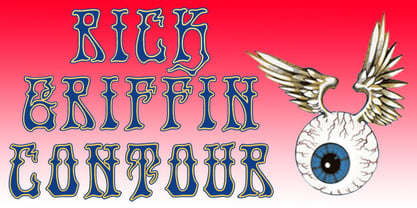 The Rick Griffin fonts are based on the 1960s psychedelic poster lettering of the Californian artist. Rick Griffin is the regular font without outlines. The Rick Griffin Contour font has the additional outline characteristic of many Griffin posters, and the matching Rick Griffin Contour Ground font can be overlapped to create bicolor artwork.
 - Pixelart Halloween by Aldedesign,
$45.00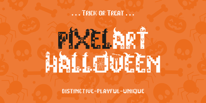 Pixelart Halloween is a crafty and distinctive decorative font. With a combination of pixel-art and scary horror themes, this font has the potential to bring each of your creative ideas to the highest level! This font is PUA encoded which means you can access all of the glyphs and swashes with ease!
 - Hello Babies by Beary,
$15.00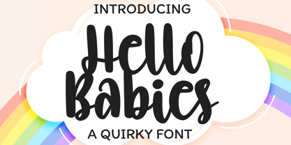 Hello Babies is a quirky and laid-back handwritten font. Whatever the topic, this font will be a wonderful asset to your font library, as it has the potential to enhance any creation. Hello Babies is PUA encoded which means you can access all of the amazing glyphs and ligatures with ease!
 - Hallo Skull by Letterara,
$14.00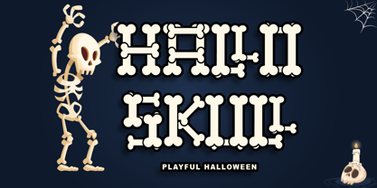 Hallo Skull is a fun friendly and spooky display font. It is suitable for each of your party designs or Halloween creation. Add it to your creative Halloween-themed ideas and notice how it makes them stand out! This font is PUA encoded which means you can access all of the glyphs.
 - Christmas Calligraphy by Letterara,
$16.00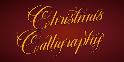 Christmas calligraphy is a dazzling formal calligraphy font that exudes sophistication and elegance. Fall in love with its ravishing style and use it to create beautiful designs. This will make the Christmas moment more classy and glamorous. This font is PUA encoded which means you can access all the glyphs and sweeps easily!
 - Amania by Sealoung,
$15.00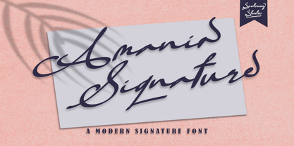 Amania Signature is a unique and elegant handwritten font. It looks beautiful on a variety of designs requiring a personalized style, such as wedding invitations, thank you cards, weddings, greeting cards, logos and so on. This font is PUA encoded which means you can access all of the glyphs and swashes with ease!
 - Stigma Halloween by Aldedesign,
$29.00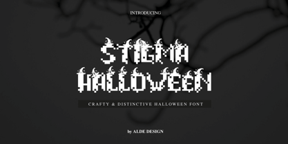 Stigma Halloween is a crafty and distinctive decorative font. With a combination of pixel-art and scary horror themes, this font has the potential to bring each of your creative ideas to the highest level! This font is PUA encoded which means you can access all of the glyphs and swashes with ease!
 - Estienne by Solotype,
$19.95Many fonts have carried this name. Ours goes back to just before 1900 in France. This general style had considerable popularity among job printers all over Europe. We have even seen it used for name imprints on medical school diplomas, which seems a bit grotesk. Surely you can do something better with it. - Katerlin by Muksal Creatives,
$12.00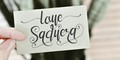 Katerlin is a handwritten font which feels incredibly elegant and flowing. It looks stunning on wedding invitations, thank you cards, quotes, greeting cards, logos, business cards and every other design which needs a handwritten touch. This font is PUA encoded which means you can access all of the glyphs and swashes with ease!
 - Piscis by Susana Simplício,
$35.00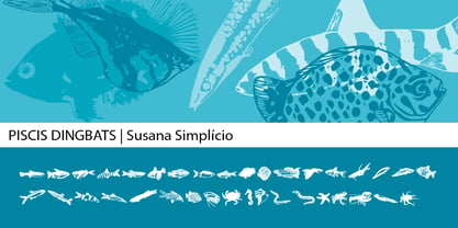 Piscis Dingbats are inspired by aquaculture and fishkeeping, and its main feature is the detailed drawings enabling a real representation of the fishes. Each Dingbat can be used individually or in the construction of illustrations through the combination of drawings, the limit is the imagination to create a variety of creative possibilities.
 - Rain Love by Jehansyah,
$15.00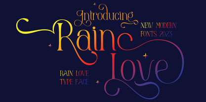 Rain Love is an elegant and modern script font with a luxurious feel. It is suitable for all titles or large writing, e-mail, magazines, book titles, movies, notes, brands, logos, and much more. This font is PUA encoded, which means you can access all of the glyphs and swashes with ease!
 - Prismatic Spirals Pro by MMC-TypEngine,
$182.00 PRISMATIC SPIRALS PRO FONT! The Prismatic Spirals PRO is a Decorative Type-System and ‘Assembling Game’, itself. Settled in squared pieces modules or tiles, embedded by unprecedented Intertwined Prismatic Structures Design, or intricate interlaced bars that may seem quite “impossible” to shape. Although it originated from the ‘Penrose Square’, it may not look totally as an Impossible Figures Type of Optical Illusions. More an “improbable” Effect in its intertwined Design, that even static can seem like a source of Kinetical Sculptures, or drive eyes into a kind of hypnosis. Prismatic Spirals Pro has two related Typefaces both more basic or easier to use versions, the Default Family plus its “bold” braided version Prismatic Interlaces… PRO provides a more advanced, complex, and twisted Design, plus requires to be typed alternating caps. Instructions: Use the Map Font Reference PDF as a guide to learn the 'tiles' position on the keyboard, then easily type and compose puzzle designs with this font! All alphanumeric keys are intuitive or easy to induce, you may easily memorize it all! Plus, often also need to consult it! *Find the Prismatic Spirals Pro Font Map Reference PDF Here! (!) Is recommended Print it to have the Reference or open the PDF to also copy and paste, when consulting is required or when it may be difficult to access, depending on the keyboard script or language. The 2 glyphs sets are separated in colors for facilitating. Also use the Map Font with key captions or switch to it for ensure that the characters are alternating between both uppercase and lowercase letters as other Keys as numbers, marks, and punctuation along the strings, holding Shift one by one or actually two by two. As a Tiles Type-System, the line gap space value is 0, this means that tiles line gaps are invisibly grouted, so the user can compose designs, row by row, descending to each following row by clicking Enter, same as line break, while advances on assembling characters. Background History: The first sketches of my Prismatic Knots or Spirals Designs dates back then from 2010, while started developing hand-drawn Celtic Knots and Geometric Drawings in grid paper, while engage to Typography, Sacred Geometry and the “Impossible Figures” genre… I started doing modulation tests from 2013, until around 2018, I got to unravel it in square modules or tiles from the grid, then idealized it as fonts, along with other Type projects. This took 13 years to come out since the first sketches and 6 months in edition. During the production process some additional tiles or missing pieces were thought of and added to the basic set, which firstly had only the borders, corners, crossings, nets, Trivets connectors or T parts and ends, then added with nets and borders integrations. Usage Suggestions: This type-system enables the user to ornate and generate endless decorative patterns, borders, labyrinthine designs, Mosaics, motifs, etc. It can seem just like a puzzle, but a much greater tool instead for higher purposes as to compose Enigmas and use seriously. As like also to write Real Text by assembling the key characters or pieces, this way you can literarily reproduce any Pixel Design or font to its Prismatic Spirals correspondent form, as Kufic Arabic script and further languages and compose messages easily… This Typeface was made to be contemplated, applied, and manufactured on Infinite Decorative Designs as Pavements, Tapestry, Frames, Prints, Fabrics, Bookplates, Coloring Books, Cards, covers or architectonic frontispieces, storefronts, and Jewelry, for example. Usage Tips: Notice that the line-height must be fixed to 100% or 1,0. In some cases, as on Microsoft Word for example, the line-height default is set to 1,15. So you’ll need to change to 1,0 plus remove space after paragraph, in the same dropdown menu on Paragraph section. Considering Word files too, since the text used for mapping the Designs, won't make any literal orthographical sense, the user must select to ignore the Spellcheck underlined in red, by clicking over each misspelled error or in revision, so it can be better appreciated. Also unfolding environments as Adobe Software’s, the Designer will use the character menu to set body size and line gap to same value, as a calculator to fit a layout for example of 1,000 pts high with 9 tiles high, both body size and line gap will be 111.1111 pts. Further Tips: Whenever an architect picks this decorative system to design pavements floor or walls, a printed instruction version of the layout using the ‘map’ font may be helpful and required to the masons that will lay the tiles, to place the pieces and its directions in the right way. Regarding to export PNGs images in Software’s for layered Typesetting as Adobe Illustrator a final procedure may be required, once the designs are done and can be backup it, expanding and applying merge filter, will remove a few possible line glitches and be perfected. Technical Specifications: With 8 styles and 4 subfamilies with 2 complementary weights each (Regular and Bold) therefore, Original Contour, Filled, Decor, with reticle’s decorations and 2 Map fonts with key captions. *All fonts match perfectly when central pasted for layered typesetting. All fonts have 106 glyphs, in which 96 are different keys with 2 versions of each of both caps and shift keys, plus a few repeated for facilitating. It was settled this way in order for exchanging with its Prismatic relative fonts which has only 48 different keys repeated twice. Concerning tiles manufacturing and Printed Products as stickers or Stencils, any of its repeated pieces was measured and just rotated in different directions in each key, so when sided by other pieces in any direction will fit perfectly without mispatching errors. Copyright Disclaimer: The Font Software’s are protected by Copyright and its licenses grant the user the right to design, apply contours, plus print and manufacture in flat 2D planes only. In case of the advent of the same structures and set of pieces built in 3D Solid form, Font licenses will not be valid or authorized for casting it. © 2023 André T. A. Corrêa “Dr. Andréground” & MMC-TypEngine.
 - Disruptor's Script by Piñata,
$15.00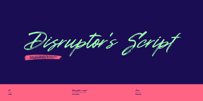 Disruptor's Script is the alter ego of our previous project Gentlemen's Script. Unlike the Gentlemen's Script, the new font is an elegant rebel and defies traditions. The font is painted with a brush pen, which is especially noticeable in the characteristic shabbiness and different thicknesses of the strokes. While the Gentlemen's Script is an embodiment of a classic costume, dress shoes and an expensive watch, Disruptor's Script is a fashionable suit, sneakers, an iWatch and a tattoo that peeks from under the shirt. The font retained the incline, speed and overall sense of dynamics inherent in Gentlemen's Script, but got a bit more chaotic and unpredictable. This is especially noticeable in the newly added shabbiness, elongated extenders, a large number of contextual alternates and different ligatures. For some high-frequency letters (10 for the Latin alphabet and 10 for the Cyrillic alphabet), we painted alternative versions that are substituted in the word instead of the standard characters when following our preceding certain groups of letters. In addition, in the Disruptor's Script you can find functional ligatures, including some of the frequently occurring two- and three-letter combinations. All these solutions dilute the monotonous line of the set, add a bit of unpredictability to the font and a touch of chaos to inscriptions. To fully enjoy usage of the font, we recommend that you always keep the features contextual alternates (calt) and standard ligatures (liga) turned on. If you do not have access to applications that support OpenType features, it does not matter—even without these features you can use and enjoy our font!
 - Yusyad by Eyad Al-Samman,
$20.00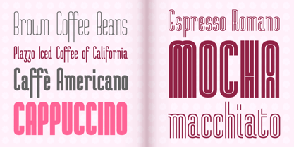 The typeface Yusyad is designed mainly for a very sentimental and emotional reason. Metaphorically, it is a modest artistic gift offered virtually from the designer to one of his beloved and cherished persons in this life, namely, his loyal and devoting wife. She represents one of the most essential motives for many artistic and non-artistic works that the designer achieved during his life. This was done through her tranquil personality, infinite patience, sincere support, and endless encouragement. The designer's partner (i.e., the significant other) lives with him along with their three children looking both always for a life full of peace, achievements, philanthropy, and of course love. The typeface's name Yusyad is a portmanteau word consists of two morphemes. It is a simple name-meshing for two different names. Those names represent the name of the designer's wife (Yusra) and the name of the designer (Eyad). Yusyad is like an epithet that ties the two partners' honest and eternal relationship until the last day of their lives. Technically, Yusyad is a sans-serif condensed and display typeface. It comprises seven fonts with dual styles and multiple weights. Specifically, it has two main styles, namely, the normal and the inline design. The normal style comes in five weights (i.e., thin, light, regular, bold, and black) whereas the inline style has two weights (i.e., regular and bold). The typeface is designed with more than 700 glyphs or characters. Its character set supports nearly most of the Central, Eastern, and Western European languages using Latin scripts including the Irish and the Vietnamese languages. The typeface is appropriate for any type of typographic and graphic designs in the web, print, and other media. It is also absolutely preferable to be used in the wide fields related to publication, press, services, and production industries. It can create a very impressive impact when used in movies' or TV-series titles, posters, products’ surfaces, logos, signage, novels, books, and magazines covers, medical packages, as well as the product and corporate branding. It has also both of lining and old-style numerals which makes it more suitable for any printing or designing purposes. To end, Yusyad's condensed appearance—especially the inline style—makes it very memorable, eye-catching, and striking for advertising, marketing, and promotional purposes.