10,000 search results
(0.028 seconds)
- Skulebuk by WCM,
$20.00Skulebuk is a decorative typeface ideally created for use on edgy/street/urban or sports related design projects. Reminiscent of the early 90s scribblings in the back of my old school books (we all remember right!) instead of doing real work! The two weights available Regular and Heavy will help balance designs that want to over use the typeface i.e Heading and body text. 80s-90s is very now! - Vanguard CF by Connary Fagen,
$35.00 Constructed for maximum impact in tight horizontal spaces, Vanguard's eight weights span a featherlight Thin to a striking Heavy, with accompanying obliques. Vanguard CF impresses in print, headlines, video, and social media. Vanguard CF pairs excellently with its sibling typeface, Integral CF. It also contrasts well with warmer styles, like Artifex CF and Greycliff CF. All typefaces from Connary Fagen include free updates, including new features, and free technical support.
 - Hasan Alquds U by Hiba Studio,
$59.00 Hasan Alquds U is an Arabic display typeface. It is useful for titles and graphic projects where a contemporary, streamlined look is desired. The font is based on the simple lines of Kufi calligraphy, and the uniform slope of its strokes gives it a structured, geometric feel. It supports Arabic, Persian and Urdu languages. Hasan Alquds is the first released typeface of collaboration between Hasan Abu Afash and Mamoun Sakkal.
 - Visconte by Zetafonts,
$51.00 After Marcovaldo, here comes Visconte: a new singularity variant expanding the Calvino typeface family by Andrea Tartarelli with Cosimo Lorenzo Pancini and Francesco Canovaro as a branding font for the Desina Graphic Design Festival in 2023. It takes the design of the original Calvino typeface in the "brutal serif" territory, expanding spiky serifs and creating unexpected distortions and connections while keeping the original calligraphic old style structure of the Calvino Family.
 - Herzchen by Font-o-Rama,
$25.00Herzchen is a well developed sans serif font. The curving and swinging letter forms remind a little of serif fonts, on closer inspection, however, they rather remind of upright italics. Playful details give charm to the typeface and make Herzchen lively and distinctive. With four cuts the typeface is suitable for simple corporate and editorial design projects. In addition there are many ligatures in the expert-set for individual use. - Air Factory by Khaito Gengo,
$22.00 Air Factory was originally designed for a merchandise company, and ordered to design iconic but plain forms. Air Factory is a very simple and modern sans-serif font inspired by early 1900’s typefaces, like Futura, and consisting of 5 weights and stencil type(free). This contemporary typeface would be good used for restaurant, retail, book, poster etc. Air Factory also features various ligatures, stylistic alternates, fractions, and languages as well.
 - PF Press by Parachute,
$45.00 Press combines aesthetic and functional attributes which make written text highly readable. It was originally designed for a newspaper with medium contrast to withstand harsh printing conditions. Its structure is quite narrow which makes this typeface ideal for body text and headlines where space is at premium. Supports Latin and Greek. This is a modern serif typeface which may be the right choice for newspapers, magazines and corporate communications.
 - Gibrael by TRF,
$20.00 Gibrael is tattoo script style font. Truly a perfect script for any project that's need delicate typeface such as custom name, greeting card, create logos, etc. A handy font for tattoo designer and artsy creative people! It's a beautiful, elegant, clean and unique typeface you need to have! Contains over 590+ glyphs, it has many alternate characters so you can make a beautiful decorative type easily and multiple language support.
 - Logx 20 by Fontsphere,
$12.00 LOGX-20 is a geometric, all-caps display typeface. This is the brother of the LOGX-10 font. It obviously refers to the previous one, but considering the construction it is a different typeface. LOGX-20 is designed to create elements of visual identification, various creative projects and outstanding graphics. It looks great in arrangements with different text sizes, headers, sentences and longer texts. Both on websites, print or applications.
 - Betm Rounded by Typesketchbook,
$39.00 The typeface of Betm Rounded is based on the successful Betm font family by font foundry Typesketchbook. Font designer Chatnarong Jingsuphatada created Betm as a Rounded version to Betm. Both type families consist of ten weights plus with italic versions. Betm’s typeface has a friendly and modern sans serif appearance. This modern geometric font is very legible and can be used for headlines as well as small and long text.
 - Tisk by Gittype,
$20.00 Tisk is a superb blackletter font. The Blackletter typeface (also sometimes referred to as Gothic, Fraktur or Old English) was used in the Guthenburg Bible, one of the first books printed in Europe. This style of typeface is recognizable by its dramatic thin and thick strokes, and in some fonts, the elaborate swirls on the serifs. Use this font for any crafting project that requires a personalized look!
 - LT DIE HARD by Latam Type Foundry,
$9.00 LT DIE-HARD FONT DUO+EXTRAS is a handcrafted typeface, carefully designed to capture the essence of strength and determination. With its horrible and worn strokes, this font transmits a sensation of resistance and solidity, Each letter is made in a unique style, creating a sense of movement and dynamism in the text. DIE-HARD typeface is ideal for projects requiring a strong and determined approach, such as posters, titles, logos...
 - Gatlinburg Gossamer NF by Nick's Fonts,
$10.00 The original characters, and now-rarely-seen alternate characters, for Memphis, designed by Emil Rudolf Weiss for American Type Founders in 1930, provided the pattern for this wispy, ultralight typeface. Although intended primarily for headlines, this typeface can also be used for brief blocks of text, if set 18 pt. or larger. Both versions of the font include 1252 Latin, 1250 CE (with localization for Romanian and Moldovan).
 - Ceratyn by RagamKata,
$12.00 Ceratyn - Experimental Typeface A Experimental typeface or Psychedelic Font Font from Ragamkata. Get lost in the trippy, mesmerizing world of Gilest: a psychedelic font that bends reality and challenges your perception of typographyand have outline version. This font has several alternatives available in it, suitable for creating logo designs, badges, web fonts, magazines and others. With a very strong font character, it will make your design different and more attractive.
 - Bertie by ITC,
$29.99Bertie was designed by Alan Meeks in 1986, an ornamented typeface with a light and elegant look. Such typefaces were at their peak in the middle of the 19th century, when they were created for the advertisements of booming industries. The sophisticated Bertie is based on forms of the transitional period and is best used in headlines with point sizes of 18 or larger to highlight its unique details. - Blauth by Latinotype,
$29.00 Blauth—a versatile and contemporary sans serif typeface—comes in 8 weights, ranging from Thin to Black, with matching italics and contains a set of alternate characters. Its small x-height gives it an elegant feel that reminds us of classic typefaces. Blauth is well-suited to continuous text and its uppercase set is ideal for high-impact headlines while its softened corners give your designs a warm and contemporary look.
 - Sign Card JNL by Jeff Levine,
$29.00 The addition of serifs to an existing typeface can drastically change the look and feel of a design. Sign Card JNL and its oblique version is just such a treatment of Sign Shop JNL. By adding the serifs, there is not only a brand-new Art Deco typeface possessing a regal and formal style, but a distant resemblance to a Russian Cyrillic font with its mechanical form and function.
 - Retroguard by Mevstory Studio,
$15.00 Retroguard is a typeface that was inspired by classic movies and frequently makes people nostalgic for the height of cinema. This typeface is distinguished by its strong, dramatic letterforms, which frequently evoke the early 20th-century Art Deco and Art Nouveau movements. Images that enhance boldness and drama, including black-and-white photos, antique movie posters, or pictures of film reels, are frequently used in conjunction with this font.
 - Chilidog PB by Pink Broccoli,
$16.00 Looking for a real fun whack-a-doodle typestyle? You may have just found your match with the Chilidog PB typeface. Chilidog PB began as a digitization of the film typeface called Nectar by LetterGraphics. This font is filled with irregular shapes, shifting weights, and a collection of ligatures that give it real personality. It's a real eyecatcher, but don't take my word for it, give it a spin for yourself.
 - Basgem by Issam Type,
$23.00 Basgem is a modern classy ligature serif typeface comes with joining ligatures that give it a fancy and unique style. This awesome font is perfect for branding, logos, invitation, watermark and so much more. Basgem typeface comes with regular, italic, Condensed and Condensed italic font styles. Uppercase & lowercase letters, numbers, punctuation, ligatures, alternates and multilingual support. If you have any questions, please feel free to get in touch. Thank you
 - Burnic by Storictype,
$19.00 Introducing vintage classic display typeface its called Burnic Typeface. Inspired by antique, mix victorian and art deco period with decorative shapes*. Those all will make you work easily to create : Posters, Logos, Print, Quotes, Headers, Clothing, Labels, Packaging etc. Features : Character Set A-Z Numerals & Punctuations (OpenType Standard) Accents (Multilingual characters) Ligatures Above the description of this font, I hope you're satisfied with what I have created. Thanks and enjoy designing.
 - Natalya by insigne,
$24.99 Natalya is a flashy and rhythmic script. The script has more space between characters than most for better legibility, and the basis point for the ornate swirls is the golden ratio. This makes for an especially harmonious typeface with timeless appeal. The typeface includes three alternates with variations of the ascenders and descenders. All three fonts include OpenType ligatures, oldstyle figures and ending swashes for an even more elaborate appearance.
 - Bomiro by Issam Type,
$22.00 Bomiro is a modern classy ligature serif typeface comes with joining ligatures that give it a fancy and unique style. This awesome font is perfect for branding, logos, invitation, watermark and so much more. Bomiro typeface comes with regular, italic, Thin and Thin Italic font styles. Uppercase & lowercase letters, numbers, punctuation, ligatures, alternates and multilingual support. If you have any questions, please feel free to get in touch. Thank you
 - Marathon by Linotype,
$29.99Marathon was originally designed by Rudolf Koch in 1931 for Schriftgiesserei Klingspor. It is a roman with short ascenders and descenders. The serifs are small, but longer at the ends of the arms of E, F and L, M is rather splayed and is without top serifs, like M in other typefeaces designed by Rudolf Koch. The lowercase g has no link and an open tail, again like the g in other Koch types. U has the lower-case design. In the W the middle strokes cross, the lower case w has no middle serif. The figures are short-ranging. Ute Harder from the Fachhochschule Hamburg had redesigned Marathon with the help and supervision of Professor Jovica Veljovic. She has added a book weight to offer more flexibility with this beautiful typeface. - handwriting-draft_free-version - Personal use only

- soul handwriting_free-version - Personal use only

- Drinking - Unknown license

- Dancing_DL1.0 - Unknown license

- Qubix - Unknown license

- ringey - Unknown license

- Retrology by Letterhend,
$15.00 So classic, so retro... it's Retrology! Introducing, Retrology. This monoline typeface will bring you to the good ol' days with its classic touch!
 - Sportive by Stringlabs Creative Studio,
$29.00 Sportive is a unique and modern display font. This playfully conceptual typeface font will look truly outstanding in a wide range of contexts.
 - Velvet Teen by Pink Broccoli,
$14.00 An art deco style typeface inspired by the poster from the 1971 film, Velvet Vampire. Such a playful font for a horror flick!
 - Caslon Openface by Bitstream,
$29.99A small x-height typeface, originating with engravers near the start of the twentieth century, appearing in type in the 1923 ATF specimen. - Golos by Hiekka Graphics,
$25.00 Golos is a sleek and authentic font face with two styles: regular and italic. Golos is recommended for use as a display typeface.
 - Dead Inside by Nantia.co,
$13.00 Is it Halloween yet? Dead Inside Chilling Font is an adorable hand-made typeface with 13+1 chilling icons, for the upcoming Halloween.
 - Streamliner by Zang-O-Fonts,
$25.00Inspired by the typefaces used for company insignia on aircraft in the 1930's and 1940's, Streamliner is light, friendly and open. - Nihil by Dawnland,
$13.00 Inspired by classic serif fonts such as (adobe) Garamond, this pencil drawn typeface give your designs a unique and elegant, yet distressed look.
 - Ultimate Victory by Epiclinez,
$18.00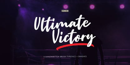 Ultimate Victory is an authentic handwritten brush typeface. This textured script font is suitable for posters, magazines, apparels, movie headlines, packaging and more.
 - JH Lea by JH Fonts,
$45.00 JH Lea cursive is a school kids typeface; it is designed based on cursive handwriting , typical for children books, first hand calligraphy experience.


