10,000 search results
(0.024 seconds)
- Nefelibata by My Creative Land,
$25.00 A new handwritten font collection made by My Creative Land especially for all you dreamers and cloud walkers out there. The collection has everything you might need for your contemporary design project. All of the 9 handwritten fonts and design element can be mixed and matched to tell your story! Brush fonts - scripts and sans serif - come in two styles: clean and canvas - both of them have nice clean edges and can be used in any sizes.
 - DEATHE MAACH by The Fontry,
$15.00 There's a war starting; you just didn't notice because you were too busy fighting to realize what was happening. Take your sides. Pick your battles. Choose a face that stands ready to defend, enforce and police. All who are ready to serve, please step forward. Deathe Maach is a six-font family of descending weights with the strength and stamina to face all comers in the approaching conflict. Armor on. Pistols out. Barrels forward. Enforce and serve.
 - Macis by Stabenfonts,
$30.00 Macis is a real-and-fake-retro-modern font-family containing five weights from thin to black. It is inspired by shop signs, packaging and typography from around the middle of 20th century. Though it is strictly geometrically constructed, it contains some hand-crafted influences as well as some irregularities. Some say, it dances on the baseline, ’cause the bowls and curves reach far out over the stems. Use it in big sizes, especially the extreme weights!
 - Givani by Khoir,
$15.00 Introducing, Givani, a font with a retro look but cute impression making this font unique with a consistent thickness, making memories of the 70s era, this font has an interesting alternative as well as several ligatures to complement it. This font is perfect for creating logos, invitations, novels, books, magazines, labels, greeting / wedding cards. So what are you waiting for! What's included? Uppercase Characters Lowercase Characters Support 75+ Language FEATURES Givani (OTF) So what are you waiting for? immediately purchase this font, feel free to comment, or send me my PM or email at khoirtypework@gmail.com Thank you for seeing
 - Dragmatis Whiplash by Alcode,
$23.00 Dragmatis Whiplash is a classic font, I built it with my relaxed hands. designing a classic font but having a modern element in it, which makes it particularly suitable for wedding media, book covers, greeting cards, logos, branding, business cards and certificates, in fact for any design work that requires a clasik, formal or luxurious. Includes multilingual support Try Dragmatis Whiplash, enjoy the richness of OpenType features and let her fun and elegant excitement make you happy and enhance your creativity! You can use this font very easily. Do not forget to see, buy, like and share my other great products, klick here.
 - Motherland by Scratch Design,
$9.00 Introducing Moonlight it's modern handwriting with a signature style and brush texture. This font comes in 2 styles with alternates. The Moonlight has natural handwriting texture making this font look authentic but still readable in incredibly versatile. This font will look outstanding in any occasion design concept, whether it’s being used on colorful backgrounds or as a stand as a headline in a minimalist background! Moonlight has multi-language support, swashes, alternate and ligature dan you can apply it in OpenType mode in adobe photoshop or adobe illustrator. Please enjoy the Moonlight signature Font which makes some stunning designs.
 - Sethasso by Twinletter,
$15.00 Introducing our newest font called Sethasso, clean simple, and elegant themed signature font, which is written in natural hand strokes making this font more charismatic natural, This font in addition to having a charming and unique shape is also equipped with various alternative options that make it easier for you to create beautiful and extraordinary designs This font is perfect for business cards, photography studios, autographs, interior designs, model names, coffee late, travel, weddings, cosmetics, jewelry, social media posts, product packaging, watermarks, special events, or anything else. Start using this font to add an authentic and heartfelt vibe to any design project.
 - Helmswald Post by Sharkshock,
$125.00 Helmswald Post is a handsome Blackletter that's been years in the making. There's a mix of wispy terminals, flamboyant caps, and the use of negative space to create contrast. Elements from High German, Old English, and many other styles make their way into this gorgeous display font. The result is a medieval looking script with cleaner, more modern feel. In addition to European accents Helmswald Post is equipped with Cyrillic, alternates and ligatures. Old world numerals are present by default but may be substituted by accessing the stylistic sets. Use it for a book cover, web headings, or a restaurant logo.
 - Nolde by Brownfox,
$21.99 Nolde is a new titling typeface named after the German-Danish painter and printmaker Emil Nolde, one of the first artists to work in the Expressionist style. Not unlike the work of Nolde the artist, the seemingly rhythmical characters of Nolde the typeface conceal expressive tension of form and nervous line quality. While its letterforms hearken to the early-20th c. foundry types, this font makes a fresh and decidedly current impression, making it suitable for cutting-edge display use. Nolde capitals are available in two weights: regular and outline, and support over 60 languages that employ Latin and Cyrillic scripts.
 - Gediya by Twinletter,
$12.00 Gediya is a san serif font family with a distinctive and appealing shape suitable for headlines and writing. This typeface is stunning in every way, making it ideal for any application that needs to wow. Gediya is an excellent solution for making a flyer, banner, or just some new text for your project. Begin utilizing this typeface in your wonderful project. of course, your various design projects will be perfect and extraordinary if you use this font because this font is equipped with a font family, both for titles and subtitles and sentence text, start using our fonts for your extraordinary projects.
 - Sugarless Coffee by Gassstype,
$23.00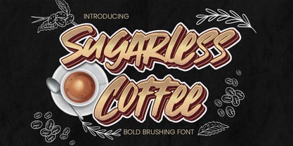 Hello Everyone, introduce our new product Sugarless Coffee - Bold Brushing Font Crafted Display, inspired by the title of the sports poster and We make it very energetically. Sugarless Coffee font with strong and challenging nuances. very suitable for the title, typography, Poster, magazines, brochures, packaging,Websites and much more for your design needs, making your designs more modern and professional. Inspired by Logo style and combination with Cute Craft style. that will fulfill your design needs for quotes,sporty theme, logotype, wordmark, etc. This has many opentype features and support multi language. You can activate Ligature OpenType panel design more interesting.
 - Streetfire by Din Studio,
$29.00 Hi, Everyone! Want a font to make your branding bold? Looking for a fabulous, stylish, artistic, and adventure font? We've got what you want. Introducing Streetfire - A Grafiti Font This typeface with artistic style looks very interesting for loads of different projects and promotions.Perfect for social media branding projects, fashion designs, printed quotes, packaging, or even as a stylish text overlay to any background image. Our font always includes Multilingual Support to make your branding reach a global audience. Features: Ligatures Stylistic Sets Multilingual Support PUA Encoded Numerals and Punctuation Thank you for downloading premium fonts from Din Studio
 - Trimo by Khoir,
$15.00 Introducing, Trimo, the clean and simple Modern Serif. This font has an attractive, clean and simple alternative and several ligatures that enhance it, making your font / logo even more attractive. This font has a thick and thin shape, making this font look unique but doesn't leave an elegant impression. This font is especially suitable for logos, invitations, novels, books, magazines, labels, greeting / wedding cards. So what are you waiting for! What's included? Uppercase Characters Lowercase Characters Support 75+ Language So what are you waiting for? immediately purchase this font, feel free to comment, or send me my PM. Thank you for seeing
 - Square Bite by PizzaDude.dk,
$9.00 Here's a fun collection of cute, weird, crazy and goofy drawings. They are all drawn within a box, which makes it easy for you to align them in a grid, or perhaps make your own colouring book or picture lottery. The shapes of the drawings are typically simple: triangles, circles, squares etc. I use drawings like these in my work as a kindergarten teacher. These simple, but yet appealing drawings, are a great inspiration for kids (especially the ones who never draws or are insecure on how to draw) to start drawing themselves, or as a kickstarter for their imagination!
 - Gallazzi by Twinletter,
$15.00 Gallazzi is a fun display typeface with a lovely and attractive appearance. Start using this font in your project since it is smooth, cool, and cute to the eye. Then you’ll have a project that is truly distinctive and cheerful in comparison to others because the harmony and harmony will make your project bolder and bolder and look different. Let’s construct an awesome project using this typeface, and make it one of a kind. This font is perfect for games, sporting events, branding, banners, posters, movie titles, book titles, quotes, logotypes, and more. Start using our fonts for your amazing projects.
 - BuddySystem - Unknown license

- Plantin Infant by Monotype,
$29.99Plantin is a family of text typefaces created by Monotype in 1913. Their namesake, Christophe Plantin (Christoffel Plantijn in Dutch), was born in France during the year 1520. In 1549, he moved to Antwerp, located in present-day Belgium. There he began printing in 1555. For a brief time, he also worked at the University of Leiden, in the Netherlands. Typefaces used in Christophe Plantin's books inspired future typographic developments. In 1913, the English Monotype Corporation's manager Frank Hinman Pierpont directed the Plantin revival. Based on 16th century specimens from the Plantin-Moretus Museum in Antwerp, specifically a type cut by Robert Granjon and a separate cursive Italic, the Plantin" typeface was conceived. Plantin was drawn for use in mechanical typesetting on the international publishing markets. Plantin, and the historical models that inspired it, are old-style typefaces in the French manner, but with x-height that are larger than those found in Claude Garamond's work. Plantin would go on to influence another Monotype design, Times New Roman. Stanley Morison and Victor Larent used Plantin as a reference during that typeface's cutting. Like Garamond, Plantin is exceptionally legible and makes a classic, elegant impression. Plantin is indeed a remarkably accommodating type face. The firm modelling of the strokes and the serifs in the letters make the mass appearance stronger than usual; the absence of thin elements ensures a good result on coated papers; and the compact structure of the letters, without loss of size makes Plantin one of the economical faces in use. In short, it is essentially an all-purpose face, excellent for periodical or jobbing work, and very effective in many sorts of book and magazine publishing. Plantin's Bold weight was especially optimized to provide ample contrast: bulkiness was avoided by introducing a slight sharpening to the serifs' forms." - Plantin Headline by Monotype,
$29.00Plantin is a family of text typefaces created by Monotype in 1913. Their namesake, Christophe Plantin (Christoffel Plantijn in Dutch), was born in France during the year 1520. In 1549, he moved to Antwerp, located in present-day Belgium. There he began printing in 1555. For a brief time, he also worked at the University of Leiden, in the Netherlands. Typefaces used in Christophe Plantin's books inspired future typographic developments. In 1913, the English Monotype Corporation's manager Frank Hinman Pierpont directed the Plantin revival. Based on 16th century specimens from the Plantin-Moretus Museum in Antwerp, specifically a type cut by Robert Granjon and a separate cursive Italic, the Plantin" typeface was conceived. Plantin was drawn for use in mechanical typesetting on the international publishing markets. Plantin, and the historical models that inspired it, are old-style typefaces in the French manner, but with x-height that are larger than those found in Claude Garamond's work. Plantin would go on to influence another Monotype design, Times New Roman. Stanley Morison and Victor Larent used Plantin as a reference during that typeface's cutting. Like Garamond, Plantin is exceptionally legible and makes a classic, elegant impression. Plantin is indeed a remarkably accommodating type face. The firm modelling of the strokes and the serifs in the letters make the mass appearance stronger than usual; the absence of thin elements ensures a good result on coated papers; and the compact structure of the letters, without loss of size makes Plantin one of the economical faces in use. In short, it is essentially an all-purpose face, excellent for periodical or jobbing work, and very effective in many sorts of book and magazine publishing. Plantin's Bold weight was especially optimized to provide ample contrast: bulkiness was avoided by introducing a slight sharpening to the serifs' forms." - Grayfel by insigne,
$- As designers, we seek perfection and originality. The more we step back and look at our work, the more changes we tend to find necessary. Drastic modifications are inevitable. The same is true of Grayfel. Grayfel began as an exercise at insigne to explore the crowded space of neutral sans. While the world of sans serifs is admittedly crowded, I still managed to find something new and different. The final Grayfel consists of 42 full-featured OpenType fonts containing three widths: Regular, Condensed, and Extended. Every width consists of 14 fonts--seven weights with matching italics, making it a good companion for setting clear text and headlines for print and screen. OpenType features are also available. There’s figure choices, such as proportional and old style figures. Additionally, Greyfel includes sophisticated typographic attributes: ligatures, fractions, alternate characters, small caps, superscripts and subscripts. Its extended character set supports Central, Western and Eastern European languages. Optical compensations also mean the outcome of this family is a hybrid of humanistic proportions. It’s a well-finished design with optimized kerning gives it a friendly look. If you like sans serifs within the tradition of Futura, Helvetica, Avant Garde and Avenir, then you’ll love Greyfel, too. Grayfel works well in a variety of applications. Subtly neutral yet fun, it’s suitable for headlines of all sizes as well as for text. Put it to the task for marketing, packaging, editorial work, branding and even on-screen projects. Try it out: it’s not just fun and playful; it’s Grayfel.
 - Dolsáb by Kent Barns,
$20.00 Dolsáb was designed from scratch with uniqueness in mind. The subtle movement from thick to thin and the variants of sharp to rounded make this cutting edge san serif a must have. The inspiration for Dolsab was a simple pairing of a rhombus and calligraphy. While neither of those two elements can be seen in their entirety in any instance, the influence of both is strong. The rhombus can be notice on most ascenders like on the lowercase t & l, for example. And the calligraphy inspiration is most easily captured on the descenders such as the lowercase y & g. The most beautiful characteristics of Dolsab is definitely the calligraphy-influenced movement. These features really stand out on the lowercase a & e. It's almost amusing to let your eye follow the contours of those two letter forms as they travel from thick to thin, sharp to rounded and back again. Users are welcomed to try all font styles of Dolsab in any applique of their choosing. However, it will be quickly noticeable that only Dolsab Air & Demi (the thiner of the styles) will be best suited for body copy. Personally I like to see these letterforms as large as they can be to really showcase the subtle movement, especially in Dolsab Heavy where these movements become much more dramatic. You'll never know what really works best unless you experiment. Dolsab surely isn't the answer to all projects, but it's certainly worth trying. No other typeface moves quite like Dolsáb.
 - Ringo by typoland,
$9.00 Whassup y’all! Me and my bros got this li’l gang together: we is Ringo, and we got da bling, yo! We is da typeface family for ya all! We got some real sweet stuff for ya, some nice characters. We got all ’em OpenType features like fractions and proportional figgers, we even got da cubic root, man! And check out da question mark, man, is real sweet. And the ampersand, yeah! I luv ’em ampersands. Now my brothers over here got some light action for ya, and they got some real bold action for ya. We got some nice foxy curves goin’ on, some nice tension, and some nice relaxation. My bro Light over here is kind of like the subtle guy, ya know. He’s in for the female fans, ya know. Heh! Hell, yeah! And man, we speak like 84 languages: we speak the German, and the French, and the Spanish, and we speak the Polish, and the Czech, and the Hungarian, and we even speak Shambala and Swahili and Rundi, and we got some Esperanto thing as well for ya. And check out my bro Black right over here, he’s like the action superhero, man! He’s got impact, man! Yeah yeah, but you know, my bros Regular and Bold are the real deal. Them is like da word of da street, man! Like da word of you, and you. And we got a message for y’all: life is hard, life is real, but you should work your mojo, be smooth, be nice, chill. We got all them kerning pairs, and all them weights, and we got ’em alternate letters. So check us out, yo!
 - Al Sinerva by Aluyeah Studio,
$120.00 This font is the result of my play with letters. Inspired by Indonesia's great cultural heritage, Batik. I wanted to create a font that has an alternative that highlights a small part of Indonesian batik culture by taking a shape like a bird's feather which is often applied to Batik. A simple, yet distinctive, elegant font that can be applied to many areas of design. Sinerva is a quilly display typeface. Coming with 130+ stunning and super easy to use alternates. Very suitable for magazine, headline, website, ads, product package and all type of design project you have. Features: OpenType support Multilingual support (15 languages) PUA Encoded Super Easy to Use alternates - It's OpenType support but you can easily call alternates character using special combination like A.2 R.3 h.5 etc. so you don't need special software. To get results like the preview just type S.4INERV.3A.8 Thanks for checking out my font. I really hope you enjoy using it!
 - Merc by Canada Type,
$24.95 Merc is a four-letter word that stops just one y short of Mercy. Merc is also the standard street abbreviation for mercenary, or a soldier for hire. Now that the global security business has become a two hundred billion dollar industry, we thought you would like to have your very own affordable merc. Knew you'd be pleased. Merc is based on an all-cap metal face called Agitator, designed by Wolfgang Eickhoff and published by Typoart in 1960. The rough brush letters look like they were made by someone who is capable of elegance but has no time for it. These are letters that live to catch the eyes and warn them loudly: Doom is here, and if you want it screamed out, this Merc is at your service. This font contains more than 460 glyphs, which means quite a few stylistic alternates and support for the majority of Latin languages.
 - Hejira by Sudtipos,
$49.00 Hejira means “rupture” and this concept was the primary principle that guided the creation of this typeface: to escape conventions and take up the challenge of designing letters with an unusual and fresh approach. Unlike traditional typefaces, each member of this somewhat atypical family has its own distinct personality and formal features. A thin, spiky font that looks like its sharp serifs could pierce through. A more experimental sibling, based on the same skeleton but taken to the extreme, that is best suited to setting big titles. An odd-one-out, sans-serif style whose shapes mimic those generated by the movement of a calligraphic pen. And a quirky fat-face with a flair for combining round curves with pointy elements. Regardless of how different they may be, all four styles feel part of the same system and can be used alongside each other seamlessly. The Hejira set includes multiple ligatures and supports a wide variety of Latin alphabet-based languages.
 - Valiety by Din Studio,
$25.00 Valiety is a serif font family to better charm your designing experiences. It consists of eight different levels to add elegant, modern touches to your designs. Valiety has a continuity aspect produced from each small stroke in order to help the eyes smoothly move from one letter to another. Besides, the thickness differences are unnoticeable so that it leaves stable, legible impressions. With such flexibility, you can use it in either bigger- or smaller-sized texts. Include 8 different weight fonts : Valiety Hairline Valiety Thin Valiety Extra Light Valiety Light Valiety Regular Valiety Medium Valiety Semi Bold Valiety Bold Features: Multilingual Supports PUA Encoded Numerals and Punctuation Valiety is best for any design projects, such as posters, banners, logos, book covers, invitations, quotes, headings, printed products, merchandise, social media, etc. Find out more ways to use this font by taking a look at the font preview. Thank you for purchasing our font and happy designing.
 - Lemony by Din Studio,
$29.00 Lemony is a serif font family in 8 different volume options expressing formality and elegance in your designs. Its family character is that it has small lines in horizontal or vertical forms on the letter body, easing readers to read the letter as the lines guide readers’ attention to the reading directions. As a result, you may use this font on any text sizes. In addition to the font weight variations, you will have freedom of how and where you should use the font. Enjoy the available features here. Features: Ligatures Multilingual Supports PUA Encoded Numerals and Punctuations Lemony fits for various design projects, such as posters, banners, logos, magazine covers, quotes, invitations, greeting cards, merchandise social media, etc. Find out more ways to use this font by taking a look at the font preview. Hopefully, you have a great experience using our font. Feel free to contact us if you require more information when you are dealing with a problem. Thank you. Happy designing.
 - Mantika Book by Linotype,
$50.99 Mantika Book was originally conceived and drawn parallel to the first Agilita drawings. *[images: pencil drawings] It took several years before having a chance looking at these designs again. But then, my first impulse was to turn this alphabet into a new sanserif, which was to become Mantika Sans. This was the starting point to conceive a super family consisting of different design styles and corresponding weights. The initial drawings of Mantika Book were refined and an Italic was developed to go with it. The aim was to create a modern serif typeface which is reminiscent of humanistic Renaissance typefaces, yet without following a particular historic model. Its large x-height for one is far away from original Renaissance models. Mantika Book was designed as a companion serif typeface to Mantika Sans that can be set for lengthy texts as in books, hence its name. It shares the same x-height with Mantika Sans but has longer ascenders and descenders, making for better word shapes in long, continuous reading. The approach of an ›old-style‹ looking typeface with large minuscules makes Mantika Book also a choice for magazine text settings where one often needs smaller point sizes to fit in a multiple columns layout. The unique details of Mantika Book are the asymetric bracketed serifs in the upright font and its higher stroke contrast than usual in a Renaissance style. The stems are slightly curved inwards. Also, the Italics have a low degree of inclination, which makes longer passages of text set in Italic rather pleasing to read. Another feature Mantika Book shares with Mantika Sans is that all four weights take up the same line length. It covers all European languages plus Cyrillic and Greek, is equipped with lots of useful scientific symbols [double square brackets, angle brackets, empty set, arrows] and the regular weight has small caps. There is a kind of an old-style feeling to Mantika Book, yet these citations were turned into a contemporary serif typeface with a soft but sturdy character.
 - Typesetter JNL by Jeff Levine,
$29.00 Typesetter JNL is based on an old-style 'grotesk' (or 'grotesque') text face popular with printers and rubber stamp makers since the 1800s. The nonconformist character shapes and line widths are reminiscent of hand-cut type of the era.
 - Signal To Noise - Unknown license

- Milford by SparkyType,
$19.00Milford is a font with its feet planted in several styles of design. It has aspects of Art Deco shapes and proportions, but has modern additions and tweaks that make it a handsome substitute for your tired heading fonts. Because of its tight spacing and filled, super-black forms, it responds nicely to treatments such as negative letter spacing and outlining. - Stuffy by Gassstype,
$23.00 Introducing of our new product, Stuffy - Handwritten Script Font font with a natural handwritten feel. This handmade font will make your design has a beautiful natural touch for each details. It is perfect for any design project as Invitation,logo, book cover, craft or any design purposes. This font is PUA encoded which means you can access all of ligatures.
 - CA Sensuell by Cape Arcona Type Foundry,
$37.00 Stefan Claudius developed this font while he was sitting in a small chalet in Denmark with a hot wood-oven and nothing but snow outside. Probably the amount of white led him to make it so thin and to have as much space between the lines as possible. If you have that in mind, it looks best in large sizes.
 - Samsheriff by Ingrimayne Type,
$5.00 Samsheriff is a large sans-serif family with a touch of quirkiness. It contains an eclectic mix of letter styles but is very legible. The origin of this typeface was in the caps-only letters used for the novelty font Coffinated. Adding lower-case letters, additional widths, additional weights, and italics resulted in the 30 styles that make up the Samsheriff family.
 - Bogota by Din Studio,
$22.00 Bogota is a modern and clean display (Serif) font create from our talented font designer. The design of Bogota will make your design more beautiful and inspiring. This font will suitable for any project, like branding, print template, logo and etc. The font also available in a thin version. Features: Accents (Multilingual characters) Alternates PUA encoded Numerals and Punctuation (OpenType Standard)
 - Marcelo by Din Studio,
$29.00 Introducing the Marcelo engraved font. Marcelo font is designed to be used in display settings. Created by our talented font designer Donis Miftahudin. The design of typeface will make your design more beautiful and inspiring. This font will suitable for any project, like branding, print template, logo and etc. Features: Accents (Multilingual characters) 27 Alternates PUA encoded Numerals and Punctuation (OpenType Standard)
 - Bubpop by SAMUEL DESIGN,
$19.00 The name of this font is Bubpop. The features of the serif body are combined with the non-sans-serif body. Structuring and reconstructing the serif font, we get a very modern font effect. The font effect is not only rounded, but also has clever ideas and solemn details. This treatment makes this font more widely used and remains different.
 - Hypestone by Invasi Studio,
$19.00 Welcome to the spooky world of Hypestone, the creepy and fun display font that's perfect for horror and Halloween styles. With its strong and captivating characters, Hypestone exudes an air of mystery, horror, and fear that will send shivers down your spine. But don't worry, we've added a playful twist with alternates and ligatures, making the glyphs organically spooky and delightfully creepy.
 - Calserif by Great Studio,
$19.00 Calserif is a serif font combined with a calligraphy serif font. With its blend of classic elements and contemporary designs, this serif family has two versions, a choice of regular serif styles and italic calligraphy styles. These fonts are perfect for your design needs such as making nostalgic but still clean and elegant designs such as headlines, magazines, logo designs, packaging, editorials, invitations.
 - Gaba by BumbumType,
$40.00 Gaba has it's roots in classic mid-twenties century typefaces. With uniform drawn character widths, rounded, comfortable warm curves, combined with sharp cuts, a large x-height and a moderate drawn contrast. A timeless and outstanding collection over a comprehensive range of weights making it the perfect workhorse for a wide range of applications. Gaba contains 588 Glyphs and numerous Opentype features.
 - NL Seasalt by Nicky Laatz,
$25.00 A breath of fresh air! Seasalt typeface was designed to emulate natural-looking handwritten notes. Opentype ligatures are included to make the typeface appear more realistic and last but not least, it includes a doodles font - arrows, scribbles and scrawls to help your designs pop! The typeface comes in three different variants to suit the look you are after : Upright, Regular and Slanted.

