10,000 search results
(0.036 seconds)
- Baroque Mortale by Letterhead Studio-YG,
$45.00 Letterhead Studio makes both fonts and design with own fonts. The studio is started in 1998 by Yuri Gordon, Valery Golyzhenkov and Olga Vassilkova. We work in graphic design, branding and type design. Our collection of Cyrillic fonts includes more than 330 faces, generally it is display fonts. Letterhead is one of leading developers of custom-made fonts, lettering and digital calligraphy in Russia. Among clients of studio are magazines like Rolling Stone, Esquire, GQ, Empire, Interni, Harpers Bazaar. Also we develop corporate fonts, more often for banks. Letterhead co-operated with Gazprombank, Rosbank, the Alpha-group, Trust, Menatep, Orgres-Nordea and others.
 - Beluga LT by Linotype,
$29.99 Linotype Beluga is a part of the Take Type Library, winners of Linotype’s International Digital Type Design Contest. The font was designed by Hans-Jürgen Ellenberger to suggest the writing of the Middle Ages but without any specific models from that time. A distinguishing characteristic of the font is its pointed, effusive serifs, which give Beluga its feel of the Middle Ages or of mysticism. In spite of its dynamic character, Beluga is legible even in smaller point sizes, which makes it equally good for headlines as for shorter texts. Beluga combines well with sans serif, slab serif and constructed fonts.
 - Nouveau Years JNL by Jeff Levine,
$29.00 Sheet music at the beginning of the 20th Century reflects both the musical and artistic tastes of the times in often colorful ways. It seemed to be a favorite thing amongst songwriters of that era to come up with very wordy song titles. The cover of the sheet music for 1907’s “Every Little Bit Added to What You’ve Got Makes Just A Little Bit More” checks in at fourteen words, but the hand lettered title (done in an Art Nouveau style) made it worthy of transposition into a digital type face. Nouveau Years JNL is available in both regular and oblique versions.
 - Dead Meal by Fonts of Chaos,
$10.00 Dead Meal is a cute hand made font made for pixel art style. Yes a mix of handmade pixel font style. Say like that is weird but trust me, it's simple useable for print works and web works.
 - Geomee by Font-o-Rama,
$9.00Geomee is a modern and square type family which works for headlines as well as for copies. It is influenced by modern pixel typography but the typeface still relies on the basic rules. Very special are three basic cuts which are set up on the same upper case character set but differ in the x-height. - Elegy by ITC,
$29.99In the early 1970s Ed Benguiat drew the International Typeface Corporation's logo, a flowing script that many have hoped would one day be expanded into a complete font. From 2008, Jim Wasco of Monotype Imaging - with Benguiat's blessing - took up the challenge. After two challenging years, Elegy™ was completed. I knew that developing the typeface would present many challenges, but I felt strongly that Ed Benguiat's lettering deserved to be preserved as a font that graphic designers could take creative advantage of." - Jim Wasco Elegy makes good use of modern OpenType features to really make this script shine, and introduces some of the spontaneity of Ed Benguiat's original logotype. And what did Ed Benguiat have to say about the completed typeface?"WOW! It's absolutely beautiful. Jim Wasco has done a magnificent job of turning my logo into a great typeface design."A glowing tribute for a very fine typeface. Do take a closer look at this elegant and very accomplished script." Featured in: Best Fonts for Tattoos - Cebreja by Rafaeiro Typeiro,
$29.90 Cebreja is made of “cereja” (Cherry in English) with “br” in the middle, “br” from Brazilian. So called because the font is made with Brazilian cherry wood, which allows thin rods to be carved without breaking and maintaining its shape with use and allowing the ink to spread evenly and precisely, since the density of the wood guarantees this robustness. Its well-polished and minimalistic, works wonderfully on its own for logos, headlines, posters, packaging and smaller applications! And with seven different weights with their correlated italics and all SmallCaps to choose from, your option to create more unique and versatile designs is a lot wider. Have fun and produce more. This typography has the OpenType features that are standard in our type foundry, complete set of numerals, standard ligatures, discretionary ligatures, Stylistic Alternates, Stylistic Sets –ss01 and ss02, in addition these features have been enriched with smarter scrypts, which make fractions form automatically; prevents alternate glyphs from clash. Making composition with this typography even faster and easier.
 - Carlino by Pío Pío,
$17.00 Carlino is named after the cutest dog on earth. Why? Because it’s the cutest font ever made. Especially intended for stationery use, it’s loaded with lots of alternates and ligatures, not only in the lowercase but in the uppercase. All of them are Open-Type programmed, so the possibilities of having something unique are endless. Following nowadays trend, Carlino is a multi-layered font: shades, holes and dots were made to work alone or all together with fantastic results! The way it works is so easy that It’s impossible not to enjoy it: Just type a word; then the same one set in another style and voilà! The font has also a lot of sweet ornaments to embellish your projects. Find inside: hearts, fleurons, party icons, flags, and the funniest animals. To accompany Carlino, there’s nothing better than Carlino Capitals. Its cute flavor makes everything more lovely. Have fun with Carlino and oh! don't forget to feed this little pug or it will bark all day long! Special thanks to Maximiliano Sproviero, whose advice helped me make this dream come true.
 - Leftfield by Fenotype,
$35.00 Leftfield - stylish vintage font collection. Leftfield collection includes following: •Leftfield Brush -a bold baseball style script with Clean and Rough version •Leftfield Swoosh -a set of swooshes designed to go with Leftfield Brush. Clean and Rough version. •Leftfield Sans -a sturdy all caps sans serif with Regular and Bold weight and Clean and Rough version of both •Leftfield Serif -a sturdy all caps serif with Regular and Bold weight and Clean and Rough version of both Leftfield Brush is a bold and strong sports team style vintage connected script. It’s great for any kind of display use from impressive logos to packaging and headlines. Brush is equipped with automatic Contextual Alternates that keep the connections smooth. In addition there is Swash, Titling and Stylistic alternates for standard characters. Try combining Leftfield Swoosh to make stunning compositions. Leftfield Sans and Serif work great as themselves, they make striking word blocks and they are designed to go with the Brush. Try Leftfield Serif in large sizes to make the best out of the subtle serif’s. Leftfield Rough versions simulate a printed version of the font for authentic vintage look. They’re otherwise the same font but with a rugged outline and print texture inside the characters. Leftfield has a wide language support including West European, Central European, Baltic, Turkish and Romanian character sets.
 - Colonial Press by Simeon out West,
$25.00 Colonial Press is a font based on serif typefaces designed by William Caslon I (1692-1766) and various revivals thereof. Caslon is cited to be the first original typeface of English origin, but some type historians point out the close similarity of Caslon's design to the Dutch Fell types, presumed to be the work of Dutch punchcutter Dirck Voskens. Colonial Press harkens to the look and feel of newspapers in Colonial North America around the mid 1700s without the rough edges commonly associated with colonial printing and many reconstructions. The rough quality of the American typeface is believed to be the result of oxidation from the exposure to seawater during the long voyage from England to the Americas. Colonial Press is a heavy font that retains some of the handcut quality of these fonts while smoothing out the irregularities that make many of these fonts so visually distracting at larger point sizes. For the italic version of this font, I chose to emulate the more ornate letterforms that I have encountered, giving the italic characters a more ornamental feel. Colonial Press comes with full punctuation and a 362 glyph character set for most Western European-based Latin alphabet languages. It is a font that is designed both for normal typing and for larger, decorative display.
 - Boomsong by Alit Design,
$20.00 BOOMSONG is a stunning font that combines the beauty of blackletter and the elegance of script styles. It features a unique mix of these two styles, creating a perfect balance between boldness and refinement. The font includes 858 glyphs, offering a wide range of options for all your design needs. With its unique alternates and ligatures, BOOMSONG allows you to create custom lettering that stands out and captures the eye. It supports PUA encoding, ensuring that you can access all glyphs and symbols, even in non-standard software. BOOMSONG is perfect for projects that require a touch of beauty and sophistication. Its concept of “beauty in the dark” adds an intriguing element to your designs, making them stand out from the rest. With support for multiple languages, BOOMSONG is a versatile font that can be used for various purposes, from branding to invitations, book covers, and more. Language Support : Latin, Basic, Western European, Central European, South European,Vietnamese. In order to use the beautiful swashes, you need a program that supports OpenType features such as Adobe Illustrator CS, Adobe Photoshop CC, Adobe Indesign and Corel Draw. but if your software doesn’t have Glyphs panel, you can install additional swashes font files.
 - LiebeErika by LiebeFonts,
$29.00 Ever since we started publishing on MyFonts in 2009, we've received requests for a typeface to complement our popular dingbat fonts. So here it is: LiebeErika. Friendly and polite, rather thin, extra narrow, and of course‚ carefully hand-crafted. LiebeErika’s casual and warm style is perfectly suited for invitations and personal correspondence. It’s even in the name: German phrase, Liebe Erika‚ translates to, Dear Erika, the beginning of a personal letter. But LiebeErika is not limited to English or to the German character set. It supports many other languages, too! LiebeErika comes with a stunning variety of ligatures and alternative forms available through OpenType features. (Please make sure your software supports OpenType if you wish to use the advanced features.) The font contains over 500 glyphs, so it’s actually two or three fonts in one. If you like this font, you may want to look at LiebeOrnaments, our perfectly matching set of swashes and curls to complement LiebeErika. By the way: LiebeErika gets along great with our wide range of illustrative fonts such as LiebeCook, LiebeFish, and LiebeTweet.
 - Quirky Notes by Insan Perkasya,
$12.00 Introducing the "Quirky Notes" font, which is a handwriting font made specifically for notes, but even though it is specifically for notes, this font is also very suitable for other things, such as quotes, lesson schedules, branding, logos and others. Quirky Notes font is made by handwriting so it produces natural strokes but is still beautiful to use. If you have any questions, don't hesitate to contact us. Thank You
 - Neacademia by Rosetta,
$70.00 Neacademia is a Latin and Cyrillic type family inspired by the types cut by 15th century punchcutter Francesco Griffo for Venetian printer Aldus Manutius. Beyond the letterforms themselves, however, the digital fonts themselves are based on the techniques and methods Griffo employed. The family comprises four distinct variants optimised for specific point sizes, as was traditional in metal type. While the display sizes maintain a visual link to calligraphic roots, text sizes exhibit more typographic qualities, following the hand of the carver. Likewise, Neacademia maintains its even colour on the page by carefully employing alternative letterforms, rather than leaning on a multitude of kerning pairs. A geeky little detail you’ll likely need to point out with a magnifying glass to your type friends, but creating a neat texture that works in readers favour nonetheless. Neacademia’s historically sensitive eye is put to work for modern typographers’ needs. It incorporates Griffo’s italic capitals and harmonizes them with the lowercase and the romans — where the original Aldine italics had no capitals of their own and simply re-used the uprights. It was designed with specific allowances for letterpress photopolymer printing. Printed digitally, it can tolerate – and even benefit from – low resolution, rough paper, and low-grade presswork. In many ways, it feels like using metal type again!
 - Brutal Milk No 3 by Casloop Studio,
$9.00 Dear Reviewer Team, Completing the trilogy, Brutal Milk No. 3 Display is our grand finale. This font embodies sophistication and innovation, aiming to provide users with a distinctive and memorable visual element for their creative projects. We believe it enriches the Trilogy font family, offering a comprehensive solution for diverse design needs. We appreciate your time and consideration in reviewing our submission. If you have any questions or require additional information, please feel free to reach out. We look forward to the opportunity to contribute to the marketplace's diverse and high-quality font offerings. Thank you for your attention. Best regards, Nina :)
 - Biographer by Sudtipos,
$79.00 Biographer is a mild upright script drawn by Angel Koziupa, with Alejandro Paul art directing and producing. Elegant but quite reminiscent of roman forms and proportions, Biographer keeps the calligraphy mostly toned down, but its ascenders and descenders occasionally flare out in final swashy confidence. As usual with Sudtipos fonts, alternates are plenty and the personal touch is never amiss. Biographer is great for women's lit and poetry book covers, as well as tame packaging of products where conveying comfort and peace of mind is of importance. An extensive range of languages are covered (Western and Eastern European, Baltic, Turkish, Maltese and Celtic).
 - Channel B by Just My Type,
$25.00 Channel B was derived from the logo for Channel B, a British entertainment internet channel, anchored by former Soccer AM presenter Tim Lovejoy at www.dailymotion.com/channelbee. I’m not sure what it was in 2008 when I first ran across the logo, but that elegant capital B seemed to cry out for a font to support it. Many of the capitals, numbers and other glyphs of Channel B are split into a top and bottom, but not all. The tall, condensed capitals are contrasted to the rounded lowercase (derived from the bottom half of the B, rotated 180°).
 - Better Kamp by Ingrimayne Type,
$6.00 BetterKamp was originally constructed in 1995-6. It was not constructed to meet any specific purpose but out of curiosity, to see what the result would be if two quite different faces were blended. KampIngriana is the offspring of BetterTypeRight, which has characteristics of a typewriter face without the monospacing, and KampFriendship, which mimics a serifed face drawn by hand. The original blending had many oddities that I did not clean up until 2020 when I also added the semi-bold weights. BetterKamp lacks polish and elegance, but it is very readable at small point sizes.
 - Jabberwub by Sentinel Type,
$30.00A fresh new decorative display face bubbling with life & spontaneity, Jabberwub belongs to a rare genus of creature fonts that time forgotócasual animated. A fun & bouncy eye-catcher that crosses into the land of the zany, dancing a whacky line between discord & rhyme, Jabberwub packs tons of fun into a state-of-the-art OpenType font loaded with 270 extra glyphs, including stylistic alternates, discretionary ligatures, word ligatures and capitalized ligatures, allowing creative typographers to achieve a custom hand-lettered look without all the mess & spilt glue of a manual paste-up job. Just like using rub-down type but it never cracks or splits, and it never runs out. The moment you start using Jabberwub you'll be laffing! Jabberwub is ideal for whatever zany stuff springs to mind. It takes an outline with no problem-o, and you can squish & squoosh it as the occasion takes your fancy. Optimal results are achieved by hand setting each individual glyph. Available in OpenType only. - TRACEROUTE - Unknown license

- Flixuble by PizzaDude.dk,
$20.00Flixuble is a mess! It was made involving an inky pen and sandpaper! Comes with more than 60 ligatures in order to make the font look more like handmade letters! - Love Twins Solid by Sipanji21,
$10.00 Say hello to Love Twins font. Made with love and joy. Comic look, so it will make your design more beautiful, cute, fun, and colorful. outline and solid style inside.
 - Waterlord by Raditya Type,
$14.00 Waterlord is made to support the work of designers who are used to making work with contemporary styles. This font is great for various design styles, modern or old school.
 - Spearhead by Solotype,
$19.95Once again we have added a lowercase to a caps-only type from late Victorian times. We made quite a few changes from the original to make words flow better. - Chalk Hand Lettering by Fontscafe,
$39.00 If you are into the vintage feel, you will love this one. This is as vintage as it probably gets. There are probably only a handful of places in the world where schools still use blackboards and chalk – they’ve given way to their white board and marker counterparts for decades now. White boards are definitely more practical and less messy when compared to chalk, but then if you are creatively inclined you will agree that a little bit of mess is worth it if you are going to get the effects that you desired! Well, we can give you the effects minus the mess with our chalk hand lettering fonts! As the name suggests, this font gives you that distinctly unique chalk on slate feel, and if you are wondering what’s distinct about it; writing on slate or blackboard was a slow process which required deliberated and concentrated efforts resulting in a handwriting which was usually quite different to a person’s handwriting on paper. Typography of chalk on slate was an everyday event in the classrooms of yesterday, and today we hardly ever get to see one of these if it all. Writing on a black board with chalk was quite an interesting achievement in its own right, if you ended up with anything legible and if your writing remained focused and ‘in-line’! But of course like everything else, his took time to master and when you did get it right, chalk hand lettering was quite an enjoyable experience! For semi-permanent designs, say for example an eventful day at school; students of the day would create beautiful typography on the boards, and add a solidarity to it sometimes by shading one side of the lettering – usual y the right side towards which the lettering leaned. This is the effect our chalk hands lettering shaded variation gives you. You could get this font individually, but we strongly advise you check out the “chalk hand lettering pack” font. It includes the simple “chalk hand lettering” (minus the shading effect) and also a “chalk hand elements” bag of tricks. The elements is a collection of graphic art which resemble shapes and designs that used to be added to chalk art, to beautify the typography. If you enjoyed seeing the effects of our Chalk Hands font, and the shaded variant – you are simply going to go gaga over Chalk Hand Elements! The chalk hand font of course enables you to make typographic art similar to the effect of chalks on slates and black boards. This was quite the art form in the days gone by! The shaded variation added a bit of solidarity and the technique was commonly used to make semi-permanent designs say for example a welcome note when somebody important was to visit. Classic chalk hand designs, especially the semi permanent ones often had little pieces of art to help beautify the creation as a whole. It could simply be symmetrical graphics appearing before and after the title and headings, maybe just an interesting shape to fill in an empty area on the board, and such…our Chalk Hand Elements offers you a ton of such graphics. The two chalk hand variations and the elements are all included in the Chalk Hand Family, and this is strongly recommended if you want to make designs that are truly reminiscent of the days of chalk on slate.
 - Sticky Notes by Hendra Pratama,
$19.00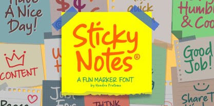 Sticky Notes is a handmade font, made from a marker pen. It's fun yet playful font for variety design graphics project. From Logotype, Poster, Quotes design, Comics book or illustration, T-shirt design, Magazine titles and many more. Sticky Notes is Good used in small or large size. Please check out all the preview images. Best!
 - Clinica Pro by Mint Type,
$- Clinica Pro is a modern take on Swiss grotesques, with a little bit of an added personality. It features 8 weights, italics, 6 sets of figures, small caps and a bunch of ligatures. Still relatively neutral, it lets a brand stand out of the grotesque-crowded environment with support for multiple languages as well as Cyrillic script.
 - PiS HansHand Pro by PiS,
$28.00 HansHand started out in 2003 as a simple free font, the adaption of my grimy handwriting. For its 10th anniversary it got a complete overhaul and lots of new characters. Now also available in BOLD for the first time, featuring scribbles, strokes, circles and boxes to underline the fast taking-notes-while-on-the-phone look!
 - Splinterhand by Hanoded,
$12.00 No, I did not have a splinter in my hand when I came up with the name for this font. It sounded right, so I used it! Splinterhand is a script font made with an almost dried out marker pen. It comes with a whole bunch of diacritics and it can be used for just about anything.
 - Lust Slim by Positype,
$50.00 Check out the new Lust Pro & Lust Pro Didone to see how the series has grown and evolved. Confident and versatile, Lust is an exercise in indulgence—an attempt to create something over the top and vastly useful. If Lust Slim seems both new and familiar, that’s because it is. The series unapologetically channels Herb Lubalin, but produced with a deliberate, contemporary twist. There is an intentional slyness infused in the letterforms—the extreme thick and thin lines flow effortlessly without becoming gratuitous. It’s always just enough, not too much. What makes the type series so appealing? The curves. When asked to describe the letterforms, most people unwittingly allude to the human form, using adjectives usually reserved for describing physical traits… creating all-too-familiar comparisons. Summerour has grown to accept this as unavoidable and reasonable given his acknowledgement of its influences and has provided nuances within the letterforms to accentuate that. Intended to be set large, the typeface has both Standard (Lust, Lust Didone and a single unified Italic) and Display variants making it perfect for editorial use and a flexible solution for any display need.
 - Broadgauge Ornate by FontMesa,
$25.00Broadgauge Ornate originated from MacKellar, Smiths & Jordan in 1869 and was only available as an all caps font with numbers. Today this old beautiful wood type rises again from the archives complete with original numbers and an all new lowercase. An all caps Greek character set has also been added plus accented characters for western, central and Eastern European countries. Included in each font file are two sets of left and right pointing hands located on the Less Than and Greater Than keys and also on the Bracket keys. Because this font works well with a Las Vegas theme I've decided to make the pointing hands gambling related with one set of hands rolling dice and the other holding cards. The condensed versions were created because in today's computer graphics applications people stretch and condense fonts to fit their project but don't notice the change in vertical stroke widths or line thickness. After compressing the letter shapes of each Broadgauge Ornate condensed font the vertical lines were corrected making sure they were the proper width or thickness. The results are balanced condensed versions that weren't simply compressed with out consideration for their appearance. - Lemon Lies by PizzaDude.dk,
$20.00A square but fair font, or as they say in Germany "kradratisch, praktisch, gut". Because of the simpleness in this font, I decided add two styles less square to the family: funky and zit. - ITC Aspera by ITC,
$29.99ITC Aspera is the product of graphic experimentation. Olivera Stojadinovic, who designed the face, recalls, Over the last 15 years, I have made several small prints using Cyrillic characters. Often, I made my first sketches with a special pointed brush which was difficult to manipulate well, but once tamed, gave me interesting results." Stojadinovic decided to see if she could reproduce the unique brush quality in digital form. "The idea was to preserve the look of strokes made by my brush, so I kept the scanned shapes as close as possible to the originals, making interventions just to maintain consistent proportions, slope and weight." While this typeface is not a connecting script, Stojadinovic did create a number of letters, such as the 'o' and 's' that are natural connecting characters. She also drew a set of ligatures and matching ornaments to accompany the design." - Debbie by Anastasia Kuznetsova,
$21.00 I am very pleased to present you Debbie – a universal set of handmade fonts! Thanks to the very clear weight contrast and authentic matte style, Debbie is guaranteed to give your text an individual, individual feel – a fancy, freshly baked font is perfect for greetings, adding to illustrations, children’s books, delicious packaging, labels, printed quotes, logos and much more!! Font features: – A-Z; character set a-z; – 1 language (English); – numbers and punctuation marks, symbols. Fonts can be opened and used in any software that can read standard fonts, even in MS Word. Made with love and magic ♡ Thank you for checking this out and feel free to write me a message if you have any questions! ~ Anastasia
 - Nightmare Street by Wing's Art Studio,
$12.00 Take a midnight stroll if you dare through the shadowy terrace of terror, in Nightmare Street! A bloodcurdling design supplied in two styles with additional underlines and paint spills, Nightmare Street is an 80s inspired horror font straight from the video store. It’s the perfect choice when you want a hand-made look for your movie posters and trailers, album covers, books and Halloween promos. This font includes complete uppercase and lowercase characters plus punctuation, numerals and language support. It also comes with a full set of alternatives ensuring that you’ll never have to repeat your e’s or t’s for a more convincing and authentic hand-drawn look. Check out the visuals for more details and usage examples.
 - Children Friends by Nirmana Visual,
$19.00 Introducing our playful and whimsical handwritten children font, perfect for bringing joy and imagination to any design project. Our font is the perfect choice for creating fun and engaging designs for children's books, educational materials, and playful branding projects. With its charming and quirky handwritten style, our font captures the innocence and creativity of childhood, inspiring imagination and wonder. The organic curves and playful details create a sense of spontaneity and fun, making it perfect for designs that need to capture a child's attention.
 - Bong God by Loaded Fonts,
$7.50Following rules, perhaps too closely. The first full font created by Ray Mullin who strongly believes a font need not be pretty to be valid. Each capital shares similar angles, as does each lowercase, making for a typeface only a mother could love. The rounded style was the true inspiration for the original, but logically it had to come second. Based entirely around Bong God but losing the harsh edges to become a usable futuristic type. Legible, but not readable, recommended in small doses. - ADIstiLleRS Font - Personal use only

- Dudu by Borutta Group,
$10.00Dudu is a font which I made mainly for my own purposes. A lot of times in many projects I was looking for elegant vertical and modular typeface. There is a lot of fonts that overall look good but if You take a closer look, You can clearly see they have mistakes. That's why I made Dudu. Dudu is a font designed with a highest attention to the detail. Each Dudu glyph has the same modular construction. Dudu Font contains over 400 glyphs ready to use in various languages. I'm also working on a cyrillic version of a Dudu Font which soon is going to be published. - LiebeDoris by LiebeFonts,
$29.00 Inspired by a workshop with iconic American sign painter Mike Meyer, Ulrike of LiebeFonts set out to create a versatile, lovely typeface for sign painting that looks not at all like a font but rather like the letters on a unique, hand-painted storefront sign. LiebeDoris combines the best of two worlds: the beauty of all-American sign painting and the meticulous craft of German engineering. Each and every letter in each of the four different styles in LiebeDoris was hand-painted on large sheets of paper with a brush and ink, then carefully transferred for digital typesetting. So rather than being one typeface with different weights, think of LiebeDoris as a package of four individual designs that go together very well. Advanced OpenType features enable this font to really shine: every letter in this all-caps font comes in four variations, so that two of the same letters typed in a row won’t look the same, giving a truly handmade charm. (This feature requires layout software or a word processor with OpenType support.) And if you do have a storefront or a restaurant menu to prettify with LiebeDoris, you will love the integrated collection of store-themed catch words like “FREE”, “NEW”, and “SALE”. If you fall in love with LiebeDoris, you may also like our other best-selling fonts, LiebeErika and LiebeGerda, or our whimsical pictogram fonts such as LiebeMenu.

