10,000 search results
(0.032 seconds)
- Wayfinding Sans Pro by FDI,
$49.00 Ralf Herrmann, the designer of Wayfinding Sans, started this project with extensive field studies, driving tens of thousands of miles to explore the legibility of road signage typefaces in dozens of countries around the world. After building his own theoretical framework of relevant legibility parameters, the design process used a unique custom real-time simulation software, which could simulate difficult reading conditions (distance, fog, halation, positive/negative contrast) while the letters were actually being designed. This process made it possible to optimize even the tiniest details of each letter for maximum legibility. Being made specifically for wayfinding purposes, this type family does not compromise on any aspect of legibility — and yet, the typeface is a beautiful, clean and modern sans serif. With its broad language support and the large number of available styles it is perfectly suitable for any possible signage project anywhere in the world. In an independent empirical study at the University of Applied Sciences “htw” in Berlin different typefaces were recently tested when used on signs and Wayfinding Sans Pro was the winner in all conducted tests, being significantly more legible and therefore superior to all other styles of the tested typefaces. Check out the PDF specimen for more information: wayfinding-sans-pro.pdf
 - FS Meridian Variable by Fontsmith,
$199.99Timeless imperfection FS Meridian is a rhythmic geometric grotesque which takes inspiration from the precise yet imperfect nature of time. There are 24 hours in a day. 60 minutes in an hour. 60 seconds in a minute. Well, almost. The Earth’s orbit isn’t a perfect circle – and nor is the Earth itself. Each day varies a few dozen seconds and up to 16 minutes each year. Look closer and time is more flexible than we think. Geometry with a twist From a geometric base, FS Meridian’s rounded forms veer and extend, creating unexpected humanistic shapes – while the straight terminals remain reliably rigid. This combination of forms gives this grotesque sans serif a pleasingly dynamic rhythm, every time it’s read. Added quirks The unconventional character of rigid terminals and ink traps are balanced with emphasized extended forms to develop visual differentiation. Designed by Kristina Jandová, the complete family has been carefully crafted with distinguishing marks. Take a look at the cap ‘Q’ which comes with three alternative options. Deliciously loopy FS Meridian has a wide geometric, mono-liner appearance with humanistic elements. Quirky individual touches like the loopy expressive pound sign help the typeface to stand out. Available in five weights, FS Meridian is both timeless and timely, a distinctive font for all screens and surfaces. - FS Meridian by Fontsmith,
$80.00 Timeless imperfection FS Meridian is a rhythmic geometric grotesque which takes inspiration from the precise yet imperfect nature of time. There are 24 hours in a day. 60 minutes in an hour. 60 seconds in a minute. Well, almost. The Earth’s orbit isn’t a perfect circle – and nor is the Earth itself. Each day varies a few dozen seconds and up to 16 minutes each year. Look closer and time is more flexible than we think. Geometry with a twist From a geometric base, FS Meridian’s rounded forms veer and extend, creating unexpected humanistic shapes – while the straight terminals remain reliably rigid. This combination of forms gives this grotesque sans serif a pleasingly dynamic rhythm, every time it’s read. Added quirks The unconventional character of rigid terminals and ink traps are balanced with emphasized extended forms to develop visual differentiation. Designed by Kristina Jandová, the complete family has been carefully crafted with distinguishing marks. Take a look at the cap ‘Q’ which comes with three alternative options. Deliciously loopy FS Meridian has a wide geometric, mono-liner appearance with humanistic elements. Quirky individual touches like the loopy expressive pound sign help the typeface to stand out. Available in five weights, FS Meridian is both timeless and timely, a distinctive font for all screens and surfaces.
 - Longbranch by Solotype,
$19.95A modern cutting designed to give the appearance of an old wood type. The letters were cut as linoleum blocks about 2 inches high, then duplicated as copper electrotypes. Used for some Ringling Bros. circus work. - Nesobrite by Typodermic,
$11.95 The Nesobrite typeface is a striking representation of the modern, boxy design aesthetic. Its linear, mechanical structure is the perfect embodiment of clean and neutral, with an austere edge that adds a touch of sophistication to any design. This font has been inspired by classic square-sans fonts, such as Bank Gothic and Microgramma, but with a contemporary twist that sets it apart. One of the most remarkable aspects of Nesobrite is its ability to imbue your message with a clear, professional, and authoritative voice. Its scientific vitality is sure to make your text come to life, whether it is for a technical report, a research paper, or a business presentation. The font’s versatility makes it ideal for conveying complex data and analytical information in a concise, clear, and easy-to-read manner. Nesobrite is also packed with useful features that make it an invaluable tool for any designer. Its small caps function is a useful addition for those looking to create designs that exude an air of formality and elegance. The font comes in five different widths and weights, as well as italics, which allows designers to use it in various contexts and settings. But what truly sets Nesobrite apart is its boxy design. The typeface’s clean and geometric structure is an ode to the modernist design movement, with its minimalistic and uncluttered aesthetic. Its sharp corners, angular edges, and right angles give it a distinct and eye-catching appearance that is sure to capture the attention of anyone who sees it. In conclusion, the Nesobrite typeface is the perfect tool for designers looking to create a sleek, modern, and professional look for their projects. Its linear, mechanical design, scientific vitality, and boxy design make it a versatile and dynamic font that is sure to elevate any project to new heights. With its range of weights, widths, and italics, Nesobrite is the perfect font for any designer looking to make a statement with their work. Most Latin-based European writing systems are supported, including the following languages. Afaan Oromo, Afar, Afrikaans, Albanian, Alsatian, Aromanian, Aymara, Bashkir (Latin), Basque, Belarusian (Latin), Bemba, Bikol, Bosnian, Breton, Cape Verdean, Creole, Catalan, Cebuano, Chamorro, Chavacano, Chichewa, Crimean Tatar (Latin), Croatian, Czech, Danish, Dawan, Dholuo, Dutch, English, Estonian, Faroese, Fijian, Filipino, Finnish, French, Frisian, Friulian, Gagauz (Latin), Galician, Ganda, Genoese, German, Greenlandic, Guadeloupean Creole, Haitian Creole, Hawaiian, Hiligaynon, Hungarian, Icelandic, Ilocano, Indonesian, Irish, Italian, Jamaican, Kaqchikel, Karakalpak (Latin), Kashubian, Kikongo, Kinyarwanda, Kirundi, Kurdish (Latin), Latvian, Lithuanian, Lombard, Low Saxon, Luxembourgish, Maasai, Makhuwa, Malay, Maltese, Māori, Moldovan, Montenegrin, Ndebele, Neapolitan, Norwegian, Novial, Occitan, Ossetian (Latin), Papiamento, Piedmontese, Polish, Portuguese, Quechua, Rarotongan, Romanian, Romansh, Sami, Sango, Saramaccan, Sardinian, Scottish Gaelic, Serbian (Latin), Shona, Sicilian, Silesian, Slovak, Slovenian, Somali, Sorbian, Sotho, Spanish, Swahili, Swazi, Swedish, Tagalog, Tahitian, Tetum, Tongan, Tshiluba, Tsonga, Tswana, Tumbuka, Turkish, Turkmen (Latin), Tuvaluan, Uzbek (Latin), Venetian, Vepsian, Võro, Walloon, Waray-Waray, Wayuu, Welsh, Wolof, Xhosa, Yapese, Zapotec Zulu and Zuni.
 - KG Hope For A Cure - Personal use only

- Geometa Rounded by Wiescher Design,
$39.50 Geometa is based on Paul Renners Futura Classic, the one that he designed before he had to soften it to make it more appealing to the broad public. I thought the original design would lend itself perfect to make a rounded version, that has got more character than the ever so boring DIN-typeface. The type-designer for interesting solutions, Gert Wiescher
 - Anderlacht by Typehand Studio,
$12.00 Anderlacht is a vintage serif font with a stamp texture that is perfect for quotes, logos, designs, digital art and more. Also accompanied by several illustrations that make it possible to make designs very easily, and there is also a multilingual language. Anderlacht Regular & Italic Anderlacht Stamp Regular & Italic 12 illustrations in lines, solids and textures PUA Encoded Multilingual Language Support
 - Jathafa by JprintStudio,
$15.00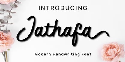 Jathafa is a cute and casual handwritten font with a very friendly feel. Whether you’re looking for fonts to make beautiful wedding invitations, beautiful artwork, interesting social media posts, and funny greeting cards. Jathafa also has several alternative letters that can make your project look modern, luxurious and classy. This font will turn any creative idea into a true work of art!
 - Bellinzo by Zealab Fonts Division,
$9.00 Bellinzo sans serif font is a set of 3 weights and it is good for making creative displays and it has urban / street wear touch. It’s a lovely and unique sans serif font, allowing you to make each word look completely stylish! Bellinzo is the unique typeface for creating elegant headlines, fashion magazine covers, book covers, templates and creative displays and logo designs.
 - Bloxhall by Ana's Fonts,
$16.00 Bloxhall is a sans serif display font with an art deco inspired style. This font family includes outline, faded and layered versions, with an extra offset variation to make layering super easy. Bloxhall's different variations and solid retro look, make it a perfect set for poster design, logotypes & branding, editorial design, titles, short phrases & slogans. Your creativity is the limit!
 - Coachella by Sarid Ezra,
$15.00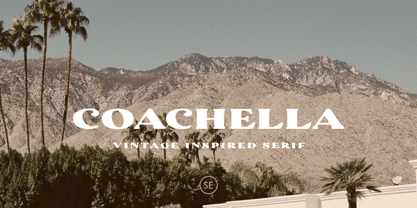 Introducing Coachella, a serif typeface with vintage vibes! Coachella is a vintage inspired serif that will make your project more vintage and modern. You can use this font for any project, such as poster, music concert announcement, or for your logo. This font have a rough detail that will make your design more handmade. This font also support multi language.
 - Queen Mestalla by ZetDesign,
$17.00 Queen Mestalla is a sherif font in gothic style with a good thickness making this font look bold and eye catching. This font is perfect for designing t-shirts, posters, music albums, magazines, billboards, and graffiti. This font is available in 2 style options, regular and italic, also comes with many alternative style options making it easy to create more awesome designs.
 - Little Moment by Letteralle,
$19.00 I'd like to introduce you Little Moment. This font has the same thickness every stroke. The spacing of each letter is slightly wide, making this font look clean. Little Moment has a friendly taste with a warm and charming impression. This font is perfect for making quotes, T-shirts, mugs, or just annotating photos, and many other things. Enjoy The Font, Thanks.
 - Forestine by Sarid Ezra,
$15.00 Introducing, Forestine, a stylish blackletter font! Forestine is a modern and stylish blackletter typeface that will make your project more stunning and unique. It comes with handwritten and rough feel, will make your design more humanist. You can use the uppercase and lowercase together for more unique touch! Also comes with multilingual support and PUA encoded! This font also including customized star!
 - Nordika by Scholtz Fonts,
$19.00Nordika is an understated, elegant, sans serif face with that clean legible corporate look. Its simple, trendy design makes it distinctive enough for display work. It makes a bold statement and is highly readable. Nordika is both condensed and quite bold and is therefore suitable for body text where some emphasis is required. Great for text and headlines - for just about any application. - Sensor by Tour De Force,
$25.00 Square "robocap" typeface containing some little bit of experimental letters such as "t" or "f". Designed by Dusan Jelesijevic who wanted to make a font that would look heavy as building construction printed on your shirts. Even if it looks strong and stable, it is surprisingly very readable at small sizes which make it perfect for titles, posters or logotypes.
 - Herbarium by Gustav & Brun,
$16.00 A colorful floral book that I found at a flea market inspired me to make the font Herbarium. What started as floral letter illustrations in 2009 has now developed into a writable font. My main intention was to make each letter like a little artwork so that they all could fit as a drop cap. Herbarium is also a good choice for headlines.
 - Bright Almond by Zeenesia Studio,
$16.00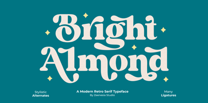 Introducing Bright Almond Bright Almond is a modern and elegant serif font. Bright Almond is well-suited for advertising, branding, logotypes, packaging, titles, headlines and editorial design. I created more much alternates variant and much natural ligatures to make this font very classy and look so beauty. Bright Almond was built with open type features make your project will be perfect.
 - GaoYah Display by Stones Design Lab,
$20.00 GaoYah Display Thin is a type in very thin line, GaoYah means Elegance in Mandarin, some characters build in unique shapes can make a good memory. This font is suitable for huge titles display, in which way the line and detail shows elegance. It will make good performance in dark background as well. Including Basic English and Western Europe languages.
 - Smouchy Font Duo by me55enjah,
$10.00 SMOUCHY FONT DUO Smouchy in two different style, hand letter sans and hand brush with rugged stroke bring more expressive look. Combine this two typeface make it more fun to use. Features: Smouchy: All Caps, numeral, punctuation & ligatures Smouchy Book: Uppercase, lowercase, punctuation, multi languages Add some extras to make your design more smouchy :) Thank you for your visit. Hope you enjoy :)
 - Mix Dimly by MIX.Jpg,
$12.00 “Mix Dimly” is a modern handwritten font with contextual alternates featur. It is perfect for branding, wedding invites and cards. “Mix Dimly” includes full set of uppercase and lowercase letters, numerals, a large range of punctuation and ligatures. All lowercase letters include ending swashes, that makes the font look fabulous! Also there are lots of stylistic alternatives, making each letter different.
 - Geometra Rounded by Wiescher Design,
$39.50 Geometra is based on Paul Renners Futura Classic, the one that he designed before he had to soften it to make it more appealing to the broad public. I thought the original design would lend itself perfect to make a rounded version, that has got more character than the ever so boring DIN-typeface. The type-designer for interesting solutions Gert Wiescher
 - Thickline by Putracetol,
$12.00 Introducing Thickline, a classic bold monoline typeface. Thickline is bold, strong, and classy. You can use this font for making awesome logos, branding, letterhead, invitations, quote, print, card clothing brand, vintage looks, and so much more!. Comes with open type feature and a lot of alternates that helps you to make great lettering. This font also has multi language support.
 - Sugar Magic by Zeenesia Studio,
$15.00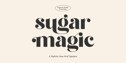 ntroducing Sugar Magic Sugar Magic is a modern and elegant sans serif font. Sugar Magic is well-suited for advertising, branding, logotypes, packaging, titles, headlines and editorial design. I created more much alternates variant and much natural ligatures to make this font very classy and look so beauty. Sugar Magic was built with openType features make your project wil be perfect.
 - Impact by URW Type Foundry,
$35.99 Impact As its name suggests, Impact, a bold sans serif, is designed to make an impression on the reader. Obviously a display font, Impact makes use of its thick strokes and blocked style, to catch and hold the eye. Because Impact is so striking, it is best placed in plenty of white space so that it does not overwhelm any accompanying text.
 - Mango Vintage by Zeenesia Studio,
$16.00 Introducing Vintage Mango Vintage Mango is a modern and elegant sans serif font. Vintage Mango is well-suited for advertising, branding, logotypes, packaging, titles, headlines and editorial design. I created more much alternates variant and much natural ligatures to make this font very classy and look so beauty. Vintage Mango was built with open type features make your project will be perfect.
 - Hybi14 Boldie by Hybi-Types,
$9.00 The Hybi14-Boldie is a bold Script in two styles. It’s lack of excessive details makes it appropriate for all oportunities of headlines, slogans and advertising. It’s friendly and charming character makes it pleasant to look at. The fonts are offering a huge character set for usage in many languages. Also thousands of kerning pairs within each style are obligatory.
 - Becka Script by ITC,
$29.00Becka Script was designed by David Harris in 1985 and is a wide running typeface with varying stroke contrasts. This font looks as though written with a broad tipped pen and its slight slant to the right makes clear its similarity to callipgraphy fonts. Becka Script is reminiscent of the 1950s and its strong strokes make it best for headlines or shorter texts. - Xbats by Holland Fonts,
$30.00Make your instant X-mas and Winter Holiday Greeting cards with the HF Xbats dingbats. 26 regular (capitals, A-Z) and 26 inverted (lowercase, a-z) images with the upcoming Winter Holiday Season as a theme. 7 instant Holiday Messages (numerals, 1-5 and inverted on 6-0 for English; ¡, !, ¿ and ? for Spanish) will make your Greeting complete in any combination. - Headstone by RagamKata,
$14.00 Headstone a classic blackletter typeface combining a modern and classic typography style, with a touch of retro style. A very suitable font to make your project look elegant with it’s rounded and bold shape. Headstone is very ideal for heading, flyers, posters, product packaging, book cover, printed quotes and many more. Enhance your work with Headstone to make your work more well-known!
 - Hybi15 Ronja by Hybi-Types,
$9.00 The Hybi15-Ronja is a characterful 4-style font family. It’s high recognition factor makes it appropriate for all oportunities of headlines, slogans and advertising. Though, it’s straight-line and well-balanced look makes it friendly and charming. The fonts are offering a huge character set for usage in many languages. Also thousands of kerning pairs within each style are obligatory.
 - The Duality by Alcode,
$20.00 The Duality is a script typeface, every letter has been carefully crafted to make your text look beautiful. This font is perfect for logos, badges, shirts, labels, clothing designs, etc Try The Duality, enjoy the richness of OpenType features and let her fun and elegant excitement make you happy and enhance your creativity! You can use this font very easily. Thank you.
 - Korge by Ferry Ardana Putra,
$19.00 Introducing "Korge", a captivating and versatile retro bold slab serif font that seamlessly marries vintage aesthetics with modern functionality. With its bold design, serif form, and a trio of regular, rounded, and extruded versions, Korge offers a wealth of creative possibilities for your design ventures. Korge is a font that transports your projects back to the golden eras of design. Its bold and distinct serifs evoke a sense of nostalgia, lending your creations a classic and enduring appeal. Korge provides not one, but three distinct styles to choose from. The regular version exudes a commanding presence, while the rounded variant softens the edges for a more approachable feel. The extruded version adds depth and dimension, giving your text a 3D, eye-catching quality. Korge is a font that speaks the language of design across borders. With its multi-language support and PUA encoding, it ensures your message resonates with audiences from diverse linguistic backgrounds. From logo design to branding, packaging, posters, and beyond, Korge adapts seamlessly to a wide array of design projects. Its bold slab serifs demand attention, making sure your message is delivered with both authority and style. Korge invites you to embark on a journey of creative exploration. Craft memorable headlines, iconic logos, or striking signage – this font is your canvas for pushing the boundaries of design. With Korge, the possibilities are limitless. Its vintage-inspired bold slab serif design, multi-language support, and versatile styles make it the ideal choice for designers seeking to infuse their projects with timeless charm and contemporary appeal. Get ready to bring your visions to life with Korge, where classic meets cutting-edge. ——— Korge features: A full set of Uppercase & Lowercase letters Numbers and punctuation Multilingual language support PUA Encoded Characters OpenType Features +237 Total Glyphs Rounded Style + Regular Style Extruded Style Korge Includes: Korge Regular Korge Regular Extruded Left Korge Regular Extruded Right Korge Regular Extruded Left Italic Korge Regular Extruded Right Italic Korge Rounded Korge Rounded Extruded Left Korge Rounded Extruded Right Italic Korge Rounded Extruded Left Korge Rounded Extruded Right Italic
 - FS Albert by Fontsmith,
$80.00 The x factor How do you make a font like FS Albert unique, distinctive? “When designing a font I try to question every letter,” says Jason Smith, “but all you need is a few that have an x factor. With FS Albert, they’re the lowercase ‘a’ and ‘g’ and the uppercase ‘I’ and ‘J’. “I remember a friend saying, ‘Why on earth have you designed the ‘a’ like that? Isn’t it too friendly for this kind of font?’ And, in a way, that’s what I wanted – honesty and warmth, because a lot of big brands at the time really needed to show a more human side.” Range of weights and styles FS Albert is a charismatic type: a warm, friendly sans serif face with a big personality. Open, strong and amenable, and available in a wide range of weights and styles, FS Albert suits almost every task you put it to. Fontsmith has crafted five finely-tuned upright Roman weights and four italic weights, as well as a special Narrow version to provide the best coverage and give headlines and text an easy-going character. The chunky kid “FS Albert was inspired by – and named after – my son, who was a bit of a chunky kid,” says Jason Smith. “I designed an extra bold weight because I always felt that the really big font heavy weights had the most personality. “I recently told Albert this story. He laughed, and forgave me for thinking he was a fat baby. He liked the big personality bit, though.” 1000s of glyphs Not content with a character set that covered Europe and the whole of the Western world, the studio decided to go further afield. There are now FS Albert character sets that cover western and eastern European languages, including those of Russia, as well as Cyrillic, Arabic and Greek scripts. In fact, the font now covers more than 100 languages, making it ideal for bringing a consistent typographic style to the communications of global brands.
 - Bely by TypeTogether,
$49.00 Bely is the first design by French newcomer Roxane Gataud. Too many typefaces are either governed by fear and never accomplish what they could, or are unrestrained which results in their frenetic dangling like a leaf caught in a spider’s web. Bely’s strength is that it has both restraint and freedom throughout the text weights and into the unique display weight. There is no fear in this type family, but only great respect for both the tradition of reading and the opportunity to make an impression. Bely is a high-class throwback containing four text weights which were built upon classical proportions to capitalise on reading familiarity. Bely Text features balanced capitals and a play between large, triangular serifs at the top and thick, bracketed, rectangular serifs at the bottom. The family is capped by a radical, expressive French-style display weight which pushes the rules of the text weights to their logical extreme. Bely Display, truly daring with its monstrous and angled contrast, exploits the features which make an impression at larger sizes. In the end, Bely Display is adventurous when used in packaging, identities, and headlines with attitude, while Bely Text’s calm baseline and piercing ascenders give paragraphs texture and familiarity. Bely covers the Latin A Extended glyph set and brings its sense of confidence to your projects with its two text weights, matching italics, and unique display style. Bely’s satisfying OpenType features allow for the implementation of typographic niceties such as small caps, both tabular and proportional lining and oldstyle figures, ligatures, alternate characters, case-sensitive variants, and fractions. The complete Bely family, along with our entire catalogue, has been optimised for today’s varied screen uses. Awards – Selected for TypeTogether’s Typeface Publishing Incentive Programme scholarship in 2014. – Selected by French magazine Étapes for the 2014 Diploma Issue. – Selected for the 2014 exhibition “TransFormations” at Centre Pompidou. — Received the SOTA catalyst Award 2016
 - FS Albert Paneuropean by Fontsmith,
$90.00The x factor How do you make a font like FS Albert unique, distinctive? “When designing a font I try to question every letter,” says Jason Smith, “but all you need is a few that have an x factor. With FS Albert, they’re the lowercase ‘a’ and ‘g’ and the uppercase ‘I’ and ‘J’. “I remember a friend saying, ‘Why on earth have you designed the ‘a’ like that? Isn’t it too friendly for this kind of font?’ And, in a way, that’s what I wanted – honesty and warmth, because a lot of big brands at the time really needed to show a more human side.” Range of weights and styles FS Albert is a charismatic type: a warm, friendly sans serif face with a big personality. Open, strong and amenable, and available in a wide range of weights and styles, FS Albert suits almost every task you put it to. Fontsmith has crafted five finely-tuned upright Roman weights and four italic weights, as well as a special Narrow version to provide the best coverage and give headlines and text an easy-going character. The chunky kid “FS Albert was inspired by – and named after – my son, who was a bit of a chunky kid,” says Jason Smith. “I designed an extra bold weight because I always felt that the really big font heavy weights had the most personality. “I recently told Albert this story. He laughed, and forgave me for thinking he was a fat baby. He liked the big personality bit, though.” 1000s of glyphs Not content with a character set that covered Europe and the whole of the Western world, the studio decided to go further afield. There are now FS Albert character sets that cover western and eastern European languages, including those of Russia, as well as Cyrillic, Arabic and Greek scripts. In fact, the font now covers more than 100 languages, making it ideal for bringing a consistent typographic style to the communications of global brands. - The Wayfaring Font by Set Sail Studios,
$13.99 Hey guys, I'm really excited to introduce The Wayfaring Font Duo! A hand-painted set of fonts designed to add a rustic and whimsical charm to your design projects. It's rough around the edges and not without imperfections - but aren't we all? With distinctive bold & playful brush strokes, The Wayfaring Font Duo is ideal for your logo designs, product packaging, wedding designs, book covers, social media posts, merchandise & more. The awesome thing about this typeface duo is that it's so easy to mix up the various font styles and create totally unique, hand-made looking words each time. Not only are there 2 sets of upper & lowercase characters, there is also a unique 'all-caps' version - which not only looks great as a supporting font, but can also be combined with the regular Wayfaring font to give you even more layout options. I'm serious! Just throw a small-caps character in the middle of a word, it's really fun to play around with.
 - Interzone by MYSTERIAN,
$9.00 This type crept up the sense that it was made in Eastern Europe by poorly trained urbanites from a crippled nation, or that it is the remains of a contemporary gothic (like Eckmann) stencil. The choice of what this type signifies is up to the public. Lately I like the idea of 'putting on' (in McLuhan's sense) a genre of idea that is somewhat different from my tradition's beliefs, and fitting a core category of that toward a teleological/eschatological advantage. Therefore postmodernist/apocalyptic carelessness (which I may 'put on' by using this type) is how I abstain from the cravings of immortality, or more so that wanting it is pointless. It’s stands as memento morí; that I will have to die someday. I have to become less, He must become more. Of course, Interzone may signify a classic Joy Division track from Unknown Pleasures as well as the Cold Warish ongoings of conflicted eastern European life. I considered naming this Lunik 9.
 - Direct Mail by Partnrz,
$15.00 Direct mail designers rejoice! Finally, a font family made just for you. Created to be as in-your-face as possible: for use as a primary headline; for dates and phone numbers; and for coupon heads and price points. Tired of kerning numbers for your coupons and prices? Then you'll love this font! All of the kerning has been done for you. (No more spacey 1's!) Designed for a tight kern - just track it in on larger sizes. Instead of standard weights, this font was designed to fit different width needs. Have a long headline, but your client wants it in one line and tall? Use the extra-condensed. Need something really bold for a phone number or price point, but you don't have much height available? Use the fat. And there are two more widths for those in-betweens. And to top it off - you can get them all in an oblique as well.
