10,000 search results
(0.174 seconds)
- Kaylie Diary by Reyrey Blue Std,
$16.00 Introducing, Kaylie Diary. It is the new serif typeface with classy, playful, cute and feminine look. It consisting of several kinds of alternative variations that can make your design more unique and trendy. Kaylie Diary is perfect for an elegant & luxury logo, book or movie title design, fashion brand, magazine, clothes, lettering, quotes, poster designs, branding, magazines, merchandise, logos and so much more. Features : · All Uppercase and Lowercase · Number & Symbol · Supported Languages · Alternates and Ligatures · PUA Encoded Hope you enjoy with our font!
 - Spookies Identity by Putracetol,
$32.00 Spookies Identity is a horror display font. This font is inspired by movie titles and some horror logos. The impression of horror is highly emphasized, but the alternate character of this font that curves at the beginning and end of the letter makes this font very suitable to be used as a logo and poster. Spookies Identity would be perfect for Logo, title, logotype, cover, headline, apparel, comic, cover books, cards, posters, or anything that requires a horrror or scarylook!
 - Fiction Crusader by PizzaDude.dk,
$17.00 The name “Fiction Crusader” was generated by a random word generator. It may sound odd, but I like the feel of it. Use your imagination: what exactly is a fiction crusader? Each letter has 6 slightly different versions, and they automatically cycle as you type. A great way to make your text look more lively and vibrant! I guess that this is an all-purpose font, because I can’t think of a project that couldn’t use a font like this!
 - Smooky by Gassstype,
$23.00Hello Everyone, introduce our new product Smooky is Funny Playful Font. Use it for any project that needs a cheerful and playful look! Perfect for labels, quotes, posters, DIY projects, branding, packaging, greeting cards, websites, photos, photography kids,child,window art, scrapbooking, tags and so much more! Smooky is font with Unique and challenging nuances. very suitable for the title, typography, Poster, magazines, brochures, packaging,Websites and much more for your design needs, making your designs more modern and professional. - Brand by Lián Types,
$37.00 Jam jars; Warhol’s “Tomato Soup”; chalk lettering and baseball. Those were the triggers to make this soft chancery cursive turned into a script font. Brand is thought mainly for packaging but can be used in magazines and invitations also. It can be easily converted into a logo when using it and its features. Pro styles are loaded with the most complete sets of alternates, ligatures and ornaments; while Std styles are smaller versions of the font, with no decorative alternates.
 - Platinor by Larin Type Co,
$16.00 Platinor this is a beautiful and elegant Display Serif font. You can use this font in the classical style, with it you can highlight exactly what you need. But Platinor can also be more expressive, playful and looking vintage due to the many alternatives and ligatures that are harmoniously combined in this font. Try changing alternatives, ligatures and you will get many options for your project, which will make it unique. This font is easy to use as it has OpenType features.
 - Chinta Retro Font by Khoir,
$15.00 Launched Chinta, new serif type modern fonts wrapped in a soft classic touch combined with crooked and crooked alternative fonts, will make it one of the conveniences to explore various types of designs. With a soft touch but does not leave an elegant impression, this font is suitable for using logos, food design, weddings, branding needs, posters, emblems, advertising and much more. so what are you waiting for? FEATURES CHINTA ONE CHINTA TWO So what are you waiting for? immediately purchase this font.
 - Return Policy by Hanoded,
$15.00 I bought something online, but when I received it, it wasn’t exactly what I had hoped it would be. So I read the return policy and sent it back. And… came up with this font and its name in the process! Return Policy is a hand drawn slab serif, inspired by a bunch of slab serifs from the early 20th century. Return Policy has been given a ‘grunge’ overhaul, making it ideal for sturdy products, websites with an industrial look and manly posters.
 - Donut Know by Gassstype,
$23.00 Hello Everyone, introduce our new product Donut Know is a Unique Display Font.This Playful Kids with a natural feel. This handmade font will make your design has a beautiful natural touch for each details. It is perfect for any design project as Invitation,logo, Kids,book cover, craft or any design purposes. This font is PUA encoded which means you can access all of the magical glyphs. That is Donut Know has charming, authentic and relaxed characteristic more natural look to your text.
 - Kiddiess by Gassstype,
$22.00 Hello Everyone, introduce our new product Kiddiess is a Funny Brush Font Playful Kids with a natural feel. This handmade font will make your design has a beautiful natural touch for each details. It is perfect for any design project as Invitation,logo, Kids,book cover, craft or any design purposes. This font is PUA encoded which means you can access all of the magical glyphs. It also features a wealth of special features including Ligatures glyphs and Alternate glyphs.
 - Today - Unknown license

- Roster by Fenotype,
$35.00 Roster is a strong brush script family of two weights, caps and a set of ornaments. Roster is great for any kind display use from advertising to packaging and from online to branding. Roster is clear and legible even in smaller sizes and works for longer texts too, but is at it’s best when used for shorter sentences or even just for one or two word display or logo use. Roster is equipped with plenty of Ligatures and Contextual alternates that are automatically activated as long as you keep Standard Ligatures feature on. These features help to maintain the flow and add on some variation when writing with Roster. If you need more than that there is at least three Alternates for each basic character: click on Swash, Stylistic or Titling Alternates in any OpentType savvy program or check out for even more alternates from the Glyph Palette. Since uppercase letters in Roster are mainly designed as initials I made Roster Caps for an all caps version of the capital letters. Roster Caps can be used on it’s own or to support Roster Script. Roster Ornaments is a set of swashes and brush strokes designed to support the font.
 - Finest Romance by Din Studio,
$25.00 Be a trendsetter and get prominent with the best style from the Finest Romance. Finest Romance is a duo font from mixtures of serif and script fonts. This harmonic duo font work hand in hand to produce marvelous designs because it expresses modernity, elegance and a little romance. Additionally, the geometric serif font’s letters are simple and consistent for a great legibility purpose. On the other hand, the script font’s letters are designed to be similar to a handwriting by adding more variations to the letters with curves and final swinging wipes. You can use this font together or separately based on your necessity. With this font’s amazing features, you can enhance your design products. Features: Stylistic Sets Ligatures Multilingual Supports PUA Encoded Numerals and Punctuations Finest Romance fits for various design projects, such as posters, banners, logos, magazine covers, quotes, name cards, invitations, headings, printed products, merchandise, social media, etc. Find out more ways to use this font by taking a look at the font preview. Hopefully, you have a great experience using our font. Feel free to contact us if you require more information when you are dealing with a problem. Thank you. Happy designing.
 - Typnic by Corradine Fonts,
$19.95 Everybody likes to have a picnic: some fresh fruits, cheese, ham, wine and so on. Like a “typographic picnic,” Typnic font system gathers many fonts with different flavors too, and you can enjoy them mixed or on their own. Typnic was drawn and calligraphed by hand and is made with eighteen typefaces, including three totally compatible yet different styles. It also has enhancement sets containing labels, dingbats, patterns and ornaments. The Headline style has six layered fonts that can be mixed in a wide variety of combinations to obtain powerful mastheads and headlines. It can be used to construct very nice advertising pieces. If you need to write informal texts, then use Typnic Script, which also comes in six variants and additionally has a complementary font with tails, double letters and ornamented ascenders. Finally, use Typnic Roman to add some secondary texts without losing the general appearance of your work. Typnic has a cool and natural feeling and could be used in all sorts of projects. Typnic is a very ambitious project and we will be working on it to further expand the whole system. Please check out our Typnic Headline Slab.
 - Type Tiles JNL by Jeff Levine,
$29.00 Type Tiles JNL is based on a ‘completed’ version of ‘Alpha-Blox’ by American Type Founders, circa 1944. The capitals, lower case and numerals shown in the sample sheet put out by ATF depicted type made with five-high blocks comprised of modular units spaced two points apart. These units could be combined in varying ways to create custom type of varying heights and widths and was available for purchase in both linear (multi-line) and reverse (white on black) formats. Using the 'reverse' model shown on the sample sheet, all of the characters were re-created digitally, and missing punctuation, foreign characters and other glyphs found in a basic computer font were drawn and added. The 'J' and 'T' in the type sample had truncations, so a more complete character was created for each of those letters. For those wanting an unbroken string of words or blank end caps, there is a double column space on the vertical bar key. A single column space is located on the broken bar key for shorter end caps. Type Tiles JNL is available in both regular and oblique versions
 - P22 Glaser Kitchen by P22 Type Foundry,
$24.95 Milton Glaser’s Kitchen Typeface from the mid 1970s exemplifies the bold 3-D art deco revival genre that was a trademark of the Glaser style. This typeface resulted from his involvement in the design of the The Big Kitchen in the World Trade Center’s concourse in New York City. The new P22 Glaser Kitchen takes on the technical challenge of overlapping 3-D shadows by offering two styles. P22 Glaser Kitchen Regular is spaced out so that the shadows do not overlap the white spaces of the neighboring letters. Whereas the P22 Glaser Kitchen 3D Fill and 3D Shadow can be used layered on top of one another to achieve the tight spacing intended by Glaser. P22 Glaser Kitchen was based on original drawings and phototype proofs from the Milton Glaser Studios archives. Typographic punctuation and sorts were imagined by James Grieshaber to work with Glaser’s design, as well as diacritics to accommodate most European languages. Over the years there have been many typefaces that borrowed heavily from the Glaser designs, but these are the only official fonts approved by Milton Glaser Studio and the Estate of Milton Glaser.
 - Broking by Alit Design,
$19.00 Presenting the ✨The Broking Typeface✨ by alitdesign. The Broking Typeface is inspired by stylish designs from the 80s to 90s. At that time the font style like "The Broking Typeface" had a firm and trendy impression. The Broking Typeface has a wide selection of alternative characters and swashes that make it easy to create bold retro-style designs. The Broking Typeface is very suitable for making designs with retro concepts, simple and playful designs, for example making magazine cover designs, music covers, YouTube thumbs, text headers, logotypes and so on with an elegant retort theme. Besides that this font is very easy to use both in design and non-design programs because everything changes and glyphs are supported by Unicode (PUA). The Broking Typeface has a total of 806 glyphs including symbol, multilingual and alternative glyphs. We really enjoyed the process of making The Broking Typeface, we hope you are also happy when using The Broking Typeface. Language Support : Latin, Basic, Western European, Central European, South European,Vietnamese. In order to use the beautiful swashes, you need a program that supports OpenType features such as Adobe Illustrator CS, Adobe Photoshop CC, Adobe Indesign and Corel Draw. but if your software doesn't have Glyphs panel, you can install additional swashes font files.
 - Bulland by Alit Design,
$19.00 Presenting the ✨The Bulland Typeface✨ by alitdesign. The Bulland Typeface is inspired by stylish designs from the 80s to 90s. At that time the font style like "The Bulland Typeface" had a firm and trendy impression. The Bulland Typeface has a wide selection of alternative characters and swashes that make it easy to create bold retro-style designs. The Bulland Typeface is very suitable for making designs with retro concepts, simple and playful designs, for example making magazine cover designs, music covers, YouTube thumbs, text headers, logotypes and so on with an elegant retort theme. Besides that this font is very easy to use both in design and non-design programs because everything changes and glyphs are supported by Unicode (PUA). The Bulland Typeface has a total of 1065 glyphs including symbol, multilingual and alternative glyphs. We really enjoyed the process of making The Bulland Typeface, we hope you are also happy when using The Bulland Typeface. Language Support : Latin, Basic, Western European, Central European, South European,Vietnamese. In order to use the beautiful swashes, you need a program that supports OpenType features such as Adobe Illustrator CS, Adobe Photoshop CC, Adobe Indesign and Corel Draw. but if your software doesn't have Glyphs panel, you can install additional swashes font files.
 - Matolha by Alit Design,
$17.00 Presenting the ✨The Matolha Typeface✨ by alitdesign. The Matolha Typeface is inspired by stylish designs from the 80s to 90s. At that time the font style like "The Matolha Typeface" had a firm and trendy impression. The Matolha Typeface has a wide selection of alternative characters and swashes that make it easy to create bold retro-style designs. The Matolha Typeface is very suitable for making designs with retro concepts, simple and playful designs, for example making magazine cover designs, music covers, YouTube thumbs, text headers, logotypes and so on with an elegant retort theme. Besides that this font is very easy to use both in design and non-design programs because everything changes and glyphs are supported by Unicode (PUA). The Matolha Typeface has a total of 843 glyphs including symbol, multilingual and alternative glyphs. We really enjoyed the process of making The Matolha Typeface, we hope you are also happy when using The Matolha Typeface. Language Support : Latin, Basic, Western European, Central European, South European,Vietnamese. In order to use the beautiful swashes, you need a program that supports OpenType features such as Adobe Illustrator CS, Adobe Photoshop CC, Adobe Indesign and Corel Draw. but if your software doesn't have Glyphs panel, you can install additional swashes font files.
 - Brodille by Alit Design,
$18.00 Presenting the ✨The Brodille Typeface✨ by alitdesign. The Brodille Typeface is inspired by stylish designs from the 80s to 90s. At that time the font style like "The Brodille Typeface" had a firm and trendy impression. The Brodille Typeface has a wide selection of alternative characters and swashes that make it easy to create bold retro-style designs. The Brodille Typeface is very suitable for making designs with retro concepts, simple and playful designs, for example making magazine cover designs, music covers, YouTube thumbs, text headers, logotypes and so on with an elegant retort theme. Besides that this font is very easy to use both in design and non-design programs because everything changes and glyphs are supported by Unicode (PUA). The Brodille Typeface has a total of 705 glyphs including symbol, multilingual and alternative glyphs. We really enjoyed the process of making The Brodille Typeface, we hope you are also happy when using The Brodille Typeface. Language Support : Latin, Basic, Western European, Central European, South European,Vietnamese. In order to use the beautiful swashes, you need a program that supports OpenType features such as Adobe Illustrator CS, Adobe Photoshop CC, Adobe Indesign and Corel Draw. but if your software doesn't have Glyphs panel, you can install additional swashes font files.
 - Minatur by Alit Design,
$19.00 Presenting the ✨The Minatur Typeface✨ by alitdesign. The Minatur Typeface is inspired by stylish designs from the 80s to 90s. At that time the font style like “The Minatur Typeface” had a firm and trendy impression. The Minatur Typeface has a wide selection of alternative characters and swashes that make it easy to create bold retro-style designs. The Minatur Typeface is very suitable for making designs with retro concepts, simple and playful designs, for example making magazine cover designs, music covers, YouTube thumbs, text headers, logotypes and so on with an elegant retort theme. Besides that this font is very easy to use both in design and non-design programs because everything changes and glyphs are supported by Unicode (PUA). The Minatur Typeface has a total of 702 glyphs including symbol, multilingual. We really enjoyed the process of making The Minatur Typeface, we hope you are also happy when using The Minatur Typeface. Language Support : Latin, Basic, Western European, Central European, South European,Vietnamese. In order to use the beautiful swashes, you need a program that supports OpenType features such as Adobe Illustrator CS, Adobe Photoshop CC, Adobe Indesign and Corel Draw. but if your software doesn’t have Glyphs panel, you can install additional swashes font files.
 - Malibre by Alit Design,
$19.00 Presenting the ✨The Malibre Typeface✨ by alitdesign. The Malibre Typeface is inspired by stylish designs from the 80s to 90s. At that time the font style like "The Malibre Typeface" had a firm and trendy impression. The Malibre Typeface has a wide selection of alternative characters and swashes that make it easy to create bold retro-style designs. The Malibre Typeface is very suitable for making designs with retro concepts, simple and playful designs, for example making magazine cover designs, music covers, YouTube thumbs, text headers, logotypes and so on with an elegant retort theme. Besides that this font is very easy to use both in design and non-design programs because everything changes and glyphs are supported by Unicode (PUA). The Malibre Typeface has a total of 721 glyphs including symbol, multilingual and alternative glyphs. We really enjoyed the process of making The Malibre Typeface, we hope you are also happy when using The Malibre Typeface. Language Support : Latin, Basic, Western European, Central European, South European,Vietnamese. In order to use the beautiful swashes, you need a program that supports OpenType features such as Adobe Illustrator CS, Adobe Photoshop CC, Adobe Indesign and Corel Draw. but if your software doesn't have Glyphs panel, you can install additional swashes font files.
 - The Bringa by Alit Design,
$19.00 Presenting the ✨The Bringa Typeface✨ by alitdesign. The Bringa Typeface is inspired by stylish designs from the 80s to 90s. At that time the font style like “The Bringa Typeface” had a firm and trendy impression. The Bringa Typeface has a wide selection of alternative characters and swashes that make it easy to create bold retro-style designs. The Bringa Typeface is very suitable for making designs with retro concepts, simple and playful designs, for example making magazine cover designs, music covers, YouTube thumbs, text headers, logotypes and so on with an elegant retort theme. Besides that this font is very easy to use both in design and non-design programs because everything changes and glyphs are supported by Unicode (PUA). The Bringa Typeface has a total of 786 glyphs including symbol, multilingual and alternative glyphs. We really enjoyed the process of making The Bringa Typeface, we hope you are also happy when using The Bringa Typeface. Language Support : Latin, Basic, Western European, Central European, South European,Vietnamese. In order to use the beautiful swashes, you need a program that supports OpenType features such as Adobe Illustrator CS, Adobe Photoshop CC, Adobe Indesign and Corel Draw. but if your software doesn’t have Glyphs panel, you can install additional swashes font files.
 - The Mietlor by Alit Design,
$20.00 Presenting the ✨The Mietlor Typeface✨ by alitdesign. The Mietlor Typeface is inspired by stylish designs from the 80s to 90s. At that time the font style like "The Mietlor Typeface" had a firm and trendy impression. The Mietlor Typeface has a wide selection of alternative characters and swashes that make it easy to create bold retro-style designs. The Mietlor Typeface is very suitable for making designs with retro concepts, simple and playful designs, for example making magazine cover designs, music covers, YouTube thumbs, text headers, logotypes and so on with an elegant retort theme. Besides that this font is very easy to use both in design and non-design programs because everything changes and glyphs are supported by Unicode (PUA). The Mietlor Typeface has a total of 735 glyphs including symbol, multilingual and alternative glyphs. We really enjoyed the process of making The Mietlor Typeface, we hope you are also happy when using The Mietlor Typeface. Language Support : Latin, Basic, Western European, Central European, South European,Vietnamese. In order to use the beautiful swashes, you need a program that supports OpenType features such as Adobe Illustrator CS, Adobe Photoshop CC, Adobe Indesign and Corel Draw. but if your software doesn't have Glyphs panel, you can install additional swashes font files.
 - Antique by Storm Type Foundry,
$26.00The concept of the Baroque Roman type face is something which is remote from us. Ungrateful theorists gave Baroque type faces the ill-sounding attribute "Transitional", as if the Baroque Roman type face wilfully diverted from the tradition and at the same time did not manage to mature. This "transition" was originally meant as an intermediate stage between the Aldine/Garamond Roman face of the Renaissance, and its modern counterpart, as represented by Bodoni or Didot. Otherwise there was also a "transition" from a slanted axis of the shadow to a perpendicular one. What a petty detail led to the pejorative designation of Baroque type faces! If a bookseller were to tell his customers that they are about to choose a book which is set in some sort of transitional type face, he would probably go bust. After all, a reader, for his money, would not put up with some typographical experimentation. He wants to read a book without losing his eyesight while doing so. Nevertheless, it was Baroque typography which gave the world the most legible type faces. In those days the craft of punch-cutting was gradually separating itself from that of book-printing, but also from publishing and bookselling. Previously all these activities could be performed by a single person. The punch-cutter, who at that time was already fully occupied with the production of letters, achieved better results than he would have achieved if his creative talents were to be diffused in a printing office or a bookseller's shop. Thus it was possible that for example the printer John Baskerville did not cut a single letter in his entire lifetime, for he used the services of the accomplished punch-cutter John Handy. It became the custom that one type founder supplied type to multiple printing offices, so that the same type faces appeared in various parts of the world. The type face was losing its national character. In the Renaissance period it is still quite easy to distinguish for example a French Roman type face from a Venetian one; in the Baroque period this could be achieved only with great difficulties. Imagination and variety of shapes, which so far have been reserved only to the fine arts, now come into play. Thanks to technological progress, book printers are now able to reproduce hairstrokes and imitate calligraphic type faces. Scripts and elaborate ornaments are no longer the privilege of copper-engravers. Also the appearance of the basic, body design is slowly undergoing a change. The Renaissance canonical stiffness is now replaced with colour and contrast. The page of the book is suddenly darker, its lay-out more varied and its lines more compact. For Baroque type designers made a simple, yet ingenious discovery - they enlarged the x-height and reduced the ascenders to the cap-height. The type face thus became seemingly larger, and hence more legible, but at the same time more economical in composition; the type area was increasing to the detriment of the margins. Paper was expensive, and the aim of all the publishers was, therefore, to sell as many ideas in as small a book block as possible. A narrowed, bold majuscule, designed for use on the title page, appeared for the first time in the Late Baroque period. Also the title page was laid out with the highest possible economy. It comprised as a rule the brief contents of the book and the address of the bookseller, i.e. roughly that which is now placed on the flaps and in the imprint lines. Bold upper-case letters in the first line dramatically give way to the more subtle italics, the third line is highlighted with vermilion; a few words set in lower-case letters are scattered in-between, and then vermilion appears again. Somewhere in the middle there is an ornament, a monogram or an engraving as a kind of climax of the drama, while at the foot of the title-page all this din is quietened by a line with the name of the printer and the year expressed in Roman numerals, set in 8-point body size. Every Baroque title-page could well pass muster as a striking poster. The pride of every book printer was the publication of a type specimen book - a typographical manual. Among these manuals the one published by Fournier stands out - also as regards the selection of the texts for the specimen type matter. It reveals the scope of knowledge and education of the master typographers of that period. The same Fournier established a system of typographical measurement which, revised by Didot, is still used today. Baskerville introduced the smoothing of paper by a hot steel roller, in order that he could print astonishingly sharp letters, etc. ... In other words - Baroque typography deserves anything else but the attribute "transitional". In the first half of the 18th century, besides persons whose names are prominent and well-known up to the present, as was Caslon, there were many type founders who did not manage to publish their manuals or forgot to become famous in some other way. They often imitated the type faces of their more experienced contemporaries, but many of them arrived at a quite strange, even weird originality, which ran completely outside the mainstream of typographical art. The prints from which we have drawn inspiration for these six digital designs come from Paris, Vienna and Prague, from the period around 1750. The transcription of letters in their intact form is our firm principle. Does it mean, therefore, that the task of the digital restorer is to copy meticulously the outline of the letter with all inadequacies of the particular imprint? No. The type face should not to evoke the rustic atmosphere of letterpress after printing, but to analyze the appearance of the punches before they are imprinted. It is also necessary to take account of the size of the type face and to avoid excessive enlargement or reduction. Let us keep in mind that every size requires its own design. The longer we work on the computer where a change in size is child's play, the more we are convinced that the appearance of a letter is tied to its proportions, and therefore, to a fixed size. We are also aware of the fact that the computer is a straightjacket of the type face and that the dictate of mathematical vectors effectively kills any hint of naturalness. That is why we strive to preserve in these six alphabets the numerous anomalies to which later no type designer ever returned due to their obvious eccentricity. Please accept this PostScript study as an attempt (possibly futile, possibly inspirational) to brush up the warm magic of Baroque prints. Hopefully it will give pleasure in today's modern type designer's nihilism. - Tatline Neue by Groteskly Yours,
$12.00 Tatline Neue is a serif font family of 14 fonts encompassing a wide range of weights — from Thin to Heavy. Tatline Neue was modelled after the original Tatline display font, but this major overhaul resulted not only in updated and tweaked shapes and smother curves, but also in addition of 13 new weights, making Tatline Neue a perfect tool for designers and typographers alike. Each font contains 450 glyphs, multiple sets of numbers, stylistic alternatives for certain glyphs, ligatures, numerators, denominators, old style figures, and other symbols. Tatline Neue can be freely used across Western European, Central European, South Eastern European languages. Tatline Neue was designed from the scratch to keep glyphs consistent across all weights. Thinner fonts are more uniform, with little to no variation in the weight of the strokes. Bolder fonts, on the other hands, are chunky and somewhat comic —in a good way. Tatline Neue was born out of a display font, losing none of its original quirkiness and vibe. While serif fonts are often seen as vintage and orthodox, Tatline Neue strikes a livelier note: one of cheekiness, bizarreness, quirkiness, and expressiveness. Thanks to a wide range of weights, Tatline Neue is a great tool for a variety of projects: whether it's used for plain text in a larger body of text or as a headline font, or even as a key element in a logo creation or brand identity. Tatline Neue is a serif font for those who are tired of seeing the boring in the typography and design; it's a font for explorers, for adventurers, for those who seek to find their own voice.
 - Soleil by TypeTogether,
$49.00 Soleil, designed by Wolfgang Homola, is a geometric sans serif typeface. Unlike most existing geometric sans serif typefaces, it has asymmetrical counters, making it look fresher, more dynamic and more contemporary. Simple geometric forms – such as the circle or the square – played a certain role in the design of the letterforms, but in order to introduce more fluidity into the rather stiff and rigid concept of geometric sans serif typefaces, a lot of optical corrections were necessary. Soleil is based on the modernist ideas of simplicity, clarity and reduction to essential forms. Yet its letter shapes are not the result of geometric construction, but of a design process that brings together simplicity and fluidity, clarity and rhythm. Soleil has a rather large x-height, making it legible also in small sizes or from a bigger distance. The typeface family consists of six weights. The Opentype version also allows for the implementation of typographic features such as Small Caps, lining and old-style figures, both tabular and proportional, ligatures, alternate characters, case-sensitive variants and fractions. Soleil offers a wide range of potential applications: signage and wayfinding systems, book and magazine design, branding and corporate publications.
 - 1514 Paris Verand by GLC,
$20.00 This set of initial decorated letters was inspired by a font in use in the beginning of 1500s in Paris. Exactly, we have used the set that Barthélémy Verand employed for the printing of Triumphus translatez de langage Tuscan en François, (from “Triumph” of Petrarque) in the year 1514. Some letters, lacked, have been reconstructed to propose a complete alphabet. It appears that the printer used some letters to replace others, as V, turned over to make a A, or D to make a Q. The original font’s letters were drawn in white on a black background only, but it was tempting to propose a negative version in black on white. It is used as variously as web-site titles, posters and flyers design, publishing texts looking like ancient ones, or greeting cards, all various sorts of presentations, as a very decorative, elegant and luxurious additional font. This font supports strong enlargements remaining very smart and fine. It’s original medieval hight is about one inch equivalent to about four lines of characters. This font may be used with all blackletter fonts, but works particularly well with 1543 Humane Jenson, 1557 Italic and 1742 Civilite, without any anachronism.
 - MFC Falconer Monogram by Monogram Fonts Co.,
$169.00 The inspiration source for MFC Falconer Monogram is an unusual hand-drawn design from a vintage embroidery publication which relies on rigid geometric letterforms to create an upward stepping framework. This monogram which evokes visions of it embossed or printed on antique baking tins was originally intended to adorn handkerchiefs, but the possibilities of its use are up to your imagination. This is one of many monogram designs from the early 1900’s which fall into a two letter format that is either adorned or interwoven decorative elements. Download and view the MFC Falconer Guidebook if you would like to learn a little more. MFC Falconer Monogram comes complete with Pro format fonts. You will require with programs that can take advantage of OpenType features contained within the Pro fonts.
 - Centola by Supfonts,
$12.00 Centola - a perfect clean modern serif Font is an open type with clean shapes and precise kerning. Centola Font Features: - Full Set of standard alphabet and punctuation - Ligatures - PUA Encoded - no special software needed to access extra characters - Language support: All European languages - Multilingual Characters AÁĂÂÄÀĀĄÅÃÆBCĆČÇĊDÐĎĐEÉĚÊËĖÈĒĘẼFGĞĢĠḠHĦIIJÍÎÏİÌĪĮĨJKĶLĹĽĻŁMNŃŇŅÑ OÓÔÖÒŐŌØÕŒPÞQRŔŘŖSŚŠŞȘẞTŤŢȚUÚÛÜÙŰŪŲŮŨVWẂŴẄẀXYÝŶŸỲỸZŹŽŻ aáăâäàāąåãæbcćčçċdðďđeéěêëėèēęẽfgğģġḡhħiıíîïìijīįĩjȷkķlĺľļłmnńňņñoóôöòőōøõœpþ qrŕřŗsśšşșßtťţțuúûüùűūųůũvwẃŵẅẁxyýŷÿỳỹzźžż Thanks so much for checking out my shop, and please get in touch if you have any questions! Don't forget to subscribe so you don't miss out on the new awesome fonts Dima
 - Fabejan by Supfonts,
$12.00 Fabejan a perfect mixed calligraphy and modern serif Font is an open type with clean shapes and precise kerning. Fabejan Font Features: - Full Set of standard alphabet and punctuation - PUA Encoded - no special software needed to access extra characters - **Language support**: All European languages - Multilingual Characters AÁĂÂÄÀĀĄÅÃÆBCĆČÇĊDÐĎĐEÉĚÊËĖÈĒĘẼFGĞĢĠḠHĦIIJÍÎÏİÌĪĮĨJKĶLĹĽĻŁMNŃŇŅÑ OÓÔÖÒŐŌØÕŒPÞQRŔŘŖSŚŠŞȘẞTŤŢȚUÚÛÜÙŰŪŲŮŨVWẂŴẄẀXYÝŶŸỲỸZŹŽŻ aáăâäàāąåãæbcćčçċdðďđeéěêëėèēęẽfgğģġḡhħiıíîïìijīįĩjȷkķlĺľļłmnńňņñoóôöòőōøõœpþ qrŕřŗsśšşșßtťţțuúûüùűūųůũvwẃŵẅẁxyýŷÿỳỹzźžż Thanks so much for checking out my shop, and please get in touch if you have any questions! Don't forget to subscribe so you don't miss out on the new awesome fonts Dima
 - Somewhere by Supfonts,
$15.00 Somewhere Delicate Script Somewhere is a delicate handwritten font with multilingual support. It is perfect for branding, wedding invitations, menu design, YouTube covers and many more Font includes a full set of gorgeous uppercase and lowercase letters, numbers, a large selection of punctuation marks & multilingual support Test it out below to see how it could look for your next project! Includes: Regular Script Multilingual languages support Uppercase and lowercase Numbers and punctuation Check out my blog: https://www.instagram.com/superdizigner https://pinterest.com/dmitriychirkov7
 - Orphic by Flawlessandco,
$9.00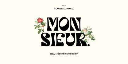 Orphic is a display retro font with a fun and bold style that perfect for your boho-themed projects such as poster design, branding materials, t-shirt, business cards, logo, photography, quotes, and more. Try out some alternate characters for another visual result! This font support for some multilingual. Also contains uppercase A-Z and lowercase a-z, alternate character, numbers 0-9, and some punctuation. If you need help, just write me! Thanks so much for checking out my shop!
 - Jelly Cloud by Supfonts,
$10.00 JellyCloud / Font with Swashes JellyCloud is a chic script with exquisite accents. It is perfect for branding, wedding invitations and invitation cards and much more. Font includes a full set of gorgeous uppercase and lowercase letters, numbers, a large selection of punctuation marks, ligatures Test it out below to see how it could look for your next project! Includes: Regular Script Latin languages support Uppercase and lowercase Numbers and punctuation Ligatures Check out my blog: https://www.instagram.com/zloillev pinterest.com/dmitriychirkov7 Enjoy
 - XXII GoreGrinder by Doubletwo Studios,
$25.99 The face of horror – The GoreGrinder is an extreme logo font designed for extreme music. If you’re in love with deathmetal, grindcore and the horror movie scene, you may find pleasure in using this font. It comes with an upper- and lowercase characterset, numerals, some punctuation and a bunch of drips and stuff used in the genre. Use it in your graphic-editing-application and be creative, play with it and find out what’s possible. Find out more about using it on Behance.net
 - Antafeda by Gloow Studio,
$15.00 Antafeda is our another retro script typeface. Use this typeface and you will make a retro design with ease! Combined your design with dozens of stylistic alternates and elegant swashes which is included in this typeface, this retro typeface is really perfect for logo design, t-shirt, vintage and retro badge, vintage quotes, branding, packaging, etc. Antafeda features: A full set of upper & lowercase characters Numbers & punctuation Multilingual language support PUA Encoded Characters +320 Glyph Up to 80 Stylistic Alternates with Swashes and Ligatures! OpenType Features To enable the OpenType Stylistic alternates, you need a program that supports OpenType features such as Adobe Illustrator CS, Adobe InDesign & CorelDraw X6-X7, Microsoft Word 2010 or later versions. There are additional ways to access alternates/swashes, using Character Map (Windows), Nexus Font (Windows), Font Book (Mac) or a software program such as Pop Char (for Windows and Mac). Thankyou for purchasing our product, hope you like and have fun with our product. If you have any queries, questions or issues, please don't hesitate to contact us directly. If you satisfied with our product, please give 5 stars rating. Happy Designing...
 - Arable by Heyfonts,
$18.00 Arable Font Is "Unique Display Font" refers to a specific type of typography that is characterized by its distinctive, one-of-a-kind design, and it is typically used for eye-catching and decorative purposes. Here's a detailed explanation of what a unique display font is: -Distinctive Design: Unique display fonts stand out because of their distinct and unconventional design. They often deviate from traditional letterforms and can take on a wide range of creative and artistic shapes. Unlike standard, legible fonts used for body text, display fonts prioritize aesthetics over readability. -Specialized Use: Display fonts are not intended for extended reading. Instead, they are used in small quantities for headlines, titles, logos, posters, banners, invitations, and other design elements where visual impact is essential. Their unique and attention-grabbing design makes them ideal for drawing attention to specific text. -Creative Freedom: Designers have creative freedom when creating unique display fonts. This allows for a wide array of styles, from whimsical and ornate to futuristic and abstract. Some display fonts may be inspired by art movements, cultures, historical periods, or nature, leading to highly original and thematic designs. -Limited Character Set: Display fonts often have a limited character set compared to standard fonts. They typically include uppercase letters, numbers, and basic punctuation marks, but may lack lowercase letters or extended characters. This limitation is due to their specialized use and focus on visual impact. -Customization: Some unique display fonts are custom-designed for specific projects or brands. Designers work closely with clients to create a font that aligns with the brand's identity or the project's theme, ensuring a truly unique and tailored result. -Combination with Other Fonts: In many design projects, unique display fonts are paired with more standard, legible fonts to achieve a balance between visual impact and readability. This combination allows for a harmonious and effective overall design.
 - Monarda by Monotype,
$29.99 Monarda™ is Terrance Weinzierl’s take on the loud and splashy brush scripts of the 1950s. It’s energetic, playful, and equally at home in hardcopy headlines as it is in interactive banners. In addition to the basic alphabet, OpenType® fonts of Monarda are also awash in super-sized swash caps, contextual alternate characters and ligatures. Pair Monarda with a mid-century structural sans like Trade Gothic® or a sturdy slab serif like Egyptian Slate™ to create typographic counterpoint that’s confident, compelling and memorable! Named for a riotous bright red flower that attracts butterflies and humming birds, Monarda is a rare combination of flamboyance and effortless beauty. Weinzierl describes it as “casual yet precise: a stiff denim jacket or perfectly white sneakers at a formal event.” Monarda clearly stands out – and always fits in. Well, almost always. Drawn for print, the design’s robust x-height, open counters and wide apertures also make Monarda screen-friendly. Monarda can be perfect for a wide variety of food and lifestyle applications as well as travel, stationery and packaging projects. Advertising campaigns and product branding are also well within its reach. Monarda works best when used large – but economically. Two or three words are its sweet spot. Think: product name, print headline or the lettering on the side of a truck. It could easily become your go-to design for projects that call for a script with a bright personality and fearless demeanor. The excellence of Weinzierl’s work has been recognized by the Type Directors Club and Print Magazine. When not working on creating new typefaces, he augments his professional practice through calligraphy, lettering, and letterpress printing. Monarda is another winner from Weinzierl’s creative mind and talented hand.
 - Llandru by Typodermic,
$11.95 Introducing Llandru, the display typeface of the future, where mechanical shapes meet sci-fi design in a bold, bizarre creation that’s sure to leave a lasting impression. Inspired by the very components that power our digital world, Llandru brings a unique twist to contemporary graphic design. With its sleek, edgy lines and futuristic appeal, Llandru is the perfect typeface for those who want to stand out from the crowd. And with OpenType stylistic alternates, you can access a variety of fascinating filled counter alternates to truly make your message pop. Take your designs to the next level with Llandru, where technology and otherworldly splendor collide. This typeface will give your message a sense of forward-thinking style that’s sure to captivate your audience. So why settle for ordinary when you can create something extraordinary with Llandru? Most Latin-based European writing systems are supported, including the following languages. Afaan Oromo, Afar, Afrikaans, Albanian, Alsatian, Aromanian, Aymara, Bashkir (Latin), Basque, Belarusian (Latin), Bemba, Bikol, Bosnian, Breton, Cape Verdean, Creole, Catalan, Cebuano, Chamorro, Chavacano, Chichewa, Crimean Tatar (Latin), Croatian, Czech, Danish, Dawan, Dholuo, Dutch, English, Estonian, Faroese, Fijian, Filipino, Finnish, French, Frisian, Friulian, Gagauz (Latin), Galician, Ganda, Genoese, German, Greenlandic, Guadeloupean Creole, Haitian Creole, Hawaiian, Hiligaynon, Hungarian, Icelandic, Ilocano, Indonesian, Irish, Italian, Jamaican, Kaqchikel, Karakalpak (Latin), Kashubian, Kikongo, Kinyarwanda, Kirundi, Kurdish (Latin), Latvian, Lithuanian, Lombard, Low Saxon, Luxembourgish, Maasai, Makhuwa, Malay, Maltese, Māori, Moldovan, Montenegrin, Ndebele, Neapolitan, Norwegian, Novial, Occitan, Ossetian (Latin), Papiamento, Piedmontese, Polish, Portuguese, Quechua, Rarotongan, Romanian, Romansh, Sami, Sango, Saramaccan, Sardinian, Scottish Gaelic, Serbian (Latin), Shona, Sicilian, Silesian, Slovak, Slovenian, Somali, Sorbian, Sotho, Spanish, Swahili, Swazi, Swedish, Tagalog, Tahitian, Tetum, Tongan, Tshiluba, Tsonga, Tswana, Tumbuka, Turkish, Turkmen (Latin), Tuvaluan, Uzbek (Latin), Venetian, Vepsian, Võro, Walloon, Waray-Waray, Wayuu, Welsh, Wolof, Xhosa, Yapese, Zapotec Zulu and Zuni.
 - Lady Slippers by Studioways,
$40.00 This is Lady Slippers, a delicate and beautiful typeface resembling one of Eliza Gwendalyn’s popular modern calligraphic styles! She is the full blown version with many OpenType bells and whistles such as, swashes, ligatures, discretionary ligatures and stylistic alternates. Enabling them makes it possible to create beautiful and seemingly hand-written calligraphy designs. Then there’s Lady Slippers Basic, Lady Slippers Loops, and Lady Slippers Align. These fonts are toned down versions of Lady Slippers. Still beautiful and delicate handwritten script typefaces, they are meant for users who don't require all of OpenType goodies. Each of these fonts support some basic OT features, like fractions, superiors, and ordinals. In an interesting twist, we have redrawn the lowercase in Lady Slippers Align to align on the baseline, giving Lady Slippers a more traditional calligraphic appeal. Finally, Lady Slippers Ornament is offered as a companion for any font in the Lady Slippers family. It contains decorative ornaments, crests and other hand drawn elements, as well as a set of figures, minimal punctuation, and some catchwords useful for invitations and bridal pieces. The package includes a key map so finding the ornaments is made easy. All the glyphs are accessible from any standard keyboard. You can purchase the fonts separately, or one of the discounted bundles we've put together, Lady Slippers 4 Pack (includes Basic, Loops, Align and Ornaments) or the Lady Slippers & Ornaments pack.
