10,000 search results
(0.025 seconds)
- Funtrude by Colllab Studio,
$9.00 "Hi there, thank you for passing by. Colllab Studio is here. We crafted best collection of typefaces in a variety of styles to keep you covered for any project that comes your way! When you have a project that needs a fun, unique font to make it pop, you can’t go wrong with Funtrude. Funtrude comes in three styles: Basic, Extrude, and Hole. Each style has more than 350 of the most beautiful glyphs you could ever dream of seeing. The Extrude style is great for titles, headings, and any other text where you want to use a bold font but don’t want it to be overly bold; the Basic style will work great for things like product names or subheadings; and the Hole style is perfect for anything else! Each individual style comes with its own swashes—so your fonts can look just as beautiful when they’re all capitalized as they do when they’re in normal text. What makes us so excited about this product is how much we love to use it ourselves. When we saw Funtrude for the first time, we couldn’t believe our eyes—it was everything we had ever wanted in a font, plus it was super affordable. GET IT NOW....!!! A Million Thanks Colllab Studio www.colllabstudio.com
 - VLNL Tp Kurier by VetteLetters,
$35.00 VetteLetters is proud to bring you the TpKurier-family. It is cooked up by our German chef Martin Lorenz currently living in lovely Barcelona! Chef Lorenz about the TpKurier recipe: “TpKurier is the second redesign we did of Courier. The first redesign in 2000, although based on a five-unit grid, was drawn completely by hand. Six years later we designed another grid version of Courier, and the TpKurier family was born. This version is completely constructed up till its last detail. We didn't want to correct ‘mistakes’ deriving from the use of the grid, but instead make them visible (see “S”). TpKurier is based on a very simple grid, composed a proportion of four units high by two units wide. A series of other links between them make it possible to form a font from this grid. We felt it was important to consistently work within these limitations so that any unexpected asperities would help provide the font with its character. Even though it is a rough constructed typeface it was important to us to design real italic lower case letters and not just a sloped roman (see “a”, “g” or “s”). The first family published contained a serif and sans-serif version of the TpKurier, with italic and bold.”
 - P22 Glaser Babyfat by P22 Type Foundry,
$24.95 Milton Glaser on designing Babyfat: “This is the first alphabet I ever designed. For some inexplicable reason I called it Babyfat. Because I’m not a type designer, most of my alphabets are actually novelties or graphic ideas expressed typographically. Here the idea was to take a gothic letter and view it simultaneously from two sides. It started out as a rather esoteric letterform; it ended up being used in supermarkets for ‘Sale’ signs.” This forced perspective 3-D font has appeared on many LP covers and posters from the mid 1960s onward. This revival includes the original lowercase for the first time in digital form. Besides the three original styles (Outline, Shaded, and Black) made for photo typesetting, the new P22 Glaser Babyfat introduces six additional variations to allow the user to easily colorize the type as Glaser envisioned. The Keyline, Fill, Glyph, Left, Right, and Down font styles give the user nearly infinite options to create dynamic chromatic effects. P22 Glaser Babyfat was based on original drawings and phototype proofs from the Milton Glaser Studios archives. Typographic punctuation and sorts were imagined by James Grieshaber to work with Glaser’s design, as well as diacritics to accommodate most European languages. Over the years there have been many typefaces that borrowed heavily from the Glaser designs, but these are the only official fonts approved by Milton Glaser Studio and the Estate of Milton Glaser.
 - 112 Hours by Device,
$9.00 Rian Hughes’ 15th collection of fonts, “112 Hours”, is entirely dedicated to numbers. Culled from a myriad of sources – clock faces, tickets, watches house numbers – it is an eclectic and wide-ranging set. Each font contains only numerals and related punctuation – no letters. A new book has been designed by Hughes to show the collection, and includes sample settings, complete character sets, source material and an introduction. This is available print-to-order on Blurb in paperback and hardback: http://www.blurb.com/b/5539073-112-hours-hardback http://www.blurb.com/b/5539045-112-hours-paperback From the introduction: The idea for this, the fifteenth Device Fonts collection, began when I came across an online auction site dedicated to antique clocks. I was mesmerized by the inventive and bizarre numerals on their faces. Shorn of the need to extend the internal logic of a typeface through the entire alphabet, the designers of these treasures were free to explore interesting forms and shapes that would otherwise be denied them. Given this horological starting point, I decided to produce 12 fonts, each featuring just the numbers from 1 to 12 and, where appropriate, a small set of supporting characters — in most cases, the international currency symbols, a colon, full stop, hyphen, slash and the number sign. 10, 11 and 12 I opted to place in the capital A, B and C slots. Each font is shown in its entirety here. I soon passed 12, so the next logical finish line was 24. Like a typographic Jack Bauer, I soon passed that too -— the more I researched, the more I came across interesting and unique examples that insisted on digitization, or that inspired me to explore some new design direction. The sources broadened to include tickets, numbering machines, ecclesiastical brass plates and more. Though not derived from clock faces, I opted to keep the 1-12 conceit for consistency, which allowed me to design what are effectively numerical ligatures. I finally concluded one hundred fonts over my original estimate at 112. Even though it’s not strictly divisible by 12, the number has a certain symmetry, I reasoned, and was as good a place as any to round off the project. An overview reveals a broad range that nonetheless fall into several loose categories. There are fairly faithful revivals, only diverging from their source material to even out inconsistencies and regularize weighting or shape to make them more functional in a modern context; designs taken directly from the source material, preserving all the inky grit and character of the original; designs that are loosely based on a couple of numbers from the source material but diverge dramatically for reasons of improved aesthetics or mere whim; and entirely new designs with no historical precedent. As projects like this evolve (and, to be frank, get out of hand), they can take you in directions and to places you didn’t envisage when you first set out. Along the way, I corresponded with experts in railway livery, and now know about the history of cab side and smokebox plates; I travelled to the Musée de l’imprimerie in Nantes, France, to examine their numbering machines; I photographed house numbers in Paris, Florence, Venice, Amsterdam and here in the UK; I delved into my collection of tickets, passes and printed ephemera; I visited the Science Museum in London, the Royal Signals Museum in Dorset, and the Museum of London to source early adding machines, war-time telegraphs and post-war ration books. I photographed watches at Worthing Museum, weighing scales large enough to stand on in a Brick Lane pub, and digital station clocks at Baker Street tube station. I went to the London Under-ground archive at Acton Depot, where you can see all manner of vintage enamel signs and woodblock type; I photographed grocer’s stalls in East End street markets; I dug out old clocks I recalled from childhood at my parents’ place, examined old manual typewriters and cash tills, and crouched down with a torch to look at my electricity meter. I found out that Jane Fonda kicked a policeman, and unusually for someone with a lifelong aversion to sport, picked up some horse-racing jargon. I share some of that research here. In many cases I have not been slavish about staying close to the source material if I didn’t think it warranted it, so a close comparison will reveal differences. These changes could be made for aesthetic reasons, functional reasons (the originals didn’t need to be set in any combination, for example), or just reasons of personal taste. Where reference for the additional characters were not available — which was always the case with fonts derived from clock faces — I have endeavored to design them in a sympathetic style. I may even extend some of these to the full alphabet in the future. If I do, these number-only fonts could be considered as experimental design exercises: forays into form to probe interesting new graphic possibilities.
 - Cabo Soft by Design A Lot,
$15.00 Cabo Soft is the 2.0 version of our original Cabo Rounded Typeface, created back in 2015. With this new version, Cabo Soft, we have brought multiple upgrades and updates compared with the original version. Some of those consist in the addition of more glyphs and accents, alternate designs for many of the glyphs (including an alternate for @, #, some of the numbers and more), and most importantly, we have done a slight update in the design of the letters, which we'll give more details in the following paragraphs. The main style and thought behind our Cabo fonts has always been the rounded corners and the soft and welcoming vibe that it gives. It's friendly and familiar, but also modern and slightly elegant, especially the Thin and Light styles. With Cabo Soft we have worked on adding an extra touch to the design of the letters by working on the termination edges of each letter. If Cabo Rounded had an exact round termination for each letter, with Cabo Soft we have developed a unique non-equally rounded shape that is applied to all types of terminations for each letter. This new design approach makes it have a more clean style, a more modern and unique look, but it also gives stylish, exclusivist and elegant vibes, while still being friendly and familiar. Thanks to it's variety in weights and styles, you can use Cabo Soft in almost any design project. It works well with headlines and paragraphs, it's a perfect match for logo design and branding, but can also do wonders in videos, signage and many other elements. The typeface covers most likely the entire Latin Alphabet, it comes with multiple design alternates for many of the letters, glyphs and numbers, with accents applied for all of the available alternates. As a finishing note, with the help of our Cabo Soft typeface you can create an friendly and welcoming designs, as well as stylish, elegant and exclusivist. It has all the necessary glyphs and accents for any Latin Alphabet projects, and you can play around with all of the alternates to create unique designs right from the start.
 - Wheaton by Typodermic,
$11.95 Introducing Wheaton, the bold and striking headline typeface that brings together the best of retro and techno aesthetics. With its softened letterforms and classic electronic vibe, Wheaton will transport your message into the future while invoking a sense of nostalgia for the past. At first glance, Wheaton’s design may seem like a throwback to the 1980s, with its clean lines and futuristic curves. But upon closer inspection, you’ll notice the subtle details that give it a contemporary edge. Its softened edges and fluid curves evoke a sense of modernity and sophistication, while its retro digital gloss adds a touch of nostalgia to your message. But Wheaton isn’t just about looks. Its scientific elegance and industrial wonder make it the perfect typeface for conveying a sense of technological progress and innovation. Whether you’re designing a website, creating an advertisement, or crafting a presentation, Wheaton is the perfect choice for making a bold statement. In the world of graphic design, standing out is key. With Wheaton, you can be sure that your message will be noticed and remembered. Its unique blend of retro and techno aesthetics gives it a distinct personality that will set your work apart from the rest. So why settle for a boring, generic typeface when you can have Wheaton? Let its futuristic assurance and industrial wonder take your message to the next level, and discover a new world of creative possibilities. Most Latin-based European writing systems are supported, including the following languages. Afaan Oromo, Afar, Afrikaans, Albanian, Alsatian, Aromanian, Aymara, Bashkir (Latin), Basque, Belarusian (Latin), Bemba, Bikol, Bosnian, Breton, Cape Verdean, Creole, Catalan, Cebuano, Chamorro, Chavacano, Chichewa, Crimean Tatar (Latin), Croatian, Czech, Danish, Dawan, Dholuo, Dutch, English, Estonian, Faroese, Fijian, Filipino, Finnish, French, Frisian, Friulian, Gagauz (Latin), Galician, Ganda, Genoese, German, Greenlandic, Guadeloupean Creole, Haitian Creole, Hawaiian, Hiligaynon, Hungarian, Icelandic, Ilocano, Indonesian, Irish, Italian, Jamaican, Kaqchikel, Karakalpak (Latin), Kashubian, Kikongo, Kinyarwanda, Kirundi, Kurdish (Latin), Latvian, Lithuanian, Lombard, Low Saxon, Luxembourgish, Maasai, Makhuwa, Malay, Maltese, Māori, Moldovan, Montenegrin, Ndebele, Neapolitan, Norwegian, Novial, Occitan, Ossetian (Latin), Papiamento, Piedmontese, Polish, Portuguese, Quechua, Rarotongan, Romanian, Romansh, Sami, Sango, Saramaccan, Sardinian, Scottish Gaelic, Serbian (Latin), Shona, Sicilian, Silesian, Slovak, Slovenian, Somali, Sorbian, Sotho, Spanish, Swahili, Swazi, Swedish, Tagalog, Tahitian, Tetum, Tongan, Tshiluba, Tsonga, Tswana, Tumbuka, Turkish, Turkmen (Latin), Tuvaluan, Uzbek (Latin), Venetian, Vepsian, Võro, Walloon, Waray-Waray, Wayuu, Welsh, Wolof, Xhosa, Yapese, Zapotec Zulu and Zuni.
 - Malaga by Emigre,
$59.00 Why do we need another typeface? This is a prickly question often asked of typeface designers. Depending on who you ask, the answer in simplified form is usually one of two: 1. As the basis of written communication, type design carries social responsibility, so we must continue to improve legibility. 2. Type design is a form of artistic expression. Without art, life is not worth living. The best work, of course, accomplishes both. Xavier Dupré, the designer of the Malaga typeface family, has at least one leg securely planted in the latter notion. He believes, like others, that within typeface design most legibility needs have been worked out and that today we are satisfying aesthetic desires. We design typefaces to differentiate our communications. Type design is primarily a formal exercise reflecting our personal quirks, technological obsessions, and cultural heritage. In case of Dupré’s work, issues of cultural heritage and personal quirks are of particular consequence. An incessant traveler, he visited the following countries during the development of the Malaga type family: Thailand, Malaysia, Indonesia, Myanmar, Cambodia, Vietnam, France, Belgium, and finally, Spain, where his choice for the name Malaga originates (Malaga is a port city in southern Spain). Dupré’s home is where his laptop is. He travels with a 12- or 15 inch PowerBook, without a printer, and with sporadic access to his reference books and other historical documents. All he needs is a table and chair. He even learned to design without a mouse since hotel and cafe tables are often too small to also fit a mousepad. Dupré is the new global designer who can take disparate influences and fluidly process the information into a coherent whole. Malaga is a case in point. It is inspired by ideas ranging from blackletter to Latin fonts, and from the Quattrocento’s first Venetian antiquas to brush stroke types. This makes Malaga a richly animated font saturated with unorthodox detail. Its black and bold weights are particularly suited for headlines and short texts, while the subtle modulation and moderate contrast in the regular and medium weights makes it perfectly readable in extended text settings. While Malaga doesn’t claim to resolve any particular legibility issues, it is nonetheless perfectly readable and will impart any design with a healthy dose of visual character.
 - Benalline Signature by IRF Lab Studio,
$14.00 Hello I'm back with a new product, this is Benalline Signature, this is a classic Calligraphy style font, vintage and retro but still looks elegant, luxurious and beautiful. Benalline Signature is a little different from some of the existing fonts, I made a slightly different shape and added an alternative character with a more decorative shape and also I added a special Ornament and swash made especially for the Benalline Signature. Thank you!
 - LD Cotton Candy by Illustration Ink,
$3.00Check this out! LD Cotton Candy is an adorable handwritten, script font...a must-have for so many lettering needs. - Bitfield by Andrew Harper Fonts,
$18.00 A meticulously consistent pixel foundation infused with a welcoming personality. The font preferred by 9 out of 10 benevolent robots.
 - Celari Titling by insigne,
$- Need for speed? Satisfy it with insigne’s Celari. Take it for a drive and watch how its simple curves, easy lines, and sturdy shapes handle the edges and corners of your projects with smooth and rapid execution. The negative space cuts through the rounded sans serif letterforms of Celari, giving this all-caps typeface a strong impression of dimension and speed. Celari’s organic stroke direction allows you to ease through its gentle turns, too, causing the font to hum around the lines of your project like a V8 engine on an open Nevada highway. The speed and agility of Celari is built for nothing less than a headline. Use the larger-than-life power of this face for any number of oversized applications--mastheads, posters, web headlines, flyers. It provides excellent performance for service-oriented ads where efficiency and quick buyer service are priorities. Customize your ride, too. The OpenType version of Celari includes some serious add-ons to make it your design. The font incorporates discretionary ligatures for some funky combinations and adds in stylistic and contextual alternates for virtually endless possibilities with the characters, ligatures, and composites. Make sure your setup allows for OpenType fonts (Adobe CS suite or Quark) before unleashing the fun of Celari, though. Be confident with your design. Be quick with your message. Again, take Celari for a drive and unleash the strength and velocity of its character in your design. You've been holding back long enough.
 - Just Sans by JUST Creative,
$14.97 JUST Sans is a highly versatile sans serif typeface with endearing, modernist warmth, geometric legibility, and a distinctive friendly bite. Designed as a professional modern geometric sans serif, JUST Sans is both serious and friendly, neutral but warmly expressive, technical but not overt, and familiar but unique enough to stand on its own. With open-airy characters and a generous width, JUST Sans has an elegant contemporary feel, with sharp angled terminals that give it grip and make it so expressively endearing. With a clean, simple, and minimal aesthetic, JUST Sans is a functional workhorse with 7 weights, complete Latin extended language support, precise hand-adjusted kerning, and a variable version for maximum versatility. JUST Sans includes hand-hinted web fonts optimized for clear, legible text on screens making JUST Sans perfect for the web as well as logos, branding, headlines, paragraph text, UI, signage, packaging, posters, and industries rooted in technology, new media, architecture, fashion & design. With its universal functionality & characteristic bite, the JUST Sans family is an essential addition to your type arsenal, even if just for those beautiful stylistic numbers. For lovers of modern sans serif fonts who are looking for something a tad more warm, open & expressive, JUST Sans is for you.
 - Eurotech Pro by RMU,
$40.00 The design of Eurotech Pro was inspired by Thannhaeuser’s Technotyp font family which was cut by Typoart, Dresden, in 1949. Eurotech is not a mere revival of the old Typoart version but many letterforms have been updated and modernized. The Cyrillic letters are designed entirely by myself. Eurotech Pro is well suited for technical purposes, like catalogs, manuals or articles which are multilingual.
 - Piano Teacher by Haksen,
$14.00 This font is about fleeting vision, touch of moments. some letters may be illegible, but their shapes arouses emotions. sometimes in design emotions are more important. our brain can uncode the letter shapes.It includes full set of uppercase and lowercase letters, multilingual symbols, numerals, punctuation and ligatures. The font has bold texture. Thanks and have a great day, Haksen Studio
 - Toyprint JNL by Jeff Levine,
$29.00Toyprint JNL is based on scanned print samples of a toy rubber stamp set imported from Japan circa the 1930s. No kerning and a very limited character set, but fun and nostalgic nonetheless. NOTE: Large size rendering of the type will give the appearance of cut paper rather than rubber stamp impressions due to the nature of the scans for this font. - Really Distinct by Haksen,
$17.00 This font is about fleeting vision, touch of moments. some letters may be illegible, but their shapes arouses emotions. sometimes in design emotions are more important. our brain can uncode the letter shapes.It includes full set of uppercase and lowercase letters, multilingual symbols, numerals, punctuation and ligatures. The font has bold texture. Thanks and have a great day, Haksen Studio
 - PM Outpost by Paper Moon Type & Graphic Supply,
$17.00 Part pirate, part BBQ, all fun. Our new adventure inspired retro showcard font. Outpost was inspired by retro hand-lettered type used on vintage movie tiles, midnight movie posters, and pulp adventure magazines. But don't let that limit your creativity. Part pirate, part BBQ, all fun. Outpost is perfect for gaming titles, casual food packaging, and of course, Halloween projects.
 - Paris Serif by S&C Type,
$8.00 Paris Serif is an avant-gardist serif handwritten font designed in Paris. It’s an all-caps thin font, with Art Deco ornaments and extended glyphs for many languages. But the little difference of Paris Serif from other handwriting typefaces is the Art Deco feeling that brings it a retro and directly familiar look. We hope you will enjoy our work. Merci beaucoup!
 - Paveline by Greater Albion Typefounders,
$19.95 Paveline is a punctuated script; by which we mean it has the look and character of handwriting, but the glyphs are discrete entities to aid legibility. It is actually based on a moderately stylized adaptation of our chief designer's handwriting. Use it to give a handwritten touch to your work. Paveline works well as small handwriting or large scale poster captions.
 - Stonecross by Scriptorium,
$18.00People are always asking us for chiseled-stone style fonts, so we thought we'd give them what they want, but with a slightly different spin. Stonecross has the look of classic Celtic uncial lettering as it would look if it was cut in stone, with some fanciful variant character forms and the nicks and chips which give it the look of stone. - Bourton Text by Kimmy Design,
$25.00 Bourton Text is a modern sans-serif typeface family perfect for both text type settings and display purposes. While it’s not a layering type family like its brother, Bourton, it come packed with features, extras and over 2,000 characters that make it stand on its own. HISTORY Bourton Text is a new take of the Bourton family that was one of the best-selling and favorite fonts of 2016. After countless requests for lowercase alphabet, or suggestions for a font pairing with Bourton, this new text setting family is based on the original shapes of Bourton. DESIGN & CREATION In taking Bourton Base was the starting point as they narrowest width and boldest weight. From there, lowercase shapes were designed that matched the aesthetic and details of the popular capitals. As Bourton was a heavy display font, some small tweaks were done to make it more fitting for smaller text settings, including reducing the letter-spacing and reworking some counters. Some areas needed complete reconstruction, such as the figures. The design of those began anew with a style that worked with the capitals and lowercase but also as a standalone set. Currency shapes were updated to match the numerals. Punctuation was also reimagined to work better in smaller type settings. Diacritics and extended language support was also updated and expanded to include full Latin plus language support for 219 latin based language spoken in 212 countries. Once the basic alphabet for Bourton Text Bold Narrow was formed, the font was expanded in both weight and width. Taking the weight from Bold down to Hairline, it allowed for more range in use. The typeface needed to be expanded in order to reach better as a book weight and width, in addition to a regular width, a wider version was create as well. FEATURES Once the extremes were set in place, small capital forms were designed for text and display purposes. These also allow for nested capital letters, lifted small caps and other display features offered in the typeface. One of the most popular fonts in the Bourton layering font family is Bourton Line. This led to an experimentation with rounded Bourton Text completely and thus a complete set of duplicated characters with rounded terminals. By using the Opentype Panel, a rounded font is a single click away. Every feature has been carefully thought out and updated across the entire font. In total, Bourton boasts over 2,300 glyphs, 42 font files with 3 widths and 7 weights in upright and italic.
 - Vintage Museum by Putracetol,
$24.00 Vintage Museum - Vintage Sans Display Font. Vintage Museum is inspired by the classic font style and elegant sans. Vintage Museum font makes for more good display, classic and retro lively. Vintage Museum has a surprise from alternate that will make your work even more beautiful. Vintage Museum is perfect for a professional touch which makes it even more unique and classic. But Vintage Museum is also suitable for logos, branding, greeting cards, invitation cards, advertisements, titles, healines, book titles, stickers, packaging, quotes, posters, t-shirts/apparel, billboards and others. The alternative characters were divided into several Open Type features such as Swash, Stylistic Sets, Stylistic Alternates, Contextual Alternates, and Ligature. The Open Type features can be accessed by using Open Type savvy programs such as Adobe Illustrator, Adobe InDesign, Adobe Photoshop Corel Draw X version, And Microsoft Word. This font is also support multi language.
 - Classic Cassette by Putracetol,
$22.00 Classic Cassette - Classic Display Font. This font is inspired by the classic style and well display curves. Classic Cassette font makes for more fun, trendy and more lively. Classic Cassette has a surprise from alternate that will make your work even more beautiful. Classic Cassette is perfect for a professional touch which makes it even more unique display and classic themes. But Classic Cassette is also suitable for logos, branding, greeting cards, invitation cards, advertisements, titles, healines, book titles, stickers, packaging, quotes, posters, t-shirts/apparel, billboards and others. The alternative characters were divided into several Open Type features such as Swash, Stylistic Sets, Stylistic Alternates, Contextual Alternates, and Ligature. The Open Type features can be accessed by using Open Type savvy programs such as Adobe Illustrator, Adobe InDesign, Adobe Photoshop Corel Draw X version, And Microsoft Word. Classic Cassette is also support multi language.
 - Burchelli by Putracetol,
$22.00 Burchelli - Bold Display Sans Font. Burchelli font makes for more fun, trendy and more lively. Burchelli is inspired by the extra bold font style and display sans. Burchelli has a surprise from alternate of sans serif that will make your work even more beautiful. Burchelli is perfect for a professional touch which makes it even more unique display and classic themes. But burchelli is also suitable for logos, branding, greeting cards, invitation cards, advertisements, titles, healines, book titles, stickers, packaging, quotes, posters, t-shirts/apparel, billboards and others. The alternative characters were divided into several Open Type features such as Swash, Stylistic Sets, Stylistic Alternates, Contextual Alternates, and Ligature. The Open Type features can be accessed by using Open Type savvy programs such as Adobe Illustrator, Adobe InDesign, Adobe Photoshop Corel Draw X version, And Microsoft Word. This font is also support multi language.
 - Cloudy Arolse by Rhd Studio,
$20.00 Is your branding missing something that makes people going WOW? Have you thought about how you can add that touch of magic to your branding and projects? What if we told you that we have solution to maximize your designs? Cloudy Arolse - A Sans Serif Font Family This font is more than just another sans serif font. Cloudy Arolse is a package that will delight you. With elegance, passion, and dreamy look you’ll be sure to boost your sales and make best impressions. This font become more special with many weights option. You will get so many alternatives to maximize your design. Use it for headings, logos, business cards, printed quotes, invitations of all sorts, cards, packaging, and your website or social media branding. Our font always includes Multilingual Options to make your branding globally acceptable. Features: PUA Encoded Numerals and Punctuation Thank you for downloading premium fonts from Rhd Studio
 - Retro Rocks by Putracetol,
$20.00 Retro Rock - Classic Display Font. Retro Rock font makes for more fun, trendy and more lively. Retro Rock is inspired by the classic style and well display curves. Retro Rock has a surprise from alternate that will make your work even more beautiful. Retro Rock is perfect for a professional touch which makes it even more unique display and classic themes. But Retro Rock is also suitable for logos, branding, greeting cards, invitation cards, advertisements, titles, healines, book titles, stickers, packaging, quotes, posters, t-shirts/apparel, billboards and others. The alternative characters were divided into several Open Type features such as Swash, Stylistic Sets, Stylistic Alternates, Contextual Alternates, and Ligature. The Open Type features can be accessed by using Open Type savvy programs such as Adobe Illustrator, Adobe InDesign, Adobe Photoshop Corel Draw X version, And Microsoft Word. Retro Rock is also support multi language.
 - Ballista Style by Nathatype,
$29.00 Is your branding missing something that makes people going WOW? Have you thought about how you can add that touch of magic to your branding and projects? What if we told you that we have solution to maximize your designs? Ballista Style-A Handwritten Font Ballista Style is a relaxed and flowing handwritten font. It encapsulates the essence of playfulness and passion. Incredibly versatile, this font fits a wide pool of designs, elevating them to the highest levels. Add this font to your favorite creative ideas and notice how it makes them come alive. Use it for headings, logos, business cards, printed quotes, invitations of all sorts, cards, packaging, and your website or social media branding. Our font always includes Multilingual Options to make your branding globally acceptable. Features: Ligatures Stylistic Sets Swashes PUA Encoded Numerals and Punctuation Thank you for downloading premium fonts from Natha Studio
 - Christmas Reign by Mans Greback,
$59.00 Christmas Reign is a very decorative festive typeface. It is a professional typeface, containing advanced but easy-to-use. OpenType functions, such as contextual alternates and ligatures. Try it and see how each letter pair behaves differently, magically creating new ways to connect as the text goes on. Use it for a stand-alone logotype, or for a longer text which requires that extra touch of magic and mystery. Each letter has more than 10 alternate variations, making it truly adaptable with hundreds of possible ways to write any word. Very easy to use functions! Use characters + < > * # to create Christmas symbols. Example: +Merry Christmas+ Use ( ) [ ] to make a decorative border around any word. Underline _ makes a space with borders. Example: (Santa_Claus) The typeface has very extensive lingual support, and works for all European languages, including Cyrillic and Greek. It also contains numbers and all characters you will ever need.
 - Dupincel by Plau,
$30.00 A typeface for telling stories. After seven years through which Rodrigo Saiani worked on Dupincel, Plau’s team still had months of dedication until found a good way of summing up this typeface. All this effort was rewarded, though, when we came up with a motif that gave Dupincel the grandiosity it deserves. Telling stories is this typeface’s gift because it has the emotion for it, resources for it and the breadth for it. Like all that wasn’t enough, it has the scale for it: optical sizes Small, Medium and Large make Dupincel optimized for stories of every length. From short stories displayed big or long stories on small letters. We don’t want to dictate the types of stories either, anything goes. But if ornaments make a good fit with that story, we will be even more thrilled. In the end, Dupincel makes us want to find new stories to tell.
 - Royal Lodge by Putracetol,
$28.00 Royal Lodge - Display Sans Serif Font. Royal Lodge font makes for more fun, trendy and more lively. This font is inspired by the extra bold font style and well balanced curves.This font has a surprise from alternate that will make your work even more beautiful. This font is perfect for a professional touch which makes it even more unique and classic. But this font is also suitable for logos, branding, greeting cards, invitation cards, advertisements, titles, healines, book titles, stickers, packaging, quotes, posters, t-shirts/apparel, billboards and others. The alternative characters were divided into several Open Type features such as Swash, Stylistic Sets, Stylistic Alternates, Contextual Alternates, and Ligature. The Open Type features can be accessed by using Open Type savvy programs such as Adobe Illustrator, Adobe InDesign, Adobe Photoshop Corel Draw X version, And Microsoft Word. This font is also support multi language.
 - Dorica by Nootype,
$35.00 Dorica is a serif font family optimized for small sizes. It is very sober and simple, with a classic appearance at first sight but the curves and details like the serifs make it very different. The name is inspired by Doric, the simplest of the three orders of organizational systems of ancient Greece. The large x-height makes it perfect for use in magazines and every context which calls for text in small sizes. Dorica comprises 14 styles, from Thin to Black with their corresponding italics. Each font includes small caps, very useful for books, plus OpenType features such as proportional figures, stylistic alternates, tabular figures, numerators, superscript, denominators, scientific inferiors, subscript, ordinals, fractions and many ligatures. The extended character set supports Central, Eastern and Western European languages. The range of styles provides great flexibility for both text and titling, and the ligatures make for an original and creative appearance.
 - DST Helfita by Designsation,
$16.00 This first font was made as an experimental work for us. learn a alot of typeform from other typeface in the past, bring us to this grace position. We learn about Variable font and all the thing to do some improvement in our work. such a nice time to present this new font to the world as the ground breaking of our mission to scale up our skill and to step up into the next vision as a font designer. We create this font with variable and Open Type features. Some instances including, from thin to black. and on the variable font has and oblique style.
 - Garagin Rock by Rodrigo de Carvalho,
$14.50 Garagin Rock was developed from the studies for the title of a publication called Garagin in 1999. Its use is indicated for the titles on posters and stuff like that, but feel free to dare. Anyway, it really was not made for small sizes and is not a WebFont obviously, but again, feel free to dare. May you notice something odd in the baseline position, this is to keep leading with a defined size. But of course you can change it in any editing program. Being a heavy typeface, use in moderation... or not! Garagin Rock Lite is a version with a limited set of characters.
 - Legestue by Bogstav,
$16.00 Legestue is danish and means playroom. But perhaps that translation is too direct. Legestue is a place where you can come with your kids and play with other kids. Kinda like a kindergarten, but in much smaller scale. I attended a Legestue when my kids were like 2 years old. But that's a looong time ago! I like the idea of just dropping by and see who's playing and who's around. And the same goes for this font - each letter is off and different, and quite playful. Also, the letters has a crunchy outline, which made me think of some of the cookies I ate at the Legestue :)
 - Young Itch AOE by Astigmatic,
$19.95Ok, so many of you are now probably wondering if I am a teenager. Nope. But I was once, and I had alot of pent up angst like alot of other teens, and maybe this typeface is my outlet for what is left of those teenage days of mine. Take it as you will, but Young Itch is a bold, scratchy, handdrawn typestyle, with that feel of grunge and pent up anger. The typeface comes with its own persona, but I bet it would work itself well into a wide array of designs. Ventilate your current or past teen angst with Young Itch today! - Janda Capslock - Personal use only

- Jasson Gillen by Din Studio,
$29.00 Introducing Jasson Gillen Font. Made with naturally handwritten, it will make your design project more beautiful. This font is suitable for any design like branding, quotes, t-shirt printing and etc. Features: Accents (Multilingual characters) Beautiful ligatures Stylistics set PUA encoded Numerals and Punctuations Customer support I hope you enjoy it !!Thanks for visiting and purchasing my font.
 - Bright Rainbow by Din Studio,
$29.00 Bright Rainbow is a classy brush font. The brush combined with handwritten font will make your design project more beautiful. Made for any professional project branding. It is the best for logos, branding and quotes. Every letter has a unique and beautiful touch. Features: Multilingual Support PUA Encoded Numerals and Punctuation Thank you for downloading from Din Studio.
 - Dittanila by Ditatype,
$29.00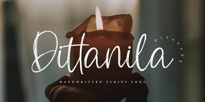 Dittanila is a beautiful handwritten font. The handwritten combined with brush font will make your design project modern and attractive. Made for any professional project branding. Dittanila is best used for branding logotype, and quotes. Features: Standart Ligatures Stylistic Set Multilingual Support PUA Encoded Numerals and Punctuation Thank you for downloading premium fonts from Dita Type
 - Summer Sunshine by Figuree Studio,
$18.00 This time for Summer Sunshine! Made with love and joy, inspired by the warmth of summer. Comic look, so it will make your design more beautiful, cute, fun, and colorful. Features: Character Set A-Z (All-caps) Numerals and Punctuation (OpenType Standard) Accents (Multilingual characters) PUA Encode I hope you can enjoy the font :) Regards Figuree Studio
