10,000 search results
(0.035 seconds)
- Asterisp by Typodermic,
$11.95 Asterisp is a set of gorgeous 4,5,6,7,8,9,10,12 and 13-sided asterisks in a bevy of styles. A few flashes, flowers, stars, splats and balloons are included along with outlined and 3D variations. They can be used on their own, or strung together to make fetching borders. Asterisp comes with a visual guide to take the guesswork out of choosing the symbol you need. Warning: using oversized, thirteen-sided asterisks in your layouts can be highly addictive!
 - Blithe by Laura Worthington,
$25.00 Bouncy, effortless looking handwriting can put us at ease or make us smile. Blithe captures the casual flair of a felt-tip pen with clean monoline strokes and retains the distinctive quirks of real handwriting and imperfectly varied letterforms. Blithe includes a wide array of 148 ligatures and 47 alternates to create even more convincing connections; all in the service of authenticity. Blithe is ready to welcome readers of cute Instagram posts, cupcake menus, baby clothing – anywhere that calls for gentle charm. See what’s included! http://bit.ly/2imxsms This font has been specially coded for access of all the swashes, alternates and ornaments without the need for professional design software! Info and instructions here: http://lauraworthingtontype.com/faqs/
 - Pascual Ferry by Comicraft,
$39.00 The slick and sexy letterforms of Ace ACTION COMICS artist, Pascual Ferry, are the latest to join our MASTERS OF COMIC BOOK ART font line. Pascual's work on the SUPERGIRLS storyline in ACTION made us want to lick each page -- but, y'know, not when anyone was looking... we know they're just comic book characters, they're not REAL and we don't fancy them or anything -- Uhhh... so we were delighted when Pascual invited us to create this stylin' sans souciant family of fonts for him. All we asked for in return was this smokin' alternate cover for the next issue of HIP FLASK... Hey, don't lick your monitor, you might get an electric shock...
 - Pidgeotto by Keristyper Studio,
$14.00 Pidgeotto is a script font with a nice, smooth flow. The basic letters are simple but modified with stylistics to make them look more attractive, there are many alternatives to make it happen. Great for logos, titles, t-shirts, packages, and anywhere else you need this kind of lined, legible script font. Pidgeotto Font multilingual support: Afrikaans, Albanian, Catalan, Danish, Dutch, English, Estonian, French, Finnish, German, Icelandic, Indonesian, Italian, Malay, Norwegian, Portuguese, Spanish, Swedish, Zulu, and many more. What’s Included : OTF/ TTF/ WOFF Web Fonts Standard & Multilingual glyphs Ligature Works on PC & Mac Simple installations Accessible in Adobe Illustrator, Adobe Photoshop, Adobe InDesign, and even work on Microsoft Word. Hope you enjoy our font!
 - Layfort by Identity Letters,
$29.00 What do you get when you cross Industrial Revolution with Art Déco? The raw force of steam-powered vessels with the panache of dashing streamliners? A sturdy industrial grotesque with a swanky stylized sans? We don't know, but our Layfort is a strong contender. It's a contrasted sans-serif typeface with old-style proportions: varying letter widths create a more vivid texture than your usual contemporary sans, and the true italics are narrower than the uprights. Layfort is elegant enough for fashion, art, and luxury; yet sufficiently sincere for serious business. And at 16 styles & 750 glyphs, it's ready for complex typographic demands (try the round dots at SS09). Let your designs fly!
 - Sante Pro by Stiggy & Sands,
$39.00 Our Sante Pro is a script of vintage origins with modern flair. This script embodies holiday and special event celebrations in its styling while exuding a confidence and carefree attitude. It makes a bold statement in any design. This script is loaded with extra features - truly giving Sante Pro lots to celebrate! Opentype features include: - Swash Capitals - Initial and Final forms of Lowercase letters via Contextual Swash Alternates. - Full set of Inferiors and Superiors for limitless fractions. - Oldstyle figures. - Ordinals. - Borders & Flourishing Ornaments. But there's still more! The Sante Initials font uses specially designed flourishes to follow the forms of Swash capitals to create a unique and fanciful look. See the PDF guidebook for Sante Initials for more information.
 - Drillos by Hanzel Space,
$25.00 Introducing our new product "Drillos" Inspired by the shape of a balloon which has rounded curves so that the font looks elastic and feels soft. Which has a thick volume in each character of the letter. There are lots of script fonts that have character, but this time the font that I created this time is no less interesting and unique. The function of this font is very suitable for use as branding, posters, logos, packaging, labels and other design needs. So this font is one solution that is quite capable for the needs of designers to complete a project. Uppercase & Lowercase, Numeral, Punctuation, Miltilingual, Swash Thanks so much Happy creating! Cheers! Hanief - Hanzel Space
 - Btoxina by FSdesign-Salmina,
$39.00 Btoxina is a free interpretation of the theme pixel font. With its technological feeling, it reflects the spirit of our age. By designing the font Filippo Salmina, the author, has been inspired by the signage used in starships. Btoxina is grid-based but it differs from classical screen fonts by the use of diagonal lines. It is characterized by the renouncement of the use of capital letters in favor of using negative letters and by the automatic generation of ligatures. The typeface is available in two different styles: Atoxina (regular) and Btoxina (italic). Btoxina is especially suited for headlines in cool or experimental typography; be careful though, this font is toxic, we deny any responsibility for its use!
 - LTC Creepy Ornaments by Lanston Type Co.,
$24.95 In researching historic decorative material offered by Lanston Monotype as well as other metal foundries such as Barnhart Brothers and Spindler, there were occasionally ornaments that defied description. Perhaps it was a Victorian sense of humor or someone really thought these were a good idea or perhaps popular taste has just changed so much over the last hundred years, or our forbearers were completely insane. In any case, LTC is somewhat proud to present a collection of the most bizarre, disturbing and baffling printers ornaments we could find. Along with mutant fowl-children and frolicsome amphibians, there are also Masonic and other secret fraternal symbols that may not be creepy to everyone, but just enough to be moderately disturbing.
 - White Space by Din Studio,
$29.00 Hello, Everybody! Imagine a world filled with white matters? Are you trying to make an elegant, calm, but stylish projects? Then grab this font immediately. Introducing White Space- A Display Serif Font This gorgeous, stylish and modern font can be used for a host of different content needs and projects. Ideal for social media banners; posts, and ads, printed quotes, t-shirt designs, packaging, or even as a modern text overlay to any background image. Our font always includes Multilingual option to make your branding globally accepted. Features: Standard Ligatures Alternate Stylistic Set Swash Multilingual Support (91 languages) PUA Encoded Numerals and Punctuation Thank you for downloading premium fonts from Din Studio
 - Hendrix by Scriptorium,
$18.00I had a chat recently with a customer who is a big fan of lettering from the psychedelic poster era. The discussion got me thinking about poster lettering we hadn't yet made into fonts, and a particular sample from a Jimi Hendrix poster I had played around with but never finished making into a font. So I went back to the drawing board and the result is the new Hendrix font. Unlike many of our other Psychedelic fonts which are stripped down to their basic character forms, this font includes the outlines characteristic of a lot of poster lettering from that period. It also includes variant versions of a number of the characters - Sagan by Associated Typographics,
$29.00 Sagan was designed as an alternate to Ramsey ; you could call them brothers. It was drawn, redrawn, and expanded on, to put it lightly. It boasts 770 glyphs in each weight, covering all European languages, and also contains an extended Cyrillic. Sagan provides advanced typographical support with features such as case-sensitive forms, old style numerals, fractions, and many alternate glyphs. Like all of our typefaces, Sagan is fun to use. Sagan has 7 weights, with accompanying italics for each weight, ranging from Extra Light to Black. It is ideally suited for branding, editorials, advertising, packaging, posters, billboards and digital screen design. Sagan will work hard for your brand or project. Make a statement that demands notice.
 - Algerian Rnd by FontMesa,
$29.00 It's finally here, Algerian Rnd is an all new version of our Algerian Mesa font with rounded soft corners and serifs. Imagine the impact Algerian Rnd will have on your product label and packaging. Algerian Rnd is a new timeless beauty that you'll find many uses for in your logos and advertising. Algerian Rnd is for every generation, put it to work in your next project, you're going to love this font. Algerian Rnd does include some alternate glyphs which you'll need an Opentype aware application to access the alternates in Algerian Rnd. Algerian Rnd is ideal for product logos, labels, packaging, t-shirt designs and other merch. Algerian Rnd is a trademark of FontMesa LLC
 - Ragazzi by Tour De Force,
$25.00 Ragazzi is well balanced serif with display impact. Contains 2 widths – Normal and Condensed and matching Italics for Normal in weight distribution from Light to Black. With gently rounded serifs, teardrop terminals, elegant hairline, equal ascender and descender heights, playful ear and smooth spur, Ragazzi represent distinctive serif family for respectable area of usage. Family's display elements are especially noticeable in headlines, but they handle longer paragraphs with same success, not effecting on legibility keeping right dose of display touch present. Ragazzi contains OpenType features: Small Caps, Initials, Standard Ligatures, Ordinals, Fractions, Superscript, Subscript, Oldstyle Figures, Tabular Figures and two decorative dingbats. Condensed and Italics font files don't contain Initials and dingbats. Ragazzi is our 104th release.
 - Gertrud by T4 Foundry,
$21.00First place in a spelling-bee competition, a Harvard University diploma or the Nobel Peace Prize? You can't go wrong with this classic Swedish calligraphy font, created by veteran designer Bo Berndal. He named Gertrud after his better half, but was also inspired by old handwritten documents: "Gertrud is a calligraphic letter design from the 16th century. I used it when I engrossed diplomas with a flat-nibbed pen in the 1980's. When I got my Mac I generated the typeface in Fontographer." Gertrud (the typeface) comes in three weights, with roman and italic. It is an OpenType creation, for both PC and Mac. Swedish type foundry T4 premieres new fonts every month. Gertrud is our sixth introduction. - WT Arthas by Wraith Types,
$50.00 Inspired by the « lettres bastardes », Arthas is a modern interpretation of ancient letterforms dating far back, before type even existed. It has been subtly adapted for better readability in 2020. The sharpness of the design creates an elegant contrast between old and new, ancient and futuristic, and will add an ominous, regal mood to your graphic design projects. This typeface is meant mostly for display use, but we can’t wait to receive a picture of someone using it for introductory text, at the start of a book…. Maybe that’s you? As all of our releases, it will be updated at time goes on. Those updates will always be free for people having already purchased the font(s).
 - Boltz by Designova,
$10.00 Boltz is a simple & cute sans-serif typeface perfect for headlines, big text, branding, logotypes & display usage. It can be excellent choice for creating outstanding logos, promotional content and marketing graphics that can bring uniqueness and freshness. Boltz comes with a highly creative handmade collection of Stylistic Alternatives for 14 uppercase letters which makes it easy to create unique monograms, logo and identities with these combinations. Please see the examples shown above to get an idea about the capability of this typeface. The typeface comes with Extended Latin character sets including Western European, Central European and South Eastern European character sets. Boltz comes with single weight but 6 variants (Regular, Italic, Outline, Outline Italic, 3D and 3D Italic).
 - Ms Kitty NB by No Bodoni,
$35.00Some scribbles on a bar napkin, a note from a cute girl passed in history class, what is there to say but why not a typeface? Actually it's that late night, �let's get this typeface done� madness that causes these flights of fancy. Anything to relieve the boredom of doing all those kerning pairs. Or maybe it's sunspots? Ms Kitty is all uppercase letterforms so there are two versions of each letter, one in the cap position, another in the lowercase position. Besides the regular weight and bold, there�s a bolder and much bolder in the works. And perhaps there will be a "too bold to be believed" version. Depends on the sunspots. - Minimal Nahidha by Attype Studio,
$19.00 Minimal Nahidha is a minimalist sans serif typeface with a casual and trendy outlook. Minimal Nahidha was built to balance the geometric qualities of a san-serif typeface with all the benefits of traditional serif fonts, like readability and personality. Minimal Nahidha comes in Regular and Slant version, each with its own unique set of characters & it has ligatures and stylistic alternates that make it easy to customize your designs. The fonts works best as display typefaces or as beautiful headline fonts, but can also be used in other ways to create stunning designs. Features : - Minimal Nahidha Family Font - Ligatures - Stylistic Alternates - Multilingual, US Roman, Latin 1 Support Hope you enjoy with our font! Attype Studio
 - Juicetime by Allouse Studio,
$16.00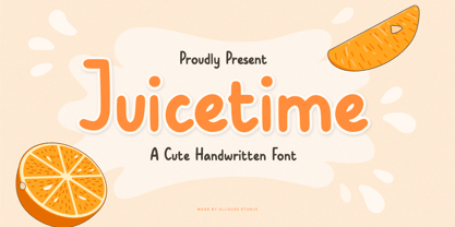 Proudly Presenting, Juicetime A Cute Handwriten Font. Juicetime is perfect for any titles, logo, product packaging, branding project, megazine, social media, wedding, or just used to express words above the background. Juicetime also come with Multi-Lingual Support. Enjoy the font, feel free to comment or feedback, send me PM or email. Thank You!
 - Mangoberry by Allouse Studio,
$16.00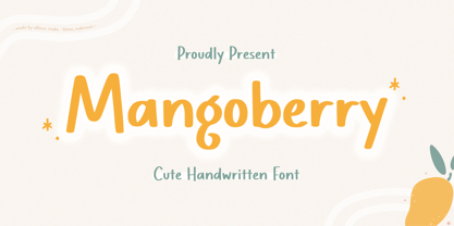 Proudly Presenting, Mangoberry A Cute Handwriten Font. Mangoberry is perfect for any titles, logo, product packaging, branding project, megazine, social media, wedding, or just used to express words above the background. Mangoberry also come with Multi-Lingual Support. Enjoy the font, feel free to comment or feedback, send me PM or email. Thank You!
 - Lemonmint by Allouse Studio,
$16.00 Proudly Presenting, Lemonmint A Cute Handwriten Script Font. Lemonmint is perfect for any titles, logo, product packaging, branding project, megazine, social media, wedding, or just used to express words above the background. Lemonmint also come with Multi-Lingual Support. Enjoy the font, feel free to comment or feedback, send me PM or email. Thank You!
 - Pink - Unknown license

- bubblii - Unknown license

- Trick Or Treat by Comicraft,
$19.00Bats, Cats, Ghosts and Ghouls, Zombies, Witches and Spiders galore. Cackling to herself alone in her coven, our very own Scary Godmother, Lilou, threw eyes of newts and wings of bats into her cauldron and sent her unearthly children down the street with mischief in mind. Our Halloween Dingbats have every kind of Spooky Monster she could imagine, and a few more besides. Keep your porch light on. Trick or Treat - C-Nation by URW Type Foundry,
$39.99 Marit Otto about C-Nation: The building typeface. Although the 70ties were very liberating and progressive, still girls played mainly with dolls and sweet things and boys with all kinds of challenging stuff. They did all sorts of basic scientific experiments in mini labs and of course built cool things with Meccano building sets. As a girl I was perfectly happy with the toys I had access to. But at the same time I was very curious about all the adventure toys and discoveries my brother did. It also made me wonder why the grown up people thought that our world could be separated so easily by separating our toys in pink and blue sections. At this day of age Meccano is probably hopelessly old fashioned and far to manual. Children of today are fed by fast images and cool animations on screen, they learn, play, communicate and relax in the same space, the digital space. The special feature of Meccano was that even though it was very basic there was the promise you could create anything. It might even contribute to a logical mind. The typeface I designed refers to the Meccano feel. It is a creative typeface. A bit masculine and bold looking perhaps but after the first impression a subtle and refined female touch is revealed. It has links to architecture and associations with metal constructions like ‘The Eiffel Tower’ and (old railway) bridges. I am convinced that we all think of that as very charming man-made objects.
 - Vendetta by Emigre,
$69.00 The famous roman type cut in Venice by Nicolas Jenson, and used in 1470 for his printing of the tract, De Evangelica Praeparatione, Eusebius, has usually been declared the seminal and definitive representative of a class of types known as Venetian Old Style. The Jenson type is thought to have been the primary model for types that immediately followed. Subsequent 15th-century Venetian Old Style types, cut by other punchcutters in Venice and elsewhere in Italy, are also worthy of study, but have been largely neglected by 20th-century type designers. There were many versions of Venetian Old Style types produced in the final quarter of the quattrocento. The exact number is unknown, but numerous printed examples survive, though the actual types, matrices, and punches are long gone. All these types are not, however, conspicuously Jensonian in character. Each shows a liberal amount of individuality, inconsistency, and eccentricity. My fascination with these historical types began in the 1970s and eventually led to the production of my first text typeface, Iowan Old Style (Bitstream, 1991). Sometime in the early 1990s, I started doodling letters for another Venetian typeface. The letters were pieced together from sections of circles and squares. The n, a standard lowercase control character in a text typeface, came first. Its most unusual feature was its head serif, a bisected quadrant of a circle. My aim was to see if its sharp beak would work with blunt, rectangular, foot serifs. Next, I wanted to see if I could construct a set of capital letters by following a similar design system. Rectangular serifs, or what we today call "slab serifs," were common in early roman printing types, particularly text types cut in Italy before 1500. Slab serifs are evident on both lowercase and uppercase characters in roman types of the Incunabula period, but they are seen mainly at the feet of the lowercase letters. The head serifs on lowercase letters of early roman types were usually angled. They were not arched, like mine. Oddly, there seems to be no actual historical precedent for my approach. Another characteristic of my arched serif is that the side opposite the arch is flat, not concave. Arched, concave serifs were used extensively in early italic types, a genre which first appeared more than a quarter century after roman types. Their forms followed humanistic cursive writing, common in Italy since before movable type was used there. Initially, italic characters were all lowercase, set with upright capitals (a practice I much admire and would like to see revived). Sloped italic capitals were not introduced until the middle of the sixteenth century, and they have very little to do with the evolution of humanist scripts. In contrast to the cursive writing on which italic types were based, formal book hands used by humanist scholars to transcribe classical texts served as a source of inspiration for the lowercase letters of the first roman types cut in Italy. While book hands were not as informal as cursive scripts, they still had features which could be said to be more calligraphic than geometric in detail. Over time, though, the copied vestiges of calligraphy virtually disappeared from roman fonts, and type became more rational. This profound change in the way type developed was also due in part to popular interest in the classical inscriptions of Roman antiquity. Imperial Roman letters, or majuscules, became models for the capital letters in nearly all early roman printing types. So it was, that the first letters in my typeface arose from pondering how shapes of lowercase letters and capital letters relate to one another in terms of classical ideals and geometric proportions, two pinnacles in a range of artistic notions which emerged during the Italian Renaissance. Indeed, such ideas are interesting to explore, but in the field of type design they often lead to dead ends. It is generally acknowledged, for instance, that pure geometry, as a strict approach to type design, has limitations. No roman alphabet, based solely on the circle and square, has ever been ideal for continuous reading. This much, I knew from the start. In the course of developing my typeface for text, innumerable compromises were made. Even though the finished letterforms retain a measure of geometric structure, they were modified again and again to improve their performance en masse. Each modification caused further deviation from my original scheme, and gave every font a slightly different direction. In the lower case letters especially, I made countless variations, and diverged significantly from my original plan. For example, not all the arcs remained radial, and they were designed to vary from font to font. Such variety added to the individuality of each style. The counters of many letters are described by intersecting arcs or angled facets, and the bowls are not round. In the capitals, angular bracketing was used practically everywhere stems and serifs meet, accentuating the terseness of the characters. As a result of all my tinkering, the entire family took on a kind of rich, familiar, coarseness - akin to roman types of the late 1400s. In his book, Printing Types D. B. Updike wrote: "Almost all Italian roman fonts in the last half of the fifteenth century had an air of "security" and generous ease extremely agreeable to the eye. Indeed, there is nothing better than fine Italian roman type in the whole history of typography." It does seem a shame that only in the 20th century have revivals of these beautiful types found acceptance in the English language. For four centuries (circa 1500 - circa 1900) Venetian Old Style faces were definitely not in favor in any living language. Recently, though, reinterpretations of early Italian printing types have been returning with a vengeance. The name Vendetta, which as an Italian sound I like, struck me as being a word that could be taken to signifiy a comeback of types designed in the Venetian style. In closing, I should add that a large measure of Vendetta's overall character comes from a synthesis of ideas, old and new. Hallmarks of roman type design from the Incunabula period are blended with contemporary concerns for the optimal display of letterforms on computer screens. Vendetta is thus not a historical revival. It is instead an indirect but personal digital homage to the roman types of punchcutters whose work was influenced by the example Jenson set in 1470. John Downer.
 - Feuerfeste Outline - Unknown license

- PeggyFont - Unknown license

- Evolved by Hemphill Type,
$24.00 The evolution of ‘Sapiens’ Evolved is the modern counterpart of its prehistoric cousin, ‘sapiens’. The letterforms have adapted and evolved to fit in a more modern space – this typeface has become more civilized but retains the quirks and character of its predecessor.
 - Best Part by Just Font You,
$20.00 Best Part, an elegant yet casual fancy script typeface inspired by the casual fashion lookbook and classy feminine stuff nowadays. Perfectly fit for branding, logo, wedding things, greeting cards, fashion, lookbook, marketing promotion, anytime you want to look fancy elegant but still casual.
 - Big Heroes by Typefactory,
$14.00 Big Heroes is playful font which puts a smile on your projects and will inspire you to create something fun and memorable. It is perfect for headings, flyer, greeting cards, product packaging, book cover, printed quotes, logotype, apparel design, album covers, etc
 - Trick Pony by Volcano Type,
$19.00Trick Pony is a typeface bastard that steals its characteristics from sans serif fonts and combines these with an ink brush appearance. The design is strictly reduced on the one hand, but on the other gets its handmade touch through varying stroke sizes. - Silly Treat by PizzaDude.dk,
$10.00 The Silly Treat font is actually handmade, but I traced each and every letter and cleaned them up - however, I wanted to keep the handmade look, and left just about enough details for you to find details of my original drawn lines.
 - Morgow by Scriptorium,
$18.00Morgow is a decorative Celtic uncial font based on original hand lettering. It is similar to other uncial fonts, but the characters are embellished with traditional Celtic spiral designs. The font is appropriately named after a species of legendary Cornish sea serpent. - Alright by K-Type,
$20.00 Alright is a cursive font is based on the handwriting alphabets used in education, but with modern short ascenders and descenders. Most of the lowercase letters and half of the capitals join up smartly. A useful teaching alphabet and surprisingly stylish too.
 - Abonity by Dhan Studio,
$21.00 Abonity is a modern handwritten font, with stylized characters that look quirky but interesting to use in a variety of modern designs such as clothing, invitations, tittle books, stationery designs, quotes, branding, logos, greeting cards, t-shirts, packaging designs, posters and more.
 - Nest by Khalid Jassim,
$27.00 This font was created for use in a ”bird nest story”. It can be used for any other things but the main idea is that someone looking for a font to use anything related with birds, this can be a perfect match.
 - Ronsten by Fontron,
$35.00I know there are already quite a few Stencil type fonts but maybe this fills a niche. A very chunky serif stencil where the serifs are closely aligned and help form the the curves of the letters. An Italic is also available. - Syntax by Linotype,
$29.99 Syntax was developed by Hans Eduard Meier in 1968 and presented by the font foundry D. Stempel AG. Its figures are based on Old Face characters but have a distinctive, modern design. The inclination to the right lends the font a dynamic feel.


