10,000 search results
(0.033 seconds)
- Random Thoughts by PizzaDude.dk,
$20.00 Random Thoughts is a selection of of quite simple handmade capital letters. They are legible, almost mono-lined, handmade and they are a bit jumpy - but never the less, they suit a headline that needs a catchy look very fine! I've included 4 different versions of each letter. One lowercase, one uppercase and two contextual alternates. These 4 different versions automatically cycle as you type, leaving your text quite random - but still very clear and legible! And, of course, there is multilingual support!
 - Encorpada Classic by dooType,
$20.00 Encorpada classic brings the best features of the Didone genre, but with a 21st century look and feel. With smooth details Encorpada Classic is a elegant choice for your type library. The Encorpada family began in 2011 with the release of Encorpada Black. After that instant success, in 2012, dooType brought to us Encorpada PRO. Encorpada Classic retains the main look and feel of his predecessors, but is designed with more functional considerations. With 14 styles, Encorpada Classic is a fine choice.
 - Wandering Pencil by Hanoded,
$15.00 I have a lot of pencils, but when I need one, they seem to have grown legs and have disappeared! When I decided I wanted to create a pencil font, it took me a long time to find the right pencil for the job! Wandering Pencil is a nice, handmade font. It is a bit shaky, a bit rough, but it does have class and will look nice on your designs! Comes with diacritics and double letter ligatures for the lower case.
 - PiS LIETZ Lindham by PiS,
$38.00 LIETZ Lindham is based on letters taken from an old type specimen folder from 1936 featuring handdrawn sans-serif ABC's. It's kinda bauhausy and straight but also shows the wonderful lively unevenness of hand-drawn letters. Being made for the use in large-scale advertisements and posters, LIETZ Lindham fits perfectly for pro-communist propaganda posters, but also features legibility in smaller sizes, so you can use it for your Neue Typographie manifesto too, Jan. Go grotesk! Go bold! Go neu!
 - Semer by Illushvara,
$14.00 Hello, Introducing Semer is a display typeface started from classic back in 80's or 90's but make it going to elegants. The line very clean but smooth upright. All in standart character very easy to use and add this font to your most creative ideas for Fashion, Poster, Handmade Product, Beauty Skincare, Logotype and more you want to used! Support the Multilingual Language! If you have any question, don’t hesitate to contact me. Happy Designing !!! Thank You, Illushvara Design
 - Fingerfood by Hanoded,
$15.00 I made this font using my index finger and Chinese ink. I thought the ink would come off easily, but I can tell you: it doesn’t. I have been walking around with a black stained finger for a week now and I do get strange looks from people every so often… Fingerfood, of course, is hand made. It is a rather playful font - all caps, but lower and upper case differ and like to mingle. Comes with a full diacritics palette.
 - Au Revoir by Hanoded,
$20.00 Au Revoir - saying goodbye is one of the hardest things in life, but in a sense it is also beautiful: there is a promise of seeing each other again, as 'Au revoir' literally means: 'to the next time we see one another'. Au Revoir font is slightly cursive, elegant without being posh, simple and legible. You could write a poem or a farewell letter with it, but I guess its simplicity lets you use it in various other, less dramatic, designs.
 - Boarding House by Hanoded,
$15.00 I have never stayed at a boarding house myself, but I’ve heard some horror stories. When I have finished painting the three fonts (using Chinese ink and a small brush), I didn’t have to think long for a name. Boarding House family consists of three distinct hand painted fonts - the complement each other, but can be used separately as well. Use Boarding House for your halloween posters, mystery novels or websites. All fonts come with an attic full of diacritics.
 - Sacremende by Lauren Ashpole,
$15.00 Welcome to Sacremende, a chunky, slightly messy display font. As the name implies, this font was inspired by the retro California aesthetic and, in particular, old surf rock posters. To highlight the vintage feel, the font package comes with a distressed option for a well-worn effect. This font is all caps but includes unique styles for upper and lowercase letters. Both versions are available as webfonts but for better performance, I would recommend using the regular option for the web.
 - Nanami Pro by Thinkdust,
$19.00 Nanami Pro is the heavily engineered follow up to the hugely successful Nanami and Nanami Rounded font families. Nanami Pro contains all the wonder of the original Nanami families, but with vastly extended language support including Cyrillic and Extended Latin, leading to a total of 458 carefully crafted glyphs. The original Nanami was a key font in many a typography collection, but with these new multi-lingual credentials, Nanami Pro has become a true must-have font for anyone who’s serious about design.
 - Mrs Eaves XL Serif by Emigre,
$59.00 Originally designed in 1996, Mrs Eaves was Zuzana Licko’s first attempt at the design of a traditional typeface. It was styled after Baskerville, the famous transitional serif typeface designed in 1757 by John Baskerville in Birmingham, England. Mrs Eaves was named after Baskerville’s live in housekeeper, Sarah Eaves, whom he later married. One of Baskerville’s intents was to develop typefaces that pushed the contrast between thick and thin strokes, partially to show off the new printing and paper making techniques of his time. As a result his types were often criticized for being too perfect, stark, and difficult to read. Licko noticed that subsequent interpretations and revivals of Baskerville had continued along the same path of perfection, using as a model the qualities of the lead type itself, not the printed specimens. Upon studying books printed by Baskerville at the Bancroft Library in Berkeley, Licko decided to base her design on the printed samples which were heavier and had more character due to the imprint of lead type into paper and the resulting ink spread. She reduced the contrast while retaining the overall openness and lightness of Baskerville by giving the lower case characters a wider proportion. She then reduced the x-height relative to the cap height to avoid increasing the set width. There is something unique about Mrs Eaves and it’s difficult to define. Its individual characters are at times awkward looking—the W being narrow, the L uncommonly wide, the flare of the strokes leading into the serifs unusually pronounced. Taken individually, at first sight some of the characters don’t seem to fit together. The spacing is generally too loose for large bodies of text, it sort of rambles along. Yet when used in the right circumstance it imparts a very particular feel that sets it clearly apart from many likeminded types. It has an undefined quality that resonates with people. This paradox (imperfect yet pleasing) is perhaps best illustrated by design critic and historian Robin Kinross who has pointed out the limitation of the “loose” spacing that Licko employed, among other things, yet simultaneously designated the Mrs Eaves type specimen with an honorable mention in the 1999 American Center for Design competition. Proof, perhaps, that type is best judged in the context of its usage. Even with all its shortcomings, Mrs Eaves has outsold all Emigre fonts by twofold. On MyFonts, one of the largest on-line type sellers, Mrs Eaves has been among the 20 best selling types for years, listed among such classics as Helvetica, Univers, Bodoni and Franklin Gothic. Due to its commercial and popular success it has come to define the Emigre type foundry. While Licko initially set out to design a traditional text face, we never specified how Mrs Eaves could be best used. Typefaces will find their own way. But if there’s one particular common usage that stands out, it must be literary—Mrs Eaves loves to adorn book covers and relishes short blurbs on the flaps and backs of dust covers. Trips to bookstores are always a treat for us as we find our Mrs Eaves staring out at us from dozens of book covers in the most elegant compositions, each time surprising us with her many talents. And Mrs Eaves feels just as comfortable in a wide variety of other locales such as CD covers (Radiohead’s Hail to the Thief being our favorite), restaurant menus, logos, and poetry books, where it gives elegant presence to short texts. One area where Mrs Eaves seems less comfortable is in the setting of long texts, particularly in environments such as the interiors of books, magazines, and newspapers. It seems to handle long texts well only if there is ample space. A good example is the book /CD/DVD release The Band: A Musical History published by Capitol Records. Here, Mrs Eaves was given appropriate set width and generous line spacing. In such cases its wide proportions provide a luxurious feel which invites reading. Economy of space was not one of the goals behind the original Mrs Eaves design. With the introduction of Mrs Eaves XL, Licko addresses this issue. Since Mrs Eaves is one of our most popular typefaces, it’s not surprising that over the years we've received many suggestions for additions to the family. The predominant top three wishes are: greater space economy; the addition of a bold italic style; and the desire to pair it with a sans design. The XL series answers these requests with a comprehensive set of new fonts including a narrow, and a companion series of Mrs Eaves Sans styles to be released soon. The main distinguishing features of Mrs Eaves XL are its larger x-height with shorter ascenders and descenders and overall tighter spacing. These additional fonts expand the Mrs Eaves family for a larger variety of uses, specifically those requiring space economy. The larger x-height also allows a smaller point size to be used while maintaining readability. Mrs Eaves XL also has a narrow counterpart to the regular, with a set width of about 92 percent which fulfills even more compact uses. At first, this may not seem particularly narrow, but the goal was to provide an alternative to the regular that would work well as a compact text face while maintaining the full characteristics of the regular, rather than an extreme narrow which would be more suitable for headline use. Four years in the making, we're excited to finally let Mrs Eaves XL find its way into the world and see where and how it will pop up next.
 - Glowitcher by Timurtype,
$14.00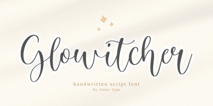 Glowitcher A Handwritten Script Font Glowitcher is perfect for product packaging, branding project, megazine, social media, wedding, or just used to express words above the background. Glowitcher also multilingual support. Embillish your designs with our original fonts, Enjoy the font 😊
 - Garbancera by Rodrigo Navarro Bolado,
$30.00 Gothic fraktur inspired design, I wanted to resemble old german calligraphy but making it very geometric, so I used an isometric reticle during sketching. This is a display font, created for BIG sizes, non textual. I recommend it for branding, poster, logos or titles. Its very experimental -- it exists within the limits of legible and illegible reading. I choose the name “Garbancera” because gothic calligraphy has issues that are linked with dark, gloomy, lugubrious things or fear feelings, culturally in Mexico. I related this with death and for mexicans, death is something we celebrate and give us joy and happiness, annoying, the most representative Mexican characters, one of those is “La Calavera Garbancera” or better known as “La Catrina”, a clothes skeleton with only a hat. It was drawn this way to make a critic to all Mexicans at that time, that were poor but they wanted to represent a high lifestyle, “those that where to the bones, but with a French hat with ostrich feathers”. La Catrina was created by José Guadalupe Posada, a Mexican lithographer but also a newspaper illustrator. I think this is a beautiful font that can lead to great results, just use it wisely.
 - Syntachron by Mofr24,
$11.00 Syntachron is an extraordinary monospaced font that stands out with its futuristic and mecha-inspired design. What sets this font apart is its unique ability to combine simplicity, modernity, and boldness, resulting in a visually captivating typeface. It is the perfect choice for those seeking to create impactful posters, eye-catching marketing materials, captivating logos, attention-grabbing headlines, and engaging book and magazine layouts. One of the distinguishing features of Syntachron is its compatibility with the Cyrillic alphabet, offering versatility and style for a wide range of design projects. Whether you're working on international branding campaigns or multi-language publications, this font seamlessly integrates with the Cyrillic characters, ensuring consistency and cohesiveness across different languages. In terms of typeface pairing, Syntachron harmonizes exceptionally well with related families and typefaces that share its sleek aesthetics and futuristic vibe. It complements and enhances other fonts, enabling designers to create stunning combinations that amplify the impact of their designs. Beyond its striking appearance, Syntachron excels in its functional aspects. The font comes in a variety of styles, allowing for versatility in design choices. Its monospaced nature ensures consistent character widths, making it ideal for code snippets, technical documentation, and typewriter-style layouts. Furthermore, Syntachron offers a comprehensive character set with special features, enabling the seamless creation of diverse and engaging designs. The design concept behind Syntachron was to capture the essence of a futuristic world and merge it with the mechanical elements of mecha-inspired aesthetics. The result is a font that exudes a sense of cutting-edge technology and boldness, empowering designers to create visually striking and impactful designs that captivate their audience. Syntachron was meticulously created to fulfill the need for a font that seamlessly merges modern simplicity with futuristic design elements. Its purpose is to provide designers with a versatile tool that sparks creativity and enables them to craft stunning visual experiences. With its sleek aesthetics, support for the Cyrillic alphabet, and functional aspects, Syntachron is an indispensable asset for any design project seeking to embrace the future.
 - Monarda by Monotype,
$29.99 Monarda™ is Terrance Weinzierl’s take on the loud and splashy brush scripts of the 1950s. It’s energetic, playful, and equally at home in hardcopy headlines as it is in interactive banners. In addition to the basic alphabet, OpenType® fonts of Monarda are also awash in super-sized swash caps, contextual alternate characters and ligatures. Pair Monarda with a mid-century structural sans like Trade Gothic® or a sturdy slab serif like Egyptian Slate™ to create typographic counterpoint that’s confident, compelling and memorable! Named for a riotous bright red flower that attracts butterflies and humming birds, Monarda is a rare combination of flamboyance and effortless beauty. Weinzierl describes it as “casual yet precise: a stiff denim jacket or perfectly white sneakers at a formal event.” Monarda clearly stands out – and always fits in. Well, almost always. Drawn for print, the design’s robust x-height, open counters and wide apertures also make Monarda screen-friendly. Monarda can be perfect for a wide variety of food and lifestyle applications as well as travel, stationery and packaging projects. Advertising campaigns and product branding are also well within its reach. Monarda works best when used large – but economically. Two or three words are its sweet spot. Think: product name, print headline or the lettering on the side of a truck. It could easily become your go-to design for projects that call for a script with a bright personality and fearless demeanor. The excellence of Weinzierl’s work has been recognized by the Type Directors Club and Print Magazine. When not working on creating new typefaces, he augments his professional practice through calligraphy, lettering, and letterpress printing. Monarda is another winner from Weinzierl’s creative mind and talented hand.
 - Jenson Classico by Linotype,
$29.99In 1458, Charles VII sent the Frenchman Nicolas Jenson to learn the craft of movable type in Mainz, the city where Gutenberg was working. Jenson was supposed to return to France with his newly learned skills, but instead he traveled to Italy, as did other itinerant printers of the time. From 1468 on, he was in Venice, where he flourished as a punchcutter, printer and publisher. He was probably the first non-German printer of movable type, and he produced about 150 editions. Though his punches have vanished, his books have not, and those produced from about 1470 until his death in 1480 have served as a source of inspiration for type designers over centuries. His Roman type is often called the first true Roman." Notable in almost all Jensonian Romans is the angled crossbar on the lowercase e, which is known as the "Venetian Oldstyle e." In the 1990s, Robert Slimbach designed his contemporary interpretation, Adobe Jenson™. It was first released by Adobe in 1996, and re-released in 2000 as a full-featured OpenType font with extended language support and many typographic refinements. A remarkable tour de force, Adobe Jenson provides flexibility for a complete range of text and display composition; it has huge character sets in specially designed optical sizes for captions, text, subheads, and display. The weight range includes light, regular, semibold, and bold. Jenson did not design an italic type to accompany his roman, so Slimbach used the italic types cut by Ludovico degli Arrighi in 1524-27 as his models for the italics in Adobe Jenson. Use this family for book and magazine composition, or for display work when the design calls for a sense of graciousness and dignity. - Corpid by LucasFonts,
$49.00 The name Corpid derives from “Corporate Identity” — which is what this family of low-contrast sans-serifs was made for. Corpid was originally commissioned by Studio Dumbar in the Netherlands as a corporate typeface for the Dutch Ministry of Agriculture, Nature Management and Fishing. The font was designed to replace the existing standard typeface (a well-known business-like sans-serif) to provide the organization with a unique and strong identity. Although it was designed to fit strict technical requirements, Corpid has a personality all of its own. This was in part a result of what Luc(as) calls “creating tension” between the inner and outer curves of each character. “I tend to put a little more diagonal contrast into fonts than is the case in most neutral sans serif fonts. This brings a certain humanistic touch to the typeface. Much more subtle here than in Thesis – but although it is almost invisible, it is still palpable.” Corpid was gradually expanded into a five-weight, three-width family. The new Corpid SemiCondensed has double functionality. It is a no-frills, compact headline font that offers optimum legibility in sizes from small to huge. It is also a great space-saving text typeface for magazines, newsletters or annual reports: economic, versatile, and provided with several different numeral sets. In this OpenType type version, all weights come with Small Caps. With its wealth of numeral styles and complete character sets (including Central European) the Corpid family is now well equipped to tackle the most complex of typographic tasks.
 - Stipeta - Unknown license

- Danken by Etewut,
$30.00 DANKEN is an all caps display typeface that was created to mix font styles and create unlimited variety of effects. Now it has 25 font styles but it’s growing.
 - Pepino by Robert Petrick,
$19.95 Pepino is loosely based on the classic font Hobo but Pepino is a completely new and original drawing. The font is bold, fun, casual, easy to set and read.
 - Bonita by Monotype,
$40.99Bonita is a bold handlettering style based on movie poster lettering from the early 20th century. It's similar to the typeface Broadway, but much bolder and far less formal. - Manus Smooth by JOEBOB graphics,
$25.00 The Manus font family is extended with a new relative: Manus Smooth. Some major and minor adjustments were made, but it still has the look & feel of the original.
 - Avocado by Justyna Sokolowska,
$15.00 Avocado is handwritten font. It's very suitable for the fashion industry and culinary. This font is crazy but readable, so it can be used for large amounts of text.
 - Baker Signet by Bitstream,
$29.99A design on classical lines with subtle but effective calligraphic touches, by Arthur Baker for VGC. The Bold version is used for the Coke logo all over the world. - Hardy Mind by Seemly Fonts,
$12.00 Hardy Mind is a simple, organic and bold display font. Simple but with a strong visual effect, this font will instantly make your creation more appealing than any others.
 - Beat by MADType,
$21.00 Beat is a quirky OCR-inspired face with a rounded, retro-electronic feel. All of the stem weights were drawn at random, but the ensuing chaos works amazingly well.
 - Diet Riot by PizzaDude.dk,
$15.00A crunchy comic font, suitable for both small and large typing. At small sizes the font appears as a "simple" handwriting font, but at larger points the crunchiness appears! - Bernyck by Eurotypo,
$24.00 Bernyck is a vintage fonts inspired by bold advertisers hand lettering styles, popular in the late 1940s through the early 1950s. It has the same charm as his brother “Cinefile”, but, this time, connected and with more alternates. The Bernyck family is integrated by Bernyck and Bernyck Extrude to interact together. To this we add a beautiful set of 131 ornaments, Bernyck Ornaments and of course, Bernyck Ornaments Extrude. The Open Type features include a full international character compliment, standard and contextual alternates, swatches, stylistic sets, initial forms, standard and discretionary ligatures. All this makes the text lively and bouncy, without the monotony of obviously repeated letterforms. A total of 634 glyphs to offer you many more options for your designs! Bernyck, like all our fonts, was carefully designed, controlled and tested in both aspects: readability and technical aspects. We take care of the kerning pairs, hinting and the precise programming of the Open Type functions; as well as the final touch of each glyph. Bernyck adapts well to titles, packages, invitations, greeting cards, magazines and book covers, children's material, fashion, logos and, posters and wherever you need a fun and sympathetic display font.
 - Scastea by Madatype Studio,
$19.00 Scastea is a modern stylish Serif font that will make your designs stand out from the crowd. This font features unique ligatures and alternates that add elegance and flair to your texts. Whether you are looking for a font for fashion and beauty designs, logos, headlines, posters, magazines, or any other creative project, Scastea will give you the perfect look. Scastea is easy to use and customize. You can access the ligatures and alternates through OpenType features or by using a glyphs panel. You can also mix and match the uppercase and lowercase letters to create stunning combinations. Scastea comes with a full set of characters, including numbers, punctuation, symbols, and multilingual support. Scastea is more than just a font. It is a statement of style and sophistication. It is a font that will impress your audience and elevate your brand. It is a font that you will love to use and enjoy. Download Scastea today and discover the beauty of this modern stylish Serif font.
 - Amor Sans Neo by Storm Type Foundry,
$55.00 The peculiarity of this alphabet is already its origin: the basic drawing was created by narrowing Roman capitals with corresponding lowercase letters. The goal was to create a monumental font for architecture and book covers. Surprisingly, however, Amor Sans has found its way into corporate identity, offices, magazines and packaging design. Its slightly narrowed, economical design predestines it for quick reading of shorter texts, which is why it is also excellent for theater posters and programs. Its moderate width proportions and rich selection of arrows and pointers are excellently used in public spaces. Amor Sans has a neutral expression that works harmoniously in any architectural style. It will serve as an orientation system in a medieval monastery as well as in a modern building, while remaining distinctive even in the dark. The family consists of ten cuts with many functions, such as small capitals, Cyrillic, several types of numerals, a number of ligatures and stylistic alternatives.
 - The Mainsthen by HKL Studio,
$19.00 The Mainsthen is a calligraphy script font that comes with exquisite character changes, a kind of classic copper decorative script with a modern twist, designed with high detail to bring out an elegant style. Antura script is interesting because it has a soft, clean, feminine, sensual, glamorous, simple and very easy to read typeface, because there are many fancy letter joints. I also offer a number of decent stylistic alternatives for multiple letters. Classic style is very suitable to be applied in various formal forms such as invitations, labels, restaurant menus, logos, fashion, make up, stationery, novels, magazines, books, greeting / wedding cards, packaging, labels or any type of advertising purposes. The Mainsthen is encoded with Unicode PUA, which allows full access to all additional characters without having any special design software. Mac users can use Font Book, and Windows users can use Character Map to view and copy any of the additional characters to paste into your favorite text editor / application.
 - Kompot Slab by VP Creative Shop,
$20.00 Introducing Kompot - This is the Greatest Font... actually typeface with 2 styles Kompot Slab is swirly, vintage typeface with 2 styles to enchant your next project. They are loaded alternate glyphs and multilingual support. Very versatile fonts that works great in large and small sizes. Basic latin, advanced latin, basic Cyrillic and advanced Cyrillic character sets are supported! Kompot Slab is perfect for branding projects, home-ware designs, product packaging, magazine headers - or simply as a stylish text overlay to any background image. Uppercase numeral, punctuation & Symbol Regular Outline Alternate glyphs Multilingual support Basic and Advanced Cyrillic support How to access alternate glyphs? To access alternate glyphs in Adobe InDesign or Illustrator, choose Window Type & Tables Glyphs In Photoshop, choose Window Glyphs. In the panel that opens, click the Show menu and choose Alternates for Selection. Double-click an alternate's thumbnail to swap them out. Feel free to contact me if you have any questions! Mock ups and backgrounds used are not included. Thank you! Enjoy!
 - Unchain My Heart by Harald Geisler,
$68.34 Unchain My Heart is Font that renders hearts on a string with a capital letter in the middle. All hearts are designed to align to a perfect string by remaining the handmade look. Lowercase letters produce a heart with outline. Uppercase letters produce a filled heart. Type in a parenthesis and a loose string end will be rendered either on the right or left side. Look in the full character set to find out more about the special decoration. Ideal for individualized mailings and greeting cards. Unchain My Heart is a part of the Light Hearted Font Collection that is inspired by a recording of Jean Baudrillard with the title, "Die Macht der Verführung" (The Power of Seduction) from 2006. Further inspiration came from the article, "The shape of the heart: I'm all yours". The heart represents sacred and secular love: a bloodless sacrifice. by British writer Louisa Young printed in EYE magazine (#43) London, 2002.
 - Ogelic by Ardyanatypes,
$17.00 Ogelic Typeface Serif is modern and elegant. It pairs well with san serif as pictured or stands firm as a title and brand representative for an elegant look. This Ogelic Typeface is equipped with a modern professional character that can present an elegant and attractive identity for your company for business purposes such as business cards, name tags, and uniforms as a brand enhancement. This modern Ogelic typeface is suitable to be embossed as a letter nameplate or even pasted in your office with a cutting sticker that looks elegant. This elegant Ogelic-type shape is also stunning for book covers or magazine writing. You can see all the available characters in the screenshot above, and you can try the modern & elegant Ogelic now for any design issues. Ogelic also comes with multiple languages, making it easy for any country and language use. It also comes with alternative Ligatures and stylistics to make your designs more attractive.
 - Warna by IKIIKOWRK,
$19.00 Proudly present Warna - Bohemian Font, created by ikiiko. With a design that is both fun and retro-inspired, Warna perfectly embodies that character. The font in question moves to the beat of your imagination. Each figure has a distinctive, hand-crafted quality, as though they were lovingly and enthusiastically created on a worn-out journal from the 1960s. "Warna" is more than simply a typeface; it's a lively storyteller who tells old tales with a contemporary twist. Its vibrant and youthful appeal makes it ideal for branding with a bohemian or retro aesthetic. The letters serve as your artistic friends, encouraging you to express your ideas with bold strokes that evoke the liberation of a joyful party. This font is very suitable for making a bohomian stuff, vintage boho brand, poster, magazine layout, fashion design, quotes, or simply as a stylish text overlay to any background image. What's Included? Uppercase & Lowercase Numbers & Punctuation Multilingual Support Works on PC & Mac
 - Brawner by IKIIKOWRK,
$25.00 Proudly present Brawner - Y2K Liquid Font, created by ikiiko. Brawner is the ultimate Y2K font with a liquid edge, developed for the fashion-forward and streetwear trendsetters. Brawner's flowing shapes encourage movement and vitality, resulting in a visual experience as bold and edgy as the streetwear culture it embodies. The font's liquid features offer a touch of avant-garde flair, making it an ideal match for firms looking to radiate cutting-edge style and stay ahead of the fashion curve. Brawner, the Y2K font that embodies the essence of hypebeast style and current streetwear, ushers you into the future of fashion. Elevate your brand's visual identity with a typeface that speaks the language of the fashionable, pushing limits and establishing trends with each letter. This font is very suitable for making a streetwear brand, poster, magazine layout, fashion design, quotes, or simply as a stylish text overlay to any background image. What's Included? Uppercase & Lowercase Numbers & Punctuation Alternates Ligatures Multilingual Support Works on PC & Mac
 - Between The Lines BF by Bomparte's Fonts,
$29.00 The famous Catalan architect, Antoni Gaudí, used to say “there are no straight lines or sharp corners in nature…” However, with Between The Lines that’s exactly what you’ll find: straight lines, parallel and perpendicular, all in a glorious display of Art Deco style. Here the verticals and horizontals dominate while the diagonals “sit this one out”. Curvilinear lines also run free here: they serve as refreshing counterpoints to prominent straights. These forms suggest a somewhat expressive script-like characteristic, (especially in lowercase) wherever the font’s many initials, terminals and contextual alternates are employed. Between The Lines offers many options for alternate letterforms (ligatures, stylistic alternates, contextual alternates, etc.). When these OpenType features are used judiciously and selectively, your typography will be greatly heightened. You’ll find BTL right at home in a number of environments: music album covers, snack food packaging, magazine headlines, cosmetics, signage and more. PLEASE NOTE: due to its very tall ascenders, Between The Lines benefits from generous leading (line spacing). Multilingual support included.
 - Adeline by ryan creative,
$10.00 Adeline which has a simple and minimalist design. In this font, there are no serifs or extra lines that stand out at the ends of the letters, making them appear more minimalistic and easier to read. Adeline can be used in both modern and contemporary designs, and is suitable for use in a variety of fashion media, posters, magazines, typography and other digital media. FEATURE; -Uppercase -Support Foreign, Numbers and Punctuation. -Alternative. -Regular. -Works on PC. -Simple installation. -Accessible in Adobe Illustrator, Adobe Photoshop. Adobe InDesign, it even works in Microsoft Word. -Fully accessible without additional design software. Adeline is encoded with Unicode PUA, which allows full access to all additional characters without having to design any special software. Mac users can use the Font book, and Windows users can use the Character map to view and copy any extra characters to paste into your favorite text editor/app. Thank you for visiting ;)
 - Lagosi by Jetsmax Studio,
$- Lagosi is a pointed serif typeface inspired by the features on the lagosi fabric found in wajo. They range in weight from light cuts that are bold and elegant to black and strong. Packed with more sets of Italic gestures and other custom bindings, this typeface is perfect for adding sparkle and elegance to your designs. What’s Included: Ligature & Unique Works on PC & Mac Simple installations Accessible in the Adobe Illustrator, Adobe Photoshop, Adobe InDesign, even work on Microsoft Word. PUA Encoded Characters – Fully accessible without additional design software. Fonts include multilingual support for; Afrikaans, Albanian, Catalan, Danish, Dutch, English, French, Hungarian, Icelandic, Italian, Spanish, Portuguese, German, Swedish, Norwegian, Polish, Indonesian, Turkish, Zulu Lagosi is very suitable for branding projects and many designs purpose like advertising, posters, invitations, branding, logos, magazines, merchandise, presentations, etc. Get Free one weight from the Lagosi family for Free! Apply to your amazing projects and enlarge your creative tools by adding the complete Lagosi family to your font library.
 - F2F Czykago by Linotype,
$29.99The Face2Face (F2F) series was inspired by the techno sound of the mid-1990s, personal computers and new font creation software. For years, Alexander Branczyk and his friends formed a unique type design collective, which churned out a substantial amount of fresh, new fonts, none of which complied with the traditional rules of typography. Many of these typefaces were used to create layouts for the leading German techno magazine of the 1990s, Frontpage. Branczyk and his fellows would even set in type at 6 points, in order to make it nearly unreadable. It was a pleasure for the kids to read and decrypt these messages! The three fonts in the F2F Czykago family, F2F Czykago Light, F2F Czykago Semi Serif, and F2F Czykago Trans, were all inspired by the Apple system font Chicago. The F2F Czykago family, along with 38 other Face2Face fonts, is included in the TakeType 5 collection from Linotype. Branczyk designed 16 of these himself."
