10,000 search results
(0.13 seconds)
- Calmingly by Nathatype,
$29.00 Calmingly is an elegant display serif font suitably applied to express charmingly aesthetic designs and to give more feminim touches to any of your designs. Its simple designs and letter height and line thickness variations make this font legible. Additionally, another characteristic of this font is the curvy letter edges added to some of the letters. Enjoy Calmingly’s lovely features to beautify your designs. Features: Stylistic Sets Multilingual Supports PUA Encoded Numerals and Punctuations Calmingly fits for various design projects, such as posters, banners, logos, magazine covers, quotes, headings, printed products, invitations, name cards, merchandise, social media, etc. Find out more ways to use this font by taking a look at the font preview. Thanks for purchasing our fonts. Hopefully, you have a great experience using our font. Feel free to contact us for further information when you have a problem using the font. Thank you. Happy designing.
 - Stone Soup NF by Nick's Fonts,
$10.00A poster for Buster Keaton's 1925 classic film "The General" provided the inspiration for this bit of typographic falderal. Essentially a monocase font, the lowercase letters are alternates, so double-clutch the shift key to add visual interest. - Terminus by Dresser Johnson,
$25.00 The Terminus typeface is an exploration of what occurs to letterforms when flip-disc display and variable-message signs begin to malfunction. Whether caused by analog or computer error, there is a mechanical beauty and randomness in the deterioration of the forms. Dresser's wild take on this concept purposely pushes the limits of legibility along with incorporating historical bits and pieces from blackletter and uncial script forms into this modern digital grid. OpenType font features provide the user with four options to use the typeface. Simply load the default Terminus for a surprisingly legible breakdown of digital characters. Select “Contextual Alternates” for a random selection of altered forms from the 994 glyphs included in the font. With the Glyph Palette open, manually select from the five full character sets to create your own unique settings. Lastly, choose “Stylistic Alternates” for an extreme test of legibility. This setting combines characters from the default font with the most elaborate set of alternates and best exemplifies the organic disintegration of Terminus.
 - Mathias by Bisou,
$15.00 Except doodling on your notebook, what a better occupation would you have while the teacher tries to explain physics on the blackboard ? Create an awesome font ? Mathias is a font created in class by a lazy designer named Mathias. The result is one of the most complete font made by Bisou. Mathias font is retro. It will catch the attention of the reader in a blink of an eye. Exclusively recommended for titles, this bold font will suite perfectly your company name on a big truck, your old school car spare parts sign, the logo for a brand of cigarettes, alcoholics or shoe polish.
 - Young Baroque by ITC,
$29.99Young Baroque was designed by Doyald Young, and the font first appeared in the ITC library in 1984. It is a delicate and elegant typeface, whose basic forms are those of baroque script. The generous spirals adorning the capital letters give the font its temperament and contrast beautifully with the small, heavily slanted lower case letters. The flowing, graceful characters create an overall image of aristocratic elegance and dignity. This font can be used advantageously for labels, invitations and certificates and its capitals as initials to contrast harmoniously with both serif and sans serif fonts. Young Baroque is best used for headlines or short texts. Featured in: Best Fonts for Tattoos - Cusp by Typeco,
$29.00 Cusp is a display font that was initially inspired by austere Art Deco lettering. After the capitals were refined, then the lowercase was designed with a bit of techno flair. From these basic letterforms a variety of styles were created, ranging from the rigid DeStijl to the whimsical Loose. The result is a versatile display font family that allows the user to mix, match, and overlay the letters for a dynamic effect. In-fact 2 overlay fonts were designed specifically so that one can create graffiti-like multi-layered effects. Cusp is a super-kawaii display family of 16 fonts plus 2 overlay fonts.
 - Wavespired by Invasi Studio,
$19.00 Wavespired is a unique font that combines the playful and jazzy lettering of the 1950s cartoon modern style with a modern and sleek design. This font is perfect for creating eye-catching logos and headings that will stand out in any design project. The font is influenced by the retro vibes of the fifties, but with a fresh and modern twist that makes it ideal for today's design needs. The font is legible and easy to read, making it perfect for headlines, titles, and other design elements that need to be easily understood. The font is perfect for any project that requires a fun, retro-inspired design with a modern twist.
 - Belphebe by Scriptorium,
$18.00Someone recently pointed out that May and June are the wedding season months, and that while we have some excellent fonts for non-traditional weddings (celtic and renaissance styles work well), we don't have a straightforward, elegant engraver style font. That's the kind of shortcoming we can remedy, hence our Belphebe font, which is in the tradition of popular wedding invitation fonts like Rook, but has some antique characteristics which are in the Scriptorium tradition. The kerning on this font was a real challenge, because we wanted all the characters to fit together for a flowing, hand-lettered look, but the results are worth it. - Admiral by Greater Albion Typefounders,
$12.00 Admiral was inspired by and extrapolated from the Art Nouveau lettering incised into the facade of a local hostelry. This gave us some inspiration for the capitals 'A', 'B', 'C', 'E', 'H', 'I', 'L', 'O', 'S', 'T' and 'U'; we then had great fun extrapolating the rest! The source of the name Admiral can be spotted if you look at characters such as 'A', 'H' and 'N'. Admiral's distinctive charm and humour lends it to projects with a 1900s Art Nouveau theme, be they book covers, posters, signage, invitations, cards, or anything else you enjoy!
 - Ironside Crosses by MADType,
$29.00 The Cross has a rich history and various meanings in many different cultures around the Globe. This font contains 178 cross symbols. Most of the designs have both a rectangular and square version.)
 - Starry Night by Lauren Ashpole,
$15.00 This slighty messy handwritten font was inspired by the scrawl of a teenager given a marker. Meaning it was inspired by my own quick writing at the time. Right down to the stars.
 - Tribal Spiral BA by Bannigan Artworks,
$14.95This font was inspired by the swirling and spiraling art from various cultures such as the ancient Celtic and Pictish tribes of Ireland and Scotland, and the Maori moko tattoos of New Zealand. - Schelter Grotesk NF by Nick's Fonts,
$10.00This forerunner of Helvetica made its debut as Breite Grotesk in the 1886 specimen book of the Schelter & Giesecke foundry in Leipzig. This classic face still retains its freshness, even after more than a century. Both versions of this font contain the complete Latin A Extended character set, as well as extended ligatures and fractions. - Doright Black NF by Nick's Fonts,
$10.00 This typeface takes its design cues from Dudley Upright, a Dan X. Solo find from the sixties. This version is considerably wider than the original, which increases its legibility while retaining its flower-power vibe. Both flavors of this font feature the 1252 Latin, 1250 Central European, 1254 Turkish and 1257 Baltic character sets.
 - Headliner TC by Tom Chalky,
$19.00 Proudly introducing the Headliner font family. 12 display fonts specially designed to grab and hold attention. This loud and proud family will make a powerful addition to your existing arsenal of design assets. Featuring Opentype kerning and multilingual support, this family is ready to command & conquer your projects right from the offset.
 - Books Script by Piñata,
$12.00Books Script — this is a good-hearted font, which was created based on the books of the Soviet period between 1960 and 1970. This font is perfect for illustrators and books which are designed for children. Scope: emotionality, uneven rhythm, display, titles, illustrations, soviet, USSR, poetry, ipad apps, fairy tale, epic poem - Glitch Esports by Alphabet Agency,
$15.00 Alphabet Agency presents this super cool new font originally designed for use in e-Sports related projects. Due to the private success, it is now commercially available for you to use. So now is your chance to stay ahead of the competition with this trendy font and create some new cool designs. gg.
 - City Tour by Jehansyah,
$9.00 City Tour This theme font is very beautiful when used as wall hangings or as your trade product, make logos, symbols, and several other design works, there are several families that you can choose and adjust to your design, make sure this will change the way you see the font design more modern
 - Christmas Calligraphy by Letterara,
$16.00 Christmas calligraphy is a dazzling formal calligraphy font that exudes sophistication and elegance. Fall in love with its ravishing style and use it to create beautiful designs. This will make the Christmas moment more classy and glamorous. This font is PUA encoded which means you can access all the glyphs and sweeps easily!
 - Nuuk by Hanoded,
$15.00 Nuuk is the capital of Greenland. It is the Kalaallisut word for "cape". I really like the sound of it, so I just had to name this font Nuuk. Nuuk is a whimsical, handmade serif font. It comes in four weights, each weight with its own Italic style.
 - Milionaria by 3Wprotype,
$10.00 Introducing the Milionaria font, which is used for the needs of designers who are looking for characters such as signature writing which is used for logo designs, branding, invitation cards, business cards and so on. This font is inspired by the natural but elegant handwriting style of characters.
 - Little Sooner by Dumadi,
$25.00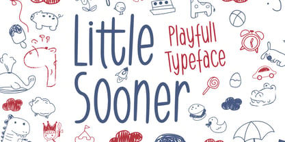 Little Sooner is a special handmade font using the Brush tool. This font is specially designed for children with a full-color style that will enhance the quality of your designs. very suitable for the design of children’s t-shirts, children’s youtube titles, children’s quotes, children’s web, and others.
 - Workbench by Graphicfresh,
$14.00 This font is great for magazine headlines, business cards, social media posts, and a variety of other applications. The text size is very flexible, with multiple font styles and sizing options that allow you to create the look you want without altering the overall design of your text.
 - Abdo Title by Abdo Fonts,
$49.50 Abdo Title is a simple Naskh font for newspaper and magazines discriminate accurately design and clarity of reading. Abdo Title is compatible with the various operation systems and modern software. We will later add the rest of the weights. This font also suitable for books titles and advertisement.
 - Spiced Cheese by PizzaDude.dk,
$20.00 Just like spiced cheese, this font has got a taste that makes the heavens sing! Even though the font is grafitti and comic inspired, the letters suits mostly everything with it's rugged and unpredictable look. Comes with multilingual support along with 5 contextual alternates that cycles AS you type!
 - Maxim by GroupType,
$19.00 Maxim was originally designed by Peter Schneidler in 1956 for the Bauer Type Foundry. This typeface is energetic and has the look and feel of a brush painted script. The FontHaus font studio released its revival version with added characters in 1994 and as an OpenType font in 2006.
 - Yolk by Monotype,
$31.99 Yolk is an Eggcentric Sans Serif Typeface consisting of nine weights in both roman and italic. Essentially, this is a geometric sans typeface that has been inspired by the shape and proportions of an egg. With its bottom-heavy glyphs, Yolk has an unusual personality – it’s not too awkward to be off-putting, and it’s not too uniform to be associated with the myriad of generic geometric sans fonts that are available. Yolk has a distinctive presence in its upright form, while the italics exude a more flamboyant nature. When combined, your typographic results will be pleasing and perhaps a little quirky too. This 18-font type family achieves a good balance of personality, versatility, and usability. Small Caps are available at the click of a button, then add Stylistic Set 1 to achieve Petite Caps. The petite caps harmonise with the regular lowercase forms, so that you can create unicase-style typography too. All Latin-based languages are covered within the 1000+ glyphs of each Yolk font. Key Features: • 18 font family – 9 weights in Roman and Italic • Small Caps, Petite Caps, with Proportional, Old Style, and Small Cap figures, plus Fractions, Numerators, Denominators, Superiors, and Inferiors • Full European character set (Latin Extended) • 1,000+ glyphs per font.
 - Jansina by Twinletter,
$15.00 Jansina is a Japanese-style display typeface with a unique shape that is ideal for making your project stand out in Japanese culture. This typeface will make all of your projects consist of a graphic presentation that fits and is precise, but it is not restricted to that. Logotypes, food banners, branding, brochure, posters, movie titles, book titles, quotes, and more may all benefit from this font. Of course, using this font in your various design projects will make them excellent and outstanding; many viewers are drawn to the striking and unusual graphic display. Start utilizing this typeface in your projects to make them stand out.
 - Market Square by Hanoded,
$12.00 I love markets, especially the farmer’s markets with fresh produce and home made cheese. Too bad I need to travel a long way to get to one, as there is only a ‘regular’ market in my hometown - you know, with cheap duvets, ‘local’ fruit like bananas and a guy selling books about the end of times. I thought it would be great to create a font family you could actually use on a market. Hence Market Square. Market Square consists of 4 different fonts (each with its own Italic style), ranging from a fat marker font to a thin, squarish font. Each of them oozes freshness and authenticity and they were designed to complement each other. The cherry on top is the cute doodle font, loaded with fresh produce and seafood - just like you’d see on a Market Square.
 - Phorfeit BRK Pro by CheapProFonts,
$10.00 Part futuristic + part rounded = totally psychedelic. This font is perfect for that 70s hippie look. I have totally redrawn the outlines, and redesigned a couple of glyphs that were too "mechanical". the slanted version has a 20 degree slant, and this speedier variant of Phorfeit BRK Pro is ready for use (for those who use software where you cannot slant the upright version yourself). ALL fonts from CheapProFonts have very extensive language support: They contain some unusual diacritic letters (some of which are contained in the Latin Extended-B Unicode block) supporting: Cornish, Filipino (Tagalog), Guarani, Luxembourgian, Malagasy, Romanian, Ulithian and Welsh. They also contain all glyphs in the Latin Extended-A Unicode block (which among others cover the Central European and Baltic areas) supporting: Afrikaans, Belarusian (Lacinka), Bosnian, Catalan, Chichewa, Croatian, Czech, Dutch, Esperanto, Greenlandic, Hungarian, Kashubian, Kurdish (Kurmanji), Latvian, Lithuanian, Maltese, Maori, Polish, Saami (Inari), Saami (North), Serbian (latin), Slovak(ian), Slovene, Sorbian (Lower), Sorbian (Upper), Turkish and Turkmen. And they of course contain all the usual "western" glyphs supporting: Albanian, Basque, Breton, Chamorro, Danish, Estonian, Faroese, Finnish, French, Frisian, Galican, German, Icelandic, Indonesian, Irish (Gaelic), Italian, Northern Sotho, Norwegian, Occitan, Portuguese, Rhaeto-Romance, Sami (Lule), Sami (South), Scots (Gaelic), Spanish, Swedish, Tswana, Walloon and Yapese.
 - Prismatic Spirals by MMC-TypEngine,
$93.00 PRISMATIC SPIRALS FONT! The Prismatic Spirals Font is a decorative type-system and ‘Assembling Game’, itself. Settled in squared pieces modules or tiles, embedded by unprecedented Intertwined Prismatic Structures Design, or intricate interlaced bars that may seem quite “impossible” to shape. Although it originated from the ‘Penrose Square’, it may not look totally as an Impossible Figures Type of Optical Illusions. More an “improbable” Effect in its intertwined Design, that even static can seem like a source of Kinetical Sculptures, or drive eyes into a kind of hypnosis. Prismatic Spirals has two related families, its “bold” braided version Prismatic Interlaces and the Pro version. While the default is simpler or easier to use, as all piece’s spin in same way, PRO provides a more complex intricate Design which requires typing alternating caps. Instructions: Use the Map Font Reference PDF as a guide to learn the 'tiles' position on the keyboard, then easily type and compose puzzle designs with this font! All alphanumeric keys are intuitive or easy to induce, you may easily memorize it all! Plus, often also need to consult it! *Find the Prismatic Spirals Font Map Reference Interactive PDF Here! (!) Is recommended to Print it to have the Reference in handy or just open the PDF while composing a design with this typeface to also copy and paste, when consulting is required or when it may be difficult to access, depending on the keyboard script or language. As a Tiles Type-System, the line gap space value is 0, this means that tiles line gaps are invisibly grouted, so the user can compose designs, row by row, descending to each following row by clicking Enter, same as line break, while advances on assembling characters. Background History: The first sketches of my Prismatic Knots or Spirals Designs dates back then from 2010, while started developing hand-drawn Celtic Knots and Geometric Drawings in grid paper, while engage to Typography, Sacred Geometry and the “Impossible Figures” genre… I started doing modulation tests from 2013, until around 2018, I got to unravel it in square modules or tiles from the grid, then idealized it as fonts, along with other Type projects. This took 13 years to come out since the first sketches and 6 months in edition. During the production process some additional tiles or missing pieces were thought of and added to the basic set, which firstly had only the borders, corners, crossings, nets, Trivets connectors or T parts and ends, then added with nets and borders integrations. Usage Suggestions: This type-system enables the user to ornate and generate endless decorative patterns, borders, labyrinthine designs, Mosaics, motifs, etc. It can seem just like a puzzle, but a much greater tool instead for higher purposes as to compose Enigmas and use seriously. As like also to write Real Text by assembling the key characters or pieces, this way you can literarily reproduce any Pixel Design or font to its Prismatic Spirals correspondent form, as Kufic Arabic script and further languages and compose messages easily… This Typeface was made to be contemplated, applied, and manufactured on Infinite Decorative Designs as Pavements, Tapestry, Frames, Prints, Fabrics, Bookplates, Coloring Books, Cards, covers or architectonic frontispieces, storefronts, and Jewelry, for example. Usage Tips: Notice that the line-height must be fixed to 100% or 1,0. In some cases, as on Microsoft Word for example, the line-height default is set to 1,15. So you’ll need to change to 1,0 plus remove space after paragraph, in the same dropdown menu on Paragraph section. Considering Word files too, since the text used for mapping the Designs, won't make any literal orthographical sense, the user must select to ignore the Spellcheck underlined in red, by clicking over each misspelled error or in revision, so it can be better appreciated. Also unfolding environments as Adobe Software’s, the Designer will use the character menu to set body size and line gap to same value, as a calculator to fit a layout for example of 1,000 pts high with 9 tiles high, both body size and line gap will be 111.1111 pts. Further Tips: Whenever an architect picks this decorative system to design pavements floor or walls, a printed instruction version of the layout using the ‘map’ font may be helpful and required to the masons that will lay the tiles, to place the pieces and its directions in the right way. Regarding to export PNGs images in Software’s for layered Typesetting as Adobe Illustrator a final procedure may be required, once the designs are done and can be backup it, expanding and applying merge filter, will remove a few possible line glitches and be perfected. Technical Specifications: With 8 styles and 4 subfamilies with 2 complementary weights each (Regular and Bold) therefore, Original Contour, Filled, Decor, with reticle’s decorations and 2 Map fonts with key captions. *All fonts match perfectly when central pasted for layered typesetting. All fonts have 106 glyphs, in which 48 are different keys repeated twice in both caps and shift, plus few more that were repeated for facilitating. It was settled this way in order for exchanging with Prismatic Spirals Pro font which has 96 different keys or 2 versions of each. Concerning tiles manufacturing and Printed Products as stickers or Stencils, any of its repeated pieces was measured and just rotated in different directions in each key, so when sided by other pieces in any direction will fit perfectly without mispatching errors. Copyright Disclaimer: The Font Software’s are protected by Copyright and its licenses grant the user the right to design, apply contours, plus print and manufacture in flat 2D planes only. In case of the advent of the same structures and set of pieces built in 3D Solid form, Font licenses will not be valid or authorized for casting it. © 2023 André T. A. Corrêa “Dr. Andréground” & MMC-TypEngine.
 - Crystal Palace - Unknown license

- Antique Shadow by Wooden Type Fonts,
$15.00A modified remake of one of the popular wooden type fonts of the 19th century. This is an extra bold, shadowed, sans serif suitable for display. - Krakow MF by Masterfont,
$59.00 Inspired by old engraving and tombstones in the Synagogue in the Jewish quarter in Krakow. This font contains lots of ligatures (well supported by Adobe Apps).
 - PAG Club by Prop-a-ganda,
$19.99Prop-a-ganda offers retro-flavored fonts inspired by lettering on retro propaganda posters, retro advertising posters, retro packages all the world over. This is perfect font for your retrospective project. PAG Club is a condensed font with a funny and retro character. The features of the typeface is in unusual figures of unbalanced characters. Ideal font to all kinds of retro design project. - Bedontes by Aminmario Studio,
$20.00 Bedontes is an unique handwritten brush font. Created with brush pen to give a great contrast between thick and thin curves. Drawn, Scanned & Vectorized from paper to screen. I wanted to create an authentic brush typeface leaving the texture and imperfections the way they are, but perfect for any awesome project that need hand writing taste. Comes with regular and italic, also support multilingual. This is suitable for branding, header, quotes, invitations, stationery, wedding design, logos, watermarks on photography, signatures, advertisement, album covers, business cards, clothing, magazines, posters, and more! Thanks for checking out this font. I hope you enjoy it!
 - Mix Basic by Mix Fonts,
$13.00 Mix Basic is just your basic everyday handwriting. This was written initially on a post-it using a fine tip Frixion pen. The font was then digitized, cleaned up, and converted into a font. Since this is basically your everyday handwriting, it has a multitude of creative applications. Think label design, greeting cards, social media quotes, handwritten notes replication, and more. Use as you please! Mix Basic includes the following characters: ABCDEFGHIJKLMNOPQRSTUVWXYZ abcdefghijklmnopqrstuvwxyz 0123456789 !@$#%^&*()`~•· ÷×+−±≈=≠≥≤[]<>:;’”,.\|/?{}“”‘’-–—_…©®‹›«»°¹²³¡¿₱¢€£¥§† ÁÀÂÄÃÅĂĀĄÆĆĈČÇÐĐÉÈÊËĖĒĘĜĤIÍÌÎÏĪĮĴŁŃÑŇ ÓÒÔÖÕŌŐØŒŔŘŚŜŠȘŤȚÚÙÛÜŮŰŬŪŲẂẀŴÝŶŸŹẐŽŻÞ áàâäãåăāąæćĉčçðđéèêëėēęĝĥıíìîïīįĵłńñň óòôöõōőøœŕřśŝšșťțúùûüůűŭūųẃẁŵýŷÿźẑžżþ Alternates/Ligatures for: & R a e i m o u y ee mm nn oo rr tt
 - Heanffe by Letterara,
$12.00 Heanffe is a one-of-a-kind handwritten font with a beautiful feel. To maintain a true, hand lettered experience, this font includes the following ligatures: Alu, at, ch, dd, ee, ff, ll, oo, pp, ss, tt, ef, es, et, eth, ily, it, ith, om, ot, on, ou, ont, th, ov, ow, sh, st, ut, zz Just use your imagination, your project will become more alive and look Elegant than ever with one of the Heanffe font. Feel free to play with all the whole alternates! Heanffe also includes full set of uppercase and lowercase letters, multilingual symbols, numerals, punctuation. The font has smooth wet ink texture, so would be perfect for all designs. You can make a greeting card or a package design, or even a brand identity, craft design, any DIY project, book title, wedding invitation, identity card, packaging, Website or any purpose to make your art / design project look pretty and trendy.
 - Papercute Inline by S&C Type,
$9.00 Papercute Inline is a cute layered hand-drawn font designed by Fanny Coulez & Julien Saurin in Paris. Inspired by paper cutting, this font is easy to read, and easy to play with 8 different styles, including 3D, outline, full or dotted line, that you can use alone or together. To do so, you can simply superimpose them with a compatible software like Photoshop, then choose a color for each, making your works charming and unique. This font, finely designed for cards, book titles, headlines or any artworks is the Inline version of Papercute . Just click on our foundry name to see it! You could follow us on our Instagram: instagram.com/sc.type We hope you will enjoy our work. Merci beaucoup!
 - 1863 Gettysburg by GLC,
$38.00 This script font was inspired by a lot of autographs, notes and drafts, written by President Abraham Lincoln, mainly the Gettysburg address, first draft and copies, but also the emancipation proclamation. It is an attempt to offer a typical manual script from this American period, not to propose the exact writing from A. Lincoln himself. This font is a little fat and monotone, maybe Abraham Lincoln used a smooth or rounded pen, but some letters I have consulted were written obviously with a sharp one, so, in the future, I will certainly produce a slim version of this font. It is used as variously as web-site titles, posters and fliers design or greeting cards, all various sorts of presentations, menus, certificates, letters. This font supports enlargement as well as small size, though the original size was about 18 to 24 pts. When printed, it remain perfectly legible from 10 to 12 pts.
