10,000 search results
(0.039 seconds)
- Anti by Type Firm,
$39.99 If we look up the definition of the word "grotesque", we find the following: "Odd or unnatural in shape, appearance, or character; fantastically ugly or absurd; bizarre." Following this definition, the design for Anti aims to create an un-compromised version of a grotesque sans-serif – where decorative details live in balance with brutalist shapes. The result is an alphabet with a slightly modernist feeling and an eccentric touch, that work wonders at small sizes. The typeface comes with four weights – light to bold – and features a character set supporting Central and Eastern European as well as Western European languages.
 - Troika by ArtyType,
$24.00 Naming this typeface Troika, the Russian word meaning "group of three", seemed apt because the starting point in this design process was a three sided letter 'O'. This triangular type styling became a template guide for the rest of the character set. Troika is a highly distinctive, ultra modern typeface with idiosyncratic letterforms that make for striking headlines, particularly at large display sizes. Challenging, futuristic and experimental, always unique, and with caps as characterful as the lower case. Troika being derived from the French 'Triangle' and the Latin 'Triangulus' it seemed only fitting to design three weights: Light, Medium & Bold.
 - FF Olsen by FontFont,
$65.99 Danish type designer Morten Olsen created this serif and slab FontFont in 2001. The family has 6 weights, ranging from Light to Bold (including italics) and is ideally suited for advertising and packaging, book text, editorial and publishing, logo, branding and creative industries, poster and billboards as well as web and screen design. FF Olsen provides advanced typographical support with features such as ligatures, small capitals, alternate characters, case-sensitive forms, fractions, and super- and subscript characters. It comes with a complete range of figure set options – oldstyle and lining figures, each in tabular and proportional widths.
 - Le Havre Rounded by insigne,
$24.99 The Le Havre series is a series of geometric sans serifs inspired by the dignified era of the passenger ship, when getting to your destination was a delight in and of itself. Le Havre Rounded is a fun and new interpretation of geometric sans serifs. Le Havre Rounded features its sister family's compressed capitals, low x-height and geometric construction, and its rounded forms lend it to be used in contemporary and technology settings. Le Havre OpenType features include twenty five alternate characters, ligatures and old style figures. The Le Havre family includes a spectrum of weights for many design options.
 - Paestum by Three Islands Press,
$24.00Paestum is a Latin typeface inspired by Greek inscriptions of the 6th and 5th centuries B.C. Its name comes, suitably, from the Latin name for Poseidonia, a former Greek city south of Naples whose two remaining Doric temples have been on antiquities tours since at least the 1700s. Others have scanned this terrain before, of course, but earlier designs failed to supply a lower case. Although Paestum includes complete upper- and lowercase alphabets, diacritics, numerals, and essential punctuation, it does not have many unhistorical glyphs -- such as currency symbols and the @ sign. Paestum comes with three weights: light, medium, and heavy. - Vikive by Eurotypo,
$23.00 Vikive is a family of Sans Serif fonts, better known in its origins as "Gothic" in America or "Grotesque" in Europe. Some authors divide them into three categories: Grotesque, Geometric and Humanistic. Probably, it can be defined that Vikive has some characteristics of the first two: Grotesque and Geometric, high x-height, slight squareness of the curves, wide set, open tail, simple construction. The family concept provides several weights and widths for one face and its matching italics, therefore this family of types is more suitable for text settings, enriched with strong contrast fonts (condensed thin or expanded black) for headlines.
 - Graphemic by Picatype,
$18.00 Inspired by the medieval print design, the look of the sans serif typeface is strong and beautiful. It brings charming curves and satisfying patterns to traditional thick fonts. I like to use this font for printed material and titles - the height attracts attention and creates a visually attractive modern medieval feel. Graphemic fonts include two fonts - Regular and Light. Graphemic offers broad language support, upper and lower case letters, extended numbers and punctuation. Specifically suitable for: Posters, Blockbusters, films, trailers, headlines, titles, logos, branding, scripts, display & bold 'goods'. Thank you for viewing! (and more thanks for the purchase)
 - Core Gothic M by S-Core,
$72.00 Core Gothic M is a simple and modern sans-serif Korean font consists of 7 weights (Light, Regular, Medium, Bold, ExtraBold, Heavy & Black). Character set is consist of Korean 11,172 characters, Hirakana & Katakana, Latin and Korean symbols. It is well balenced between Korean and Latin characters. Latin typeface (Core Sans M) was adjusted to be matched with korean typeface. Spaces between individual letter forms are adjusted in detail so that it makes perfect typesetting. Supported codepages are MS Windows 1252 Latin1 and MS Windows 949 Korean. We recommend to use for books, web, screen displays and so on.
 - NorB Pen Cased by NorFonts,
$28.00 This is the Cased version of my NorB Pen fonts are being inspired from Arial Round font, I use this font regularly in my jazz lead-sheets. It's a handwritten text font emulating marker permanent pen. You can use this font with any word processing program for text and display use, print and web projects, apps and comic books, graphic identities, branding, editorial, advertising, scrapbooking, cards and invitations and any casual lettering purpose… or even just for fun! Pen cased font8 weights, each with their matching italics and in a Light, Normal, Bold and Heavy version.
 - Torus by Monotype,
$25.99 Torus is a simple, rounded monoline typeface that has been designed specifically for logo design, headlines and branding purposes. While the default character set is distinctive in its own right, graphic designers will love playing with the numerous alternate glyphs that will help them create unique wordmarks and logo designs. Torus’ simplistic forms and soft terminals make this a lovely, warm typeface perfect for a multitude of typographic applications. Please also consider: Torus Variations (2018) Torus Pro (2021) Key features: 6 weights 49 Alternates (via 2 Stylistic Sets) Full European character set (Latin) 550+ glyphs per font.
 - FF Letter Gothic Mono by FontFont,
$62.99 Italian type designer Albert Pinggera created this sans FontFont in 1998. The family has 6 weights, ranging from Light to Bold (including italics) and is ideally suited for editorial and publishing, logo, branding and creative industries as well as software and gaming. FF Letter Gothic Mono provides advanced typographical support with features such as ligatures, alternate characters, case-sensitive forms, super- and subscript characters, and stylistic alternates. It comes with tabular oldstyle and tabular lining figures. This FontFont is a member of the FF Letter Gothic super family, which also includes FF Letter Gothic Slang and FF Letter Gothic Text.
 - Barnstormer Script by Dear Alison,
$29.00 Have you ever wondered why sign painter scripts, even though they can sometimes be filled with unusual letterforms strike up such a personal connection of familiarity? Is it the weight of the brushstrokes, or is it the quick fluidity of the strokes? Whatever the reason, a sign painter script just has personality! Barnstormer Script taps into that association and brings a speedy sassiness reminiscent of retro travel brochures and appliance advertisements. But for whatever you might need this script for, you'll find it up for the task. Add a little flavor to your font collection and pick up Barnstormer Script today!
 - Neubau by TipografiaRamis,
$29.00 Neubau is a condensed geometric display typeface, designed in 2009. The inspiration for this face came from Joost Schmidt lowercase letters developed during 1925-28 in Bauhaus Dessau. Schmidt was one of the proponents of New Typography – a movement advocating the use of only lowercase letters which were constructed strictly geometrically using only ruler and compass. Neubau family consists of two subfamilies - Neubau Sans and Neubau Serif, each of them in three weights - light, regular and bold. Neubau typeface is recommended for use as a display font, and has been generated in a single OpenType format with Western CP1252 character set.
 - Core Gothic D by S-Core,
$72.00 Core Gothic D is a simple and modern sans-serif Korean font consists of 9 weights (Thin, ExtraLight, Light, Regular, Medium, Bold, ExtraBold, Heavy & Black). Character set is consist of Korean 11,172 characters, Hirakana & Katakana, Latin and Korean symbols. It is well balenced between Korean and Latin characters. Latin typeface (Core Sans D) was adjusted to be matched with korean typeface. Spaces between individual letter forms are adjusted in detail so that it makes perfect typesetting. Supported codepages are MS Windows 1252 Latin1 and MS Windows 949 Korean. We recommend to use for books, web, screen displays and so on.
 - Neue Frutiger Vietnamese by Linotype,
$29.00 Neue Frutiger Vietnamese''' was developed by a team of designers and font engineers from the Monotype Studio under the direction of Monotype type director Akira Kobayashi. The family is available in 10 weights from Ultra Light to Extra Black, with matching italics. Neue Frutiger Vietnamese embodies the same warmth and clarity as Adrian Frutiger's original design, but allows brands to maintain their visual identity, and communicate with a consistent tone of voice, regardless of the language. It is part of the Neue Frutiger World collection, offering linguistic versatility across environments – suited to branding and corporate identity, advertising, signage, wayfinding, print, and digital environments.
 - Ainda by Resistenza,
$45.00 We always had a crush for multilinear fonts and a great love story with script types. So we decided to bring them together and create Ainda. A new multiline script font based on and English copperplate skeleton. A modern approach to classic flourished scripts, designed with a slanted angle that gives dynamism and creates a ribbon effect when the lines come together in the connections, adding depth and perspective. Ainda family includes 2 weights, Regular & Bold. This Display font will light your layout with a contemporary and elegant flair. Highly recommend to use it on big sizes.
 - Merel by Inhouse Type,
$33.78 Merel is a modern geometric typeface with humanist attributes. Geometry and logic are at the heart of this 6 weight font family. Humanist touches give it a number of distinctive characteristics, as well as aid legibility. Despite being rational and function driven in its nature, Merel has a soft and gentle touch. It was designed to tackle both print and onscreen challenges of the modern environment. Details include reduced x-height, mild stroke contrast and vertically sheared terminals with cushioned finish across the typeface. Merel features a number of alternative characters, manually edited kerning and Opentype features.
 - Kopitha by Ekahermawan,
$15.00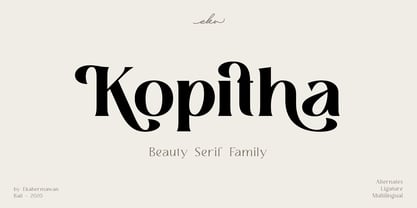 Kopitha is a beauty serif family with 5 weights from Light to ExtraBold. Kopitha also includes alternate characters (PUA Encoded) and ligatures to give you a wide range for create an unique typographic design results. Kopitha is suitable font for many different projects such as logo, branding, poster, magazines, label, merchandise, invitation, presentation, advertising, quotes and so much more! FEATURES: OpenType support Playfull to use (with ligatures and alternates options) Multilingual support PUA Encoded If you need support or more information about this item please kindly contact me : ekahermawanputu@gmail.com Thank you so much I really hope you enjoy when using it!
 - FF Legato by FontFont,
$68.99 Dutch type designer Evert Bloemsma created this sans FontFont in 2004. The family has 8 weights, ranging from Light to Bold (including italics) and is ideally suited for book text, editorial and publishing, logo, branding and creative industries as well as small text. FF Legato provides advanced typographical support with features such as ligatures, small capitals, alternate characters, case-sensitive forms, fractions, and super- and subscript characters. It comes with a complete range of figure set options – oldstyle and lining figures, each in tabular and proportional widths. In 2011, FF Legato received the Letter.2 award.
 - Aulas by Eurotypo,
$48.00 Aulas's design is inspired by an ancient Roman lettering. This font is characterised by the strength and weight of its glyphs, in addition to its predominant height of "x", as well as the ascending and descending, with particularly short strokes. Aulas includes more than 200 alternative glyphs (swashes, stylistics sets, stylistics alternates), more than 70 ligatures, and a set of more than 30 ornaments, very easy to combine with the rest of the letters. This font offers good readability for use in editorial design, magazines, newsletters, and print. The strong personality of its glyphs is well suited to headlines.
 - VLNL Breakz by VetteLetters,
$35.00 Donald DBXL Beekman needed a break. And he took it too. While sitting there consuming a sandwich and a half-pint of milk, he took up his ruler and pencil. By the time there was no milk left and only some bread crumbs remained on his plate, VLNL Breakz was finished. That’s DBXL for you. Get your letters during your break. VLNL Breakz was originally designed as the headline and logo font for the breakdance competition Amsterdam Breakz, but turned out to be very versatile. It has 4 variations, Regular and Condensed widths / Bold and Light weights.
 - Mitra by Linotype,
$187.99Mitra is a modern Arabic text typeface with two weights: Mitra Light and Mitra Bold. Both of the fonts include Latin glyphs (from Optima Medium and Optima Bold, respectively) inside the font files, allowing a single font to set text in both most Western European and Arabic languages. The two Mitra fonts incorporate the Basic Latin character set (Western CP 1252 Latin 1/ANSI and Macintosh US Roman) and the Arabic character set (CP 1256), which supports Arabic, Persian, and Urdu. They include tabular and proportional Arabic, Persian, and Urdu numerals, as well as a set of tabular European (Latin) numerals. - FF Suhmo by FontFont,
$68.99 German type designer Alex Rütten created this serif and slab FontFont in 2010. The family has 8 weights, ranging from Light to Black (including italics) and is ideally suited for advertising and packaging, film and tv, editorial and publishing, logo, branding and creative industries as well as web and screen design. FF Suhmo provides advanced typographical support with features such as ligatures, small capitals, alternate characters, case-sensitive forms, fractions, and super- and subscript characters. It comes with a complete range of figure set options – oldstyle and lining figures, each in tabular and proportional widths. In 2011, FF Suhmo received the TDC2 award.
 - Ivoor by Cloveron Media,
$18.00 Meet Ivoor, a new sans serif typeface of the 21st century. It has distinct letter accents and comes with beautiful ligatures. It's a very versatile font that works as standalone or paired with other fonts. It is a great design choice for branding, logo, labels, packaging, magazine headers & so much more. Features: Weights - Regular & Bold Lowercase & Uppercase Classy Ligatures Numerals & Punctuation Multilingual Characters In .otf file Language Support: Western Europe Follow my shop for upcoming updates and new products that you might be interested in next time. Please message me for any suggestions and support. I would like to hear it. Thank you!
 - Bandera by AndrijType,
$21.00 This square serif typeface is a real workhorse. It is a modern tool for text design: extremely legible and well shaped. Bandera has six weights with original italics. It catches attention in headlines of posters and magazines or makes reading comfortable in plain texts. Bandera shares main proportions with sans serif Osnova Pro typefamily so ideally can pair it. It has Bandera Text and Bandera Display sister families as well. Please check also Pro version for pan-european support (full Latin-Greek-Cyrillic). Bandera is Spanish for ‘flag’. And Bandera is a symbol of Ukrainian fighting for freedom for many years.
 - Lark by Shana Hu,
$20.00 Lark is a modern calligraphic sans inspired by a rich history of broad-edge and translation contrast calligraphy. By combining its sharp geometry with flared curves, Lark exhibits a nice warmth as a display face. Lark was initially conceived as a final project as part of the Type@Cooper West Extended Program's post-graduate certificate program in typeface design, so its journey has benefitted from routine feedback from experienced typeface designers. Comes in Bold, Medium, Regular, and Light weights for both roman and italic, and supports multiple languages including Danish, Dutch, English, French, German, Italian, Portuguese, Spanish, Swedish, and more.
 - Elongated Roman by Red Rooster Collection,
$45.00 Elongated Roman is a Didone-style serif typeface. It was originally designed in 1950 by typographers at Stephenson Blake. After International TypeFounders, Inc. acquired exclusive licensing rights to the Stephenson Blake Collection, Steve Jackaman (ITF) digitally revived the typeface in 1997 for the Red Rooster Collection. Much like other Didone typefaces, Elongated Roman’s strong contrast between thick and thin strokes and hairline serif design strengthen its elegance as a “modern face.” Unlike other Didone typefaces in the Red Rooster Collection, Elongated Roman was designed with display size in mind thanks to its strong variance in stroke weight.
 - Gaspo Slab by Latinotype,
$26.00 Gaspo Slab is a fresh slab serif typeface that features esthetically pleasing curves, strong serifs, ample counters, humanist proportions and ink traps. The result is a very functional font with a contemporary design and highly readable at small sizes. Gaspo Slab consists of 7 weights, from Ultra Light to Black, with matching italics. This family comes with a 434-character set that includes European diacritics, tabular figures, alternative characters, numerators and fractions, making it possible to use the font in 128 different languages. The font is well-suited for headlines, medium-length text, magazines, newspapers, advertising, corporate use and product design.
 - SK Fencer by Shriftovik,
$10.00 SK Fencer™ is a typeface inspired by the fine art of fencing. Its light linear features contrast with the angular thicknesses, creating a unique image of the font and influencing its behavior in the line. Using alternative uppercase characters, you can implement a lot of typographic ideas that will decorate your design. A large selection of weights will also be a great help in your work. The SK Fencer typeface is suitable for both headers and small text arrays, and its widest set of glyphs supports both extended Latin, Cyrillic and many other languages. SK Fencer – elegant, practical, dynamic, unusual!
 - Ariom Sans by S6 Foundry,
$25.00 Ariom is a fresh, geometric, sans-serif font family inspired by iconic typefaces. Ariom has a big x-height value, geometrical letterforms, sharp edges, and strong stroke contrast as the neo-grotesque fonts from the 20th Century. The typeface is versatile and can be successfully used in magazines, posters, branding, websites, headlines, large-format prints, brand identities, social media, advertising, editorial design, posters. The family contains over 40 alternative glyphs and over 50 ligatures in each style. The family comes in 3 weights with their corespondent italics. The family Latin supports Western, Central, South Eastern, South American, Oceanian, Pan African, Vietnamese, and Sámi.
 - Neue Frutiger Arabic by Linotype,
$79.00 Neue Frutiger Arabic was created by Nadine Chahine and a team of designers and font engineers from the Monotype Studio, under the direction of Monotype type director Akira Kobayashi. The family is available in 10 weights from Ultra Light to Extra Black. Neue Frutiger Arabic embodies the same warmth and clarity as Adrian Frutiger's original design, but allows brands to maintain their visual identity, and communicate with a consistent tone of voice, regardless of the language. It is part of the Neue Frutiger World collection, offering linguistic versatility across environments – suited to branding and corporate identity, advertising, signage, wayfinding, print, and digital environments.
 - CamingoSlab by Jan Fromm,
$45.00 A sturdy and solid presence, CamingoSlab is defined by its heavy serifs, low stroke contrast and elliptic curves. Yet it retains a light touch, and feels vivid and friendly, thanks to the humanistic tone that derives more from handwriting than from strict construction. Special attention has been paid to compatibility with the other members of the Camingo series — With their consistent line heights, an equal grey value and the same formal language it can be seamlessly combined with CamingoDos and CamingoMono. CamingoSlab comes with a Pro version that contains small caps, ligatures, 10 different figure sets, stylistic alternates and two sets of arrows.
 - FF OCR-F by FontFont,
$68.99 German type designer Albert-Jan Pool created this sans FontFont in 1995. The family contains 3 weights: Light, Regular, and Bold and is ideally suited for film and tv, small text as well as software and gaming. FF OCR-F provides advanced typographical support with features such as ligatures, alternate characters, case-sensitive forms, fractions, super- and subscript characters, and stylistic alternates. It comes with a complete range of figure set options – oldstyle and lining figures, each in tabular and proportional widths. As well as Latin-based languages, the typeface family also supports the Cyrillic writing system.
 - Linotype Sketch by Linotype,
$29.99 Linotype Sketch is part of the Take Type Library, chosen from the contestants of Linotype’s International Digital Type Design Contests of 1994 and 1997. German designer Dieter Kurz gave his display font a calligraphic character. The forms lean slightly to the right and have a spontaneous and individual look. This light, cheerful font also displays a harmony among the forms and gives text a personal touch. Linotype Sketch combines well with modern text fonts which have the same narrow proportions. This font is well-suited for headlines and short and middle length texts with point size 12 or larger.
 - Bigante by Vibrant Types,
$29.00 Bigante is a big, giant superfamily with two variants: Solid and Inline, offering six weights and seven widths. Its constructed design interprets rounded corners as three 30° angles, resulting in edged terminals and twelve-sided dots. While it sounds functional, this rounded-like semi-serif enhances the appearance, creating a friendly aesthetic. The lowercase alphabet features a high x-height. For versatile use in display and advertising, the multitude of fonts enables flexibility. Captivating with a linear structure, it associates with modern architecture, tactical sports, space travel, and futuristic technology. The character set of 780 glyphs supports 410 Latin languages.
 - Pacaembu by Naipe Foundry,
$60.00 Pacaembu is a sans serif typeface that finds its roots in Brazilian football. This seven weight family began as a study of the stone lettering found in the Paulo Machado de Carvalho Municipal Stadium, affectionately known as the Estádio Pacaembu, a real gem of the Art-Deco style inaugurated in 1940. These art-deco letters, like football itself, were brought to Brazil by Europeans and out there in the tropics found a totally unique personality. Pacaembu is a celebration of Brazilian Football, it’s unique flavours, moves, sights and colors which have been delighting fans for generations.
 - FF Letter Gothic Slang by FontFont,
$41.99 American type designer Susanna Dulkinys created this display and sans FontFont in 1999. The family has 6 weights, ranging from Light to Bold and is ideally suited for festive occasions and music and nightlife. FF Letter Gothic Slang provides advanced typographical support with features such as ligatures, alternate characters, case-sensitive forms, and stylistic alternates. It comes with a complete range of figure set options – oldstyle and lining figures, each in tabular and proportional widths. This FontFont is a member of the FF Letter Gothic super family, which also includes FF Letter Gothic Mono and FF Letter Gothic Text.
 - Kuoros VP by VP Creative Shop,
$20.00 Introducing Kuoros Serif typeface - 5 fonts Kuoros is classic, sophisticated typeface with 5 weights to enchant your next project. Very versatile fonts that works great in large and small sizes. Basic latin and advanced latin character sets are supported! Kuoros is perfect for branding projects, home-ware designs, product packaging, magazine headers - or simply as a stylish text overlay to any background image. Uppercase, lowercase, numeral, punctuation & Symbol Hairline Light Regular Bold Black Ligatures Multilingual support Feel free to contact me if you have any questions! Mock ups and backgrounds used are not included. Thank you! Enjoy!
 - Core Gothic N by S-Core,
$72.00 Core Gothic N is a simple and modern sans-serif Korean font consists of 9 weights (Thin, ExtraLight, Light, Regular, Medium, Bold, ExtraBold, Heavy & Black). Character set is consist of Korean 11,172 characters, Hirakana & Katakana, Latin and Korean symbols. It is well balenced between Korean and Latin characters. Latin typeface (Core Sans N) was adjusted to be matched with korean typeface. Spaces between individual letter forms are adjusted in detail so that it makes perfect typesetting. Supported codepages are MS Windows 1252 Latin1 and MS Windows 949 Korean. We recommend to use for books, web, screen displays and so on.
 - Miegha by Dora Typefoundry,
$18.00 Miegha is a serif typeface inspired by the beauty of classic serif and calligraphy styles, Both upright and italic fonts blend with modern appeal and unique binding, high contrast and light weight font perfect for feminine logo signs, fashion heads & editorial designs, branding projects , Apparel Branding, packaging, magazine titles, advertisements, T-shirts, postcards and more. Here's what's included: · Alternates & Ligatures · Numbers & punctuation · Characters with accents · Supports Multiple Languages · PUA Encoded This type of family has become the work of true love, making it as easy and fun as possible. I really hope you enjoy it! Thank You!