10,000 search results
(0.033 seconds)
- Mix Sonic by Mix Fonts,
$13.00 MIX SONIC is a font pair inspired by the night sky. You get a round, bouncy and plump decorative san serif in MIX SONIC MOON and an all-uppercase and moon and stars dingbat hybrid in MIX SONIC STAR. The shapes of these glyphs capture the various phases of the moon, and how it lights up eerily lights up the night sky at each phase. MIX SONIC MOON and MIX SONIC STAR are great additions to your font collection. Make it a go-to font for all your projects of the mystic, astrology, magic, zodiac, elemental, witchcraft or divine variety. Use together, or separately, both font sets are sure to delight! MIX SONIC MOON comes with the following glyphs: ABCDEFGHIJKLMNOPQRSTUVWXYZ abcdefghijklmnopqrstuvwxyz 0123456789 !@#$%^&*()`~♥♥✿•· ÷×+−±≈=≠≥≤[]<>:;’”,.\|/?{}“”‘’-–—_… ©®™‹›«»°¹²³ªº¡¿₱¢€£¥½¼¾¶§№† ÁÀÂÄÃÅĂĀĄÆĆĈČÇÐĐÉÈÊËĖĒĘĜĤIÍÌÎÏĪĮĴŁŃÑŇÓÒÔÖÕŌŐ ØŒŔŘŚŜŠŞȘŤȚÚÙÛÜŮŰŬŪŲẂẀŴÝŶŸŹẐŽŻÞẞ áàâäãåăāąæćĉčçðđéèêëėēęĝĥıíìîïīįĵłńñňóòôöõōő øœŕřśŝšşșťțúùûüůűŭūųẃẁŵýŷÿźẑžżþß MIX SONIC STAR comes with the following glyphs: ABCDEFGHIJKLMNOPQRSTUVWXYZ abcdefghijklmnopqrstu-vwxyz 0123456789 !@#$%^&*()`~+= []<>:;’”,.\|/?{}“”‘’-_‹›₱¢€£¥ Fellow witches, enjoy!
 - Scripta Pro by John Moore Type Foundry,
$54.00 Scripta is a family of typefaces that leads "Scripta Pro", a commercial script writing similar to those used in ads advertising the decades 40 and 50, with fine lettering combinations of that time, Scripta Pro is ideal for composing headlines and subheads and this is supplied in two weights. This system is complemented by a Roman Sans "Scripta Gothic" an artdeco style typeface to harmonize with the style of that fonts. To add style to set fonts, created "Scripta Icons", one dingbats font based on a series of graphs that help recreate the ornamental fantasies of a postwar generation, a society in transition between the classical world and ornament and promises of a cosmic and atomic world. For those wishing to use words made was created "Scripta Catchwords". "Scripta Pro" is a script typeface inspired by the style works of the american typeface designer LH Copeland.
 - Core Sans E by S-Core,
$29.00 The Core Sans E family is part of the Core Sans series, such as Core Sans N, Core Sans M, Core Sans A, Core Sans G and Core Sans D. This is a modernized, grotesque font family with horizontal terminals, low-stroke contrast, enclosed apertures and little-line-width variation. Its tall x-height makes the text legible; and the spaces between individual letter forms are precisely adjusted to create the perfect typesetting. The Core Sans E family consists of 9 weights, from Thin to Black with italics. It supports WGL4, which provides a wide range of character sets—Greek, Cyrillic, and Central and Eastern European characters. Each font includes support for tabular numbers, arrows, mathematical operators, and OpenType features (such as proportional figures, numerators, denominators, subscript, superscript, scientific inferiors, fractions, case features, and standard ligatures). We highly recommend it for use in books, web pages, screen displays, and so on.
 - Montecatini Pro by Louise Fili Ltd,
$35.00 Montecatini takes its cues from the elegant Stile Liberty travel posters of Italy in the early 1900s. In its successful first release by Louise Fili Ltd in 2017, the typeface introduced distinctive ligatures typical of the time when Art Nouveau emerged as a worldwide phenomenon. Now Montecatini has been expanded into 24 alluring styles, spanning 6 weights and 4 widths. With the addition of these new styles, Montecatini has a dynamic capacity for comprehensive use and pairing. Everything looks better in Montecatini, from book jackets to monograms to packaging and logos—and the wide selection of ligatures, weights, and widths makes copyfitting a delight. Montecatini Pro’s ligatures are setup as contextual alternates. If you would like to try out Montecatini Pro’s ligatures or learn more about the font, please visit: https://www.louisefili.com/montecatini-pro
 - Chaotic Neutral by Missy Meyer,
$12.00 I'm letting my inner nerd show through on this one: "Chaotic Neutral" is a Dungeons & Dragons thing. But the name applies to this font, too! Chaotic: This font has all sorts of built-in irregularities. Some variation in letter heights and letter widths, and the stroke widths are all over the place. It's all about the hand-written messiness. Neutral: And yet! I've smoothed the strokes a bit, and gone for as few nodes on each letter as I can (while still keeping a bit of roughness), so this font can be used for any kind of purpose -- not just print, but cutting out as well! Chaotic Neutral also comes with over 300 extended Latin characters for language support, and is fully PUA-encoded for easy access no matter what program you're using.
 - Thinpaw by upirTYPO,
$4.00 Thinpaw is a serif handwritten font perfect for usage in a really big sizes (50 pt+). The stem width is about 0.5 mm (0.019") in 100 pt size. The font comes with central european character set and a set of various glyphs and icons (see preview images). Opentype features: - Standard ligatures - fi, fl, ff - Discretionary Ligatures - ft, fb, fh, fk, fj - Contextual Alternates - a, e, f, g - Stylistic set 01: A Stylistic set 01 changes every dot into the heart shape symbol. It turns every writing into a nice looking love letter! Thinpaw is perfect for wedding proposals, wedding invitations, happy birthday cards or anything personal. For usage on the computer screen, the stem width is about 1 pixel for 50 pt size, and 2 pixel for 100 pt size.
 - Tusker Grotesk by Lewis McGuffie Type,
$35.00 Tusker Grotesk is a headline typeface designed for robust and high-impact use. The initial inspiration for Tusker came from postwar typefaces like Haettenschweiler, Impact and Helvetica Inserat which use very high x-heights. Other influences in the condensed end of the Tusker family are old grotesques like Folio Extra Condensed and Stephenson Blake Elongated Sans No.1 with their flat terminals and closed-up apertures. Then as the widths in Tusker grow, the lettering takes some more inspiration from gothic style sans such as Inland Type's Title Gothic No.8, while maintaining the optical weight established in the narrow end of the family. Each width set is duplexed, stackable and is ideal for headlines, logos and bold attention-grabbing editorial design. Tusker has extended latin coverage ideal for western, central and eastern European languages.
 - FF Fago Monospaced by FontFont,
$67.99 FF Fago Thanks to his many years of involvement in major corporate type projects, Ole Schäfer had the necessary resources from which to construct his FF Fago™. The result is an extended family that provides comprehensive typographic support and whose qualities come to the fore in all relevant contexts ? from print to office through internet and wayfinding systems. FF Fago The sizable x-height together with the generous and open design of the characters ensure that the sans serif Fago remains clearly legible even in small point sizes or in potentially difficult situations, such as on wayfinding systems. A subtle contrast in line weight and letter forms that are reminiscent of those of an antiqua typeface provide the font with a restrained yet friendly and lively tone. Available in five weights, each with three different kerning widths and matching genuine italic variants, FF Fago is equipped for practically every situation. There are also small caps, oldstyle and lining figures, a selection of ligatures and geometric symbols. The range of potential applications of this universal font is almost inexhaustible ? it can be used in packaging design, on signs, posters and even for setting longer text sections. Fago is the ideal partner for those working on major corporate projects! FF Fago Correspondence Sans und Correspondence SerifThe Correspondence versions of Fago have been optimized for use in the business environment and in office communication. The carefully modified characters have a particularly robust feel, so that the clear, easily differentiated glyphs allow for straightforward communication even on screen. With these aims in mind, Schäfer has not only adjusted the x-height, but has provided certain letters in the sans variant ? such as the lowercase "i", the "r" and the uppercase "I" ? with serifs. Correspondence Serif, on the other hand, has been conceived as a slab serif throughout and in appearance has the look of the letters produced by the old office typewriting machines. An individual note has been added by providing a few unusual serif forms, as for example in the case of the "m", the "v" and the "y". Both Correspondence Sans and Serif are available in two weights with complementary italic versions and thus are ideally suited for use with standard office programs. This is all rounded off with a selection of office symbols. FF Fago Monospaced The use of a few typographic tricks is necessary to ensure that the letters of the alphabet appear to have the same width. Narrow letters such as "r" and "i" have been made to seem more expansive by using prominent serifs while the broader letters ? a good example is the "m" ? have the forms seen in a condensed font. And it is thanks to this design strategy that Fago Monospaced has the character of old typewriter text. What was once unavoidable because of the technology of the time is now a welcome alternative that can be used for the purposes of emphasis. As an additional supplement to the Fago superfamily, Fago Monospaced can be used, for example, to set short notes or draw attention to special text passages. There are three weights, in their original form without italic variants or small caps, but offering an alternative, technical form of the "0" with a crossbar.
 - ALS Direct by Art. Lebedev Studio,
$63.00 ALS Direct is an open and dynamic typeface with clear-cut letterforms that make it instantly readable. It lends text a neutral, yet agreeable and modern feel. Direct has nine font styles convenient for the purposes of navigation signage. Regular-style letterforms are rather wide, because direction signs are likely to appear before readers at an angle, so the type needs to withstand perspective distortions. And as signs and boards may vary in size, Direct was developed to include several width variations. Condensed fonts can be used where horizontal space is limited, allowing you to keep proper height and readability of the characters. A signage typeface must be easily readable from some distance away and have simple letterfoms with clear-cut features to quickly identify characters. Designing a type for a potentially wide range of purposes calls for a universal approach. If not destined to be used for navigation in a particular building, it shouldn’t incorporate any peculiar elements to agree with certain design or architecture. All of the above determined our choice of a sans serif with large apertures and definite features allowing readers to instantly recognize letters. Descenders are made compact not to interfere with the line below. And the low contrast between thick and thin strokes renders all elements equally perceptible. The x-height is significant, close to the cap height, which inhances readability of the lowercase type. There are two reasons why directions must not be set in all caps. Firstly, lowercase letters are more diverse and include ascenders and descenders identifying some of the letters in the line. And secondly, having learned to read, people recognize word shapes rather than individual letters, which makes lowercase text more readable. With Direct being a signage typeface, first to be developed were its width variations, and different weight styles and italics were added later. Another thing to be kept in mind was that signs often use dark background colors, and black type on a white background appears smaller than white type on a black background. Direct is the first Cyrillic typeface created for navigation purposes. Before that, designers could use the Cyrillic version of Frutiger (Freeset) developed by Adrian Frutiger for the Paris Charles de Gaulle International Airport, and a number of other, mostly body copy, neutral sans serif types. However, signs and boards were dominated by Arial, which Direct would be glad to replace offering elegance and lucidity of form instead of type bluntess. Direct was designed as a signage typeface, but its neutral style and clear-cut letterforms suggest various other ways of application.
 - FF Attribute Mono by FontFont,
$69.00 FF Attribute™ Mono is a monospaced design with an industrial strength, minimalist vibe, making it perfect for attention getting, theme-based headlines, posters, banners and navigational links. And, because it is such a robust family, FF Attribute can also be used for branding of blogs, games, web sites and tech products. FF Attribute comes in two families; Mono and Text. The Mono is a fixed width (monospace) design, while the Text is a proportional design. FF Attribute was, in fact, initially designed for the use in code editor software. Its seven roman and italic monospaced weights and extended character set supporting many languages also make it a powerful communications tool. But this is only the tip of the iceberg. In addition to the monospaced version, where all characters share a fixed width, there is also a proportional, “faux monospaced” version: FF Attribute Text. The Text family keeps the visual character of a monospaced typeface, but wide letters are given more space while narrow characters have been drawn with correct proportions and spacing. FF Attribute Text looks monospaced – but it’s not. Drawn by Viktor Nübel, FF Attribute Mono’s 14 designs, huge character set, including box-drawing characters and user-interface icons, make it the Swiss Army Knife® of monospaced fonts.
 - KG Something To Believe In by Kimberly Geswein,
$5.00 Highly legible writing with a painted, stamped effect.
 - Swank Gothic by BA Graphics,
$45.00A gothic with a contemporary look very powerful. - Ouija and Whiskey by Fonts of Chaos,
$10.00 Experimental font with spiritism inspiration in 103 characters.
 - KG Ray Of Sunshine by Kimberly Geswein,
$5.00 Teen handwriting with heart accents and unique styling.
 - Littler Serifada by Intellecta Design,
$21.90a bold sans serif family with many variants - Geomanticus by 2D Typo,
$28.00 Simple geometric print with a clear modular design.
 - Minshar MF by Masterfont,
$59.00 Tender and serif font with romantic tender touch.
 - Like A Fool by PizzaDude.dk,
$20.00 Clumsy handmade font with ligatures for double letters
 - Subamera by Subtitude,
$- This font was created with 8mm camera pieces.
 - Spectators Headline by OGJ Type Design,
$35.00 Spectators Headline is a typeface with eight fonts.
 - KG Ten Thousand Reasons by Kimberly Geswein,
$5.00 Chalkboard or crayon-style handwriting with great legibility.
 - Klingon by BA Graphics,
$45.00A great headline face with a unique look! - Radiance Brush by BA Graphics,
$45.00A brush letter with a nice casual feeling. - Tremida by BRtype,
$21.90 Tremida is a handwritten font with irregular trace.
 - Christmas by New Fonts,
$45.00A "softened" blackletter with built-in "Christmas Ornaments". - Grotesca Defragmentation by Intellecta Design,
$16.90a round sans serif with optical art effects - DLG Monospace by Sebastian Cabaj,
$20.00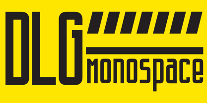 An elegant monospaced font, with a modern feel.
 - Bitwild by Pechay Studio,
$10.00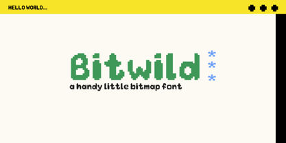 A bitmap font with the roughness of handwriting.
 - Funtasy by Mirror Types,
$20.00 Funtasy is a fun font. It mixes the formal rules of traditional types, and also has the beauty of informal fantasy types. It could be useful with kids clothes, children books, birthday invitations, and with more kid related items.
 - Lithos by Adobe,
$35.00Old Greek inscriptions were Carol Twombly's inspiration when she created Lithos, which appeared with Adobe in 1990. The alphabet is composed exclusively of capital letters, which can also be used as initials combined with other fonts, such as Caslon. - Saga Arjuna by Saxofont,
$18.00 Saga Arjuna is a modern, elegant and luxurious font with custom alternatives and multilingual support. With a strong desire and grace, it can be used as a logo and title. Great for books, product packaging, advertisements, brands and more.
 - Evocativa by Intellecta Design,
$23.00 Evocativa has a perfect combination of roman bodonian inspired ornamented caps with a well crafted blackletter set, in a balanced typeface suit to use in your headings text projects and in jobs with a classit and yet antique feeling.
 - FP Dancer Pro by Fontpartners,
$29.00 FP Dancer attempts to combine a constructed face with an upright script face. The goal was a type family that combines softness and friendliness with more strength. Typographica.org selected this font as one of the best typefaces for 2007.
 - Asmillione by Sibelumpagi,
$18.00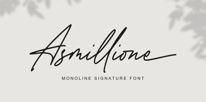 Asmillione is a monoline signature font with a handwriting feel. It comes with ligatures and alternates, also supports multiple languages. It’s perfect for logos, product packaging, wedding invitations, branding, headlines, signage, labels, signature, book covers, posters, quotes, and more.
 - Funny Easter by Yoga Letter,
$14.00 "Funny Easter" is a display font created for Easter. This font is very unique with its distinctive shape. This font is equipped with uppercase, lowercase, numerals, punctuations, and multilingual support. It is suitable for Easter, spring, summer, and more.
 - Krisis Sans by ABSTRKT,
$25.00This font was originally designed for one lettering job with only one simple purpose—to be as much condensed as a font can be. Then it was developed as a font family of 4 weights with regulars and italics. - MB GEOMETRIXA by Ben Burford Fonts,
$25.00 Inspired from geometric curves and circles, an audacious lower case display face with some alternate characters in Upper and Lower case glyphs. Great for Logos and Logotypes, headlines and larger text. Works well with smaller strap lines as well.
 - Fd Hallway by Fortunes Co,
$15.00 Hallway inspired from vintage script combined with modern style, suite for adventure or classic feeling sport, sign painting, labeling, suitable for logo, product names packages, labels, old fashioned coffee shops, bars and everything with specific characteristics of past times.
 - Billetha by Yoga Letter,
$18.00 "Billetha" is a beautiful handwritten font decorated with love. This font is very suitable for Christmas, Valentine's Day, weddings, engagements, branding, and others. Equipped with uppercase letters, lowercase letters, numerals, punctuation, swash, titling, uppercase alternates, ligatures, and multilingual support
 - Confas by Krntype Studio,
$16.00 A clean handwritten font. Confas come with stylish swashes, and ligature. This font also come with multilingual support. Confas is suitable for your creative design needs such as product packaging, merchandise, social media design, T-shirts, Logotype, and more.