10,000 search results
(0.036 seconds)
- Yusyad by Eyad Al-Samman,
$20.00 The typeface Yusyad is designed mainly for a very sentimental and emotional reason. Metaphorically, it is a modest artistic gift offered virtually from the designer to one of his beloved and cherished persons in this life, namely, his loyal and devoting wife. She represents one of the most essential motives for many artistic and non-artistic works that the designer achieved during his life. This was done through her tranquil personality, infinite patience, sincere support, and endless encouragement. The designer's partner (i.e., the significant other) lives with him along with their three children looking both always for a life full of peace, achievements, philanthropy, and of course love. The typeface's name Yusyad is a portmanteau word consists of two morphemes. It is a simple name-meshing for two different names. Those names represent the name of the designer's wife (Yusra) and the name of the designer (Eyad). Yusyad is like an epithet that ties the two partners' honest and eternal relationship until the last day of their lives. Technically, Yusyad is a sans-serif condensed and display typeface. It comprises seven fonts with dual styles and multiple weights. Specifically, it has two main styles, namely, the normal and the inline design. The normal style comes in five weights (i.e., thin, light, regular, bold, and black) whereas the inline style has two weights (i.e., regular and bold). The typeface is designed with more than 700 glyphs or characters. Its character set supports nearly most of the Central, Eastern, and Western European languages using Latin scripts including the Irish and the Vietnamese languages. The typeface is appropriate for any type of typographic and graphic designs in the web, print, and other media. It is also absolutely preferable to be used in the wide fields related to publication, press, services, and production industries. It can create a very impressive impact when used in movies' or TV-series titles, posters, products’ surfaces, logos, signage, novels, books, and magazines covers, medical packages, as well as the product and corporate branding. It has also both of lining and old-style numerals which makes it more suitable for any printing or designing purposes. To end, Yusyad's condensed appearance—especially the inline style—makes it very memorable, eye-catching, and striking for advertising, marketing, and promotional purposes.
 - Narcis by VP Creative Shop,
$15.00 Introducing Narcis, the delightful retro bold script font that's bound to add a touch of nostalgia and flair to any project! This charming typeface boasts a unique blend of boldness and elegance, making it perfect for various design purposes. With its alternate and ligature glyphs, Narcis offers a wonderful range of creative possibilities. These additional characters add extra variety to your text, giving it a truly personalized and artistic feel. Whether you're designing a logo, poster, invitation, or any other project, Narcis' alternates and ligatures will help you achieve a distinct and eye-catching look. But that's not all! Narcis is also impressively versatile when it comes to language support, accommodating up to 87 languages. This means you can confidently express yourself in multiple languages without compromising on the font's aesthetics or legibility. Narcis comes in both regular and italic styles, allowing you to emphasize specific parts of your text or create a dynamic interplay between the two styles. The regular style offers a bold and confident appearance, while the italic style adds a touch of sophistication and movement to your design. Whether you're a seasoned designer or just starting on your creative journey, Narcis is sure to become your go-to font for adding that retro touch with a modern twist. Its warm and friendly demeanor will instantly win you over, making every project a joyful and visually captivating experience. So go ahead and give Narcis a try – you won't be disappointed! Language Support : Afrikaans, Albanian, Asu, Basque, Bemba, Bena, Breton, Chiga, Colognian, Cornish, Czech, Danish, Dutch, Embu, English, Estonian, Faroese, Filipino, Finnish, French, Friulian, Galician, Ganda, German, Gusi,i Hungarian, Indonesian, Irish, Italian, Jola-Fonyi, Kabuverdianu, Kalenjin, Kamba, Kikuyu, Kinyarwanda, Latvian, Lithuanian, Lower Sorbian, Luo, Luxembourgish, Luyia, Machame, Makhuwa-Meetto, Makonde, Malagasy, Maltese, Manx, Meru, Morisyen, North Ndebele, Norwegian, Bokmål, Norwegian, Nynorsk, Nyankole, Oromo, Polish, Portuguese, Quechua, Romanian, Romansh, Rombo, Rundi, Rwa, Samburu, Sango, Sangu, Scottish, Gaelic, Sena, Shambala, Shona, Slovak, Soga, Somali, Spanish, Swahili, Swedish, Swiss, German, Taita, Teso, Turkish, Upper, Sorbian, Uzbek (Latin), Volapük, Vunjo, Walser, Welsh, Western Frisian, Zulu How to access alternate glyphs? To access alternate glyphs in Adobe InDesign or Illustrator, choose Window Type & Tables Glyphs In Photoshop, choose Window Glyphs. In the panel that opens, click the Show menu and choose Alternates for Selection. Double-click an alternate's thumbnail to swap them out. Mock ups and backgrounds used are not included. Thank you! Enjoy!
 - Ghibli by Eyad Al-Samman,
$- The word ‘Ghibli’ per se refers to a Saharan hot and dry wind commonly known as the Sirocco. In Arabic language, ‘Ghibli’ is known as ‘Qibli or Kibli’, meaning ‘Southern’ for those Arabic nations who live in the North of Africa. The ‘Ghibli’ wind is most common during spring and autumn, and can blow at almost 60mph; it is this wind which is responsible for the dry, dusty conditions on the Mediterranean coast of North Africa. ‘Ghibli’ can last for days making life miserable and is therefore feared by the desert dwellers in that region. It can also have profound effect on the landscape by moving vast quantities of sand and dunes. Inspired by the Studio Ghibli’s unique and magical characters, the ‘Ghibli’ typeface is designed as a Latin free and literary serif typeface. It strongly expresses transition, imagination, sharpness, characterization, and modernization. It is a literary type that can capture the eyesight of readers and other observers with its acute and stylistic letterforms, dots, and numerals. It has transitional serifs and it is generally based upon the Latin printing style of the 18th and 19th centuries, with a pronounced vertical contrast in stroke emphasis (i.e., vertical strokes being heavier than the horizontal strokes). It has more regular forms in which serifs are bracketed and more symmetrical. The main characteristic of ‘Ghibli’ typeface is in its new designed serif letters. Special letters that can be described as having modern designs include small ‘g’, ‘p’ (with their open ends), ‘x’, and capital ‘B’, ‘P’, ‘Q’, and ‘R’ (with their open ends). ‘Ghibli’ typeface has also both of lining and old-style numerals which makes it more suitable for any literary and printing purposes. This gratuitous font comes in only two weights (i.e., Ghibli Regular and Ghibli Bold). It is absolutely preferable to be used in the wide fields related to literature and publication industry. This includes typing titles of diverse literary and academic books, readable texts of novels, novellas, short stories, prose, poetry, textbooks, newspapers, and magazines. It is also notable if chosen for designs that include movies’ titles, logos of academic institutions such as colleges and universities, organizations and associations’ names, medical packages such as those dedicated for tablets and syrups, and also other different educational and social materials. ‘Ghibli’ is simply a free literary typeface dedicated for all who want to write and read using a modern and stylish serif font. Enjoy it.
 - Anca by DizajnDesign,
$49.00 Anca typeface started as a comission work for Fest Anca, an international animation festival. They needed something to complement the corporate identity of the festival. Inspiration came from a sketch made by my friend long time ago, which had a tremendous potential. As letters were digitized and the basic alphabet was completed, a very practical and universal typeface resulted. The whole type family has a playful and simple look with rounded stroke endings as well as long ascenders. The construction skeleton uses the minimum number of strokes and as a consequence, some original letter shapes (Q, w, j, &, A, §) were produced. Despite the fact that most letter shapes are based on geometry, some strokes are intentionally irregular, which creates a very natural feeling. Anca is appropriate for setting short paragraphs, headings and big inscriptions.
 - Reality Goals by Fikryal,
$22.00 Reality Goals is a beautiful and stylish handwritten display font that exudes creativity and inspiration. This font is perfect for a variety of projects, including branding, marketing materials, social media graphics, quotes, invitations, and more. The font features unique and eye-catching letterforms that are carefully crafted to convey a sense of playfulness and sophistication. The characters are designed to appear as if they were hand-drawn, with irregular lines and strokes that add a personal touch to any design. With a bold and modern look, “Reality Goals” is sure to catch the attention of your audience and make a lasting impression. It is versatile and easy to use, and can be paired with a variety of other fonts to create a unique and cohesive look. Reality Goals Multilingual Support Thank you
 - Momain Kidz by IbraCreative,
$37.00 Momain Kidz is a delightful and enchanting children's typeface that captures the imagination and playfulness of young minds. Its rounded and bubbly letterforms exude a sense of innocence and joy, instantly transporting us to a world of imagination and wonder. With its slightly irregular shapes and friendly curves, Momain Kidz evokes the spontaneity and creativity of a child's handwriting, making it perfect for children's books, educational materials, and playful designs. The vibrant and cheerful colors of Momain Kidz bring a sense of fun and excitement to any project, while its legibility ensures that young readers can easily engage with the text. Momain Kidz is a whimsical and inviting typeface that sparks curiosity and invites young hearts to embark on exciting adventures in the world of reading and learning.
 - Terry Junior by Monotype,
$40.99 Terrance Weinzierl's Terry Junior typeface is a perfectly imperfect design – one that retains the marks of the brush used to create it and harks back to the craft required to hand make letterforms. Originally drawn during a Monotype Font Marathon, Weinzierl later refined the typeface digitally – adding an Inline version and designing alternates that replicate the irregularity of real-life brush scripts. “It has a natural, cheery and bold appearance,” says designer Terrance Weinzierl. “It's young, but not wild. Painted, but not sloppy. A sign painter's apprentice, perhaps.” Terry Junior is an obvious choice for designers and brands communicating with younger audiences, but would also work well on book covers, packaging, and in digital environments that need a little bit of extra playfulness. The family includes five fonts, including an Inline version.
 - Maribor by Dima Pole,
$30.00 Maribor is a slab serif font with nice shapes, they are both soft and angular. It is perceived calmly and with a twist. Maribor means "Mara`s pinery". The energy of the Universe, reflecting the modification, renewal and change for the better is called Mara; Ancient wise ancestors called it so. Today it is known as the goddess Mara in the Vedic worldview of the Slavic-Aryan peoples. Maribor is a multilingual font, it contains characters for 104 Latin languages and all Slavic, including all capitals for them. There are all major currency signs, including the ruble and the Euro. Many OpenType features allow you to make a variety of compositions; as well as to see the font from the new side thanks to the stylistic sets for the Slavic alphabets.
 - KOGAMA by Twinletter,
$15.00 Introducing Kogama, our newest Japanese-style inspired font, which was created specifically to carry the Asian font concept and will make your project look beautiful and appealing. Start utilizing this typeface to make your project stand out and be well received. Logotypes, food banners, branding, brochure, posters, movie titles, book titles, quotes, and more may all benefit from this font. Of course, using this font in your various design projects will make them excellent and outstanding; many viewers are drawn to the striking and unusual graphic display. Start utilizing this typeface in your projects to make them stand out. Caps only fonts.
 - Theadzan by Almarkha Type,
$29.00 Hello everyone, we introduce our new product, Thadzan - Super Bold Condensed inspired by the title of the sports poster, We make it very energetically, so it has very strong characteristics, taking into account the thickness and density of each gliph, along with a ligature that makes this font look unique. Thadzan font with strong and challenging nuances. It is also equipped with 10 glyph ligatures, which make the characteristics of this font even more extraordinary. very suitable for the title, typography, clothes, Poster, magazines, brochures, packaging,Websites and much more for your design needs, making your designs more modern and professional.
 - Print Shop Parts JNL by Jeff Levine,
$29.00 Print Shop Parts JNL has a nostalgic assortment of blank sign panels, a pointing hand, decorative embellishments and even an assortment of "Made in U.S.A.", "Made in America" and "Made in United States" emblems located on the 1-9 keys. All are from vintage type catalogs and sign painting instruction books from the early 1900s. When scaled up, the blank sign panels can be used for small signs or price tags as originally made in years past. During the early part of the 20th Century, it was common to create show cards in attention-getting shapes matched with beautiful hand lettering.
 - Cabrito by insigne,
$24.00 After my son was born, I found myself reading him a lot of books. A LOT of books. Some were good, some were great, but I found myself wanting to develop something using my skills and interests to make something that only I could make. In short, I realized my son needed to be indoctrinated—I mean, introduced into the wonderfully wild world of fonts. So, I set about to make a board book to teach about typography, called “The Clothes Letters Wear.” You can learn more about the book here. I’ve made the captivating illustrations bright and colorful, and the use of different letter forms makes for a fascinating read to delight ages young and young at heart. And, as an added bonus, this children’s book has a custom designed font. I’m always looking for an excuse to design a new font, and this book created the perfect alibi. Drum roll, please. I now give you … Cabrito (“little goat” en Español). This new serif typeface incorporates the latest research on typographic legibility for children, features to make it—well, extra legible. A little background: studies show that Bookman Old Style is one of the most readable typefaces, and as a consequence or perhaps the reason why, it is used thoroughly for children’s books. This font became my initial inspiration for the typeface. Then, I found more legibility research saying that (brace yourselves) Comic Sans is also very legible for beginning readers, much due to the large x-height and softer, easily recognizable forms. In addition, forms that are closer to handwriting also seem to be more legible. Once I threw all that into my cauldron and stewed it a bit, the result was a pleasantly rounded typeface that includes not-so-strictly geometric, handwriting-inspired forms for the b, d, p, and q. Es guapo! Cabrito’s slender weights are simple and fun, with extras that turn any “bah humbug” into a smile. Add lighter touches to your project with the typeface’s included sparkles or rainbows (not included). Splash a little more color on the page with the firmer look of the thicker weights. Cabrito’s upright variations across all weights are matched by optically altered italics, too, giving you even more variety with the font family. This modern typeface’s bundle of alternates can be accessed in any OpenType-enabled software. The fashionable options involve a significant team of alternates, swashes, and meticulously refined aspects with ball terminals and alternate titling caps to decorate the font. Also bundled are swash alternates, old style figures, and small caps. Peruse the PDF brochure to check out these options in motion. OpenType-enabled applications like the Adobe suite or Quark allows comprehensive control of ligatures and alternates. This font family also provides the glyphs to aid a variety of languages. Cabrito is a welcoming, everyday font family by Jeremy Dooley. Use it to convey warmth and friendliness on anything from candy and food packages to children’s toys, company IDs or run-of-the-mill promotional material. Cabrito’s unique appearance and high legibility make it equally at home in print as it is on a screen.
 - Zomsenso by Pootis Type Corp.,
$31.99 Zomsenso is an angular, semi-modular typeface that supports OpenType alternates. The angular part means that the entire* font uses only angular segments and shapes. The alternate glyph shapes are under Stylistic Set 01. This font includes Seven Segment display (U+E000 to U+E07F) and arbitrary fractions (U+E1nd, n=numerator; d=denominator) that are mapped to the Private Use Area, so users can easily insert them via Unicode input. You can combine these fractions with the superscript and subscript numerals to create more fractions. This font can be used for essays, signs, logos, posters, commercial projects, videos, and many more. *except the circles in the Geometric Shapes block, which are still round
 - Socialite JNL by Jeff Levine,
$29.00Socialite JNL takes its cue from the Art Deco style of the 1930s with its clean, angular lines and stylized letter shapes. - MarkerMoe by JOEBOB graphics,
$- What happens when you write small characters with a huge marker? The answer is MarkerMoe; very irregular handwriting that's only just readable.
 - Cybersky by Typefactory,
$14.00 Cybersky is a sharp, angular, futuristic font in a retro style. Perfect for sci-fi themes, night street race and space adventures!
 - Master Script by Solotype,
$19.95An unusual angular vertical script. In late Victorian times it was seen mostly in advertising work, seldom in social stationery and announcements. - P22 Freely by IHOF,
$24.95 A loosely-written, slightly irregular but very legible handwriting style. Useful for the personal touch on menus, advertisements, greeting cards, flyers etc.
 - Cyclic by ArtyType,
$29.00 Cyclic is a stylish and modern slab serif in three practical, highly legible weights. The name ‘cyclic’ suits this typeface in several ways. Firstly because I wanted to create an ‘all-round’ typeface (pun intended) that could adapt to most applications, but also, as the dictionary definition explains - “occurring in circles, regularly repeated”. The basis for a lot of the characters did begin with a circle or sections of one; the equally distributed, rounded forms of this font are complemented however by the vertical strokes, and further counter-balanced by angular slab serifs on the remaining glyphs. Curved alternates with a celtic vibe are also included in the fonts and feature on the default slots in the separate Cyclic Uncial set. In summary, the whole Cyclic type family comprises a combined palette of circles and straight lines; something the cubist movement would have been proud of!
 - Cyclic Uncial by ArtyType,
$29.00 Cyclic is a stylish and modern slab serif in three practical, highly legible weights. The name ‘cyclic’ suits this typeface in several ways. Firstly because I wanted to create an ‘all-round’ typeface (pun intended) that could adapt to most applications, but also, as the dictionary definition explains - “occurring in circles, regularly repeated”. The basis for a lot of the characters did begin with a circle or sections of one; the equally distributed, rounded forms of this font are complemented however by the vertical strokes, and further counter-balanced by angular slab serifs on the remaining glyphs. Curved alternates with a celtic vibe are also included in the fonts and feature on the default slots in the separate Cyclic Uncial set. In summary, the whole Cyclic type family comprises a combined palette of circles and straight lines; something the cubist movement would have been proud of!
 - Be Kind by Seemly Fonts,
$12.00 Be Kind is a sweet and simple handwritten font. Its friendly feel makes this font incredibly versatile, fitting a wide range of contexts. Add it to your creative ideas and notice how it makes them stand out!
 - Cute Lime by Sipanji21,
$10.00 Cute Lime is a bold and colorful display font. Its friendly feel makes this font incredibly versatile, fitting a wide range of contexts. Add it to your creative ideas and notice how it makes them stand out!
 - Stellus by The Arborie,
$11.00 Stellus is a handmade futurist font. It symmetrical and geometric nature make it perfect for modern uses. The separation on the glyphs makes it look a little alien, yet it maintains softer qualities like the rounded ends.
 - Sisterhood by Din Studio,
$29.00 Sisterhood is a beautiful brush signature font. Made for any professional project branding. Every letter has a unique and beautiful touch. Made from our talented font designer. Features: 52 Stylistic set 52 Ligatures Multilingual Support PUA encoded
 - Super Kids by Stringlabs Creative Studio,
$29.00 Super Kids is a playful, and quirky display font. Its friendly feel makes this font incredibly versatile, fitting a wide range of contexts. Add it to your creative ideas and notice how it makes them stand out!
 - Banyu langits by Stringlabs Creative Studio,
$29.00 Banyu Langits is a cute and quirky display font. Its friendly feel makes this font incredibly versatile, fitting a wide range of contexts. Add it to your creative ideas and notice how it makes them stand out!
 - Avenus Type by Stringlabs Creative Studio,
$29.00 Avenus Type is a cute and quirky display font. Its friendly feel makes this font incredibly versatile, fitting a wide range of contexts. Add it to your creative ideas and notice how it makes them stand out!
 - Sweets by Agnieszka Ewa Olszewska,
$29.00 Sweets is an illustrative, hand made font.
 - Tuska by Intellecta Design,
$24.90a fancy font, to make beautiful artworks - Tastebud by Bogstav,
$17.00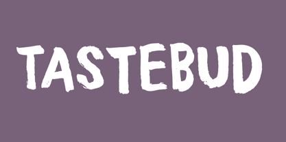 Brushy brushed font, made to look organic!
 - Fortima by Meat Studio,
$30.50 Fortima is a 12 style angular sans serif that utilises subtle modular shapes, designed by Stew Deane. The result is a font with character that adapts to a variety of sectors and brands, and is suitable for anything from advertising and branding to web and screen. The angular shapes help create a unique aesthetic that are instantly recognisable and have impact and character in large or small sizes.
 - Ateros by HansCo,
$17.00 INTRODUCING, ATEROS – Modern logo typeface! ATEROS is a futuristic font with unique style in UPPERCASE that will make your design looks hi-tech and modern. You can use this font for any purpose, especially to make logotype. You can mix and match the uppercase and lowercase to make your logo more readable. This font also provides some alternative characters, check and get the best version of yours. Enjoy!
 - Sancoale Gothic by insigne,
$35.00 In comparison to the powerful and commanding original, Sancoale Gothic is a more sober version of Sancoale. The medium contrast between thick and thin strokes makes for a typeface that stands out with striking clarity in longer texts, yet is very readable. This new addition to the Sancoale family is a perfect alternative if you want to use a different style than the original family. Using the utmost care and restraint, the designer strove to avoid overbearing futurism in favor of a typeface with clean lines and clear forms. Show your customers the world with Sancoale Gothic, a versatile sans with a wide range of styles, from delicate thins to bold, hefty weights that dominate the page and screen with confidence and futuristic flair. A fresh, friendly voice for all kinds of uses, from corporate statements to fashion, Sancoale Gothic is a versatile sans with a wide range of styles, from delicate thins to bold, hefty weights that dominate the page and screen with confidence and futuristic flair. Sancoale Gothic has a distinct personality, which allows you to create a wide range of projects, including posters and websites. The Sancoale Gothic fonts come in many varieties, so you can go with a light or thick weight, depending on what fits your project best. With their sweeping curves, the heavy fonts are meant for huge headings on posters and websites. The Sancoale Gothic family is made up of 48 distinct styles, with 660 glyphs and supports 70 languages, allowing you to communicate with your customers all over the world. Small Capitals and other OpenType features abound! The design is sleek with no stems or spurs in the default character set, but OpenType alternates have alternates with stems. OpenType capable applications such as Quark or the Adobe suite can take full advantage of the automatically replacing ligatures and alternates. The superfamily offers an array of optical sizes, contrasting weights, and contrasting optical sizes to discover the right balance, contrast, and optical size for your design. Prepare to be blown away by Sancoale Gothic’s smooth curves and captivating allure. Sancoale Gothic is perfect for both a contemporary and forward looking style. Sancoale Gothic is both practical and unique, in a standalone capacity or with the companion Sancoale fonts. Use it to make an impact today.
 - ITC Garamond Handtooled by ITC,
$34.99Claude Garamond (ca. 1480-1561) cut types for the Parisian scholar-printer Robert Estienne in the first part of the sixteenth century, basing his romans on the types cut by Francesco Griffo for Venetian printer Aldus Manutius in 1495. Garamond refined his romans in later versions, adding his own concepts as he developed his skills as a punchcutter. After his death in 1561, the Garamond punches made their way to the printing office of Christoph Plantin in Antwerp, where they were used by Plantin for many decades, and still exist in the Plantin-Moretus museum. Other Garamond punches went to the Frankfurt foundry of Egenolff-Berner, who issued a specimen in 1592 that became an important source of information about the Garamond types for later scholars and designers. In 1621, sixty years after Garamond's death, the French printer Jean Jannon (1580-1635) issued a specimen of typefaces that had some characteristics similar to the Garamond designs, though his letters were more asymmetrical and irregular in slope and axis. Jannon's types disappeared from use for about two hundred years, but were re-discovered in the French national printing office in 1825, when they were wrongly attributed to Claude Garamond. Their true origin was not to be revealed until the 1927 research of Beatrice Warde. In the early 1900s, Jannon's types were used to print a history of printing in France, which brought new attention to French typography and the Garamond" types. This sparked the beginning of modern revivals; some based on the mistaken model from Jannon's types, and others on the original Garamond types. Italics for Garamond fonts have sometimes been based on those cut by Robert Granjon (1513-1589), who worked for Plantin and whose types are also on the Egenolff-Berner specimen. Linotype has several versions of the Garamond typefaces. Though they vary in design and model of origin, they are all considered to be distinctive representations of French Renaissance style; easily recognizable by their elegance and readability. ITC Garamond? was designed in 1977 by Tony Stan. Loosely based on the forms of the original sixteenth-century Garamond, this version has a taller x-height and tighter letterspacing. These modern characteristics make it very suitable for advertising or packaging, and it also works well for manuals and handbooks. Legible and versatile, ITC Garamond? has eight regular weights from light to ultra, plus eight condensed weights. Ed Benguiat designed the four stylish handtooled weights in 1992." In 1993 Ed Benguiat has designed Handtooled versions. - Happy Dinosaur by Sipanji21,
$10.00 Happy Dinosaur is a sweet and chunky lettered display font. Its friendly feel makes this font incredibly versatile, fitting a wide range of contexts. Add it to your creative ideas and notice how it makes them stand out!
 - Dead Meal by Fonts of Chaos,
$10.00 Dead Meal is a cute hand made font made for pixel art style. Yes a mix of handmade pixel font style. Say like that is weird but trust me, it's simple useable for print works and web works.
 - Funky Shed by PizzaDude.dk,
$20.00OMG it's the funky shed! The height and width of each character vary to make it look jumpy. At the same time, Funky Shed, has got a crunchy line which makes it even more funky to look at! - Spooky Green by Illushvara,
$13.00 Spooky Green is an incredibly unique and quirky display font. Its friendly feel makes this font incredibly versatile, fitting a wide range of contexts. Add it to your creative ideas and notice how it makes them stand out!
 - The King Of Romance by Creativework Studio,
$18.00 The King Of Romance is a classic and elegant handwritten font. It is enriched with alternative characters and ligatures that make this font even more beautiful. Add it to your favorite creative ideas and make them stand out!
 - NEON LED Light - Personal use only

