10,000 search results
(0.054 seconds)
- Vishenka by Supfonts,
$9.00 Vishenka Cyrillic will be perfect for wedding lettering, beautiful frame for your home, book covers, greeting cards, logos, marketing, magazines or anything that requires cute handwritten lettering :) What's inside: Vishenka Script Multilingual support Cyrillic support Cricut support If you have any questions, please contact me directly or in instagram @superdizigner
 - Shentholla by Liartgraphic,
$23.00 Meet our newest product, we call this product Shentholla font. Shentholla font are sans serif typeface font Whit a uniqe touch and assertive. Shentholla font is very nice to use on: fashion magazine, logos, ,and photography, landing page, fliyer, What’s includes - mutilngual support - alternate - ligature Thank you, salutations Ali Sifak Muftari
 - Squeam by PizzaDude.dk,
$17.00 Here's a fun font that is quirky, jumpy and uneven. It's also unpredictable, but not more than your text will be clear and legible...but in a fun way! :) I've added several lowercase versions that automatically cycles as you type. A great way to make your text random and lively
 - Lord Mayor by Solotype,
$19.95We know very little about this font. A printer in Lisbon had it, but said it came from England. Nicolette Gray shows it in her Nineteenth Century Ornamented Type Faces as Lord Mayor from the British Typefoundry. We never got the complete font, but drawing the missing letters was not difficult. - Dancing Fool by PizzaDude.dk,
$15.00 A Dancing Fool is not always meant as a positive thing - but in this case it is 100 percent positive and innocent. It's just about someone who is dancing in a foolish way. A good way to describe this font, because it is silly looking, but not in any offensive way!
 - Ian Segoe by Ingrimayne Type,
$6.00 The faces of IanSegoe were early attempts by IngrimayneType to construct medieval-looking faces. They drew inspiration from several medieval-themed fonts that were available at the time (1990). The upper-case letters are similar but not identical in the two faces but the lower-case letters are completely different.
 - Codswallop by Hanoded,
$20.00 The origin of the word Codswallop is uncertain, but it might have something to do with a 19th century English soft drink brewer named Hiram Codd. Codswallop is a beautiful hand drawn font. A little weird, a tad grotesque and a wee bit over the top, but fun and useful nonetheless.
 - Wolves, Lower - Unknown license

- Antelope H - Unknown license

- Doctor Azul - Unknown license

- Melanie - Unknown license

- Tombats Smilies - Unknown license

- Keratine by Zetafonts,
$39.00 The letterforms that we now accept as the historical standard for printing latin alphabets were developed in Italy around the end of 1400. Deriving from Roman capitals and from italic handwriting, they soon replaced the blackletter letterforms that were used a few years before by Gutenberg for his first moveable types. Between these two typographical traditions there's an interesting and obscure middle ground of historical oddballs, like the Pannartz-Sweynheym Subiaco types, cut in Italy in 1462. Keratine is the result of Cosimo Lorenzo Pancini's exploration of that territory. Like our Kitsch by Francesco Canovaro it explores the impossible territory between antiqua and blackletter, not as a mere historical research, but rather as a way to re-discover and empower an unexpected and contemporary dynamism. Using contemporary digital aesthetics to combine the proportions of humanistic type with the gestural energy of Fraktur letterforms, Keratine develops a "digitally carved", quasi-pixelated appearance (clearly stressed in Keratine's italics) that allows an unexpected balance between small-size readability and display-size personality. Keratine also relies heavily on a variable identity as the letterforms change dynamically with weight, developing from a contrasted, text-oriented light range to more expressive and darker display range, for a total of 8 weights with italics. Open type features and glyph alternates further enrich the usage possibility of this typeface that embodies our contemporary swap culture by embracing the contradictory complexity at the crossroads between Gothic and Humanist styles, while playfully empathising with a digital, brutalist spirit.
 - LDJ Doodaddles by Illustration Ink,
$3.00The letters of this TrueType font are decked out with holiday star ornaments for a festive and slightly quirky look. Your Christmas messages will sparkle and shine. Try it on your annual family newsletter or as a title for Christmas eve scrapbook pages. - Parisian Ornamentals by Celebrity Fontz,
$24.99Beautiful, richly ornamented shadowed letters in the Empire fashion, similar to the fonts of the Parisian type founder J. Gille', cut around 1810. Includes one set of A-Z ornamental initials conveniently assigned to both the upper and lower case alphabet characters. - IC Havolane by Ironbird Creative,
$7.00 Havolane, A display serif font with a modern vintage twist, ideal for branding, headlines, and packaging. Havolane offers two styles, "Regular" and "Inked," to add versatility and depth to your designs. Perfectly complements sans-serif fonts, making your creations stand out effortlessly.
 - Black Manta Brush by Creaditive Design,
$12.00 Black Manta is a strong charactered, brushed display font. It looks fierce and urban and it will most certainly make each of your designs stand out. Add it confidently to your favorite creations and let yourself be amazed by the outcome generated.
 - Sweet Mia by Angele Kamp,
$24.00 Sweet Mia is a playful modern calligraphy font with a dancing baseline. This sweet font has nice smooth lines and is perfect for crafters and cutting machines. Sweet Mia will look gorgeous on cards, mugs, quotes, logos and all your other lovely projects.
 - Anjara by 611 Studio,
$15.00 This typeface got its name from "anyar", which means "new/modern" in local Indonesian (Javanese). Just like it's name, this typeface gives a modern and simple look. Anjara's medium contrast makes it easily stand out in any compositions, especially it's bold version.
 - Scratchedman by OCSstudio,
$12.00 Scratchedman Font is a natural handwritten font. This All Caps typeface is strong to stand out in your design projects. Scratchedman Font has two font styles Regular and Italic so you can customize it in your design project, as well as multilingual support.
 - The Inlines by Okaycat,
$19.50 The Inlines is available in two styles - inlined, or non-inlined. A distinctive font set for logo creation, titling, and more. Check it out! The Inlines is extended, containing West European diacritics and ligatures, making it suitable for multilingual environments and publications.
 - Oatlander by Almarkha Type,
$29.00 Introducing, Oatlander ! A bold script that will stands out from the crowd! Perfect to be used as logotype, badge and label! This has many opentype features like stylistic alternate,and support multi language. if you have any Question please Message Me. Thank You
 - Hermaphrodite by Volcano Type,
$29.00Hermaphrodite was developed for the Bastard Project and had its origin in the idea of applying the process of an Antiqua on a Grotesque. In other words, a Grotesque font was drawn calligraphically and then digitized. Some inconvenient corners were simply cut off. - Chop Phooey by Pink Broccoli,
$14.00 An offbeat typeface inspired by the titling of the 1969 Pink Panther cartoon starring the Aardvark, "Technology, Phooey". It contains an alternate H and T, as well as a handful of ligature swap outs for doubles like EE OO SS TT, etc.
 - Yenda by Deniart Systems,
$20.00 Yenda is a bold angular font with just a bit of swoosh. Great for short text and headlines! Don't leave this one out of your next sci-fi or bold designs! This typeface includes all the special diacritics required for European languages.
 - Fathers by Konstantine Studio,
$18.00 Introducing Fathers, Inspired from the vintage classic old packaging and advertising back in 1950 - 1980's era. perfectly fit for your classic packaging, vintage logo branding, old poster and advertising. Get the easy forefathers feel by just type it out to your design.
 - Pique-Nique NF by Nick's Fonts,
$10.00 The 1895 specimen book from American Type Founders included the pattern for this face, originally called Outing—Art Nouveau with a laid-back vibe. Both versions of this font support the Latin 1262, Central European 1250, Turkish 1254 and Baltic 1257 codepages.
 - Astarie by Yukita Creative,
$12.00 Astarie is a modern sans with a trendy and not stiff style that will make your poster, cover, or logo more stunning and stand out! This font supports Multi-Language. This font will go well with logos, headlines, titles, and minimal layouts.
 - Raifin by Hooper Type,
$9.99 Out with the old in with the BOLD. Raifin is a messy, gory and fantastical piece of work which shoves two fingers up at conformity. A title font, a copy font, a bonkers font. An experimentation of the rules, or lack thereof. Enjoy!
 - Paleos by Scriptorium,
$12.00For Halloween season, we thought we'd better trundle out a nice, crude prehistoric font to meet the growing need. Paleos features many different versions of almost every character so you can give it the natural variety of lettering hand-carved by a troglodyte. - El Mayor by Typefactory,
$15.00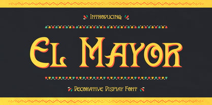 El Mayor is a decorative display font. The font has festival vibes. It will turn any design project into a stand out. El Mayor font is really great for a restaurant menu, business branding, clothing, quotes, headings, birthday invitations, posters, and many others.
 - Advertisers Gothic by Monotype,
$29.99AdvertiserÆs Gothic Light, from a volume of headline fonts, was designed by Robert Wiebking in 1917. Wiebking was a skilled type engraver from Chicago who created his own pantographic machine, used to cut punches drawn by other successful type designers, including Frederic Goudy. - Abi Nouveau JNL by Jeff Levine,
$29.00Inspired by the images on some EBay auctions, Jeff Levine sketched out and revived this early 1900s serif design used on some French sign letters. Named for a friend in the graphics industry, this font captures the charm of the Art Nouveau period. - Somatype Skwosh by ArtyType,
$10.00 Somatype Skwosh was born out of a desire to ignore traditional rules for condensed character forms in favour of contrasting vertical and horizontal thicknesses and the interesting shapes produced by re-scaling along only one axis. Somatype Bold was the starting point.
 - Hayden Creek by Letters by Wordsworth,
$34.00 Hayden Creek started as a few letters chosen from vibrant brush lettering. It evolved into a unique font that has an underlying movement with a wonderful energy. The jaunty kick-outs on some of the lower case letters are both fun and elegant.
 - No Liming by chicken,
$17.00 A chunky, laid-back typeface inspired by a hand-painted notice on the doors of a mechanic's workshop in Plymouth, Tobago. Two different mostly-uppercase alphabets in one font help to keep things loose. 'Liming'? hanging out, drinking rum, shooting the breeze...
 - Stripy Matey by Gleb Guralnyk,
$14.00 Hello! Introducing a geometric style font — Stripy Matey. It's a vintage look smooth typeface built of dashed flowing lines. Stripy Matey font has multilingual support (check out a screenshot with available letters and signs). Thank you and wish you a peaceful sky!
 - Common Stencil JNL by Jeff Levine,
$29.00 Common Stencil JNL takes a vintage lettering stencil from the 1980s with imperfectly bent cutting dies [which unintentionally gave the characters a distressed or "grunge" look] and recreates it in a digital form. The design is available in both regular and oblique versions.
 - Wetty Penny by Gleb Guralnyk,
$14.00 Hello! Introducing a decorative font — Wetty Penny. It's a smooth shape bold typeface with vector wated drops effect. This font includes lots of multilingual characters (check out a screenshot with available letters and signs). Thank you and wish you a peaceful sky!
 - Revitale by FallenGraphic,
$17.00 Revitale is stands out as a diverse selection of typefaces, beautiful alternates character that maintain a coherent look and feel throughout. font is perfect for branding, headings, signatures, logos, blog, wedding invitations, t-shirts, letterhead, merchandise, signage, lable, news, posters, badges etc.


