10,000 search results
(0.229 seconds)
- 1495 Bastarde Lyon by GLC,
$38.00 Font designed from this who was used by an unknown printer in Lyon (France) to print the “Conte de Griseldis ” (Griseldis' tale), from Petrarque, inspired by Boccace, in 1495. The original font has a relatively small number of special characters and ligature, for the time. This font includes “long s”, naturally, as typicaly medieval but numerous letters - as accented ones - were added for this version. A render sheet, enclosed with the file, helps to identify them on keyboard. It is used variously in web-site titles, posters and fliers design, editing ancient texts or greeting cards as a very decorative and fine font... This font works at a small size like 9, remaining clear and easy to read on screen, but always better when printed.
 - Coral by Scholtz Fonts,
$17.00Coral had its origins in the font Leah. I had requests from users that I create a cursive version of Leah. (In a cursive font the letters are joined together as in handwriting). In the process of development it changed sufficiently that I decided to release it under its own name. Hence "Coral". Coral is relaxed but very readable. It is, perhaps, a tad more formal and regular than Leah but not sufficiently so as to detract from its relaxed quality. The font is fully professional: carefully letterspaced and kerned. It contains over 235 characters - (upper and lower case characters, punctuation, numerals, symbols and accented characters are present). (It has all the accented characters used in the major European languages). - Rumba by Type-Ø-Tones,
$60.00 This family typeface consists of three fonts which have the same weight and style, but have been designed to work best at different sizes and in slightly different contexts. It is based on handwriting and calligraphy and consists of three typefaces: Rumba Small (for texts), Rumba Large (for headlines) and Rumba Extra (for words). The family is based on the idea of fonts that are interrelated depending on the differences in contrast, expressiveness and use, not on the classic range of weights. This type has been designed specifically but not exclusively for use in the languages spoken in Spain, hence special attention has been paid to the design of accents, special characters and ligatures. In a later development it was extended to CE Character Set.
 - Tati by Wiescher Design,
$33.33I only had this bouncy curve and a photograph of a daily menu (Truite Meunière) I took outside an obscure Paris restaurant when starting the design of this font. But while working on it I suddenly started thinking about Jacques Tati the famous but almost forgotten french director of Les Vacances de Monsieur Hulot, Jour des Fêtes, Mon Oncle, Playtime, Trafic etc. I thought about his bouncy walk and his hilarious ideas. The memories never left me while working on the font, so I decided to name the font after this great French moviemaker who gave me so many happy hours. Since Tati was a very funny character, I gave my characters a funny price. Thank you Jacques Tati, yours Gert Wiescher - Progeny by Type Associates,
$35.00 Progeny is a single-stroke freehand informal script that began life as a logo for a fast food company. That logo was rejected but when I added a suite of swash caps and a few extra ligatures and my trademark underlines it all started to come together as a font. Then I used it successfully for another logo and I proceeded to complete the weight variations that emerged during the first logo design, rounding the lighter weights to give a more friendly, softer look. That treatment didn't suit the bold weight but sharp corners did not detract from the robust, legible headliner that emerged. All weights work in all-lowercase, all-capitals, lowers with swash or regular initial caps and surprisingly – in all-caps with swash initials.
 - ITC Luna by ITC,
$40.99 ITC Luna is the work of Japanese designer Akira Kobayashi. He turned to the designs of the 1930s for his inspiration for both ITC Luna and ITC Silvermoon. Luna is designed to fill the gap between a pure Art Deco display face and an ordinary text face," says Kobayashi. "It has an Art Deco style but is still fairly easy to read. It can be used in short passages of text. As for individual characters, I especially liked the distinctive O, shaded only on one side. Lowercase a and g are also unusual, but they are somehow legible enough in text matter." And for a finishing touch on his Luna, Kobayashi added the charming moon face as an extra character.
 - Vintage Reclame by Putracetol,
$32.00 Vintage Reclame is a vintage script font. As the name suggests, this font is inspired by classic billboards/boards. Besides that, I also combine it with a script style and it's a little irregular in its shape / bouncy style. I strengthen the vintage/retro impression with the character ligatures, there are 140 ligatures in this font. But if you want to use this font with a neater impression, you can disable this ligature feature. This font is perfect for projects with vintage/retro and classic themes. But this font is also suitable for logos, branding, greeting cards, invitation cards, advertisements, titles, healines, book titles, stickers, packaging, quotes, posters, t-shirts/apparel, billboards and others. This font is also support multi language.
 - Sparko by Locomotype,
$19.00 Sparko is a display sans serif typeface with a distinctive geometric shape. Lowercase have a small x-height and tall ascenders make the font look great in titles and short paragraphs. While capital letters has a unique character that reminds us of the old typographic style but has been modernized. But don't worry, alternative caps are already prepared in case you want a different look in your creations. This font is available in 7 weights, from Thin to Black. In addition to standard characters that support multi-language, it also provides stylistic sets for more exploration in your design projects. Sparko is suitable for big headlines, promotional posters, movie titles, games, logotypes, packaging designs, aesthetic typography, personal quotes and more.
 - Fun Club by Designova,
$9.00 FunClub - the lovey & playful handwritten fonts inspired from kids doodles & sketchbooks, completely handmade and developed with perfection The typeface is actually simple in design but with a touch of uniqueness, it can be perfectly useful for designing posters, flyers, cartoons, comics, graphics, logotype, web and display usage. Please see the examples shown above to get an idea about the capability of this typeface. FunClub comes with Extended Latin character sets including Western European, Central European and South Eastern European character sets having support for 19 languages: Afrikaans, Albanian, Catalan, Croatian, Danish,Dutch, English, Estonian, Finnish, French, German, Italian, Lithuanian, Norwegian, Portugese, Slovenian, Spanisch, Swedish, Zulu. The typeface comes with single weight but 6 variants (Regular, Italic, Outline, Outline Italic, Script and Script Outline.
 - Gambit Nouveau SG by Spiece Graphics,
$39.00 Sinuous but sturdy; ornate but legible - Gambit Nouveau is modern-day design created in the spirit of Art Nouveau. This delicate and natural typeface features tapered spurs, compact swashes, and spiral curling. You will find it ideally suited for announcements and invitations as well as decorative headlines. And for your convenience, Gambit Nouveau comes equipped with corner and free-standing ornaments plus a wide range of alternate characters. Gambit Nouveau is also available in the OpenType Std format. Some new features including initial forms and old style figures have been added to this OpenType version. Advanced features currently work in Adobe Creative Suite InDesign, Creative Suite Illustrator, and Quark XPress 7. Check for OpenType advanced feature support in other applications as it gradually becomes available with upgrades.
 - Lab Sans Pro by Vanarchiv,
$25.00 Lab Sans Pro is a geometric sans-serif typeface with a technological and minimalist look and is suitable for use in large sizes. It has eight versatile weights, (from Thin to Black) including true italics for each one, and a wide range of stylish alternate characters to improve its use in different graphic contexts. The name of this typeface was inspired by an experiment, mixing a structure with calligraphic influences and completely geometrical and structured drawings. Lab Sans Pro has a wide range of OpenType® features such as: small caps, old style/titling and small caps figures, fractions, superior and inferior scripts, scientific components and ligatures. Versatile but original, precise but lively, Lab Sans Pro is a carefully crafted technological typeface designed by Tiponautas.
 - Aurelux by Andfonts,
$16.00 Just imagine, You are searching for the font that should be modern and elegant at the same time, which is not possible with typical sans or serif fonts. So, Aurelux is what You need. This font in your library can be with you for decades, because it is useful and It's open border to create graphic designs that require "modern but elegant touch". : cafe, bar, theatre, spa, hotels, overall entertainment industry, travel, vintage, retro signs. Font is gender neutral. But, when You see Bold and black styles You understand that this font can be in the design of some industrial companies, factories, construction companies that want to show that they have history and heritage. You can contact me if You need questions: andfontscontact@gmail.com
 - Magtis by Identitype Co,
$25.00 Magtis is a standout display font that is an ode to Contrast Serif typography in present day. It’s elaborate curves and unique shapes make it perfect for headings, logos & wedding invitations. Magtis is all class so if you want a stylish font that is guaranteed to draw the eye, then this is it! Magtis come with elegant style, strength and contrasts, with features an extended latin character set of 396 glyphs covering over 87 languages. Magtis is ready to be like a top model on the design catwalk, making your projects looking classic but contemporary, finely tuned but assertive, and elegant as the best luxury fashion. There Include : 7 Font Style 49 Ligature Extended Latin Opentype Feature Alternate Character Multilanguage
 - Vodka by Fenotype,
$19.00 Vodka - a display pack with an edge. Vodka is a display combo pack of four styles and six fonts. Vodka fonts are clean but soft. Vodka's core is two weights of a Brush Script and a Monoline Script with similar characters. Vodka Sans is a bold sans with very soft features. Vodka Sans lowercase letters are a bit condensed version of uppercase. Vodka Slab is a rounded bold display type. Vodka Brush and Pen are equipped with automatic Contextual Alternates and Standard Ligatures that help to keep the flow smooth. For more expressive letters there’s Swash Alternates for every standard letter. Vodka fonts are designed to play together but can easily be used as themselves too. For the best price purchase the whole pack!
 - Freckle Face Pro by Stiggy & Sands,
$29.00 Freckle Face Pro draws its inspiration from Pillbury's “Funny Face” drink mix packages. I loved these drink mixes when I was a kid, not only because of the great flavors, but also the fun packaging. Who knew the love affair would renew itself later by finding myself loving the lettering too! An rough-hewn appearance, frolicking baseline, and fun but legible letterforms makes this font a real crown pleaser. The SmallCaps and extensive figure sets give Freckle Face Pro a more diverse design voice, ranging from lightly comic to borderline insane. Opentype features include: - SmallCaps. - Full set of Inferiors and Superiors for limitless fractions. - Tabular, Proportional, and Oldstyle figure sets (along with SmallCaps versions of the figures). - Stylistic Alternates for Caps to SmallCaps conversion.
 - Sina by Hoftype,
$- Sina is a strong, sturdy and self-confident serif accented face. Distinct ascenders and descenders in classical proportions ensure pleasant reading. Robust but assertively warm, it recalls and references the virtues of early classical printing types but presents a distinctly contemporary look. With its even text flow it works very well for long texts. It is also great for headlines and in larger styles. An extended, fine-tuned range of weights renders it suitable for almost every application. Sina comes in 12 styles and in OpenType format. All styles contain standard and discretionary ligatures, small caps, proportional lining figures, tabular lining figures, proportional old style figures, lining old style figures, matching currency symbols, fractions, and scientific numerals. Sina supports West European, Central and East European languages.
 - Lockal by Prominent and Affluent,
$30.00 Lockal - the ultimate font display that's here to take your designs to the next level. With a solid structure and an impressive collection of ligatures, this bad boy is bound to make your creations pop. But wait, there's more! Lockal comes in not one or two but THREE styles - Regular, Rounded, and Rough. And as if that wasn't enough, each style also has an oblique mode for when you need that extra edge. So whether you're working on a branding project or creating eye-catching posters, Lockal has got your back. Trust us; your clients will be blown away by the results. Don't settle for ordinary fonts when you can have something extraordinary like Lockal. Get it now and watch your creativity soar!
 - P22 Garamouche by P22 Type Foundry,
$24.95 Think of Garamouche as Garamond's drunken cousin. This font replicates a long lost document ravaged by time and the elements (with a little sloppy printing for good measure.) Unlike the fake bolding option found in software programs, Garamouche Bold is a variant with more appropriate thick and thin features. The "dancing along the baseline" that has made Garamouche a favorite, is also a feature in Garamouche Bold, but the letters align and tilt in on their own terms. Using the two Garamouche fonts together can produce much more expressive results than just hitting "bold". P22 Garamouche Ornaments is a set of 72 ornamental embellishments designed to complement the Garamouche fonts but can be used with almost any layout that calls for historical decoration.
 - Bulkr by Hackberry Font Foundry,
$24.95 Over the years, I've used Impact a lot. But, not because I liked it—rather because it was the only font I could find with the bulk I needed for a given title or whatever. I finally decided to make my own. It was originally built off Librum Sans Bold, but I quickly made a mask of Impact for the widths, bumped the x-height way up, made the horizontals much heavier, and on and on. You know how it is when you start designing. The result is a black sans with the bulk of Impact and much more interesting character shapes. I suspect I'll use it a lot. My hope is that you like it as much as I do. Have fun!
 - Covergirl by Trine Rask,
$25.00 Warning: works with contextual alternate-feature, which is not showing here. Covergirl is a script typeface that works all by itself. It has a very high contrast, but works also in smaller sizes. It is a display typeface. Covergirl is based on handwriting. The basic shapes are transformed to a very high contrast strict form and the hairline runs through the words in an amusing lively way that simulates the writing by hand. Its scandinavian designed handwriting, decorated, but also very minimalistic. While writing the letters will be substituted by one of the variations of the letter, that will make sure that the letters connect well. When writing in only UPPERCASE a much more simple letter shape will substitute the default.
 - Gabriel Sans by Fontfabric,
$45.00 Gabriel Sans is a font family inspired by the original Sans Serif fonts of the Transitional age like Futura and Grotesk, but with a modern twist. It is clean, elegant and straight-to-the-point. It has features similar to the classic Helvetica - like the endings of the capital C - but goes one step further. It also has a quadratic look, which makes it easily distinguishable and easy to use - the height is nearly as long as the width. It is professional and equally suited to your business or your personal lifestyle; it can be used in logotypes as well as in typeset text. It’s an all-purpose font offering the best of both worlds! Gabriel Sans comes in six weights, italic and normal.
 - Breakers by Kostic,
$40.00 Breakers is a sans serif originally conceived to be a display typeface. Works great in text also, but the diversity in weights is its strong point. It is easy to achieve that high contrast using thin against the ultra weight, but setting tall and lean capitals against the compact and heavy small caps can make really diverse compositions for all kinds of display design. With small caps included, and over 600 glyphs in each weight, it should prove itself useful in finding the right combination for any typographic setting. Breakers has a character set to support Western and Central European languages, and an extended set for monetary symbols. Each weight includes small caps, ligatures, proportional lining and oldstyle numbers, tabular figures, fractions and scientific superior/inferior figures.
 - Zoelander by Locomotype,
$15.00 Zoelander is an experimental geometric font. The distinctive feature of this font is having an irregular x-height. This will look unusual, but if you are looking for something unique and looks different, Zoelander can be an alternative to making an attractive typography. Zoelander comes in two versions, Zoelander Regular and Zoelander TF. Each has a bold and rounded style. Zoelander Regular is a sans serif font with irregular x-height but if you want the same x-height size, the stylistic alternates feature allows you to do it. While Zoelander TF is the development of a regular version where each letter is connected in a line at the baseline. Some of the other opentype features make it easier for you to explore more interesting typographic designs.
 - Astaire Pro by Hackberry Font Foundry,
$24.95 This is a deco-style text OpenType Pro font loosely based on Koch's Locarno as seen in KochAltschrift a recent free German tribute to Koch's work. I was familiar with Meek's Letraset presstype version called Locarno, but I never liked the proportions used by either Meeks or Koch. So I radically revised ascender, descender, and x-height to make them more usable and brought the shapes within my sense of design. Mine is probably closer to Meeks than Koch, but hopefully it is a tribute to both. Astaire looks much more modern and it is much more usable. I added oldstyle figures, small cap figures, small caps, several ligatures, and more. There are an italic, bold, and bold italic also in this family
 - Stylish Title JNL by Jeff Levine,
$29.00 The cover title for the July, 1935 issue of Harper’s Bazaar magazine was hand lettered in a condensed, squared slab serif design with a few stylized characters. This is now available as Stylish Title JNL, in both regular and oblique versions. For many years, each issue of the magazine had its title rendered in different type styles; offering many unique variations to coincide with that month’s cover art.
 - Sapore by Fonderia Serena,
$23.90 Sapore is a script font family, mostly monoline, inspired by the elegant handmade signs in the beautiful city of Venice, Italy, where I work and live. Many of these signs were made at the beginning of the 20th century by skillful craftsmen and artists, carrying that distinct vintage Italian flavour, and this is why I named the font Sapore, which means precisely flavour (also, one of the signs is from a pastry shop that makes the most delicious things). The design takes this retro vibe into the 21st century, making it up-to-date and fresh, while keeping it authentic. It is a script font, but I added some stand alone capitals that you can use in all caps words and texts effortlessly, as the open type code is taking care of using the right set of letters at the right time, I could have made two separate fonts, but I wanted to give you the best value I could and ease of use. Make sure contextual alternates are always on! There are also swashes, alternate styles, stylistic sets, small caps, 2 figure sets and decorative elements, all accessible through open type. I think the font is particularly suited for display use, as in logos, packaging design, branding, but it is readable enough for small text blocks. You can access the non-linking caps by clicking on the discretionary ligatures button. You can access the loopy caps by clicking on the titling alternates button. The main version has straight terminals but I included a round version and a calligraphic one, called “classico”. Hope you like it!
 - DT Lythmore by Dragon Tongue Foundry,
$9.00 Lythmore This font is called Lythmore and is inspired by Lithos. Lithos was originally designed for Adobe by Carol Twombly in 1990, based it on the lettering from ancient Greek inscriptions. The Capitals are similar in feel and design, but is totally original and built from scratch. It is designed to be similar intentionally, but it is not a clone or rip off. Lithos is an example of a simple blocky san serif font style, with subtly concave sides, angled ends, and off centred curves. Lythmore is also an example of that same style. But is also different in places where I felt it could be improved. And it has a complete lower case set, which Lithos doesn't. I built Lythmore with 8 different weights. Lythmore can be very effective when used in advertising and general display work, but it can also be used for much more. Although it was never designed to be body copy, when used as such, it is still perfectly readable and adds its own version of sans serif style and flavour. I have included two versions of the Lythmore family. Lythmore A and Lythmore B. In the Lythmore A family, the lighter 4 weights all vary in weight in both the horizontal and vertical axis. The heavier 4 weights all vary in the horizontal axis only. In the Lythmore B family, the transition is even in both directions across the entire family. The result of this difference is that the A and B versions difference is most noticeable between the Regular and Medium weights. While the extreme ends of each family version are virtually identical.
 - Rhode White by Cititype,
$16.00 'Rhode White' is a natural calligraphy font. We created this font for modern brands. branding and branding only. The soft, unique and natural touch gives a different impression, it invites attention to take a closer look at your brand. This is a font favoured by agencies who like modern branding, you can make a large number of logos with one font because this font is suitable for use in web logos, personal signatures, portfolios, prints, header, magazine, book cover, t-shirt print, craft, and cosmetic packaging. Again, this is a font worthy of your collection. Thank you,
 - Starlit Neon by Ditatype,
$29.00 Starlit Neon is a delightful display font that combines the elegance of rounded letterforms with the captivating allure of neon lights. With its bold uppercase characters and unique design, this typeface adds a touch of playfulness and charm to your projects. The defining feature of Starlit Neon lies in its rounded letterforms, which exude a sense of softness and approachability. Each letter is meticulously crafted with smooth curves, creating a harmonious and pleasing aesthetic. The rounded shapes give the font a friendly and welcoming appearance, while the neon style adds a touch of excitement and vibrancy. Inspired by the mesmerizing glow of neon signs, Starlit Neon infuses a sense of enchantment and allure into each character. The font captures the captivating charm of neon lights, casting a radiant glow that evokes a magical atmosphere. In some letters, you'll find additional subtle accent lines, which enhance the overall composition with a touch of sophistication. The uppercase letterforms of Starlit Neon are bold and assertive, commanding attention with their rounded shapes. Each letter of Starlit Neon is thoughtfully crafted to strike a balance between rounded shapes and legibility. The uppercase characters are distinct and easily recognizable, ensuring your message remains clear and impactful. The additional subtle accent lines in select letters add an extra touch of visual interest, elevating the font's overall composition. Find out more ways to use this font by taking a look at the font preview. Features: Alternates Multilingual Supports PUA Encoded Numerals and Punctuations Starlit Neon perfect for designs like headlines, logos, and eye-catching titles that seek to make a bold statement with a touch of whimsy. Whether you're creating posters, branding materials, digital artwork, or anything in between, this font will infuse your projects with a sense of joy and uniqueness. It particularly shines in applications related to entertainment, children's products, beauty, and lifestyle themes. Find out more ways to use this font by taking a look at the font preview. Thanks for purchasing our fonts. Hopefully, you have a great time using our font. Feel free to contact us anytime for further information or when you have trouble with the font. Thanks a lot and happy designing.
 - Rollgates by Cotbada Studio,
$5.00 Rollgates - An Modern Sans Serif and minimalist character! it's perfect for logos, name card, magazine layouts, invitations, headers, or even large-scale artwork.
 - Ultimate Victory by Epiclinez,
$18.00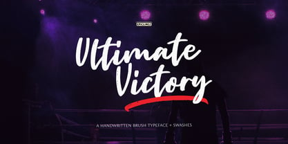 Ultimate Victory is an authentic handwritten brush typeface. This textured script font is suitable for posters, magazines, apparels, movie headlines, packaging and more.
 - La Pamalia by Fikryal,
$14.00 La Paloma is a handwritten font, and is perfect for your needs such as: logos, posters, handwriting, mockup, magazines, business cards and more.
 - Morning Violetta by Fortunes Co,
$19.00 Morning Violetta is modern contemporary display sans, and well suited for magazines, brochures, logos, headline or quotes, stand alone display, and short paragraphs.
 - Kona by Linecreative,
$14.00 Kona is a display font perfect for branding, homeware design, product packaging, magazine headers - or just perfect as display text against any background.
 - VTCTattooScriptTwo - Personal use only

- VTC-KomikaHeadLinerChewdUp - Personal use only

- Shout by HiH,
$12.00 Shout is a “Hey, Look at ME” font. It is an attention-getting font for posters, flyers and ads. Its lineage includes the Haas Type Foundry’s 19th century advertising font, Kompakte Grotesk, which Jan Tschichold (1902-1974) dryly described as “extended sans serif” and which graphic designer Roland Holst (1868-1938) would have disapprovingly referred to as a “shout,” as opposed to the quiet presentation of information that he believed was the proper function of advertising. In 1963 Letraset released what appears to be an updated variation in multiple weights designed by Frederick Lambert called Compacta. Shout draws heavily on Compacta, as well as other similar fonts of the 50s and 60s like Eurostile Bold Condensed and Permanent Headline. In weight, it falls about halfway between Compacta Bold and Compacta Black, but with a relatively heavier lower case that is not so easily pushed around by the upper case. After all, one can shout while sitting down. Shout is the first font released with our new encoding, as noted in the All_customer_readme.txt. The Euro symbol has been moved to position 128 and the Zcaron/zcaron have been added at positions 142/158 respectively. Otherwise, Shout has our usual idiosyncratic glyph selection, with the German ch/ck instead of braces, a long s instead of the Greek mu and our usual Hand-in-Hand symbol. There are also left and right glyphs of a big mouth ]ing (135/137) and left and right glyphs of an angry man shouting (172/177). Please use Shout with discretion. Folks get tired of being yelled out. After awhile, they stop listening. Shout ML represents a major extension of the original release, with the following changes: 1. Added glyphs for the 1250 Central Europe, the 1252 Turkish and the 1257 Baltic Code Pages. Add glyphs to complete standard 1252 Western Europe Code Page. Special glyphs relocated and assigned Unicode codepoints, some in Private Use area. Total of 355 glyphs. 2. Added OpenType GSUB layout features: pnum, ornm, liga, hist & salt. 3. Added 266 kerning pairs. 4. Revised vertical metrics for improved cross-platform line spacing. 5. Revised hyphen, dashes & math operators. 6. Minor refinements to various glyph outlines. 7. Inclusion of both tabular & proportional numbers. Please note that some older applications may only be able to access the Western Europe character set (approximately 221 glyphs). The zip package includes two versions of the font at no extra charge. There is an OTF version which is in Open PS (Post Script Type 1) format and a TTF version which is in Open TT (True Type)format. Use whichever works best for your applications.
 - Gaslon by Canada Type,
$24.95 Gaslon is a slight reinterpretation and major expansion of a 1973 film type called Corvina Black, originally designed for VGC by A. Bihari. While the original typeface was popular in its own right, there were some things in it that were too quirky to work in the display applications it was intended for. Some of the letter combinations just didn't work to their visual optimum. For example the a and o were too similar, ditto the C and G, the E, F and J were too overwhelming to be set properly within certain display uses. Gaslon eliminates these problems by the inclusion of plenty of alternates for the vast majority of the original letters. In fact, the original a is itself now an alternate to a gorgeous new one. The Gaslon Alt font includes tremendous possibilities for both unicase use, and proper use in conjunction with the main font. This is our true homage to a typeface that had great potential more than three decades ago, but was overlooked by digitizers because of a few quirks it had in film type contexts. Full of curves and invitation, Gaslon ranks very high among the friendliest poster faces ever made. It is ideal for friendly store signs, children book covers, and plenty of other applications. In fact, if you're planning on contributing to a few protests around your neighborhood or city, you would probably be better off using Gaslon to help your sign/placard carry words and slogans that are big but friendly. Nothing beats "DOWN WITH GAS PRICES" set in a nice imaginative mix of the many Gaslon letters. The OpenType version of Gaslon is a single font that contains all the alternates and niceties programmed within features accessible by OT-friendly programs.
 - Monatha by Attype Studio,
$13.00 Monatha is a classy script typeface that suitable for cute & feminine looks on your works. Monatha is perfect for girly product, branding, logo, invitation, stationery, product packaging, merchandise, monogram, blog design, game titles, cute style design, Book/Cover Title and more. Features : - Ligatures - Ending Swashes - Multilingual Support - Made it into separated file to make it easier to use by beginner & separated file user can use the font with software which doesn't accept open type features. --- Hope you enjoy with our font! Attype Studio
 - Funky Muskrat - Unknown license


