10,000 search results
(0.034 seconds)
- Legestue by Bogstav,
$16.00 Legestue is danish and means playroom. But perhaps that translation is too direct. Legestue is a place where you can come with your kids and play with other kids. Kinda like a kindergarten, but in much smaller scale. I attended a Legestue when my kids were like 2 years old. But that's a looong time ago! I like the idea of just dropping by and see who's playing and who's around. And the same goes for this font - each letter is off and different, and quite playful. Also, the letters has a crunchy outline, which made me think of some of the cookies I ate at the Legestue :)
 - Young Itch AOE by Astigmatic,
$19.95Ok, so many of you are now probably wondering if I am a teenager. Nope. But I was once, and I had alot of pent up angst like alot of other teens, and maybe this typeface is my outlet for what is left of those teenage days of mine. Take it as you will, but Young Itch is a bold, scratchy, handdrawn typestyle, with that feel of grunge and pent up anger. The typeface comes with its own persona, but I bet it would work itself well into a wide array of designs. Ventilate your current or past teen angst with Young Itch today! - SK Boncuk by Salih Kizilkaya,
$9.99 SK Boncuk is a very special font family I designed for my pet. Bead is a very smart and special rabbit. It can understand all commands and do whatever is said. It is very lively and fun in his daily life, but also monotonous. For this reason, I designed a fun font for him, with a single weight but with surprises. This font represents Boncuk's fun but monotonous life. SK Boncuk offers full support for the Latin alphabet and includes all the typographic elements you will need. This font family consists of 8 different fonts and 3288 glyphs and it supports hundreds of different languages thanks to the characters it contains.
 - Diediedie - Unknown license

- Mandalay - Unknown license

- Alpha Dance - Unknown license

- PF DIN Mono by Parachute,
$45.00 PF DIN Mono is the latest addition to the ever-growing set of DIN super-families by Parachute. It was based on its proportional counterpart DIN Text Pro but was completely redesigned to reflect its new identity. DIN Mono is a monospace typeface which is comprised of characters with fixed width. Traditionally, monospaced fonts have been used to create forms, tables and documents that require exact text line lengths and precise character alignment. DIN Mono, on the other hand, can prove to be more than a useful typeface for technical applications. In the world of proportionality, DIN Mono stands out as a fresh new alternative to the popular standard, particularly for publishing and branding applications. Additional care was given to the aesthetic form and its pleasing characteristics. The spacing attributes of the glyphs were redefined and legibility was further improved by revising or changing the shape of the letterforms. Furthermore, kerning was not included in order to preserve the monospace nature of this typeface. The family consists of 12 weights including true-italics. Currently, it supports Latin, Eastern European, Turkish and Baltic.
 - Arzachel by CAST,
$45.00 Arzachel is a humanistic sanserif with a big x-height and a specific organic look. Its design is scientifically sharp and efficient in small type sizes as well as rugged and dramatic in headlines. Arzachel’s essential feeling comes from several features: all the letters are slightly sloped, stem terminations are flared at the top, and the terminals in letters a, c, e, f… are widening with the inside parts completely flat. The stroke contrast is low in the regular weight while it increases in the black; finally the capitals have an inscriptional flavor. Despite being a sanserif (thus a product of recent typography) Arzachel’s roots stretch back to the Renaissance tradition: Olocco took inspiration from some of the early and rather weird types cut in Venice in the 15th century. Arzachel was conceived during Olocco’s MA in Reading to provide a companion for his Zenon for use in small type sizes. But instead of expanding the Zenon family with optical sizes, the designer decided on a sans with its own personality rather than a sanserif version of Zenon with chopped-off serifs.
 - ITC Caslon No. 224 by ITC,
$40.99 The Englishman William Caslon (1672-1766) first cut his typeface Caslon in 1725. His major influences were the Dutch designers Christoffel van Dijcks and Dirck Voskens. The Caslon font was long known as the script of kings, although on the other side of the political spectrum, the Americans used it as well for their Declaration of Independence. The characteristics of the earlier Renaissance typefaces are only barely detectable. The serifs are finer and the axis of the curvature is almost or completely vertical. The overall impression which Caslon makes is serious, elegant and linear. Next to Baskerville, Caslon font is known as the embodiment of the English Baroque-Antiqua and has gone through numerous new interpretations, meaning that every Caslon is slightly different. ITC Caslon 224 was designed by Edward Benguiat and appeared with ITC in 1982. It is the text font which expanded upon the title font ITC Caslon 223. The alterations in the proportions of the letters make this Caslon 224 a noticeable departure from the original, but make the font overall more legible.
 - Greek by Scholtz Fonts,
$8.95The Greek font started from an experiment with designing fonts based on a geometric grid. I joined the points on the grid with straight lines to form the various characters and found that this resulted in a font that closely resembled Greek writing (derived from inscriptions carved in stone) of ancient times. I continued to develop this theme but I now accentuated the look and feel of Greek writing. The three styles shown are the results of this development. I did not kern or letterspace the individual letters since this would have been out of character with the orignal Greek writing. This means that the font is mono-spaced. At a later stage I may produce more refined and "modern" versions of these fonts. Surprisingly, the Greek SCF styles are very readable. The font is fully professional in terms of its character set. It contains over 235 characters - (upper and lower case characters, punctuation, numerals, symbols and accented characters are present). In fact, it has all the accented characters used in the major European languages. - Lust Hedonist by Positype,
$50.00 Check out the new Lust Pro & Lust Pro Didone to see how the series has grown and evolved. Confident, voluminous and versatile, Lust is an exercise in indulgence—an attempt to create something over the top and vastly useful. Lust Hedonist pushes contrast almost to the limit. The letterforms, especially the Script style are very self-indulgent for me, dare I say Hedonistic, and how I like to see letter masses taken to extreme contrast. The series unapologetically channels Herb Lubalin, but produced with a deliberate, contemporary twist. There is an intentional slyness infused in the letterforms—the extreme thick and thin lines flow effortlessly without becoming gratuitous. It’s always just enough, not too much. What makes the type series so appealing? The curves. When asked to describe the letterforms, most people unwittingly allude to the human form, using adjectives usually reserved for describing physical traits… creating all-too-familiar comparisons. Summerour has grown to accept this as unavoidable and reasonable given his acknowledgement of its influences and has provided nuances within the letterforms to accentuate that.
 - FS Renaissance by Monotype,
$52.99 FS Renaissance is a display stencil typeface by the Monotype Studio. A collaboration between lettering artist and designer Craig Back and Creative Type Director Pedro Arilla, the single style font explores the intersection between art and design. With artist and designer working hand in hand, each letter was crafted as a standalone piece of art, while working harmoniously together as a functioning typeface. The typeface is inspired by the Renaissance period symbolised by flourishing progress in the arts, sciences, learning, and philosophy. The typeface is not a traditional stencil design: the cuts are not rigid but interactions that are hand crafted between each element, emphasising the idea of a typeface as a piece of art or sculpture. Pedro Arilla’s aim was to take the core DNA of Craig's lettering and apply it to a typographic base with a solid internal consistency, balanced with an external elegance. Pedro and Craig worked closely together to make sure the original concept was not compromised and this is reflected in the finished design which strikes the perfect balance between functionality and art.
 - Bouquet by Serebryakov,
$39.00 Bouquet font is a cursive fat typeface influenced by brush writing and skilfully flavored with elements of fractur. The result is really amazing – a font with bespoke personality, strong unique presence and classy standing out amongst the other look. Type designer Dzianis Serabrakou really did well in every single letterform, aperture, curve and line, but this was probably below satisfactory and he didn’t stop here – Denis developed the font to a higher level by making it fully open-type compatible. Bouquet supports large set of multilingual diacritics plus a beautifully designed set of Cyrillic characters. Additionally you will be able to use also ligatures and really lots of alternative symbols to bring more life, versatility and personalization in your work. Initially Bouquet has been designed as a logo font – it is so identical that could easily turn every brand name into logo icon. Furthermore this font is perfect for designing t-shirts, typographic posters, packaging etc and it is highly recommended for letterpress as well as for normal offset and screen printing.
 - Mr Gabe by Leksen Design,
$- Check out Mr Gabe in motion! Mr Gabe is a typeface designed to dance. Not that it’s a flamboyant display face, but that it has a liveliness, especially in its heavier weights, that dances across the page. And the letters include a selection of exuberant flourishes that can be used to kick up a ruckus or make a sweeping gesture. Mr Gabe is a high-contrast serif typeface with vertical stress, a “modern” face in traditional type terms. Even in the regular weight, the contrast between thick and thin strokes is very obvious. Designer Andrea Leksen has given many of the lowercase letters ball terminals, teardrop shapes that make Mr Gabe seem decorated even when most of its letter forms are conservative. If you need more bells and whistles, or perhaps revolving mirror balls and dancing shoes, you can explore the font’s collection of ornaments and decorative borders. Mr Gabe comes in four weights, from Regular to Black, with italics for each. Each font includes over 57 ligatures, 31 illustrations and borders, small caps and proportional oldstyle numerals.
 - Ornable by Casloop Studio,
$16.00 Meet Ornable Typeface, your font of choice for a captivating blend of Renaissance, Art Nouveau, Medieval, and Art Deco vibes. This single-weight typeface is designed for those seeking a font that embodies a rich tapestry of artistic nuances. With 35 meticulously crafted ligatures, Ornable ensures your text is not just seen but experienced. Dive into the charm of fractions for precise numerical representation and case-sensitive forms for a perfect interplay of uppercase and lowercase letters. Stand out effortlessly with the inclusion of a unique arrow symbol, adding a modern touch to your designs. Ornable adapts seamlessly to various themes, from the classic allure of Renaissance to the bold geometry of Art Deco. Whether you're crafting posters or logos, Ornable celebrates your creativity with sharp lines and intricate details. It's the ideal choice for projects that demand a touch of mystique and retro charm. Capture the essence of artistic movements with this typeface and step into a world where past and future converge – embrace Ornable and redefine the boundaries of your creative expression.
 - Linotype Mega by Linotype,
$29.00Linotype Mega is part of the Take Type Library, chosen from the entries of the Linotype-sponsored International Digital Type Design Contests of 1994 and 1997. The fun schrift of German designer Till F. Teenck is available in three weights whose names are word plays in themselves. Mega in (which we hope the font will be) contains relatively light, somewhat irregularly-drawn characters which look as though they were printed by hand and the characters are set rather far apart from each other. This weight is good for short and middle length texts in point sizes of 10 and larger. Mega normal is anything but. The characters are the outline forms of Mega in and their larger width reduces the distance between them. This weight is generally a headline font. Mega out is a very heavy weight and is the filled-in version of Mega normal. The characters flow into each other and look almost like silhouettes. The reduced legibility makes this font suitable exclusively for headlines in larger point sizes. - Gilam by Fontfabric,
$39.00 Gilam is a sans serif font with semi-condensed proportions. The typeface was based on the famous DIN but combines its popular neo-grotesque look with characteristics, such as the pointed edges in the “W” and “M” as well as the outward cut terminals, which gives a distinctive look to the modern geometric typeface. The complete set of 9 weights plus italics gives to designers the absolute freedom to create anything. Perfect layouts with blocks of text, headlines, motion graphics, logos, apps, and websites are just part of the intended usage of this versatile typeface. Features: • 765 glyphs in 18 styles; • Extended Latin, Cyrillic and Greek; • Geometric forms and low contrast; • Prominent x-height which makes it legible in a text; • Perfect for headlines and logos; • Suitable for web, print, motion graphics etc. • Semi-condensed proportion; • Advanced typographical support and OpenType features including case-sensitive forms, fractions, superscript and subscript characters, and stylistic alternates; • Complete set of figures - old style and lining figures, which come with proportional and tabular variation; Gilam means “joy of people” so that you can enjoy it!
 - MGN Kinetic by Morgana Studio,
$18.00 MGN Kinetic is an innovative font iconography type product released by Morgana Studio in 2023. This unique font set offers a fresh and dynamic approach to incorporating icons into your designs. MGN Kinetic features a one-of-a-kind design that sets it apart from other font sets, making it an ideal choice for designers who want to create eye-catching and memorable designs. One of the standout features of MGN Kinetic is its ability to bring movement and energy to your designs through its dynamic icons. These icons are designed to convey a sense of motion and fluidity, adding a new dimension of interest to your work. With MGN Kinetic, you can create designs that are not only aesthetically pleasing but also convey a sense of action and movement, making your work more engaging and memorable. Whether you're designing for a website, app, or other digital media, MGN Kinetic is the perfect choice for designers who want to elevate their work and stand out from the crowd
 - Claston Script by Krafted,
$10.00 Turn the page to the future and leave all the past behind. It’s a new age and you will move the cogs of the world forward! There is no need to worry or fear, the Claston Script will pave the way for you. With its clean script-type design and curved indentations, this font will take your projects to the next level! Move forward with elegance and bring your audiences to where your vision is: the future. It might take some time to get them there, but that’s okay! You have the perspective, the frame of mind, and most importantly the attitude to wrap it all together into a neat project! The Claston Script aims to bring out a modern and stylish view to what you make. It fits right in with your designs, whatever it is! It’s beautiful without trying too hard, it’s gorgeous without being apologetic, it’s brave in the face of uncertainty, these all represent you. Easily connect with your urban and forward thinking audience with this script and blow their minds!
 - Battista by preussTYPE,
$29.00 The BATTISTA typeface stands in the long tradition of the designs developed by Giambattista Bodoni, who made his famous typefaces in the end of the eighteenth century. Similar designs can be found on various specimen books e.g. Alexander Wilson, John Bell, Edmund Fry and Alexander Thibaudeau. One of the best italics was available by Stephenson Blake & Co. foundry form Sheffield, England. In the end of the nineteenth century an unknown punch cutter at the German type foundry Schelter & Giesecke made an very bold cut of this Bodoni design. He brought both designs, the regular and the italic to an new level of harmony. Compared to the original Bodoni designs the new typeface was a lot bolder, which was well taken by the audience in this time. The BATTISTA typeface is an remarkable design, assembled of ultra bold and very fine shapes, but in all, the spirit of Bodonis design was well preserved. BATTISTA is a classic display design. The fine details are best shown on larger text sizes.
 - Pagewalker by Kostic,
$40.00 The name of the font is chosen to suggest its main purpose—setting multiple pages of text. All the features in this family were made with that in mind—legibility, distinct italics, small caps and various OpenType features, all make this font a useful tool for typographers. On the other hand, for packaging, posters, logotypes, etc. setting heavier weights in large size brings out its display qualities. Pagewalker is very legible and appears to be larger than other text typefaces. That is because the lower-case characters are made large compared to the capital letters. This means it can be used for setting text in, e.g. 9 pt size—while appearing to be 10 pt, but occupying less space. Pagewalker has a character set to support Western and Central European languages, and an extended set for monetary symbols which, in combination with tabular numbers, is perfect for financial reports. Each weight includes small caps, ligatures, proportional lining and oldstyle numbers, tabular figures, fractions and scientific superior/inferior figures.
 - Strapwork by 2D Typo,
$36.00 The Strapwork is a symbolic font with the ornaments from the 16th century Mannerism era. These type of ornaments are called Strapwork and are combined with the Moreske ornament. Together they create a rich and refine style. As a prototype for this font I took the tables of ornament examples by etcher Balthasar Bos (1554). The font contains high quality vector graphics with a special attention paid to details. This collection consists of many friezes (borders). There are more than ten basic motifs and a great number of combinations. The ribbon elements are easily laid out by typing the combination of letters. The four typefaces help to combine ornaments in various tones and colors. By overlaying plants elements with ribbon elements you can get a multicolor richness and combinations variety. The font comes with a detail documentation and examples in PDF format. The Strapwork ornaments will ideally suit your needs in graphic design, textile industry or various decorations. The Strapwork font can be easily used not only in traditional approach but also in grunge stylistics, which will enrich your compositions.
 - Evalfey by insigne,
$35.00 Love at first sight: Evalfey is a script you will find yourself falling for. It has a smooth, sophisticated look to it, but don't be fooled by its elegant appearance – this script is actually very simple and easy to use. The tall x-height, flag like terminals and flame-like smooth, sweeping strokes give this font a fluid, flowing quality that will help enhance your design. Evalfey Script is a great font for a wedding invitation or similar. The elegant, brushed look and strong "nuptial" feel make this the perfect choice for wedding invitations, save-the-date cards, thank you notes, and more. Evalfey is the perfect font for any wedding invitation or ceremony. Simple and elegant, Evalfey is a good choice for the wedding that likes to stand out from the crowd. The tall x height, graceful flag-like terminals, and wavy sweeping strokes give this font a regal appeal. Evalfey is a perfect combination of elegance and simplicity for your wedding invitation, announcement card or other special document. Production assistance from Lucas Azevedo and ikern.
 - Rakochuk by Twinletter,
$17.00 Rakochuk is the ideal font for your project if you want a typeface that has a classic, retro, and vintage vibe in a condensed form. This typeface has a unique shape that will bring a classic touch to your project and was designed with attention and detail in mind. Not only that, but Rakochuk includes ligature and alternate characteristics, providing you greater freedom in its application, especially when you need a more personal touch in your design. This typeface is appropriate for international projects due to its linguistic support. If you want to bring an elegant classic, retro, or vintage feel to your project, consider Rakochuk. Get it now and set your project out from the crowd! What’s Included : - File font - All glyphs Iso Latin 1 - Alternate, Ligature - Simple installations - We highly recommend using a program that supports OpenType features and Glyphs panels like many Adobe apps and Corel Draw so that you can see and access all Glyph variations. - PUA Encoded Characters – Fully accessible without additional design software. - Fonts include Multilingual support
 - Squid Junkie by Mans Greback,
$59.00 Squid Junkie is a bold and vibrant tribute to the funky, hippie-inspired designs of the past. With its playful, cartoonish aesthetic and playful use of line and color, this sans-serif font is the perfect choice for designers looking to inject a touch of retro fun and humor into their projects. With its versatile range of styles, including regular, light, and bold weights, each with its own italic counterpart, this font is designed to meet the needs of designers of all levels. But that's not all - Squid Junkie is also available as an outlined font, giving you even more options for making your designs stand out. The font is built with advanced OpenType functionality and has a guaranteed top-notch quality, containing stylistic and contextual alternates, ligatures and more features; all to give you full control and customizability. It has extensive lingual support, covering all Latin-based languages, from Northern Europe to South Africa, from America to South-East Asia. It contains all characters and symbols you'll ever need, including all punctuation and numbers.
 - Segment B Type by Kobuzan,
$19.99 Segment B is a powerful display type family with 18 styles inspired by condensed European grotesques of 19th-century with a reference to the first grotesques, which differ in the contrast of strokes, but with clear geometric proportions. In Black weights, the letterforms are inspired by the aggressive industrial graphic design of the 1960s and 70s. Both have 3 axes and are adjustable in weight, width and 10? italic. It is a typeface with narrow proportions, distinctive character, high-quality outline and lots of details. Characters have oblique cuts, sharp tails and highly visible ink traps. All this makes the font more aggressive and edgy. The huge x-height with short ascenders and descenders allows this typeface to be used in blocks with minimal line spacing. Features: – Total glyph set: 631 glyphs; – 18 styles (3 weights x 3 widths + italic); – Support 210+ languages; – Latin Extended; – Cyrillic Basic + Bulgarian letters; OpenType features: – Proportional numerals, tabular numerals, superiors, fractions; – Punctuations and symbols; – Arrows; – Stylistic alternates (ss01-ss05); – Ligatures; – Case-sensitive forms.
 - Omletta by Invasi Studio,
$17.00 This chunky rounded bold font is not only fun and playful but also incredibly versatile. Whether you're working on food product branding, creating a display headline, or designing packaging for your latest project, Omletta font will surely bring a smile to your face. With its bold and rounded design, Omletta font is perfect for creating eye-catching designs that demand attention. It's perfect for brands that want to make a bold statement and stand out from the crowd. Plus, with its support for Latin multilingual, you can use Omletta font for all of your international design projects. So what are you waiting for? Add some fun and excitement to your next project with Omletta font. With its playful and youthful tone, this font is perfect for creating unique and memorable designs. Whether you're designing for a food brand or a fun event, Omletta font is the perfect choice to help you capture the essence of your project. Get ready to make your designs pop with this bold and playful font!
 - Grunge Formal by Scholtz Fonts,
$15.00 Grunge Formal started out as a more upright, formal version of one of my fonts, Figment. A most versatile contemporary typeface, Grunge Formal works equally well from funky to formal, from giant size headers to pint size body text, from movie posters to wedding invitations. If you've ever needed a font that has a grungy, deconstructed look but works well for all sizes, a font that you can use for funky, gritty designs, and also for formal wedding stationery, Grunge Formal is a perfect choice. From the formal viewpoint, the font presents as a regular serif typeface with deconstructed edges, giving the antique look popular in wedding stationery design. Here it can be used from header to body size. For in-your-face design, Grunge Formal, when oversized, is really powerful and its deconstructed outline provides a raw, rough contrast to your background images. Grunge Formal has all the features usually included in a fully professional font. Language support includes all European character sets, Greek symbols and all punctuation.
 - Strateen by IbraCreative,
$17.00 Strateen – a Futurism Sans Serif Font Strateen, a Futurism Sans Serif font, encapsulates the essence of contemporary design with its sleek and progressive aesthetic. Its clean, geometric lines and minimalistic strokes evoke a sense of modernity, making it ideal for projects that seek a futuristic and cutting-edge look. The typeface’s letterforms boast a harmonious balance between simplicity and sophistication, enhancing legibility while maintaining a distinctive personality. Strateen’s sans serif nature contributes to its versatility, enabling seamless integration across various mediums, from digital interfaces to print materials. The font’s forward-thinking design not only aligns with the visual trends of the future but also ensures a timeless appeal, making Strateen a compelling choice for those in pursuit of a dynamic and forward-looking typographic solution. Strateen is perfect for branding projects, logo, wedding designs, social media posts, advertisements, product packaging, product designs, label, photography, watermark, invitation, stationery, game, fashion and any projects. Fonts include multilingual support for; Afrikaans, Albanian, Czech, Danish, Dutch, English, Estonian, Finnish, French, German, Hungarian, Italian, Latvian, Lithuanian, Norwegian, Polish, Portuguese, Slovak, Slovenian, Spanish, Swedish.
 - Haboro Sans by insigne,
$- Quit trudging through the thick with encumbering fonts, and spring to the front of the pack with the cutting edge sans serif, Haboro Sans. With nothing to clutter up your work, your editorial designs, websites, and software will be sharp and clear. While this hyperfamily is simple in character, it (like Haboro Slab and Haboro as well) provides you with plenty of options. Haboro Sans features simple geometric shapes to help you achieve that perfect effect wherever you use it. Enjoy the comforting reassurance that this multi-tool of a typeface family can work on most anything, including packaging, branding, web copy, and more. Take the simplicity of Haboro Sans a step farther with OpenType features, too. Haboro Sans contains special glyphs like Titling, Small Caps and Oldstyle figures that give your work just enough of a distinct touch. For even more options, use the entire Haboro hyperfamily to expand your capabilities. Put some simple class into your projects with the traditional look of Haboro Sans. Your layouts, websites, iPhone apps, advertising, and newspapers (to name just a few) will thank you.
 - Maris by insigne,
$25.00 Maris is a rich, elegant script, subtly characterized by a whimsical handwritten calligraphy. The family is composed of six different weights, each one bolder than the last but all equally as filling. The lighter weights move delicately through each line, showing a gentle strength in their smaller frame. The six weights from these lighter forms to the bold include some textured versions such as jean, wood, print, rough and halftones. The Maris family performs superbly in custom headlines and logotypes. Turn on Swash, Stylistic or Contextual Alternates for even greater emphasis. Opentype lets you "auto-magically" swap out letter sets with alternate versions and creates the visual diversity that gives you the one-of-a-kind look of custom lettering. It also uses OpenType features to assist with letter flow. When you choose to make use of its open-type decorative glyphs, your headlines will dazzle. For the greatest benefit, grab the entire Maris family. Thanks to its variety of styles, Maris makes it easier for you to design. With this large font family, solve your design problem with just one typeface.
 - Night Visions by Wing's Art Studio,
$14.00 Night Visions: An Unsettling Hand-Drawn Brush Script Font Night Visions is a hand-drawn script font with a loose style typical of late night horror and thriller movie posters. It’s designed to look as though ink has been laid with the nervous flick of the artists brush, giving a random, imperfect, but elegant result. This font comes with the flowing script of the regular version or a complete set of non-script alternatives. Added to which there are additional character alternatives and special ligatures to experiment with for a truly hand-made look. Each version comes with a full set of uppercase and lowercase characters along with numerals, punctuation and language support. I recommend this font for anyone about to design a header or title that needs an authentically hand-made look. It’s the perfect choice for movie titles or posters, album covers, comic books, t-shirts or editorials. It’s a font that rewards experimentation and offers many options for your designs. Check out the visuals for usage ideas.
 - Animal Chariot by Timurtype,
$14.00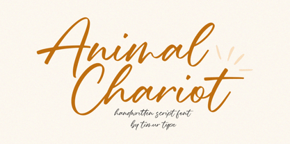 Animal Chariot A Handwritten Script Font Animal Chariot is perfect for product packaging, branding project, megazine, social media, wedding, or just used to express words above the background. Animal Chariot also multilingual support. Embelish your designs with our original fonts.Enjoy the font,Thank you!
 - Chucara Next by Letritas,
$25.00 Chucara next is the newest font designed by Juan Pablo De Gregorio, a typeface aimed at high readability when set in paragraphs or large chunks of text. Its predecessor "Chúcara", born in 2003, sought after increasing readability by achieving big and simple counterforms. This time around Juan Pablo went further by increasing the X-height and trimming both ascenders and descenders, thus the font appears to be much larger than it is and can be readable at smaller sizes. The DNA of the whole font is marked by the terminal of the "a" character. Juan Pablo used a specially crafted cut to design this counterform, and this shape together with the graceful and winding forms of the letter resembles the form of a horse, hence the name Chúcara, or untamed. The italic version has a 10-degree angle and a 10% condensation, making it way more streamlined than a regular italic font. The Philosophy of a larger counterform is maintained through and through in the italic variant. This version looks different not only due to its inclination, but the sheer effort put into carefully taking care of the condensation and the gestures allow the italic to enrich the texts gracefully, for the highlighting of the words stands out without affecting the grey of the paragraph. Chucara next is a typeface optimal for being used in books, newspapers, magazines, texts, printing, headlines, editorial, quotes, corporate identity, and lo res printing. The typeface has 8 weights, ranging from “thin” to “black”, and two versions: "regular" and "italic". Its 16 files contain 635 characters with small caps, stylistic sets and different kind of numbers. It supports 219 Latin-based languages, spanning through 212 different countries. Chucara next supports this languages: Abenaki, Afaan Oromo, Afar, Afrikaans, Albanian, Alsatian, Amis, Anuta, Aragonese, Aranese, Aromanian, Arrernte, Arvanitic (Latin), Asturian, Atayal, Aymara, Bashkir (Latin), Basque, Bemba, Bikol, Bislama, Bosnian, Breton, Cape Verdean Creole, Catalan, Cebuano, Chamorro, Chavacano, Chichewa, Chickasaw, Cimbrian, Cofán, Corsican Creek,Crimean Tatar (Latin),Croatian, Czech, Dawan, Delaware, Dholuo, Drehu, Dutch, English, Estonian, Faroese, Fijian Filipino, Finnish, Folkspraak, French, Frisian, Friulian, Gagauz (Latin), Galician, Ganda, Genoese, German, Gikuyu, Gooniyandi, Greenlandic (Kalaallisut)Guadeloupean, Creole, Gwich’in, Haitian, Creole, Hän, Hawaiian, Hiligaynon, Hopi, Hotc?k (Latin), Hungarian, Icelandic, Ido, IgboI, locano, Indonesian, Interglossa, Interlingua, Irish, Istro-Romanian, Italian, Jamaican, Javanese (Latin), Jèrriais, Kala Lagaw Ya, Kapampangan (Latin), Kaqchikel, Karakalpak (Latin), Karelian (Latin), Kashubian, Kikongo, Kinyarwanda, Kiribati, Kirundi, Klingon, Ladin, Latin, Latino sine Flexione, Latvian, Lithuanian, Lojban, Lombard, Low Saxon, Luxembourgish, Maasai, Makhuwa, Malay, Maltese, Manx, M?ori, Marquesan, Megleno-Romanian, Meriam Mir, Mirandese, Mohawk, Moldovan, Montagnais, Montenegrin, Murrinh-Patha, Nagamese Creole, Ndebele, Neapolitan, Ngiyambaa, Niuean, Noongar, Norwegian, Novial, Occidental, Occitan, Old Icelandic, Old Norse, Oshiwambo, Ossetian (Latin), Palauan, Papiamento, Piedmontese, Polish, Portuguese, Potawatomi, Q’eqchi’, Quechua, Rarotongan, Romanian, Romansh, Rotokas, Sami (Inari Sami), Sami (Lule Sami), Sami (Northern Sami), Sami (Southern Sami), Samoan, Sango, Saramaccan, Sardinian, Scottish Gaelic, Serbian (Latin), Seri, Seychellois Creole, Shawnee, Shona, Sicilian, Silesian, Slovak, Slovenian, Slovio (Latin), Somali, Sorbian (Lower Sorbian), Sorbian (Upper Sorbian), Sotho (Northern), Sotho (Southern), Spanish, Sranan, Sundanese (Latin), Swahili, Swazi, Swedish, Tagalog, Tahitian, Tetum, Tok Pisin, Tokelauan, Tongan, Tshiluba, Tsonga, Tswana, Tumbuka, Turkish, Turkmen (Latin), Tuvaluan, Tzotzil, Uzbek (Latin), Venetian, Vepsian, Volapük, Võro, Wallisian, Walloon, Waray-Waray, Warlpiri, Wayuu, Welsh, Wik-Mungkan, Wiradjuri, Wolof, Xavante, Xhosa, Yapese, Yindjibarndi, Zapotec, Zulu, Zuni.
 - Brown Marlyn by Ergibi Studio,
$20.00 This is the perfect combination of fonts, we are proud to introduce BROWN MARLYN, these fonts are of two types serif and script. Display Serif inspired by famous logo, This typeface has been made carefully to make sure its premium quality and luxury feel. The ligatures on serif makes this typeface unique and stands out rather than the regular serif font, perfectly for headlines, wedding, social media, logos, posters, packaging, T-shirts,coffee shops, restaurants, magazine’s headers, signs or gift/post cards,cafe’s and weddings or any type of advertising purpose. What's Included : Standard glyphs Ligatures International Accent Works on PC & Mac Simple installations If there is a problem, question, or anything about my fonts, don't hesitate to ask! Big Thanks ~ Ergibi Studio
 - British Castilla by Ergibi Studio,
$19.00 British Castilla Luxury Font Duo, these fonts are of two types serif and script. This typeface has been made carefully to make sure its premium quality and luxury feel. The ligatures on serif makes this typeface unique and stands out rather than the regular serif font, perfectly for headlines, logos, posters, packaging, T-shirts,coffee shops, restaurants, magazine’s headers, signs or gift/post cards,cafe’s and weddings or any type of advertising purpose. British Castilla Luxury font includes over 94 ligatures to make it more natural and has a beautiful characteristic hand lettering What's Included British Castilla* include, numbers, punctuation, alternates, and it also supports other languages British Castilla* it also supports multilingual if you have any questions, don’t hesitate to contact us
 - Exit by FSD,
$50.00Exit is my first typeface (designed in 1988). The relationship to Neville Brody's work is evident but with personal touch - Cheapside by Device,
$29.00 A condensed serif that’s been through the ravages of reproduction but has now been digitized for modern use. Elegantly wasted.
 - RM Serifancy by Ray Meadows,
$19.00 A bit Circus ... a bit Showbiz ... a bit Western ... but completely FANCY Includes: Western European, Central European, Baltic & Turkish sets
 - Alta Basilica by Blendy wine,
$9.00 This font was created to capture the delicacy of ancient art. But it can still be used today very well.


