10,000 search results
(0.16 seconds)
- Blitzeffekt by Matthias Luh,
$22.00 Pointy edges, flat design and recurring shapes. blitzeffekt is like lightning: sharp corners and distinctive shapes. Be minimal. blitzeffekt.
 - Gavinha by Intellecta Design,
$19.00 A highly decorative font inspired by victorian and flourish like designs. Great in header and large vintage style designs.
 - MicroTech - Unknown license

- Stencil Set JNL by Jeff Levine,
$29.00 Stencil Set JNL takes the 2011 release of Stencil Mark JNL (a spur-serif letter based on a vintage set of brass stencils) and transitions it to the design of a clean, bold sans typeface.
 - Black Beer by Fractal Font Factory,
$10.00 Black beer, strong Gothic. It is designed for logos, prints, headlines and more. The font has 4 styles, base, blurred, outlined, and aged. Contains basic characters and punctuation marks as well as extended multilingual characters.
 - Hookshot by Callout,
$19.00 Hookshot is a quirky serif font font with a retro touch, inspired by an old Canon Word-mark. Hookshot works great for headlines, callouts, and illustrations. It is perfect for short words and even sentences!
 - Alt Gotisch by HiH,
$12.00 Alt-Gotisch Verzierte is a typeface of decorative initials that is Victorian in style and bears a close family resemblance to the many ornamental tuscans cut throughout the nineteenth century by British foundries. Instead of the bifurcated terminals of the archetypical tuscan (see Figgins Tuscan by HiH or Stereopticon by Dan X. Solo), these letters display what Nicolete Gray might call a “wedge and bite” design -- as if they started with the wedge serif of a latin form and someone came along and took a perfectly round bite out of the wedge. We need not dwell on the lack of teeth marks. The calligraphic curls and flourishes are often graceful, sometimes a bit contrived, but always complex. There is a busyness that marks the style of the period. If you ever see an old photograph of a well-appointed Victorian parlor, you will recognize that same quality of busyness. Overdone is a word that frequently comes to mind. Alt-Gotisch Verzierte means “adorned or decorated old gothic.” The typeface is attributed by Alexander Nesbitt to an unidentified German foundry of the nineteenth century (Decorative Alphabets and Initials, Dover, New York 1987, plate 92). The designer is unknown. Our font is supplied with a lower case that is similar to the upper case, but is 15% shorter and is simplified by the omission of the decorative vines. For the lower case, alternate letters A, E, & T; and ligatures LE, OT & LY have been supplied. In addition, a few small decorative vines were planted here and there for optional use. An accented upper case is not part of the original design and is not here supplied. This design is also seen under the name “Sentinel” -- as always, it is worthwhile to compare the completeness of the character set and the faithfulness of the rendering. We believe you will agree that we provide a balance of quality and value that is unmatched in the contemporary marketplace. Alt-Gotisch Einfach is a simplified version of Alt-Gotisch Verzierte. The vine-less lower case of the Verzierte font is the upper case in Einfach. For a lower case for Einfach, the letters were further simplified by stripping away the three-dimensional outline, down to the bare bones and bites, as it were. Einfach, in fact, means “simple” or “plain.” It is interesting to note that this bare bones & bite lower case bears (I have a special license to use two homonyms in the same sentence) a striking resemblance to the 15th & 16th century ornamental letters from Westminster Abbey shown in Plate 47 of Alexander Nesbitt’s Decorative Alphabets and Initials (Dover, New York 1987).
 - Freitag Display by Zetafonts,
$39.00 Probably as a reaction to the pragmatism of modernist design, the seventies saw an explosion of buoyant, vivacious typography. Psychedelia fueled a return to the melting, lush shapes of Art Nouveau while Pop culture embraced the usage of funky, joyful lettering for advertising, product design and tv titling. New low-cost technologies like photo-lettering and rub-on transfer required new fonts to be expressive rather than legible, pushing designers to produce, bubbly, high-spirited masterpieces, where geometric excess and calligraphic inventions melted joyfully. Freitag is Cosimo Lorenzo Pancini's homage to this era and its typography. His starting point was the design of a heavy sans serif with humanist condensed proportions, flared stems and reverse contrast, that generated both the main family, and a variant display subfamily. The main typeface family slowly builds the tension and design exuberance along the weight axis - a bit like our desire for the weekend increases during the week. In Light and Medium weights the font shows a more controlled, medium-contrast design, tightly spaced for maximum display effect. The Book weight follows the same design but uses a more relaxed letter spacing to allow usage in smaller sizes and short body copy. As weight increases in the Bold weight the style becomes more expressive, with a visible reverse contrast building up and culminating in the Heavy weight with his clearly visible "bell bottoms" feel. In the display sub-family the design is pushed further by introducing variant letterforms that have a stronger connection to calligraphy and lettering. Also, the weight range becomes a optical one, with weights marked as Medium, Large, XLarge, as bringing the contrast and the boldness to the extreme creates smaller counterspaces that require bigger usage sizes. Another important addition of the display sub-family is the connected italics that sport swash capitals and cursive letterforms, developed with logo design and ultra-expressive editorial design in mind. To balance the extreme contrast in the XL weight, contrast of punctuation is reduced, creating a rich, highly-dynamic texture wherever diacritics and marks are used in the text. The full family includes 16 styles + 4 variable fonts, allowing full control of the design over its tree-hugging design space. All 20 fonts share an extended latin charset with open type features including case sensitive forms, single and double story variants and alternate glyphs. According to its creator, "Freitag is the typeface that sounds like an imaginary Woodstock where on the stage with Jimi Hendrix with Novarese, Motter, Excoffon and Benguiat playing onstage with Jimi Hendrix". Jeepers creepers!
 - Gummi by Anastasia Kuznetsova,
$22.00 I present to you a fascinating contrasting font system, Gummi! Modern development of 3 fonts, each of which is designed to complement each other in a natural way. This is an extremely versatile font collection, ideal for experimenting with vibrant and modern typographic designs in any modern design. This product includes 3 font files containing uppercase and lowercase characters, numbers and a large set of punctuation marks. Font Features * A-Z; a-z character set; * 1 language (English); * numbers and punctuation marks, symbols A font containing uppercase and lowercase letters, numbers, and a wide range of punctuation marks. Fonts can be opened and used in any software that can read standard fonts, even in MS Word. No special software is required, and to get started. It is recommended to use it in Adobe Illustrator or Adobe Photoshop Made with love ♡ Thanks for checking it out, and feel free to drop me a message if you had any queries! ~ Anastasia
 - Caerphilly by Hanoded,
$15.00 I really like Wales; I like the culture, the people and the language. I also like the Welsh legends, especially the ones about King Arthur and Merlin. I am reading a book about Arthur right now, so when I was working on this font, I wanted to give it a Welsh name. Caerphilly is a town in Southern Wales and is home to an immense 13th century castle (Castell Caerffili). Caerphilly font is based on a 16th century manuscript. I kept the glyphs rough, to give it ‘ye olde’ look. Comes with a hoard of diacritics, a bunch of double letter ligatures and some alternate glyphs as well.
 - Legestue by Bogstav,
$16.00 Legestue is danish and means playroom. But perhaps that translation is too direct. Legestue is a place where you can come with your kids and play with other kids. Kinda like a kindergarten, but in much smaller scale. I attended a Legestue when my kids were like 2 years old. But that's a looong time ago! I like the idea of just dropping by and see who's playing and who's around. And the same goes for this font - each letter is off and different, and quite playful. Also, the letters has a crunchy outline, which made me think of some of the cookies I ate at the Legestue :)
 - Struffoli by Hanoded,
$15.00 Struffoli are small, marble sized deep fried dough balls from Naples. They are served with a variety of sweet condiments, like honey, sugar and sprinkles. There is nothing deep fried about Struffoli font, nor does it resemble a deep fried dough ball: I just liked the name and at least now I can say what Struffoli are! Struffoli was handmade using a brush and Chinese ink. It does look like a connected script font, but it is not (really): only a few letters connect, making it a more versatile font. Use it for your cookbooks, posters and toy packaging. Rest assured, it comes with a generous serving of diacritics.
 - Tournedos by Hanoded,
$10.00 The other day, I was cooking a curry and I suddenly realised that we, as a family, eat a lot of meat. At home we do like meat, but given the state our world is in right now, we cannot continue eating meat like there is no tomorrow. As a result, I am hunting the internet right now for good vegetarian recipes (if you have one you’d like to share, then please contact me!). Tournedos is a beefy font family: a chunky all caps set of fonts - and a leaner set to counter and complement this rather heavy dish. And do eat your greens!
 - LiebeFish by LiebeFonts,
$19.90 LiebeFish is a collection of 172 individually hand-drawn fish. Each has its very own personality; some are happy, some are sad. Some like company, some are bored, most are cute and a few are weird. If you look closely, some fish will surely look like people you know. LiebeFish probably is the most comprehensive collection of hand-drawn fish ever. They look great on almost any greeting card, birthday card or invitation. LiebeFish also serve as a perfect companion to any informal graphic design that needs a personal, handmade touch. If you like this font, have a look at our other cute fonts such as LiebeTweet and LiebeRobots.
 - Honey Burst by PizzaDude.dk,
$16.00 I love honey - as a dessert or just as a quick snack. I didn’t really like it as a kid, but I guess that is just a result of people changes taste as time goes. I also love letters and notes - and that I also loved as a kid! And the Honey Burst font is a tribute to people to likes to take notes, and those who likes their letters being legible, but not focusing on height, width and position according to the other letters. I’ve added 7 slightly different versions of each letter, which leaves your text quite random and lovely organic - go ahead and type those notes! :)
 - Al Britania Ligatura by Aluyeah Studio,
$99.00 Britania Ligatura, a Ligature Addict Display Font Coming to you with 170+ stunning alternate and ligature to create a perfectly fashionable, beautiful, fancy, and elegant design. Features: OpenType support Multilingual support (15 languages) PUA Encoded Super Easy to Use alternates - It's OpenType support but you can easily call alternates character using special combination like A.2 B.2 a.2 b.2 etc. so you don't need special software. For special ligature you can use combination like a.n a.m u.b d.h etc To get results like the preview just type B.4r.ita.ni.2a.2 Liga.tur.a Thanks for checking out my font. I really hope you enjoy using it!
 - Hebrew Sevilha Tanach by Samtype,
$149.00 This is Classic Hebrew Sefardi Font. This is a beautiful typeface to invitations, posters, cover books and small texts. All diacritic marks for vocalization are present (Nikud), including shevana, kamats katan, cholam chaser and dagesh hazak.
 - Kally Dreams by Hishand Studio,
$14.00 Kally dreams is a beautiful monoline font with signature style that really good for water mark, logotype, advertisement, social media posts, product packaging, clothing design and more. complete with uppercase lowercase ligatures swashes alternates multilingual support
 - Hebrew Sevilha Std by Samtype,
$49.00 This is Classic Hebrew Sefardi Font. This is a beautiful typeface to invitations, posters, cover books and small texts. All diacritic marks for vocalization are present (Nikud), including shevana, kamats katan, cholam chaser and dagesh hazak.
 - Elastik by bb-bureau,
$65.00 Grotesk typeface with elastic punctuation & diacritical mark. in 4 weights: Light, regular, Medium and Bold by 4 styles: A (small diacritical), B (normal diacritical), C (hight diacritical) and D (very hight diacritical) language: all latin glyphs
 - Industrial Stencil JNL by Jeff Levine,
$29.00 Samples of vintage machine-punched stencils used for marking crates and cartons were spotted in an online auction. These served as the basis for Industrial Stencil JNL, which is available in both regular and oblique versions.
 - Deskmark Pro Slab by Alexey Makarov,
$14.00 Hi! Introducing Deskmark Slab Pro Typefamily. Original and soft version. 3 weight for each version, bold, regular and light. Language support: Contains full set of Latin alphabet, including diacritical marks for European languages and Cyrillic alphabets.
 - Stencil Plate JNL by Jeff Levine,
$29.00 A brass stencil hand cut to mark the tops of oil drums yielded the lettering for Stencil Plate JNL. The font emulates the retro feel of the unique letter forms found in the original antique design.
 - Monster DD by Doffdog,
$14.00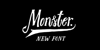 Monster DD is a decorative vintage font in modern performance. It is perfect for: Logos Posters Labels Headlines Apparel Tattoo & more Monster DD comes with upper and lowercase characters, numbers, marks and punctuation. Multilingual support Enjoy!
 - FineOMite - Personal use only

- Daphnis by RMU,
$35.00 Walter Tiemann’s elegant display font brought to life again and carefully extended with Baltic, Turkish and Central European character sets.
 - HandsOn by Letterhead Studio-VG,
$20.00 HandsOn font was developed in the late 90s. Font shape looks like manual drawing. Suitable for decoration of children's books.
 - Kalchynsky Simple Heavy by Rotograf,
$12.00This font has complete kerning pairs for all languages. Designed for books, leaflets and for outdoor use like a banner. - Bobolha by Intellecta Design,
$24.90Bobolha is a funny font good to use in kids stuff, like birthday decorations and this kind of joy things... - Deriva by BRtype,
$21.90 Deriva was created taking as inspiration the manuscripts of a homeless person live in the city of São Paulo, Brazil.
 - Beau Chat by Cititype,
$12.00 Beau Chat is a sweet handwritten font. Use this gorgeous and unique font to bring any DIY project to life!
 - ITC Panache by ITC,
$29.99Typefaces, like most other works of art, provide a small window into the personalities and sensibilities of the artists who create them. ITC Panache not only provides this window, it is also aptly named. Mr. Edward Benguiat the dreator of ITC Panache, has all the dash, verve (and panache) hinted at in the design, Creative, capable and prolific, Ed Benguiat has drawn hundreds of exciting and popular typeface designs. Benguiat's design goal was to create a sans serif typestyle that is versatile, utilitarian - and distinctive. We think he has succeeded admirably. ITC Panache's three weights mix exceptionally well to complement each other or provide emphasis where necessary. Extensive testing at text sizes and design fine-tuning has produced a typeface family which is remarkably homogenous and consistent in color. Text set in ITC Panache is inviting without dissapointment. It is exceptionally easy to read, even in long text blocks of copy or small point sizes. When set in larger sizes or used for headlines, ITC Panache's character traits becomes more apparent and pronounced to the reader. They help to create graphics with distinction and style. Big or small. a little or a lot. it's hard not to use ITC Panache well. If you could pigeonhole ITC Panache, it would probably be classified as a stressed sans", but this would not completely describe, or do justiceto, the design. There is a slight contrast in stroke weight, which becomes more pronounced as the familiy weight increases; but there is a more to distinguish ITC Panache from ather sans serifs. Perhaps most obvious is its high waist and correspondingly slight condensation of the top half of the "round" capitals. Both of these traits link ITC Panache with the sensuous forms of art nouveau creations. In contrast are the typicall old style "e" found in designs like Cloister and ITC Berkeley Old Style, and the two storied "g" common to the early 20th century sans serif designs. The capital "A" even has the cupped top found in Caslon designs. Part of the beauty of ITC Panache is that all of these seemingly unrelated desig traits are melded into a design of exceptional continuity." - Southwest Serenade JNL by Jeff Levine,
$29.00 The 1940s-era hand-lettered title on vintage sheet music for the song hit "Donkey Serenade" had an interpretation of the classic typeface "Broadway" used in a Mexican/Southwest motif with wavy lines cutting through the letters. Adapting Playwright JNL (itself, a hand-lettered interpretation of "Broadway") to this style, the festive design is now a digital typeface called Southwest Serenade JNL.
 - Adegianty by Awan Senja,
$14.00 Adegianty feels equally charming and elegant. It looks stunning on wedding invitations, thank you cards, quotes, greeting cards, logos, business cards and every other design which needs a handwritten touch. This font is PUA encoded which means you can access all of the glyphs and swashes with ease! It features a varying baseline, smooth lines, gorgeous glyphs and stunning alternates.
 - FF Softsoul by FontFont,
$41.99Dutch type designer Donald Beekman created this display FontFont in 2006. The family has 10 weights, ranging from Light to Ultra and is ideally suited for festive occasions, music and nightlife as well as poster and billboards. FF Softsoul provides advanced typographical support with features such as ligatures, case-sensitive forms, fractions, and super- and subscript characters. It comes with proportional lining figures. - Signwriter Standard by Greater Albion Typefounders,
$16.50 Typeface for posters and signage. An extensive range of opentype features are incorporated:- Small Capitals, Title forms, stylistic alternates, old-style and lining numerals, ‘small capitals’ numerals, ligatures and so forth. A touch of flair an distinction is given to these solid letter forms by the provision of tiny serifs. Why not use Signwriter Standard and make an emphatic statement today!
 - Sonopa by Kenneth Woodruff,
$20.00Sonopa is a classically unclassifiable face, with an array of standard and extended ligatures and alternates, tabular and lining oldstyle figures. In essence, it is a playful, hand-penned script, with elements of rigidity taken from more structured styles. Sonopa contains enough detail to fare well at poster sizes, with an evenness of color that is also suitable for text runs. - Valute by Authentype,
$12.00 Valute is a custom font with variable typeface, but at first glance it looks very mischievous. Very thincontrasting lines are very legible with heavy use of paragraph text. We made Valute with 9 weights that include ligatures and are multilingual. We will make language and feature updates in the future as this is a long-term project that we will be building on.
 - Moldyen by MJType,
$19.00 Moldyen is a Elegant typeface that combines classic elegance with modern functionality. With its clean lines, sophisticated curves, and beautiful letterforms, Moldyen adds a touch of refinement and sophistication to any design project. What sets Moldyen apart is its unique variable design, which allows you to adjust the font’s weight to perfectly match the tone and style of your content.
 - Steamship JNL by Jeff Levine,
$29.00 While viewing a YouTube video of film footage in and around New York in the mid-1930s, one scene showed some people “window shopping” by the storefront office of the French Line, an international steamship service. A screen capture allowed the storefront sign to be recreated as the digital typeface Steamship JNL, which is available in both regular and oblique versions.

