10,000 search results
(0.027 seconds)
- Century 751 by Bitstream,
$29.99The year 1914 marked the appearance of Washington Ludlow's first typograph machine. This remarkable invention permitted typesetters to quickly cast a full line of lead type in one operation using supplied brass matrices, a procedure which was for the time a major technological improvement over the usual hand-set foundry type methods. Casting type the Ludlow way necessitated the creation of an entire range of new Ludlow typefaces, a development which made Ludlow not only a major manufacturer of printing machinery, but also one of the world's leading sources of professional type design. Renowned typographers such as Douglas C. McMurtrie and Ernest F. Detterer created original faces at Ludlow's request. Robert Hunter Middleton was Ludlow's design director for over fifty years, and during his distinguished career produced an entire library of typefaces representing virtually every known typographic style. He is recognized as one of the most prolific type designers of all time. Today, new Ludlow computer fonts are in preparation, including optically-correct versions of many classic Ludlow typefaces, drawn directly from the originals in the Ludlow company library. - TXT101 by 101 Editions,
$19.00 TXT101 is a fresh, friendly typeface for mock text and borders. As a retro-cool digital successor to the pencil marks that were hand-drawn as placeholder text in the analog era, TXT101 includes 52 styles, from Arch to Zigzag, with a couple of loops, several slants, and a swell set of waves. If your final copy is TBD, use TXT101 to mock up roman, bold, italic or light. TXT101 looks GR8 and is EZ to set. BWTM! Corner pieces make TXT101 a complete and charming bordering typeface. All patterns come in four weights, so you can make frames and borders for everything from little labels to big broadsides. Corners (north, south, east, west) are TTLY a snap to select from their own stylistic sets. DIY: MIX & MATCH TO CREATE COOL PATTERNS! Many styles have aligning baselines, so glyphs will connect. Single- and double-line variations abound, and you can combine weights (light, regular, bold, black) as well as styles. BTW, feel free to insert word spaces or leave them out.
 - Technical Rounded VP by VP Type,
$24.00 The initial inspiration for the typeface came from examining precisely machined labels on tools of various kinds, from cameras to cars, which need to be perfectly legible at all sizes. Such processes create a distinctly streamlined, clean look that feels both robust and stylish - universal and unique. Technical Rounded VP includes ten diverse styles, offering great versatility. All styles in this family include an extensive Latin character set, the Greek alphabet, multiple sets of numerals, a large set of punctuation marks, and other symbols. With 1120 glyphs in each style, it guarantees full support for all Latin languages. To make the family even more powerful, twenty OpenType features are included, such as multiple vertical positions, diagonal fractional forms, optional slashed zeros, separate old-style and lining figures, small capitals, and contextual alternates. If you are looking for similar typefaces, note that Technical Rounded VP is the soft counterpart of Technical Standard VP. A stenciled version is also available. They can be used either on their own or together seamlessly.
 - Et Cetera by Scholtz Fonts,
$25.00 Et Cetera is a beautiful, hand-lettered script. It abounds in OpenType features such as terminal swashes and ligatures and is best used with OpenType savvy software with the “standard ligatures” and “contextual alternates” features turned ON. Et Cetera is comprehensive and vigorous. Most letters in the font are connected, but, as in typical handwriting fonts, not all are connected. Most characters have a consistent shape within the font, but not all. Some characters in Et Cetera are sensitive to their position in the text and change depending on the adjoining characters. This contributes to the casual and relaxed style of Et Cetera; not allowing the features of the font to get between the reader and the message. A wealth of OpenType features lie beneath the mellow exterior of Et Cetera. These Open Type features make few demands on the user which makes for a versatile script font that requires no expertise from the user, performs well at larger sizes, and remains legible even when setting copy at very small sizes. Et Cetera comes in three styles, Black, Regular & Line. Et Cetera Black is dramatic and bold, making a powerful statement. Et Cetera Regular is elegant and romantic, perfect for wedding stationery and clothing brands. Et Cetera Line is delicate and feminine, portraying a smooth, flowing effect. Et Cetera is a breezy, light, yet expressive font that is perfect for titling work, product packaging and romantic stationery.
 - HiH Firmin Didot by HiH,
$10.00 Before Bodoni, there was Didot. With the publication by Francois Ambroise Didot of Paris in 1784 of his prospectus for Tasso’s La Gerusalemme Liberata, the rococo typographical style of Fournier de Jeune was replaced with a spartan, neo-classical style that John Baskerville pioneered. The typeface Didot used for this work was of Didot’s own creation and is considered by both G. Dowding and P. Meggs to be the first modern face. Three years later, Bodoni of Parma is using a very similar face. Just as Bodoni’s typeface evolved over time, so did that of the Didot family. The eldest son of Francois Ambroise Didot, Pierre, ran the printing office; and Firmin ran the typefoundry. Pierre used the flattened, wove paper, again pioneered by Baskerville, to permit a more accurate impression and allow the use of more delicate letterforms. Firmin took full advantage of the improved paper by further refining the typeface introduced by his father. The printing of Racine’s Oeuvres in 1801 (seen in our gallery image #2) shows the symbiotic results of their efforts, especially in the marked increase in the sharpness of the serifs when compared to their owns works of only six years earlier. It has been suggested that one reason Bodoni achieved greater popularity than Didot is the thinner hairlines of Didot were more fragile when cast in metal type and thus more expensive for printers to use than Bodoni. This ceased to be a problem with the advent of phototypesetting, opening the door for a renewed interest in the work of the Didot family and especially that of Firmin Didot. Although further refinements in the Didot typeface were to come (notably the lower case ‘g’ shown in 1819), we have chosen 1801 as the nominal basis for our presentation of HiH Firmin Didot. We like the thick-thin circumflex that replaced the evenly-stroked version of 1795, possible only with the flatter wove paper. We like the unusual coat-hanger cedilla. We like the organic, leaf-like tail of the ‘Q.’ We like the strange, little number ‘2’ and the wonderfully assertive ‘4.’ And we like the distinctive and delightful awkwardness of the double-v (w). Please note that we have provided alternative versions of the upper and lower case w that are slightly more conventional than the original designs. Personally, I find the moderns (often called Didones) hard on the eyes in extended blocks of text. That does not stop me from enjoying their cold, crisp clarity. They represent the Age of Reason and the power of man’s intellect, while reflecting also its limitations. In the title pages set by Bodoni, Bulmer and Didot, I see the spare beauty of a winter landscape. That appeals to a New Englander like myself. Another aspect that appeals to me is setting a page in HiH Firmin Didot and watching people try to figure out what typeface it is. It looks a lot like Bodoni, but it isn't!
 - Buddy Lotion by PizzaDude.dk,
$15.00A grafitti and comic like font trapped inside boxes! - Teleprinter - Unknown license

- Love Birdy by Gilar Studio,
$16.00 Love Birdy is a beautiful and flowing handwritten font with love. It looks beautiful on a variety of designs requiring a personalized style, such as wedding invitations, thank you cards, weddings, greeting cards, logos and so on. This font is PUA encoded which means you can access all of the glyphs and swashes with ease! Love Birdy a new fresh & modern script with a handmade calligraphy style, decorative characters and a dancing baseline! So beautiful on invitation like greeting cards, branding materials, business cards, quotes, posters, and more!! The alternative characters were divided into several Open Type features such as Swash, Stylistic Sets. The Open Type features can be accessed by using Open Type savvy programs such as Adobe Illustrator, Adobe InDesign, Adobe Photoshop Corel Draw X version, And Microsoft Word. And this Font has given PUA unicode (specially coded fonts). so that all the alternate characters can easily be accessed in full by a craftsman or designer. You can mix and match with Opentype feature: More than 316 of glyphs Alternates Stylistic sets from ss01 to ss03 Multilingual Language Swash Line If you don't have a program that supports OpenType features such as Adobe Illustrator and CorelDraw X Versions, you can access all the alternate glyphs using Font Book (Mac) or Character Map (Windows). To Access Alternate Characters Click The Link Below: Adobe illustrator CS https://www.youtube.com/watch?v=geL0Ye02Ryk Adobe illustrator CC https://www.youtube.com/watch?v=V25yiUh8BcE Ms Word https://www.youtube.com/watch?v=HxkhZiCuwEw Coreldraw X7 https://www.youtube.com/watch?v=UBVsufJjons Adobe Photoshop CC https://www.youtube.com/watch?v=BYKXl58AdNY Indesign CS https://www.youtube.com/watch?v=HgZTCxKG14Q Check my other Font here : https://gilarstudio.com/
 - Poligon by Halbfett,
$30.00 Poligon is a large family of geometric sans serif fonts. It is inspired by classic typefaces from the geometric-sans genre, like Futura and Avant Garde Gothic, whose shapes were constructed from circles and straight lines. Every character has been crafted to give it a distinct and individual feel. The family is an excellent choice for both corporate design and editorial design projects because of its range of weights, as well as its legibility in text. The typeface family ships in two different formats. Depending on your preference, you can install the typeface as two Variable Fonts or use the family’s eight static OpenType font files instead. Those weights run from Thin to Black. While the static-format fonts offer a good intermediary-step selection, users who install the Variable Fonts have vastly greater control over the stroke width in their upright and italic texts. The weight axes in Poligon’s Variable Fonts allow users to differentiate between almost 1,000 possible font weights. That enables you to fine-tune your text’s exact appearance on-screen or in print. But even the static fonts satisfy the need for flexibility, creating harmonious variations of texture and emphasis. Despite their rigid geometry, the fonts have a playful air to them. That playfulness and uniqueness can be dialed up by applying stylistic alternates via the fonts’ four Stylistic Sets. The first of these replaces “G”, “M”, and “&” with alternate, more outgoing shapes. Stylistic Set 2 has an alternate “ß”; Stylistic Set 3 has a “Q” with a longer tail and another “G”. Stylistic Set 3 has alternates for “A”, “K“, “Q”, “R”, “S”, “Y”, and “Z”.
 - Beach Loves by Gilar Studio,
$16.00 beach loves is a beautiful and flowing handwritten font with love. It looks beautiful on a variety of designs requiring a personalized style, such as wedding invitations, thank you cards, weddings, greeting cards, logos and so on. This font is PUA encoded which means you can access all of the glyphs and swashes with ease! beach loves a new fresh & modern script with a handmade calligraphy style, decorative characters and a dancing baseline! So beautiful on invitation like greeting cards, branding materials, business cards, quotes, posters, and more!! The alternative characters were divided into several Open Type features such as swash and Stylistic Sets. The Open Type features can be accessed by using Open Type savvy programs such as Adobe Illustrator, Adobe InDesign, Adobe Photoshop Corel Draw X version, And Microsoft Word. And this Font has given PUA unicode (specially coded fonts). so that all the alternate characters can easily be accessed in full by a craftsman or designer. You can mix and match with Opentype feature: More than 419 of glyphs 23 ligatures Alternates Stylistic sets from ss01 to ss02 Multilingual Language Swash Line If you don't have a program that supports OpenType features such as Adobe Illustrator and CorelDraw X Versions, you can access all the alternate glyphs using Font Book (Mac) or Character Map (Windows). To Access Alternate Characters Click The Link Below: Adobe illustrator CS https://www.youtube.com/watch?v=geL0Ye02Ryk Adobe illustrator CC https://www.youtube.com/watch?v=V25yiUh8BcE Ms Word https://www.youtube.com/watch?v=HxkhZiCuwEw Coreldraw X7 https://www.youtube.com/watch?v=UBVsufJjons Adobe Photoshop CC https://www.youtube.com/watch?v=BYKXl58AdNY Indesign CS https://www.youtube.com/watch?v=HgZTCxKG14Q Check my other Font here : https://gilarstudio.com/
 - MARIAMNE by Type Innovations,
$39.00 MARIAMNE is an original design by Alex Kaczun. It is an elegant, modern and traditional interpretation based on and modeled after his successful "Contax Pro" and "New Age Gothic" typeface series. As such, it has generous proportions with clean, crisp lines—ideally suited for easy reading and long lines of copy. Alex felt that the skeleton for "Contax" was perfectly suited to transform the design into a modern version of 'old-style', somewhat reminiscent of German Black Letter. Numerous modifications where made to the body proportions, stems and shapes. True 'old-style' serifs and unusual 'cross-strokes' where added for a touch of distinction. The 'cross-strokes' where added at exactly visual mid-point on the overall heights. This gives the typeface a romantic, female-like quality to the overall design. Strong, yet delicate. Visually stimulating in appearance and function. The result is a truly unique transitional and modern design. Unlike other typefaces, MARIAMNE incorporates uniform stems throughout the capitals, lower case and figures. This gives the design a uniform appearance in overall color and strength. There is a perfect visual balance between inter-letter spacing, stem weights and proportions. The accents are equally large, bold and command attention. This font includes a large 'Pro' character set, which supports most Central European and many Eastern European languages. As a result, the design is ideally suited for display copy as well as text composition. In the near future, Alex plans to expand the typeface series to include a light and heavy weight, along with true italics.
 - Blured Stroke by Ditatype,
$29.00 Blured Stroke is a beautiful script font. Every letter in this font looks like it was created with a skillfully swung brush. The subtle and soft brush strokes are clearly visible at every angle and bend, giving the entire font an artistic and expressive feel. The ends of each letter tend to be rounded, giving it a soft and elegant touch. This font is designed with detail and a perfect balance between thick and thin strokes. The thicker lines bring out strength and firmness, while thinner lines add softness and elegance to this font. The perfect combination of these differences creates an eye-catching visual harmony and expresses a unique writing style. The colors used in this font can vary, but to maintain a soft impression, bright colors would be the right choice. The letters remain legible and understandable because they have clear outlines. Enjoy the various features available in this font. Features: Ligatures Multilingual Supports PUA Encoded Numerals and Punctuations Blured Stroke fits best for any design projects that want to convey tenderness, friendliness and creativity. This font can be used in the invitations, greeting cards, brand logos, promotional materials, and many other design projects that require a warm artistic touch and are full of personality. Find out more ways to use this font by taking a look at the font preview. Thanks for purchasing our fonts. Hopefully, you have a great time using our font. Feel free to contact us anytime for further information or when you have trouble with the font. Thanks a lot and happy designing.
 - Butterfly Wingz by Ingrimayne Type,
$5.00 IngrimayneType has put letters inside a variety of objects, including bowling pins, book covers, coffee mugs, teapots, pumpkins, Christmas ornaments, train cars, tombstones, old bottles, circles, and rectangles. In each case the letters were placed on a single shape. The use of the Opentype feature of contextual alternatives makes it easy to use two different but alternating shapes. ButterflyWingz puts its letters on the right and left wings of a butterfly. The wings provide a large surface for drawing letters, but they have a odd shape so letters must be distorted to fit. The wings are symmetrical but some letters are not, so the right and left wing versions of the same letter are sometimes quite different. Without the contextual alternative feature one could design a typeface like ButterflyWingz but the user would have to alternate upper and lower case keys. With contextual alternatives turned on, the computer automatically alternates the letters creating a line of complete butterflies. Turning on the Opentype feature stylistic styles one (ss01) replaces the empty spaces with empty wings. However, sometimes an empty wing at the end of a line is unwanted and it can be removed by changing the typeface or by turning off the stylistic style for that character. The family contains two styles, a filled style and an outline style. They can be used separately or together in layers to add color. (Empty wings are on the logicalnot and registered characters.) ButterflyWingz is hard to read and should be used in small doses for decorative effects.
 - Dobi Hand by Tugrul Peker,
$5.00 Dobi Hand is a fat, bold, fun, cartoon like and has variable contrast handmade typeface. Dobi Hand that can be used for graphic design like food packaging, children books, birthday invitations, greeting cards etc. Dobi means in Turkish "fat, fatty" (in street language)
 - Dava by Tiposureño,
$20.00 The Dava typeface is the result of almost two years of self-study. Dava is a screen sans serif font that is small but fun. His family is small and has fine, regular, bold, fine slant, regular slant, and slanted bold weights.
 - Truncheon by Cool Fonts,
$24.00 Truncheon is a grunge font with hair on its chest. Like its namesake it beats you over the head with enough attitude to leaves you confused and spinning. Upper and Lower case characters have variations like filled counters to keep things random.
 - Dada Slab Pro by Dada Studio,
$20.00 Dada Slab Pro is simple in form but an elegant font with huge language support and open-type features like ligatures, stylistic alternates, fractions, four variations of numerals and many more... It is suitable for large headlines in applications like magazines or newspapers.
 - FormPattern Color Two by Tarallo Design,
$14.99 FormPattern Color Two is a dingbat font for creating borders, frames, lines, and patterns. It is made up of a versatile set of interconnectable shapes that can flow together to make lines, borders, and patterns. Try different letter spacing to connect the forms into a continuous pattern or to space them apart. Explore leading (line spacing) to create large areas of pattern. Work with layering and opacity to discover the color-mixing potential of this font. Web designers can use FormPattern to make unique horizontal rules. How does FormPattern work? Install is as a regular font and as you type you will get forms instead of letters. Most design software, such as Illustrator, InDesign, and Photoshop provide a glyphs palette where you can choose the precise form you want. Color fonts are supported by Photoshop 2017, Illustrator 2018, and QuarkXPress 2018 (and later versions). A solid uncolored font comes with every purchase and can be used in applications that do not support color fonts. It will appear black and can be colored in the usual ways. FormPattern Color Two is compatible with all other FormPattern fonts from Tarallo Design.
 - Tombo Brush by Ditatype,
$29.00 Tombo Brush is an interesting font that combines brush font’s artistic and organic characteristics with even line edges which are clear and firm. Furthermore, the capital letters express more modern, simple impressions by following the brush script font’s characteristics of the soft and smooth brush wipes, yet the even smooth lines on the edges show clearer, firmer nuances. Bright and contrast colors can show interesting, dynamic nuances on designs with this font. The even edge lines will ease the application of colors and show clearer visual effects separated from the background. You can apply this font for big text sizes for a legibility reason and also enjoy the available features here. Features: Multilingual Supports PUA Encoded Numerals and Punctuations Tombo Brush fits best for various design projects, such as brandings, quotes, printed products, merchandise, social media, etc. Find out more ways to use this font by taking a look at the font preview. Thanks for purchasing our fonts. Hopefully, you have a great time using our font. Feel free to contact us anytime for further information or when you have trouble with the font. Thanks a lot and happy designing.
 - Densit by Adtypo,
$32.00 Densit is a display mega black typeface, containing 6 styles. It aims for a ultimate density with a maximum weight on a minimum place. Glyphs therefore balances on a slim border of touch. The typeface is designed for expressive and short texts at big sizes and is suitable for photography or other visual materials underlaying. The 3 basic styles parodies ordinary type styles. They only differents from each other lays in the lenght of straight thin lines. The stencil style without these lines is intended especially for spray stencils, the sans style is imitating linear sans types and the serif style having stronger contrast and indicated serifs. The typeface contains a large set of special ligatures for playing with aesthetic qualities of text and obtain maximum space saving. Densit contains 34 special forms for members and frequently used short words in various languages. Very short terminals offer compact setting of multi-lines captions. Densit can be used for music posters, eye-catching headlines of art articles and everything in which is possible graphic impression from legibility prefered. • 6 styles (2 alternatives, 3 kinds) • 12 OT features • 1313 glyphs • sophisticated system of ligatures • support of latin languages
 - Starx by Koray Özbey,
$11.00 Starx is a variable display typeface with angular lines, offering a futuristic and dynamic aesthetic. It consists of three axes: angular, rounded, and slanted. The bold version embodies a strong and high-tech expression, while the italic and rounded versions convey a dynamic, sporty, and futuristic impact.
 - FF Scratch by FontFont,
$41.99 Dutch type designer Max Kisman created this display FontFont in 1990. The family contains 2 weights and is ideally suited for poster and billboards and sports. FF Scratch provides advanced typographical support with features such as ligatures and case-sensitive forms. It comes with proportional lining figures.
 - ITC Newtext by ITC,
$40.99ITC Newtext was designed by Ray Baker, who created a well designed and legible typeface and built into it every design refinement which could optimize its usefulness. The expanded shapes are generous and legible and the economical vertical set results in more lines to the page. - Alessyia by Umbra95,
$15.00 Alessyia is a classic style typeface font. This font has classic but at the same time a fresh look. "Alessia family" includes 3 font types: Regular ( Classic and elegant with straight geometric lines ) Grunge ( Dirty and messy ) Retro ( Hand drawn brush font with an uneven texture )
 - Pelin by Koray Özbey,
$9.00 The design of Pelin, which began as an experiment, inspired by the harmony created by the contrast between the soft, flowing movements and sharp movements found in Circassian dances. To capture this harmony, both curved and sharp lines were used along with stems that contrasting angles.
 - FF DuMifu by FontFont,
$30.99 Belgian type designer Dung van Meerbeeck created this script FontFont in 1992. The font is ideally suited for festive occasions, film and tv as well as poster and billboards. FF DuMifu provides advanced typographical support with features such as ligatures. It comes with proportional lining figures.
 - Quality Capcay Black Light by Sulthan Studio,
$6.00 Quality Capcay Black is a handwritten that comes with three fonts. This font is fresh and cute and it will be fun for you when use it. File include - Quality Capcay Black(line). otf/ttf - Quality Capcay Black(light). otf/ttf - Quality Capcay Black. otf/ttf
 - Passenger Train JNL by Jeff Levine,
$29.00 A 1940s travel poster for the Florida East Coast Railway (which then carried passengers but is now a freight line) had the railroad’s name hand lettered in a bold Art Deco sans. This inspired Passenger Train JNL, which is available in both regular and oblique versions.
 - Sweet Nancy by Matteson Typographics,
$9.99 Sweet Nancy is a monoline connected script typeface with a nostalgic, yet modern feel. Elegant cues inspired by Art Deco combine with a modern lettering style for lovely invitations, announcements, logos, book jackets and menus. Enjoy Sweet Nancy’s flowing lines in whimsical, romantic or fantastical designs.
 - Xero by Megami Studios,
$12.50 Xero is an intentionally loose creation of a humanist font, given a Russian flair! Played rougher than its counterparts Helvetica and Arial, Xero works well for those who want to go that route but don't want the sharply defined lines of others in the humanist family.
 - FF DuMathieu by FontFont,
$30.99 Belgian type designer Dung van Meerbeeck created this script FontFont in 1992. The font is ideally suited for festive occasions, film and tv as well as poster and billboards. FF DuMathieu provides advanced typographical support with features such as ligatures. It comes with proportional lining figures.
 - Eyebel by Ingrimayne Type,
$6.95 Eyebel was an attempt to form letters as simply as possible using only straight lines but still have them legible. The family is low contrast and has a boxy look. Eyebel-Ruff was formed by randomly moving control points. None of these faces have any curves.
 - AZ Placid by Artist of Design,
$15.00 AZ Placid font is basically a rough outline that lends well to other Serif fonts. This font utilizes an "old look" to the line work which is designed to have a "worn feel" to it. Ideal for use as headline or sub-head text in you design.
 - FF DuTurner by FontFont,
$30.99 Belgian type designer Dung van Meerbeeck created this script FontFont in 1992. The font is ideally suited for festive occasions, film and tv as well as poster and billboards. FF DuTurner provides advanced typographical support with features such as ligatures. It comes with proportional lining figures.
 - Madeline Forhes by Luhop Creative,
$29.00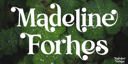 Madeline Forhes is a stylish and modern serif font that’s perfect for bringing a touch of sophistication to your designs. Its clean lines and contemporary letterforms create a timeless yet fresh look that’s perfect for editorial design, branding, and any project that requires a touch of elegance.
 - Normandy Isle JNL by Jeff Levine,
$29.00 Normandy Isle JNL is a condensed sanserif typeface built off of the basic design of an old wood type, but augmented with thick and thin lines to create a whole different look. The font itself is named after a community in the North end of Miami Beach.
 - FF DuGauguin by FontFont,
$41.99 Belgian type designer Dung van Meerbeeck created this script FontFont in 1992. The font is ideally suited for festive occasions, film and tv as well as poster and billboards. FF DuGauguin provides advanced typographical support with features such as ligatures. It comes with proportional lining figures.
 - Fox Grotesque Pro by TipografiaRamis,
$39.00 Fox Grotesque Pro is follow-up version of Fox Grotesque family. Typeface consists of ten font styles with extended support for most Latin languages plus Cyrillic. Fox Grotesque Pro release in OTF format and includes some opentype features – proportional/tabular, lining/oldstyle figures, slashed zero, ligatures, fractions...
 - Inventory JNL by Jeff Levine,
$29.00Inventory JNL is based on a "solid letter" stencil where you trace the body of the letter and fill in the top and bottom connecting lines to each character. This is another font in Jeff Levine's series of digital designs based on classic lettering stencil guides. - Nedo by Typogama,
$25.99 Nedo is a retro inspired, single weight display font based on a series of geometric lines. It features a large set of ligatures and some alternate characters that allow a range of possible combinations for text layouts and is best suited for use in large settings.
