10,000 search results
(0.058 seconds)
- Couple Valentine by Selvia Design,
$15.00 "Couple Valentine" is a very unique and beautiful display font. This font has a heart shape on each letter. It is suitable for romantic moments, Valentine's Day, weddings, and more. This font is equipped with uppercase, lowercase, numerals, punctuations, and multilingual support.
 - Ailee Sofia by Tlatous Type,
$19.00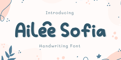 Introducing Ailee Sofia Font by Tlatoustype Ailee Sofia is a Playful Thick Display Font. Ailee Sofia is perfect for book cover, product packaging, branding project, megazine, social media, wedding, or just used to express words above the background.This font also multilingual support.
 - GrottoGoth by Grey Fortress Ent,
$20.00 GrottoGoth is a sans serif created to expand the availability of fonts used in creating Gothic, Halloween, and overall spooky designs. This is the first font designed by Grey Fortress Enterprises. Additional variations are planned and other original fonts are in the works.
 - Button Grinder by FHFont,
$19.00 Button Grinder is display font with handwritten dry brush style, ispired by halloween event and grunge rock style, with opentype feature include of the font. Suitable for design, element design, wedding, event, t-shirt, logo, badges, sticker, and awesome work. Caps Only Fonts.
 - Stellar Moon by ArimaType,
$18.00 Stellar Moon is an authentic, bold and simple serif font. Whatever the topic, this font will be a wonderful asset to your font library, as it has the potential to enhance any creation. If you have questions, please contact us at arimatype@gmail.com
 - Vetto Cosellza by Graphicfresh,
$8.00 Vetto Cosellza - Handwritting Font Introducing Vetto Cosellza Handwritten Font. It comes with an elegant and feminine style which is perfect to make any design stand out! This font is perfect for branding, wedding invites, magazines, mugs, business cards, quotes, posters, and more.
 - Pink Chicken by Scratch Design,
$9.00Pink Chicken is a cute handwritten font, this font is complete all punctuations and multi-languages support. Pink chicken has an authentic casual shape so this design will applicable on any occasion design. Enjoy this font, its also support for mac and windows. - Asrafel by Scriptorium,
$18.00Asrafel is an original font by Dave Nalle. It is a strong, stylish titling font based on hand lettering influenced by Celtic uncial styles and Art Nouveau titling fonts. It includes a variety of alternate character forms to create interesting visual relationships. - Cheerful Peach by Sakha Design,
$12.00 Cheerful Peach is a cute and playful display font that conveys impeccable friendliness. Whether you’re using it for crafts, digital design, presentations, or making greeting cards, this font has the potential to become your favorite go-to font, no matter the occasion!
 - October Nightmare by AEN Creative Studio,
$15.00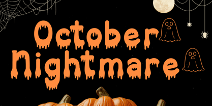 October Nightmare Font is a captivating and spooky display font designed to perfectly encapsulate the spirit of Halloween. This display font is an ideal choice for creating chilling and eye-catching designs for Halloween-themed posters, apparel, embroidery, crafts, and other festive applications.
 - Techno Board by Putracetol,
$28.00 Technoboard - A Scifi Futuristic Display Font. This font is inspired by techno circuit boards, combined with the scifi font type. Technoboard is great for any kind of display purpose from logos, Tshirt, apparel, product packaging, tittle header, poster, merchandise, social media, labels, branding.
 - Herbal Medicine by Wildan Type,
$12.00 Introducing Herbal Medicine Font !! Herbal Medicine is a fun and quirky handwritten font with a unique style, playful look & feel! embodies fun. Use this gorgeous and unique font to bring any DIY. you also can enjoy many unic alternate style each character.
 - Roble by Latinotype,
$26.00 Roble is a Slab Serif Font, from a mix between Andes and Sanchez, following a harmony with both fonts one sans and one serif with a fresh and dynamic result. Roble is a family of 16 display fonts 8 weights plus italics.
 - Electroz by 4RM Font,
$30.00 Electroz font is a techno themed font made with futuristic values, made with condensed width and slanted cuts at the corners of the letters making this font look cool and have a strong futuristic value. suitable for use in futuristic-themed designs
 - Backline by Subectype,
$13.00 Backline is a monoline script font with an cute style. It has good readability and is perfect for logos, invitations, wedding, signatures, and much more! What's Included : - Kind Heart Font Script - Multilingual Support - Alternates I hope you enjoy this font. Thank You, Subectype
 - Restrick by ZetDesign,
$15.00 Restrick is a strong display font. uses curved corners for flexible use on a variety of media displays. This font is very suitable for use as a headline in a newspaper, poster, or magazine. This font is available in regular and italic format.
 - Kingsman Dual Style! by Mindtype Co.,
$25.00 Proudly presenting our latest product: Kingsman! Kingsman is a simple font, comes with alternate characters and some ligatures. This font looks elegant, readable, stylish, and catchy. The fonts are great for products, logos, wedding cards, clothing brand logos, vintage designs and much more.
 - Beatles by Ronin Design,
$10.00 Beatles is an elegant and natural handwritten font style, with features ending and beginning alternate and some ligatures. Beatles have 2 font style, Regular style and Bold style, this font will look perfect for poster design, invitation card, advertisement and many more.
 - erqif by Guixis,
$24.75 This font is a nod to paper notebooks in which a long time ago students made notes. That's why the font looks like written by hand. The inspiration of this family font is the phrase, "Let me go back to the past".
 - La Fausto by The Ocean Studio,
$15.00 La fausto is a beautiful font script, font will make your design more beautiful and classy. This font is suitable for any design like Logo, branding, quotes, and etc. very single letters have been carefully crafted to make your text looks beautiful
 - Svaxtica by Ilhamtaro,
$15.00 SVAXTICA is a modern font like a maze with a galaxy theme. This font is all caps font. To enable the OpenType Stylistic alternates, you need a program that supports OpenType features such as Adobe Illustrator CS, Adobe Indesign & CorelDraw X6-X7. Cheers!
 - Shay Man by Fonts of Chaos,
$10.00 Shay Man is a font design for poster and title tag line. The font is only uppercase in two weights. Shay man is a typicaly straight angular font taking inspiration from the old post brutal design. Use it for making awesome artworks. Enjoy.
 - Bomerch by Authentype,
$12.00 Bomerch Modern Display Font is a modern display font that includes Regular and Italic. This font is suitable for vibrant, energetic and bold designs such as sports poster designs, music posters, branding, t-shirts, prints, business cards, logos, posters, t-shirts, photography.
 - Halistine Signature by Typebae,
$15.00 Halistine Signature is a monoline script font with a signature style and a handwritten appearance. Inspired by handwritings, this font exudes elegance, smoothness, and a personal touch. This font is suitable for designs that require a personal touch and a casual feel.
 - Looney by Bhubbiberry Studio,
$16.00 Looney, a handmade font! This bold, free-flowing and casual font is designed to be easily customisable. Looney is a font which you can use and enjoy, for anything from promotional material and handwritten quotes, to product packaging, merchandise and branding projects.
 - Gaby Pro by RMU,
$35.00 Inspired by the 1947 Weber font Gabriele, Gaby Pro is a freshly designed versatile and everyday cursive font that can be used for a wide range of printed products and for web design as well. The font was carefully extended for multilingual use.
 - Sugar Sand by Ira Natasha,
$10.00 Sugar Sand is a handwritten sans serif font. A new fresh handmade font with rough edges. This font is support multi language. It will be perfect for many different project ex: quotes, logo, blog header, poster, branding, fashion, apparel, letter, invitation, stationery, etc….
 - Kids Yock by PizzaDude.dk,
$20.00 Kids Yock is an updated and cleaner version of my popular comic font Kids Rock. Even though this font is more steady and clean, I did my best to keep the characteristics of the original font, which includes influences from grafitti and comics.
 - Vallisa by Letterara,
$12.00 Vallisa is a cute and sweet handwritten font with an incredibly friendly feel. This font will turn any creative idea into a true piece of art! This font is PUA encoded which means you can access all of the cute glyphs with ease!
 - Austin Antique by HiH,
$10.00 “More is better” may have been the motto of Richard Austin of Austin and Son’s Imperial Letter-Foundry on Worship Street at Finsbury Square in London when he designed and cut his Antique typeface. The year it was created is uncertain, but it is known to have appeared in a specimen book produced in 1827. At first glance, the upper case letters of Austin Antique look very much like Figgins Antique. But, upon examination, one will note that the Austin face is much darker. In general, the letters designed and cut by Richard Austin have fatter strokes, larger serifs and smaller counters -- more metal and less daylight. The premise was that the darker the letter, the more attention an ad using the typeface would receive. In old pictures of London and Paris one may see walls crowded with posters and “bills” -- competing for the attention of the passerby. Morris and Updike aside, the early nineteenth century marked the beginning of a commercial as well as industrial revolution. Patterns of commerce were changing. With new methods of marketing came the need for new typefaces to support the new methods. Foundries found the display types were very profitable and competed most energetically and creatively for the trade. There was a lot of trial-and-error. Some ideas faded away. Others, like the Antiques or Egyptians, were refined and developed. From them came the Clarendons that were to prove both popular and long lasting -- because they worked. Their job was to sell goods, not please the aesthetic sensibilities of the critics. They did their job well. Austin Antique has a full Western European character set, plus the following ligatures: ct, st, fi, fl, ff, ffi and ffl. Tabular numbers. Surprisingly readable.
 - Sevigne ST by Reserves,
$39.99 Sevigne [sey-vee-nyey] is a highly refined, contemporary geometric stencil, inspired by the ambience of high-end fashion and luxury combined with the raw, utilitarian nature of the stencil. The inclusion of over 130 unique ligatures expand it’s sensibility of alluring, well-balanced letterforms and distinctive style. The stencil marks are atypically placed and vary throughout, giving it a purposely forward presence. Stylistically, as an all-caps typeface, Sevigne exudes a greater sense of harmony and polish due to it’s unicase form where the interplay of a limited amount of characters is the focus. Subtle, considered details are found within individual letters, contrasted by the complex, intersecting forms that make up the various ligatures. With multiple stylistic sets added to the expanded ligatures, individual letters and ligature pairs can be carefully exchanged to fine-tune text settings for a unique custom type solution. Features include: Precision kerning- Expanded set of over 130 Ligatures, including alternates (ae, oe, fi, fl, ffi, ffl, ffj, ff, fh, fj, ft, tt, th, ct, st, oo, og, go, ogo, gog, la, ea, ev, ew, fy, ez, et, oc, ga, do, uv, vu, yu, uy, nn, mm, xy, yx, ao, oa, ac, da, aq, nt, aa, ll, ss, ut, tu, ka, ca, ag, of, off, co, ne, nr, nl, nd, nk, hn, mn, me, mp, al, an, af, ar, ak, ah, ad, ab, and, gg, all, co, ço, he, the, tl, tn, tf, tr, tk, td, tb, te, am, ame, amb, tm, ap, tp, wu, uw, kt, tz, ra, za, mk, xx, yy, vv, ww, ky, fu, oq, cc, cq) Alternate characters (A, G, R, Q, _, $, ®, •, ¶) Slashed zero Full set of numerators/denominators Automatic fraction feature (supports any fraction combination) Extended language support (Latin-1 and Latin Extended-A) *Requires an application with OpenType and/or Unicode support.
 - David Hadash Sans by Monotype,
$50.99Monotype Imaging is pleased to present David Hadash (New" David), the full family of typefaces by Ismar David, in its intended authentic form. The Estate of Ismar David has sought to revive this jewel of Twentieth-Century design by granting an exclusive license to Monotype Imaging to implement it in industry-standard format. Never before has the typeface in its full set of sub-styles been made available to the design community. David Hadash consists of three style families, Formal, Script, and Sans. Each of these appears in three weigths: regular, medium, and bold. Originally devised as a companion to the upright Formal style, the Script style has a beauty and grace all its own that allows it to be used for full-page settings also. While it is forward-leaning and dynamic, it does not match any of the existing cursive styles of Hebrew script. Ismar David created an eminently readable hybrid style which is like no other by inclining the forms of the upright while blending in some features of Rashi style softened with gentle curves. One can say that the Script style is the first truly italic, not just oblique, typeface for Hebrew script. Although the proportions of the Sans style are very similar to those of the Formal style, its visual impression is stunningly different. If the Formal style is believably written with a broad-point pen, the Sans is chiseled in stone. Rounded angles turn angular and stark. The end result is an informal style that evokes both ancient and contemporary impressions. David Hadash (Modern) supports the writing conventions of Modern Hebrew (including fully vocalized text) in addition to Yiddish and Ladino. David Hadash Biblical is a version of the Formal style that supports all the complexities of Biblical Hebrew, including vocalization and cantillation marks. " - Arlette by TypeTogether,
$49.00 Pilar and Ferran based Arlette on the fast stroke of one letter from a Roger Excoffon family, but along the way they abandoned that starting point in favour of experimentation. Many sans serifs are like a svelte black dress: functional, beautiful, and the unfussy outfit for a nice evening get together. The Arlette family isn’t like this. It’s a stunner — an incandescent reimagining of what defines a sans and how it can look. Arlette explores the boundaries of the sans serif landscape and returns with forms developed from gestural vigour. Thinking of it as “painterly” may at first seem to fit, but it underestimates Arlette’s ability to master an unseen world of countless emotions and physical applications: magazines, branding, editorial, teen and young adult works, book covers, and a host of products and packaging whose content will be amplified with Arlette’s voice. Not only does Arlette use its eight weights plus italics to speak in Latin-based scripts, it is also fluent in Thai and has six weights (hairline through bold) with which it meets that challenge, whether in text or display. Arlette Thai’s modern nature is seen in two features for the script. One is the decorative Thai characters that are based on original palm leaf manuscripts. Another is a version of the Latin numerals adapted to the height of the script due to their wide use in Thailand. Arlette Thai has been meticulously developed, including contextual kerning to avoid mark clashes. Arlette’s OpenType capabilities include mathematic and scientific figures, positional forms, pointers, arrows, and oldstyle, lining, and tabular lining numerals. In addition to all this, it’s packed with swashes and swash ligatures in both scripts for enthusiastic typesetting. Because it pushes experimentation without compromising readability, both Arlette Thai and Latin are surprisingly legible in small sizes and arrestingly beautiful when their details can be seen.
 - Hymers JNL by Jeff Levine,
$29.00 Born on May 8, 1892 in Reno Nevada, Lewis Franklin (“Lew” ) Hymers left an indelible mark as a caricaturist, cartoonist and graphic artist. At the age of twenty [in 1912] he worked for the San Francisco Chronicle. During World War I he worked for the Washington Post. He even was employed for a time by Walt Disney as an animator - but most of his life was spent in either Tujunga, California or his birthplace of Reno, Nevada as a self-employed illustrator. Hymers inked a feature for the Nevada State Journal called “Seen About Town”, which was published during the 1930s and 1940s. In this panel, he caricaturized many of the familiar faces around Reno. He also designed signs, logos, post cards and numerous other commercial illustrations for clients, but what has endeared him to a number of fans was his vast library of stock cuts (the predecessor to paper and electronic clip art) which feature his humorous characters in various professions and life situations. So popular is his work amongst those “in the know” that a clip art book collection of over seven hundred of his drawings that was issued by Dover Publications [but long out of print] commands asking prices ranging from just under $15 to well over $100 for a single copy. Lew Hymers passed away on February 5, 1953 just a few months shy of his 61st birthday. Although his artwork depicts the 1930s and 1940s lifestyles, equipment and conveniences, more than sixty years after his death they stand up amazingly well as cheerful pieces of nostalgia. The twenty-seven images (and some variants) in Hymers JNL were painstakingly re-drawn from scans of one of his catalogs and is but just a tiny fraction of the hundreds upon hundreds of illustrations from the pen of this prolific artist.
 - Le Havre Titling by insigne,
$24.00 Throughout time, history’s architects have incorporated some of the finest illustrations of type into their great works--cuneiform on Mesopotamian ziggurats; Greek etched into the temples of the gods; inscriptions marking the monuments of mighty Rome. From these Roman inscriptions specifically, we take our capital letters of today; and while we've lost the need for serifs over time, our current characters maintain the classical foundations, even after being distilled to their simplistic forms. Here’s where we have the basis for Le Havre Titling. This updated face is a carefully optimized version of Le Havre that uses purely capital lettering. Originally inspired by the golden period of the passenger ship and the French port that bid a rich bon voyage to so many famed, luxurious ocean liners of the Roaring Twenties and Thirties, the typeface includes an exciting array of ligatures that brings it into the present day and gives designers a tremendous amount of versatility in their work. With its seven weights, Titling looks equally at home on the side of a building as it does in a finely crafted invitation. With over five hundred glyphs, Le Havre Titling offers a multiplicity of options for your projects. Combine ligatures, play around with two sets of art deco forms, use original caps, and more; every one of these is obtainable with the OpenType functionality. The new design also shares five weights with the original Le Havre, allowing you to maximize your potential through its interchangeability. Titling’s Thin weights are delicate but not too fragile, and its geometric forms give each individual composition you create an exquisite and beautiful sense of emotion. Without a doubt, this fresh, fashionable take on the classical forms offers your reader refined, yet unanticipated approach as he or she travels through your text.
 - David Hadash Script by Monotype,
$50.99Monotype Imaging is pleased to present David Hadash (New" David), the full family of typefaces by Ismar David, in its intended authentic form. The Estate of Ismar David has sought to revive this jewel of Twentieth-Century design by granting an exclusive license to Monotype Imaging to implement it in industry-standard format. Never before has the typeface in its full set of sub-styles been made available to the design community. David Hadash consists of three style families, Formal, Script, and Sans. Each of these appears in three weigths: regular, medium, and bold. Originally devised as a companion to the upright Formal style, the Script style has a beauty and grace all its own that allows it to be used for full-page settings also. While it is forward-leaning and dynamic, it does not match any of the existing cursive styles of Hebrew script. Ismar David created an eminently readable hybrid style which is like no other by inclining the forms of the upright while blending in some features of Rashi style softened with gentle curves. One can say that the Script style is the first truly italic, not just oblique, typeface for Hebrew script. Although the proportions of the Sans style are very similar to those of the Formal style, its visual impression is stunningly different. If the Formal style is believably written with a broad-point pen, the Sans is chiseled in stone. Rounded angles turn angular and stark. The end result is an informal style that evokes both ancient and contemporary impressions. David Hadash (Modern) supports the writing conventions of Modern Hebrew (including fully vocalized text) in addition to Yiddish and Ladino. David Hadash Biblical is a version of the Formal style that supports all the complexities of Biblical Hebrew, including vocalization and cantillation marks. " - David Hadash Biblical by Monotype,
$50.99Monotype Imaging is pleased to present David Hadash (New" David), the full family of typefaces by Ismar David, in its intended authentic form. The Estate of Ismar David has sought to revive this jewel of Twentieth-Century design by granting an exclusive license to Monotype Imaging to implement it in industry-standard format. Never before has the typeface in its full set of sub-styles been made available to the design community. David Hadash consists of three style families, Formal, Script, and Sans. Each of these appears in three weigths: regular, medium, and bold. Originally devised as a companion to the upright Formal style, the Script style has a beauty and grace all its own that allows it to be used for full-page settings also. While it is forward-leaning and dynamic, it does not match any of the existing cursive styles of Hebrew script. Ismar David created an eminently readable hybrid style which is like no other by inclining the forms of the upright while blending in some features of Rashi style softened with gentle curves. One can say that the Script style is the first truly italic, not just oblique, typeface for Hebrew script. Although the proportions of the Sans style are very similar to those of the Formal style, its visual impression is stunningly different. If the Formal style is believably written with a broad-point pen, the Sans is chiseled in stone. Rounded angles turn angular and stark. The end result is an informal style that evokes both ancient and contemporary impressions. David Hadash (Modern) supports the writing conventions of Modern Hebrew (including fully vocalized text) in addition to Yiddish and Ladino. David Hadash Biblical is a version of the Formal style that supports all the complexities of Biblical Hebrew, including vocalization and cantillation marks. " - David Hadash Formal by Monotype,
$50.99Monotype Imaging is pleased to present David Hadash (New" David), the full family of typefaces by Ismar David, in its intended authentic form. The Estate of Ismar David has sought to revive this jewel of Twentieth-Century design by granting an exclusive license to Monotype Imaging to implement it in industry-standard format. Never before has the typeface in its full set of sub-styles been made available to the design community. David Hadash consists of three style families, Formal, Script, and Sans. Each of these appears in three weigths: regular, medium, and bold. Originally devised as a companion to the upright Formal style, the Script style has a beauty and grace all its own that allows it to be used for full-page settings also. While it is forward-leaning and dynamic, it does not match any of the existing cursive styles of Hebrew script. Ismar David created an eminently readable hybrid style which is like no other by inclining the forms of the upright while blending in some features of Rashi style softened with gentle curves. One can say that the Script style is the first truly italic, not just oblique, typeface for Hebrew script. Although the proportions of the Sans style are very similar to those of the Formal style, its visual impression is stunningly different. If the Formal style is believably written with a broad-point pen, the Sans is chiseled in stone. Rounded angles turn angular and stark. The end result is an informal style that evokes both ancient and contemporary impressions. David Hadash (Modern) supports the writing conventions of Modern Hebrew (including fully vocalized text) in addition to Yiddish and Ladino. David Hadash Biblical is a version of the Formal style that supports all the complexities of Biblical Hebrew, including vocalization and cantillation marks. " - Hyper Super by Bisou,
$15.00 Made in La Chaux-de-Fonds Switzerland, Hyper Super is born while the hyperdesigner Bisou watches "Blow up", a french film-lover show. This episode about Paul Newman quotes the 1969 movie "Winning". The Italian poster with the title "Indianapolis pista infernale" uses a striking handmade font that inspire Hyper Super, a very fast font. Hyper super is thought from ground up to give a strong impact and an impression of speed. Its retro 70’s car racing movies style makes it best suitable a dog race stadium. It works perfectly with short texts for advertisement like a tuning garage sign or delivery pizza menu. Just use it for your pizza restaurant and see Paul Newman in person apply for a delivery boy job.
 - Bellatrice Natural by IbraCreative,
$17.00 Bellatrice Natural is a captivating natural signature font that effortlessly combines elegance with a touch of organic charm. Its fluid strokes emulate the graceful movements of handwritten script, lending a personalized and authentic feel to any design. The gentle curves and slightly irregular lines of Bellatrice evoke the warmth and individuality of a handcrafted signature, making it an ideal choice for projects that seek a distinctive and human touch. The font’s natural flow and intricate details create a harmonious balance, resulting in a timeless and sophisticated signature style that can elevate a variety of creative endeavors, from invitations and branding to personal correspondence. Bellatrice is a testament to the artistry of a well-crafted signature font, capturing the essence of natural handwriting with grace and finesse.