1,222 search results
(0.105 seconds)
- Zentenar Initialen by ARTypes,
$35.00Zentenar Initialen is based on the initials designed by Prof. F. H. E. Schneidler, c. 1937, for his Zentenar-Fraktur types. Alternative letters are contained in the AR font. Aa Bb Cc Dd Ee Ff Gg Hh Ii Jj Kk Ll Mm Nn Oo Pp Qq Rr Ss Tt Uu Vv Ww Xx Yy Zz - Geonica by Struvictory.art,
$16.00 Geonica is minimalistic geometric sans serif font with different line width. Geonica is suitable for the design on the theme of architecture, game industry, minimalism ect. Geonica includes stylistic alternates for symbols: A, E, K, M, O, Q, T, V, W, g. There are also ligatures: AA, AJ, AM, LA, LM, MA, MM, OO, VV, fi, gg, gi, gj, oo, ri, rr, ti, vv, yy.
 - ASTEROID - Unknown license

- TRACK - Unknown license

- Along Sans Rasoe by Brenners Template,
$19.00 Along Sans Rasoe is a pretty unique font family. It only tried to connect with lines, and it didn't use curves at all. And the equalization of stems was arranged irregularly. Various attempts have been applied to the glyphs to showcase the designer's feeling more sensibly. 9 Weights, 18 Styles Discretionary ligatures (Ac, Ad, Ae, Am, At, Ca, Ce, Ch, Co, Cr, Ra, Re, Ro, cc, ee, ll, mm, nn, oo, pp, rr, ss) Stylistic Sets Circled Glyphs. Multilingual support And various OpenType Features.
 - Baked Milk by Struvictory.art,
$15.00 Baked Milk is a display font family with nostalgic motives. The font is created in a groovy retro style. Baked Milk includes Regular and Symbol Styles. The font is suitable for retro summer posters, menu and social media design, branding, event design etc. Baked Milk has extensive language support, it includes English, French, German, Italian, Spanish, Portuguese, Danish, Norwegian, Swedish, Finnish, Estonian, Turkish. Baked Milk font contains ligatures: aa, dd, ff, ft, hh, jj, kk, ll, mm, nn, oo, pp, rf, rr, rt, ss, tt, uu, Ti.
 - Loopy Lola by Mix Fonts,
$29.00 MIX LOOPY LOLA is a very fun, quirky, off-kilter all-uppercase handwritten font. This handdrawn typeface is perfect for social media graphics, edgy posters, and bold headlines. Match the font with some fun loopy doodled elements to give your art that added bit of cute. Character set to includes (standard alphabet, punctuation, extended, accented, ligatures): ABCDEFGHIJKLMNOPQRSTUVWXYZ abcdefghijklmnopqrstuvwxyz 0123456789 !@$#%^&*()`~♥❤✿•· ÷×+−±≈=≠≥≤[]:;'",.|/?{}“”‘’-–—_… ©®™«»°¹²³ªº¡¿₱¢€£¥½¼¾¶§№† ÁÀÂÄÃÅĂĀĄÆĆĈČÇÐĐÉÈÊËĖĒĘĜĤIÍÌÎÏĪĮĴŁŃÑŇ ÓÒÔÖÕØŌŐŒŔŘŚŜŠȘŤȚÚÙÛÜŮŰŪŲẀẂŴÝŶŸŹŽŻÞ áàâäãåăāąæćĉčçðđéèêëėēęĝĥıíìîïīįĵłńñň óòôöõøōőœŕřśŝšșťțúùûüůűūųẁẃŵýŷÿźžżþß LIGATURES: bb dd ff gg itt kk ll mm nn oo pp rr ss tt
 - Mix Basic by Mix Fonts,
$13.00 Mix Basic is just your basic everyday handwriting. This was written initially on a post-it using a fine tip Frixion pen. The font was then digitized, cleaned up, and converted into a font. Since this is basically your everyday handwriting, it has a multitude of creative applications. Think label design, greeting cards, social media quotes, handwritten notes replication, and more. Use as you please! Mix Basic includes the following characters: ABCDEFGHIJKLMNOPQRSTUVWXYZ abcdefghijklmnopqrstuvwxyz 0123456789 !@$#%^&*()`~•· ÷×+−±≈=≠≥≤[]<>:;’”,.\|/?{}“”‘’-–—_…©®‹›«»°¹²³¡¿₱¢€£¥§† ÁÀÂÄÃÅĂĀĄÆĆĈČÇÐĐÉÈÊËĖĒĘĜĤIÍÌÎÏĪĮĴŁŃÑŇ ÓÒÔÖÕŌŐØŒŔŘŚŜŠȘŤȚÚÙÛÜŮŰŬŪŲẂẀŴÝŶŸŹẐŽŻÞ áàâäãåăāąæćĉčçðđéèêëėēęĝĥıíìîïīįĵłńñň óòôöõōőøœŕřśŝšșťțúùûüůűŭūųẃẁŵýŷÿźẑžżþ Alternates/Ligatures for: & R a e i m o u y ee mm nn oo rr tt
 - Faerie Queen NF by Nick's Fonts,
$10.00Based on a typeface named "Titania" from a 1930s specimen book from the Fundición Richard Gans in Madrid, this exquisite design will add a touch of elegance and nostalgic charm to any project it graces. - Bestlady by Dhan Studio,
$19.00 Bestlady is a romantic textured brush font suitable perfectly for invitations, brand projects, logos, greeting cards, news, product packaging, posters blogs, everything including personal charm etc. This font is alternates all lowercase,also have equipped with 69 ligatures unique and beautiful: zz yy ww vv uu tt tl th st ss sh rr qq pp oz oy ow ov ou ot os or op oo on om ol ok oj oi og of od oc ob nt nn nl ng mm lt ll lh kk is ii id hh gg ff et el ee cl ck ch cc bl bb aw at ap an am al ah af ab aa
 - The Ahmedians by Zamjump,
$13.00 The Ahmedians is a handwritting gel pen typeface, The Ahmedians is an out-of-this-world addition to your font arsenal, perfect for quote graphics, modern/edgy vinyl cutting projects, or logos & branding. The Ahmedians is best for: - social media graphics or quote graphics - logos + branding with a modern feel - crafting projects with your Cricut or Silhouette - Starstuff has a super smooth edge perfect for vinyl cutting or SVG designs - website design + website accents - clean print design, like magazines + flyers - header elements that need a handwritten touch The Ahmedians : - full upper + lower case characters - numbers + punctuations - Multi Language Support - Standard double letter ligatures ee, ff, ll, oo, rr, ss, tt - PUA-encoding
 - Silly Girls by HIRO.std,
$16.00 Silly Girls is a Monoline font. This font describes about girly, feminist, dynamic, easy to use and easy to use and will bring a good harmony when the letters are connected and paired each other. FEATURES - Support Opentype Features - Support Ligatures bb dd ee ff gg kk ll mm nn oo pp rr ss tt st at att et ett it itt ot ott ut utt yt gt lt rt The - Uppercase - Lowercase - Numbering and Punctuations - Multilingual Support - Works on PC or Mac USE Silly Girls works great in any branding, logos, magazines, wedding designs, social media posts, quotes, invitation, stationery, craft and any projects that need monoline handwriting taste. Enjoy using! Thanks. HIRO.std
 - Torjus by Brenners Template,
$19.00 Torjus is so rigid and stiff typeface. While designing a more dry and stiff handwriting typeface, I tried to remove the Bezier curves. Rhythms were also created by dramatically simplifying the paths used in the Glyphs and emphasizing individual contrasts. 60 predefined Ligatures to bring your passion and inspire you to wonder. Ligatures : Ba, Be, Bo, Ca, Ce, Co, Da, De, Do, Ea, Fa, Fe, Fo, Ga, Ge, Go, Ha, He, Ho, Ja, Je, Jo, Ka, Ke, Ko, La, Le, Lo, Ma, Me, Mo, Na, Ne, No, Oa, Pa, Pe, Po, Ra, Re, Ro, Sa, Se, So, Ta, Te, To, Va, Ve, Vo, Wa, We, Wo, Ye, Yo, ee, ff, ll, oo, rr.
 - Le Tarot by Struvictory.art,
$16.00 Le Tarot is a modern serif font with celestial motives. The font is created in classic proportions and decorated with the moon and stars. Le tarot includes stylistic alternates and ligatures. The font is suitable for the design on the theme of astrology, mysticism, spirituality, witchcraft, magic, esotericism. Le Tarot has extensive language support, it includes English, French, German, Italian, Spanish, Portuguese, Danish, Norwegian, Swedish, Finnish, Estonian, Turkish. Le Tarot includes stylistic alternates for symbols: A, a, D, d, G, g, J, j, M, m, O, o, T, t, U, u, W, w. There are also ligatures: Ka, La, Ma, OO, Ra, aa, am, ka, ko, la, lo, ma, mm, mo, oo, ra, rm, ro, rr, tt, xa, za.
 - Gans Antigua Manuscrito by Intellecta Design,
$14.95Gans Antigua Manuscrito is a revival font by Intellecta Design. researched at the rare catalogue from the extinct Fundicion Richard Gans, from Madrid. See also other font families inspired by Gans' original typefaces: Gans Tipo Adorno , Gans Lath Modern , Gans Titular Adornada , Gans Ibarra , Gans Antigua , Gans Fulgor and Gans Radio Lumina . - Retiro Std by Typofonderie,
$59.00 Full of life Hispanic Didot in 2 optical sizes Retiro is a daring interpretation of Spanish typography. Severe, austere and yet, full of life, Retiro is a vernacular version of Castilian and Andalusian in a typical Didot. Named after a lovely park in Madrid, Retiro started life as a a bespoke typeface designed to give a unique voice to the magazine Madriz. In 2006, the founder of Madriz was looking for a Didot for his new magazine. The Didot is the archetypal typeface used in high-end magazines. Retiro is a synthesis of these high contrast styles mixed with an Hispanic mind. Result is then, after 2-3 years of work, a typeface with countless variations to establish typographic shades adapted to different sections and pages of the Madriz. In 2014, it was necessary to further revise the typeface before its launch at Typofonderie. In order to keep its originality, the unique weight was retained, but complemented with optical size variants to set highly contrasted headlines into various sizes, visually balanced. How to use Retiro optical sizes? Each font provided in Retiro family is named according to the scale of body size: 24 pt and 64 pt. Of course, these names are referring to the body sizes used in typographic design. In the “glorious old days,” the letterpress period, it was customary to cut punches directly to the size at which typefaces would be used. The punchcutter had to visually adapt his design to the engraving size. The aim was to optimize the best contrast and general weight, but also to respect both design’s and reader’s needs. In Retiro’s case, intended for large titling sizes, it’s an adaptation of this ancient practice for our contemporary uses. Although each font is named by a typographic point size, do not feel obliged to use this font at this precise size, but why not, in larger or smaller. It’s rather the concept of gradients that must be preserved in layouts, rather than strictly size numbers. It’s up to the designer to select the right font size for his own designs. Granshan Awards 2012 Creative Review Type Annual 2011 Designpreis 2011 Club des directeurs artistiques, 41e palmarès Type Directors Club 2010 Certificate of Type design Excellence
 - Decimosexto NF by Nick's Fonts,
$10.00This typeface family includes Spanish Roman letters and “Griffo” style italics, both hand-drawn by Francisco Lucas in Madrid, 1577. The letters, sometimes slightly mismatched in size or off the baseline, capture the look and feel of sixteenth-century printing. Both versions of the font include 1252 Latin, 1250 CE (with localization for Romanian and Moldovan). - OricNeo by The Northern Block,
$12.80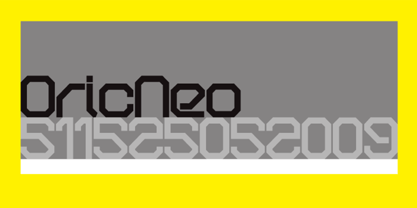 A computerized typeface inspired by the Matrix trilogy.
 - Olivera by Artisan Studio,
$15.00 Olivera has Stylistic standard, Stylistic Initial, Stylistic Teminal and ligatures and includes uppercase and lowercase letters, numbers and punctuation marks. Multilingual Support OpenType smart programs such as Adobe Photo Shop, Adobe Illustrator, Adobe Indesign, Corel Draw and Microsoft Office. A total of 462 Glyphs: Ligatures: Ju Ct ff Cl all gh of ck tt ut nt ak ll pp il rt it ot st at rr om mm ar ss as or ox ow on tt ut ut Ct st at ot rt it Cl Swashes access: A B C D E F G H I J K L M N O P Q R S T U V W X Y Z 7 alternative sets access: a b c d e f g h i j k l m n o p q r s t u v w x y z
 - Martoni by Artisan Studio,
$17.00 Martoni font has two styles, namely clean and rough. It's a work that is purely a result of handwriting and has natural characteristics. It is perfect for invitations, signatures, blogs, social media, business cards, product brands. Martoni has Stylistic standard, Stylistic Initial, Stylistic Terminal and ligatures, and includes uppercase and lowercase letters, numbers and punctuation marks. Accessed by using OpenType smart programs such as Adobe Photo Shop, Adobe Illustrator, Adobe Indesign, Corel Draw and Microsoft Office. - Ligatures: st nt ult ot ul th at ff el fl ut ll al sl et nl ct cl rt rl tt ft of ss an rr on mm - Swash: A B C D E - Initial and terminal: a b c d e f g h i j k l m n o p q r s t u v w x y z
 - Un Jour Merveilleux by Roland Hüse Design,
$20.00 Un Jour Merveilleux means "a Wonderful Day" in French. This font is a Modern Calligraphy script with stylistic alternates for all the lowercase letters and numbers for a natural flow and rhythm. Smaller and larger alternates are set to switch between each other within the Contextual Alternates OpenType rule, so make sure to enable this feature while setting text with this font. Alternatively you may select and replace characters from the Glyphs window manually. There are PUA encoded ligatures for the double letters bb, ht, li, ll, lt, on, oo, rr, ss and tt. The font set covers Eastern, Central and Western European accented Latin Languages. Hope you like this font and it will add a beautiful fresh touch to your new project! Roland Image credits: Photo by Plush Design Studio on Unsplash Coffee on Table: Kelly Lockett @kellylock
 - Romena by Brenners Template,
$19.00 It is a modern grotesque family that can feel strong power. Hairline Styles are designed to be thinner than the average Thin Styles and have a lower x-height than Black Styles. So when you design your typography using the entire font family, you get a great sense of balance and harmony. And with creative Alternates, you can make your logo and product branding design work unique. Cropped glyphs provide meaningful metaphors for logo design. Be sure to try the Stylistic Alternates and Ligatures this family has to offer. OpenType Features Stylistic Alternates - C, G, K, N, R, S, a, e, g, i, o, s, u, y Standard Ligatures - ff, ffi, fi Discretionary Ligatures - tt, rr Fractions Oldstyle Figures Tabular Figures Circled Numbers Multilingual Support Western Europe, Central/Eastern Europe, Baltic, Turkish, Romanian Basic Cyrillic Ukraine
 - Fmiring Campotype One - Personal use only

- Procyon by Fatchair,
$6.95A dot-matrix style display font with a twist. - TB Abacus by TrueBlue,
$9.00A creative dot matrix font reminiscent of Abacus counters. - Melina BT by Bitstream,
$50.99Melina Plain and Melina Fancy are characterized by graceful lines, strong contrast and nostalgic overtones. These typefaces are patterned after two members of a type family named Greco, released by Fundición Tipográfica Richard Gans of Madrid, Spain, in the 1920s. Melina Plain is a refined version of Greco Bold, and Melina Fancy is based on Greco Adornado, with the notable addition of a lowercase, which was not a part of the original design. Melina is based on two typefaces (ca. 1920) from the Fundición Tipográfica Richard Gans in Madrid, Spain. Nick Curtis first found Greco Adornado in a type specimen at the Library of Congress. It was a cap only design. He made a cut of the original (Melina Fancy) and created his own lowercase, and many other characters to support contemporary character sets. Later he came across Greco Bold, which had a lowercase, but he chose not to use it and instead, adapted his Melina Fancy to create Melina Plain. - Almoneda by Sudtipos,
$49.00 Almoneda: Sale at public auction of movable goods, generally used. And also: private and voluntary sale of jewelry and junk that is made without the intervention of justice. Formerly, it was nothing more than the market or sale of things and spoils won from the enemy in war. Nowadays, the almoneda is practically associated with spaces where the sale of "old things" takes place and, in Madrid, they are usually concentrated in the area of El Rastro, an open-air market that is set up on Sundays and some holidays in the center of Madrid. There, you can find everything and, if you walk around a lot and look hard enough, great typographic finds. It is there where I find a large number of elements (usually from the late nineteenth and early twentieth century) such as boxes, posters, books, etc.. in which appear uppercase letters with a variety of shapes, letters embedded, rare ligatures ... In addition, many elements extracted from street signs, tiles from bars and commemorative elements of Madrid have been used to complete this font design made with care and patience. Thus was born Almoneda, a modern typeface with a marked axis and great contrast, and an uppercase with several sets of characters to play with and enjoy. It also includes a large number of ligatures and discretionary ligatures. A Variable font is included with the full package license. Almoneda, a typeface that will not leave you indifferent. They take it out of my hands, hey!
 - Transactive JNL by Jeff Levine,
$29.00Transactive JNL is a simple dot matrix font design from Jeff Levine. - Mattius Rossy by Zamjump,
$17.00 Mattius Rossy is a handwritten font suitable for branding, signatures, wedding invitations, promotions, product packaging and other necessities. This font is modern, simple, but still authentic. You will get a full set of lowercase and uppercase letters, numbers and punctuation marks, multilingual symbols, ligatures, dashes, and swashes. This is tutorial to use ligature and swash : To use swash you can type a + underscore + underscore ( a_ _ ) without space. this only applies up to ( j_ _ ) for ligatures available only ( ee, ff, ll, oo, rr, ss, tt ). "To generate all ligatures, go to Adobe Illustrator - Type - Glyphs." Please send me a message if you are having trouble either installing or using this font. We want to hear your feedback to further improve our product. If you're using this product and come across a problem or come across something we might have missed, feel free to drop us a message.
 - Kifisia Antigua NF by Nick's Fonts,
$10.00This rough-and-ready display face is based on El Greco Antique, released by the Fundición Richard Gans of Madrid in the 1930s. Distressed but not distressing, rough yet charming, ragged around the edges but curiously refined. Named after a village in Greece which is the ancestral home of the forebears of the Curtii. Both versions of the font include 1252 Latin, 1250 CE (with localization for Romanian and Moldovan). - Romeo by Font Bureau,
$40.00 David Berlow drew Romeo Medium Condensed during winter of 1990, basing the design on the Estrecha Fina weight of Electra, a spectacular art deco sanserif with an unusually fine condensed series. Carlos Winkow designed it circa 1940 for the Nacional typefoundry of Madrid, the leading typefoundry in Spain. Jill Pichotta drew the ultra-light Skinny Condensed, a digital tour de force released with Medium Condensed; FB 1990–91
 - Rodrigues PERSONAL USE ONLY - Personal use only

- WL Rasteroids by Writ Large,
$5.00 Rasteroids is a typographic flashback to computing of the mid 1980s, when 9-pin dot-matrix printers were the state of the art, and most home computer displays were TVs hooked up to RF modulators. Rasteroids not only captures the dot-matrix printer look, but recreates the rasterized appearance of text on those lower-resolution monitors. Unlike that dot matrix type of yore, Rasteroids does have some variation in character width, and is legible in small blocks of copy. Still, it is best used sparingly, or as a special effect.
 - Foundry Flek by The Foundry,
$99.00 Foundry Flek and Foundry Plek are created on the same dot matrix grid system. Each family includes: light, regular, medium and bold weights – with a selection of dot patterns that can extend the grid vertically and horizontally. The underlying matrix common to each weight allows experimentation with overlays, and mixing weights produces varying effects. Foundry Plek used conventionally works well for serious correspondence, with a 'typewriter font' effect. Foundry Flek has an integral dot matrix grid as a background. With these two fonts a whole new graphic language can be explored.
 - Foundry Plek by The Foundry,
$99.00 Foundry Plek and Foundry Flek are created on the same dot matrix grid system. Each family includes: light, regular, medium and bold weights – with a selection of dot patterns that can extend the grid vertically and horizontally. The underlying matrix common to each weight allows experimentation with overlays, and mixing weights produces varying effects. Foundry Plek used conventionally works well for serious correspondence, with a 'typewriter font' effect. Foundry Flek has an integral dot matrix grid as a background. With these two fonts a whole new graphic language can be explored.
 - Lamia by Atelier laia,
$50.00 The Lamia font is inspired by the work of the most famous calligrapher of the Basque Country, Jose Francisco de Iturzaeta Eizaguirre (Getaria1788-Madrid 1853). His writing method was compulsory in Spanish schools since 1835. His "unpolished Spanish font" tried to be more effective than the more commercial English version by avoiding embellishments and excessive rear tearing. More akin with the liberal values imported by the French, his offerings sought uniformity, speed and efficiency to ensure that those in the less-favored echelons of society had an effective communication tool. From his "general collection of characters of European Letters" published in Madrid in 1833, we have chosen the "lower case pancilla reformed" represented in one of the prints. We have tried to reinterpret it by keeping its essence but also ensuring that it is viable for potential contemporary uses which, thanks to its good readability and effectiveness in longer texts, basically means as a decorative or display font. The upper case was generated using the lower case as a reference.
 - Moreva by HIRO.std,
$17.00 Moreva is a new casual modern script font. This font describes about girly, feminist, elegant, catchy, dynamic, humanist, easy to use and will bring a good harmony when the letters are connected and paired each other. FEATURES - Support Opentype Features - Support Ligatures - Automatic stylistic alternates am an ar at att bb bl cl ct dd fl el elt em en er et ett ff gg gt hh il im in ir it itt kk ll lt mm nn nt oo ol olt om on or ot ott pp rr ss se sh sk sl so st tt the um un ur utt yl yt Sl Sk St Sh Gl Gh Kl Kh Ch Cl Bl Bh - Uppercase - Lowercase - Numbering and Punctuations - Multilingual Support - Works on PC or Mac USE Moreva works great in any branding, logos, magazines, apparel, wedding designs, social media posts, advertisements, quotes, product packaging, product designs, label, photography, watermark, invitation, stationery and any projects that need handwriting taste. Enjoy using! Thanks. HIRO.std
 - Whiplash by 38-lineart,
$16.00 Whiplash is a natural handwritten font with firm strokes as the main character. All-caps and mixed-match are the main concepts of this font, where the uppercase and lowercase can be pair according to your taste. This font has a very strong and very prominent character that will distract the eyes. This is a great choice when used as a title on banners, posters, book titles and even magazine covers. Modern lifestyle brands such as fashion, cosmetics, and outdoor sports are also a trend to use this font style. You who like travelling can also try to write a caption or quote, people are increasingly curious about the mystery of your adventure and short notes. Besides being equipped with multi-language, we also equip ligature such as ee, ll, gg, oo, ss, tt, pp, rr. Enjoy our fonts, and make sure your brand will stand out and invite people to take a closer look.
 - Forestory by Michael Rafailyk,
$9.00 Forestory is a typeface that was born among the trees. Its natural curly shapes are filled with the magic of a forest full of stories. View PDF Specimen: https://michaelrafailyk.com/typeface/specimen/Forestory.pdf Contextual Alternates: FF GG KK MM OO SS TT ZZ cc dd ee hh jj nn oo pp rr ss ww yy zz ГГ ПП бб λλ. Stylistic Alternates: ABDFGKMNOPRSTZabcdefghjmnopqrswz АБВГЖКЛМОПРТФЬЪЫЯабеёорсьъы ΑΒΓΖΚΜΝΟΠΡΤΦΆβδλορϲφ ÀÁÂÃÄÅĄĂĀẢẠẮẰẲẴẶẤẦẨẪẬÆĎĐÐĞĢŘŔŖàáâãäåąăāảạắằẳẵặấầẩẫậæďđèéêëěęēėẻẽẹếềểễệğģ 269. Stylistic Set: Unclosed (ss01). This set reveals the closed letterforms, making the typeface even more curly. Ligatures: VB VD VE VF VP VR WB WD WE WF WP WR YB YD YE YF YP YR ax cs cx es ex gp gr qp qr ux vr wr (+ their stylistic alternates). These ligatures are designed to connect some characters in a more natural way. The typeface includes Latin, Greek, Cyrillic scripts and supports up to 104 languages. The promo images used photos of Andie Venzl and Sarah Chai from Pexels.
 - Aleesya Rose by Brenners Template,
$19.00 Aleesya Rose is a Stylish Font Family to bring a touch of elegance to any design. The clear contrast blends into all styles - even thin styles - and the strong individuality by weight delights the designer's imagination. 14 styles including 7 weights and italics are essential for designers to complete more detailed and sophisticated typography. This style has 426 glyphs each, check the glyph window in your app. The upright standing of the vertical stems stably supports the center of gravity of the entire font. And the thin strokes used as finishing touches will convey an elegant personality to the layout. The ligatures are designed to appeal to the reader with their beautiful tenderness, and they are: Ba, Be, Ha, He, LO, Le, Lo, Re, Ro, ck, de, do, ee, ff, fi, oo, rr, th. In particular, we recommend that you choose this font family to achieve the following purposes: Editorial design, Personal branding, Branding business, logo design, portfolio, and any special design.


