10,000 search results
(0.179 seconds)
- Marbellya by Namara Creative Studio,
$5.00 Marbellya an Condensed Sans Serif Font with luxurious style. Available in 6 styles : Regular, Italic, Outline, Bold, Bold Italic and Bold Outline. Included alternates, ligatures and multilingual support. It's perfect for headlines, logos, quotes, packaging, magazine covers, editorial design, and many more project with suitable purpose!
 - Stradas by Din Studio,
$22.00 Stradas is an amazing display font. The font is suitable for any project like branding , lettering , tshirt print and many others. Included Files : Accents (Multilingual characters) 9 Ligatures 78 Alternates and swashes PUA encoded Numerals and Punctuation (OpenType Standard) Features in Solid, Outline, Inline and Shadow Version.
 - Ludema by JAM Type Design,
$18.00 Ludema is a very informal and adventurous typeface designed by JAM Type and inspired by the many children’s books and the video games of our youth. Perfectly adaptable to be used in such designs as well on shop floors, Ludema is simply a bit of fun.
 - Sweet Dawn by Yumna Type,
$16.00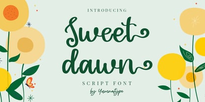 Sweet Dawn is a beautiful handwritten font. Made for any professional project branding. It is the best for logos, branding and quotes. Every letter has a unique and beautiful touch. Includes: Sweet Dawn (OTF) Features: Standard Ligatures PUA Encoded Multilingual Support Numerals and Punctuation by Yumnatype
 - Brag Pro by Eclectotype,
$36.00 The now discontinued Brag & Brag Stencil are hereby available as Pro fonts, with an extended character set (Latin Extended A) and Oldstyle figures. All features of the original fonts are still there, but now you can talk with Brag's signature bold look in many more European languages.
 - Starla by Letter Muray,
$19.00 Starla is a Clean and modern calligraphy font with many alternative styles. Very recomended to open in software design like a Adobe photoshop / illustrator, coreldraw, and more.. This font is perfect for various projects such as invitations, product packaging, product design, labels, logos & branding or whatever.
 - Galileo by Arendxstudio,
$12.00 Galileo, a vintage font family made by brush. Each letter that has been hand drawn and then scanned, which makes the font unique and special. Galileo contains 4 styles and can be used for headlines, t-shirts, logos and posters. Appreciate this project and follow us :)
 - Author Think by Almarkha Type,
$35.00 Introducing Author Think - Authentic Signature Script is a Quality script that is written casually and quickly. Letters are made with Sign on paper. Then scanned and carefully drawn into vector format. Author Think is perfect for homeware designs,branding projects, Logo, design, Quotes, Product packaging, Photography, Watermark.
 - Gacor by Din Studio,
$29.00 Gacor is urban sans serif font. Made for any professional project branding. It is the best for branding, printing, and quotes. Every letter has a unique and beautiful touch. Features: PUA Encoded Multilingual Support Numerals and Punctuation Thank you for downloading premium fonts from Din Studio
 - Night Candle by Yumna Type,
$16.00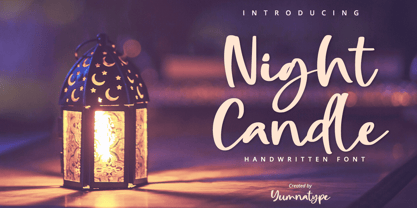 Night Candle is a elegant handwritten font. Made for any professional project branding. It is the best for logos, branding and quotes. Every letter has a unique and beautiful touch. Includes: Night Candle (OTF) Features: Standard Ligatures PUA Encoded Multilingual Support Numerals and Punctuation by Yumnatype
 - Donita by MrLetters,
$15.00 Donita Script is a soft and beautiful font that has a connection to the upper part of the letter, this is something unique but very beautiful, luxury and charming. This font is to complement your design needs in making amazing works. Donita Script is perfect for branding, wedding invitations, magazines, mugs, business cards, quotes, posters, and many more that you can use on your big project will be very beautiful. Donita Script has been equipped with the OpenType feature and has many glyphs. and of course having a lot of flying machines will be able to choose letters to your liking, lots of variations and choices for each letter, so you can adjust your design choices and also have other languages supported.which you will get in this package: This font is very suitable for use with programs that support OpenType features such as Adobe Photoshop Cs / Adobe Photoshop CC, Adobe Illustrator CS / Adobe Illustrator CC, Adobe Indesign, and Corel Draw and many more programs that support OpenType. If you have any questions, don't hesitate to contact me via email at: hello.mrletters@gmail.com Thank you and happy designing :-)
 - Boxy by Hackberry Font Foundry,
$24.95 In my on-going quest for display fonts to be used with my books and on my book covers, I decided I need a squared sans serif. I started the build off of Fiscal, a font I designed back in 2006. I never liked the font, plus my tastes have changed. So, I opened it, made it narrower, increased the x-height, and various stuff like that. I made it much heavier—an ended up with Boxy. Then my brain slapped me and said, "Why don't you make a sorta modern version?" So, I did and decided to call that style Chic. But then I wanted a thin version also. Fiscal was always too heavy and ponderous for me. So, I made the Thin style. Finally, I felt I needed an italic of Chic. OpenType features didn't seem to work well with the family, so all I added was oldstyle figures. So, I ended up with another of my unique families—with two unmodulated fonts: Thin and Medium, and two modulated fonts: Chic and Chic Italic. But, I'm pleased with it. My hope is that you will like it also.
 - Theatre by Jeremia Adatte,
$39.00 Display typeface originally created by French graphic designer Marcel Jacno in 1950. Digitised, designed and expanded by Jeremia Adatte with Małgorzata Bartosik from original source material and typeface specimens. THEATRE is inspired by stencil letters found on cargo warehouse wooden crates. "With this unexpectedly-shaped alphabet, I wanted the words to take center stage and create an image in the printed matter" said Mr. Jacno. THEATRE has a second version of each of its letters, painted by hand by Jeremia Adatte and meticulously vectorised and implemented in the font to create words with a hand-made and random effect with no two letters alike, thanks to an opentype feature (enable CALT feature in your favourite design program). Carefully designed ultra detailed letters, for ultra large headlines use without the cheap made-on-a-computer look, but painted-by-hand look, just as it was originally made. THEATRE has more than 50’000 kerning pairs and speaks more than 80 languages. Use THEATRE in your packaging design, like roasted coffee, natural wine or craft beer labels, film or cultural posters and anything you like that needs a unique graphic design voice.
 - Amitale by Hackberry Font Foundry,
$24.95 Amitale (A-mi-tah'-lay) is the union of Amitale Book and Amitale Wide into a new 8-font book family in my continuing objective of designing a better font family for readability in booklets. My goal here is for a full range of styles from light, regular, bold, and black without the plugged counters and clunky feel of most bold fonts. In my use, personally. I do not use Amitale Book Bold. I use Wide for the bold and Wide-Bold for the black style. In many ways, Amitale is Brinar with bracketed serifs. Many people find Brinar to be an exceptionally readable and beautiful humanist sans. This new serif font family has many of the same characteristics. This is also the debut of my new OpenType features set for 2009. There are more and more ligatures for your fun and enjoyment: bb gg ff fi fl ffi ffl ffy fj ft tt ty Wh Th and more. Like all of my fonts, there are: caps, lowercase, small caps, proportional lining figures, proportional oldstyle figures, & small cap figures, plus numerators, denominators, superiors, inferiors, and a complete set of ordinals 1st through infinity.
 - Spitzkant Variable by Julien Fincker,
$185.00 About the design Spitzkant is a serif typeface family that is characterized by strong contrasts. Pointed, sharp serifs and edges contrast with round and fine forms, making it very individual and expressive. This makes it particularly suitable for branding, editorial, packaging and advertising. The high-contrast display version has been complemented by a lower-contrast text version, making Spitzkant in combination suitable for both strong headlines and extensive body text. An allrounder that can be used for many purposes. Variable Font The Variable Font contains 3 axes: weight, oblique and optical size – all in just one file. Features With over 850 characters, it covers over 200 Latin-based languages. It also has an extended set of currency symbols and a whole range of open type features. For example, there are alternative characters as Stylistic Sets, Small Caps, automatic fractions and many other features. Ligatures Especially the extensive selection of ligatures (standard and optional) is a special feature which was an important part during the design process. With over 95 different ligatures there are many possibilities to give headlines and logos an individual touch. Get the usual version of the Spitzkant family here: https://www.myfonts.com/fonts/julien-fincker/spitzkant/
 - Novel Sans Hair Pro by Atlas Font Foundry,
$50.00 Novel Sans Hair is the new package of 24 ultra light weights of Novel Sans Pro, the humanist grotesque typeface family within the largely extended award winning Novel Collection, containing Novel Pro, Novel Sans Pro, Novel Sans Hair Pro, Novel Sans Condensed Pro, Novel Mono Pro, Novel Sans Rounded Pro and Novel Sans Office Pro. Novel Sans Hair has a carefully attuned character design and a well balanced weight contrast. Classic proportions and the almost upright italic makes Novel Sans Pro being a modern humanist with the calligraphic warmth of a real italic. Many similarities with the other typeface families within the Novel Collection enable designers to combine the families and reach highest quality in typography. Novel Sans Hair [1020 glyphs] comes in 24 styles and contains small caps, an extra set of alternate glyphs, many ligatures, lining figures [proportionally spaced and monospaced], hanging figures [proportionally spaced and monospaced], small caps figures [proportionally spaced and monospaced], positive and negative circled figures for upper and lower case, superior and inferior figures, fractions, extensive language support, arrows for uppercase and lowercase and many more OpenType™ features.
 - Devil's Snare - Unknown license

- (afGiHmtV)* - Unknown license

- Widget - Unknown license

- For The One Hundreth Time - Unknown license

- Credititle by Jonahfonts,
$29.95 A condensed tall upright font with lowercase small-caps. Basically designed for movie posters. May also be used for a variety of tight-fitting type designs, from packaging to captions.
 - Human Silhouettes by Intellecta Design,
$14.90 Human Silhouettes are inspired by people and daily situations. It includes a wide variety of topics and may be used individually or in combination with wide range of design possibilities.
 - Ambroise Std by Typofonderie,
$59.00 An exquisite Didot font in 18 series Ambroise is a contemporary interpretation of various typefaces belonging to Didot’s late style, conceived circa 1830, including the original forms of g, y, &; and to a lesser extent, k. These unique glyphs are found in Gras Vibert, cut by Michel Vibert. Vibert was the appointed punchcutter of the Didot family during this period. It is the Heavy, whom sources were surest that Jean François Porchez has been used as the basis for the design of the typeface family. In the second half of the 19th century, it was usual to find fat Didots in several widths in the catalogs of French type foundries. These same typefaces continued to be offered until the demise of the big French foundries in the 1960s. Ambroise attempts to reproduce more of what we see printed on paper in the 19th century; a more accurate representation of Didot punches. So, the unbracketed serifs are not truly square straight-line forms but use tiny transitional curves instead. The result on the page appears softer and less straight, particularly in larger sizes. The illustrious Didot family of type founders and printers Every variation of the typeface carries a name in homage to a member of the illustrious Didot family of type founders and printers. The condensed variant is called Ambroise Firmin. The extra-condensed is called Ambroise François. Ambroise Pro brought back to life: fifteen years in the making! Club des directeurs artistiques, 48e palmarès Bukva:raz 2001
 - Autoradiographic by Typodermic,
$11.95 Ahoy there, folks! Have we got a typeface for you! It’s called Autoradiographic, and it’s inspired by those trusty old warning signs from back in the day. You know the ones…“Inflammable! Stay away!” And boy oh boy, does it have personality! Back in the post-WWII era, low waistlines were all the rage—but let me tell you, strict waistline alignment was not. No, sir! That’s where Autoradiographic comes in. It’s informational, sure, but it’s also neat as a pin and chock full of personality. And listen to this—Autoradiographic has everything you need to crunch those numbers like a pro. Mathematical symbols? Check. Fractions? Check. Currency symbols? Check, check, and check. And for those times when you really want to make an impact, Autoradiographic’s italics are narrow and loosely spaced. Now that’s what I call a typeface with some serious sass! So what are you waiting for? Grab a copy of Autoradiographic today—it comes in five weights and italics, so you’re sure to find just the right fit for your project. Don’t miss out on the chance to add some mid-century flair to your work—you won’t regret it! Most Latin-based European, and some Cyrillic-based writing systems are supported, including the following languages. A Afaan Oromo, Afar, Afrikaans, Albanian, Alsatian, Aromanian, Aymara, Bashkir (Latin), Basque, Belarusian (Latin), Bemba, Bikol, Bosnian, Breton, Bulgarian, Cape Verdean, Creole, Catalan, Cebuano, Chamorro, Chavacano, Chichewa, Crimean Tatar (Latin), Croatian, Czech, Danish, Dawan, Dholuo, Dutch, English, Estonian, Faroese, Fijian, Filipino, Finnish, French, Frisian, Friulian, Gagauz (Latin), Galician, Ganda, Genoese, German, Greenlandic, Guadeloupean Creole, Haitian Creole, Hawaiian, Hiligaynon, Hungarian, Icelandic, Ilocano, Indonesian, Irish, Italian, Jamaican, Kaqchikel, Karakalpak (Latin), Kashubian, Kikongo, Kinyarwanda, Kirundi, Komi-Permyak, Kurdish (Latin), Latvian, Lithuanian, Lombard, Low Saxon, Luxembourgish, Maasai, Macedonian, Makhuwa, Malay, Maltese, Māori, Moldovan, Montenegrin, Ndebele, Neapolitan, Norwegian, Novial, Occitan, Ossetian, Ossetian (Latin), Papiamento, Piedmontese, Polish, Portuguese, Quechua, Rarotongan, Romanian, Romansh, Russian, Sami, Sango, Saramaccan, Sardinian, Scottish Gaelic, Serbian, Serbian (Latin), Shona, Sicilian, Silesian, Slovak, Slovenian, Somali, Sorbian, Sotho, Spanish, Swahili, Swazi, Swedish, Tagalog, Tahitian, Tetum, Tongan, Tshiluba, Tsonga, Tswana, Tumbuka, Turkish, Turkmen (Latin), Tuvaluan, Uzbek (Latin), Venetian, Vepsian, Võro, Walloon, Waray-Waray, Wayuu, Welsh, Wolof, Xhosa, Yapese, Zapotec Zulu and Zuni.
 - Tacky Shoes by PizzaDude.dk,
$18.00 May I present to you: Tacky Shoes. Actually there's nothing tacky here - just liked the sound of that :) Just like the letters may look quite straight-forward, but here and there the lines are a bit off, which enhances the handmade look - which makes it great for work like posters, invitations, flyers, stickers or something that has to do with creativity. Each letter has 6 variants (in all 6 versions!) which makes the text look more natural and random - because these variants cycle as you type!
 - Letterature by Kaer,
$21.00 Letterature is an elegant serif. I designed old-fashioned letters with playful ligatures. The font may be used for creating classical printing, logo design, clothing embroidery, product packaging, vintage header, luxury identity, etc. What you will get: * Uppercase and lowercase * Ligatures * Multilingual support * Numbers * Symbols * Punctuation To have a look at all the ligatures in the font you may open the glyphs panel: In Photoshop go to Window - glyphs In Illustrator go to Type - glyphs Please feel free to request to add characters you need: kaer.pro@gmail.com
 - GAMECUBEN - Unknown license

- Starzy Darzy - Personal use only

- Denne Threedee - Personal use only

- ICONOS SKATE - Personal use only

- (((O))) Basic - 100% free

- Kingsley by Red Rooster Collection,
$45.00Designed by Les Usherwood. Digitally engineered by Steve Jackaman. This beautiful recreation by Les of the Frederick Goudy typeface, Kennerley Old Style, circa 1911-24, may be superior to any other. - Arco Perpetuo Pro by Hanken Design Co.,
$25.00 Arco Perpetuo Pro is a sans serif typeface with subtle rounded corners for the display stability on screen. Arco Perpetuo Pro may be used as small text or as big headlines.
 - Pekora by Typoforge Studio,
$15.00 To design the font Pekora I was inspired by a You And Me Monthly published by National Magazines Publisher RSW Prasa that appeared from May 1960 till December 1973 in Poland.
 - Mixed Silhouettes by Intellecta Design,
$13.90 Mixed Silhouettes are inspired by people, animals and various situations. It includes a wide variety of topics and may be used individually or in combination with wide range of design possibilities.
 - Galaxus - Personal use only

- Helveticrap - 100% free

- Posterama by Monotype,
$40.99 The Posterama™ typeface family contains 63 fonts and is a true journey through space and time. Designed by Jim Ford, each Posterama family contains 7 weights from Thin to Ultra Black, in 9 distinct families. What makes Posterama so unique and versatile are the eight alternative display families. By making use of a collection of alternative glyphs, Posterama sets an evocative flavor to visualize an entire century of futuristic reference points from art, architecture, poster design and science fiction into one family. Posterama Text is the base family. It has the most robust character set including upper and lowercase glyphs and pan-European language support (including Greek and Cyrillic). Note: all the other Posterama variants described below do not have lowercase letters or Greek and Cyrillic support. Posterama 1901 recalls the decoratively geometric style of Art Nouveau from the turn of the 20th century. Letterforms such as the slender, snaking ‘S’, the high-waisted ‘E’ and the underlined ‘O’ revive the spirit of Charles Rennie Mackintosh and the designers of the Viennese Secession. Posterama 1913 pays homage to the Armory Show, or 1913 Exhibition of Modern Art, which brought the revolutionary work of European artists such as Picasso, Duchamp and Kandinsky to the US for the first time to the shock and astonishment of press and public. Near-abstract, angular characters such as the ‘A’, ‘E’ and ‘N’ hint at cubism’s jagged and clashing planes. Posterama 1919 uses a small, but important, variation to set a tone when the Bauhaus was founded, and the surge in radical European typography that followed. The straight-sided, roundheaded ‘A’ adds a flavor of 1919 – this style of ‘A’ can still be seen in the Braun logo, designed in 1934. Posterama 1927 captures the year of Metropolis, The Jazz Singer and Paul Renner’s pioneering, geometric Futura typeface from 1927, which had a profound influence on design in the US and Europe. Posterama 1933 – With its low-waisted, sinuous designs, the Posterama 1933 typeface family echoes lettering of the Art Deco period, which in turn had its roots in Art Nouveau, the key influence on Posterama 1901. The two fonts make a great team and can be used interchangeably. Posterama 1945 features a few Cyrillic characters to conjure up an era when Russian art and political posters made their mark in cold war propaganda, espionage and also giant aliens and monsters. Posterama 1984 takes its typographic influences from George Orwell’s classic novel, publicity for the dystopian action and sci-fi movies (Blade Runner, Videodrome and Terminator) and games like Space Invaders and Pac-Man that made an impact at that time. Posterama 2001 was inspired by Stanley Kubrick’s science fiction masterpiece, which made extensive use of the Futura typeface. Posterama 2001 finds its cosmic orbit with its nosecone-style ‘A’ from NASA’s much-missed ‘worm’ logotype. There’s an echo, too, in Bauhaus designs from as early as 1920, whose minimalist, geometric lettering also featured a crossbar-less ‘A’.
 - New Ayres by MaGo Fonts,
$20.00 Based on my very first font creation, New Ayres keeps the same feel, but raised to high-quality level. Its long clean lines and soft curves merge old style and modern, giving a new meaning to timeless elegance. Perfect for titling; with at least five alternates per letter, the possibilities become endless. Choose the one better suited for your project and make your text stand out immediately! 703 glyphs take part in this font, including a large set of alternates, ligatures and swashes for you to choose from. With accents and special characters for languages, New Ayres supports 88 languages: Afrikaans, Albanian, German, Swiss German, Upper Sorbian, Asu, under Sorbian, Bemba, Bena, Norwegian Bokmal, Bosnian, Catalan, Czech, chiga, cornic, Creole Cape Verdean, Creole Mauritian, Croatian, Danish, embu, Slovak, Slovene, Spanish, Esperanto, Estonian, Euskera, Faroese, Filipino, Finnish, French, Rialan, scottish Gaelic, Galician, Greenlander, gusii, Hungarian, Indonesian, Irish, Icelandic, Italian, Kalenjin, Kamba, Kikuyu, Kinyarwanda, Kiroundi, kölsch, latvian, lithuanian, luo, luxembourgish, luyia, machame, makhuwa-meetto, makonde, malay, malagasy, maltese, manx, meru, Northern ndebele, nyankole, norwegian nynorsk, oromo, polish, portuguese, romeo, rombo, romanian, rwa, samburu, sango, sena, shena, shamble, Shona, rope, somali, swedish, swahili, taita, teso, Turkmen, vunjo, walser, zulu. This font is PUA encoded: this means each character has a unicode name, and you may access any of them through this codes. Open Type features on the open type file: easy access for alternates and ligatures! The download includes both .otf and .ttf files, so you may choose which one suits you better. With a strong personality, but yet adaptable into many styles, New Ayres is everything you are needing for your projects!!
 - Abaddon™ - Unknown license


