10,000 search results
(0.049 seconds)
- Divad Square - Personal use only

- Citaro Zij DS - 100% free

- Churchward Conserif by BluHead Studio,
$25.00BluHead Studio LLC is pleased to announce the release of 4 fonts from the Churchward Conserif family designed by New Zealand typeface designer Joseph Churchward. BluHead Studio is in the process of digitizing many of the fonts in Churchward's extensive library of exciting and unique designs and will be releasing them in OpenType format on a regular basis. - Krays by Pesotsky Victor,
$10.00 «KRAYS» is an ultra-thin font display. Simple structure and fine uniform strokes contrast with bold squares in the structural units. The combination of gravity and lightness. Krays supports Basic Latin and Extended Latin, Cyrillic — in total about 90 languages are supported. The font has one Regular weight. All uppercase. Krays font was designed by Viktor Pesotsky.
 - Penna by DSType,
$45.00 Penna is a calligraphic type system designed by Pedro Leal. Amidst the four available styles you get four different ascender and descender styles, two different styles of starting and ending swashes, a plethora of ligatures and several other features. Choose between regular, swashes, unconnected and connected versions or mix them all up for a deeper calligraphic feeling.
 - Art Director JNL by Jeff Levine,
$29.00 Free-form hand lettering on a 1979 poster for the Washington, D.C. exhibition of watercolors and etchings by the Elie Abrahami inspired Art Director JNL, which is available in both regular and oblique versions. This type of lettering was most popular in the late 50s through the mid-60s for movie titles, greeting cards and poster text.
 - Crowded by Din Studio,
$29.00 Crowded rounded vintage font was created by our talented artist with full passion for vintage display. You will find a fresh vintage sensation. Visit our gallery and enjoy the previews. Includes: Crowded Regular Crowded Ornament Features: Accents (Multilingual characters) 16 Ligatures 79 Alternates PUA encoded Numerals and Punctuation (OpenType Standard) Thanks for visiting and purchasing my font.
 - Cat Fight by Tour De Force,
$25.00 Cat Fight is small decorative font family containing two "weights". They are not weights in actual meaning, as they differ by style but to secure safe OTF usage in all OS, they are named as Regular and Bold. Cat Fight is ideal for lively and cheerful usages on posters, packages, labels, website titles, book covers and other similar situations.
 - Bonega by Locomotype,
$16.00 Bonega is a display font inspired by classic typography on ancient stone inscriptions. Consist of 4 weight (light, regular, bold, black) with each matching italics. With sharp and manly characteristics, Bonega family is suitable for powerful headlines, logotypes, beautiful signs, posters and more. Contains more than 400 glyphs including stylistic sets that make your typographic design more attractive.
 - Disco Salvation by Funk King,
$10.00 Disco Salvation and Disco Salvation Solid are two display faces inspired by the fun and funky disco era and disco balls. The Regular version uses the grid pattern to achieve the disco ball effect; the white space of the grid is transparent and will allow any image beneath the type to appear through the grid holes.
 - Old Trail JNL by Jeff Levine,
$29.00 An image of an antique metal marking stencil [circa late 1890s or early 1900s] reading “Folck’s Roller Mills #196 New Surprise manufactured by Wolfe Brothers, Cumberland, MD” had the words “New Surprise” rendered in a Western/Victorian typeface. Those letters served as the model for Old Trail JNL, which is available in both regular and oblique versions.
 - MBF Hourglass by Moonbandit,
$10.00 a display typeface inspired by the elegant and exotic shape of hourglass. This typeface is perfect if you are in need of a fresh new elegant, rich and expensive feel. This font is filled with unique shaped glyph and several alternate letters. This typeface also comes with 2 styles, regular and connected. Switch in between according to your liking.
 - Maybrook JNL by Jeff Levine,
$29.00 One of the type examples found within the pages of “Lettering” by Harry B. Wright (1950) is a bold hand lettered serif typeface with a unique twist – the slab serifs had rounded corners, looking very much like show card lettering of the early 1900s. This design is now available digitally as Maybrook JNL, in both regular and oblique versions.
 - Morning Miow by Arttype7,
$6.00 We want to introduce the newest product from us. which we named "Morning Meow." Morning Meow comes with 2 weights. Regular Morning Meow and Morning Meow Outline. and accompanied by ligatures that will bring your design to life. This Morning Meow is perfect for craft designs, birthday greeting cards, t-shirts, movie titles, quotes, logos. and Silhouette crafts.
 - Dellamonde by MlkWsn,
$18.00 Dellamonde is a Classy Script font with 2 styles: regular and italic. Inspired by luxury and branded stuff which makes this font looks classy and awesome in many ways to your latest project. Dellamonde is perfect for logos & branding, photography, invitation, watermark, advertisements, product designs, stationery, wedding designs, label, product packaging, special events or anything that need handwriting taste.
 - Devama SRF by Stella Roberts Fonts,
$25.00 Devama SRF was designed by Typodermic's Ray Larabie and provided for Stella Roberts Fonts. Available in Regular, Backlash and Forward, this typeface evokes a retro-80s look while still remaining clean and fresh. The net profits from my font sales help defer medical expenses for my siblings, who both suffer with Cystic Fibrosis and diabetes. Thank you.
 - Corvone by Greater Albion Typefounders,
$16.95 Corvone is a heavy bullnosed display family, inspired by the post war era's ideas of modernity. Two faces are offered, plain—a solid black face, and regular—which employs a three-dimensional pipeline effect to add real emphasis. Use Corvone to give work a retro feel, and/or where you want to really drive your point home.
 - Amazed Breath by Almarkha Type,
$29.00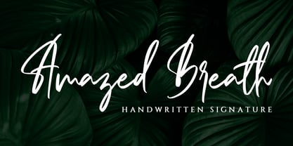 Amazed Breath is a classy script font that comes in Regular and Slant. Inspired by luxury, this font will look classy and awesome in many ways in your latest project. Amazed Breath is perfect for logos and branding, photography, invitations, watermark, advertisements, product designs, stationery, wedding designs, labels, product packaging, special events or anything that needs a handwritten taste.
 - Lyps by hgo,
$15.00 Lyps is a contemporary headline family designed by Heiko Hoos. There are 4 font styles: Lyps Regular, Lyps Small, Lyps Extra Small and Lyps Wide. Each font file has OpenType features for ligatures, caps and some alternative Type variations. The Lyps family is suitable for high impact situations like posters, headlines, titles, magazines, packaging and many others.
 - Le Kick by Resistenza,
$46.00 Introducing LeKick. Inspired by Fraktur script with a contemporary flare, LeKick is a blackletter display face. This font has been designed with a flat brush and ink, choose between two styles; Brush, which demonstrates the strokes and construction of each letterform, or Regular. The perfect typeface for typographic creations such as book covers, headlines, and banners.
 - Mogathe by Invasi Studio,
$16.00 Mogathe was inspired by the west life era. Mogathe is a slab serif font with a vintage western look and feel. Four varieties are available: Regular, Stamp, Spurs, and Spurs Stamp. The use of this font results in carefully-crafted styles. Mogathe font is ideal for branding projects or packaging that need a vintage western feel.
 - Show Card Pen JNL by Jeff Levine,
$29.00 The 1920 edition of “How to Paint Signs and Sho’ Cards” by E. C. Matthews offered a number of examples of then-modern lettering styles for sign painters and show card writers. A bold display alphabet made with a round lettering nib is now available as Show Card Pen JNL, in both regular and oblique versions.
 - Believe by Haksen,
$19.00 Believe is a versatile font family. Strong capitals and a smooth, open lowercase are effective in a variety of applications. The geometric, near-monoline construction lends a classic durability, tempered by softened edges and vibrant shapes. Version Including : Thin, Regular, also in slant (Italic). Every letter has been redrawn and refined, with improved kerning and expanded language support.
 - Churchward Freedom by BluHead Studio,
$25.00BluHead Studio LLC is pleased to announce the release of 7 fonts from the Churchward Freedom family designed by New Zealand typeface designer Joseph Churchward. BluHead Studio is in the process of digitizing many of the fonts in Churchward's extensive library of exciting and unique designs and will be releasing them in OpenType format on a regular basis. - Dezen Pro by DizajnDesign,
$- Dezen is a contemporary, mechanical grotesque typeface. Its letters were first constructed from individual modules and then optically refined to enhance its rhythm. Its tight letter spacing and narrow proportions make the typeface particularly well suited for display sizes and headlines. When you add spacing, font can be used for shorter amount of text, bigger than 12 points. The Dezen type family consists of a wide variety of styles – solid and stencil. The Dezen Pro subfamily combines all 4 styles (Solid, Stencil 01, Stencil 02, Stencil 03) in a specific sequence, which originates a “pattern” for the alphabet (or dezen, in Slovak).
 - Dezen Solid by DizajnDesign,
$39.00 Dezen is a contemporary, mechanical grotesque typeface. Its letters were first constructed from individual modules and then optically refined to enhance its rhythm. Its tight letter spacing and narrow proportions make the typeface particularly well suited for display sizes and headlines. When you add spacing, font can be used for shorter amount of text, bigger than 12 points. Dezen type family consists of a wide variety of styles – solid and stencils. Dezen Pro subfamily combines all 4 styles (Solid, Stencil 01, Stencil 02, Stencil 03) in a specific sequence, which originates a “pattern” for the alphabet (or dezen, in Slovak).
 - Rogliano by TipoType,
$25.00 Rogliano is an affable Slab Serif. On one hand it responds to the classic tenet of strong and direct alphabets of the Industrial Revolution period. While nourishing the text of a warm environment, it takes the freedom to flirt with lettering and lithographic posters of the Victorian era: due to its multiple stylistic alternatives, borders and decorative ornaments. This wide range of voices makes Rogliano a versatile typeface that can move from the mechanical to humanistic with absolute ease, and perform efficiently from branding to editorial design. Rogliano offers 14 weights with support for more than 200 latin languages.
 - Dezen Stencil 02 by DizajnDesign,
$39.00 Dezen is a contemporary, mechanical grotesque typeface. Its letters were first constructed from individual modules and then optically refined to enhance its rhythm. Its tight letter spacing and narrow proportions make the typeface particularly well suited for display sizes and headlines. When you add spacing, font can be used for shorter amount of text, bigger than 12 points. Dezen type family consists of a wide variety of styles – solid and stencils. Dezen Pro subfamily combines all 4 styles (Solid, Stencil 01, Stencil 02, Stencil 03) in a specific sequence, which originates a “pattern” for the alphabet (or dezen, in Slovak).
 - Dezen Stencil 03 by DizajnDesign,
$39.00 Dezen is a contemporary, mechanical grotesque typeface. Its letters were first constructed from individual modules and then optically refined to enhance its rhythm. Its tight letter spacing and narrow proportions make the typeface particularly well suited for display sizes and headlines. When you add spacing, font can be used for shorter amount of text, bigger than 12 points. Dezen type family consists of a wide variety of styles – solid and stencils. Dezen Pro subfamily combines all 4 styles (Solid, Stencil 01, Stencil 02, Stencil 03) in a specific sequence, which originates a “pattern” for the alphabet (or dezen, in Slovak).
 - Acrom by Inhouse Type,
$33.78 Acrom is a geometric sans serif typeface with a minimal stroke contrast. It was designed with a modern, contemporary context in mind. Acrom is not merely mechanical, it can also be recognised as a natural typeface with subtle geometric aesthetics. The humanist quality of the font aids legibility across both text and display work. Acrom’s main characteristics lie in the injection of stylistic forms that enhance its individuality without overpowering the font’s functional purpose and integrity. The font can be tamed utilising the set of alternative characters available within the typeface. Details include 500 characters, manually edited kerning and Opentype features.
 - Dezen Stencil 01 by DizajnDesign,
$39.00 Dezen is a contemporary, mechanical grotesque typeface. Its letters were first constructed from individual modules and then optically refined to enhance its rhythm. Its tight letter spacing and narrow proportions make the typeface particularly well suited for display sizes and headlines. When you add spacing, font can be used for shorter amount of text, bigger than 12 points. Dezen type family consists of a wide variety of styles – solid and stencils. Dezen Pro subfamily combines all 4 styles (Solid, Stencil 01, Stencil 02, Stencil 03) in a specific sequence, which originates a “pattern” for the alphabet (or dezen, in Slovak).
 - Microsoft Sans Serif by Microsoft Corporation,
$39.00Microsoft Sans Serif™ Regular is a very legible User Interface (UI) font. It was designed to be metrically compatible with the MS Sans bitmap font that shipped in early versions of Microsoft Windows. The original MS Sans was in the inflexible .fon bitmap format and could not be scaled. Microsoft Sans Serif Regular is much more flexible and legible as it font antialiasing and scalable user interfaces. Character Set: Latin-1, WGL Pan-European (Eastern Europe, Cyrillic, Greek and Turkish). - Metrolite #2 by Linotype,
$29.00In 1929 Chauncey Griffith at Mergenthaler commissioned W.A. Dwiggins to design a warmer and less mechanical Geometric Sanserif to compete with Futura. Dwiggins’ best efforts proved that human warmth had little to do with cool geometry; for twelve years, until the introduction of Spartan, Mergenthaler lost ground to Intertype’s licensed version of Futura. - Challenge by ITC,
$29.99Challenge is the work of English designer Martin Wait. The brush lettering gives the typeface a unique, spontaneous quality. Capitals should be set closely and lowercase letters overlapped to produce the look of authentic handwriting. Challenge is at the same time informal and authoritative and good for a variety of display applications. - Qotho by Scholtz Fonts,
$7.50 Qotho is a clean, geometric sans serif font, available in five weights. Qotho Dark, Qotho Medium, Qotho Light and Qotho Thin also come in two widths, regular and Cond. Clear and versatile, Qotho is designed for magazine pages, newspapers etc. Its large x-height and simple lines make it extremely legible. The font contains over 235 characters - (upper and lower case characters, punctuation, numerals, symbols and accented characters are present). It has all the accented characters used in the major European languages.
 - Capellina by Outras Fontes,
$35.00 Capellina is a responsive type family comprised of four styles – two script fonts and two small caps romans – built to work together in typographic compositions intended to catch the eye. The fonts will work in your app as you can see in the presentation above. They can be seen as some kind of lettering machines programed to take advantage of swashes (specially at the beginning and and at the end of text lines) and to avoid stroke collisions. Because of the Contextual Alternates feature, the letters will change while you’re writing. Just use any OpenType-compatible software, keep this feature activated and the font’s algorithm will do the rest. In Capellina Script and Capellina Rough you can also use the stylistic alternates / stylistic sets feature if you want to explore some extra letterforms.
 - Hargloves by Heypentype,
$17.99 Hargloves is a modern sans serif font family. The overall design shapes taken from advance engineering technology themes in various industries like motorsports, biotech, games, architecture, robotics, and aerospace tech. A distinct visual characteristic of this font family can be found on 'G','O','P','Q', and 'R' letter. Each glyph design combined a geometric shapes and stylished ink-traps with parabolic curves. The design of the glyph curves taken from fast corner often found on motorsports circuit, when diagonal glyph shapes taken from aerodynamic in machine engineering and kinetic movement on sports. Hargloves consist of 12 font with 6 weight: From thin to Bold with each matching italics.It also contains extras 4 Icons designed specifically for sports entertainment. Hargloves support for most western languages and several opentype features.
 - Cyan by Wilton Foundry,
$29.00The design of Cyan was inspired by features found in classic Roman and styles like Trajan and Bodebeck. It shows the designer's personal preference for geometric Roman proportions while incorporating open centers (B,P,R) and compact serifs. Unlike Trajan, Cyan has lowercase characters in the regular version. The characters stay true to the same features as the capitals, resulting in an unusually distinctive style. The Regular Capitals version contains Roman numerals. Cyan's weight is similar to Trajan's but the horizontal strokes are slightly bolder resulting in better legibility for small sizes, especially for lowercase characters. There are many subtle details in Cyan that become more interesting in larger sizes, for instance the subtle curves in the serifs and the overall smoothness as a result of the mostly rounded angles. Cyan is a robust font that will exceed expectations in areas never explored before. The name is inspired by the Greek word cyan, meaning "blue". The color cyan can have many different variations. One definition is a color made by mixing equal amounts of green and blue light (it also is a pure spectral color). As such, cyan is the complement of red: cyan pigments absorb red light. Cyan is sometimes called blue-green or turquoise and often goes undistinguished from light blue. Obviously the Cyan family is a perfect companion to the Cyan Sans family. - Tahoma by Microsoft Corporation,
$49.00Tahoma™ Family is one of Microsoft's most popular sans serif typeface families. The original Tahoma™ Family consisted of two Windows TrueType fonts (regular and bold), and was created to address the challenges of on-screen display, particularly at small sizes in dialog boxes and menus. In 2010 Ascender Corporation added italics, so now the Tahoma font family contains 4 fonts in total: Tahoma regular, italic, bold and bold italic. The Latin, Greek and Cyrillic characters were designed by world renowned type designer Matthew Carter, and hand-instructed by leading hinting expert, Tom Rickner. The Tahoma fonts set new standards in system font design. Tahoma is ideal for use in User Interface scenarios and other situations requiring the presentation of information on the screen. Character Set: Latin-1, WGL Pan-European (Eastern Europe, Cyrillic, Greek and Turkish). - Sánchez Niu by Latinotype,
$- Sánchez Niu is a redesign of Sánchez—one of the first font families by Latinotype designed in 2011. In the typedesign industry the terms ‘nova’, ‘neue’, ‘next’, ‘new’ are often used to refer to a typeface that has been modified in different ways: redesign, technical readjustments, greater number of characters, etc. At Latinotype we are now starting to use the word ‘niu’ to refer to these kinds of typefaces. Niu is an adaptation of the original word ‘new’, i.e., we have adapted this English word to the phonology and spelling of our own language but keeping the original meaning. Race mixing, diversity, change and adaptation are part of the essence of Latin American culture and, at Latinotype, we are all constantly expressing these elements in everything we do. Latin Power! This new version includes improvements that make it work well with longer text. Such improvements have not had a major effect on the look of the font, though. We have adjusted the original proportions and added a number of new characters as well as OpenType features such as small caps, oldstyle figures, tabular numbers and stylistic alternates. Sánchez Niu contains a set of 720 characters that support 219 languages. The font is well-suited for long text, headlines and logotypes, and it has been optimised for web usage. Sánchez Niu comes with two free fonts—Regular and Regular Italic! Corrections, digital editing and review by César Araya, Rodrigo Fuenzalida and Alfonso García.

