7,830 search results
(0.052 seconds)
- Isonorm by Linotype,
$29.99Isonorm was created in 1980 by the International Standards Organization (ISO). The font's design is simple, clean, and geometric, with strokes that all have rounded ends. Isonorm is a font whose forms are very legible by both the human eye and machine readers. The font is also a good choice for drafting and architectural purposes, as well as for technical charts and graphics. - Comic Toon 3 D by Adita Fonts,
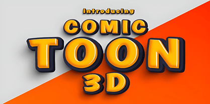
$20.00Comic Toon 3D is a cool and fun Color font 3D Style. It is the perfect font for titles or words needing a more dramatic emphasis. Whatever the topic, this font will be a wonderful asset to your font library, as it has the potential to enhance any creation. COMPATIBILITY Windows Apple/Mac Linux Easily convert to webfont Silhouette Other cutting machines - Cabriolet by JVB Fonts,
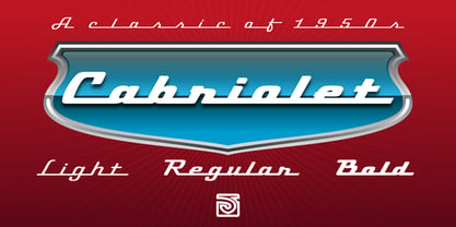
$35.50Cabriolet is a connected geometric script re-interpretation inspired by old chromo emblems of Chevy truck Apache of 1960. With three weight variables, it can be used in logos, games and graphic related to cars, automotive, American, Detroit, Art Deco, 1940, 1950, 1960, vintage, retro, classic and old machines. Can be expandable using underscore for connect words or expanding between letters space. - Mooners by Burntilldead,
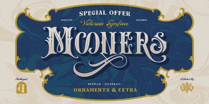
$14.00Make your design as a time machine with "Mooners" typeface. Inspired by the decorative victorian advertising poster, Mooners came to make make your document, poster, logo, etc... perfectly have a vintage victorian vibes. It's a solid combination that can bring your design, logo, document, website, etc. back to 1800 decade. Multilingual fonts-family and playful one with 165 alternate characters. - Guilloche A by Wiescher Design,
$80.00Guilloches were – in the old days – used to make the falsification of banknotes more difficult. The engraving of these intricate lines was done by a highly specialized mechanical machine, which was operated by an equally highly specialized engraving artist. Once the settings for a specific curve were changed back to zero it was very difficult, if not impossible to set them back to the old design. I have designed a useful set of Guilloches that join to form ribbons that create a kind of op-art 3d effect. Under the keys A-U and a-u you find joining pieces. Under the keys V-Z and v-z I placed start- and endpieces. 0-4 are different lenght straight extensions and 5-9 are not quite so straight extensions. All other keys are corner pieces that can be used as stand-alones or put in rows to make for superb decoration. With a little bit of experimentation and maybe colored overlays you can achieve super-phantastic designs. Your elegant type designer Gert Wiescher. - Flirt Script by Positype,
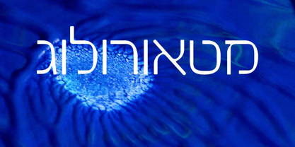
$50.00Young, playful, loopy, flirty. Flirt Script® carves out a niche for itself by concentrating on natural writing tendencies and not the simplified mechanics of script-to-font type design. A free-flowing monoline, the two weight typeface exploits the common letter-to-letter transitions of the typical cursive hand by utilizing three variable-height strike points controlled within the machinations of OpenType Contextual Alternates. The ease of writing (and the decisions made from letter to letter) is reflected as the structure and cadence of the writing evolves as the user types. To see it in action, click here USE CONTEXTUAL ALTS Flirt Script® is equipped for complex, conscientious, professional typography. As an exclusively OpenType release, these fonts feature over 2700 glyphs and an extended character set to support Central and Eastern European as well as Western European languages. So, to really let the font perform for you, be sure to have Contextual Alternates activated. Flirt Script® received the “Certificate of Excellence in Type Design” at the TDC2 (2014). - Aklimat MF by Masterfont,
$59.00 - Headline Helpers Three SG by Spiece Graphics,
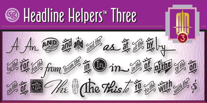
$39.00Wouldn't it be nice to have an assortment of little hand-lettered words? Words like “The” or “A”; “With” or “At”; “To” or “From”? Headline Helpers Three are word accents that can go just about anywhere. Set off the title of your next design project with one of these little gems. Or use a Helper with your new product introduction headline. Convenient instructions and character map come as standard equipment with this highly desirable addition to your type library. Headline Helpers Three is available in the OpenType Std format. Advanced features currently work in Adobe Creative Suite InDesign, Creative Suite Illustrator, and Quark XPress 7. A Windows TrueType version of this font has also been provided if you prefer normal keyboard access. - Headline Helpers Four SG by Spiece Graphics,
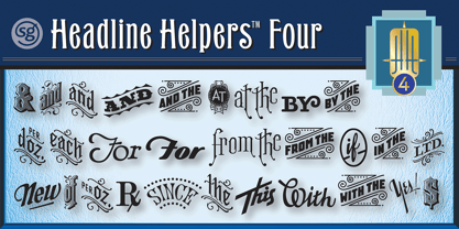
$39.00Wouldn't it be nice to have an assortment of little hand-lettered words? Words like “The” or “A”; “With” or “At”; “To” or “From”? Headline Helpers Four includes word accents that can go just about anywhere. Set off the title of your next design project with one of these little gems. Or use a Helper with your new product introduction headline. Convenient instructions and character map come as standard equipment with this highly desirable addition to your type library. Headline Helpers Four is available in the OpenType Std format. Advanced features currently work in Adobe Creative Suite InDesign, Creative Suite Illustrator, and Quark XPress 7. A Windows TrueType version of this font has also been provided if you prefer normal keyboard access. - Ultramodern Classic SG by Spiece Graphics,
$39.00If you're getting tired of using Broadway, here’s an exciting alternative in regular and bold weights. Douglas C. McMurtrie, Aaron Borad, and Leslie Sprunger began designing this high-contrast novelty face for the Ludlow Foundry in 1928. It retains the classic style of the Jazz Age with a bit more individuality and spirit than Broadway. This extreme thick and thin design also sports normal descenders instead of the clipped ones found on Broadway. Ultramodern Classic is also available in the OpenType Std format. Some new characters have been added to this OpenType version. Advanced features currently work in Adobe Creative Suite InDesign, Creative Suite Illustrator, and Quark XPress 7. Check for OpenType advanced feature support in other applications as it gradually becomes available with upgrades. - Headline Helpers Two SG by Spiece Graphics,
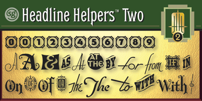
$39.00Wouldn't it be nice to have an assortment of little hand-lettered words? Words like “The” or “A”; “With” or “At”; “To” or “From”? Headline Helpers Two are word accents that can go just about anywhere. Set off the title of your next design project with one of these little gems. Or use a Helper with your new product introduction headline. Convenient instructions and character map come as standard equipment with this highly desirable addition to your type library. Headline Helpers Two is available in the OpenType Std format. Advanced features currently work in Adobe Creative Suite InDesign, Creative Suite Illustrator, and Quark XPress 7. A Windows TrueType version of this font has also been provided if you prefer normal keyboard access. - Valverde Rounded by Jehoo Creative,
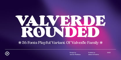
$20.00Valverde Rounded is the more playful and gentle variant of Valverde Family. It still remains a super-serif font family with 2 widths condensed and normal, each width consists of 18 fonts and has a complete weight from thin to black combined with beautiful italic cuts to meet the needs of any design in any format. Inspired by the type of vintage rounded look that has recently become a trend, this round letter character has a comfortable and friendly impression. Opentype features such as Stylistic Alternate and Ligature on the Valverde family make it look more aesthetic so that it fits in a classy modern look. Stunningly beautiful and vintage rounded serifs make them an essential addition to any type of tool kit. - Headline Helpers One SG by Spiece Graphics,
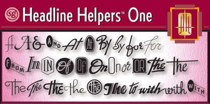
$39.00Wouldn't it be nice to have an assortment of little hand-lettered words? Words like “The” or “A”; “With” or “At”; “To” or “From”? Headline Helpers are word accents that can go just about anywhere. Set off the title of your next design project with one of these little gems. Or use a Helper with your new product introduction headline. Convenient instructions and character map come as standard equipment with this highly desirable addition to your type library. Headline Helpers One is available in the OpenType Std format. Advanced features currently work in Adobe Creative Suite InDesign, Creative Suite Illustrator, and Quark XPress 7. A Windows TrueType version of this font has also been provided if you prefer normal keyboard access. - Headline Helpers Five SG by Spiece Graphics,
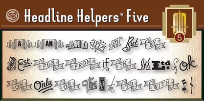
$39.00Wouldn't it be nice to have an assortment of little hand-lettered words? Words like “The” or “A”; “With” or “At”; “To” or “From”? Headline Helpers Five includes word accents that can go just about anywhere. Set off the title of your next design project with one of these little gems. Or use a Helper with your new product introduction headline. Convenient instructions and character map come as standard equipment with this highly desirable addition to your type library. Headline Helpers Five is available in the OpenType Std format. Advanced features currently work in Adobe Creative Suite InDesign, Creative Suite Illustrator, and Quark XPress 7. A Windows TrueType version of this font has also been provided if you prefer normal keyboard access. - Magzo by HansCo,
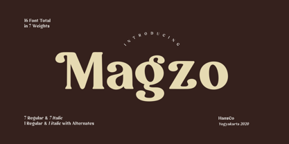
$12.00Magzo is specially designed for food logo brand identity and packaging design projects. Some other industries that are very suitable for this font are beauty cosmetic and handmade projects. Magzo consists of 16 fonts including: 7 normal, 7 italic and 2 alternate (semi Bold) normal and italic versions too. As a note, alternate characters and ligature only available in Magzo Alt regular and italic . You can see an example of using the Magzo Alt font on covers 1 and 3. Tutorial how to Install & use Alternate / Special Character : https://hanscostudio.com/tutorial/ Enjoy! - Hercílio by Sea Types,
$25.00Hercílio is a typographic family without condensed serif, modern and geometric inspired by the architectural forms of the Hercílio Luz Bridge in Florianopolis | Brazi Comprising eleven (11), weights of which ten (10) business are: Five weights Romans: Light, Normal, Regular, Medium and Bold Five Italics weights: Light, Normal, Regular, Medium and Bold And a weight (FREE) Hercílio Decorative Comprising 430 glyphs in each source, brings support for 56 languages (Latin and West, Central and East European) still has features Open Type, ligatures and tabular figures. http://www.cort9.com/wp-content/uploads/2016/05/Specimen_Hercilio.pdf - Magnify PRO by XdCreative,
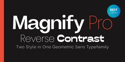
$32.00About Magnify Pro Magnify Pro Geometric sans 2 Style in 1. Magnify PRO Geometric sans is the latest version of "Magnify" by. Faldykudo. Comes up with more complete language support and features, including ink-trap and reverse contrast will add more different taste & style to the art of modern typography. Magnify PRO has two style in one font, normal & inverse contrast. If you are like normal: just type with regular letters, if you are like reverse contrast: just access your opentype features to find the alternate letters. Thank You. - Nannaula by UlianaShabanova,
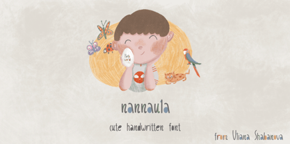
$15.00Welcome to the new font! A fun and playful handwritten font with universal letters that looks great in ALL CAPITAL letters or is regularly used in sentence cases. Perfect for book covers, children's books, birthday invitations, stationery, calendars, magazines, Instagram posts and more! Each letter is a tall, all caps typeface with lots of bouncy glyphs Please note that the Nannaula-colorvector font is COLOR and COLOR CANNOT be changed! BUT Nannaula-normal font is normal font and you can change the color:) Feel free to email me shabanovasprt@gmail.com if you have any questions. :) - The Ruttmey by Balevgraph Studio,
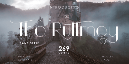
$12.00The Ruttmey is an elegant and unique sans serif font. With its neat and beautiful arrangement of letters, this typeface will look outstanding in both formal and non-formal designs. What's Included? Uppercase & Lowercase Numbers & Punctuation Ligatures & Alternates Multilingual Support PUA Encoded Regular & Italic - Snake one - Unknown license
- Calvin and Hobbes - Unknown license
- Dungarees by Victory Type,
$-Dungarees is a font on caffeine... It's a normal sans-serif typeface gone wild: jagged in some places, smooth in others. It makes documents not only fun to read but really interesting too! - Bungalow by Elemeno,
$25.00Roughhewn, but oddly formal, Bungalow is a rock-solid casual font. - Ongunkan Rosetta Stone by Runic World Tamgacı,
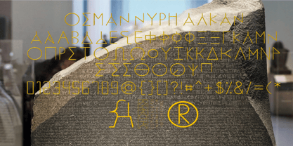
$50.00The Rosetta Stone, or Rashid Stone, was accidentally found by a French soldier during an excavation in the fortification of Egypt. The stone was inscribed in three languages, intended to be sent to three major Egyptian temples. These languages are: Demotic (the language used by the people in Egypt), Hieroglyphic and Ancient Greek. This font contains ancient greek. - Eclipse by Type Innovations,
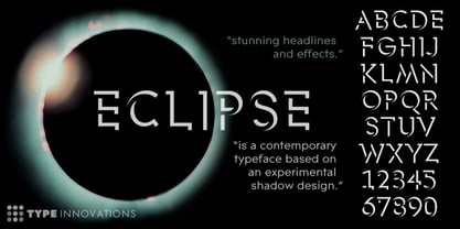
$39.00I often experiment with different shadow techniques. One day I accidentally scaled, instead of repositioning, some black text behind the white copy on top and noticed something very different and interesting happen. It was an intriguing effect. It took some clever handiwork to make it work properly across the entire alphabet. And behold, Eclipse was born. - Bemis by Leksen Design,
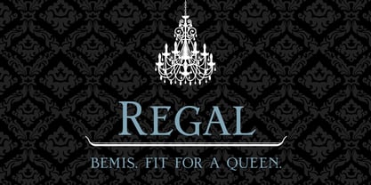
$29.00I accidentally fell in love with type design, and more specifically, the inscription on the historic Bemis building in Seattle. A high waist and great contrast are characteristics of this classic caps lettering that inspired my debut typeface, with additions of 3/4 caps and ornaments to boot. Read and hear more about the creation of this digital revival. - Garava - 100% free
- FS Conrad by Fontsmith,
$50.00Art into type In 2008, Fontsmith were approached by their friend, Jon Scott, to investigate whether a typeface could assume the aesthetic of one artist’s body of work. Jon’s not-for-profit charity, Measure, was organising an event for the artist, Conrad Shawcross, whose giant mechanical installation, entitled Chord, was going on public display in the long-disused Kingsway tram tunnel in Holborn. Chord explores the way we perceive time, as either a line or a cycle. Two enormous machines with dozens of rotating arms and moving in opposite directions, weave rope with almost infinite slowness. An unusual brief Phil Garnham visited Conrad in his Hackney studio to get a feel for his work and ideas. “Conrad is a very clever and philosophical guy. He struggled to see how typeface design had any relevance to him and his art. This was going to be a challenge.” The artist presented the type designer with a pile of rope and a huge diagram of sketches and mathematical workings. “This was, in essence, my brief.” Phil developed three concepts, the simplest of which ticked all the boxes. “The idea of the strokes in the letterforms appearing and ending at peaks or points of origin fitted perfectly with Conrad’s idea of time occurring and ending at two ends of the sculpture.” Two versions Phil planned modules for two versions of the typeface: one with five lines in the letterforms and one with seven. He then drew the modules on-screen and twisted and turned them to build the machine that is FS Conrad. “This is not a simple headline typeface,” says Phil. “It’s not a rigid structure. It has varying character widths, and it’s informed by real typographic insight and proportions so that it actually works as piece of functioning, harmonious type.” - Ariadna MF by Masterfont,
$59.00 - Edward Edwin by Ingrimayne Type,
$8.95 - Sketchzone by Mozatype,
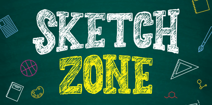
$13.00Sketch Zone is a unique and interesting display font. Incredibly versatile, this font fits a wide pool of designs. Fall in love with its quirky style and use it to create spectacular projects! What’s Included : – Works on PC & Mac – Easy to use ( Installations ) – Easy Convert to webfont – Compabilty Windows, Apple, Linux, Cricut, Silhouette and Other cutting machines Thanks for downloading, and I hope you enjoy it! - Template Shadow by Jeff Levine,
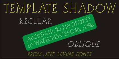
$29.00A series of lettering guides called “Mimeostyle” for the A. B. Dick Company of Chicago (produced for use in making mimeograph machine printing stencils) were custom manufactured by the Wright-Regan Instrument Company (Wrico). One design featured a sans serif letter produced in Shadow relief, with a touch of Art Deco flair. This is now available as Template Shadow JNL, in both regular and oblique versions. - NS Gibswing by Novi Souldado,
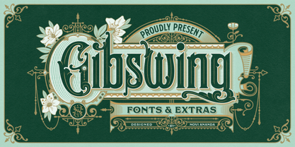
$35.00Gibswing born based on the reference of old fancy lettering, vintage illustration, and victorian calligraphy. The Gibswing decorative style make it as an instant time machine to the era from 1800-1900 victorian visual style of the products, printed advertising, and signs back in the day. It will be a perfect companion of your classic visual direction for decorative sign, labels, branding, logotype, you name it. - Jx Tabe by Jetsmax Studio,
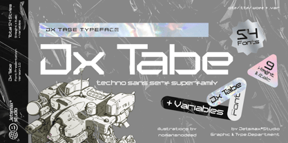
$-Jx Tabe is New techno sans serif typeface with super family. inspired by robotic, mecha and aethetic machine - a font suited for the future technology. This multi-purpose typeface will grab reader's attention with its stylish and neat design. With 9 Weight + Italic and 2 Axis Condensed and Expanded, With total 54 styles its a timeless workhorse for many possible application from branding to editorial. - Battlexoid by PizzaDude.dk,
$20.00Get ready for a battle - a battle of punk and grunge! This surely is a messy font...it looks like it has been run over by a VERY bad copy machine! Comes with a bunch of cool features such as: - Different lower/caps letters - Unique accented charaters - Ligatures for double letters/numbers - Alternative letters You will need to use OpenType supporting applications to use the autoligatures - Disclosure by Device,
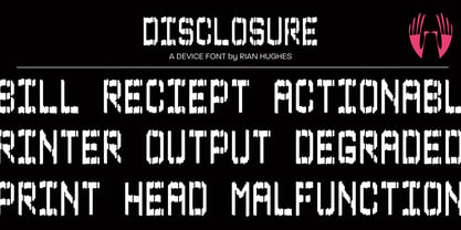
$39.00Disclosure is suggestive of low-grade digital output, screen displays, fax machines, or high-speed data transfer. It is missing vertical sections, perhaps due to a faulty print head or signal degradation. It is intentionally monospaced — each letter has the same width, like a typewriter — and unkerned. Suitable for uses where an unfussy urgency and drama is required. Developed from the 112 Hours numbers-only font, Throughput. - Hey Girl by Angele Kamp,
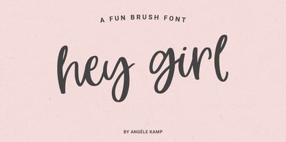
$26.00Hey Girl is a fun, brush font with a a bouncy baseline. This playful font will give your designs that fresh, modern feel to it and will look lovely on quotes, cards, logo's and all your other lovely projects. Hey Girl has nice smooth lines which makes it perfect for crafters and cutting machines. Hey Girl contains standard characters, lowercase, uppercase, numbers, punctuation, ligatures, and international characters. - Knitting And Sewing Doodles by Outside the Line,
$19.00Knitting & Sewing Doodles are just that. If you type all caps you get 15 knitting icons and lower case is 15 sewing doodles. Knitting items include yarn, knitting, needles, ball winder, spinning supplies, stitch counter, etc. Sewing machine, buttons, thread, pin cushion, bobbin, thimble and needles, scissors, label, tape measure, darning egg, zipper, seam ripper, and pins, all in the Outside the Line style. - Transaction SRF by Stella Roberts Fonts,
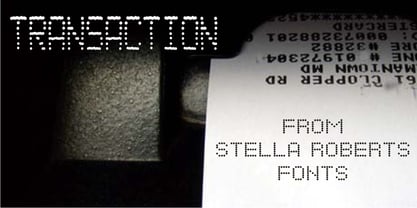
$25.00Leave it to Ray Larabie to come up with an interesting typeface that looks as if it were printed straight out a store's register. Stella Roberts Fonts presents Transaction SRF, the perfect font for emulating cash register receipts and adding machine tapes. The net profits from my font sales help defer medical expenses for my siblings, who both suffer with Cystic Fibrosis and diabetes. Thank you. - Axion RX-14 by Type Innovations,
$39.00Axion RX-14 is an original design by Alex Kaczun. It is but one of several alternate designs based on his original Axion family of fonts. Alternate design elements, specifically on capitals like 'A' , 'V' and terminals of 'C' and 'G', along with contrasting sharp and rounded corners, create a tension within this modern grotesque and add a class of destinction and interest. This display font is not intended for text use. It was designed specifically for display headlines, logotype, branding and similar applications. The entire font has an original look which is strong, dynamic, machine generated and can be widely used in publications and advertising. Axion RX-14 is a futuristic, techno-looking and expressive typeface with an apperance of machined parts with sharp and rounded edges. This attractive display comes in roman with lower case and lining figures. The large Pro font character set supports most Central European and many Eastern European languages.
