10,000 search results
(0.029 seconds)
- Hello Anggela by Gian Studio,
$12.00 Hello Anggela Script a new fresh & modern script with a handmade calligraphy style, decorative characters and a dancing baseline! So beautiful on invitation like greeting cards, branding materials, business cards, quotes, posters, and more!! Hello Anggela Script come with 275+ glyphs. The alternative characters were divided into several Open Type features such as Swash, Stylistic Sets, Stylistic Alternates, Contextual Alternates. The Open Type features can be accessed by using Open Type savvy programs such as Adobe Illustrator, Adobe InDesign, Adobe Photoshop Corel Draw X version, And Microsoft Word. And this Font has given PUA unicode (specially coded fonts). so that all the alternate characters can easily be accessed in full by a craftsman or designer. How to access and use font glyphs on a Windows PC : https://designbundles.net/design-school/how-to-access-use-font-glyphs-windows Accessing Font Glyphs with Font Book on Mac : https://designbundles.net/design-school/access-font-glyphs-mac Can't find Glyphs on Mac? Make sure you are in Repertoire Mode! https://designbundles.net/design-school/cant-find-font-glyphs-mac NOTE : Tail is available only for lowercase letters. Thank you
 - Fan Script by Sudtipos,
$99.00 A friend of mine says that sports are the ultimate popular drug. One of his favorite things to say is, “The sun’s always shining on a game somewhere.” It’s hard to argue with that. But that perspective is now the privilege of a society where technology is so high and mighty that it all but shapes such perspectives. These days I can, if I so choose, subscribe to nothing but sports on over a hundred TV channels and a thousand browser bookmarks. But it wasn't always like that. When I was growing up, long before the super-commercialization of the sport, I and other kids spent more than every spare minute of our time memorizing the names and positions of players, collecting team shirts and paraphernalia, making up game scenarios, and just being our generation’s entirely devoted fans. Argentina is one of the nations most obsessed with sports, especially "fútbol" (or soccer to North Americans). The running American joke was that we're all born with a football. When the national team is playing a game, stores actually close their doors, and Buenos Aires looks like a ghost town. Even on the local level, River Plate, my favorite team where I grew up, didn't normally have to worry about empty seats in its home stadium, even though attendance is charged at a high premium. There are things our senses absorb when we are children, yet we don't notice them until much later on in life. A sport’s collage of aesthetics is one of those things. When I was a kid I loved the teams and players that I loved, but I never really stopped to think what solidified them in my memory and made them instantly recognizable to me. Now, thirty-some years later, and after having had the fortune to experience many cultures other than my own, I can safely deduce that a sport’s aesthetic depends on the local or national culture as much as it depends on the sport itself. And the way all that gets molded in a single team’s identity becomes so intricate it is difficult to see where each part comes from to shape the whole. Although “futbol” is still in my blood as an Argentinean, I'm old enough to afford a little cynicism about how extremely corporate most popular sports are. Of course, nothing can now take away the joy I got from football in my childhood and early teens. But over the past few years I've been trying to perceive the sport itself in a global context, even alongside other popular sports in different areas of the world. Being a type designer, I naturally focus in my comparisons on the alphabets used in designing different sports experiences. And from that I've come to a few conclusions about my own taste in sports aesthetic, some of which surprised me. I think I like the baseball and basketball aesthetic better than football, hockey, volleyball, tennis, golf, cricket, rugby, and other sports. This of course is a biased opinion. I'm a lettering guy, and hand lettering is seen much more in baseball and basketball. But there’s a bit more to it than that. Even though all sports can be reduced to a bare-bones series of purposes and goals to reach, the rules and arrangements of baseball and basketball, in spite of their obvious tempo differences, are more suited for overall artistic motion than other sports. So when an application of swashed handlettering is used as part of a team’s identity in baseball or basketball, it becomes a natural fit. The swashes can almost be visual representation of a basketball curving in the air on its way to the hoop, or a baseball on its way out of the park. This expression is invariably backed by and connected to bold, sleak lettering, representing the driving force and precision (arms, bat) behind the artistic motion. It’s a simple and natural connective analysis to a designer, but the normal naked eye still marvels inexplicably at the beauty of such logos and wordmarks. That analytical simplicity was the divining rod behind Fan Script. My own ambitious brief was to build a readable yet very artistic sports script that can be a perfect fit for baseball or basketball identities, but which can also be implemented for other sports. The result turned out to be quite beautiful to my eyes, and I hope you find it satisfactory in your own work. Sports scripts like this one are rooted in showcard lettering models from the late 19th and early 20th century, like Detroit’s lettering teacher C. Strong’s — the same models that continue to influence book designers and sign painters for more than a century now. So as you can see, American turn-of-the-century calligraphy and its long-term influences still remain a subject of fascination to me. This fascination has been the engine of most of my work, and it shows clearly in Fan Script. Fan Script is a lively heavy brush face suitable for sports identities. It includes a variety of swashes of different shapes, both connective and non-connective, and contains a whole range of letter alternates. Users of this font will find a lot of casual freedom in playing with different combinations - a freedom backed by a solid technological undercurrent, where OpenType features provide immediate and logical solutions to problems common to this kind of script. One final thing bears mentioning: After the font design and production were completed, it was surprisingly delightful for me to notice, in the testing stage, that my background as a packaging designer seems to have left a mark on the way the font works overall. The modern improvements I applied to the letter forms have managed to induce a somewhat retro packaging appearance to the totality of the typeface. So I expect Fan Script will be just as useful in packaging as it would be in sports identity, logotype and merchandizing. Ale Paul
 - Nombueang by Jipatype,
$17.00 Nombueang is an informal headline typeface with a bold appearance and loop-headed Thai letters, giving it a fun, friendly, and warm feeling. It is suitable for use in various media and is especially effective in emphasizing special importance, such as in posters, packaging, and more.
 - Nurnberg Schwabacher by Intellecta Design,
$29.95"I digitized and to revitalize NurnbergSchwabacher by the extinct Haas'sche Schriftgiesserei, a German/Swiss foundry established in 1790 and based in Basel/Münchenstein. Many of its shares were acquired by D. Stempel in 1927. On the Luc Devroye site this foundry is listed on the Extinct Foundries of the 18th century page. This design is very similar to another Intellecta best seller: Hostetler Fette Ultfraktur Ornamental, both drawn from the classical type specimen book from Hostetler. The ornamental frame that completes the font is a fantastic baroque ornament that I found in another old book, unfortunately lost now. Luc Devroye, whose book is the source for all of my fonts, writes this about Rudolf Hostettler: He was a Swiss type designer, author of “The Printer’s Terms” designed by Jan Tschichold, of "Technical Terms of the Printing Industry" (5th edition was printed in 1995), and of "Type: eine Auswahl guter Drucktypen; 80 Alphabete klassischer und moderner Schriften" (Teufen, Ausser-Rhoden: Niggli, 1958). He also wrote "Type: A Selection of Types" (1949, fgm books, R. Hostettler, E. Kopley, H. Strehler Publ., St. Gallen and London) in which he highlights type made by European houses such as Haas, Enschedé, Deberny and Nebiolo. Jost Hochuli wrote his biography. - Super League by Arkitype,
$12.00 Super League is a display typeface created for the sports industry. The typeface itself doesn't lean too much in a particular sports category direction which makes it versatile in use across various sporting categories. Super League has loads of. options to make use of including; small caps, stylistic alternates, ligatures for vs, st, nd, rd and th that are very useful when handling typography for sports in particular. Use Super League in all your printed material or on screen. Create badges or print names and numbers sports kits. All weights come with an oblique version which makes the total number of 16 fonts in this typeface.
 - Yiggivoo Unicode - 100% free

- Italiano Fushion New by RM&WD,
$35.00 Italiano Fushion is part of an expanding project on which we have been working for several years and which we are committed to in the future. Like the first two, this one too starts from the study of the great Futurist adventure of the early 1900s by great artists such as DEPERO and MARINETTI, who twisted the world of typography with shapes and colors. Italian Fushion is made up of almost 2,000 glyphs for each weight and in addition to hundreds of alternatives mainly, such as initials and endings of each word but also different alternatives for the letters I, J, Y. Thanks to the characteristics of Open Type, you can change them in automatic many of the alternatives, use it as a simple text font by changing only the I's and J's that have the typical capital dot, and giving the text a more fun breath to the composition. Italiano Fushion is suitable for large texts and to get the most out of it it is compulsory to transform the text into UPPERCASE text using the tabs of graphic applications such as Illustrator, or activate the Alternavive tabs and the various options of SS. Ideal for creating Logos, Head Lines, Web Titles, Posters, Epub Covers, Tatoo Projects, T-Shirts, Drink Labels ... Thanks
 - Gemini Type Fontpack by Chank,
$49.00 INTRODUCING THE GEMINI TYPE FONTPACK, an industrial-strength OpenType font bundle inspired by and optimized for dimensional type. Chank Co is proud to introduce the new “Gemini Type Fontpack,” a collection of ten fonts available for use on your desktop computer or web pages, but also optimized for use as exterior cast-metal signage in bronze or aluminum in collaboration with Gemini, a family-owned industry leader in the wholesale manufacture of dimensional letters, logo and plaques based in Cannon Falls, MN. Gemini collaborated with Chank Co to assemble a line of fonts that would work well as dimensional, cast-letter signage for use on the sides of buildings, in stores, and other public spaces. The fonts included in the “Gemini Type Fontpack” are reinterpretations of previous Chank Fonts, now optimized for dimensional signage display, but then also repackaged and presented for your use as an OpenType desktop computer font collection: GT-Adrianna DemiBold GT-Adrianna Bold GT-Adrianna ExtraBold GT-Fairbanks GT-Forward Thinking GT-Hydropower ExtraCondensed GT-Kegger GT-Shopaganda GT-Shopaganda Condensed GT-Timeless Geometric. This is a multi-purpose collection of heavy-lifting fonts to convey your message strong and clearly, full of legibility and clarity, but also displaying personality and distinction. You can purchase and download these fonts in OpenType format for your desktop computer right now via MyFonts. Get it today and you'll also get a great introductory special sale price. These exclusive typefaces are also available as dimensional letters, manufactured by Gemini in bronze or aluminum, from 6" tall up to 18" tall, with a variety of finish options, for use in public signage and wayfinding systems. Gemini manufacture their products in 20 plants through out the US, Canada and Mexico, and all their products are backed by a lifetime guarantee. Chank Co is excited to offer these ten strong, industrial font designs in durable cast metal format via Gemini. ----- More about the fonts in the Gemini Type Fontpack: GT-Adrianna DemiBold, Bold, and Adrianna ExtraBold Clear, invisible, no-nonsense, multi-purpose. A versatile sans-serif heavy-lifting font family. GT-Fairbanks Vintage, silent film, speedball, old-timey, old-fashioned, retro. Based upon the lettering in the 1914 silent film, “The Good Bad Man.” GT-Forward Thinking Futuristic, semi-serif, clean, distinctive, contemporary, idiosyncratic. A font for tomorrow and the future. GT-Hydropower ExtraCondensed Extra-condensed, compressed, strong, rigid and concise. GT-Kegger Strong, sporty, collegiate, athletic. Nothing says “GO TEAM” quite like a big, bold slab-serif font. GT-Shopaganda and GT-Shopaganda Condensed Industrial, geometric, constructivist, propaganda, oh there’s so much to love about the strength and clarity of these two fonts. Based on Chank’s Liquorstore and Nicotine fonts, which have been married and unified here, with a few new twists and turns to their letterforms. GT-Timeless Geometric Bauhaus, anyone? The geometric and minimalist alphabet here is about as clean and straight-forward as a semi-condensed sans can get. ----- All of the fonts in this package are available individually, or save money when you purchase all ten of them as a collection. Download this digital font package from MyFonts today and you'll receive both OpenType and TrueType formats in your download for your desktop computer. Webfont format is also available. (If you'd like to use these fonts as cast-metal letters for exterior, architectural purposes, visit the Gemini website to learn more about how you can find a signage retailer near you.)
 - Advertising Script by Zetafonts,
$39.00 Advertising Script is a brush script typeface inspired by a handmade sample drawn by the calligrapher Ross Frederic George and depicted in Speedball 1947 Textbook Manual. Advertising Script has a vintage brush script look, perfect for food packaging, display and logo design and period advertising. The original design has been completely reworked and extended by the Zetafonts Masterclass 2016 Team to provide three lighter weights, a rough and a monoline variant, and to produce an extended character set with open type support for ligatures, alternates, European languages and ending swashes. Advertising Script covers over 40 languages that use the Latin alphabet, with a full range of accents and diacritics. It comes in four weights plus a special monoline weight. Advertising Script makes full use of Open Type ligatures to provide swashes, alternates and a wide array of ligature characters for a more handmade, natural look. Swashes can be accessed through glyph palette or by typing one to six underscores after the letter. Take care: open type features are developed using open type technology, fully compatible with Adobe software and major design softwares and OS, but not supported by every software. Check before buying!
 - Corsa Grotesk by Typedepot,
$39.00 Corsa Grotesk is our very own tribute to two typographic giants: the Futura and Avenir typefaces. It is Designed with geometric simplicity in mind with well balanced strokes and modern touch. Generous proportions and x-height with more contemporary details - the single story ‘a’ and the horizontally barred ‘k’ being just two of many examples makes it shine in every jobs it takes. Corsa Grotesk blends the classic geometric aesthetics into a well-balanced font with generous proportions and minimal contrast. It features 10 weights ranging from Hairline to Black plus matching italics, as well as Cyrillic support for Bulgarian and Russian localizations. Filled with all the essential OpenType features like tabular figures, fractions, ligatures etc, it is a great choice for branding, advertising, user interfaces or any text that needs a bit of polish and a slick, present-day look that still feels familiar. With its 2.0 version we managed to polish the font even more. We revisited every path and fixed all the inaccuracies throughout. Corsa Grotesk now comes with way better and consistent spacing and kerning, just the right amount of contrast and balance. Live Tester | Download Demo Fonts | Subscribe
 - Chris Master by Gilar Studio,
$16.00 ChrisMaster is a Christmas Script font and an extra font containing doodle illustration. It looks stunning on wedding invitations, thank you cards, quotes, greeting cards, logos, business cards and every other design which needs a handwritten touch. This font is PUA encoded which means you can access all of the glyphs and swashes with ease! It features a varying baseline, smooth lines, gorgeous glyphs and stunning alternates Please check all lowercase, uppercase and numerals to access all Doodle in font format. The best tool if you want to create t-shirt designs, mug designs, logos or just play around. Features : Uppercase & Lowercase Numerals & Punctuations (OpenType Standard) Accents/Multilingual characters beginning and ending swash (ss01-ss06) beautiful ligature PUA Encoded To access all OpenType Stylistic alternates, you need a program that supports OpenType features such as Adobe Illustrator, Adobe Photoshop, CorelDraw and Microsoft word. The font has PUA Unicode (Private Use Areas - font specific code), so that all the alternative characters (with flourishes and swirly lines) can be easily accessed in full through Windows and Mac and you can loadt hem into applications such as Cricut Design Space and SilhouetteStudio. Check my other Font here : https://gilarstudio.com/
 - Hollyhock by Angie Makes,
$32.00 Meet Hollyhock, a modern and messy calligraphy font with wild, tall letterforms that refuse to be tamed. Inspired by calligraphy the breaks the rules and hollyhocks that grow rebelliously where they please. This font includes two full sets of capital letters… a set that is tall, energetic, and wild as well as a set a bit more tame and subdued. Open type features in this font include contextual alternates, fractions, ordinals, discretionary ligatures, and swashes. Use contextual alternates to add subtle swashes to the beginnings and ends of your letters. Use your open type swashes panel to use the many and various doodles, swirls, and swashes to manually add flare and flavor to your text. Or, install the separate Hollyhock Ornaments font to access the swashes and doodles more easily. Most Diacritics included for various language support. Message me if there’s one you're not sure is included. This font works best in OpenType aware software (ie. Adobe Applications) so that you can take advantage of its many features. Comes as two .otf (OpenType font) files. See this tutorial for more on how to add the various swashes and doodles to this font! http://angiemakes.com/add-swashes-fonts-photoshop/
 - 99 Names of ALLAH Random by Islamic Calligraphy75,
$12.00 We have transformed the “99 names of ALLAH” into a font. That means each key on your keyboard represents 1 of the 99 names of ALLAH Aaza Wajal. The fonts work with both the English and Arabic Keyboards. We call this Calligraphy "Random" because we don't follow any one principle to write the names, some overlap some don't, some letters are big and some are small. All the letters, harakat, decorative letters and symbols may differ from one name to another.(in the zip file you will find a pdf file explaining the differences in the "harakat", pronunciation and spelling according to the Holy Quran). Decorative symbols are at a minimum. Decorative letters used in this calligraphy: "Mim, Aain, Sin, HHe, He, Kaf". Purpose & use: - Writers: Highlight the names in your texts in beautiful Islamic calligraphy. - Editors: Use with kinetic typography templates (AE) & editing software. - Designers: The very small details in the names does not affect the quality. Rest assured it is flawless. The MOST IMPORTANT THING about this list is that all the names are 100% ERROR FREE, and you can USE THEM WITH YOUR EYES CLOSED. All the “Tachkilat” are 100% ERROR FREE, all the "Spelling" is 100% ERROR FREE, and they all have been written in accordance with the Holy Quran. No names are missing and no names are duplicated. The list is complete "99 names +1". The +1 is the name “ALLAH” 'Aza wajal. Another important thing is how we use the decorative letters. In every font you will see small decorative letters, these letters are used only in accordance with their respective letters to indicate pronunciation & we don't include them randomly. That means "mim" on top or below the letter "mim", "sin" on top or below the letter "sin", and so on and so forth. Included: Pdf file telling you which key is associated with which name. In that same file we have included the transliteration and explication of all 99 names. Pdf file explaining the differences in the harakat and pronunciation according to the Holy Quran. Here is a link to all the extra files you will need: https://drive.google.com/drive/folders/1Xj2Q8hhmfKD7stY6RILhKPiPfePpI9U4?usp=sharing
 - Challenger by Linotype,
$29.99German-born, veteran graphic designer and calligrapher Mandred Kloppert, has designed everything from book covers and packaging to logos and fonts. In fact, in 1977, one of his poster designs was voted best poster of the year. Challenger, his first digital typeface draws on his more than 40 years of experience as a freelance graphic designer and calligrapher. Challenger is a versatile font and is particularly effective in contexts in which the purpose is to put across a message very directly and assertively, while retaining a dignified style - in advertisement texts, on packaging, invitations and greetings cards and the like. It is dynamic without being overbearing, individual without being quirky. - VVDS Pacifica by Vintage Voyage Design Supply,
$18.00 Pacifica – hand lettered elegant bold script for decorative typography inspired by American branding typography from end of XX century. Comes with different variates – filled, highlighted or pressed. Perfectly for headers, signs, logos, prints, etc. Comes with ending and some middle alternates and some standard ligatures.
 - Varidox by insigne,
$35.00 Varidox, a variable typeface design, allows users to connect with specific design combinations with slightly varied differences in style. These variations in design enable the user to reach a wider scope of audiences. As the name suggests, Varidox is a paradox of sorts--that is, a combination of two disparate forms with two major driving influences. In the case of type design, the conflict lies in the age-old conundrum of artistic expression versus marketplace demand. Should the focus center primarily on functionality for the customer or err on the side of advancing creativity? If both are required, where does the proper balance lie? Viewed as an art, type design selections are often guided by the pulse of the industry, usually emphasizing unique and contemporary shapes. Critics are often leading indicators of where the marketplace will move. Currently, many design mavens have an eye favoring reverse stress. However, these forms have largely failed to penetrate the marketplace, another major driving factor influencing the font world. Clients now (as well as presumably for the foreseeable future) demand the more conservative forms of monoline sans serifs. Typeface designers are left with a predicament. Variable typefaces hand a great deal of creative control to the consumers of type. The demands of type design critics, personal influences of the typeface designer and the demands of the marketplace can all now be inserted into a single font and adjusted to best suit the end user. Varidox tries to blend the extremes of critical feature demands and the bleeding edge of fashionable type with perceptive usability on a scalable spectrum. The consumer of the typeface can choose a number between one and one-thousand. Using a more conservative style would mean staying between zero and five hundred, while gradually moving higher toward one thousand at the high end of the spectrum would produce increasingly contemporary results. Essentially, variable fonts offer the ability to satisfy the needs of the many versus the needs of the few along an axis with a thousand articulations, stabilizing this delicate balance with a single number that represents a specific form between the two masters, a form specifically targeted towards the end user. Practically, a user in some cases may wish to use more conservative slab form of Varidox for a more conservative clientele. Alternatively, the same user may then choose an intermediate instance much closer to the other extreme in order to make a more emphatic statement with a non-traditional form. Parametric type offers a new options for both designers and the end users of type. In the future, type will be able to morph to target the reader, based on factors including demographics, mood or cultural influences. In the future, the ability to adjust parameters will be common. With Varidox, the level of experimentality can be gauged and then entered into the typeface. In the future, machine learning, for example, could determine the mood of an individual, their level of experimentality or their interest and then adjust the typeface to meet these calculated parameters. This ability to customize and tailor the experience exists for both for the designer and the reader. With the advent of new marketing technologies, typefaces could adjust themselves on web pages to target consumers and their desires. A large conglomerate brand could shift and adapt to appeal to a specific target customer. A typeface facing a consumer would be more friendly and approachable, whereas a typeface facing a business to business (B2B) customer would be more businesslike in its appearance. Through both experience, however, the type would still be recognizable as belonging to the conglomerate brand. The font industry has only begun to realize such potential of variable fonts beyond simple visual appearance. As variable font continues to target the user, the technology will continue to reveal new capabilities, which allow identities and layouts to adjust to the ultimate user of type: the reader.
 - Classic Grotesque by Monotype,
$40.99 Classic Grotesque by Rod McDonald: a traditional font with a modern face. The growing popularity of grotesque typefaces meant that many new sans serif analogues were published in the early 20th century. Setting machines were not compatible with each other but all foundries wanted to offer up-to-date fonts, and as a result numerous different typeface families appeared that seem almost identical at first glance and yet go their separate ways with regard to details. One of the first fonts created with automatic typesetting in mind was Monotype Grotesque®. Although this typeface that was designed and published by Frank Hinman Pierpont in 1926 has since been digitalised, it has never achieved the status of other grotesque fonts of this period. But Monotype Grotesque was always one of designer Rod McDonald’s favourites, and he was overjoyed when he finally got the go-ahead from Monotype in 2008 to update this “hidden treasure”. The design process lasted four years, with regular interruptions due to the need to complete projects for other clients. In retrospect, McDonald admits that he had no idea at the beginning of just how challenging and complex a task it would be to create Classic Grotesque™. It took him considerable time before he found the right approach. In his initial drafts, he tried to develop Monotype Grotesque only to find that the result was almost identical with Arial®, a typeface that is also derived in many respects from Monotype Grotesque. It was only when he went back a stage, and incorporated elements of Bauer Font’s Venus™ and Ideal Grotesk by the Julius Klinkhardt foundry into the design process, that he found the way forward. Both these typefaces had served as the original inspiration for Monotype Grotesque. The name says it all: Classic Grotesque has all the attributes of the early grotesque fonts of the 20th century: The slightly artificial nature gives the characters a formal appearance. There are very few and only minor variations in line width. The tittles of the ‘i’ and ‘j’, the umlaut diacritic and other diacritic marks are rectangular. Interestingly, it is among the uppercase letters that certain variations from the standard pattern can be found, and it is these that enliven the typeface. Hence the horizontal bars of the “E”, “F” and “L” have bevelled terminals. The chamfered terminal of the bow of the “J” has a particular flamboyance, while the slightly curved descender of the “Q” provides for additional dynamism. The character alternatives available through the OpenType option provide the designer with a wealth of opportunities. These include a closed “a”, a double-counter “g” and an “e” in which the transverse bar deviates slightly from the horizontal. The seven different weights also extend the scope of uses of Classic Grotesque. These range from the delicate Light to the super thick Extrabold. There are genuine italic versions of each weight; these are not only slightly narrower than their counterparts, but also have variant shapes. The “a” is closed, the “f” has a semi-descender while the “e” is rounded. Its neutral appearance and excellent features mean that Classic Grotesque is suitable for use in nearly all imaginable applications. Even during the design phase, McDonald used his new font to set books and in promotional projects. However, he would be pleased to learn of possible applications that he himself has not yet considered. Classic Grotesque, which has its own individual character despite its neutral and restrained appearance, is the ideal partner for your print and web project.
 - OL Hebrew Cursive by Dennis Ortiz-Lopez,
$30.00 This font contains every variant found in the Hebrew Bible such as the “mutilated” Waw in Numbers 25: verse 12, the small Heh in Genesis 2: verse 4 and the Nun Inversum before Numbers 10: verse 35 and after verse 36 and elsewhere as well as oversized consonants and various double-wide consonants used in inscriptions.
 - Adonis New by ParaType,
$30.00 Adonis New is a considerate update of the Adonis serif. This dense serif with smooth lines has new, bolder styles, and it supports Greek now. In addition, Natalia Vasilyeva reworked the main styles and made them fresher and more accurate. Adonis New works well in bookset, particularly in fiction and humanities. New version was released by ParaType in 2021.
 - Sign Work Deco JNL by Jeff Levine,
$29.00 The prolific hand lettering of Samuel Welo is showcased in his “Studio Handbook for Artists and Advertisers” (published in both 1927 and 1960). A thick and thin Art Deco design in the 1960 edition – somewhat reminiscent of Futura Black (but with significant differences) is now available as Sign Work Deco JNL in both regular and oblique versions.
 - OL Hebrew Formal Script by Dennis Ortiz-Lopez,
$30.00 This font contains every variant found in the Hebrew Bible such as the “mutilated” Waw in Numbers 25: verse 12, the small Heh in Genesis 2: verse 4 and the Nun Inversum before Numbers 10: verse 35 and after verse 36 and elsewhere as well as oversized consonants and various double-wide consonants used in inscriptions.
 - OL Hebrew Formal Script With Tagin by Dennis Ortiz-Lopez,
$30.00 This font contains every variant found in the Hebrew Bible such as the “mutilated” Waw in Numbers 25: verse 12, the small Heh in Genesis 2: verse 4 and the Nun Inversum before Numbers 10: verse 35 and after verse 36 and elsewhere as well as oversized consonants and various double-wide consonants used in inscriptions.
 - Herrmann by driemeyerdesign,
$19.00 Herrmann is a sans serif typeface family. It was especially designed for use in headlines, but it's great legibility also allows for use in longer texts and smaller sizes. The geometrical design gives it a distinct industrial / architectural style. Herrmann comes in 10 styles (thin, light, regular, semibold and bold, all in regular and italic) and has 374 glyphs.
 - Sond by Eurotypo,
$34.00 Sond is a casual, modern and hand brushed font. I've designed Sond carefully with the intention to preserve in its glyphs the original tell-tale dry brush imperfections and a bouncy baseline for a more personalized effect even more authentic. As an exclusively Open Type release, with 519 glyphs and ornaments, it has special alternatives for all letters with lots of possibility an infinity of combinations. There are plenty of options to allow you to create something unique and special: standard ligatures, swashes and stylistics alternates for each letter, beginning and ending letters. This lovely fonts have already an extended character set to support Central and Eastern as well as Western European languages. Sond is a good choice for greeting cards, posters, labels, t-shirt design, logos, and more.
 - Jester Jumble by Putracetol,
$16.00 Jester Jumble - Fun Clown Font is a whimsical and playful typeface designed with a clown and circus theme in mind. Its quirky characters add an element of chaos and fun to your designs, making it perfect for projects that require a playful touch. This font includes six adorable clown-themed decorative variations, featuring circus hats, masks, laughing mouths, and more. Perfect for clown-themed designs, such as invitation cards, birthday invites, party decorations, logos, stickers, clothing, packaging, children's books, magazines, and more, Jester Jumble adds a delightful and entertaining dimension to your creative projects. With its charming and playful style, this font captures the essence of circus merriment and clownish fun, making it an ideal choice for any project that aims to bring a smile to people's faces.
 - Asparocus by Prestigetype Studio,
$16.00 Asparocus is a modern and clean font duo that includes all caps sans serif and script font style. Sans serif style comes in 16 weights with italics + variable fonts. Designed with a modern minimalist mind, Asparocus is suited for display, advertising, web design, headline, branding, logo, text, business card, and many editorial design purposes. What you will get: All caps sans serif and script font style Numbers and punctuation Multilingual Ligatures Alternates Opentype features Future Updates Available We highly recommend using a program that supports OpenType features and Glyphs panels like many Adobe apps and Corel Draw so you can see and access all Glyph variations. We hope you enjoy our font - please do let us know by emailing us at info@prestigetype.com or prestigetypestudio@gmail.com if you need something!
 - ALS Meringue by Art. Lebedev Studio,
$63.00 Meringue, a transitional serif face, is designed specially for modern glossy magazines. It is ideal for fashion photography, fashion publications and mag covers, and can be used for headings and captions, as well as for body copy. The italic version, with its wave-like vertical strokes, creates yet more stylishly expressive feel. Text set in Meringue has an elegant weightless look, and the strongest effect can be achieved with high-quality printing. The typeface includes old style figures, ligatures, and alternative characters that allow creating truly versatile design by means of typography. Designers may also find Meringue perfect for beautiful presentations, invitations and other special occasion papers. Meringue was designed during the Type and Typography course at the British Higher School of Art and Design, supervised by Ilya Ruderman.
 - Ruzicka Freehand by Linotype,
$29.99In 1935, Rudolph Ruzicka approached W.A. Dwiggins at Linotype in the USA and handed him six typeface design sketches. These later led to the typeface family now known as Fairfield. The sketch called Script’ was forgotten until 1993, when sketches and designs were found in Ruzicka’s archives. Ruzicka Freehand was originally a more flowing calligraphy typeface which Ruzicka later developed into this strong and unusual form. The typeface is designed in two weights and their matching italics. The figures are clear, only just indicating the handwritten style in the italic forms, and combine into light and harmonic lines of text. Ruzicka Freehand gives texts a private and personal character and is suitable for middle length texts and headlines. - Expanse by Alfareaniy,
$500.00 Expanse is a retro futuristic typeface. The font has a bold and big vibe and mixes sharp and round corners, kind of like the very old sci-fi movie titles. Expanse includes uppercase multilingual letters, numbers and punctuation.
 - Meliya by Yumna Type,
$16.00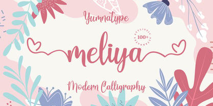 Meliya is a beautiful and modern script that is best used for weddings, branding, logotype, and quotes. Features : Beautiful Ligatures Beautiful Alternates + Swashes PUA Encoded Multi-lingual Support Numerals and Punctuation Beginning Swash and Ending Swashes (a-z)
 - Melyana by Yumna Type,
$16.00 Melyana is a beautiful and modern script that is best used for weddings, branding, logotype, and quotes. Features : Beautiful Ligatures Beautiful Alternates + Swashes PUA Encoded Multi-lingual Support Numerals and Punctuation Beginning Swash and Ending Swashes (a-z)
 - Velvet Script by Typadelic,
$19.00A pretty handwriting typeface. Smooth and feminine. You'll find an alternate "r" and "s" (Option 9 and Option 10 on the keyboard) which have a beginning stroke to achieve a finished look. Try it and see for yourself. - Carlista by Yumna Type,
$16.00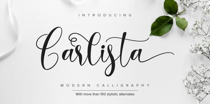 Carlista is a beautiful and modern typeface that is best used for weddings, branding, logotype, and quotes. Features : Beautiful Ligatures Beautiful Alternates + Swashes PUA Encoded Multi-lingual Support Numerals and Punctuation Beginning Swash and Ending Swashes (a-z)
 - Kathiya by Yumna Type,
$16.00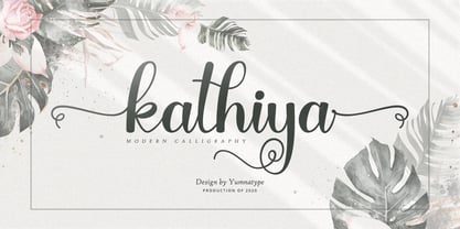 Kathiya is a beautiful and modern script that is best used for weddings, branding, logotype, and quotes. Features : Beautiful Ligatures Beautiful Alternates + Swashes PUA Encoded Multi-lingual Support Numerals and Punctuation Beginning Swash and Ending Swashes (a-z)
 - Burger Honren by IRF Lab Studio,
$12.00 Burger Honren is a beautiful collection of fonts, consisting of scripts, monolines and serifs. In this collection you will see fonts in various styles. With their help, many options open up for you to create your projects, both in vintage and modern styles. The script fonts in this collection provide both charisma and charm, crafted with care and complemented by alternatives and strokes. Serif comes in 10 styles and it is possible to choose the required style for your design. This font is PUA encoded which means you can access all the glyphs and sweeps easily!
 - Kuzanyan by ParaType,
$30.00 The hand composition typeface was created at Polygraphmash type design bureau in 1959 by a well-known Soviet book and type designer Pavel Kuzanyan (1901-1992). It was reproduced in the 1960s for slugcasting and machine display composition. Sharp contrast, strong weight, slightly condensed Modern Serif with calligraphic elements. The typeface is useful in text and display composition, in scientific, fiction and art books. The revised and completed digital version was designed at ParaType in 2002 by Lyubov Kuznetsova.
 - SF Mabsut by Sultan Fonts,
$19.99 Sultan-Mabsut, designed by Sultan Maqtari in 2018, is an Arabic typeface in the style of Maghribi (Moroccan Mabsut). This style, which originated in western North Africa, is characterized by a strong baseline and long, fluid, and curvaceous curves. It can be used in headlines or in text and gives a very fresh and calligraphic look. The font combines two methods of writing at one time (writing oriental and writing Moroccan). It also includes lots of Stylistic Alternates.
 - Neva by ParaType,
$30.00 Neva Regular with Italic was created by Moscow book and type designer Pavel Kuzanyan (1901-1992) at Polygrafmash in 1970 for slugcasting and display composition. Based on simple strict letterforms of Russian classical typefaces. Neva typeface was rewarded on the Gutenberg international type design contest in 1971 (Leipzig). The typeface is useful in text and display composition, in fiction and art books. The digital version and bold styles were designed for ParaType in 2002 by Lyubov Kuznetsova.
 - Daleant by Maculinc,
$15.00 The new beautiful and attractive Serif Font comes with a unique alternative in each Uppercase, This Font is available in Uppercase and Lowercase Complete with Numbers, Punctuation, Alternate and Ligatures. Daleant Serif Font is available in the family of Light, Light-Italic, Regular, Italic, Medium, Medium-Italic, Semi Bold, Semi Bold-Italic, Bold, Bold-Italic. Alternatives and Ligatures in this font are only available in uppercase letters, Add alternatives to make sentences more unique and interesting.
 - Kungfu Brush by Ditatype,
$29.00 Kungfu Brush is a captivating game-themed display font designed in uppercase, infusing the essence of martial arts and the artistry of brush strokes. It features a distinct brush-style accent that brings a sense of handcrafted artistry to each letter. Inspired by the fluid movements of martial arts, the font captures the energy and elegance of brush strokes. This unique feature adds a touch of creativity and authenticity, making this font stand out from conventional display fonts. Designed with fairly low contrast, Kungfu Brush prioritizes a balanced and harmonious visual experience. The subtle differences in stroke width across the letters create a smooth and comfortable reading experience. With its uppercase design, Kungfu Brush exudes power and strength. Each letter commands attention and showcases the boldness of martial arts. The font's uppercase style adds a sense of authority and captures the spirit of determination found in the martial arts realm. You can also enjoy the available features here. Features: Multilingual Supports PUA Encoded Numerals and Punctuations Kungfu Brush fits in headlines, logos, posters, titles, branding materials, print media, editorial layouts, website headers, and any projects that aim to capture the essence of combat, adventure, and discipline. Find out more ways to use this font by taking a look at the font preview. Thanks for purchasing our fonts. Hopefully, you have a great time using our font. Feel free to contact us anytime for further information or when you have trouble with the font. Thanks a lot and happy designing.
