10,000 search results
(0.042 seconds)
- Fontoddler by CozyFonts,
$20.00 Fontoddler Font Family, This font was created with the personality, in mind, of my two-and-a-half-year-old granddaughter Chloe Bella. I believe strongly that fonts have personalities that’s why we refer to their members as ‘characters’ or to be more accurate, ‘glyphs’. This font is playful, bold, colorful in form and design, a bit irregular, a bit informal, a bit irreverent, a bit humorous, a bit sassy, and a bit independent just like my little one. When used in color Fontoddler sings. She’ll be writing and creating visual words in just the nick of time. At 2 she started recognizing many colors and identifying people, places, animals, and objects and now she’s recognizing letters. I can’t wait for her to understand that this font was designed and named after her. Fontoddler currently exists in 3 styles, Medium, Heavy, and Heavy Outline. Naturally Heavy and Heavy Outline are congruous, ie. They are fitting together. I hope you enjoy and use this 24th font family from Cozyfonts Foundry. It will fit well with greeting cards, signage, birthday parties, holiday occasions, invites, stationary, headlines, logos, posters, cartoons, animation titles, movie titles and even sports events and sports logos. Have fun with this one. Tom Nikosey
 - Ganz Grobe Gotisch by URW Type Foundry,
$39.99 It is not only coarse but extremly black, and it is quite right to name it Black Letter in English. Ernst Schneidler, the designer, created the smallest possible counters. Still, this very coarse black letter is sensitive in detail and drawn with a high level of aesthetics. By the way, it was said in Schneidler's design class in Stuttgart that his number one student Walter Brudi had cut some of the characters with �silhoutte scissors� from black paper. Sharing his ideas and work with his students does not at all decrease or lower his copyright.Ganz Grobe Gotisch is not only a distinguised but also a very catchy design.(Albert Kapr in Fraktur -- �Form und Geschichte der gebrochenen Schrift�.)
 - Dave Gibbons Lower by Comicraft,
$49.00 Other guys may imitate him, but the original is still the greatest! Get in with the In Crowd and check out the font created by Mister Fontastic for Dave Gibbons Original Graphic Novel, The, ah, The Originals. Yes, Dave Gibbons now comes in lower case, it's not just what he does when he gets back from the off license. Be sure and pick up The Originals from Amazon -- now available in paperback, and probably still available as a hard case, much like Dave. After the crack about the case of beer above, I'm guessing you'll find me with a broken spine in the remainder pile. See the family related to Dave Gibbons Lower: Dave Gibbons Journal & Dave Gibbons .
 - Scirocco by Wiescher Design,
$39.50 Scirocco is a hot and humid wind that blows from the Sahara over to France and Italy. It crosses the mediterranean sea and carries lots of fine desert dust with it. Once it hits the coast of Provençe one can feel it grinding ones teeth and see it as fine dust covering every car. It makes people go nuts! Scirocco, the typeface has that same hot moving character and the finer hairlines giving it a kind of Arabic touch. If you use it too much, it will make you go nuts. Your pretty crazy Gert Wiescher
 - Miss Seshat by Eurotypo,
$48.00 In Egyptian mythology, Seshat was the Ancient Egyptian goddess of wisdom, knowledge, and writing. She was seen as a scribe and record keeper, and her name means she who scrivens, and is credited with inventing writing. Miss Seshat font is a fun, charming and expressive handwritten font with 900 glyphs. They have many advantages of the OpenType futures to choose from: stylistic alternates, contextual alternates, and a full set of standard and discretionary ligatures, Swatches, Beginnings and endings, as a rich set of 120 ornaments, connectors and catch words. Miss Seshat Pro version supports all diacritics for CE languages. They've been specially thought to obtain endless possibilities of composition and to help to make each creation unique and interesting. Miss Seshat font can be used in packaging design, children books, advertising, logotypes, greeting cards, web sites and much more.
 - Stem by ParaType,
$40.00 The thing is that many sans-serif typefaces are usually intended for universal usage. But sometimes faces that work fine in body text look not so good in large point sizes for display purposes when all the contrast in non-contrast sans-serif, or ink traps, become visible to the naked eye. Every designer solves this problem in his own way. We offer a drastic solution in our Stem: a sans-serif with optical sizing. The first part of the type family, Stem Display, is for use in largest point sizes, from 36 pt indefinitely. Stem Display consists of 12 faces of widths from Hairline to Bold, and it has true italics. The development of Stem type family will include Stem Text for body text and “traditional”, universal use, and Stem Caption for small point sizes. Stem is a geometric sans-serif with semi-closed aperture, large x-height and modern proportions of uppercase letters, like in famous Avenir and Gotham. Its important feature is a professionally designed and carefully tested Cyrillic glyph set.
 - Gosent by NamelaType,
$19.00 Gosent is a Modern Sans serif typeface that has larger x-height size, it will give great performance in small text sizes. Features moderate contrast and lots of special details like the unusual ink trap, giving a modern feel. Gosent is great your various design, both serious and fun projects. Consists of 9 Weight variants from Thin to Black and comes with Oblique version
 - Hengela Script by Hrz Studio,
$14.00 Hengela - is a modern script calligraphic typeface with some alternate bonds and strokes. This font is created in a modern style with a start and end that is very beautiful, elegant, very casual and will suit many of your design needs Perfect for logos, branding, titles, social media posts, advertisements, product packaging, product designs, labels, photography, signs water, special events, magazines, web design, etc.
 - Rekord Antiqua by RMU,
$30.00 Rekord Antiqua, regular and semibold, released 1911 by Wagner & Schmidt, is a perfect body text partner for Art Nouveau display fonts. Both styles come with a long s, which can be reached by the OT feature of historical forms or by typing [alt] + b. In addition, you find two framing elements on [alt] + P and [alt] + p, and an oblique style was added too.
 - Zappaloosa by Bogstav,
$18.00 Zappaloosa is a wordplay, and the name came to me while listening to the radio while making this font. At a point I must have misheard something, but the name Zappaloosa popped up in my mind. The letters of Zappaloosa are playful and easy to use for serious or more loose use. I've added 3 different versions of each lowercase letter and multilingual support
 - Knockdown by Hanoded,
$15.00 Finding my long-lost inkwell was a lucky moment for me and it resulted in a whole bunch of brushy/inky fonts. The latest font to leak out of this well is Knockdown. It is a bold and wild brushface, but very legible. Use if for your posters, book covers and T-shirts! Or, whatever else you like. Comes with a KO of diacritics.
 - Intima Politha by Attype Studio,
$15.00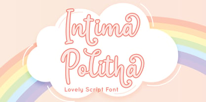 Intima Politha is a lovely script font with stylistic set and alternates. Fall in love with its incredibly versatile style and use it to create spectacular designs! Intima Politha is perfect for branding, logo, invitation, quotes, apparel design, product packaging, merchandise, game titles, cute style design, Book/Cover Title and more. What's Included : - Ending Swash - Multilingual Support --- Hope you enjoy with our font! Attype Studio
 - Japan Stamp by Pavel Boog,
$26.00 Japanese stamp - when creating this font, the author wanted to create a font unlike any other, taking inspiration from Japanese culture and history. It is one of a kind and unique font. It will immerse you in the historical era and add mystery to any of your projects. Anyone who wants to stand out among all this font will suit as out of place.
 - Quickbrush by Trial by Cupcakes,
$29.00 Like its cousin Quickpen, Quickbrush is an unfussy, confidently jotted script, with lots of rich texture to recreate the skips and jumps that appear in brush pen lettering. Contextual alternates for lowercase letters mimic starting and ending marks, to make each word look truly written by hand. It’s a typeface you’ll reach for again and again, for any project that needs a casual, handwritten touch.
 - Futura Next by Neufville Digital,
$45.25 Our most up-to-date Futura adapted to the new times. Its peculiarity lies in the curved endings of three of its letters (“j”, “l” and “t”), which gives the typeface a more dynamic and modern look, making it easier to visualize on small and low-resolution screens. The original designs of these characters are also included. Futura is a Trademark of BauerTypes SL
 - Fogie by Din Studio,
$22.00 Fogie is a modern serif family font. Features with 10 fonts. This family also featured with many ligatures and alternates. Designed with powerful OpenType features in mind and perfectly suited for graphic design and any display use. It could easily work for web, signage, corporate as well as for editorial design. The Thin style is free so you can try this for your content.
 - Fengo by Mostardesign,
$35.00 Fengo is a beautiful handlettering font inspired by Sino-Japanese and traditional Chinese hieroglyphic characters. As a result the font looks authentic and very friendly. It contains a wide range of features such as initials, finals, swashes, arrows, circled numerals. Fengo can cover all kind of graphic design project from packaging, signage, branding, titles… Fengo was designed in duo by Jean-Claude and Olivier Gourvat.
 - Something Rounded by wearecolt,
$16.00 Something Rounded is a soft version of Something New and has been designed with logo designers and typographers firmly in mind. This feature-packed display font is a perfect addition to your design arsenal, ready for your next logo wordmark, heavy headings, or coffee labels. "A stylish mix of serif and blackletter" Great for; logos, branding materials, business cards, gift cards, t-shirts, prints, posters, quotes, etc.
 - Pinky Sunday by Attype Studio,
$15.00 Pinky Sunday is a Script Vintage font with stylistic set and alternates. Combine Pinky Sunday stylistic set to get amazing letterform! Fall in love with its incredibly versatile style and use it to create spectacular designs! Pinky Sunday is perfect for branding, logo, invitation, quotes, apparel design, product packaging, merchandise, game titles, cute style design, Book/Cover Title and more. What's Included : - Beginning & Ending Swash - Multilingual Support
 - HT Gelateria by Dharma Type,
$19.99 Gelateria is characterized by its dots and tails. This font is as a whole smooth and elegant. But because its dots and end of the tails are little points, Gelateria impressed you very much. Holiday Type Project offers retro hand drawing scripts. Inspired by retro script on shopfront lettering, wall paint advertisements in Italy around 1950s. Check out the script fonts from Holiday Type!
 - Franca by René Bieder,
$29.00 Franca is a neo-grotesk family in nine weights plus matching italics. The inspiration for the design came through the constant interest in new interpretations of the classic grotesk model and a study of "neutral“ typefaces like Helvetica, Univers or Normal Grotesk. During the studies, additional attention was given to the American representatives of the genre, resulting in the initial impetus for a reinterpretation, combining both paths into one contemporary design. This is reflected in the name, blending together the names of the most popular typefaces of each genres, (Fran)klin and Helveti(ca). Due to its large x-height and plain design, the family is perfectly suited for all kinds of text. Its mid-weights are optimized for usage in long paragraphs, while the bolder weights, due to a short descender and ascender, create a compact and confident look in headlines or short copy. In order to create strong and dynamic italics, the oblique glyph shapes come with a faint calligraphic hint, defined by a higher stroke contrast and a steeper connection between stems and arcs in, for example, h n m and u. This is followed by different standard shapes for a and y, supporting the dynamic movement of the lowercase in general. A wide range of OpenType features such as ligatures, old style figures, fractions, case-sensitive shapes and many more, are available for professional and contemporary typesetting. This is completed with eleven alternative glyph sets, enabling a quick customization of the typeface. The family supports up to 92 languages and comes with 500+ glyphs per font.
 - Litho Display by Arkitype,
$9.00 Litho Display is a bold display typeface, it has 8 fonts in the family with four different styles. Litho Display has been created with bold headline and poster typography in mind. It is perfect for use on typography heavy posters, packaging or on screen idents. The four different styles Litho Display comes in is Regular, Rounded, Rough and Press each with an italic pairing. With these styles Litho Display is versatile for various different uses whether it needs to be clean type for a poster or on screen or a more rough and rustic style for some packaging.
 - Flexo Soft by Durotype,
$49.00 Flexo Soft is the soft companion of Flexo. In Flexo Soft, the sharp edges of Flexo's characters have been tempered by a moderate rounding—creating a softer and friendlier typeface. Flexo Soft has a squarish design, making it stand out in many uses. It will shine in both headlines and text. It is well suited for graphic design and corporate identity design. Flexo Soft has sixteen styles, extensive language support, eight different kinds of figures, sophisticated OpenType features—so it’s ready for advanced typographic projects. For more information about Flexo Soft, download the PDF Specimen Manual.
 - Mikado by HVD Fonts,
$30.00 Mikado is a friendly, casual type family designed by Hannes von Döhren. It is intended to be used everywhere where a pleasant feeling should be conveyed: Games, Food, Service or Advertising. Mikado has a positive, kind of "out-of-the-box-appearance" in big sizes, but because of its straight architecture the fonts are also very legible in smaller sizes and longer texts - in print or on screen. Mikado is equipped for complex, professional typography with alternate letters, ligatures, arrows, fractions and an extended character set to support Central and Eastern European as well as Western European Languages.
 - Stradivari by Ana Delgado.,
$16.00 Stradivari is a romantic, classic and elegant serif. It was created based on the decorative forms of the Stradivarius “General Dupont” violin. During the Baroque era, this type of shape with a gouty ending was common. It can be found in many areas like architecture, sculpture, and even in the design of contemporary lyrics. This typeface can be applied to editorial design, branding, product packaging, magazine headers, or simply as a text overlay to any background image. It is advisable to use this typeface in display proportions (+24pt). It supports multilingual texts, such as English, Italian, Norwegian, Swedish, German, French, Danish, and Portuguese.
 - Bannock Brae Gothic by Red Rooster Collection,
$45.00 Bannock Brae Gothic is a sans serif typeface. It is an original creation of Steve Jackaman (ITF) and was created for the Red Rooster Collection in 1999. The typeface was loosely inspired by a typeface from an old obscure wood type specimen book from the turn of the 20th century. Due to its turn-of-the-century roots, Bannock Brae Gothic has an informal 1920’s art deco look. It finds an ideal home in lighthearted projects concerning crafts, food, festivals, and music, but its alternates still give it the flexibility to showcase a classic and timeless feel in any project.
 - Coats by Piñata,
$9.90 We've created a lively antiqua that is perfect for short emotional inscriptions. Coats will warm you up on a cold day and add a little kindness and easiness into any layout. Lines typed with this typeface start “trembling” in long texts, so be careful to use this family for special occasions and in small amounts. Imagine: on a cold day, you've just arrived home from a frosty walk to be rewarded with a cup of hot cocoa topped with marshmallows. We call this feeling the Coats effect. Add to your collection this unique font family that works perfectly in the contemporary digital age.
 - Manufacturer JNL by Jeff Levine,
$29.00 Manufacturer JNL is a reinterpretation of the classic type face Venus Extra Bold Extended, and is available in both regular and oblique versions. According to Wikipedia: “Venus or Venus-Grotesk is a sans-serif typeface family released by the Bauer Type Foundry of Frankfurt am Main, Germany from1907 onwards. Released in a large range of styles, including condensed and extended weights, it was very popular in the early-to-mid twentieth century. It was exported to other countries, notably the United States, where it was distributed by Bauer Alphabets Inc, the U.S. branch of the firm.”
 - Simplo Soft by Durotype,
$49.00 Simplo Soft is the soft companion of Simplo. In Simplo Soft, Simplo’s original sharp geometrics have been tempered by the moderate rounding of the edges of its characters — creating a softer and friendlier geometric typeface. Simplo Soft is ideal for use in display sizes. It is also quite legible in text, and is well suited for graphic design and corporate identity design. Simplo Soft has sixteen styles, extensive language support, eight different kinds of figures, sophisticated OpenType features — so it’s ready for advanced typographic projects. Free demo font available. For more information about Simplo Soft, download the PDF Specimen Manual.
 - Prosty by Fontsphere,
$12.00 PROSTY is a family of minimalistic and geometric fonts. It follows the style of other Fontsphere's forms, but goes one step further. It contains both uppercase and lowercase characters, which makes it useful for display, titling, captions but also for composing short, intermediate and longer texts, which is a very interesting and useful combination here. It was created carefully with details in mind. PROSTY contains a large number of characters as well as multilingual support.
 - Rito by Wilton Foundry,
$19.00 Rito Regular and Italic is a clean, crisp and modern monospaced font ready to make your work shine. Its distinctive ink-trap inspired chiseled glyphs create a unique flavor that is more pronounced in the italics. Rito is not your typical monospaced boring font - from the outset the goal was to develop an exuberant, dynamic and contemporary mono-spaced font. Ideal for coding, writing and has plenty of attitude to stretch into display formats!
 - Monema by ArimaType,
$18.00 Monema is a modern serif font with a unique, high-contrast binding style. The letterform morphology makes this typeface ideal for display purposes such as large bold logos and titles. Also, thanks to its large x-height, it works flawlessly in headlines with tight prefixes. On the other hand, its high contrast and very simple and easily recognizable form makes it very easy to read, so it also works with small and long text.
 - Benito by Hipfonts,
$9.00 Benito is a font that exudes elegance and sophistication. With its timeless design, it adds a touch of class to any project. The sleek, professional look of Benito makes it a perfect choice for high-end brands and upscale designs. Additionally, its multilingual support makes it versatile and accessible to a global audience. Whether used in print or digital media, Benito is a font that commands attention and leaves a lasting impression.
 - Far Space AT by Andrew Tomson,
$10.00 Hi, friends! Sitting under the starry sky, I thought about extraterrestrial life and was inspired. I imagined if there was extraterrestrial life and their means of communication. The outline of this font popped up in my mind and I quickly sketched it out so I wouldn't forget it! This font is great for logos, quotes, space-themed inscriptions, it's also just pleasing to the eye and makes you think about the extraterrestrial!
 - Lorelei by insigne,
$21.99 Lorelei is an exuberant and bouncy script. The ink seems to be slathered onto the surface in a casual and spontaneous manner, making for a flowing and feminine script that is perfect for invitations or greeting cards. The script also contains a large number of OpenType alternates and ligatures to extend the impulsive nature of the lettering. Lorelei is named for a young German maiden that supposedly threw herself into the Rhine.
 - Jenriv by Linh Nguyen,
$25.00 Inspired by designs of the early Renaissance, Jenriv brings out a sedate atmosphere and generous inner spaces. Starting with the idea of mixing straightforward strokes and curves, it results in kind masculine figures, but calm and humble. It reminds some archaic air but a simplified one. Jenriv embraces text flows, multiple languages, and various styles with standard OpenType features. It is well adapted to various applications, from medium body text to large headlines, or logotypes.
 - Baby Dastheg by IRF Lab Studio,
$10.00 Baby Dastheg is a feminine modern handwritten font, carefully handcrafted to become a true favorite. Its casual charm makes it appear wonderfully down-to-earth, readable and, ultimately, incredibly versatile. Baby Dastheg will look outstanding in any context, whether it’s being used on busy backgrounds or as a standalone headline. Equipped with alternative letters for beginning and ending. and also "stylistic alternates" which makes this letter very beautiful and attractive. Thank you
 - Gordita by Type Atelier,
$25.00 Gordita is a minimal sans serif typeface with a geometric foundation that has been built upon with modern details that result in an optically balanced, friendly typeface. When designing Gordita referring to features in Futura were influential as were the structural and harmonious strokes of Gotham. Forms have been optically compensated to appear natural and purely geometric. Joints are slightly tapered and ink traps feature in heavier weights with the purpose of achieving maximum legibility. Gordita has been tested in print and on screen in a wide range of point/pixel sizes. The family is equipped with OpenType features including alternate glyphs, fractions, case sensitive forms, small figures, arrows and symbols as well as old style and tabular figures. Now delivered in 7 weights with matching italics that slant at 15°. The italics are slightly lighter and narrower than the upright versions. The horizontal weighting in the italics have been reduced to compensate for the loss of vertical stroke thickness. With support for over two hundred languages with an extended Latin and Cyrillic character set, Gordita is ready to be put to work. Designed by Thomas Gillett, metrics and engineering by iKern (Igino Marini). The family has been recently updated to include two additional weights (Thin & Ultra + their matching italics) as well as slightly opened apertures for better legibility in the heavier weights, new glyphs and more opentype features.
 - Deberny by Typorium,
$15.00 The Deberny typeface is an interpretation–carrying a contemporary imprint–of a typographic style which appeared and spread at the end of the 19th century until the begining of the 20th. These typefaces were named Italian, Venetian, Veronese and were classified in the Hellenic category, a spontaneous typographic movement caracterized by triangular and heavy serifs. They found their inspiration among numerous references, from incised to slab serif typefaces and their extreme expressions in wood type letterforms. The Deberny font family is made of 26 styles in 3 complementary sets of style, offering a wide palette of visual resonance: • Deberny Line is ideally suited for editorial, branding, posters and billboards. It has sharp contrast between thick and thin strokes. Heavy horizontal strokes are not frequent in roman letters, but here they fit naturally with the italic letters. • Deberny Open is a stylish outline declination of Deberny Line Medium and Medium Italic. • Deberny Text is an adaptation of Deberny Line made for broader use. Its shapes are less contrasted, which makes it perfectly legible for print or screen reading in small size text. Old style figures and small caps complete Deberny Text in all its 8 styles. The Deberny typeface family supports Latin-based languages and will be available soon in Cyrillic and Greek. Deberny Narrow will be released this year in all its 26 styles.
 - ARB-187 Moderne Caps AUG-47 by The Fontry,
$25.00 Beginning in January, 1932, Becker, at the request of then-editor E. Thomas Kelly, supplied SIGNS of the Times magazine’s new Art and Design section with an alphabet a month, a project predicted to last only two years. Misjudging the popularity of the “series”, it instead ran for 27 years, ending finally two months before Becker’s death in 1959, for a grand total of 320 alphabets, a nearly perfect, uninterrupted run. In late 1941, almost ten years after the first alphabet was published, 100 of those alphabets were compiled and published in bookform under the title, “100 Alphabets”, by Alf R. Becker. And so, as published in August, 1937, The Fontry presents the truly "modern" version of Becker’s 187th alphabet, Moderne Caps, complete with OpenType features and Central European language support.