10,000 search results
(0.718 seconds)
- Tilden Sans by Delve Fonts,
$29.00 Thoroughly contemporary, clean, and ready for work, Tilden Sans was designed by Delve Withrington to be no-nonsense but still stylish and friendly. Tilden Sans is square-ish with low contrast and a generous x-height. Curvilinear strokes like those in the capitals C or S, and many lowercase letters feature incised terminals offering a measure of distinction from other sans serifs, without sacrificing legibility. All of those features work in unison to make this typeface a pleasure to use and read. The Tilden Sans family has seven useful weights ranging from Light to Black and features a glyph repertoire of over 900 glyphs with language support for 225 languages. This versatile typeface performs brilliantly in a host of sizes. The Regular and Medium weights can be used at text sizes, while the Light and Black weights are great for display size settings.
 - Campione Neue by BoxTube Labs,
$24.00 Campione Neue was designed to be a true work horse. It is powerful and versatile thanks to its two styles Sans and Serif. It's perfect for logotypes, sports branding, social media edits, posters, apparel design, magazine headlines, labels and so much more. Campione Neue is spanning from Thin to Black in both Sans and Serif. The Variable Fonts can be used in Adobe Photoshop and Adobe Illustrator and other applications that supports this feature. They make the process of designing more flexible and easy. For those who prefer fixed weight fonts we've included nine weights for each style in the package. Campione Neue comes with a character set supporting most western languages including: Afrikaans, Basque, Breton, Catalan, Danish, Dutch, English, Finnish, French, Gaelic, German, Icelandic, Indonesian, Irish, Italian, Norwegian, Portuguese, Sami, Spanish, Swahili, Swedish and many more...
 - Joker by ParaType,
$30.00 The original sketch of Joker was drawn by Viktor Kharyk in 1978 as experiment on creation type by a method of subtraction. In 2000 the font was digitized, modified and Hebrew, Greek, Georgian, Armenian and Arabi? alphabets and outline style were added. As a display face, Joker allows the creation of decorative compositions, easily combining a vertical and horizontal arrangement of words. Its characters are easy for filling with images. In line the face creates ornamental effect very appropriate for logotype design. The font is good to set small expressive advertising texts also. Joker type family received the third prize at TypeArt 2001 Cyrillic type design competition in Moscow.
 - Nyala by Microsoft Corporation,
$49.00Nyala is an Ethiopic font designed by John Hudson and Geraldine Wade. The Nyala font features Ethiopic harmonized with Latin characters for bilingual documents. The Nyala typeface is named for the Mountain Nyala, a native antelope found in the mountains of Ethiopia. The Ethiopic characters in the Nyala font were designed by John Hudson based on initial drawings by Geraldine Wade. The Latin characters in Nyala were designed by John Hudson to be in harmony with the Ethiopic characters. The Nyala font supports Ethiopic, Amharic, Tigrinya and Tigre, and also other modern tongues of Ethiopia and Eritrea including Ge'ez - the ancient scriptural language. View Nyala Type Specimen (PDF) - Jan by Linotype,
$29.99Jan Regular combines an experimental, bold, mono-weight geometric sans serif with the Arabic writing system's means of joining letters. Adding in script-like letter connections, a feature that is found in both western cursive and Arabic type, as well as distinctly Arabic-like accents above and below certain letters, Michael Parsons has created a cross cultural typographic statement. Jan Regular is best used for headlines, and small strings of text, in sizes large enough to view and appreciate the unique counter forms within the letters. This font is one of 10 creations from the young Swiss designer Michael Parson included in the Take Type 5 collection, from Linotype GmbH." - Galavant by Atlantic Fonts,
$32.00 Galavant will take you anywhere you want to go! Enjoy three font looks in one; a fun, chunky lower-case, a bold, animated upper-case, and in all-caps with discretionary ligatures turned on, Galavant is tightly interlocking. To explore the interlocking possibilities, turn some ligatures off and others on until you settle on the best combo. There are over 260 two, three, and four-letter ligatures available. Discover interlocking ligatures featuring lower-case "i" along the road as well. In sentence-case, turn discretionary ligatures off, except to add more handmade variation in double-letter pairs and to access a fine "ft". However you roam, Galavant aims to entertain.
 - RyuGothic by StudioJASO,
$42.00 RyuGothic Family is a humanistic interpretation of the Hangul Gothic style. It delivers messages in a soft, calm tone that does not overpower. The narrow counter design of consonants in Hangul and the narrow counter of the Latin lowercase letters are connected to create a sense of structural unity between the two sets of characters. This enables you to read long lines and works well in a variety of media and situations. Each font includes: 2,350 Hangul syllables, the smallest unit for expressing modern Korean; Latin Basic; punctuation; symbols for Korean codepage. Cyrillic, Greek, and Kana alphabets were excluded. The punctuation is designed in the preferred location for Korean typesetting.
 - Yankee Doodle Boy JNL by Jeff Levine,
$29.00 In the early years of the 20th Century, singer-dancer-actor-composer-playwright George M. Cohan was known as "The Man Who Owned Broadway". In 1904, Cohan was enjoying success with his latest creation, "Little Johnny Jones". Cohan gave America what would become a number of iconic songs, and both he and his compositions were immortalized in the 1942 biographical film "Yankee Doodle Dandy" starring James Cagney. The Art Nouveau-influenced hand lettering of the title on the cover of the sheet music for "The Yankee Doodle Boy" was the model for its namesake digital typeface design and is available in both regular and oblique versions.
 - Ascent Pro by Fontop,
$17.00 Ascent Pro – a modern geometric sans serif with an engaging character. Inviting and versatile, with ton of stylistic alternates and ligatures to choose AscentPro works perfectly for logos, headlines, posters, packaging, business cards and many more! Thinner fonts look great in text copy. All in all 18 fonts including obliques provide you with a huge number of design options. HOW TO ACCESS ALTERNATE CHARACTERS Open glyphs panel: In Adobe Photoshop go to Window - glyphs In Adobe Illustrator go to Type – Glyphs / or Window – Type - OpenType FEATURES: 18 weights and obliques Stylistic Alternates & Contextual Alternates Standard Ligatures & Discretionary Ligatures Numerals & Punctuation Fractions, Superscript & Subscript Multiple Latin Languages Supported
 - Severe by Gerald Gallo,
$20.00 Severe is a clean, contemporary, condensed, geometric font family. There are 2 fonts in the Severe family, Severe Lower Case and Severe Small Caps. The small caps versions has small caps in place of the lower case alphabet. The lower case and small caps versions have the same uppercase alphabet, numbers, punctuation, symbols and miscellaneous characters. In addition to the cap height numbers there are small cap height numbers in each. The Severe fonts are ideal for headlines, titles, branding, small blocks of text or wherever a fresh, contemporary, condensed font is desirable. Severe Lower Case and Severe Small Caps are sold only as a set priced at $20.
 - Strayhorn MT by Monotype,
$29.99 Strayhorn is a sans serif development of the popular typeface family, Ellington. Although classified as a sans serif, the Strayhorn font family has markedly flared stems and calligraphic terminal treatment. A fairly condensed face with vigorous letter shapes, Strayhorn makes an eye-catching display face and an economical, legible text type. The contrast between thick and thin strokes is more apparent than in most sans serif designs, resulting in an open, rather striking appearance on the page. Strayhorn is ideal for use in advertising, flyers, labels and packaging. It will also make a refreshing alternative to the more monotone sans serifs used in magazines, periodicals, newsletters etc.
 - Bodoni Campanile Pro by Red Rooster Collection,
$60.00 Bodoni Campanile Pro is a font that bridges the gap between a “fat” and a compressed traditional serif typeface. It was originally designed in 1936 by Robert H. Middleton for Ludlow. International TypeFounders exclusively licensed the family from the Ludlow Collection, and Steve Jackaman (ITF) produced a digital version in 1998. Jackaman completely redrew the font for its 2017 release. Bodoni Campanile Pro, much like its transitional status as a font, is successful in both formal and casual roles. The free-flowing aspects of the family, seen especially in the lowercase ‘g’ and the leg of the uppercase ‘R,’ give the family an air of elegance.
 - Badora by Twinletter,
$15.00 BADORA, a display font with a Japanese flair, is now available. We created this typeface using natural handwriting that has been modified in visual form so that it may be used in a variety of applications. This font will enhance any of your projects, particularly those with a casual and fun theme. Logotypes, food banners, branding, brochure, posters, movie titles, book titles, quotes, and more may all benefit from this font. Of course, using this font in your various design projects will make them excellent and outstanding; many viewers are drawn to the striking and unusual graphic display. Start utilizing this typeface in your projects to make them stand out.
 - Letraset Crillee by ITC,
$40.99Crillee is a family of our styles that was originally produced by Letraset. In 1980, Dick Jones designed Crillee Italic. Jones also designed the family's second style, Crillee Extra Bold Italic, in 1981. Peter O'Donnell designed Crillee Bold Italic in 1986. The fourth style, Crillee Italic Inline Shadow, was completed by Vince Whitlock. At the time of Crillee's development, Jones, O'Donnell, and Whitlock were all employees of the Letraset Type Studio. Crillee's slight lean to the right and geometric forms create a feeling of power and speed. Crillee should be spaced closely in word settings and is perfect for anything which should have a cool, modern appearance. - Frank Ruhl1924 MF by Masterfont,
$59.00 The most common Hebrew typeface, based on Sefaradic tradition, used in most newspapers and publications. The main Hebrew typeface of the 20th century, designed in 1908 and was published by Berthold in 1924. OpenType Pro Excellent support for Niqqud (Vowels). All marks are programmed to fit each glyph's shape and width. OpenType Pro includes new advanced features like Dagesh Hazak, ShevaNa, Qamatz Katan, Holam Haser and wide letters. Best used with Adobe InDesign CC that support complex Hebrew text. Please check these advanced features in this link: https://tinyurl.com/ybgdsxme Font files were re-generated to get better online screen display, as well as refined OpenType features as kerning glyph substitution.
 - Glober by Fontfabric,
$39.00 The Glober font family includes 18 weights - nine uprights with nine italics. It is characterized by excellent legibility in both - web & print design areas, well-finished geometric designs, optimized kerning, excellent web-font performance and legibility etc. Inspired by the classic grotesque typefaces - Glober has his own unique style in expressed perfect softened geometric forms. The font family is most suitable for headlines of all sizes, as well as for text blocks that come in both maximum and minimum variations. Glober font styles are applicable for any type of graphic design in web, print, motion graphics etc and perfect for t-shirts and other items like posters, logos.
 - Agakê by Sea Types,
$19.00 Agakê is a typography for comics with 03 weights, variations in italics and shadow. It has 432 glyphs with support for multiple languages and was designed to adapt to a variety of styles and narrative genres, whether adventure, fiction, graphic novel or even superhero. Traditionally, the typeface in the comics are applied in capital letters, seeking the optimization of the space without losing the readability. But Agakê was designed to work also in lowercase, allowing a greater number of combinations and an incredible reading experience. Valuing the foundations of the graphic narrative, Agakê obtains total harmony next to the most diverse styles of illustration of the comic books.
 - Lust Didone by Positype,
$49.00 Lust Didone’s character set was expanded as well during the redraw and update, the Italics were separated and reimagined anew from the universal italics in the original offering. Lust Didone also includes the new Fine optical size with complementing Italics for each size as well. And, yes, more swashes. The Lust Collection is the culmination of 5 years of exploration and development, and I am very excited to share it with everyone. When the original Lust was first conceived in 2010 and released a year and half later, I had planned for a Script and a Sans to accompany it. The Script was released about a year later, but I paused the Sans. The primary reason was the amount of feedback and requests I was receiving for alternate versions, expansions, and ‘hey, have you considered making?’ and so on. I listen to my customers and what they are needing… and besides, I was stalling with the Sans. Like Optima and other earlier high-contrast sans, they are difficult to deliver responsibly without suffering from ill-conceived excess or timidity. The new Lust Collection aggregates all of that past customer feedback and distills it into 6 separate families, each adhering to the original Lust precept of exercises in indulgence and each based in large part on the original 2010 exemplars produced for Lust. I just hate that it took so long to deliver, but better right, than rushed, I imagine.
 - Go To Town JNL by Jeff Levine,
$29.00 Vintage sheet music for a song from the 1941 animated feature "Mr. Bug Goes to Town" featured a casual, hand-lettered inline type style on its cover page. Recreated as the digital font Go to Town JNL, this design is presented in all the imperfect glory of pen and ink lettering. Go to Town JNL is available in the regular inline version as well as a solid version. A bit about the cartoon: The project was created by the legendary Fleischer Studios in Miami, Florida (they had relocated from New York City), after they could not obtain the rights to adapt Maurice Maeterlinck's "The Life of the Bee". Beset by the expenses of relocating to Florida, growing production costs on the full-length feature cartoon and other problems; mid-way through the making of "Mr. Bug Goes to Town" the Fleischer brothers were forced to sell their studio to their distributor (Paramount Pictures) in order to continue in operation. It was released on Dec. 5, 1941 - just two days before the Japanese attack on Pearl Harbor. The release [and subsequent re-release by Paramount as "Hoppity Goes to Town"] was a disappointing failure, earning [as late as 1946] only $241,000 of the initial cost of $713,511 it took to make the film.
 - FF Real Text by FontFont,
$50.99 FF Real is a convincing re-interpretation of the German grotesque style from between 1998 and 1908, but with much more warmth and improved legibility as well as a hint towards the warmer American grotesques. Later on, not just slanted styles, but a “proper” italic version was added inspired by the way Roman and Italic are distinguished in traditional serif faces. NEW: a specially created set of obliques were added in 2018 to give designers more design flexibility, for those looking for a less calligraphic look. In 2020 the family was extended with matching condensed weights. FF Real was originally conceived by Erik Spiekermann as one text weight and one headline weight to be used as the only faces in his biography ‘Hello I am Erik’, edited by Johannes Erler, published in 2014. While Spiekermann drew the alphabets, he passed on the font data to Ralph du Carrois and Anja Meiners who cleaned it up and completed it. In the meantime, FF Real has been extended to a family of two styles and 65 weights each. The design of FF Real is rooted in early static grotesques from the turn of the century. Several German type foundries – among them the Berlin-based foundries Theinhardt and H. Berthold AG – released such designs between 1898 and 1908. The semi-bold weight of a poster-size typeface that was lighter than most of the according semi-bolds in metal type at the time, gave the impetus to FF Real’s regular weight. In the words of Spiekermann, the historical example is “the real, non-fake version, as it were, the royal sans serif face“, thus giving his new typeface the name “Real” (which is also in keeping with his four-letter names, i.e. FF Meta, FF Unit). FF Real is a convincing re-interpretation of the German grotesque style, but with much more warmth and improved legibility. With a hint towards the warmer American grotesques, Spiekermann added those typical Anglo-American features such as a three-story ‘g’ and an ‘8’ with a more defined loop. To better distinguish characters in small text sizes, FF Real Text comes in old style figures, ‘f’ and ‘t’ are wider, the capital ‘I’ is equipped with serifs, as is the lowercase ‘l’. What’s more, i-dots and all punctuation are round.
 - FF Real Head by FontFont,
$50.99 FF Real is a convincing re-interpretation of the German grotesque style from between 1998 and 1908, but with much more warmth and improved legibility as well as a hint towards the warmer American grotesques. Later on, not just slanted styles, but a “proper” italic version was added inspired by the way Roman and Italic are distinguished in traditional serif faces. NEW: a specially created set of obliques were added in 2018 to give designers more design flexibility, for those looking for a less calligraphic look. In 2020 the family was extended with matching condensed weights. FF Real was originally conceived by Erik Spiekermann as one text weight and one headline weight to be used as the only faces in his biography ‘Hello I am Erik’, edited by Johannes Erler, published in 2014. While Spiekermann drew the alphabets, he passed on the font data to Ralph du Carrois and Anja Meiners who cleaned it up and completed it. In the meantime, FF Real has been extended to a family of two styles and 65 weights each. The design of FF Real is rooted in early static grotesques from the turn of the century. Several German type foundries – among them the Berlin-based foundries Theinhardt and H. Berthold AG – released such designs between 1898 and 1908. The semi-bold weight of a poster-size typeface that was lighter than most of the according semi-bolds in metal type at the time, gave the impetus to FF Real’s regular weight. In the words of Spiekermann, the historical example is “the real, non-fake version, as it were, the royal sans serif face“, thus giving his new typeface the name “Real” (which is also in keeping with his four-letter names, i.e. FF Meta, FF Unit). FF Real is a convincing re-interpretation of the German grotesque style, but with much more warmth and improved legibility. With a hint towards the warmer American grotesques, Spiekermann added those typical Anglo-American features such as a three-story ‘g’ and an ‘8’ with a more defined loop. To better distinguish characters in small text sizes, FF Real Text comes in old style figures, ‘f’ and ‘t’ are wider, the capital ‘I’ is equipped with serifs, as is the lowercase ‘l’. What’s more, i-dots and all punctuation are round.
 - Lillius by Aga Silva,
$22.50 This font contains images in two variants, that is: tiles (seamless, endless) and dingbats showing plants, leaves, blooms, frogs, butterflies and ants. Note: Please be aware that you may need to prepare those patterns in order to work with them in CAD-CAM or if you intend them for bolt cutter etc.
 - Nouveau Dreams JNL by Jeff Levine,
$29.00 The 1910 sheet music for “In All My Dreams I Dream of You” had the title hand lettered in an eclectic sans serif that typified the free form Art Nouveau movement of the time. The lettering was recreated digitally as Nouveau Dreams JNL, and is available in both regular and oblique versions.
 - Betina Script by ParaType,
$30.00 The type family was designed at ParaType (ParaGraph) in 1992 by Alexander Tarbeev. Based on the handwriting of the German graphic artist Betina Kuntzsch. For use in advertising and display typography. Additional Latin letters (for the whole family) and Greek letters (for the normal style) were added by Gennady Fridman in 2006-2009.
 - Lidia by ParaType,
$25.00 The decorative title typeface was designed at Polygraphmash type design bureau in 1967 by Iraida Chepil. It is a decorative variant ('open', or 'engraved') of classical serif typefaces. For use in magazine headlines, title and display typography. The revised and completed digital version was designed for ParaType in 2005 by Victor Kharyk.
 - Growling by Alexandr Galuzin,
$26.00 The font is well suited for stencils. Can be successfully used in outdoor advertising, a poster and any large inscription. In small size, font details may be lost. The characteristic stylization of the font makes it possible to use it in a variety of works. There is a regular and oblique outline.
 - Oksana Sans Narrow by AndrijType,
$33.00 Oksana Sans Narrow is a space-saving addition for Oksana Sans Roman faces. In six weights from Thin to Heavy it works well in long as in short texts. Supports Western, Central, Baltic Latin and European Cyrillic codepages. Old-style digits, some ligatures, alternative characters and Ukrainian hryvnia sign are also included.
 - Balzano by Adobe,
$29.00In 1994, John Benson designed Balzano, Alexa and Caliban, three typefaces with a similar calligraphic character. Balzano differs from the other in its vertical figures, adding a static element to the otherwise lively, flowing components. Balzano is good for short texts and headlines, anywhere in which a personal, elegant look is desired. - Paint Store JNL by Jeff Levine,
$29.00Paint Store JNL is the third in Jeff Levine's series of display fonts modeled from actual water-applied decals that were manufactured by the Duro Decal Company of Chicago (now Duro Art Industries). Duro Decals were sold in paint, hardware, variety and art supply stores, and even [in some cases] print shops. - Bennedik by Arendxstudio,
$18.00 Give a touch of elegance in each of your projects with Bennedik, in a modern style that will make your design more grand and attractive The feature in Bennedik: 1. Uppercase, Lowercase 2. Numbers and Punctuation 3. Support for multiple languages 4. Ligatures 5. Alternate Email me asep.rendi16@gmail.com with any questions.
 - Wedding by HiH,
$10.00 Wedding Regular was originally designed by Morris Fuller Benton for ATF and released as Wedding Text in 1901. It is a lighter version of his ENGRAVER'S OLD ENGLISH of the same period. Wedding Regular is based on the Textura style of blackletter that continued in popularity in England into the 16th century, long after the Dutch, French and Italians had moved to a Roman model that expressed the Renaissance humanism of the period. Wedding Headline is a still lighter version of the regular text face, suitable for setting larger sizes while still preserving the delicacy of the decorative hairlines. Textura continues in use in England and the United States for newspaper mastheads, gift shop signs, wedding invitations and programs and other applications where a feeling of tradition is desired. I recently saw an 1980ish photo of a “Tubby Isaac” sign in London using textura. I believe Benton’s design captures that feeling without being heavy-handed and still remaining quite readable for eyes accustomed to Roman lettering. Both Wedding Regular and Wedding Headline convey a comfortable familiarity. These two fonts may be purchased together at an attractive discount or they may be purchased separately. The full character set may be found in the pdf file that you can download from the gallery section. The two monks (alt-0172 and alt-0177) are from a set of sixteenth century decorative initial letters by Gering and Renbolt. Please note that there are two different eszetts, the blackletter style at alt-0126 and the antiqua style at the alt-0223.
 - Blissful Beauty by Letterhend,
$17.00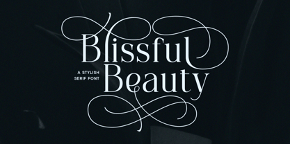 Blissful Beauty is a serif font that radiates elegance and sophistication. Its stylish alternates and delicate swashes make it the perfect choice for creating designs that demand a refined and chic look. From high-end branding to elegant wedding invitations, this font will captivate with its luxurious appeal. Features : Uppercase & lowercase Numbers and punctuation Alternates & Ligatures Multilingual PUA encoded We highly recommend using a program that supports OpenType features and Glyphs panels like many of Adobe apps and Corel Draw, so you can see and access all Glyph variations.
 - Flowery Drop Caps by Celebrity Fontz,
$15.99The Flowery Drop Caps font is a set of highly ornate block letters with rich embedded flowery designs, perfect for Spring and holiday themes and publications or any text where you want to add some texture, pizzazz, and depth to make your message stand out. This one-of-a-kind font has the feel of a homemade embroidered or quilted design and comes with both upper and lower case letters to give you more design flexibility. (Numbers, special characters, and punctuation are a neutral sans serif typeface and are included for convenience only.) - Snowflake Drop Caps by Celebrity Fontz,
$15.99The Snowflake Drop Caps font is a set of highly ornate block letters with rich embedded snowflake designs, perfect for winter and holiday themes and publications or any text where you want to add some texture, pizzazz, and depth to make your message stand out. This one-of-a-kind font has the feel of a homemade embroidered or quilted design and comes with both upper and lower case letters to give you more design flexibility. (Numbers, special characters, and punctuation are a neutral sans serif typeface and are included for convenience only.) - Culinary by Latinotype,
$39.00 Culinary is a typographic system inspired by the art of cooking. This family comes with 2 subfamilies: one Regular Family of 4 weights plus a Sans Line font and a set of Borders, and one 4-weight Script Family that also includes Sans Line and Borders. Culinary is well-suited for packaging, restaurant and cafe branding, bakeries, logos, magazines, menus, recipe books, invitations and much more. The OpenType features allow access to a wide set of characters, including ligatures, swashes, endings, initial and terminal forms, and lots of alternates.
 - Dinner by Ingrimayne Type,
$7.00 Dinner is a family of novelty fonts in which the characters are formed from spoons, forks, and knives. Dinner-Regular was designed in 1990, one of the earliest fonts in the IngrimayneType collection. It contains a mixture of knives, forks, and spoons and the lower-case letters are smaller versions of the upper-case letters. In 2021 the family was expanded with Dinner-Knives in which all characters are formed by arranging knife shapes, Dinner-Spoons in which the characters are formed from spoon shapes, and Dinner-Forks in which the characters are formed from fork shapes. All three are caps-only but the characters on the lower-case keys are alternate versions of upper-case letters . Dinner is a decorative display family that needs to be used at a large size. The logical place to use it is for food-related items.
 - Ongunkan Wakanda Runic by Runic World Tamgacı,
$50.00 Wakandan is an alphabet designed by Hannah Beachler, and used in the 2018 film Black Panther. It is based on Nsibidi symbols. In the film it is used to transliterate English text in the credits and other on-screen text. Another script used in the film was developed by Oluwaseun Osewa and inspired by Nsibidi, a system of symbols used in southeastern Nigeria between about 400 and 1400 AD. In addition, the symbols of several different ancient languages were also used for the alphabet. Like Old North Arabia, Old Tifinagh. I did not draw for this font, except for a few letters. I transferred the sound values from the ancient writing languages fonts that I had made before to the Wakanda font, so I did not take much time, I finished it in 4-5 hours.
 - Romana by Bitstream,
$29.99The French interest in the revival of suitably edited Oldstyle romans as an alternative to a world of Modern typefaces started in 1846 when Louis Perrin cut the Lyons capitals. About 1860, as Phemister was cutting the Miller & Richard Old Style in Edinburgh, Theophile Beaudoire turned the idea of the Lyons capitals into a complete Oldstyle typeface, with similar overwhelming success; it was generally known as Elzevir in France and Roemisch, Romanisch, Romaans or Romana in Germany, Holland and Switzerland. In 1892, Gustav Schroeder, at the Central Division of ATF, expanded the series, adding a boldface under the name De Vinne. It was promptly copied, initially in Europe by Ludwig & Mayer, and spread rapidly throughout the US and Europe, becoming the best known member of the series. ATF made popular an ornamental form under the name De Vinne Ornamental. - Queulat by Latinotype,
$- Queulat is a hybrid typeface that combines two different styles, reflecting charm, freshness and, especially, a strong personality. The font is inspired by Modern and Grotesk styles. The former is shown in some characteristic features such as teardrop terminals, which give the typeface an attractive unique look, making it an ideal choice for logotypes and labelling. The latter, with its rationality, makes Queulat a stable and strong face for headings and subheadings. The combination of styles can be clearly seen by comparing the regular with the alt version. The regular version is more simple than the alt one. Differently, the alternative version possesses more features of the Modern style, like teardrop terminals in ‘k’ and ‘v’. Queulat also comes with a Unicase version, in which a higher number of shapes can be found, resulting in a unique colourful display.
 - Gill Display Compressed by ITC,
$29.99The successful Gill Sans® was designed by the English artist and type designer Eric Gill and issued by Monotype in 1928 to 1930. The roots of Gill Sans can be traced to the typeface that Gill's teacher, Edward Johnston, designed for the signage of the London Underground Railway in 1918. Gill´s alphabet is more classical in proportion and contains what have become known as his signature flared capital R and eyeglass lowercase g. Gill Sans is a humanist sans serif with some geometric touches in its structures. It also has a distinctly British feel. Legible and modern though sometimes cheerfully idiosyncratic, the lighter weights work for text, and the bolder weights make for compelling display typography. Gill Sans is also available as Value Pack for Macintosh, PC or as Hybrid CD with both platforms.