10,000 search results
(0.034 seconds)
- Penta by Wiescher Design,
$29.00 »Penta« is a new Sans typeface, designed in the American tradition with contrast between the up- and downstrokes. The contrast is hardly visible on the »thin« cut, but the heavier the weights get, the more contrast becomes visible. That makes this font very useful, almost linear in the lighter weights and very distinct rhythm in the heavier ones. »Penta« is extremly versatile, it can be used for bodycopy in the lighter weights and for heavy headlines.
 - Pintanina by RodrigoTypo,
$45.00 Pintanina was developed in 2013 with many alternatives of alphabets as ligatures Based on the Comics of Condorito in the headlines, a typography very condensed, in 2015 was redesigned next to andrey kudryavtsev now with a much more finished design and a better Cyrillic and now 2017 with Franco Jonas, takes Pintanina and begins to generate all the Family of Thin, Light Regular, Bold, Extrabold, Black, also contains different dingbats that can be of help in the titles.
 - Bravado NF by Nick's Fonts,
$10.00 This growing family of friendly faces is based on the typeface Bravour, designed in 1913 by Martin Jacoby-Boy for the D. Stempel AG foundry in Frankfurt am Main. The wide stance and very large x-height shared by the family members makes them warm and inviting, and equally suitable for use in headlines or text blocks. All versions of this font include the Unicode 1250 Central European character set in addition to the standard Unicode 1252 Latin set.
 - Telingater Display by ParaType,
$30.00 PT Telingater Display™ was designed in 1959 by a well-known Soviet book designer Solomon Telingater (1903-1969) at Polygraphmash type design bureau. The typeface was awarded the Silver Medal at the International Book Art Exhibition (IBA-59) at Leipzig (Germany) in 1959. Light flared sans serif with calligraphic flavor and low contrast between main strokes and hairlines. For use in title and display typography. The digital version was developed for ParaType in 2001 by Lyubov Kuznetsova.
 - Eagle by Font Bureau,
$40.00 The Eagle series realizes the ideas behind Morris Fuller Benton’s famous titling face, Eagle Bold, which was drawn in 1933 for the National Recovery Administration and became the symbol of American recovery. Font Bureau’s Eagle was started in 1989 for Publish magazine. David Berlow designed a lowercase, finished the character set, and in 1990 added Eagle Book for setting text. In 1994, Jonathan Corum added Eagle Light and Eagle Black to form a full series; FB 1989–94
 - Antea by Wiescher Design,
$39.50 Antea is named after "Antaeus" the giant of Libya in Greek mythology, son of Poseidon and Gaia (mother earth), whose wife was Tinjis. He was extremely strong if he stayed in contact with the earth, but once lifted into the air he became weak and liquid. So is this font, strong if grounded and weak if floating in the air. I will in due course add different weights for different purposes. Your designer of very mysterious fonts, Gert Wiescher
 - Evuschka by Petra Sucic Roje,
$33.00 A dramatic contrast between thick and thin strokes, “ball” shapes at stroke terminals, and straight hairline serifs are main Evuschka characteristics. In this font, the x-height is specifically accentuated in relation to body height. In spite of its extreme geometrical shape, Evuschka exudes fairytale romance. Belonging to decorative type fonts, it is best suited for headlines, titles, and small amounts of text in large sizes. Evuschka was selected for TDC Certificate of Typographic Excellence 2017.
 - TA Bankslab by Tural Alisoy,
$33.00 The building of the Northern Bank of St. Petersburg's Baku branch was built in 1903-1905. It was the first Art Nouveau-style building in Baku, Azerbaijan. Later the bank was transformed into the Russian-Asian Bank. After the oil boom in Baku in the 19th century, branches of many banks and new banks were opened in the city. The branch of the Northern Bank of St. Petersburg was among the first banks that was opened in Baku. N.Bayev was the architect of the building for the branch of the Northern Bank of St. Petersburg located at Gorchakovskaya 3 in 1903-1905. The building currently houses the Central Branch of the International Bank of Azerbaijan. My purpose in writing this is not to copy and paste the information from Wikipedia. What attracted me to the building was the word "Банкъ" (Bank) written in Cyrillic letters, which was also used in Azerbaijan during the Soviet era. The exact date of the writing is not known. Every time I pass by this building, I always thought of creating a font of this writing someday. I had taken a photo of the building and saved it on my phone. I did a lot of research on the font and asked a lot of people. However, some did not provide information at all and some said they did not have any information. I was interested in the history of this font but I do not know if this font really existed or it was created by the architect out of nowhere. If there was such a history of this font, I wanted to recreate this font and make it available. If not, I had to create it from scratch in the same way, using only existing letters on the building. Finally, I made up my mind and decided to develop the font with all letters I have got. It was difficult to create a font based on the word, Банкъ. Because in the appearance of the letters, the midline of the letters on A, H, K was very distinct, both in the form of inclination and in more precise degrees. The serif part of the letters, the height of the upper and lower sides, differed from each other. I don't know whether it was done this way when the building was constructed or it happened over time. I prepared and kept the initial version of the font. I took a break for a while. I started digging on the story of the font again. Meanwhile, I was researching and got inspired by similar fonts. Unfortunately, my research on the font's history did not yield any results. I decided to continue finishing up the font. After developing the demo, I created the font by keeping certain parts of these differences in the letters. In addition, I had to consider the development of letters in the Cyrillic, as well as the Latin alphabet, over the past period. Thus, I began to look at the appearance of slab-serif or serif fonts of that time. In general, as I gain more experience in developing fonts, I try to focus on the precision of the design for each font. In recent years, I specifically paid attention to this matter. YouTube channel and articles by Alexandra K.'s of ParaType, as well as, information and samples from TypeType and Fontfabric studios on the Cyrillic alphabet were quite useful. I gathered data regarding the Latin alphabet from various credible sources. I do not know if I could accomplish what I aimed at but I know one thing that I could develop the font. Maybe someday I'll have to revise this font. For now, I share it with you. I created the font in 10 styles. 7 weight from Thin to Extra Black, an Outline, Shadow, and Art Nouveau. The Art Nouveau style was inspired by the texture in the background used for the text on the building. The texture I applied to capital letters adds beauty to the font. If you like the font feel free to use it or simply let me know if your current alphabet doesn't support this font.
 - TA Bankslab Art Nouveau by Tural Alisoy,
$40.00 TA Bankslab graphic presentation at Behance The building of the Northern Bank of St. Petersburg's Baku branch was built in 1903-1905. It was the first Art Nouveau-style building in Baku, Azerbaijan. Later the bank was transformed into the Russian-Asian Bank. After the oil boom in Baku in the 19th century, branches of many banks and new banks were opened in the city. The branch of the Northern Bank of St. Petersburg was among the first banks that was opened in Baku. N.Bayev was the architect of the building for the branch of the Northern Bank of St. Petersburg located at Gorchakovskaya 3 in 1903-1905. The building currently houses the Central Branch of the International Bank of Azerbaijan. My purpose in writing this is not to copy and paste the information from Wikipedia. What attracted me to the building was the word "Банкъ" (Bank) written in Cyrillic letters, which was also used in Azerbaijan during the Soviet era. The exact date of the writing is not known. Every time I pass by this building, I always thought of creating a font of this writing someday. I had taken a photo of the building and saved it on my phone. I did a lot of research on the font and asked a lot of people. However, some did not provide information at all and some said they did not have any information. I was interested in the history of this font but I do not know if this font really existed or it was created by the architect out of nowhere. If there was such a history of this font, I wanted to recreate this font and make it available. If not, I had to create it from scratch in the same way, using only existing letters on the building. Finally, I made up my mind and decided to develop the font with all letters I have got. It was difficult to create a font based on the word, Банкъ. Because in the appearance of the letters, the midline of the letters on A, H, K was very distinct, both in the form of inclination and in more precise degrees. The serif part of the letters, the height of the upper and lower sides, differed from each other. I don't know whether it was done this way when the building was constructed or it happened over time. I prepared and kept the initial version of the font. I took a break for a while. I started digging on the story of the font again. Meanwhile, I was researching and got inspired by similar fonts. Unfortunately, my research on the font's history did not yield any results. I decided to continue finishing up the font. After developing the demo, I created the font by keeping certain parts of these differences in the letters. In addition, I had to consider the development of letters in the Cyrillic, as well as the Latin alphabet, over the past period. Thus, I began to look at the appearance of slab-serif or serif fonts of that time. In general, as I gain more experience in developing fonts, I try to focus on the precision of the design for each font. In recent years, I specifically paid attention to this matter. YouTube channel and articles by Alexandra K.'s of ParaType, as well as, information and samples from TypeType and Fontfabric studios on the Cyrillic alphabet were quite useful. I gathered data regarding the Latin alphabet from various credible sources. I do not know if I could accomplish what I aimed at but I know one thing that I could develop the font. Maybe someday I'll have to revise this font. For now, I share it with you. I created the font in 10 styles. 7 weight from Thin to Extra Black, an Outline, Shadow, and Art Nouveau. The Art Nouveau style was inspired by the texture in the background used for the text on the building. The texture I applied to capital letters adds beauty to the font. If you like the font feel free to use it or simply let me know if your current alphabet doesn't support this font.
 - Archemy by Sonic Savior,
$90.00Archemy is a restricted and obscure branch of Alchemy that deals specifically with the life, generation and transmutation of Metals. The Archemy font is primarily a magical and alchemical alphabet. It was created on initiative of Senior Zadith, in order to properly quote older alchemical manuscripts, without the need to insert handwritten symbols. The font combines a unique and elegant Roman alphabet with a set of the most frequently used planetary and alchemical symbols that are common in the Western Mystery Tradition, and as used by those involved in the Royal Art. The Archemy font contains a selection of symbols that are still used by practitioners of the Art today, and for the sake of completeness, a selection of less used and more arcane symbols that can be found in older alchemical texts. In addition a Hebrew Alphabet is included, which will supply practitioners of the Art with the glyphs related to Cabalistic studies. The Hebrew Alphabet in this font does not include vowel points, since they have no place in ancient Hebrew, nor in the Western Mystery Tradition. A selection of the most distinct glyphs as used in the Antediluvian font family - the Alphabet of the Ancients - is included for those that wish to include the archetypal and arcane quality of these glyphs from the dawn of history. By our knowledge there exists at this time no font that includes a selection of Alchemical symbols, let alone combines all of the above mentioned archetypal symbols of occult language in a single package. In that respect Archemy can be considered to be an “Arch” font. - FF Holmen by FontFont,
$41.99 Danish type designer Per Jørgensen created this serif FontFont in 2007. The family has 5 weights, ranging from Regular to Bold (including italics) and is ideally suited for book text, festive occasions as well as editorial and publishing. FF Holmen provides advanced typographical support with features such as ligatures, small capitals, case-sensitive forms, fractions, and super- and subscript characters. It comes with a complete range of figure set options – oldstyle and lining figures, each in tabular and proportional widths.
 - Waika by Hazztype,
$16.00 Waika is a modern sans serif font that seamlessly blends a rounded aesthetic with condensed proportions, resulting in a contemporary and versatile typeface. Its smooth curves and absence of serifs contribute to a clean and friendly appearance, making it suitable for a wide range of applications. The deep inktrap adds a touch of sophistication and uniqueness to each character, ensuring legibility and visual appeal in various design contexts. Waika is a dynamic choice for projects seeking a balance between modernity and approachability.
 - Crimstone by Locomotype,
$14.00 Crimstone is a bold and strong geometric typeface. Rectangular shape with rigid and sharp edges is the first impression that makes this font look powerful and hit. Its continued development created other variations including rounded styles, inline and handmade styles. Not only the clean version, Crimstone is also available in a printed version with a rough and textured appearance. Each has an upright and slanted version. Available in 16 fonts, the Crimstone family is perfect for poster designs, movie titles, logotypes, packaging etc.
 - Yassitf by Ingrimayne Type,
$6.00 Yet another san serif typeface, Yassitf is a generic sans, a font meant to blend in rather than stand out. It has little contrast and is almost monoline. It includes three widths: condensed, narrow, and regular. The widths have four to six weights: ultra thin, thin, light, plain, bold, and extra bold. Further, each width and weight combination has both upright and italics styles. The thirty fonts in the family contain several open-type features, including both proportional and tabular (monospaced) numbers.
 - Windsor by URW Type Foundry,
$35.99 Windsor is an unusual design cut by Stephenson Blake in 1905. Windsor is a bold face with heavy rounded serifs and strong diagonal stress. Capitals M and W are widely splayed, P and R have very large upper bowls. The Lowercase a h m and n of the Windsor font have angled right hand stems, e has an angled cross-stroke. The overall effect is one of friendliness and warmth. Use the Windsor font in advertising, on posters and for general display work.
 - Partizano Serif by deFharo,
$22.00 Geometric typography with serif, extra condensed retro look and very elegant for use in publications, graphic design and advertising where you need an exclusive typography with great horizontal space saving for headlines and paragraph texts. It has a complete set of capital letters and numbers and monetary symbols in small caps, also alternative letters such as the 'A' capital letter or the lowercase 'a' type alpha. Use the following keys to write the bitcoin symbol and the partisan icon: b #, a #
 - Windsor by Monotype,
$40.99 Windsor is an unusual design cut by Stephenson Blake in 1905. Windsor is a bold face with heavy rounded serifs and strong diagonal stress. Capitals “M” and “W” are widely splayed, “P” and “R” have very large upper bowls. The Lowercase “a”, “h” “m” and “n” of the Windsor font have angled right hand stems, “e” has an angled cross-stroke. The overall effect is one of friendliness and warmth. Use the Windsor font in advertising, on posters and for general display work.
 - Jacbos by Twinletter,
$14.00 Jacbos is a playful font with an abstract shape like paper folds, which is unique but elegant and attractive in its use All Capital sans is charming and brave, a font with a bold style and strong character makes your design look bold to convey a message to the audience in every design. This font is perfect for a variety of school design projects, essays, vintage, retro, and various outdoor events, storytelling, branding, banners, posters, movie titles, food and beverages, clothing, and more.
 - SK Sofuto by Shriftovik,
$32.00 SK Sofuto is a bold display typeface inspired by graffiti culture. Striking and unusual forms of the font distinguish it and do not allow you to forget about it. SK Sofuto is a typeface that cannot be unnoticed. It is bright, wicked, and screaming. The typeface supports multilingualism, namely Latin, both classical and extended, as well as Cyrillic! The SK Sofuto typeface will make your work noticeable and will fit perfectly in both poster and printing design, as well as in web design.
 - Deserted Canyon by Letterhend,
$17.00 Deserted Canyon is a textured SVG typeface with bold and strong look and feel. Available in two types, solid version and transparent version. This type of font perfectly made to be applied especially in headlines which is need a standout font, and the other various formal forms such as invitations, labels, logos, magazines, books, greeting / wedding cards, packaging, fashion, make up, stationery, novels, labels or any type of advertising purpose. Features : Solid version and svg version numbers and punctuation multilingual ligatures PUA encoded
 - Getone by Robert Corseanschi,
$14.99 Getone is an exotic font, based on the Sereno font made by the same designer. It has a modern touch which makes it to stand out, all the glyphs are designed "out of the box" to combine each other in harmonious way. Getone is coming in ten styles : thin, ultra light, light, regular, bold and italics. Is ideally suited for advertising and packaging, festive occasions, editorial and publishing, logo, branding and creative industries, poster and billboards as well as web and screen design.
 - Reckless by Ana's Fonts,
$12.00 Reckless is a thick brush font with rough edges. It’s perfect to make a statement and will look great in quotes, logos, titles, postcards, tags. This handlettered font includes: - A-Z, a-z, 0-9, accents, punctuation and symbols - Ligatures and Contextual and Stylistic Alternates - An extra set of 26 splatters and swashes - A bonus faded version & an all caps sans serif font The sans serif font is the small caps version of my font A Pompadour in both regular and bold.
 - Korey Sister by Dhan Studio,
$20.00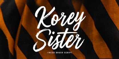 Korey Sister is a beautiful brush font, a contemporary approach to design, this is intentionally made by hand to make it more natural and attractive when used in your design. Suitable for use in title design. Such as clothing, invitations, book titles, stationery designs, quotes, branding, logos, greeting cards, t-shirts, packaging designs, posters, and others. Korey Sister includes a complete set of upper and lower case letters, and multi-language support, numbers, punctuation, and also has Alternatives and ligatures.
 - Corset Pro by DBSV,
$67.00 The Corset Pro is not another font, but not exactly and the same, as the previous two (Khamai Pro, Aeolus Pro) but is simple a different... But it has common elements and is based on two earlier. A new style added is Inlier, has this advantage engagement with Βlack style in the same manner explained in Aeolus Pro. And this series is composed and includes 12 fonts with 625 glyphs each, with true italics and supports Latin, Greek and Cyrillic.
 - Hey Beibeh by Java Pep,
$15.00 Introducing a new font called Hey Beibeh. As the name, Hey Beibeh comes with love and romantic themes. The theme of love and romance will be increasingly felt with the heart icon in the letters i and j. You can access OpenType features in Hey Beibeh fonts such as stylistic set alternate (SS01-SS02), ligatures set, and alternate. Hey Beibeh is PUA encoded and supports 17 languages. Live to love coz life needs love. Thanks, and have a nice day.
 - Hughes by Larin Type Co,
$12.00 Hughes is a stylish and original multi-functional font, made in 6 styles (regular, rough, pressed, bold, bold rough, bold pressed), he fits perfectly for both modern and vintage design. With it, you can create beautiful logos, labels, templates, signs, highlight text, use it for outdoor advertising, branding, and much more. Also in this font there are stylistic alternates and swashes that will make your design even more attractive and interesting. It is easy to use and has OpenType features.
 - FF Tibere by FontFont,
$41.99 French type designer Albert Boton created this serif FontFont in 2003. The family has 7 weights, ranging from Light to Bold (including italics) and is ideally suited for book text, film and tv, editorial and publishing as well as small text. FF Tibere provides advanced typographical support with features such as swashes, ligatures, small capitals, petite capitals, alternate characters, and case-sensitive forms. It comes with a complete range of figure set options – oldstyle and lining figures, each in tabular and proportional widths.
 - Alternox by Asenbayu,
$12.00 Alternox fonts is a new futuristic multipurpose sans serif font family with sophisticated geometric shapes. You can use it in a modern, clean and professional design. This font is perfect for your various projects such as logos and brand identity, technology, business cards, web, stationery, displays, sports and more. Alternox fonts feature opentype, kerning, ligatures and alternates packed in 6 fonts: ExtraLight, Light, Regular, SemiBold, Bold, and ExtraBold. Alternox fonts include uppercase letters, lowercase letters, numeral, punctuation and multilingual support.
 - Ceramika by Santi Rey,
$25.99 Ceramika is a modern tribute to Old Style typefaces. This design is inspired by the letterforms of the serif faces found in history books from the beginning of the 20th-century. Its sturdiness and generous X-Height makes it bold and compact; while the high-contrast strokes and recognisable shapes makes it extremely readable. All this makes Ceramika a really versatile font, perfect for logos, headlines and even body copy. It comes in 6 different weights and 2 styles — Standard and Italic.
 - Anko by Eko Bimantara,
$22.00 Anko is a mix of Old Style Roman Serif styles. The glyphs are formed in extend width, smooth strokes, moderate stem contrast and soft edges to pursue clarity, quick recognizable text and warm personality. The italics style is 8 degree low slanted with redrawned lowercase which shown in more organic and flowy forms. Anko contains 8 weights with more than 450 glyphs that support extended latin language and opentype features such as standard and discretionary ligature and a variation of numeral figures.
 - Rebeck by OhType!,
$31.99 Rebeck Black is a typeface that evokes the best of two worlds, the classic and refined lines, the high contrast and forceful movements of the 18th century together with fresh strokes and risky characters that combine perfectly to place this typeface in the modern and avant-garde times of the 21st century. Created to be different, generate power and visual impact, it is ideal for use in identities, headers and all types of graphic pieces that seek to enhance the message.
 - Boldina by DSType,
$19.00Boldina consists of 18 fonts with a lot of personality. This is a font to be mixed. That’s its purpose and that’s why it's designed as one single weight in so many different styles. My intent was to give designers a chance to use the same typeface in many different ways, putting together sans and serif, lots of italics and even Greek, Cyrillic and CE characters. The Ligatures and the Script versions give a more poetic and more accurate feeling to the text. - Clamshell by Jafar07,
$20.00 Clamshell Modern Caligraphy Script font is a harmonious blend of elegance and contemporary flair, seamlessly adaptable to modern and classic design landscapes. It effortlessly radiates timeless elegance and is tailored to meet the needs of professionals seeking designs that are both sophisticated and versatile. Easy to use yet rich in detail, this font is the ideal choice for designers who value both beauty and functionality in their work. Explore this font collection now and infuse your designs with the captivating essence of calligraphy.
 - Elvian Andreani by Scratch Design,
$9.00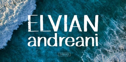 Elvian Andreani is a handwritten font with board marker style, and an authentic texture and casual look and vintage style. This font is useful in various designs such as quotes, menus, logos, branding, clothing and other designs with casual or vintage concept. Elvian Andreani also includes support for multiple languages. Feature: - Uppercase & Lowercase - Numbers - Punctuation - Multilingual Support (ÀÁÂÃÄÅÇDÐEÈÉÊËIÌÍÎÏNÑOØÒÓÔÕÖUÙÜÚÛWYÝŸỲŸÆŒßÞþ) Support in Mac and Windows OS, Easy to install We hope you like it and thank you so much for purchase :) Scratch Design
 - Phone Pro by Tamar Fonts,
$50.00 "Relation Between Typology and Type Design" 'PRISTINE'; this font is—neither beautiful nor ugly, neither vigorous nor weak, neither traditional nor modern, neither serif nor sans serif, neither script nor printable, neither a text font nor a display font—it is rather all of the above, which makes it a more versatile typographic tool—[handwritten] characters that are well-suited for a wide variety of applications—from editorial design, [friendly] greeting cards... to branding, advertising, publicity and digital. Each glyph design combines its unique shapes and stylish ink-traps with parabolic curves. Each glyph design has been treated as an 'individual character'—the way I would treat a breathing, living, vulnerable and courteous human being; looking after each and every character as if it was my only child — bringing to light the authenticity and uniqueness of each individual, as well as my objective to bring about peace and harmony between them all as a whole. Designed with the intention of harmonizing between four scripts — Latin, Cyrillic, Greek and Hebrew; the whole family has a comprehensive set of characters—in addition to the Latin letters, the Phone typeface also has a full set of characters for Vietnamese, partially extended Cyrillic, Greek and Hebrew (sold separately). The t_t ligature is something unique to Phone, as well as the t_z ligature, among others and extras. A distinctive trait of the Phone typeface, is a high x-height combined with relatively short ascenders. The Phone typeface is in a way evoking the feeling of some Gaelic font and of the [Egyptian] Papyrus font (by Chris Costello, though, not being based on neither of those), having an exotic and an exquisite look, under the category of "Soft Fonts & Friendly Faces". Copyright Tamar Fonts/Hillel Glueck 2021 ALL RIGHTS RESERVED Any unauthorized distribution of my work is strictly prohibited, and will be prosecuted; do the right thing, and do not participate in the piracy of my typefaces; if you appreciate my work, then please pay for it and help me prosper — thank you!
 - Sweet Kulfi by Putracetol,
$28.00 Sweet Kulfi - Quirky Display Font Introducing "Sweet Kulfi", a quirky display font that adds a playful touch to your designs. Inspired by hand-lettered bold typefaces, this font is perfect for those looking to inject some fun into their projects. With both uppercase and lowercase versions available, you can mix and match to create unique designs that stand out. Sweet Kulfi also comes with a ligature feature that adds an extra cute touch to your work. For those looking to add a playful yet stylish touch to their designs, Sweet Kulfi is the perfect choice. This font works well for a variety of projects such as logos, titles, cover designs, headlines, apparel, comics, book covers, cards, posters, and anything that requires a childlike feel. It's great for those who want to bring a sense of fun and playfulness to their designs. Sweet Kulfi comes with a range of features including uppercase and lowercase letters, OpenType alternates and ligatures, numbers, punctuation and symbols. This font also supports multiple languages, making it easy to use for international projects. Inside the zip package, you'll find the Sweet Kulfi font available in OTF, TTF, and WOFF formats. With these formats, you can easily use Sweet Kulfi in a variety of design applications such as Adobe Photoshop, Illustrator, InDesign, or any other software that supports these formats. If you're looking for a font that is both playful and stylish, then Sweet Kulfi is the perfect choice. With its unique hand-lettered style, this font is perfect for a variety of design projects that require a fun and creative touch. In summary, Sweet Kulfi is a quirky display font with both uppercase and lowercase versions, OpenType alternates and ligatures, numbers, punctuation and symbols, and multilingual support. This font is perfect for a range of design projects that require a playful touch, such as logos, titles, cover designs, apparel, comics, book covers, cards, posters, and more.
 - Benchmark2 by Alphabet Agency,
$30.00 Benchmark2 is a super cool serif font developed from the popular original Benchmark font. This version has been remastered in the latest font developing software and now the new version includes a lot of additional characters that are not available in the original. The original font has been used worldwide, used in Hollywood films and in products in popular clothing lines. The font works well in a variety of themes including tattoo, rebellious, street, western and vintage, to name some. The font was initially designed for use on Baseball jerseys in an effort to developed ways of creating new looks in the field of sports related graphic design.
 - Averta Standard by Intelligent Design,
$10.00 Averta Standard is the basic version of Averta. Bringing together features from early European grotesques and American gothics, Kostas Bartokas’ (Greek: ‘αβέρτα’ – to act or speak openly, bluntly or without moderation, without hiding) Averta is a geometric sans serif family with a simple, yet appealing, personality. The purely geometric rounds, open apertures, and its low contrast strokes manage to express an unmoderated, straightforward tone resulting in a modernist, neutral and friendly typeface. Averta Standard is intended for use in a variety of media. The central styles (Light through Bold) are drawn to perform at text sizes, while the extremes are spaced tighter to form more coherent headlines. The dynamism of the true italics adds a complementary touch to the whole family and provides extra versatility, making Averta Standard an excellent tool for a range of uses, from signage to branding and editorial design. Averta Standard comes with alternate glyphs, case sensitive forms and contextual alternates, in eight weights with matching italics and supports over two hundred languages with an extended Latin, Cyrillic (Russian, Bulgarian, and Serbian/Macedonian alternates), Greek and Vietnamese character set. It ships in three different packages offering different script coverage according to your needs: Averta Standard PE (Pan-European: Latin, Cyrillic, Greek), Averta Standard CY (Latin and Cyrillic), and Averta Standard (Latin and Greek). Averta's Cyrillic have received the 3rd Prize in the 2017 Granshan Awards in the Cyrillic Category.
 - Werd by Putracetol,
$24.00 Introducing Werd - a modern stylish serif font inspired by elegant and luxury typography. With its unique and beautiful design, Werd is perfect for adding a professional touch to your designs. This versatile font can be used in various design projects, such as headings, flyers, greeting cards, product packaging, book covers, printed quotes, logotypes, apparel designs, album covers, and more. Werd features alternative characters that are divided into several OpenType features, including swashes, stylistic sets, stylistic alternates, contextual alternates, and ligatures. These OpenType features can be accessed using software programs that support OpenType, such as Adobe Illustrator, Adobe InDesign, Adobe Photoshop, Corel Draw X version, and Microsoft Word. This allows you to customize your typography and create unique compositions that suit your design needs. In your zip package, you'll receive the Werd font files in otf, ttf, and woff formats, providing flexibility for different design projects. The font includes uppercase and lowercase letters, numerals, punctuation, and symbols, ensuring that you have all the essential elements for your designs. Werd also supports multilanguage characters, making it suitable for designing in different languages. Whether you're creating designs in English, Spanish, French, or any other language, Werd has got you covered. In summary, Werd is a modern stylish serif font that offers elegant and luxury typography for various design purposes. With its OpenType features and multilanguage support, Werd provides versatility and customization options for your designs. Thank you for choosing Werd from our collection. Happy designing!
 - Kindah by Eyad Al-Samman,
$30.00 “Kindah” is a Yemeni ancient tribe with evidence of its existence going back to the second century B.C.E. The kings of Kindah exercised an influence over a number of associated tribes more by personal prestige than by coercive settled authority. The Kindites were polytheistic until the 6th century CE, with evidence of rituals dedicated to the gods Athtar and Kahil found in their ancient capital in south-central Arabia. It is not clear whether they converted to Judaism or remained pagan, but there is a strong archaeological evidence that they were among the tribes in Dhu Nuwas' forces during the Jewish king’s attempt to suppress Christianity in Yemen. They converted to Islam in the mid-7th century CE and played a crucial role during the Muslims' conquests of their surroundings. Among the most famous figures from Kindah known as Kindites are Imru' al-Qays (526-565?), al-Ash'ath ibn Qays (599-661), Hujr ibn 'Adi al-Kindi (?-660), al-Miqdad Ibn Aswad al-Kindi (589-653), and Abu Yusuf Yaíqub ibn Ishaq as-Sabbah al-Kindi (805-873) known as the Philosopher of the Arabs. "Kindah" font is a modern Kufic font comes in three weights (i.e., bold, regular, and thin) which is mainly designed to be used as a display Arabic font. The main feature of this typeface is the mixture of curves and rectangular shapes used in the designed Arabic characters. Kindah font was inspired by the design of the Yemeni modern windows of houses in which only top part of the arc is used for building such windows which reflects the originality of the architecture preserved in this part of the world. "Kindah" font is extremely outstanding when used in printed materials with big sizes especially for headline, titles, signs, and names of brands. Hence, it is suitable for books' covers, advertisement light boards, and titles in magazines and newspapers. It has also a Latin character set and it also supports several Arabic character sets which makes it proper for composing alphabetical and numerical words in Arabic, Urdu, and Persian.