10,000 search results
(0.035 seconds)
- FF Hertz by FontFont,
$68.99 Low stroke contrast, generous spacing, and fine-grained weights from Light to Extra Bold make FF Hertz a workhorse text typeface which holds up well under today’s widely varying output conditions from print to screen. The quite dark Book style works well on e-ink displays which usually tend to thin out letters, as well as in print when you want to evoke the solid letter image of the hot-metal type era. Two sizes of Small Caps are included: A larger size for abbreviations and acronyms, and a smaller size matching the height of the lowercase letters. FF Hertz is a uniwidth design, that means each letter occupies the same space in all weights. This feature allows the user to switch between weights (but not between Roman and Italic styles) without text reflow. Jens Kutilek began work on FF Hertz in 2012. From a drawing exercise on a low-resolution grid (a technique proposed by Tim Ahrens to avoid fiddling with details too early), it soon evolved into a bigger project combining a multitude of influences which up until that point had only been floating around in his head, including his mother’s 1970s typewriter with its wonderful numbers, Hermann Zapf’s Melior as well as his forgotten Mergenthaler Antiqua (an interpretation of the Modern genre), and old German cartographic lettering styles. Jens likes to imagine FF Hertz used in scientific books or for an edition of Lovecraftian horror stories.
 - Karlo by The Northern Block,
$28.95 Karlo is a super family of several branches, originating in the same lightweight skeleton. The lightweights are based on a pen of an even stroke-width. Inspired by the writings of calligrapher Edward Johnston, the family moves on in two directions in the heavier weights. Johnston demonstrated that the broad nib pen can produce different writing styles. Following this, one heavy weight has a humanistic low stroke contrast (KarloSerifBold and KarloSansBold), and another has a high stroke contrast of vertical axis with references to the 19th century jobbing typefaces (KarloOpen). The latter is inspired by Johnston’s demonstration of the broad nib pen, where he suggested fastening two pencils together. With each pencil representing an edge of the pen, it becomes more evident how the pen works in writing. The friendly informal look makes KarloSans and KarloSerif usable for both running text and for display sizes. KarloOpen, on the other hand, is solely designed for display purpose showing few words at a time. In Denmark, a guy named Karlo would typically be an old fellow with a slick hairstyle that makes an effort with his appearance. He is a handyman who can do a bit of this and that when needed. He is a happy go lucky kind of guy that takes one day at a time. To me, the typeface family has some of the same qualities. Check out Pyke which is a great pair for Karlo.
 - Brother Dreams by Ditatype,
$29.00 Brother Dreams is a captivating brush font that exudes a raw and artistic vibe. With its bold capitalized letterforms and ragged edges, this typeface brings a unique and rebellious touch to your designs. The defining feature of Brother Dreams lies in its rugged and ragged edges, giving the font a handcrafted and slightly distressed appearance. This font is designed with expressive brush strokes, capturing the essence of brush calligraphy. The bold capitalized letterforms command attention, making a powerful statement with their unconventional and untamed style. Inspired by the untamed spirit of artistic expression, Brother Dreams embodies a sense of creativity and authenticity. The rough and ragged edges add a touch of uniqueness and individuality to each letter, as if they were painted with passion and emotion. This font embraces imperfection and celebrates the beauty of artistic spontaneity. Each letter of Brother Dreams is meticulously crafted to maintain its boldness and legibility while embracing the rugged and ragged edges. The resulting composition is a balance of artistic expression and readability. This font allows your message to stand out with its raw energy and rebellious charm. Enjoy the various features available in this font. Features: Multilingual Supports PUA Encoded Numerals and Punctuations Brother Dreams is ideal for headlines, titles, logos, and any design that requires a lively and energetic display. Whether you're working on posters, packaging, branding materials, or any project that needs a touch of liveliness, this font will bring a contagious sense of cheer. Find out more ways to use this font by taking a look at the font preview. Thanks for purchasing our fonts. Hopefully, you have a great time using our font. Feel free to contact us anytime for further information or when you have trouble with the font. Thanks a lot and happy designing.
 - Epoca Classic by Hoftype,
$39.00 Epoca-Classic, designed in 2012, is the contrasted sister of Epoca, also suited for text and display. As is the case with Epoca, Epoca-classic has economical proportions, a neutral appearance and a discreet elegance. It is fresh, crisp and distinguished. Its well-balanced proportions result in an even text flow which allows for pleasant reading even with large amounts of text. Epoca-Classic comes in twelve weights, in OpenType format and with extended language support for more than 40 languages. All weights contain small caps, standard ligatures, proportional lining figures, tabular lining figures, proportional old style figures, lining old style figures, matching currency symbols, fraction- and scientific numerals.
 - Diaria Sans Pro by Mint Type,
$- Diaria Sans Pro is a sans-serif counterpart of Diaria Pro. With its extensive 9 weights and corresponding italics, extensive language support, and various OpenType features it is meant to build visual heirarchies of any detail and complexity in editorial design. This modern sans-serif typeface designed as a universally legible medium for both titles and paragraph text. Its large x-height and static exteriors allow comfortable reading in printed narrow columns as well as in screen graphics. Some of the styles of Diaria Sans Pro can be found in Mint Type Editorial Bundle together with other fonts which make some great pairs. Check it out!
 - Zenit by Cuchi, qué tipo,
$9.95 As "Zenith" means, in an astronomical context, the highest point reached by a celestial body, my new typeface raises its drawing for carry it to the highest expression. In an effort to design a singular graphic and visual letters system, the contrasts and proportions of “Zenit” boosts up and are squeezed as much as possible, resulting in a very particular aesthetic, while still maintaining a certain grotesque reminiscence. Given its dynamic, postmodern, daring and futuristic style, “Zenit” is an ideal typeface for use in designs that want to discover new space worlds full of color and speed, still unexplored. “Zenit, the typeface that rockets you!.”
 - Galifex by Andfonts,
$10.99 Galifex is a modern and futuristic sans-serif font that includes 4 weights and alternates. It can be used in many many projects. Standard CAPS letters are great in 90% scenarios, it can be masculine strong branding of construction company, but also it can be used in fashion design, interior, etc. you know....it works almost everywhere. But also you can use alternate CAPS and you can create logos of some sort of tech companies, future companies, metaverse, crypto you know...web 3.0. Create logos, labels, use in packaging, advertising, book covers, branding and magazines, headings, banners, posters and much more. Feel free to contact me: andfontscontact@gmail.com
 - Mode by Daggertypo,
$24.00 Mode is a typographic experiment exploring how same sans serif form adapts to different circumstances and what are the possibilities in variations of Thin / Black, Contrast / Negative contrast. Two main groups are Mode 0 (with rounded shapes) and Mode 1 (with angular shapes). Each of them varies from Thin to Black in six cuts, in the same manner it varies from contrast shapes to negative contrast. Mode comes in total of 72 cuts regular and italic, it speaks majority of Latin based languages and is equipped with smcp, c2sc, Old style and all caps numerals. Mode is made by DAGGERtypo during a period of 2019/2020
 - Baldione by Greater Albion Typefounders,
$15.00 Baldione is a highly stylised variation upon a classic Didone typeface, incorporating a globular decorative 'ball' or 'blob' in each character's design. The result has a feel of the 1970s about it somehow and works well in poster and advertising designs with a hint of the outré' about them. Balidone includes an extensive range of ligatures and stylistic alternates. Article abstract: Baldione is a highly stylised variation upon a classic Didone typeface, incorporating a globular decorative 'ball' or 'blob' in each character's design. The result has a feel of the 1970s about it somehow and works well in poster and advertising designs with a hint of the outré' about them.
 - Teaspoon by Canada Type,
$29.95 Teaspoon was originally designed by Haley Fiege as a project-specific font in 2007, then completed and produced by Canada Type for commercial viability in 2008. With a personality that can only be described as “ironic cute”, it serves as a much needed alternative for the old overused poster faces, such as Cooper Black and Gill Sans Extra Bold. Words that look good set in Teaspoon include puppies, rainbows, salmonella poisoning and Tom Cruise. Teaspoon is available in all popular formats, comes with plenty of alternate characters, and supports a wider than normal range of Latin-based languages, as well as Cyrillic and Greek.
 - Ongunkan Death Space by Runic World Tamgacı,
$50.00 Dead Space is a science fiction/horror media franchise created by Glen Schofield and Michael Condrey, developed by Visceral Games, and published and owned by Electronic Arts. The franchise's chronology is not presented in a linear format; each installment in the Dead Space franchise is a continuation or addition to a continuing storyline, with sections of the storyline presented in prequels or sequels, sometimes presented in other media from the originating video game series, which includes two films and several comic books and novels. This font is related to the video game Death Space, I redrawn this font to make it a font with a minimum character set.
 - Kaligane by ArimaType,
$18.00 Kaligane is a type family designed with passion. A geometric typeface, first designed in a muscular black weight with a high-powered dynamic typographic aesthetic used in various communications, and later developed in a lighter weight where the shape exhibits some vintage-inspired proportions. With these diverse influences, typefaces allow for the use of impressive displays and effective logo designs as well as the use of more subtle editorials in body text - with a natural inclination for effective and powerful advertising. Sports typography typically uses italics for added dynamism and impact, and Kaligane complies by offering a choice of three alternative italic shapes with different slants.
 - Hewalk by RGB Studio,
$17.00 Hewalk is a font inspired by the Blackletter typeface, made with a modern impression but still looks strong and unique. In addition, Young Best font is also supported with multilingual characters that can be used in several international languages. Hewalk font is very suitable for use in making music album cover designs, tattoo logos, wishkey labels, packaging pomades and so on which are made with dark and strong concepts. Files Include : Basic Latin A-Z and a-z Numbers Symbols PUA Encode Multi-language Support Thanks and have a wonderful day, If you have any questions, please get in touch with us Don't forget to check out our other products.
 - Jali Arabic by Foundry5,
$26.00 Jali is a humanist sans serif typeface particularly suited for wayfinding. Jali comes in versions that support Arabic, Greek, and Latin. The name ‘Jali’ means clear in the Arabic language. The design of Jali reflects the ethos of its name. The combination of low-contrast strokes, ample counters, dots, and distinguishable marks make Jali a versatile typeface. With its humanistic voice and clear letterforms, Jali aims at offering a warm and efficient reading experience. Similar to other wayfinding type families, Jali is also well suited for demanding typographic environments. Jali has received two renowned awards: TDC Certificate in Typographic Excellence and Granshan’s 1st Prize, Arabic & Latin Category in 2019.
 - Bike Power by PizzaDude.dk,
$19.00 I love my bike, and I couldn't dream of not using it on a daily basis - I use my bike in rain, sun, snow, and windy days...all year, in other words! This font is dedicated to my bike, and is the first in a series of handmade fonts! Play around with the three layers and your favourite colours, for awesome effects. All versions comes with Contextual Alternates, which means several versions of each letter. In this case, every letter has 5 different versions that automatically cycles as you type! A quite awesome thing, because it makes your text more lively and natural looking!
 - Bike Jam by PizzaDude.dk,
$17.00 I love my bike, and I couldn't dream of not using it on a daily basis - I use my bike in rain, sun, snow, and windy days...all year, in other words! This font is dedicated to my bike, and is the second in a series of handmade fonts! Play around with the 5 layers and your favourite colours, for awesome effects. All versions comes with Contextual Alternates, which means several versions of each letter. In this case, every letter has 7 different versions that automatically cycles as you type! A quite awesome thing, because it makes your text more lively and natural looking!
 - American West by FontMesa,
$20.00 Inspired by an old document from the New York and Western Railroad, American West brings the olden days to mind.
 - Ellington Manor by BA Graphics,
$45.00A great look for formal announcements, book work, business, high-end ads and terrific for text as well as headlines. - Flow by Hemphill Type,
$17.99 Flow is a relaxed font family that finds a happy balance between work and play. Its a Caps Only Fonts.
 - Blacker Pro by Zetafonts,
$39.00 Blacker Pro is the revised and extended version of the original wedge serif type family designed by Cosimo Lorenzo Pancini and Andrea Tartarelli in 2017. Blacker was developed as a take on the style that Jeremiah Shoaf has defined as the "evil serif" genre: typefaces with high contrast, oldstyle or modern serif proportions and sharp, blade-like triangular serifs. Due to the high contrast in the design - slightly reminescent of didone typefaces - Blacker has been developed in two optical subfamilies. The display version offers tighter tracking, higher contrast and sharper corners for maximum effect at big sizes, while the text variant offers better readability and screen rendering at smaller sizes, with lower contrast and looser spacing. In the pro version, two additional condensed variant families have been added (condensed display and condensed text) allowing for more freedom and versatility in typesetting where space constraints are present. Also, three titling uppercase-only variants have been added, with a slightly extended feel, and two decorative subfamilies (inline and diamond). Each of these seven variants has been developed in six weights from light to heavy, with matching italics, for a total of 69 styles covering a wide range of editorial and advertising uses. All Blacker Pro feature a revised and extended character set covering over two hundred languages using the latin, cyrillic and greek alphabets. Open type features include small caps, positional numerals, fractions, superior & inferior figures, alternate forms, and an extended set of standard and discretionary ligatures. With its bold personality, Blacker aims to be a modern classic used for bold statements and self-conscious brands, making your text look great both on paper and on the screens.
 - Scorno by Rosario Nocera,
$22.99 Scorno is a geometric sans serif that offers a high legibility also in the lighter weights. Scorno is ideal for sports and technology. The shape of its letters makes it different from most geometric fonts, making it suitable for branding, magazines, catalogues and much more. Scorno is available in nine weights, from thin to heavy plus matching italics and it comes with open type features like old style and lining figures, ligatures, numerator, denominator, scientific figures, and fractions. What’s more, it also features the bitcoin symbol in the currencies set.
 - Carelia by My Creative Land,
$29.00 Carelia is a modern multilingual (including cyrillic) serif family with classic forms, enhanced by extended OpenType features. It is well suited for all sorts of design - starting from web, to editorial and branding. Its stylistic alternates, swashes and ligatures (more 1200 glyphs in each font) will make your design even more stylized and unique. Carelia comes in two styles Upright and Italic - each has it's own character but both share the same curves and style. Both fonts are fully unicode mapped - can be used in any application of your choice.
 - Reaktif by Plasebo Studio,
$14.90 Reaktif type family has been created with a new and modern approach to the popular geometric sans serif type. It has a very legible, multifunctional, contemporary and dynamic design. Sharp-angle details in minuscule letters “a, b, d, f, g, m, n, p, q, r, t, u” boosts its' characteristics in the Reaktif font family. Reaktif type family contains 24 fonts and 550+ glyphs. Stylistic alternatives come with 30+ ligatures and many opentype features. It can meet your needs in many medium such as Reaktif branding, editorial, web and printing.
 - Evie Sans by KTStudio,
$23.99 Evie Sans was developed in 2020 by Katy Thompson as a typeface to be used for her customisable planner / diary company PLANNER.STUDIO. The fonts have geometric proportions and subtle Art Deco influences in several of the uppercase characters, including a lowered crossbar on the H, lowered middle arm on the F and deepened bowl on the P. The family includes 6 weights in regular, italic and condensed variations, each with 216 glyphs. Evie Sans is perfect for modern branding and logo design, editorial design, web design, packaging and other projects.
 - Brock Pro by Stawix,
$49.00 Brock Pro celebrate the essence of the famous 19th century wooden letterpress type, Block Berthold by bringing out its remarkable features and explicate them in relation to the modern day trend. Brock Pro is a conventional font with a twist, fun, easy to use and has a very particular tone of voice that suits numerous design purposes. Brock pro comes in 10 weights and 20 styles to support a wide range of usage, every needs and great building brands, Brock Pro also available in both ttf. and otf.
 - Diocletian by Type Fleet,
$12.00 Diocletian fortiter in re, suaviter in modo Diocletian typeface captures the essence and glory of the Diocletian’s palace, one of the most imposing heritages of the late Roman empire. It is designed to bring the confidence and fortune to contemporary communication in a heroic and gentle manner. Diocletian typeface is based on the Uncial script, made up of wide, rounded letters. It is desirable for cafes, restaurants, shops, hotels and apartments. The typeface’s x-height is around 76% of its capitals. The font is enriched with ligatures and special characters.
 - Autor by Latinotype,
$29.00 Autor is a medium-contrast sans serif font with a dynamic stroke modulation. Its clean look and angled terminals give your designs a ‘sharp’ and contemporary feel. Autor Family comes in 7 weights, ranging from Thin to Black, with matching italics, resulting in a total of 14 styles. Autor is well-suited for editorial design, body text in books and magazines, headers and titles. It can also be used—as a display font—for logotypes, branding, advertising and publishing. The font includes a character set containing more than 400 glyphs that support over 200 languages.
 - Nena Serif by DuoType,
$39.00 Nena Serif is a transitional readable typeface, with a contemporary style, designed for extensive reading in books, newspapers and magazines. The font is very legible when used in small body text, with medium x-height and moderate contrast it creates an elegant look on the page and is well suited for stylish headers and various on-screen uses. The Nena Serif family is available in 6 weights, ranging from light to heavy, with matching italics and alternate glyphs. The font contains a character set of 411 characters supporting 206 different languages.
 - Mag Mixer by ParaType,
$30.00 MagMixer, a display typeface, was designed in 2005 for ParaType by Dmitry Kirsanov. During work on Magistral the designer had an idea of creating a more decorative face based on Magistral shapes but reflecting an industrial and mechanichal approach. Each glyph has maximal contrast between strokes and horizontal shift in shape. The result is some strange and enigmatic but legible letterforms with active inner rhythm. Its letters are reminiscent of building construction, chess board, and many other things that corresponding to author's task. For use in advertising and display typography.
 - Harmonie Glamour by Tropical Sunlight Co.,
$16.00 Harmonie Glamour - Modern Font Duo The font is called "Harmonie Glamour", it is font duo with fashionable themes. The font comes with two pairing typefaces (script and serif). Script font contains set alternates and some ligatures. Harmonie Glamour matches apply in some designs such as the logotype, quotes, wedding invitation, business card, packaging, branding, and more custom design. Harmonie Glamour includes : - Uppercase, lowercase, numeral, symbol and punctuation, alternate, ligature in script font - All-caps, numeral, symbol, punctuation and ligature in serif font - Multilingual - PUA Encoded If you have any questions, please contact : tropicalsunlight.co@gmail.com
 - Logx 30 by Fontsphere,
$12.00 LOGX-30 is a geometric, all-caps, display typeface. As a brother of LOGX-10 and LOGX-20 , this is the most narrow version in a series of three related typefaces. LOGX-30 is designed, like other LOGX versions, for a wide range of graphic designs and visual identifications. I think that it works best in works with a technical, geometric style, and rather striving for minimalism. Both the normal and the italic version can be used together to compose graphics, photos, large and small text in an interesting way.
 - Biffo by Monotype,
$29.99Biffo was designed by David Marshall and produced in 1964. The alphabet in handwritten style has the character of writing done with a broad tipped pen. The figures are round and flexible, even its vertical strokes have rounded edges, softening the look of the characters. The basic forms show parallels with a pear shape: generous in the lower third and thinning out as they move upward. Biffo is a unique, lively typeface perfect for personal correpondence and for communicating spontaneity. It is best for short and middle length texts as well as headlines. - P22 Civilite by P22 Type Foundry,
$24.95 P22 Civilite is a historic font revival. The font is a non-connecting upright handwriting script based on 16th century sources with a lineage going back to Robert Granjon in France and from early Dutch type specimens from the Enschede and Sons Foundry. The P22 Civilite suite of fonts includes the 6 basic Dutch versions of Civilite in both "historical" and "modern" styles in basic OpenType format and Pro versions that combine the historical, modern & sorts into one OpenType font with alternates, expanded language coverage and pro features.
 - Rundfunk Grotesk by Linotype,
$29.99Rundfunk Grotesk was produced together with Rundfunk Antiqua by the Linotype Design Studio in 1933-1935. The combination was originally intended for small point sizes and shorter texts. Unfortunately, this typeface was never completed and consists only of Antiqua roman and Grotesk bold. This unusual combination was chosen because small newspaper ads often use a semi bold for the headlines and a regular antique for the text. Rundfunk Grotesk is intended to be used exclusively in headlines and reflects in its unique character the spirit of the 1930s. - Sedifo by Twinletter,
$15.00 Introducing our newest display font, Sedifo, which has a fun, cheerful, and unique font. When used in conjunction with other fonts in our collection, it gives you the ability to create unique, captivating, and highly impressive visual displays. This multipurpose font will be very easy for you to use in your various projects. of course, your various design projects will be perfect and extraordinary if you use this font because this font is equipped with a font family, both for titles and subtitles and sentence text, start using our fonts for your extraordinary projects.
 - Elfen Fraktur by FDI,
$25.00 Elfen-Fraktur is monolinear blackletter typeface, that was originally designed by M. Beck and published in 1919. This revival comes in two extended versions with a complete Latin 1 character set: Elfen-Fraktur A uses the original blackletter skeletons and is suitable for setting texts with traditional German typesetting and orthography rules. Elfen-Fraktur B includes modernized letter designs for a broader and more legible use in various languages. A free bonus is the set of 22 border elements called Elfen-Schmuck. Check out the type specimen PDF for more details and instructions.
 - Snoop City by Supersemarletter,
$10.00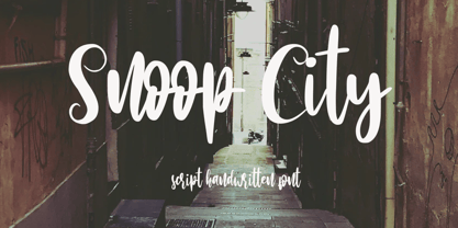 Snoop City is a flowing handwritten font, described by an elegant touch, perfect for your favorite projects. Fall in love with its incredibly distinct and timeless style and use it to create spectacular designs!. Honestly it works perfectly for headlines, logos, posters, packaging, T-shirts and much more. Font Features : • Regular version • Character set A-Z in uppercase and lowercase • Numerals & Punctuation • Accented Characters • Multiple Languages Supported Recommended to use in Adobe Illustrator or Adobe Photoshop with opentype feature. If you have questions, just send me a message and I'm glad to help.
 - Recording Artist JNL by Jeff Levine,
$29.00 When 45 RPM records were the norm for a teenager’s music collection in the 1950s and 1960s, many discs had their labels printed by letterpress. Some record companies utilized a bold, condensed typeface set in all caps for the song’s title and other pertinent information. The digital version of this font is called Recording Artist JNL, and is available in both regular and oblique versions. A companion font loosely based on this type design [but with more original characters and a slightly lighter weight] is Promotional Copy JNL.
 - Skid Rock by HansCo,
$12.00 Skid Rock is a modern, bold and clean font that will be perfect for multipurpose projects. This font looks cool in any design and is very recommended for craft, posters, books, branding, quotes, print templates, packaging, invitations, music labels or anything else that needs a touch of something bold and clean. Skid Rock comes in uppercase and lowercase, with punctuation, symbols, numerals, swashes and it also has multilingual support. Swashes is alternate from numeral 0 - 9. You can access swashes from your OpenType panel in your design software.
 - Marmitte by Supersemarletter,
$12.00 Marmitte is a modern, cute and quirky handwritten font. It has many special features including alternative glyphs and ligatures. Use it to add a special touch to your designs! Font Features : • Regular version • Character set A-Z in uppercase and lowercase • Ligatures in Lowercase and special • Alternates option • Numerals & Punctuation • Accented Characters • Multiple Languages Supported • Format File: OTF Recommended to use in Adobe Illustrator or Adobe Photoshop with opentype feature. If you have questions, just send me a message and I'm glad to help. Best Regards, Supersemar Letter